Located in the heart of Valencia, the flagship PAU brand was redesigned by Estudio DIIR through an in-depth experimental process, defining every detail from brand recognition to the new sales space.
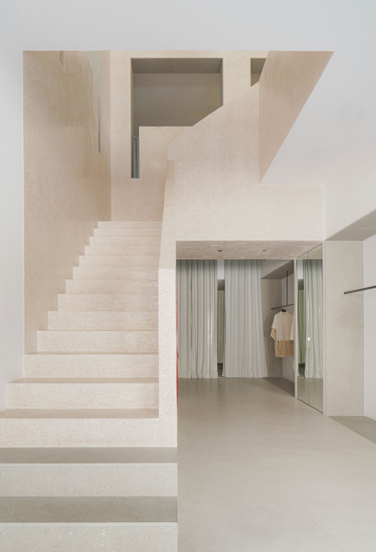
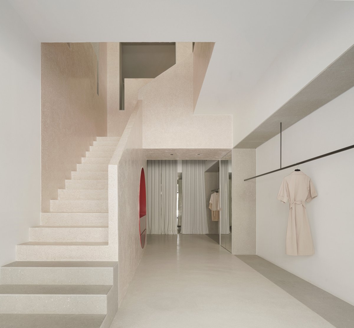
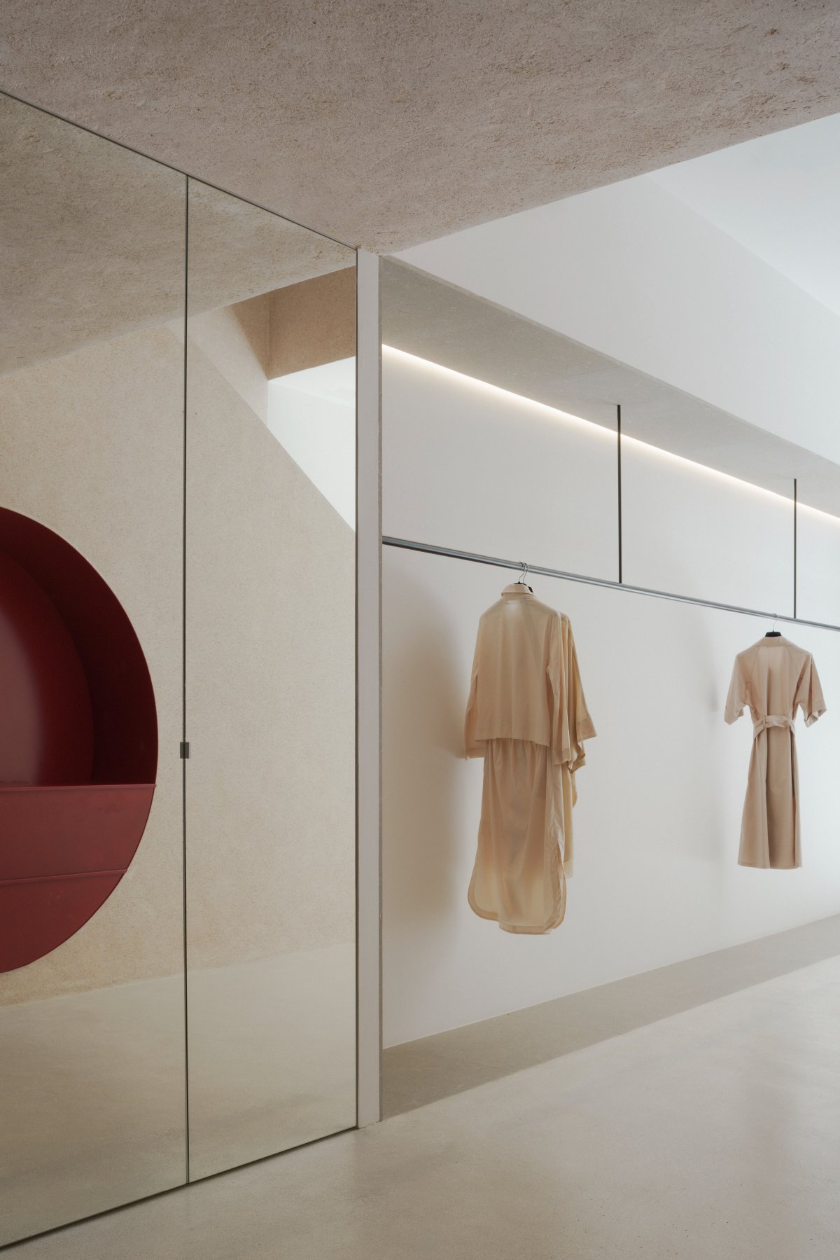
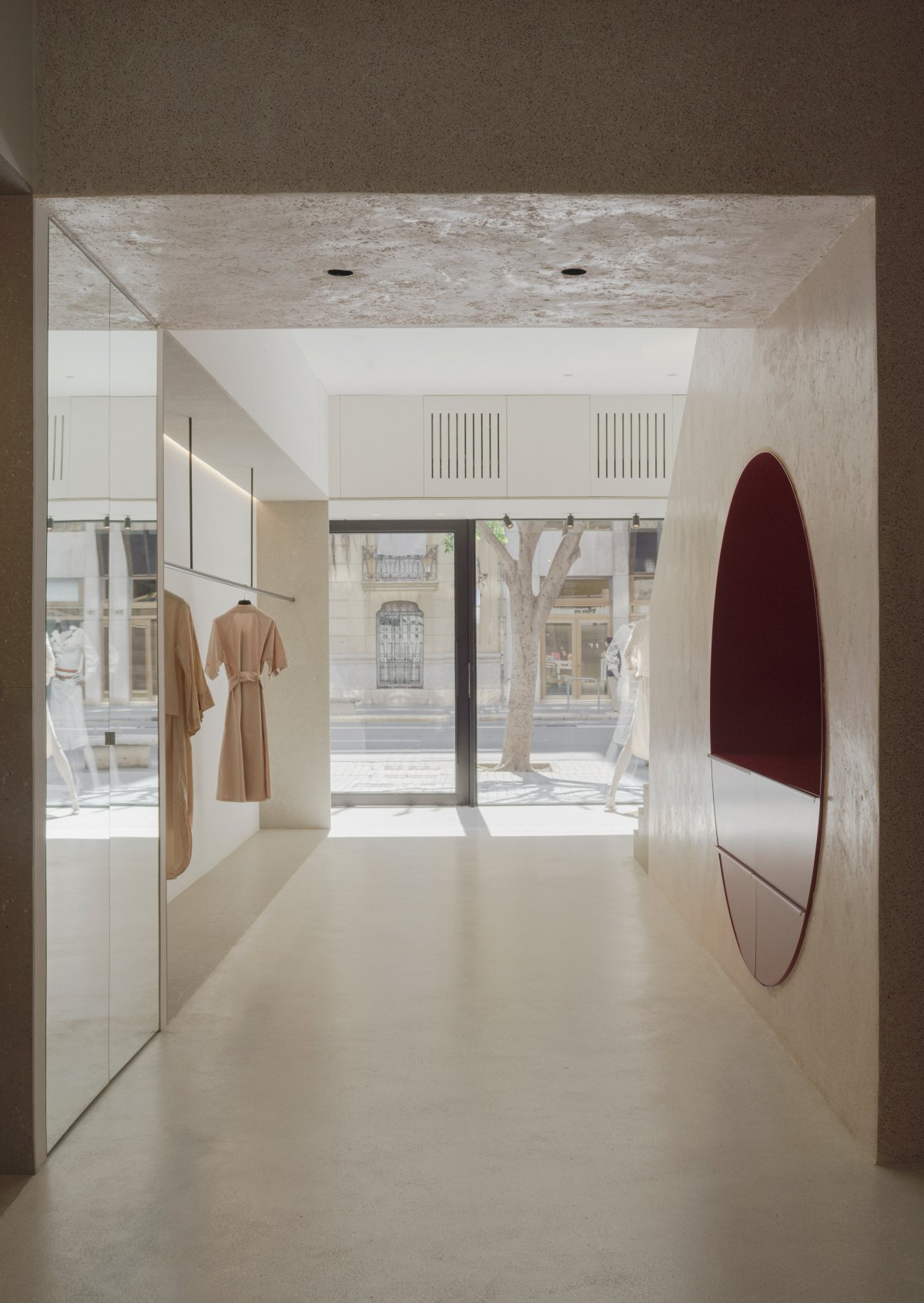
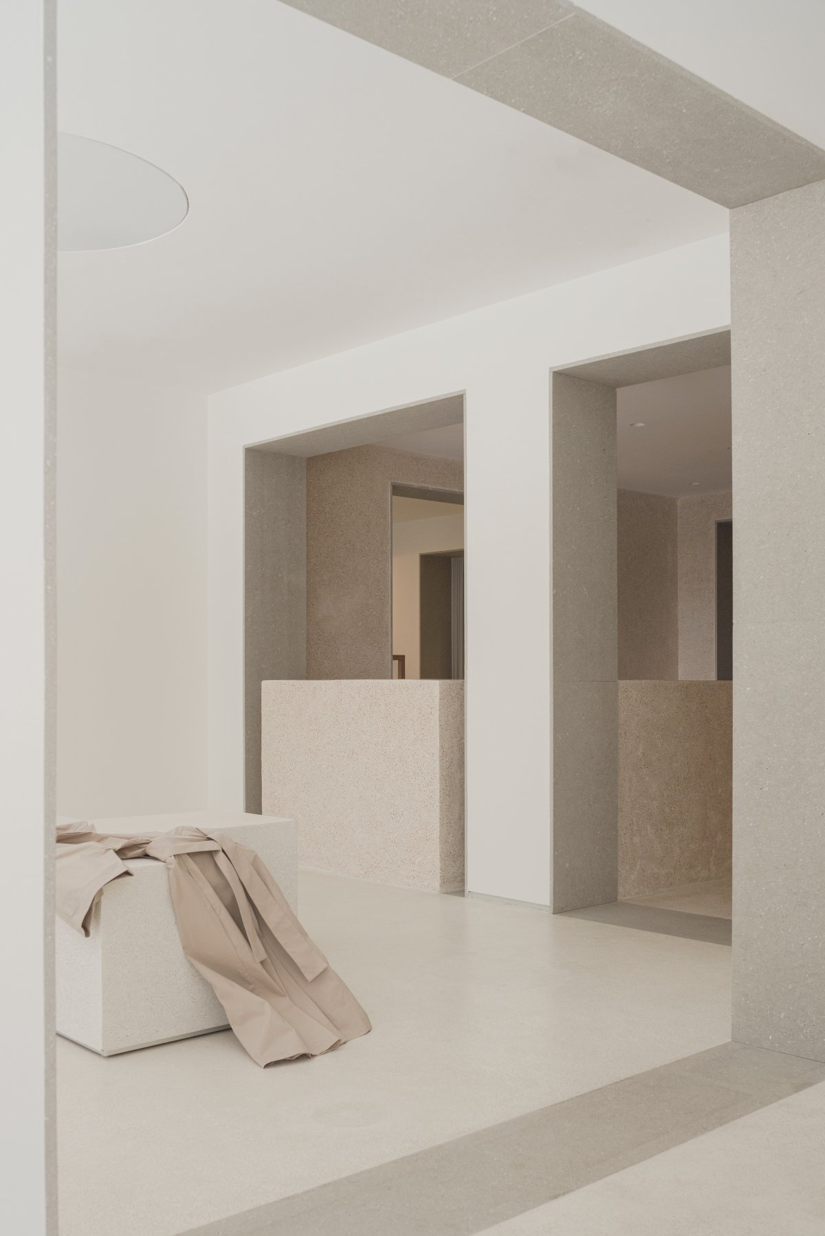
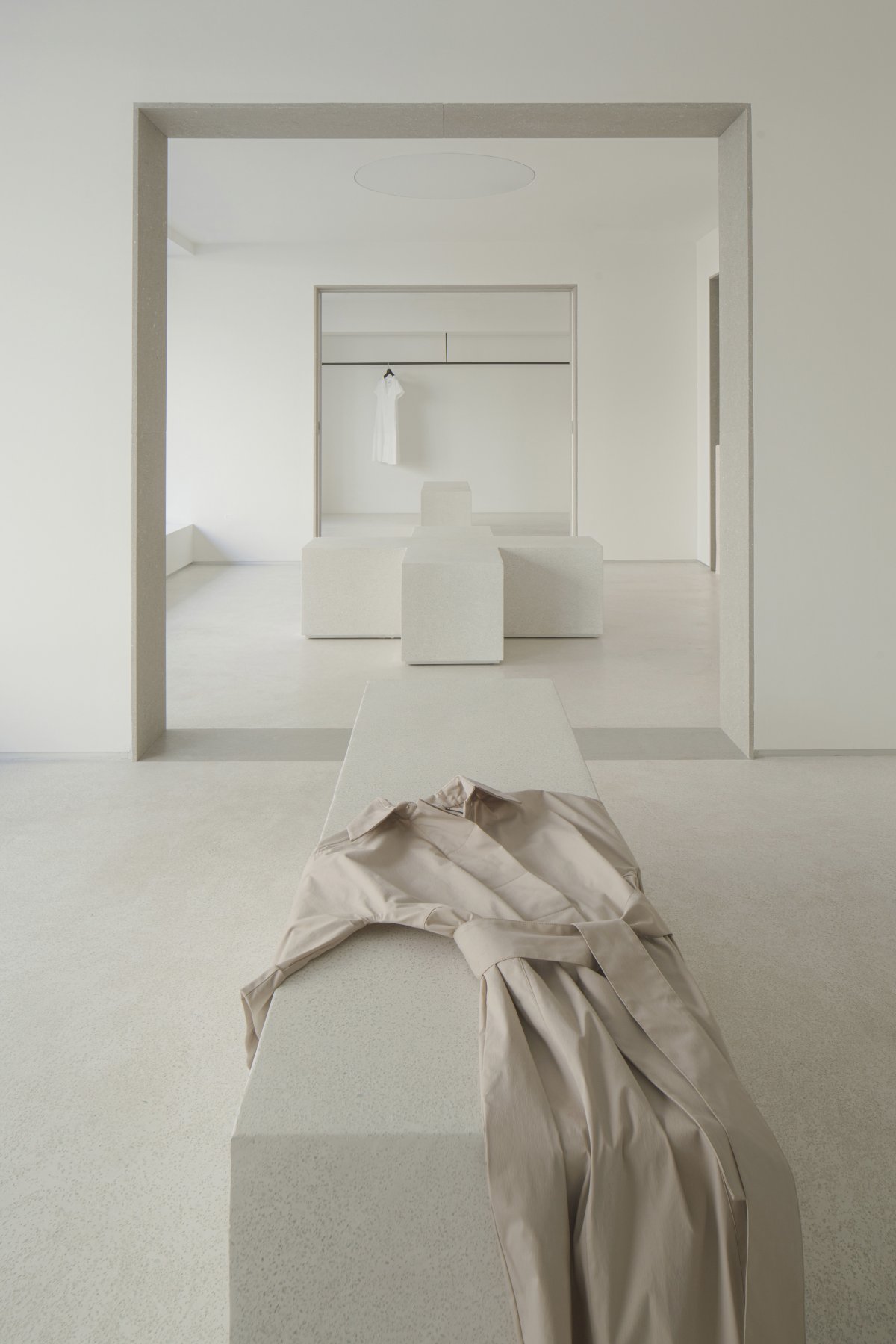
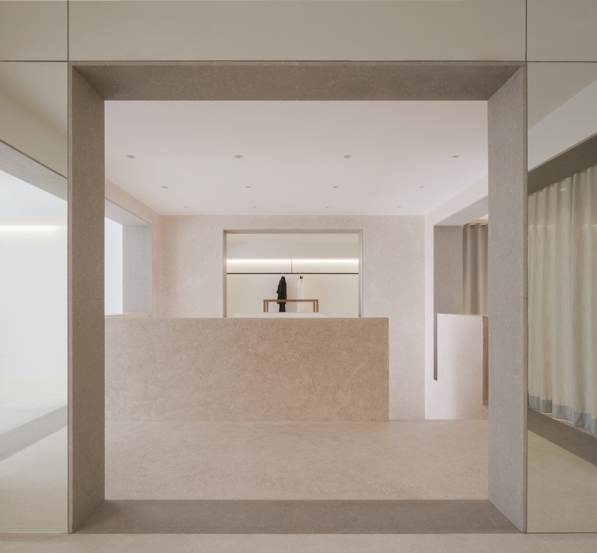
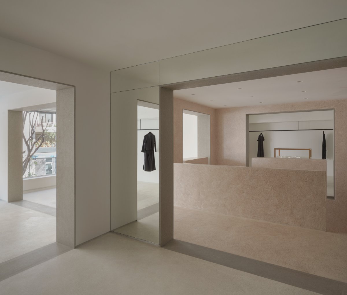
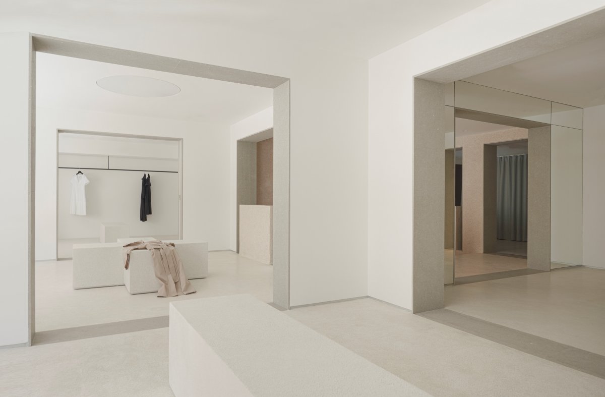
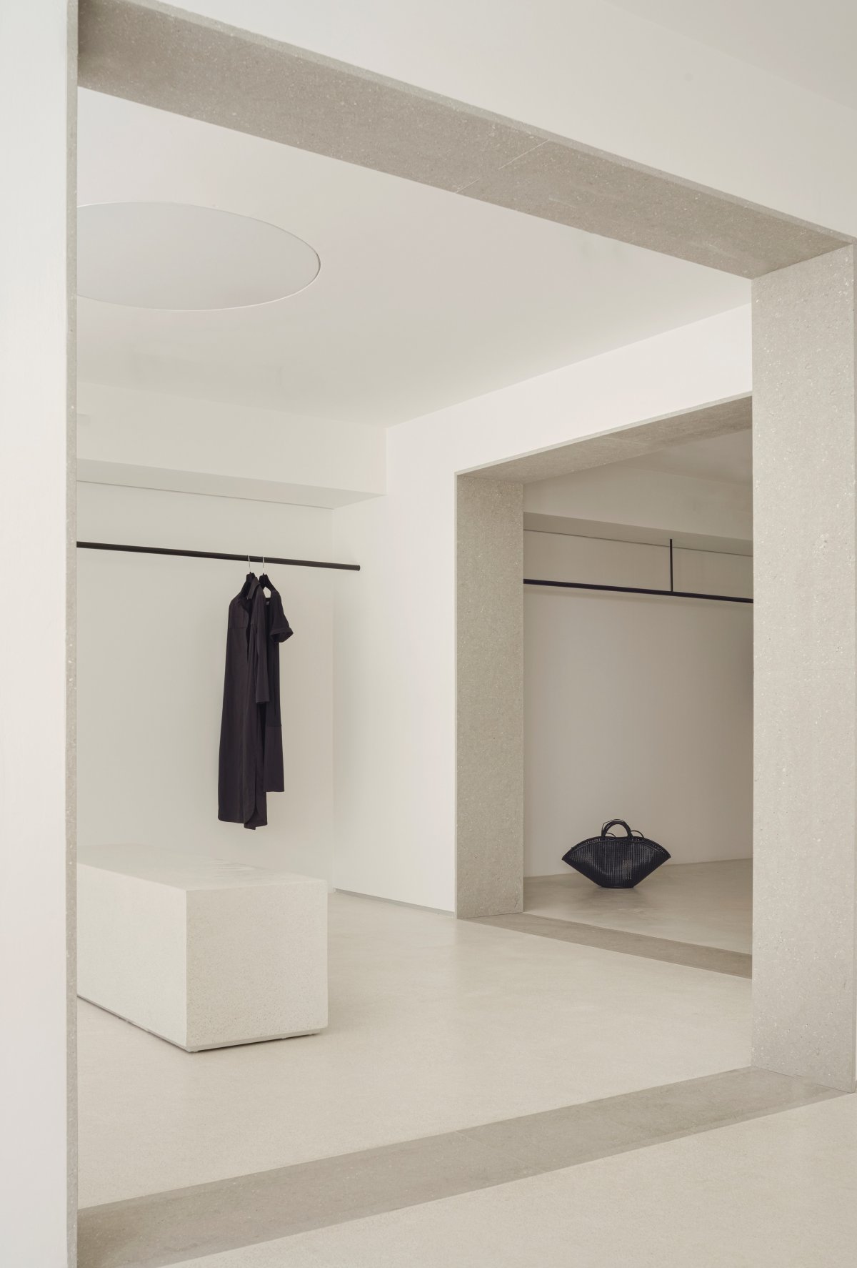
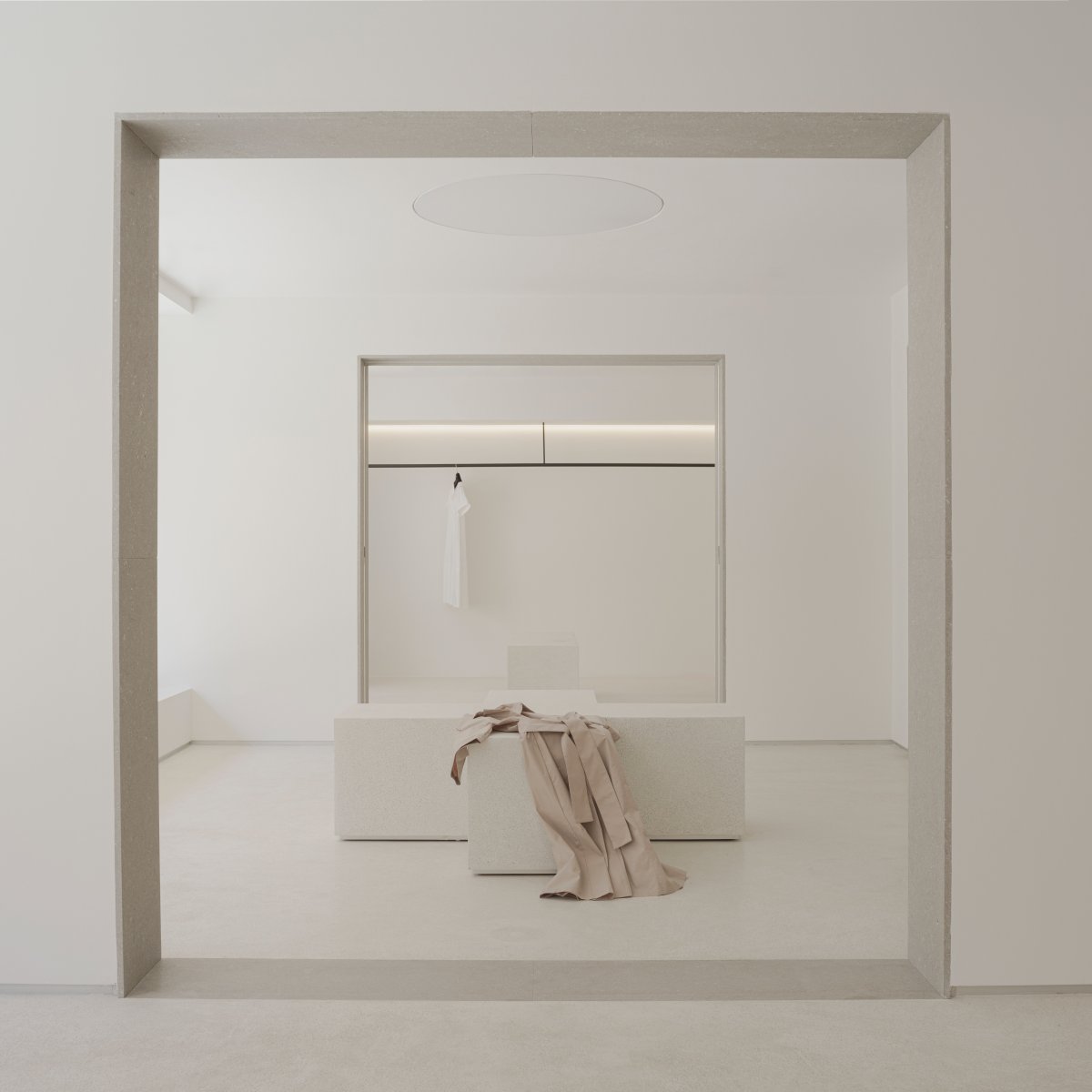
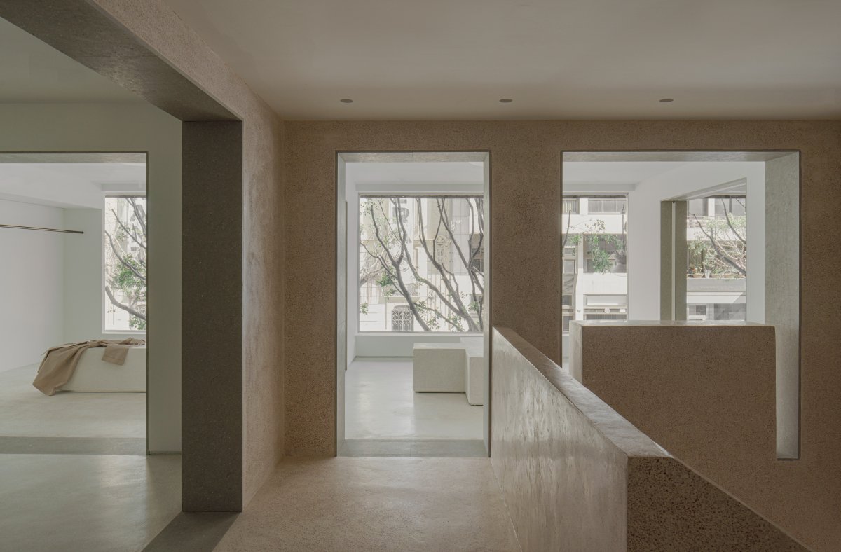
Reinterpreted and inspired by the historic palaces of the 18th and 19th centuries, the PAU Flagship Store has a series of rooms that enhance the spatial experience. The square plane is divided into nine spatial grids. The result is a sum of eight rooms +1, all perfect squares endowed with special qualities. This flexible layout makes it possible to combine exhibitions of the collection, event staging, or the occasional private sale. The intersecting perspectives enhance the museum nature of the space while providing a contextually flexible display space for the products on sale.
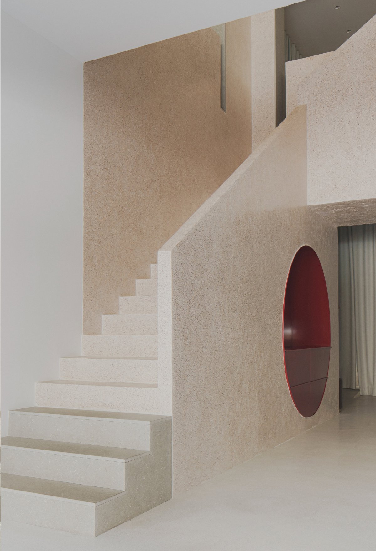
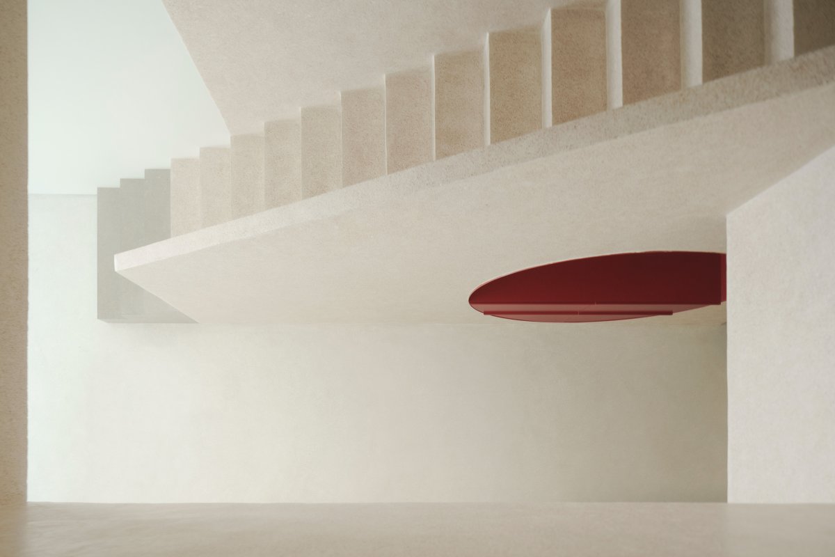
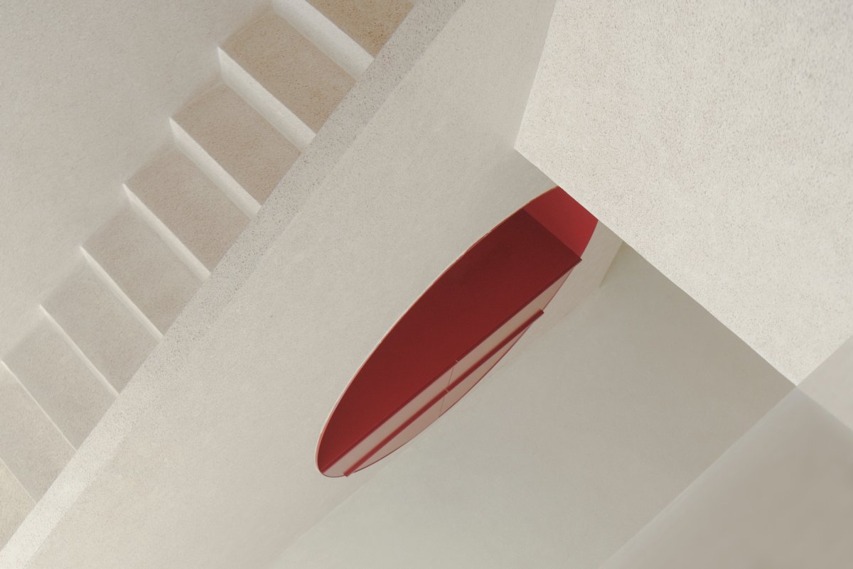
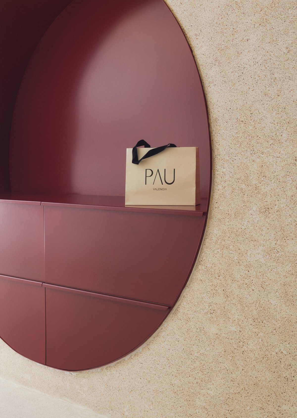
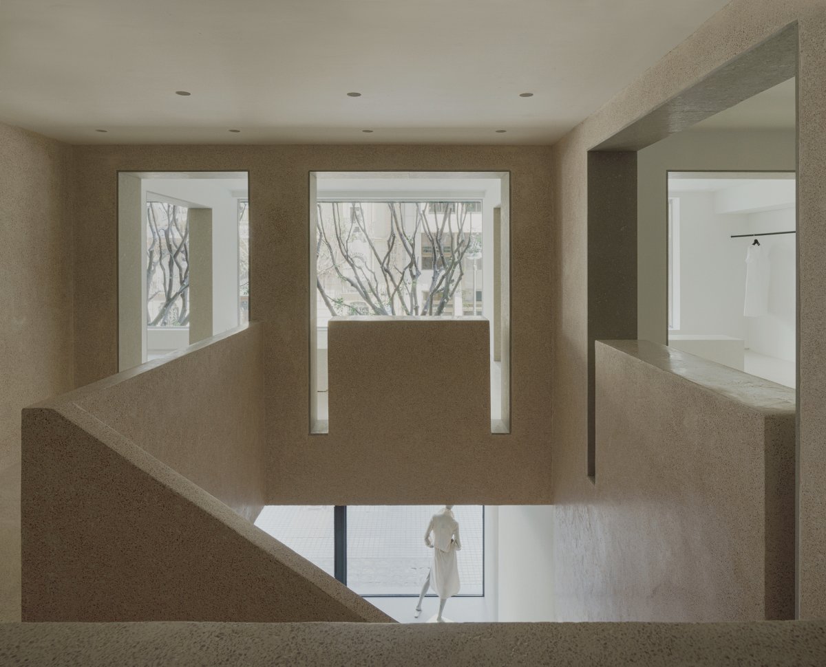
Among the nine rooms, the central space adopts a unique identity. It expresses its uniqueness through color and acts as a bond; On the one hand, it connects the two floors vertically, on the other hand, it organizes and connects the eight surrounding Spaces. Inside, an impressive staircase is designed as a red micro-terrazzo sculpture that becomes a central element of the project.
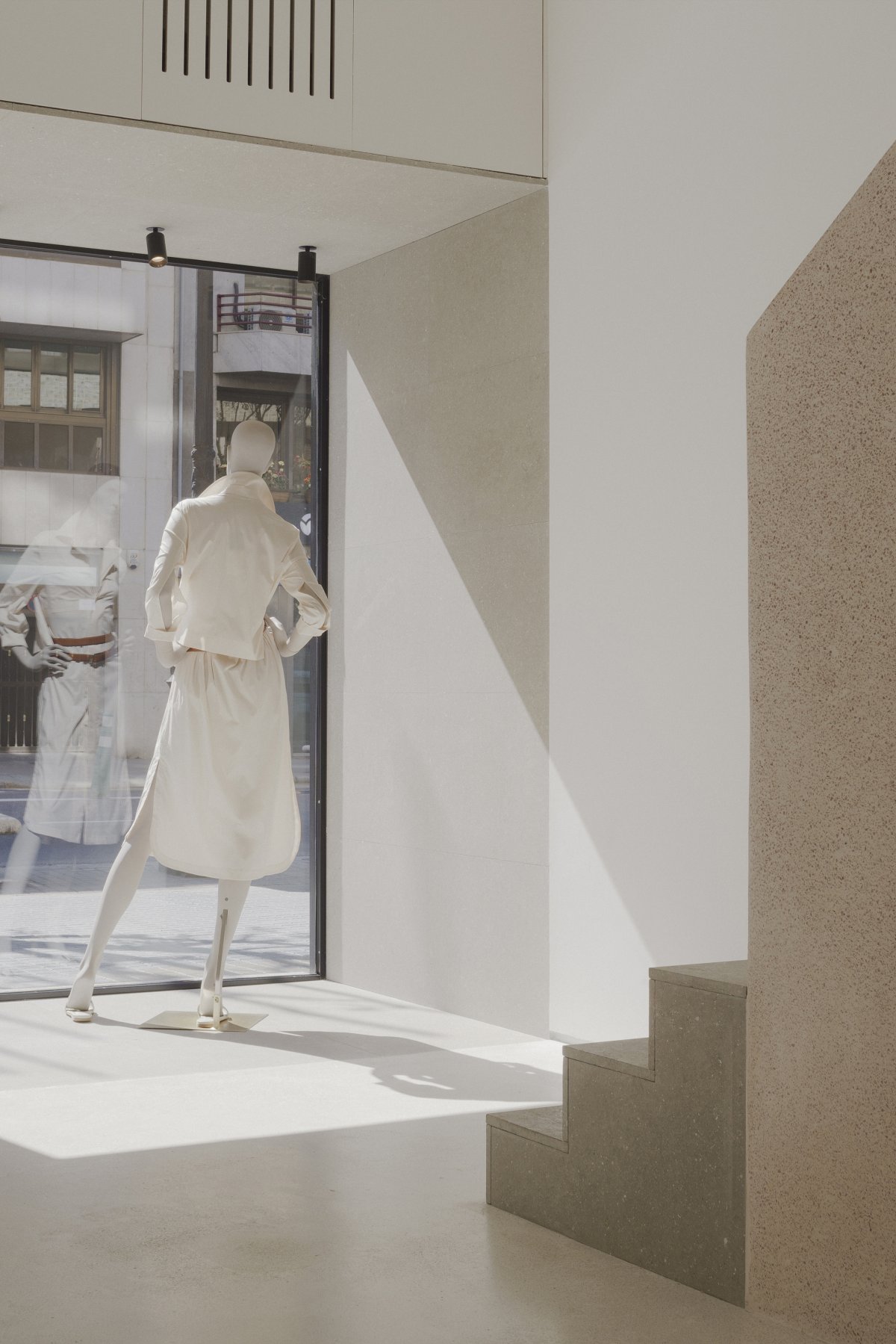
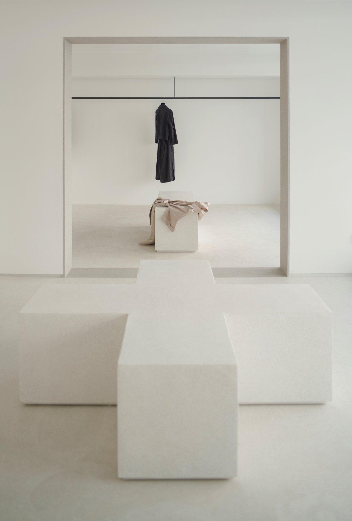
While the use of geometry is characteristic of this space, it also transfers to other rooms. The strong fragments and sheer volume of neutral microterrazzo organize the space and allow enhancement of the products displayed there. On the other hand, the steps between the rooms are composed of local stone cladding from Valencia, a form that emphasizes the geometric power of the transition and emphasizes its depth. In short, this unique space invites people to reflect on new sales norms and propose a shopping experience based on the roundness of the space and the quality of the materials in the atmosphere.
- Interiors: Estudio DIIR
- Photos: David Zarzoso
- Words: Gina

