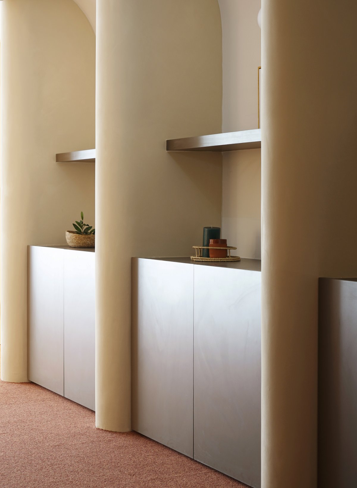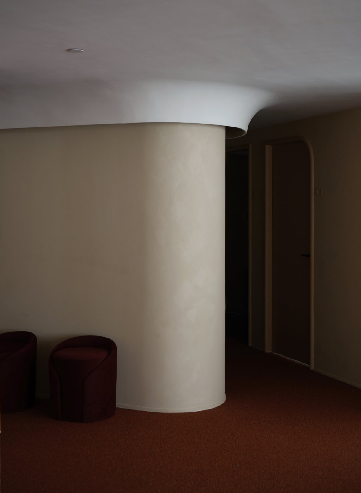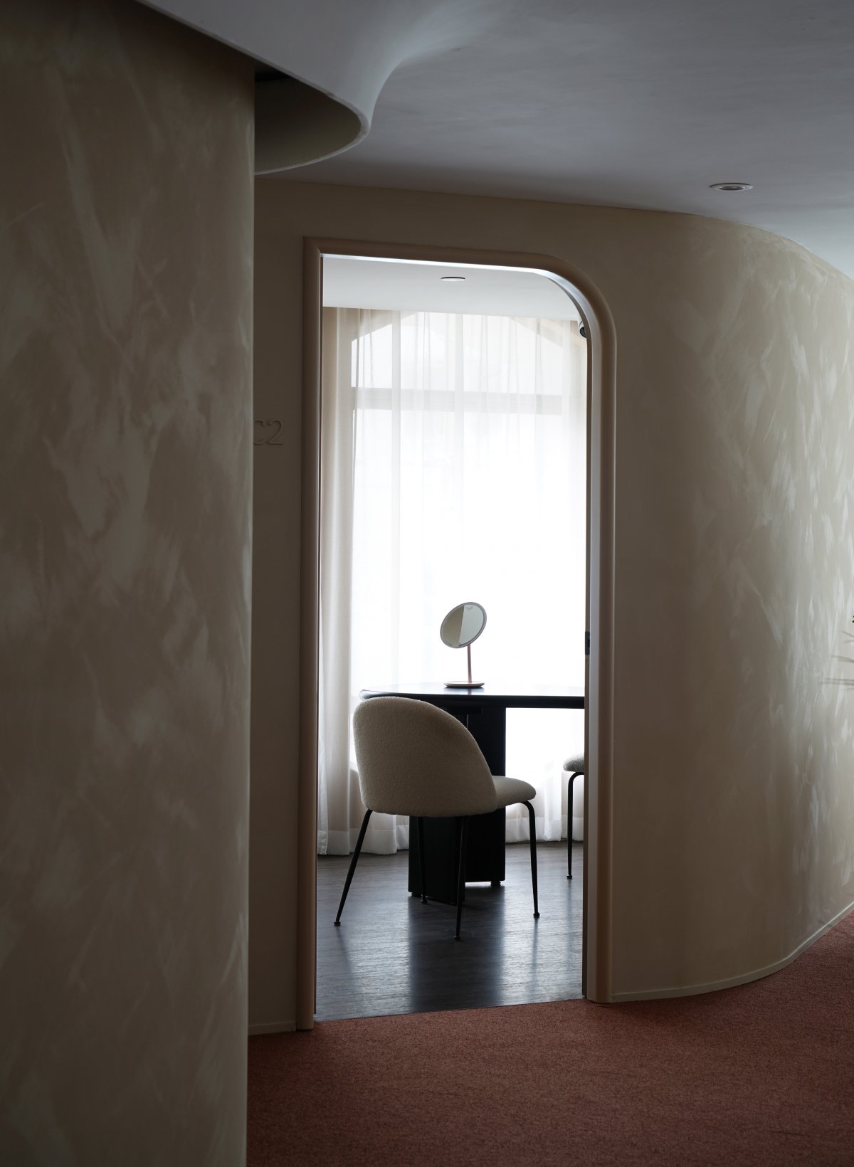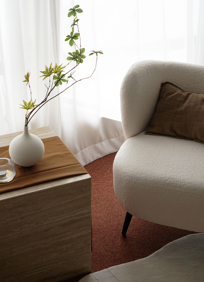
Hermia - a medical beauty centre in Hong Kong - takes its name from a fictional character in Shakespeare’s play, A Midsummer Night’s Dream, to encapsulate the brand’s young, courageous, and energetic voice. With their latest branch in Causeway Bay, we sought to continue the classical and theatrical theme of both the brand and location, by applying a medley of sweeping arches, contoured ceilings, sculptural furnishings, and sandy hues that run through the space, swathing the interiors with a soothing, protective, and healing atmosphere.
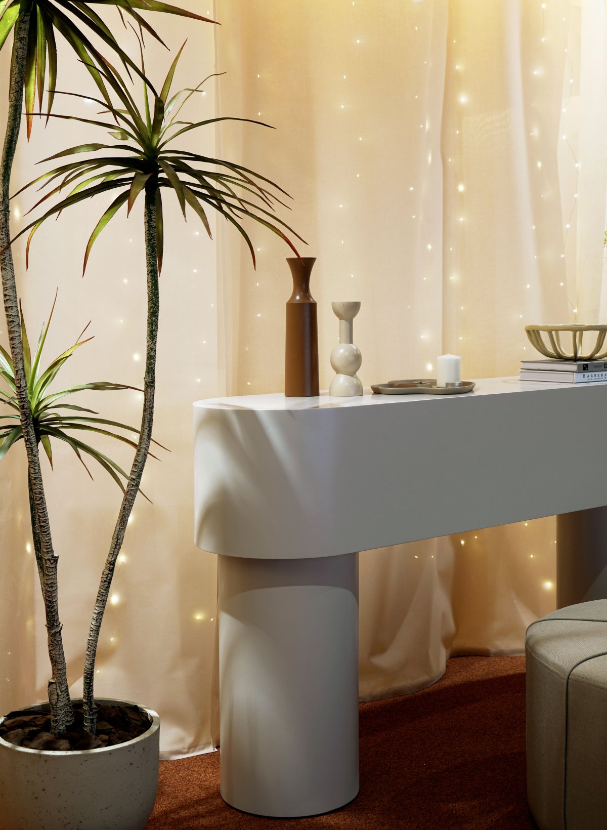
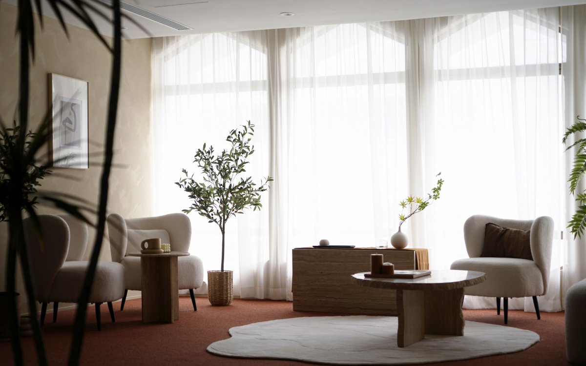
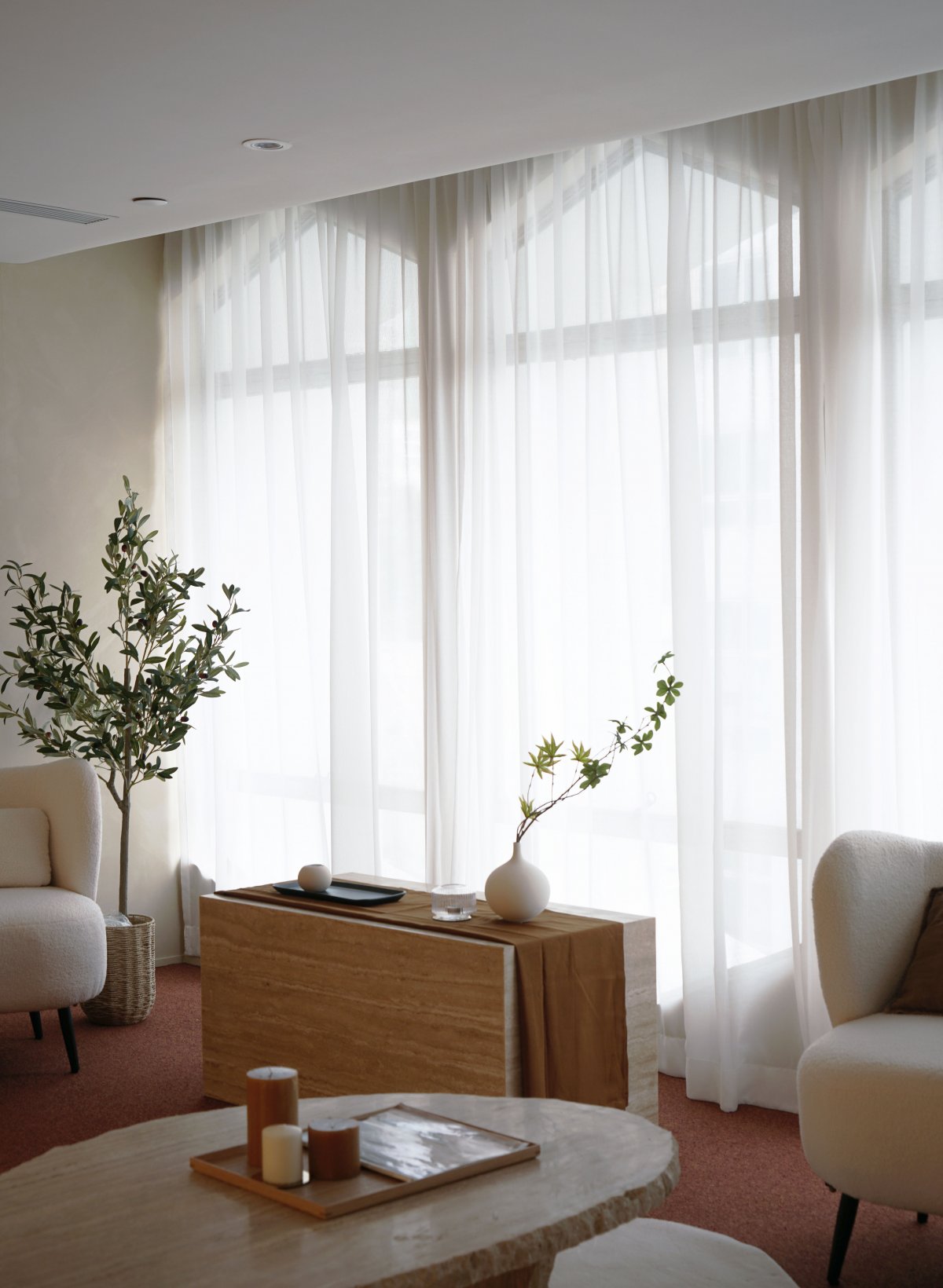
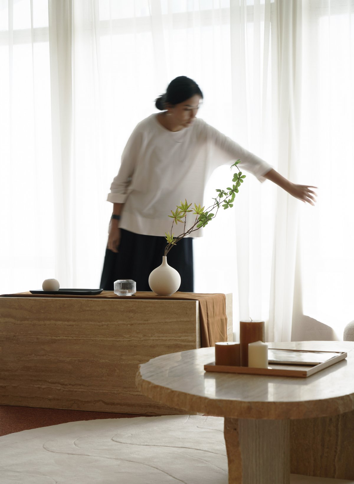
The venue is divided into three functional zones - the reception / waiting area, consultation, and treatment zones - each enveloped by a series of hexagonal windows retained as one of the site’s original features. The reception / waiting area was imagined as a transitional place, where we leveraged the scale and form of these windows, in conjunction with the abundance of natural light streaming in through the sheer curtains, to enhance the interior’s meditative sensibility.
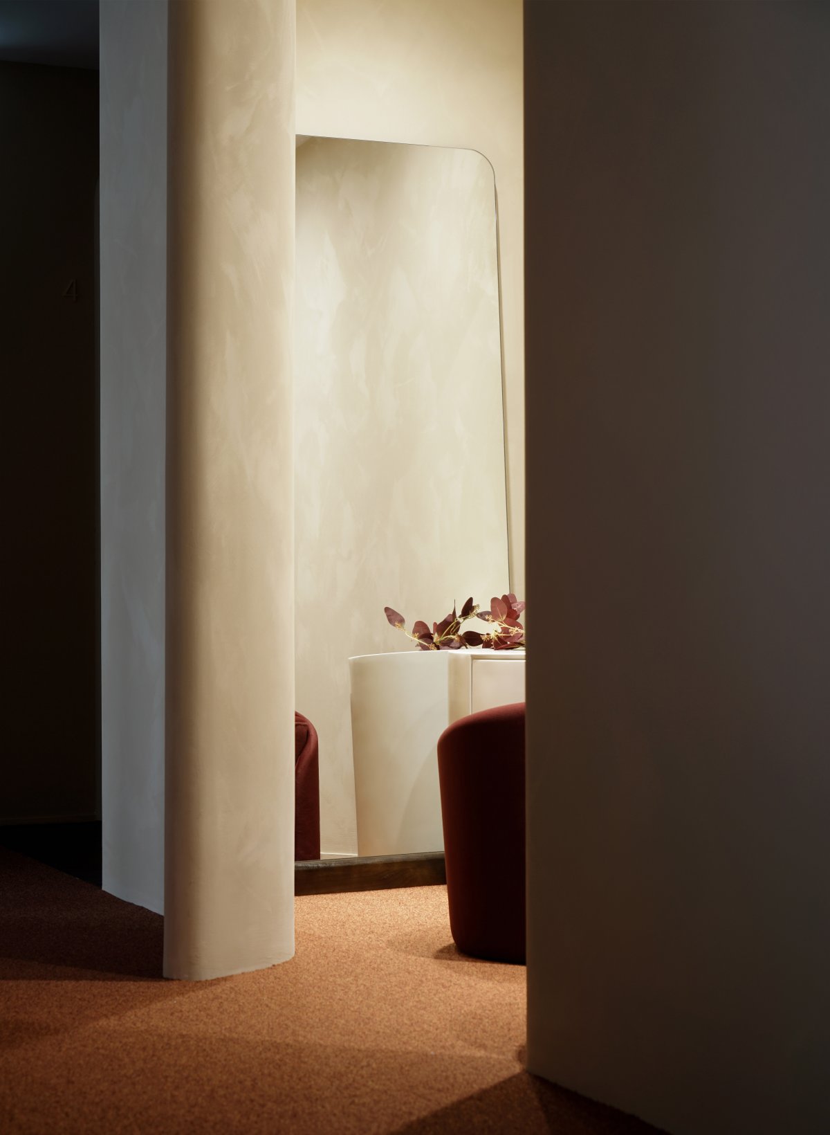
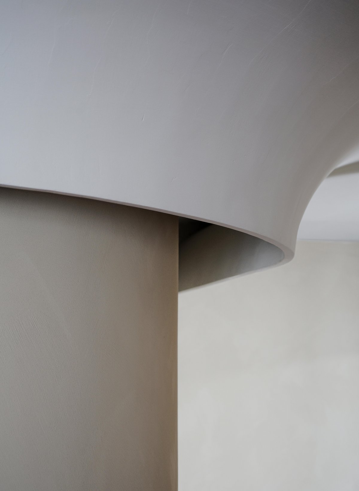
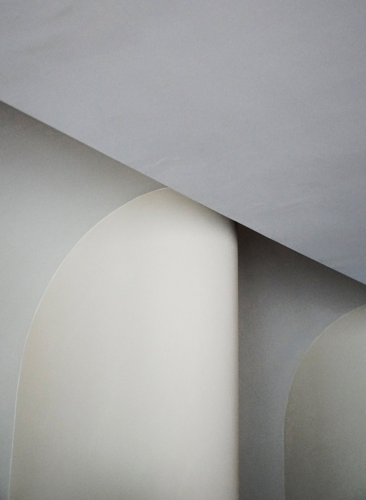
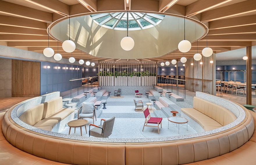
Taking a cue from the origins of the brand’s name, we looked to the Doric Column of the Greek Order the decorate the turning points of each passage. The ceiling was carved downwards to engulf the top section of the walls, controlling the way in which artificial light diffuses throughout the space. This interplay in geometry, textures, and volume allows for a choreography of light and shadow to unfold throughout the day.
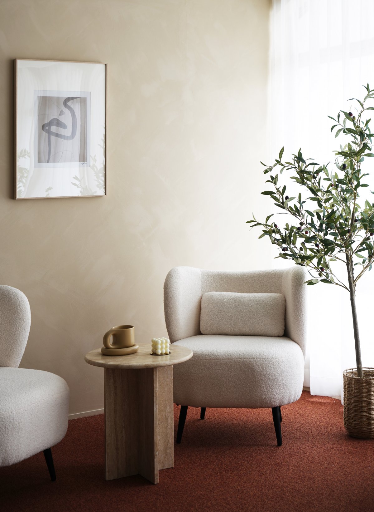
The reception/waiting area was imagined as a transitional place, where we leveraged the scale and form of the pre-existing hexagonal windows, in conjunction with the abundance of natural light streaming in through the sheer curtains, to enhance the interior’s meditative sensibility.
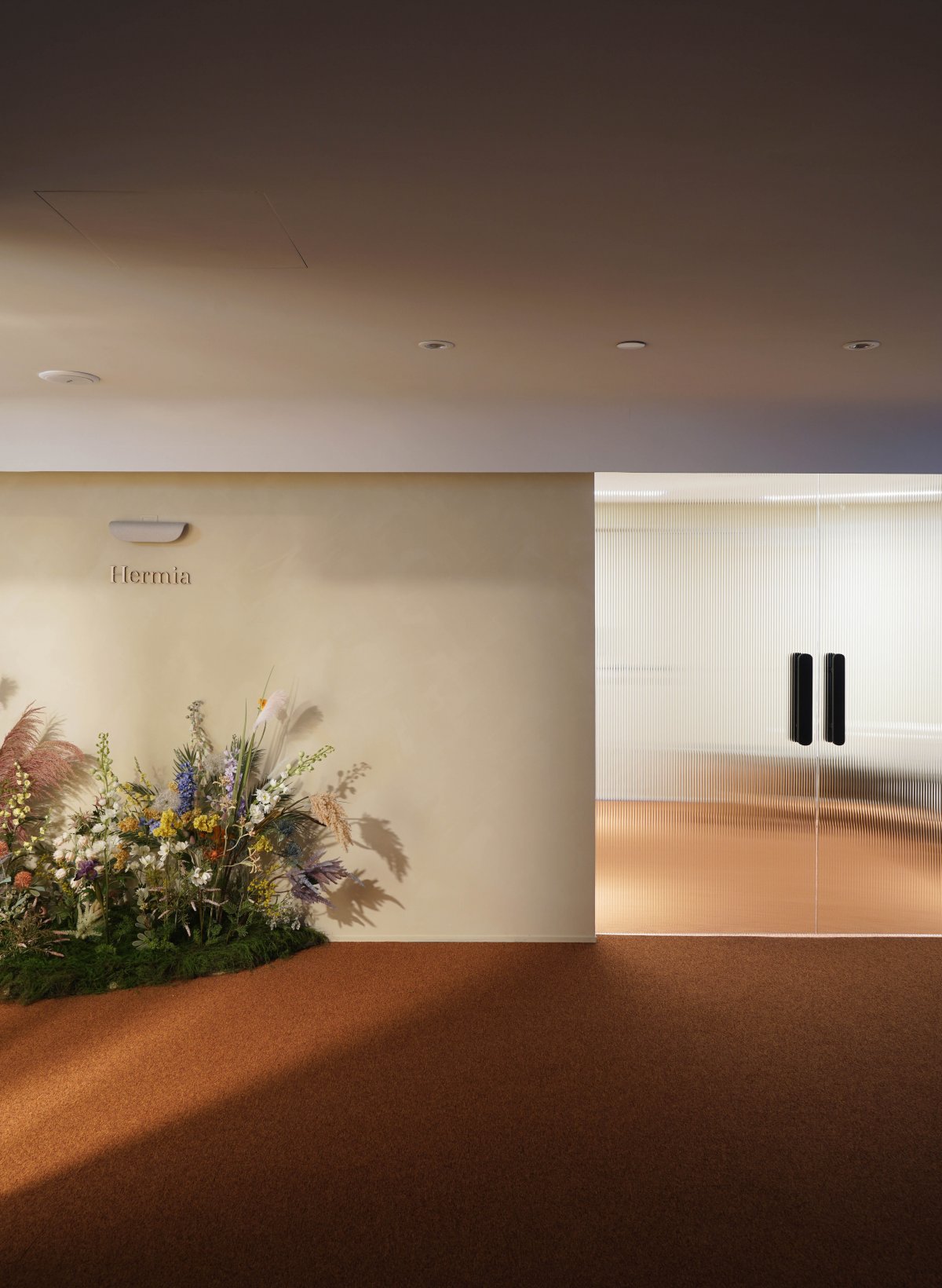
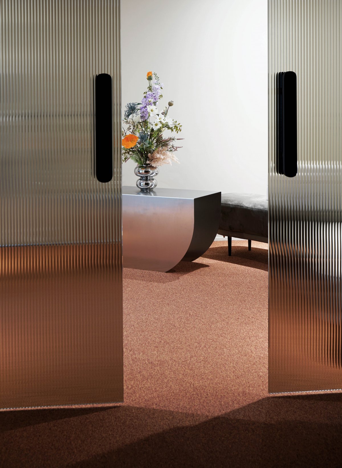
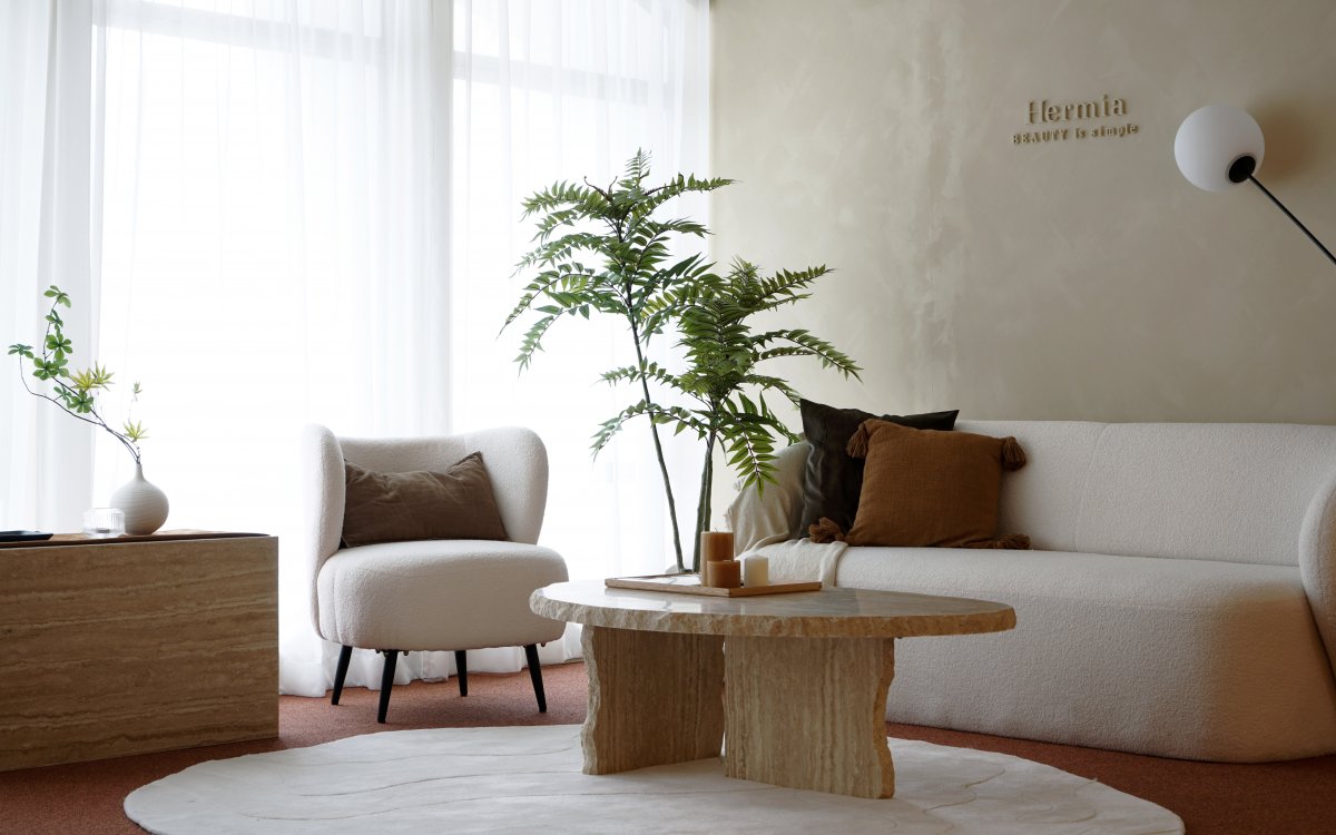
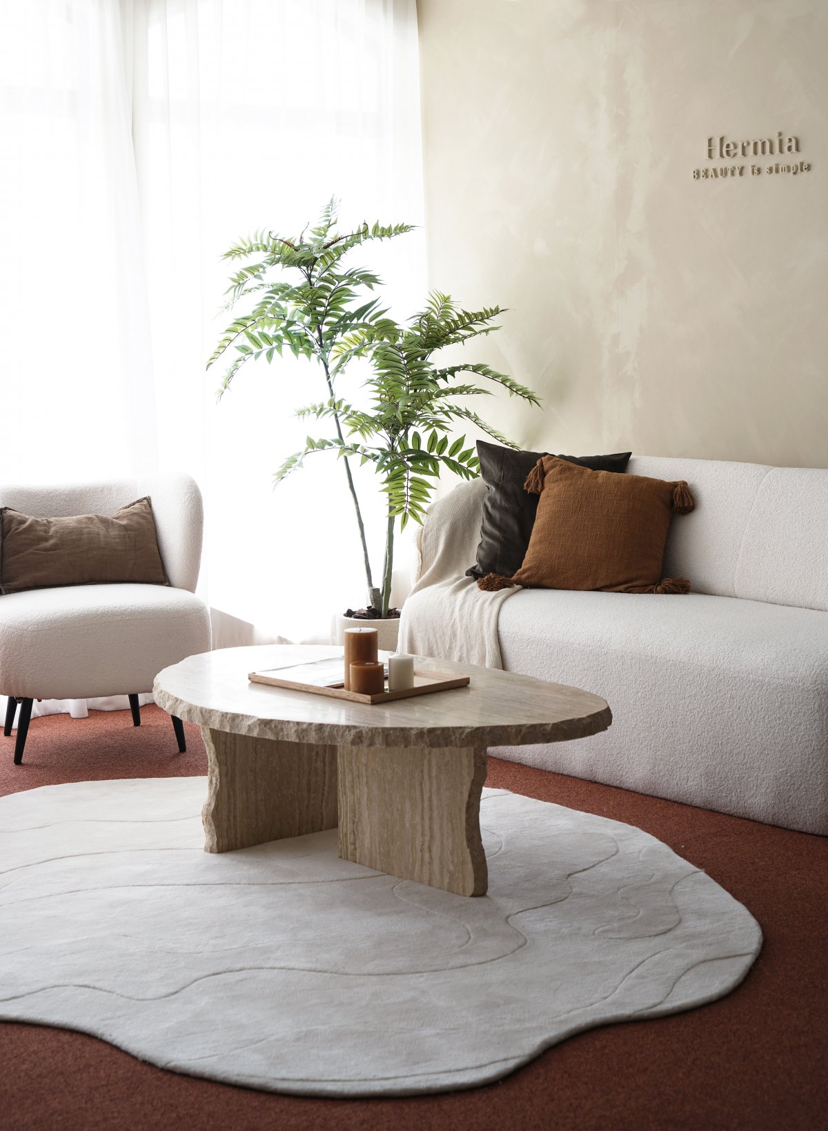
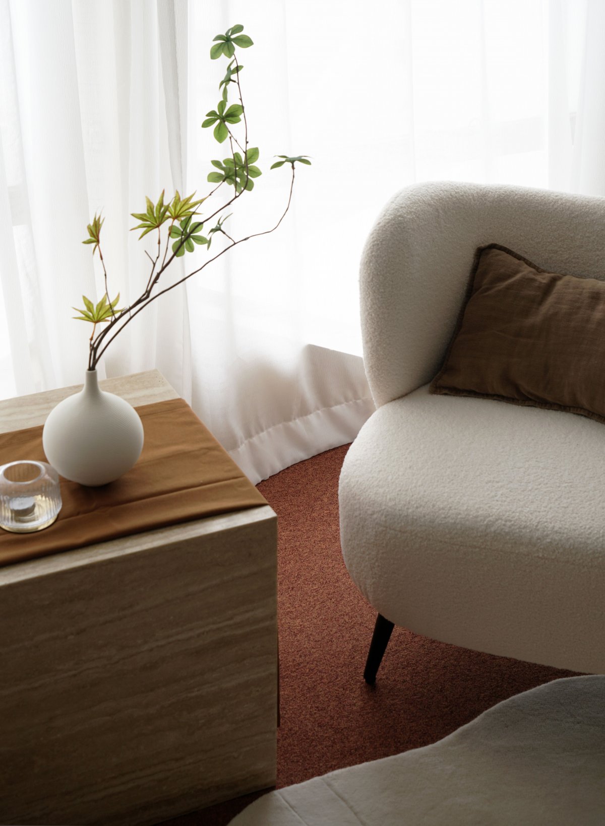
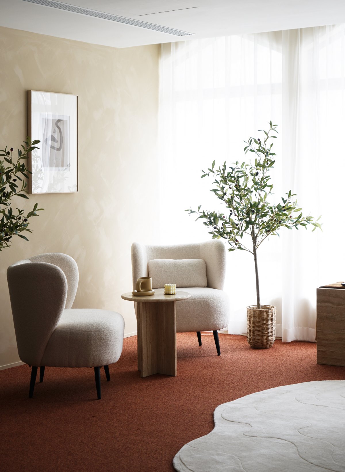
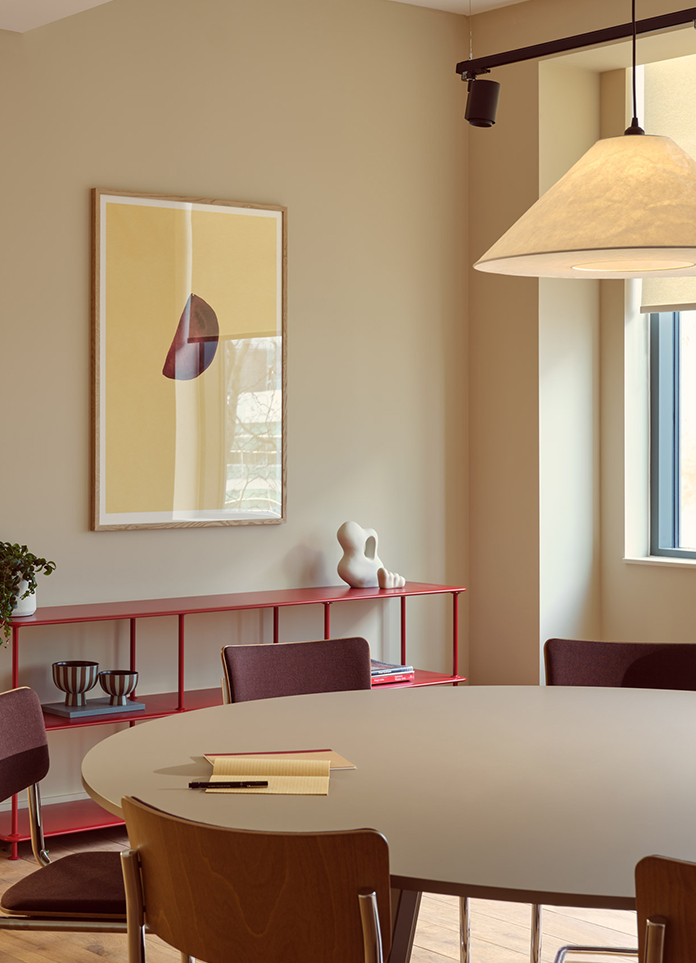
Inspired by the romantic comedy itself, the interiors are dressed in an autumnal palette of reds, yellows, and browns. The walls are finished with a beige-toned paint from St Leo using a stucco technique to add depth and texture to the walls when natural light shines through. The entrance is marked by a glass door and to its left, you will find the doctor’s consultation area. Here, a more solemn and stern palette is carried, featuring dark wooden floors and metal furnishings to shape a more professional, medical image. As an integral part of the healing experience, we also custom-designed a number of furniture, storage units, and accessories for the centre, offering visitors a truly sensuous experience to rejuvenate.
Taking a cue from the origins of the brand’s name, we looked to the Doric Column of the Greek Order the decorate the turning points of each passage. The ceiling was carved downwards to engulf the top section of the walls, controlling the way in which artificial light diffuses throughout the space.
An interplay in geometry, textures, and volume allows for a choreography of light and shadow to unfold throughout the day.
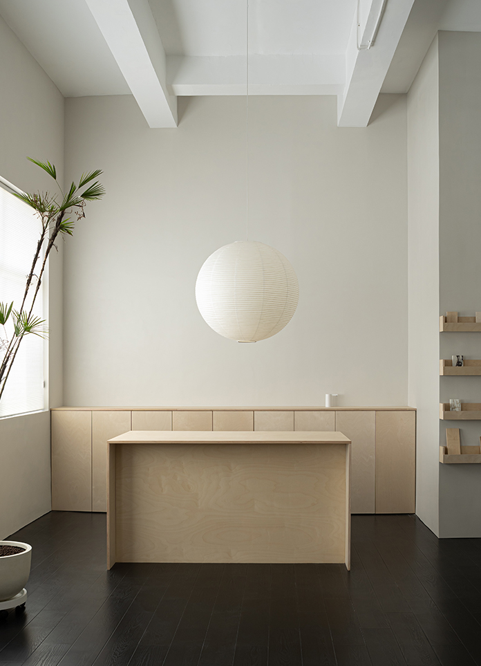
The entrance is marked by a glass door and to its left, you will find the doctor’s consultation area. Here, a more solemn and stern palette is carried, featuring dark wooden floors and metal furnishings to shape a more professional, medical image
Inspired by the romantic comedy itself, the interiors are dressed in an autumnal palette of reds, yellows, and browns. The walls are finished with a beige-toned paint from St Leo using a stucco technique to add depth and texture to the walls when natural light shines through.
- Interiors: JAAK Design
- Photos: JAAK Design
