To the east of Qishan Road, at No. 189-6, stands a three-storey independent building. Except for the existing commercial space on the left side of the first floor, the rest are temporarily vacant. As a chain brand of skin care experts, Younger Care is located on the second floor and is accessible by elevator through the public passage on the first floor in the northwest. The commercial storefront on the left side of the original building on the first floor of the site is self-contained and cannot form a whole; the external facades on the second and third floors are large-area single curtain windows, which leads to the obvious internal column and beam structure, which is too transparent. , is also not conducive to the use of internal functions and the establishment of brand image. The optimal design of the façade has become the first element we need to consider.
For an ordinary building, it is better to deconstruct it properly than to rebuild it. The elemental application of geometry has become a consensus to improve the relationship between the façade blocks. Based on the consideration of the entrance, from the first floor to the third floor, a column with a diameter of 4m is embedded in it to strengthen the path of the vertical circulation, and at the same time form a striking image of the brand store. The cross-embedding of the horizontal 3m arc section on the second floor makes the original transparent curtain window form a contrast between the virtual and the real, and the visual ratio of "visible" and "non-visible" can be precisely controlled. The 0.15m gap, as a hint of the internal scene, is interspersed in a horizontal and vertical manner, with a sense of asymmetrical balance.
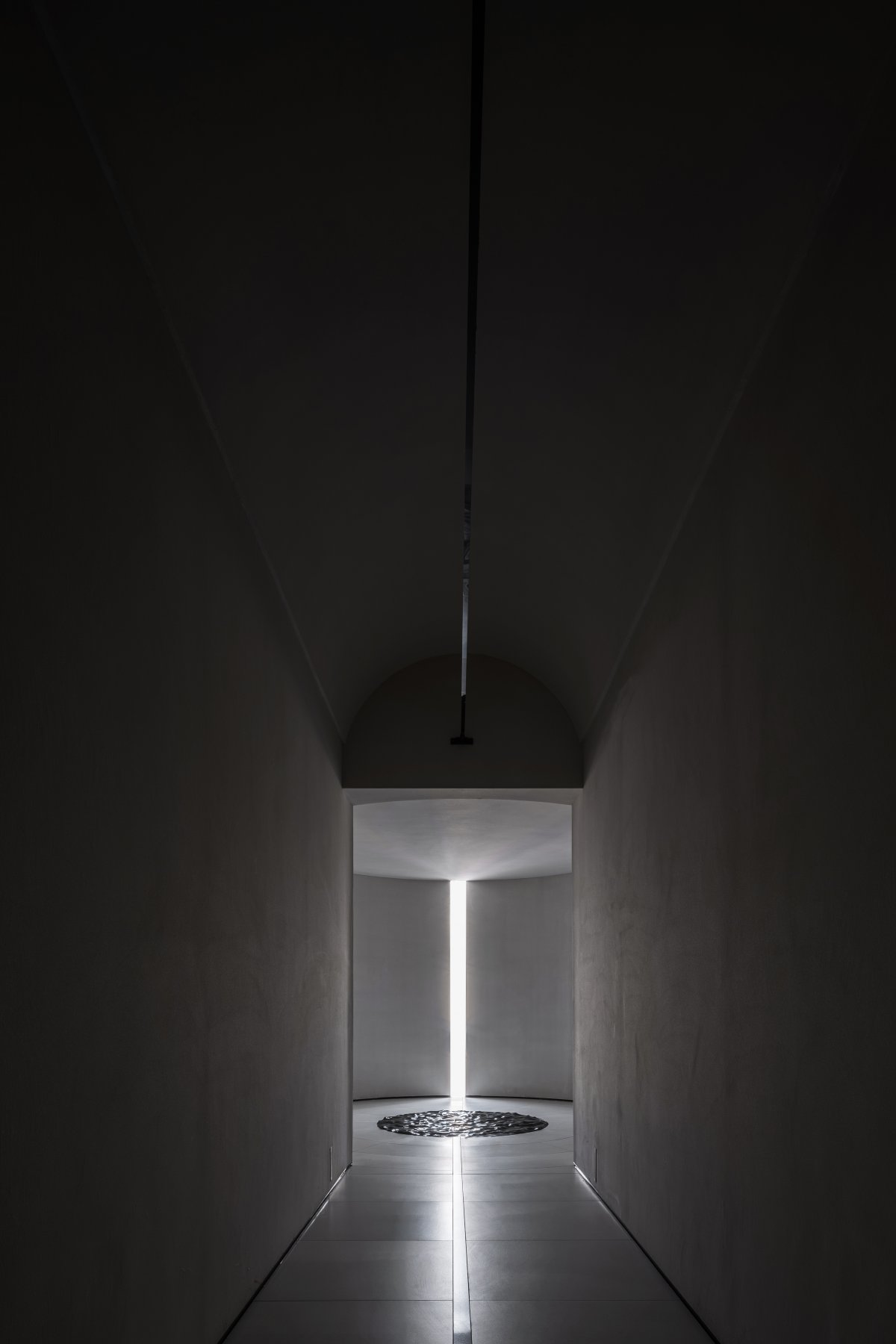
The square opening of the vertical column is reserved for the main entrance. After passing through the circular space and then to the square vault, the changes of geometric shapes have different moods of the place. Due to the factors of height difference inside and outside, the steps are based on three steps to form a gradual buffer platform to avoid the feeling of depression due to cramped space. Just like the "elevator" in Christopher Nolan's 《Tenet》, it connects different space scenes as a carrier of time and space travel.
The path of travel also echoes the spatial rhythm of the entrance on the first floor, from the square arch to the round flat roof, and then into the open reception hall. The mutual mobilization and transformation of the geometric scales between the squares and circles seems to imply a certain inner spiritual connection of the place, which is in line with the connotation and essence of the brand attributes.
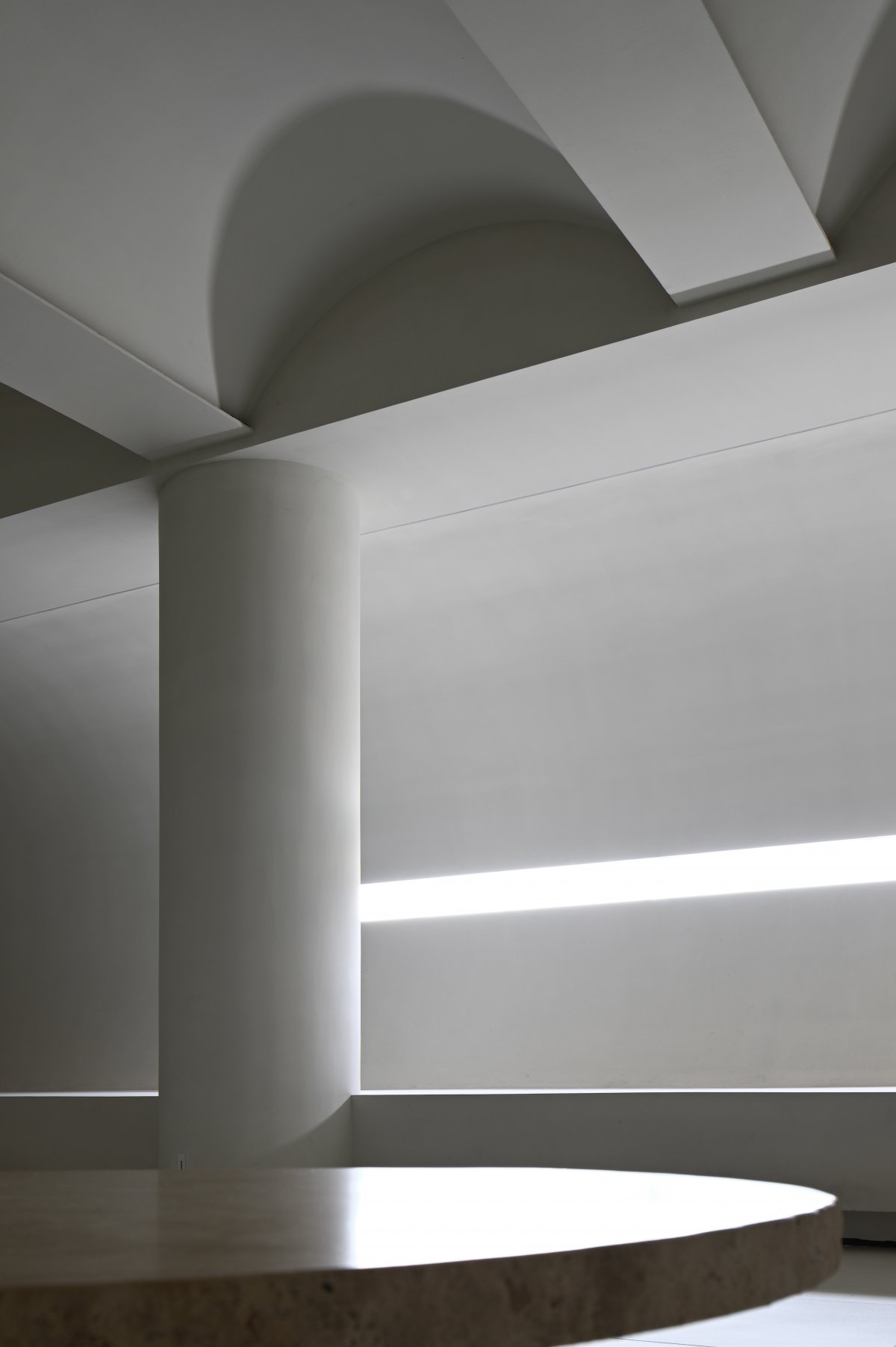
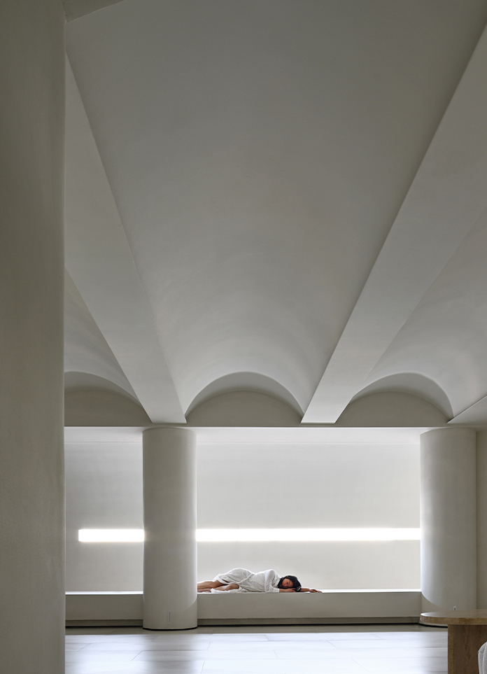
While we pursue form to serve function, in turn, function relies on form to create a spatial concept of "serving" and "being served". The front reception area is blocked by the arc of the facade, which ensures the privacy of the guests and is not easily seen. The weak light is projected through the slits on the northwest side, smearing a pure construction atmosphere. The sequential arrangement of the longitudinal continuous vaults of the ceiling in the open area not only solves the problem of multiple beams on site, but also makes the sight line regular. As for the unity and coordination of the space base, it effectively avoids the existence of clutter and disorder, and the purity of a single material, at the same time, echoes the original pursuit of beauty like "clean as angel skin".
As a brand that serves the body, Younger Care Anti-aging Center continues to explore the body itself, and the "body" here does not specifically refer to it, it may be the physical body or the place where it is located. Spaces or fields are more likely to be macroscopic microscopic observations and microscopic macroscopic insights.
- Interiors: JCD
- Photos: Xu Yiwen Chen Ming
- Words: Off-Words / Moon


