Deep implication follows the further inflection, and then narration comes. Expression is the process that includes much entertainment. To some extent, the exhibition space is the narration of the brand for the outside readers.
In this design of Lansen Exhibition Hall, we reconsidered the relationship among consumers, space and designers. The main manager is defined as the narrator to express its own living attitude to consumers through the media role of products and space. The brand philosophy is expressed by the agency type experience process.
01.Inner space makes sense and the experience goes first
The story starts right here
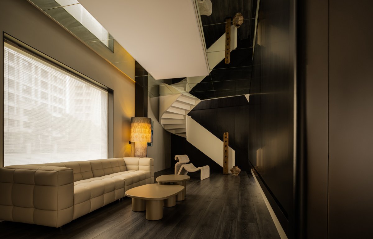
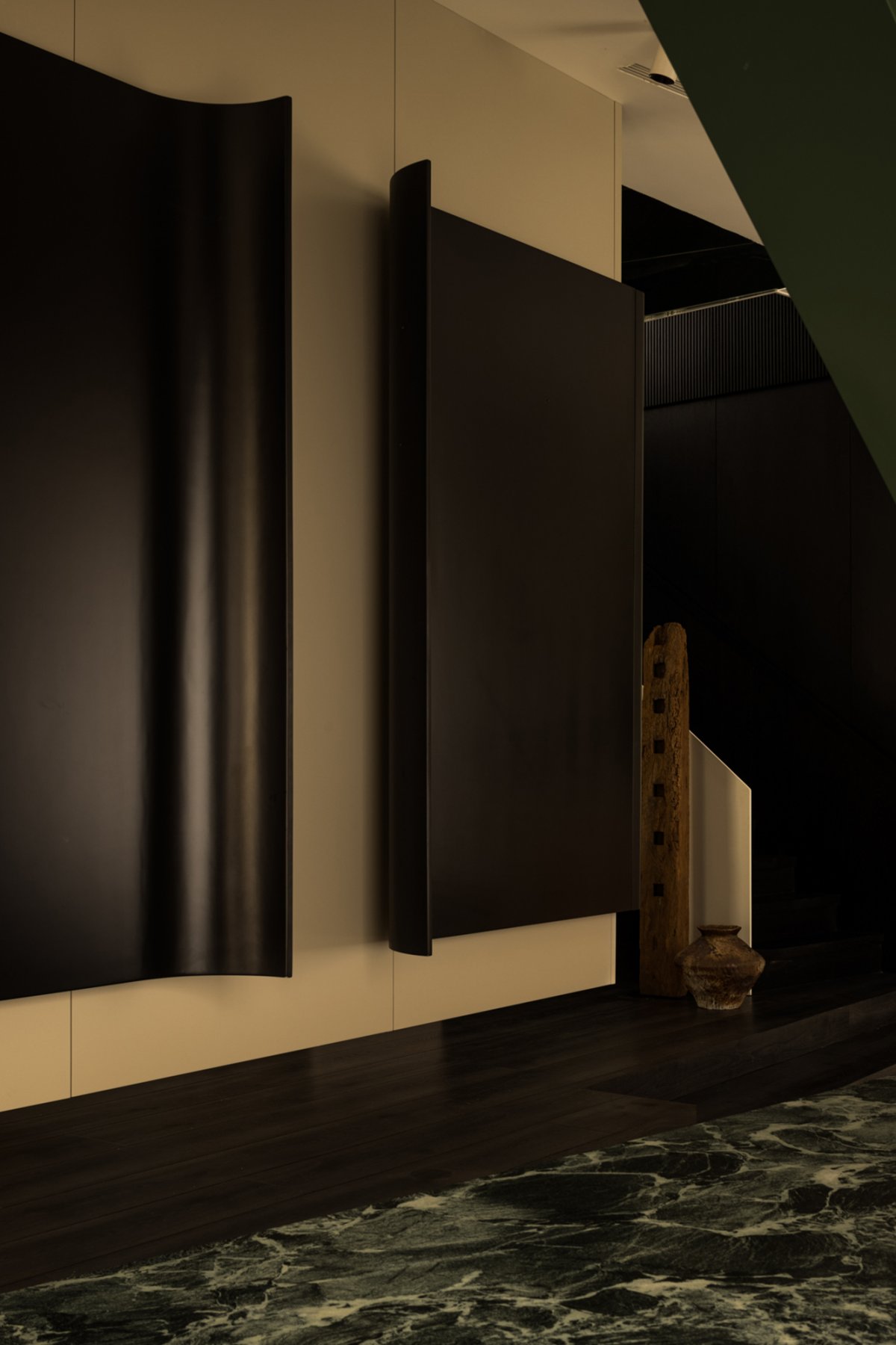
Different from the common material exhibition halls which accommodate products at the very beginning, it makes the experience spatial mode to minimize the implicit narration and then change the emotions gradually from outside to inside, from noises to peace and softness. The random tree shadows in front of the floor-to-ceiling windows get the reflection at the moist texture materials. The shadows swing and reflect, showing charm and affection. The stationery and movement of the space, the brightness and the darkness together reflect and express themselves with each other. At the right side of the space on the first floor, there’s a more comfortable waiting experience zone where the mixed experience is expressed of wood production and intelligence systems. Through controlling the mobile cabinet doors, the functions of TV and gathering are shown gradually. When they are closed, these functions can be hidden perfectly. The background boards of the aisle space is produced naturally which is deeply related with the refined technical details. The top floor has the refraction relation because of the mirror effects which opens the vertical structure. Therefore, the state of climbing up consistently is generated to provide the plane space with interesting tension.
02.Break and then stand up. The question is raised.
The lying green columns contains social characters.
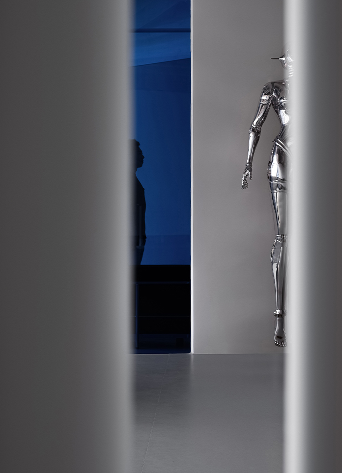
The twisting and climbing of emotions are always the representation of spatial rhythm. The abrupt green columns break the silence at the fleeting glimpse and divide the middle island into two parts with great power to create the occlusal extension of communication and material choosing space. Creating a topic is one way of making narration more interesting. The lying green columns have social characters. They are abrupt, interesting and eye-catching enough to make people raise questions voluntarily of the meaning of these columns. Then the story can come to the next chapter to be told. Making no comments on the space structures, details constantly imply the refined techniques of the wood productions. Although the softness and the hardness are two different types of modes, they can come to the combination in the exhibition of the arc-shaped wood productions.
03.Emotions taking the lead, both the stationery and movement suit well.
Having fun is of the most significance.
Walking all the way through the middle path to the inner side to the kitchen area, the emotions change from stationery to movement and then switch to stationery again like a story going to the climax from the beginning plane narration and then returning back to peace. Designers follow the interesting expressive logics to mix products into every detail of the space which doesn’t catch your eyes by exaggerated appearance. However, consumers’ autonomous finding is what really matters. The question of whether consumers can find actually isn’t included to the consideration range. The important thing is to create a space where people can enjoy themselves and relax well.
04.The upper and the lower sides are divided by different functions.
The layout ways of the exhibition hall are taking into consideration.
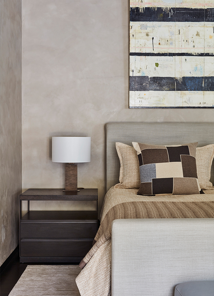
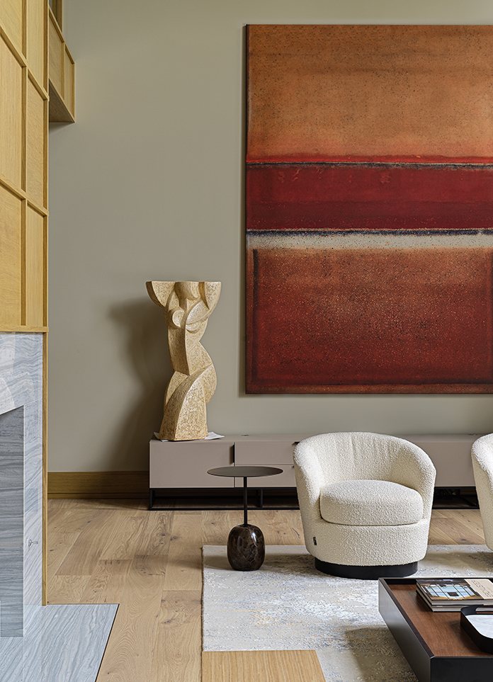
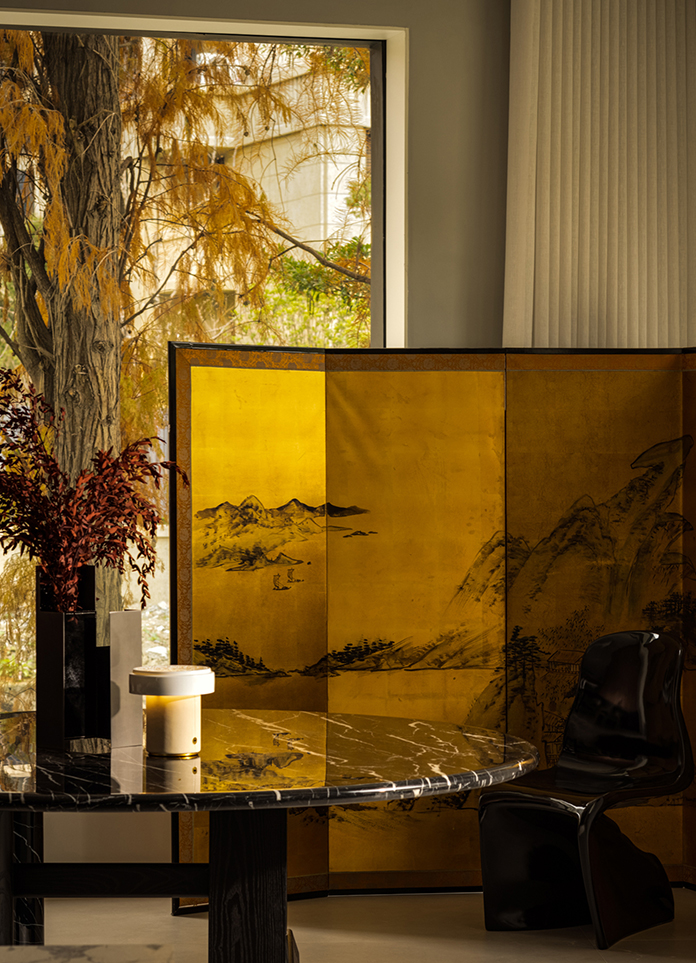
The double space of the ancient and the modern gives the wood productions the charms of crossing times. The yellowing leaves outside and the old golden leaf painting from Japan inside can respectively stand for brand new life and sleeping souls. When the slanting lights comes inside, every corner of the space is filled with golden color. When we view the first floor as the agency type scene where experience takes priority, then the second floor takes the real role of the exhibition hall to show materials and to make communications happen and plans discussed. Functions are included within a peaceful space and the layout ways of products are more solid. The story comes to its ending part here. Returning to the courtyard before entering the space, you are surrounded within the forest with fallen leaves around. Such experience matches perfectly with the products and names of the brand. Wood is taken from the forest. No other ending can be better than this one.
- Interiors: Kinsun Design / Cai Zhongyi, Zhang Bingbing
- Photos: Wu Changle
- Words: ChengShe Media


