Exemplifying harmony between form and function, Brimar House is a generous and tranquil multi-generational home. With poise and restraint, Michael Ong Design Office draws on dualities of light and dark, delicate and heavy, open and enclosed, built and natural to create a responsive and intuitive place for one or for many. Visually, functionally and conceptually, Brimar House evokes the idea of yin and yang, whereby opposing forces are interconnected. Rather than conflicting, they counterbalance one another to form a dynamic whole.
With clients who have lived in multiple countries overseas, Michael Ong Design Office was briefed with creating a home to settle down in, supporting the family’s current life in Melbourne. The house needed to accommodate the clients, their two young-adult children, as well as the various family and friends who would often visit from overseas. The outcome is a residence of over 600 square metres that effortlessly manipulates volumes, lines and levels to realise serene and intimate spaces. With a restrained colour scheme and an emphasis on materiality, the building is at once striking and composed.
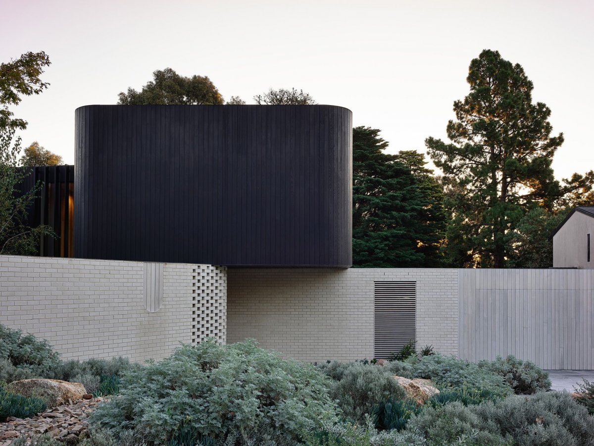
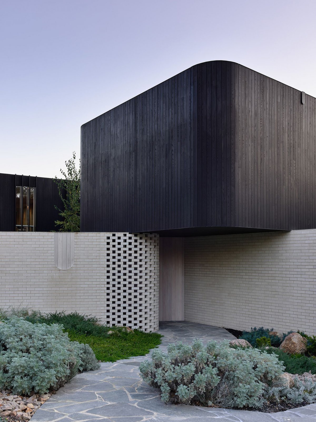
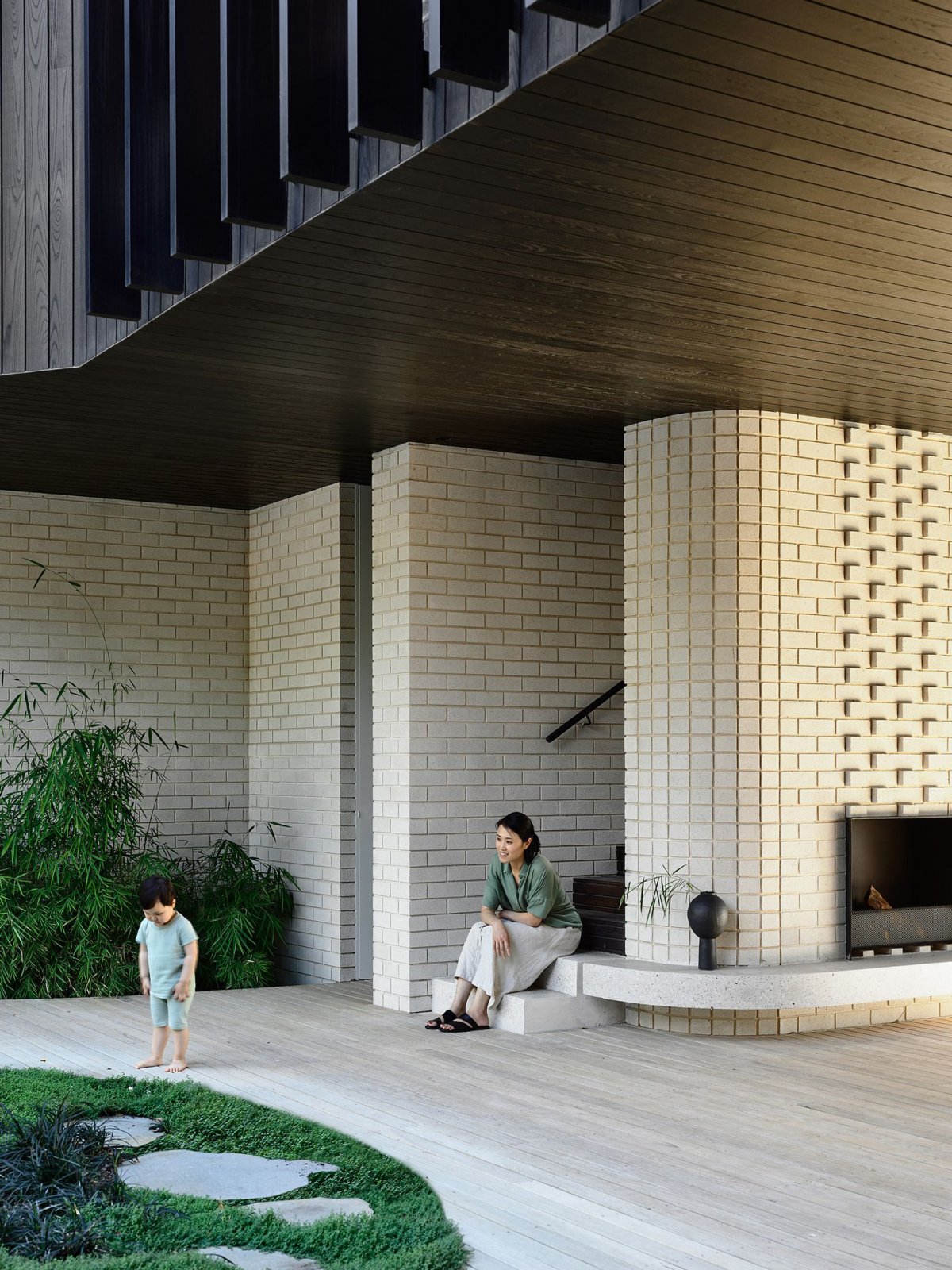
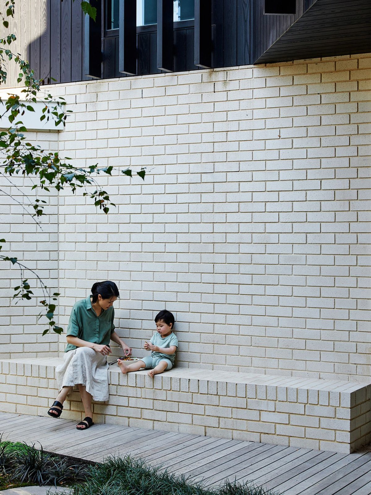
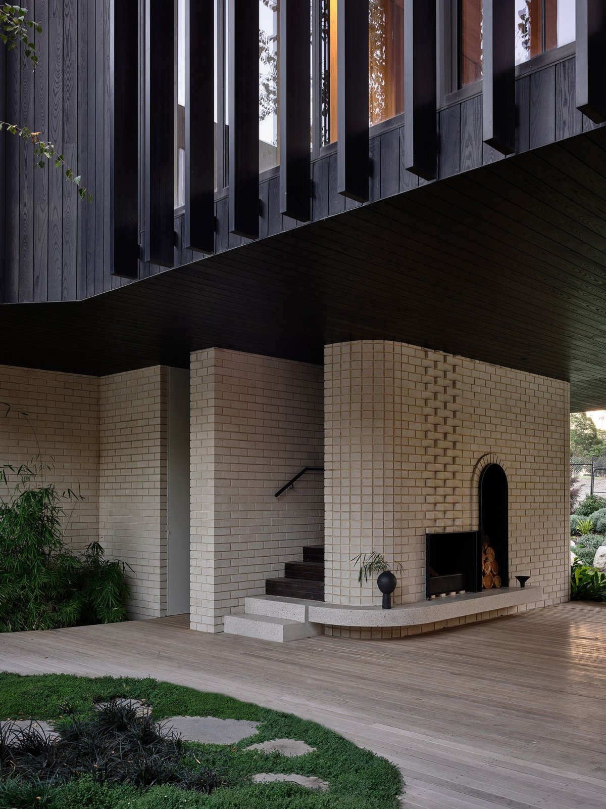
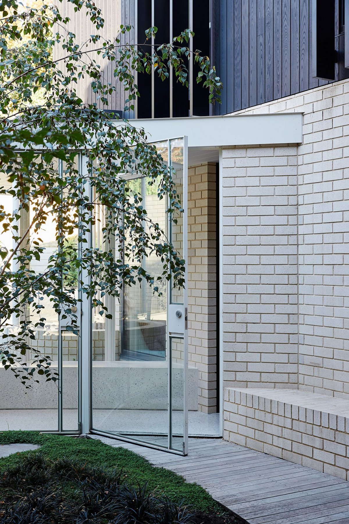
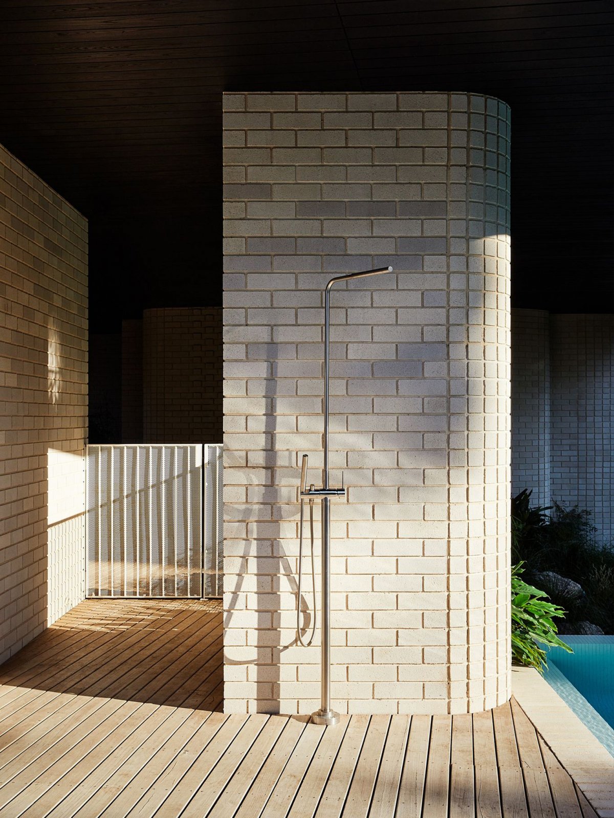
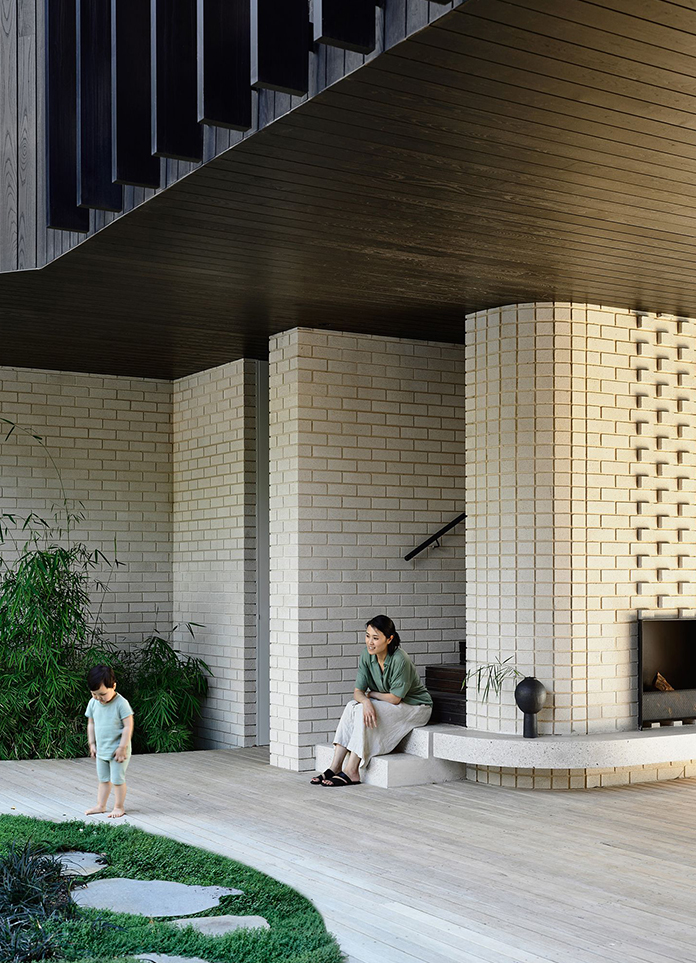
"They wanted something dynamic and different," explains Michael Ong, director of Design Office at Michael Ong. "Formally, it looks pretty powerful, but it's not trying to offend you." From all angles, the exterior of the house is separate. Built by Visioneer Builders, the lower half is made of ivory-coloured bricks, while the second storey is covered in black Gambian grey. Something rather heavy and solid is key, ivory concrete brick walls sort of like house supports. With brick massiness offset, the detail like delicate bud silk and metope downy curve. It is not easy to achieve such an easy contact with this material. Each layer of brick has steel plates that hold the lace pieces together.
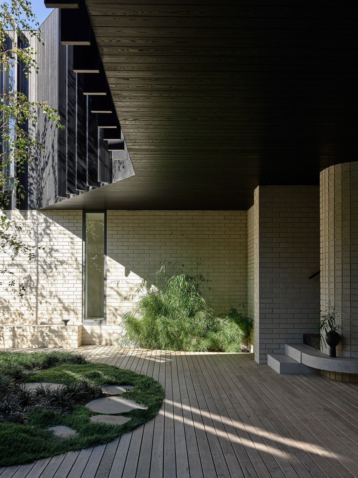
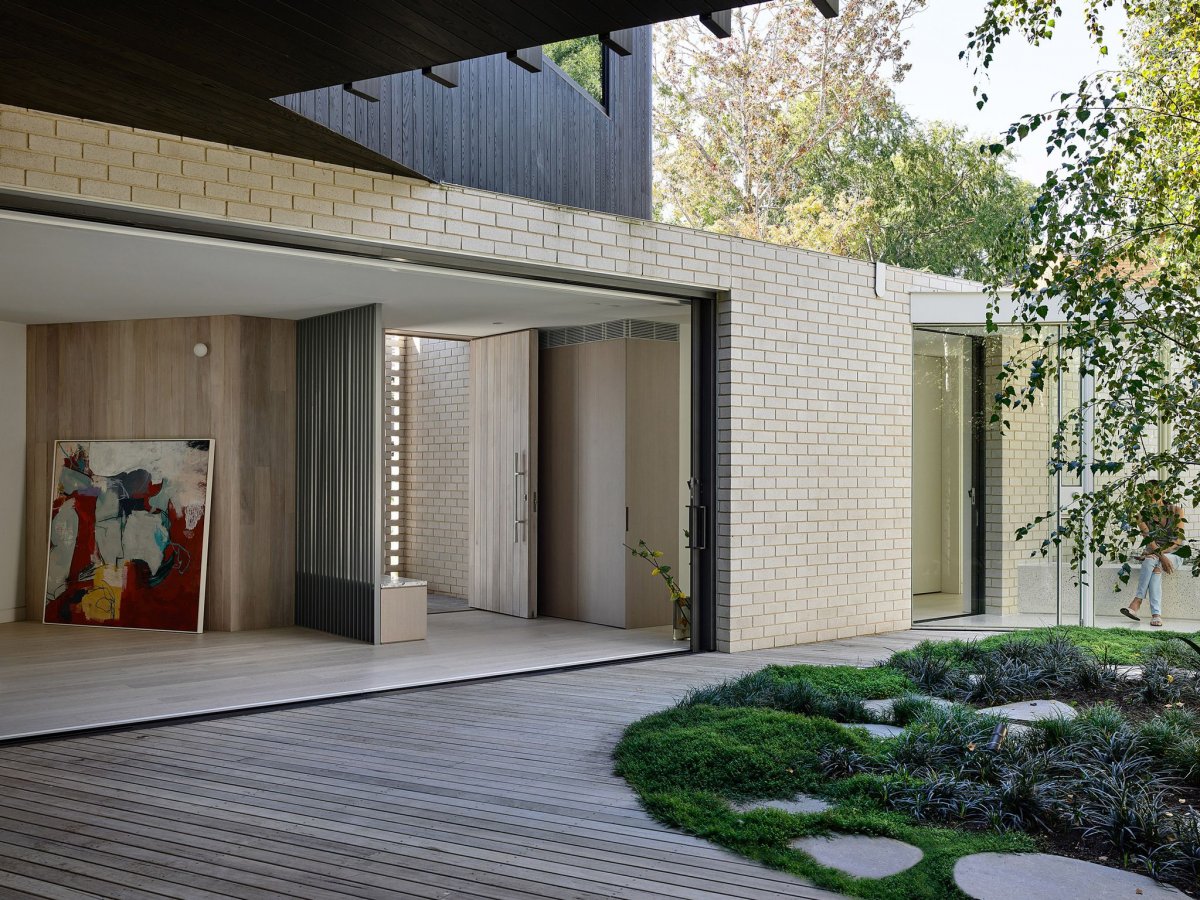
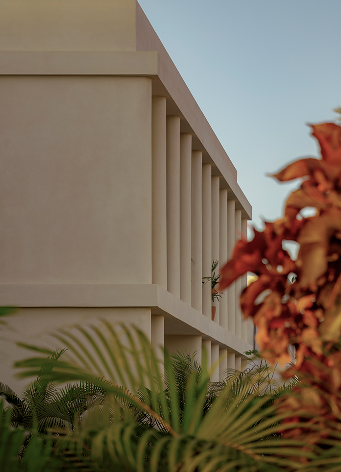
The dynamic simplicity of form and colour, the texture of the wood, the brickwork and the sheer volume provide depth and diversity to the building. Michael describes the wood surface, the texture of which is still visible. Pick up the color of the trees and the blue of the sky, and it does change when the light hits it. So you get a very nice variation in the tone and texture of the building, but it's very subtle. Michael believes that while the brick itself is more coherent, it has more shadow. The brick defines the lower level and the wood defines the upper level, creating the impression of discrete volumes. However, the two floors of the house necessarily intersect and overlap at different points. As a result, these ground forms have a sense of flow that seems to expand, contract and unfold around the central courtyard garden.
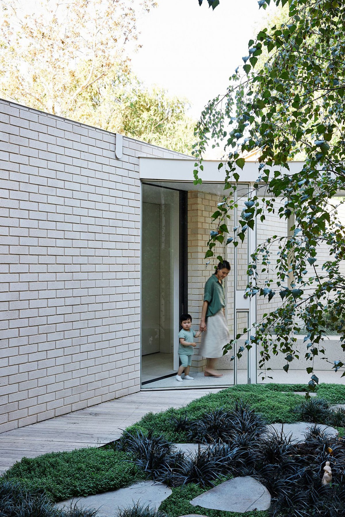
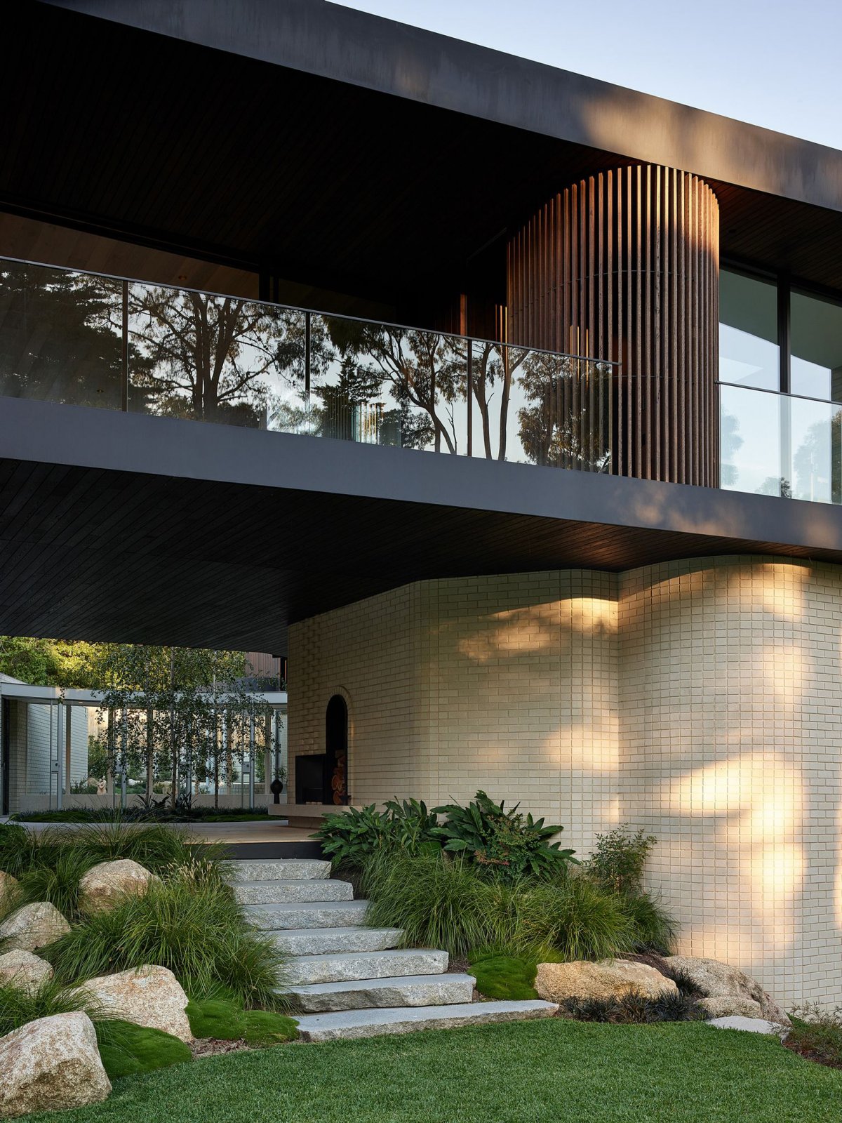
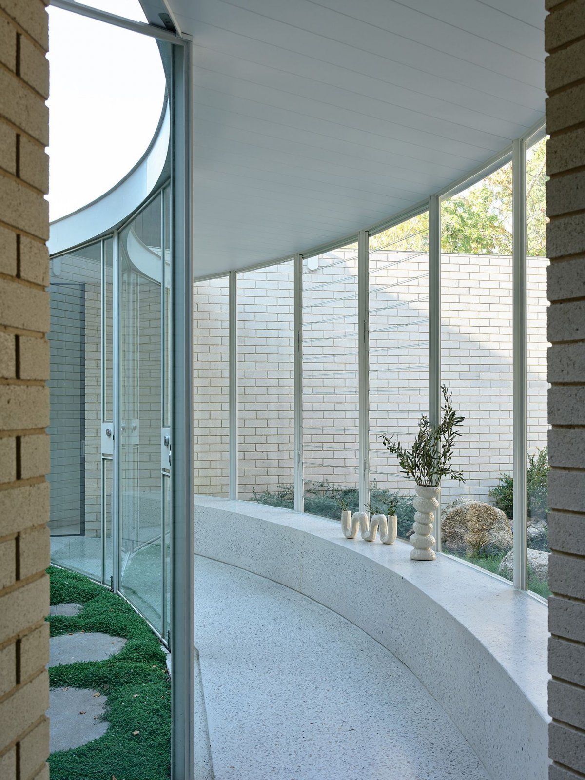
It was a large house, and the courtyard was its centre and anchor. Michael wanted the whole house to feel connected, through the exterior, through the courtyard, always knowing where he was. The building opens onto views of Riversdale Golf Club and the courtyard allows more light into the home. It is a space for contemplation, as well as a place for outdoor gatherings and entertainment. Three birch trees in the green landscape of the Bush project. Benches and an outdoor fireplace are built into the exterior, like a shelter over the outdoor dining space, formed from the base of the black building. Michael likes to let the building work in a way that actually provides a cover for the outdoor space, rather than having the outdoor space and then putting up some kind of awning.
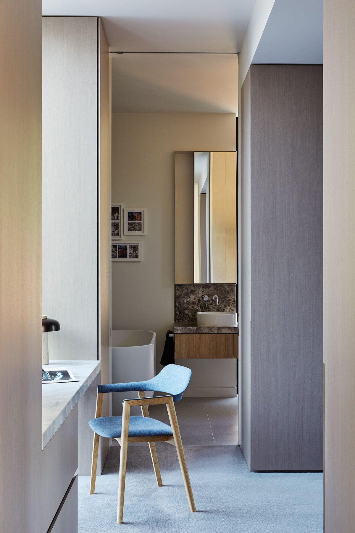
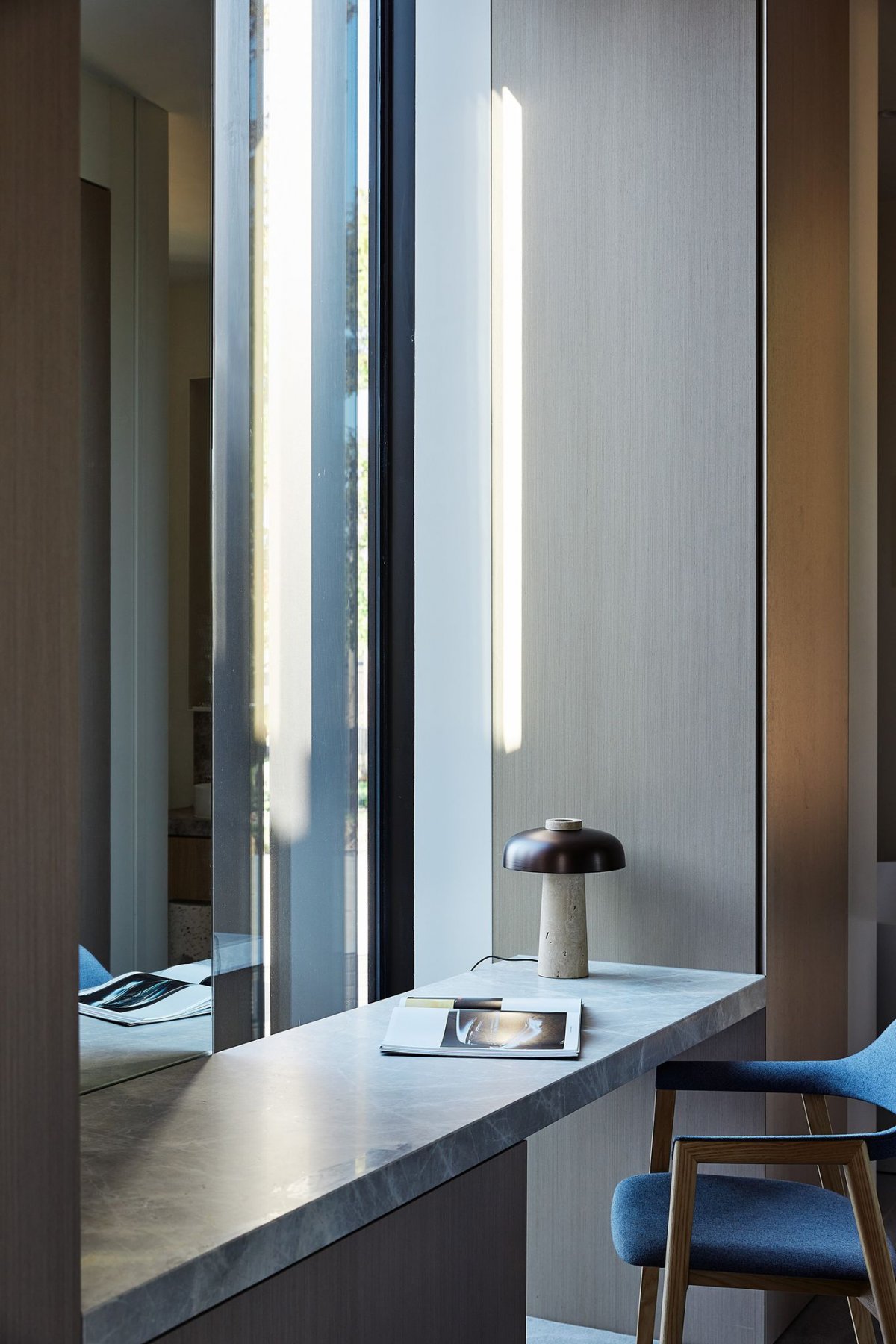
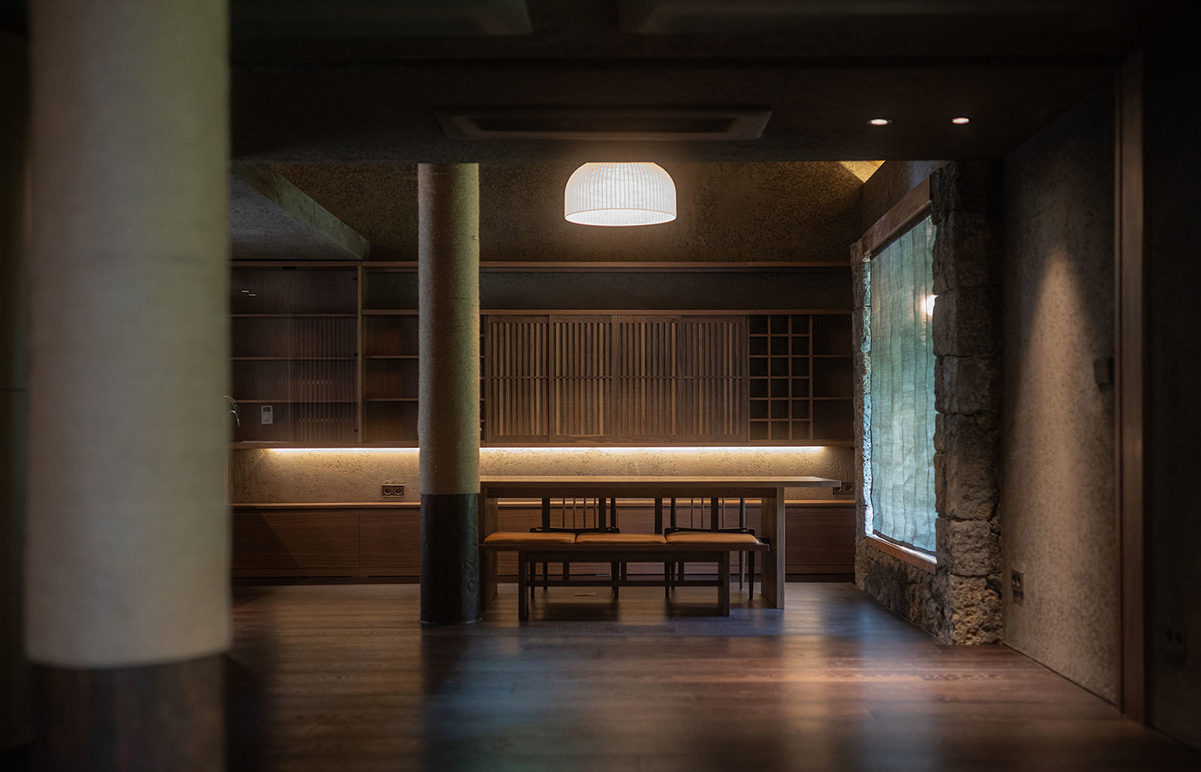
The upstairs home is fully equipped with a bedroom, kitchen, living and dining areas, as well as a swimming pool, sauna and gym. Here, the dark Cambia grey cladding is reflected in the solid dark kitchen, which is clad in black wood finishes. The black upper floors frame the green views towards the golf course and a glimpse into the central courtyard. It also creates a sense of intimacy in a larger space. The design studio wanted to make sure the space remained comfortable when they lived together as a family of two or four. Reduce the proportion of dark interior tones so you don't feel swallowed up by the space, even if it's big enough. Dark wood walls, wood cabinets, wood ceilings, wood floors, and dark details on fireplaces and bookshelves give an intimate feel.
- Architect: Michael Ong Design
- Photos: Derek Swalwell
- Words: Sarah Sivaraman
- Copy: The Local Project
