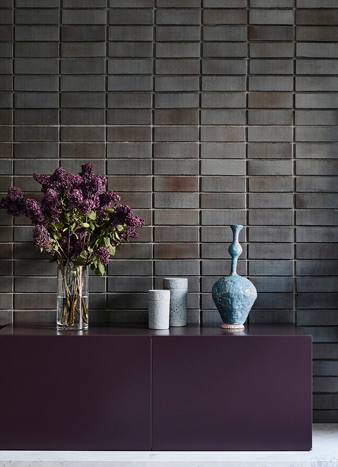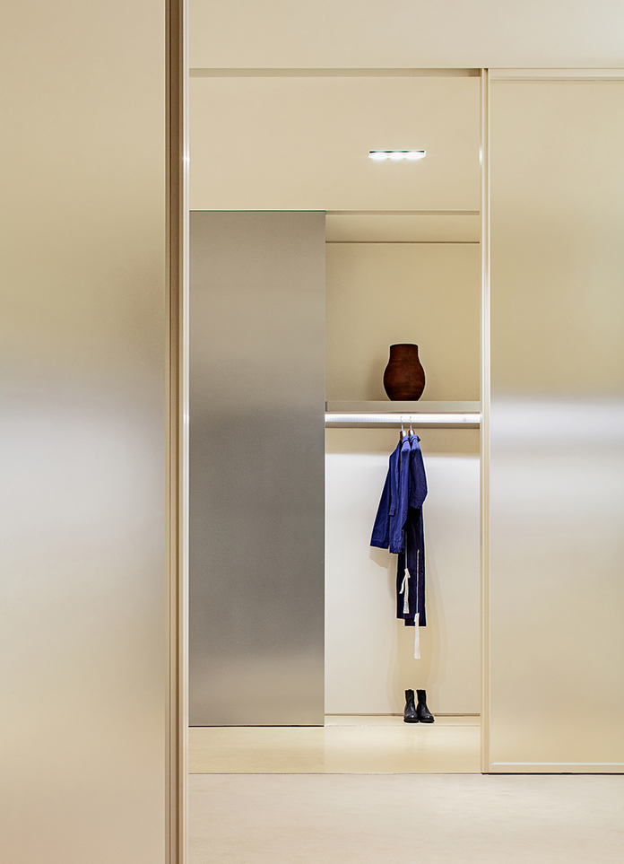
Is the product, is the artwork, is also a space art museum. Italian design brand Mutina has its first independent store in China, which was created by Modeno in Jiaxing, Zhejiang province. Integrate natural elements into contemporary design to arouse people's sympathy with nature. Break the boundary, in the continuous overthrow and reconstruction, with a different way to express ceramic, ceramic materials and promote the integration of art space.
“Observing nature is very important to my creation.”. The presentation of Mono design, instead of the traditional ceramic sales show, but extremely inclusive, through the art curatorial form display works, using the natural characteristics of the space, skillfully combine products, make it a part of the space. Let the visitor walk in, feel comfortable and relaxed space atmosphere, understand the design concept of the brand.
Rebranding: the field of perception
Based on the concept of nature and light and shadow, the Moye design changes the original plain and inferior space form, excavates the original space characteristics, and expresses it with rational and restrained design. Reshape the facade to present the texture of the brand.
By rearranging the circuitous route of the site, it enriches the interest of the tour by height difference, and transits the noise of the outside world to reach the Inner Ninh Hoa. With the language of minimalism and restraint, through a side of still water and viewing platform to form a look at each other, an instant to build a space of tranquility and ease.
The texture of handmade ceramics shows the beauty of primitive and nature. Whether it is the craftsmen's spirit of tenacious creation, or the simple and quiet inspiration field, all become the brand concept that we want to convey.
Design adheres to the natural texture of the unified material decorative external see, through the delicate perception of texture, convey the resonance of beauty and art.
Use the off-axis door to extend the indoor and outdoor, open the space experience of returning to simplicity. Celosia, appearing here, acts as a guide, bringing light and shadow into the room with the visitors.
Natural Aesthetics: a museum of Light and shadow
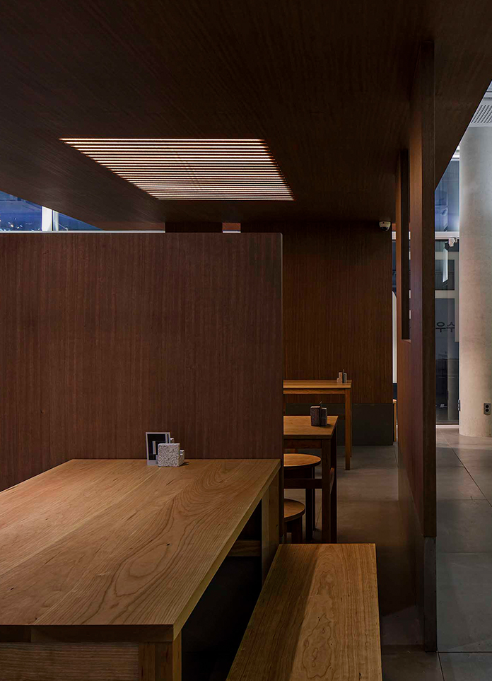
Let the natural light and shadow flow in the room, creating the aesthetics of time. Let people relax to walk in it, Feel the shadow and light, order and freedom.
Light and shadow caressed every part of the field over time. Make here more vivid vitality and eternal beauty.
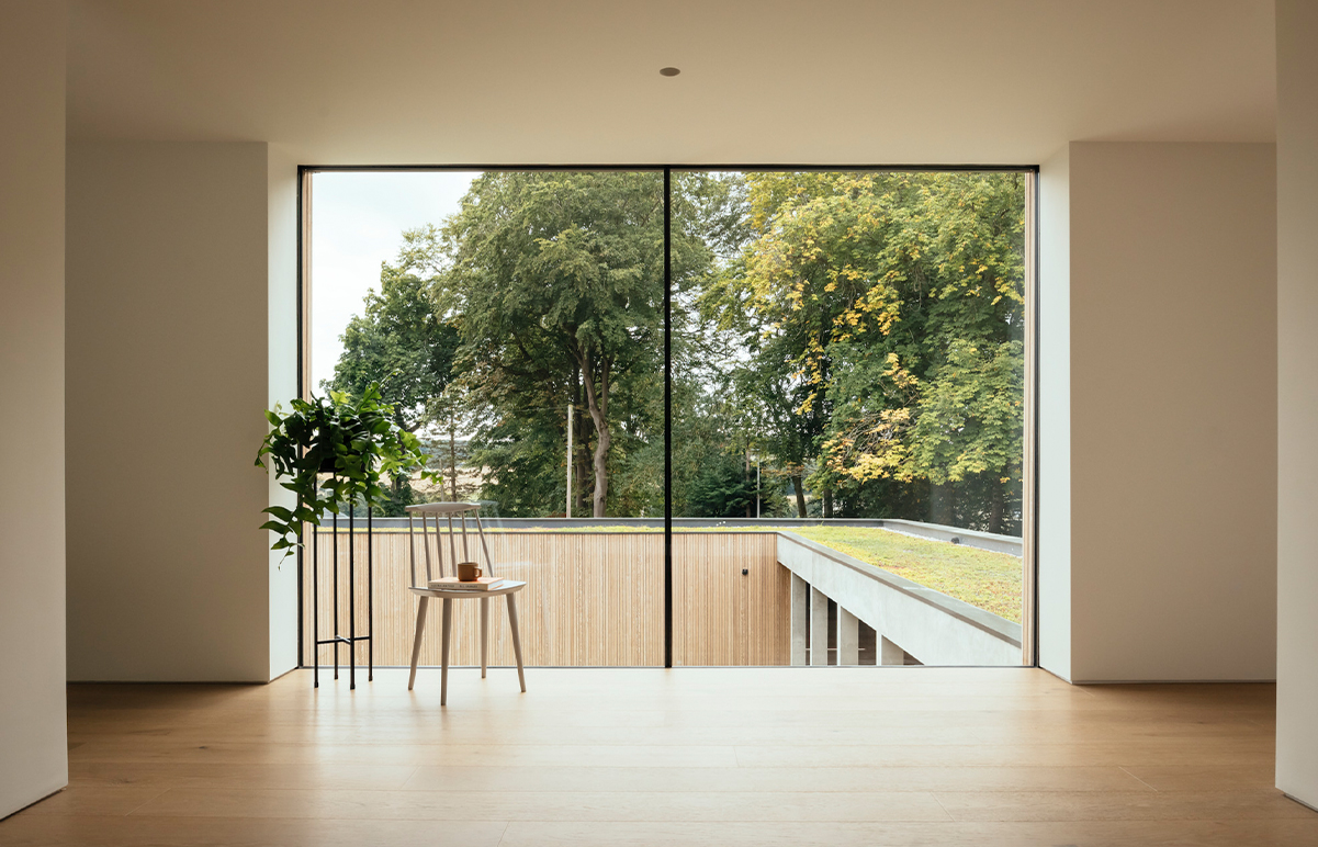
The meeting place of Shadow and light, by extending the building façade, is integrated into the 9m long integrated glass giant screen, allowing the nature and light and shadow of the outside to permeate the interior.
Based on the concept of Mutina natural fusion, this space is also designed with a focus on the relationship between man and nature. The long window gives a panoramic view of the plants and the four seasons, while extending the space's sense of permeability and breathing.
“FORM follows THOUGHT”, the mode of thinking determines the FORM of expression. Or linear, modular, geometric sense, three-dimensional and other rational ways to provide designers with infinite perceptual creative space.
Design in the warm and peaceful space on the background, low-key and restrained into the product display, so that its natural state presented to the customer, with the cooperation of Light, space presents a changing attitude, but also let the traces of time have passed, in the texture of concrete texture so that gentle and rough to find a better combination, creating a calm, relaxing sense of relaxation.
In the use of poetic materials, the product itself is a piece of indoor decorative art, for the construction of space interest, color, vitality.
Restore the true sense: rational construction of the field
Make the second skin of the space.”-the artist designs and thinks about the size, texture and material composition of the tiles, making them approachable and applicable to the space.
Design eliminates the sense of spatial boundaries, which triggers new behaviors in the client. To artistic curatorial form, showing a unique exhibition hall atmosphere. Hanging on the wall with a light hanging line products, as the general display of art paintings, people free to walk, Gaze, watch, read.
The indoor does not have the superfluous wall block, accommodates the abundant walking space. The naked and unadorned columns of the building restore the most authentic and natural colors of the materials, showing the natural temperature and texture, but also let the time left traces. Ceramic works are laid out in the space without revealing traces, “Blending” into the space. Design is not an adjunct to space, but an enabler that serves it.
Repeat the rhythm, the extreme to the seam lines, the construction of moving visual order, while conveying the brand meticulous craftsmanship. Designers want to show products more hidden scene, focus on the provision of functional services, like a work of art, but can penetrate the subtle perception of the guests.
The bar material in the space selected Fringe series products, two width-spaced parallel lines, engraved on the bar surface, forming a brick-like structure. The different parallel lines are sketched by contrasting epoxy caulking agent. Through the simple change of line color and size, they freely form many kinds of jointless patterns, which bring visitors a strong sense of order.
Just like the original intention of Mutina brand: to break the traditional understanding and use of ceramics, explore and tap the potential of ceramics. In the design of the exhibition hall, Mono design also breaks away from the normal frame of the product sales hall, and instead refines the brand tone, focusing on the natural rhythm and excellent texture of the space, lead the viewer to immerse in a deep experience about space art, deeply feel the perfect integration of ceramic art and modern space aesthetics.
- Interiors: Moye Design | Zhu Jiemei, Miao Yongle
- Photos: NEVER | Long Zhao


