NOTHING DESIGN Shanghai Office
Creating a quiet, pure artistic fulcrum in the midst of Shanghai's rushing bustle. --Liu Chang
The transparent structure and abundant light are the biggest charms of this space. Therefore, when Liu Chang first came here, he decided to transform it into the second office of Nothing Design, creating a quiet, pure artistic fulcrum in the midst of Shanghai's rushing bustle. Unlike the first studio in Beijing Xidian Memory, this space is located in a renovated old building on Dingxi Road in Changning District, with two rows of large L-shaped windows that bring in plenty of sunlight and provide an excellent view. With the addition of light and scenery, the interior decoration can be more simple, like a textured canvas that can be sculpted by light and display.
Filter out excess color, Everything is only related to the material
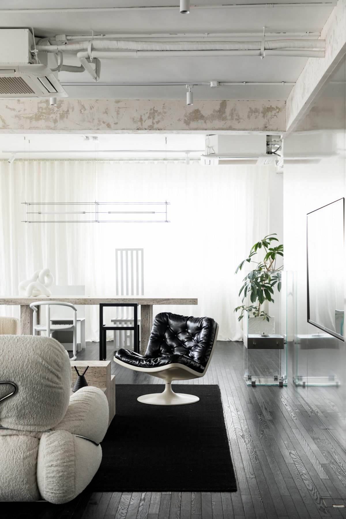
Space of 250㎡, a small half is reserved for the work area that accommodates 8 people, and all the remaining, all retain the original open layout. The base of the space is simple and pure. The long and thin black wooden flooring is used throughout, which has the charm of old Shanghai houses.
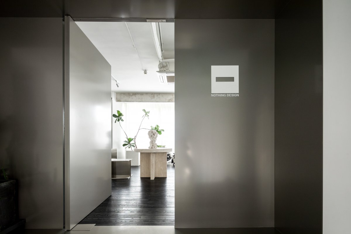
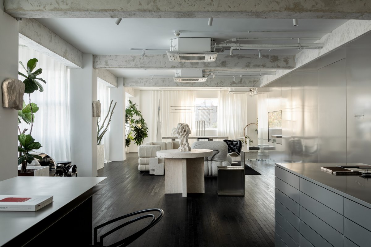
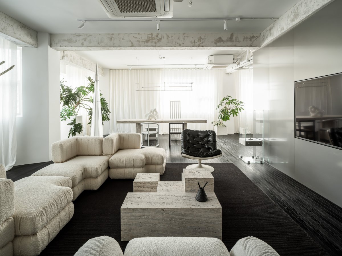
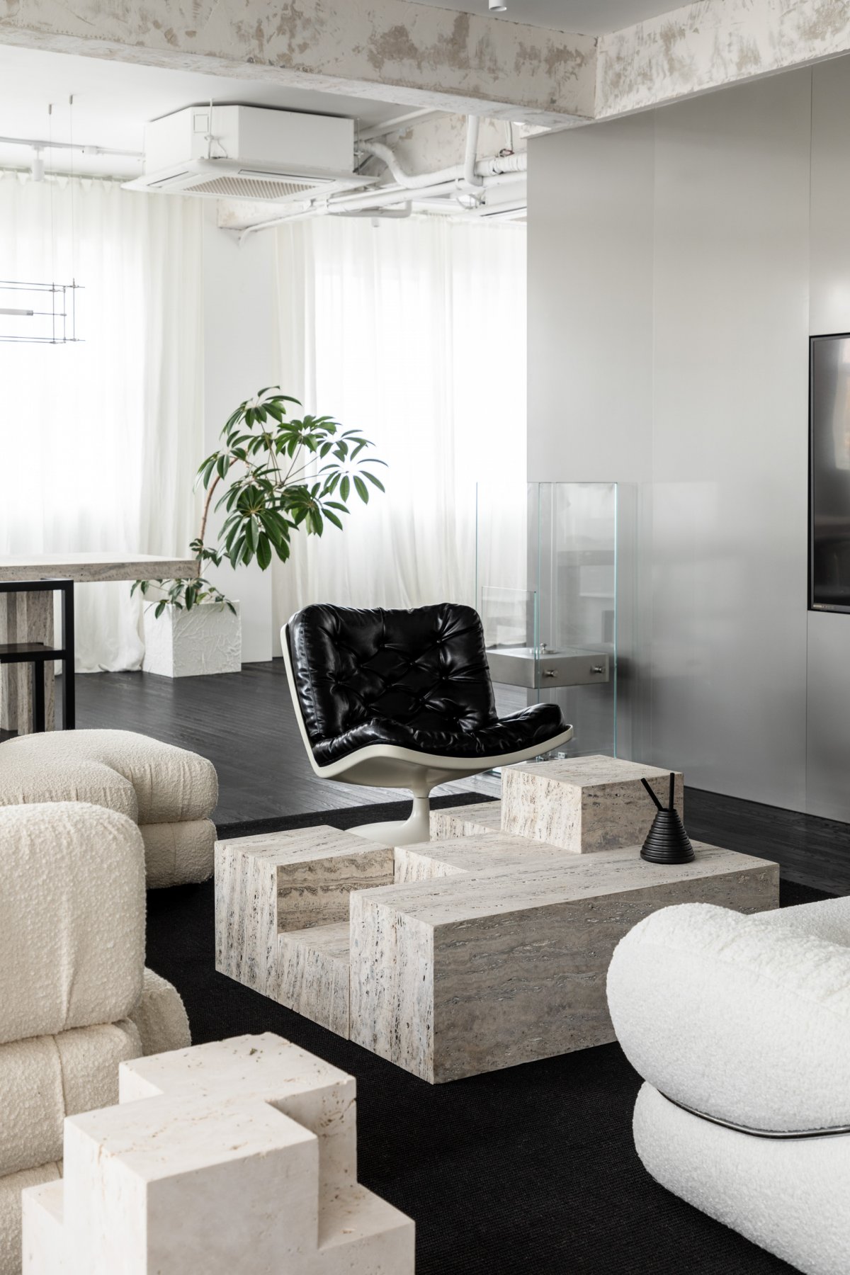
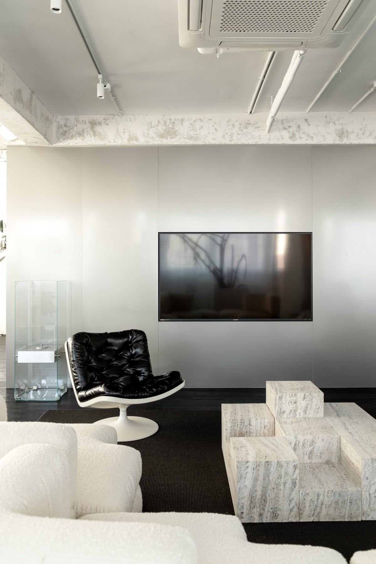
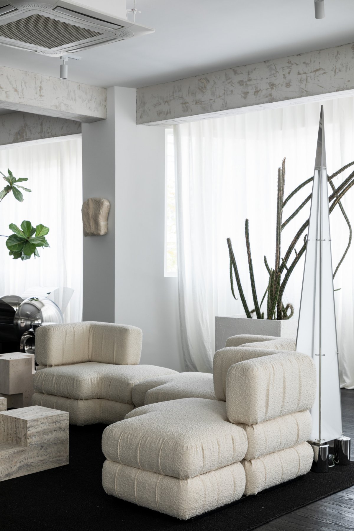
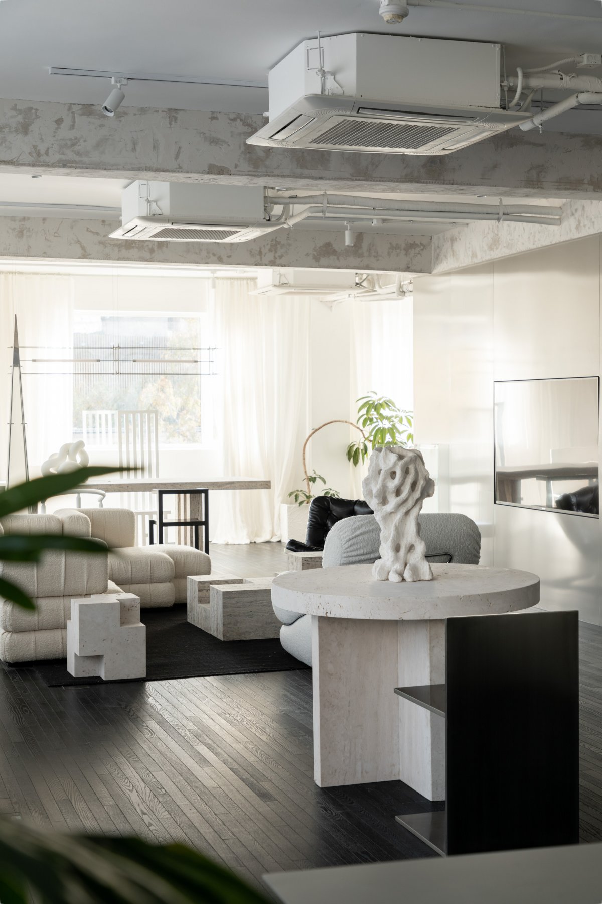
The sofa area is set off with a customized black carpet, which is visually almost integrated with the floor, not breaking the overall sense of the floor, but only adding comfort in the sense of touch, while enriching the layers of materials. The windowless walls are covered with stainless steel finishes throughout, including the central door into the studio, which seems to be invisible when the door is closed because the material is identical, making the space an isolated, "no exit" existence. The walls and columns on the side of the windows are left white. The white floor-to-ceiling curtains are in a sense an extension of the wall, but they are light and soft, releasing a lazy air that instantly loosens up this hard space full of straight lines.
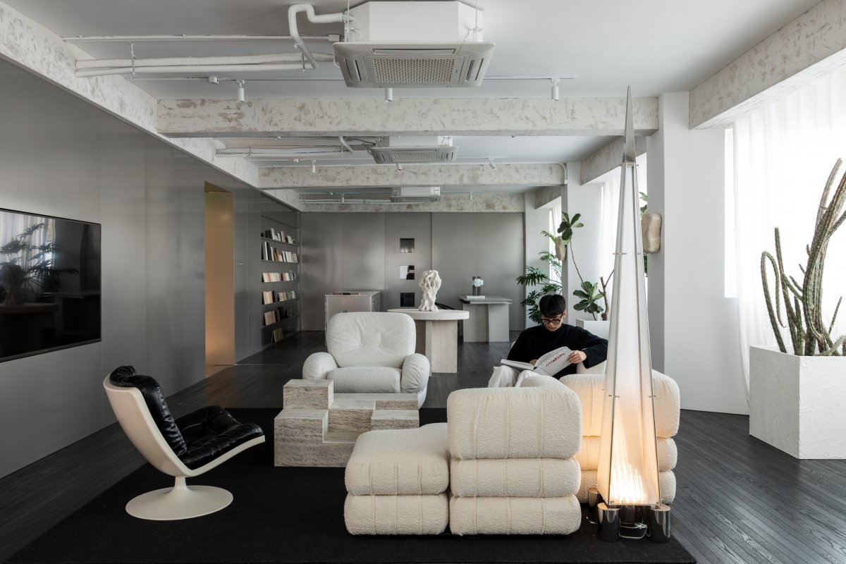
The wall opposite the sofa area is seamlessly embedded with a large screen, which is very convenient for internal meetings or discussing proposals with clients. The bleak state of the screen, which is normally turned off, is also unobtrusive in this minimalist space composed of black and white and gray. The unadorned white ceiling echoes the columns and curtains. The beams are "subtracted", the original surface coverings were removed to reveal the stain and roughness of the cement, forming a strong contrast with the delicate texture of the stainless steel walls.The black floor, gray walls and white ceiling form a colorless luminance ladder here, from dark to light, from heavy to light, with a natural but clear hierarchy. Filtering out all the mixed colors and keeping only the purity of black, white and gray, the space seems to be outside of time, quiet and constant, untouched by the years.
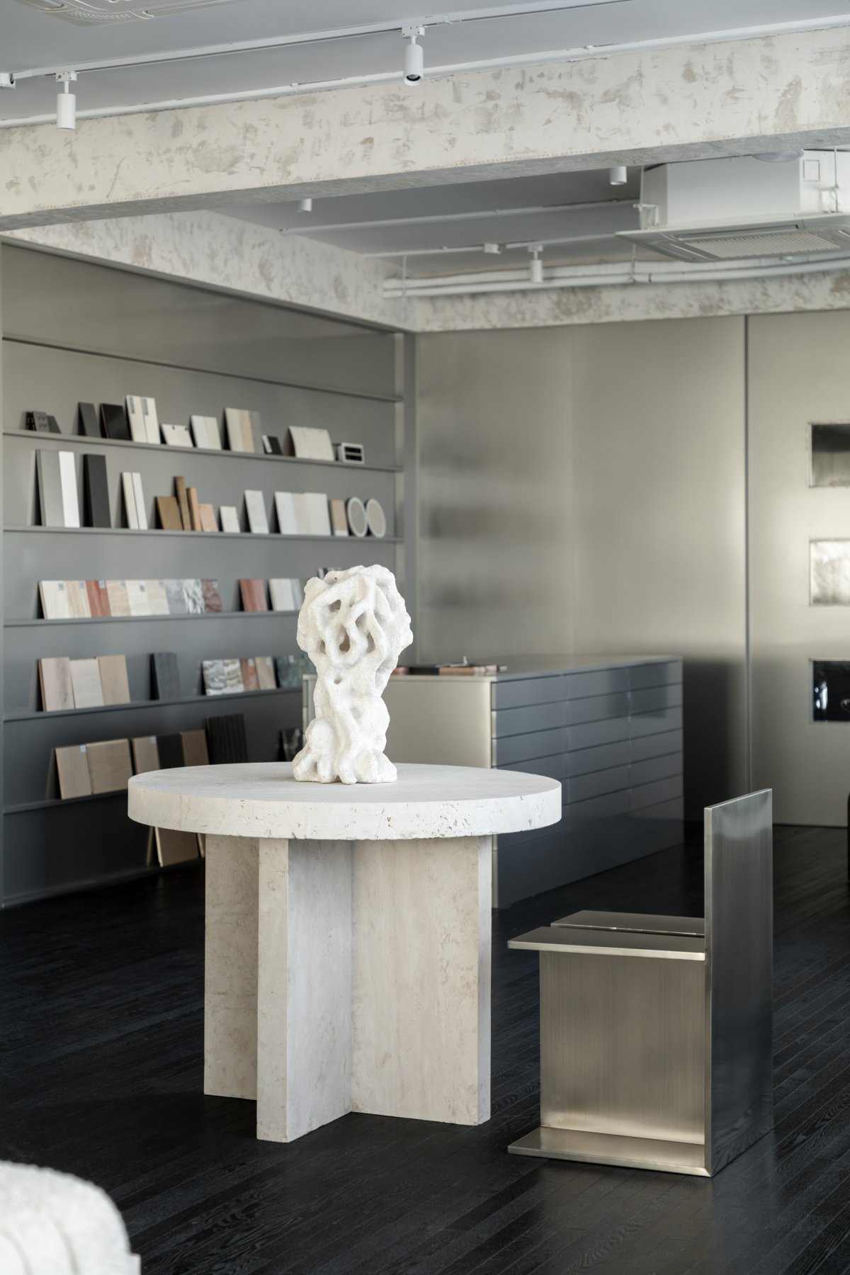
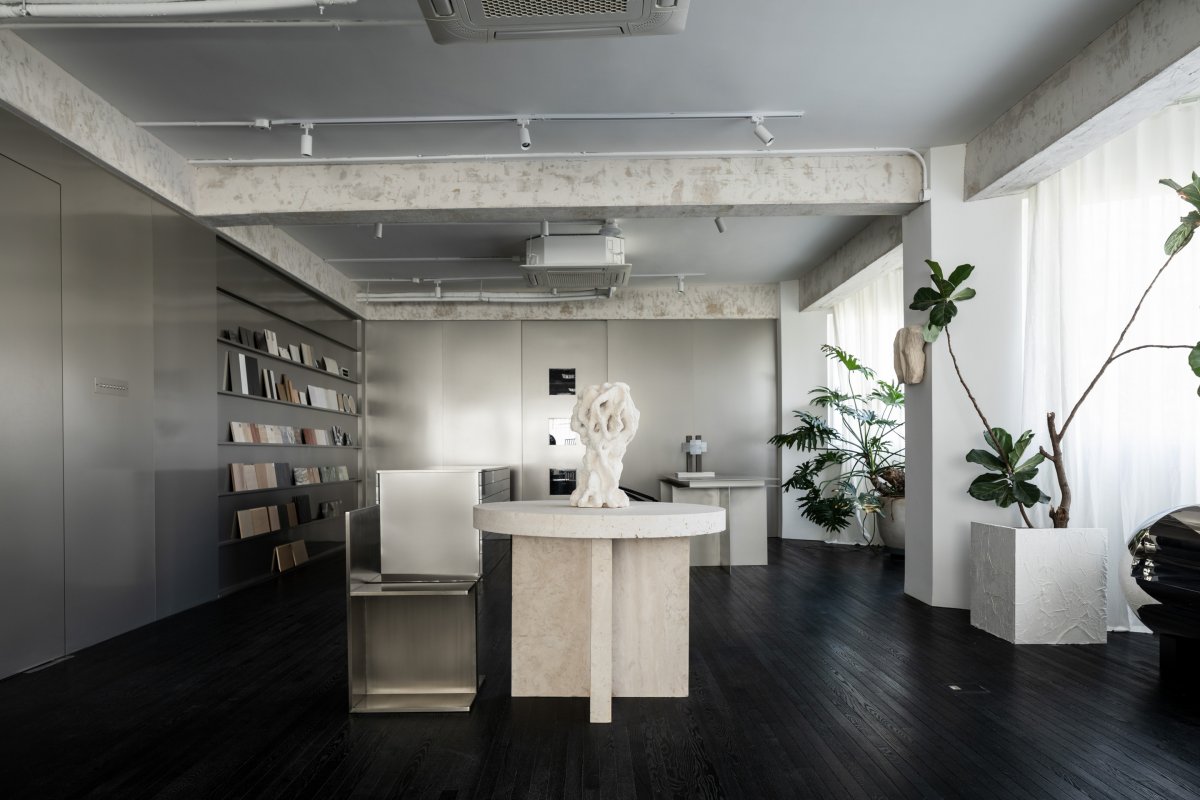
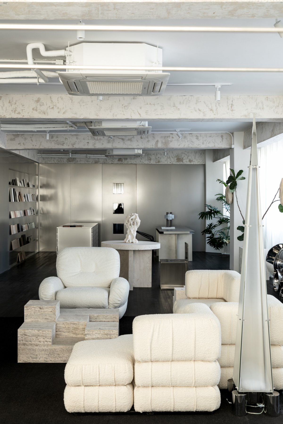
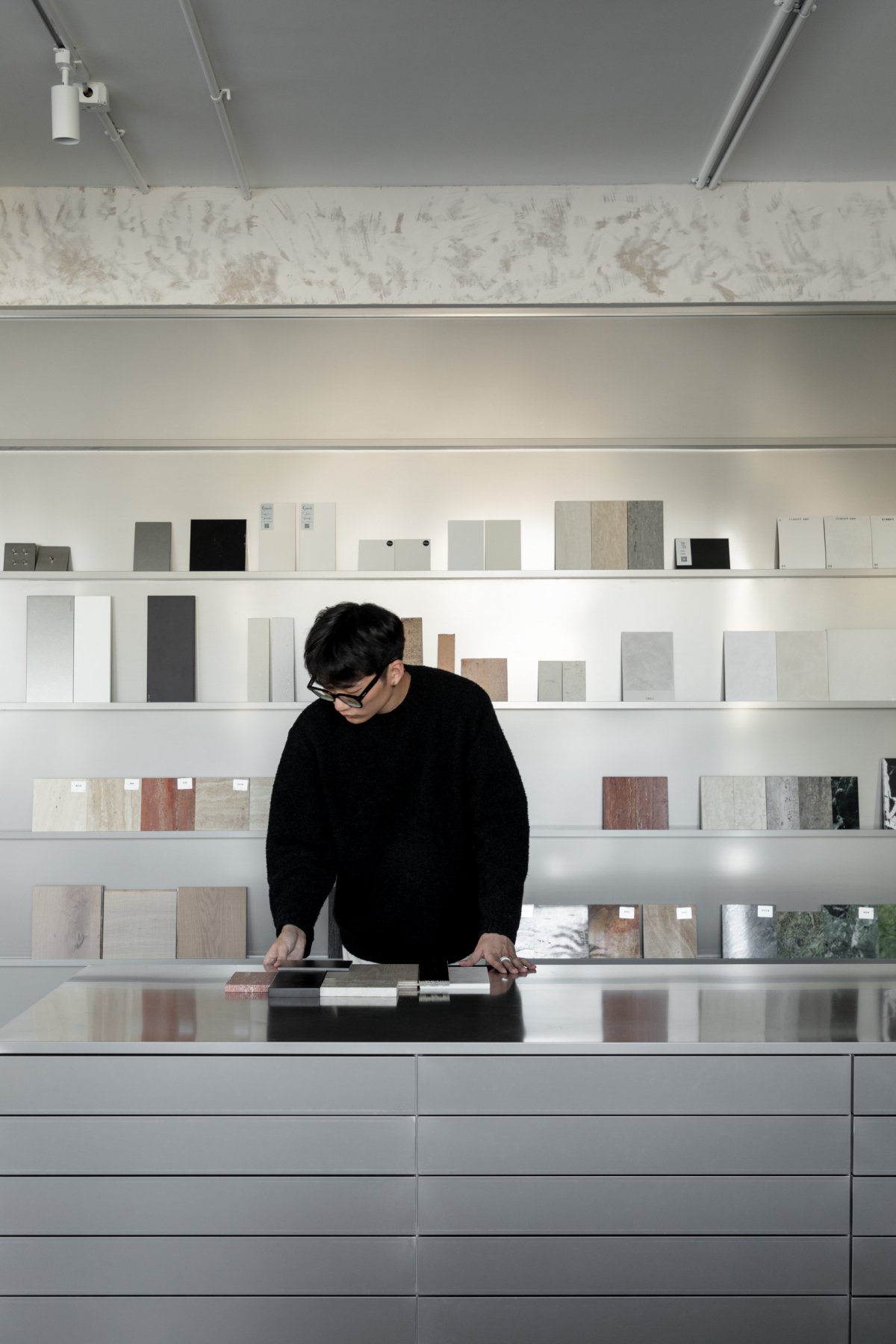
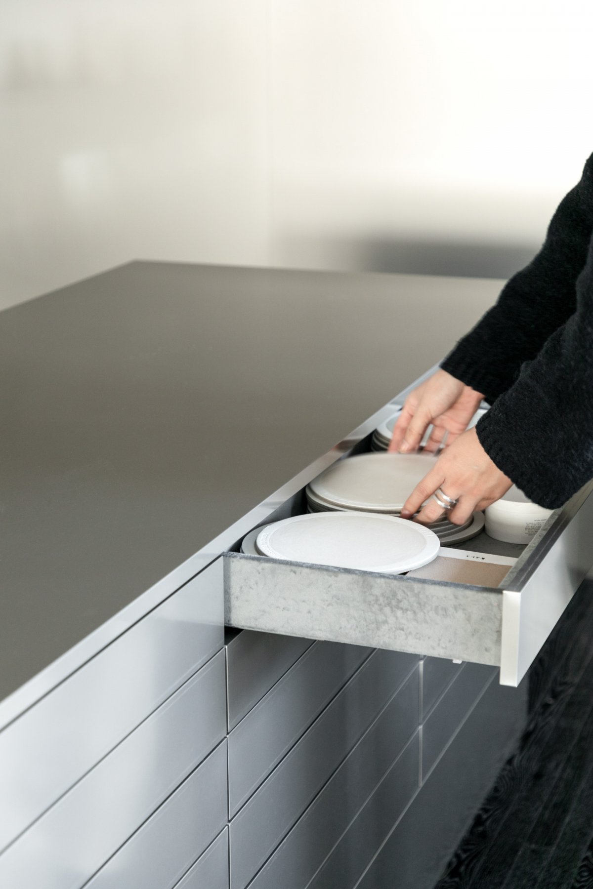
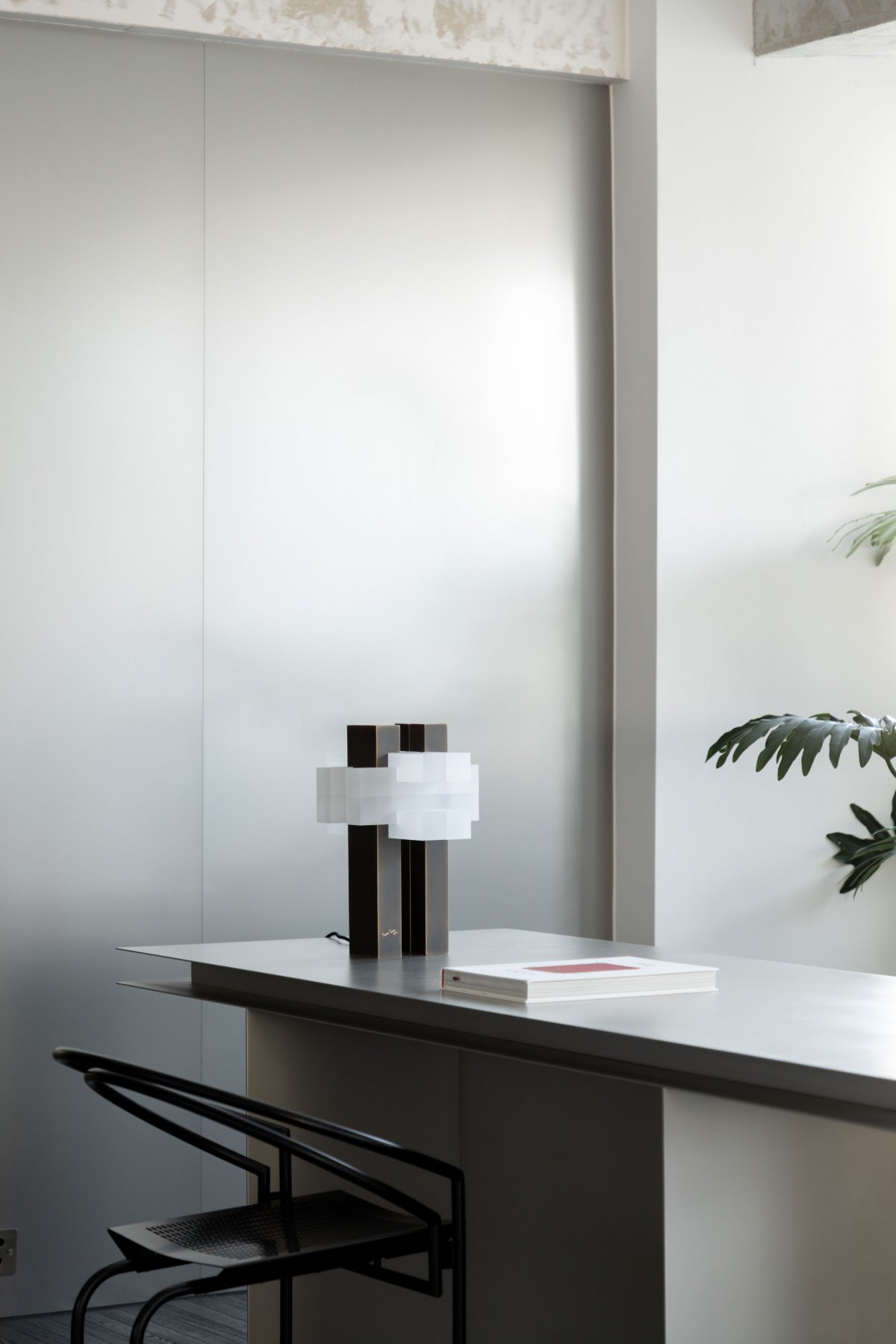
The stainless steel wall also extends two important areas - the material area and the reading area. The stainless steel bookshelves in the reading area display books and materials that designers often need to look through when working. In addition to the display wall, there is also a square table covered with drawers on both sides, also made of stainless steel, its square shape and minimalist design without handles brings out the beauty of this metal to the extreme.
The material area is one of Liu Chang's favorite spaces, where he always finds much inspiration. The clean stainless steel substrate is able to release the qualities of each material to the maximum. "Stainless steel is a material I really like," Liu Chang explains, "It's modern, cool and has a very nice texture."
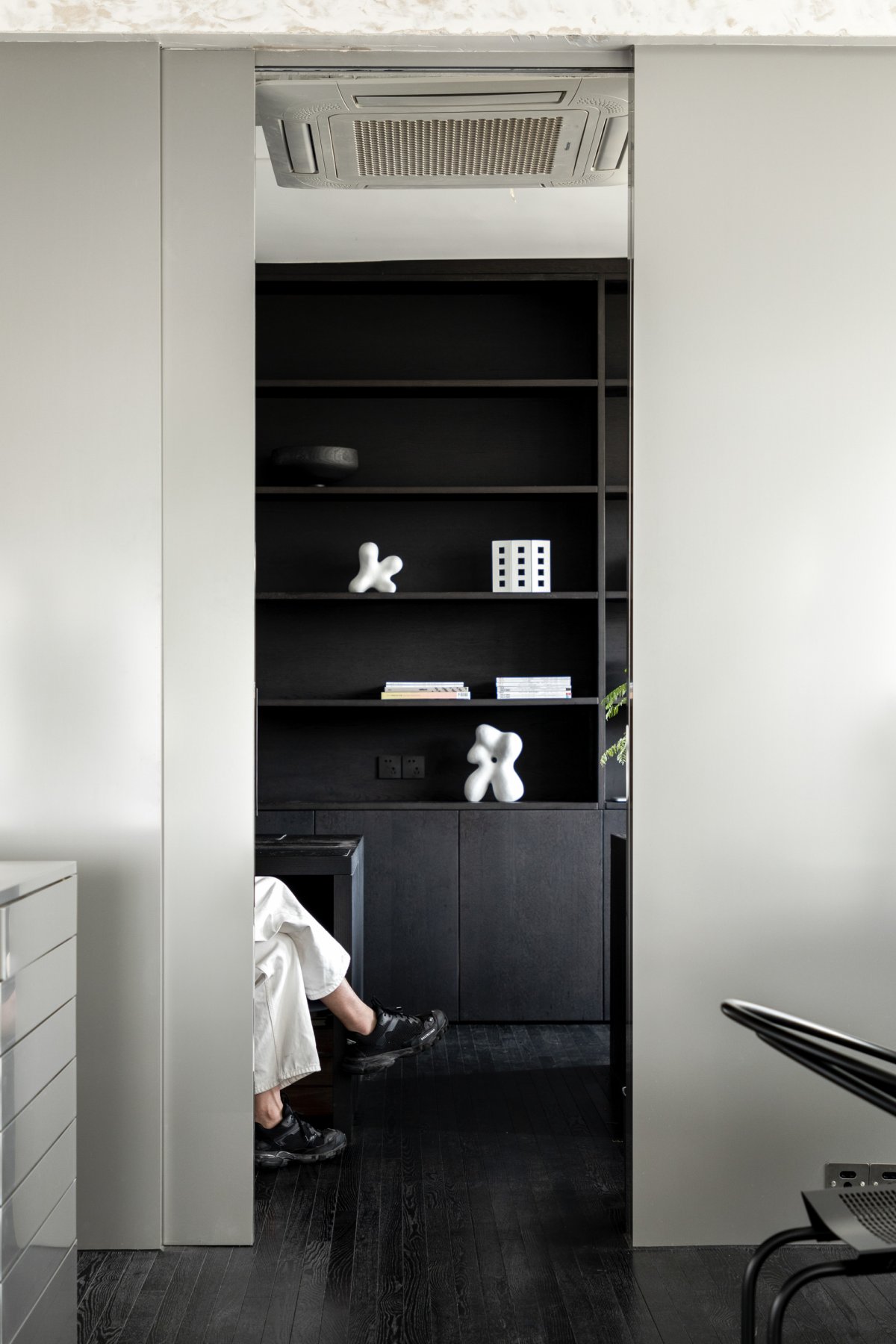
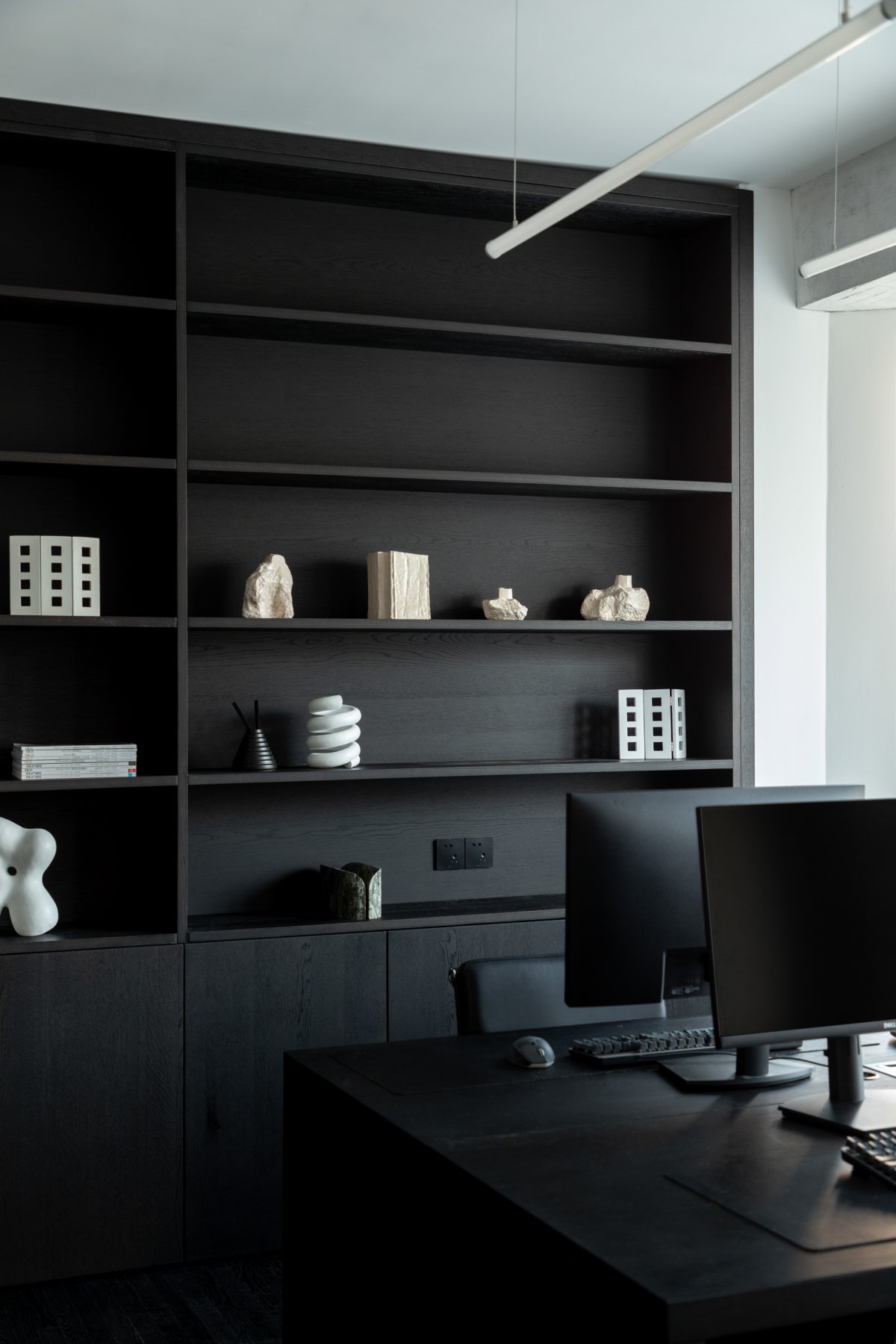
Behind a hidden sliding door next to the material area is a pure black office space. Desks, chairs, custom cabinetry, including all electronic equipment needed on a daily basis, are all black and almost all are designed with square, straight lines, revealing rationality in their minimalism.
Each object is a design story
Open spaces tend to have higher requirements for display. On top of this base composed of black and white gray, from large furniture to small table lamps and ornaments, each item has its own precise position and meaning of existence. In addition to their inherent functions, these objects hide many stories. Touching them, using them and walking through them, you will feel that you are constantly communicating with the design and listening to the unique ideas they convey.
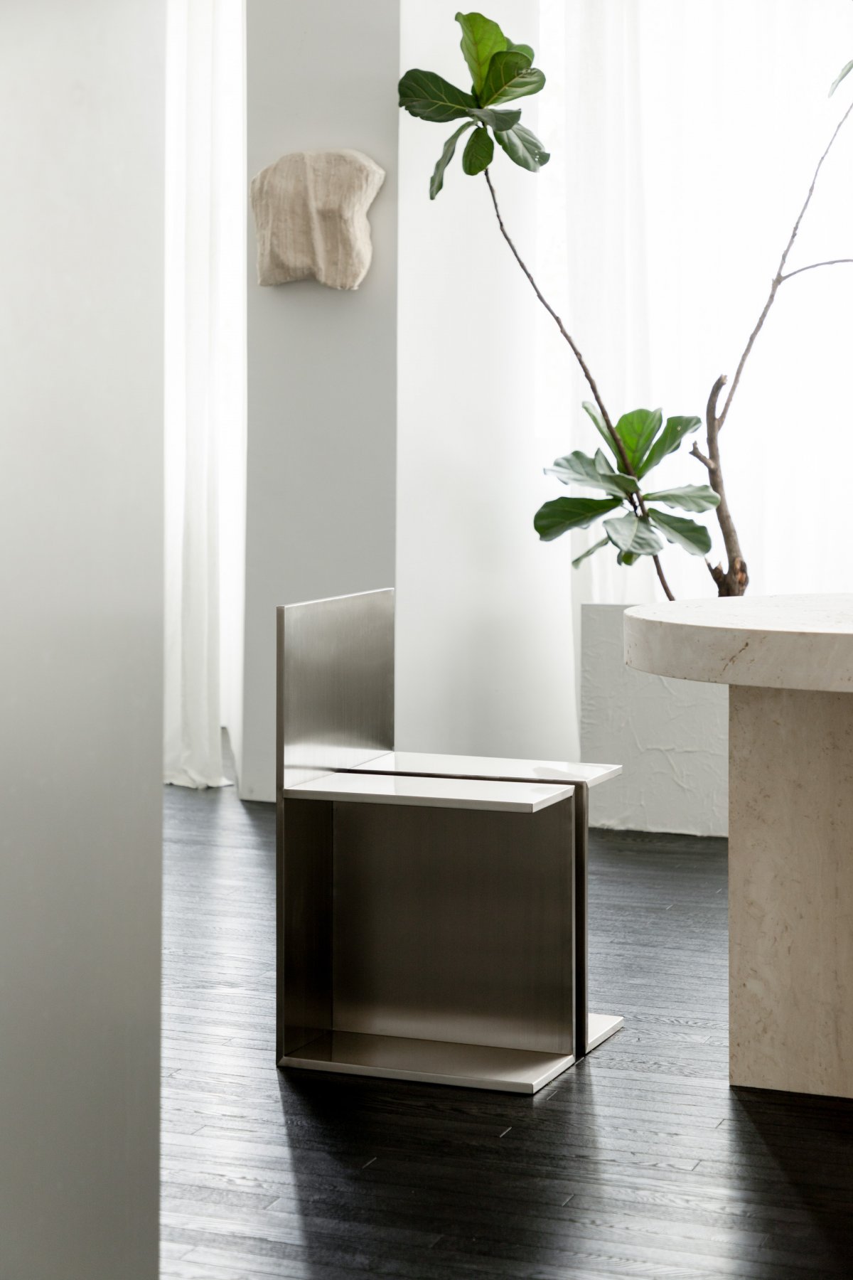
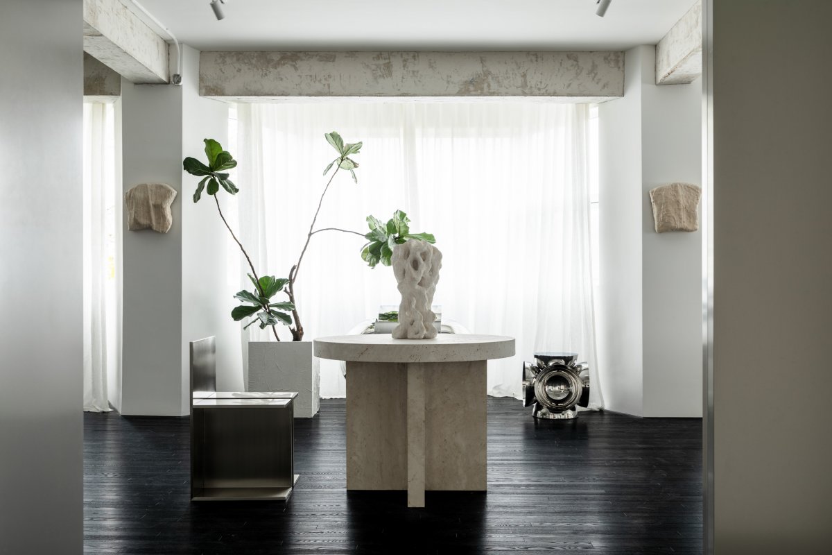
Enter the space, three objects in the center of your view set the tone: a small travertine table, a square aluminum chair, and a sculpture with a free form. The organic forms seem to come to life, enlivening the landscape. The seat is from Thomas Gayet's UNTITLED series. The sculpture is from the post-95 artist Feng Jie, made of rough sagger mud, the organic form expresses the understanding of all things in nature.
The coldness of metal, the texture of travertine and the roughness and naturalness of sagger mud also create a beauty of a material conflict between the three. To the left of the round table is a material area and a metal desk. The chair is the Latonda Chair designed by Swiss architect Mario Botta in 1986. The curved lines of the chair neutralize the coldness of the desk and create a harmonious interplay of "surface" and "line". The table lamp “Unlock” is the Yuan Yuan's work, inspired by the mortise and tenon construction in traditional Chinese architecture. By the window, there are seats and side tables designed by Liu Xiao. The seat is called "The Disappearing Ancient City", made of stainless steel, which is loved by Liu Chang, who is also a stainless steel lover.
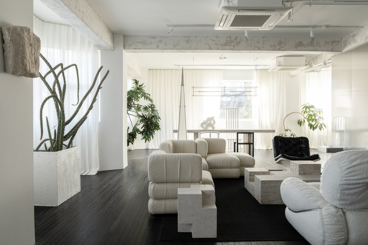
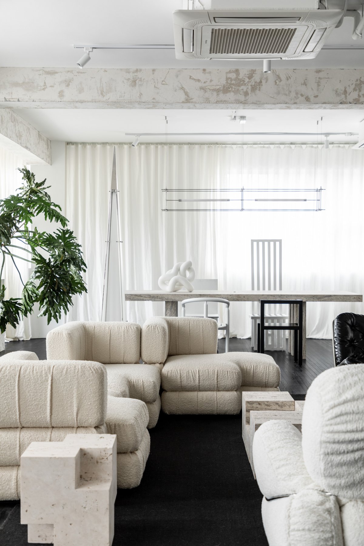
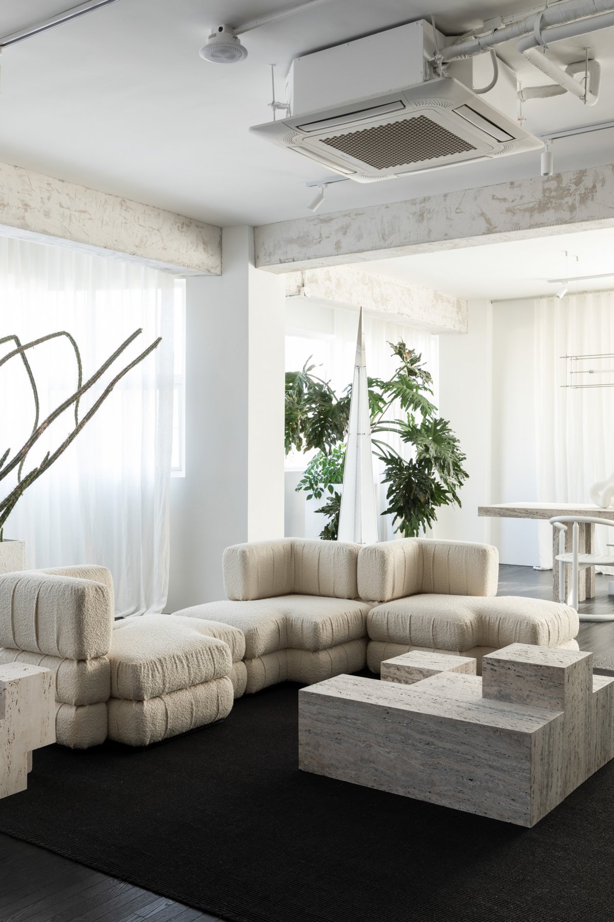
The meeting area is a combination of a sofa and two chairs. The sofa is the one that Liu Chang liked at first glance in the Chinese antique furniture store, the staggered square shape is very sculptural, and the looped velvet fabric piles up natural folds on the surface, which is stylish and not dull. The two lounge chairs are both from Space Age in the last century. Behind the sofa is a floor lamp by artist Chen Xingyu, with a towering shape like a small universe in a minaret. The collision of Space Age furniture and contemporary pioneering works, which span nearly a century, instantly widens the dimension of time and makes it seem like being in a different world. Interestingly, these works, which span a century between East and West, seem to be articulating the same theme - the exploration of the future.
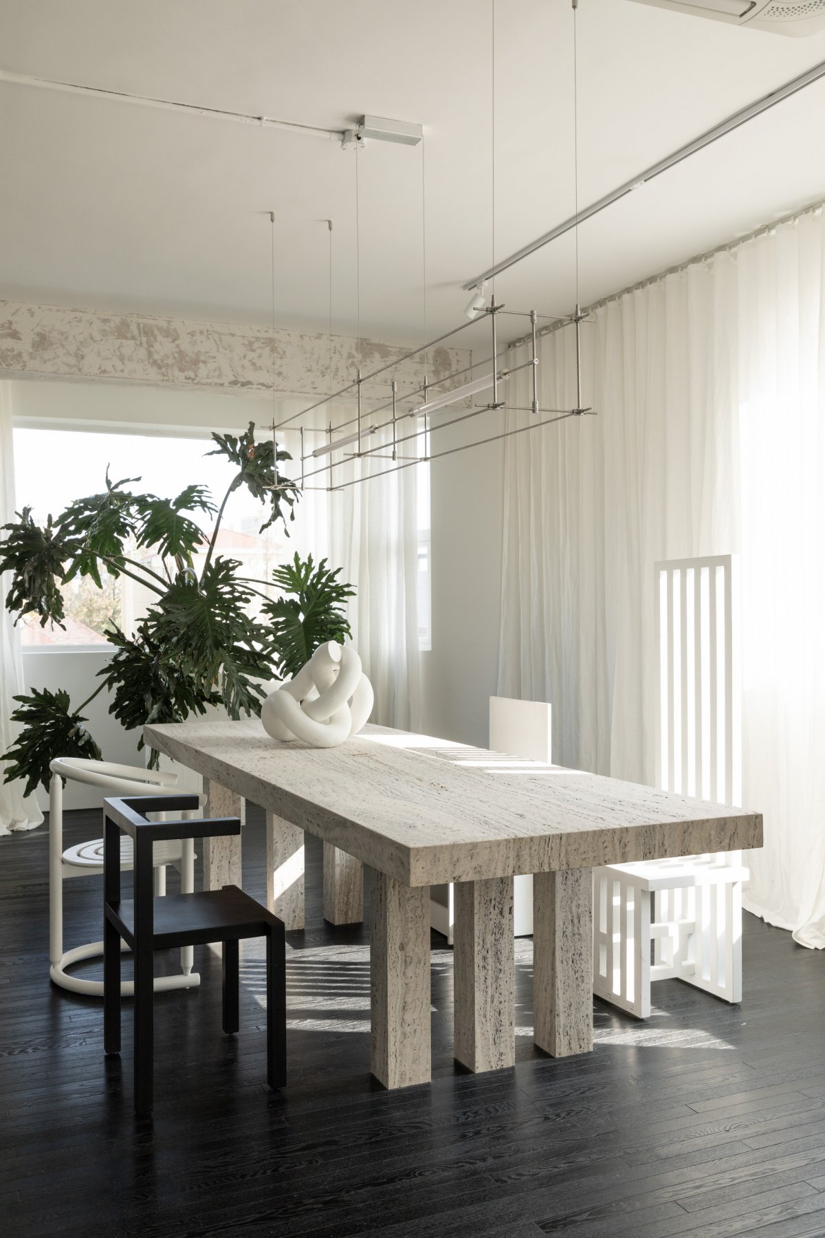
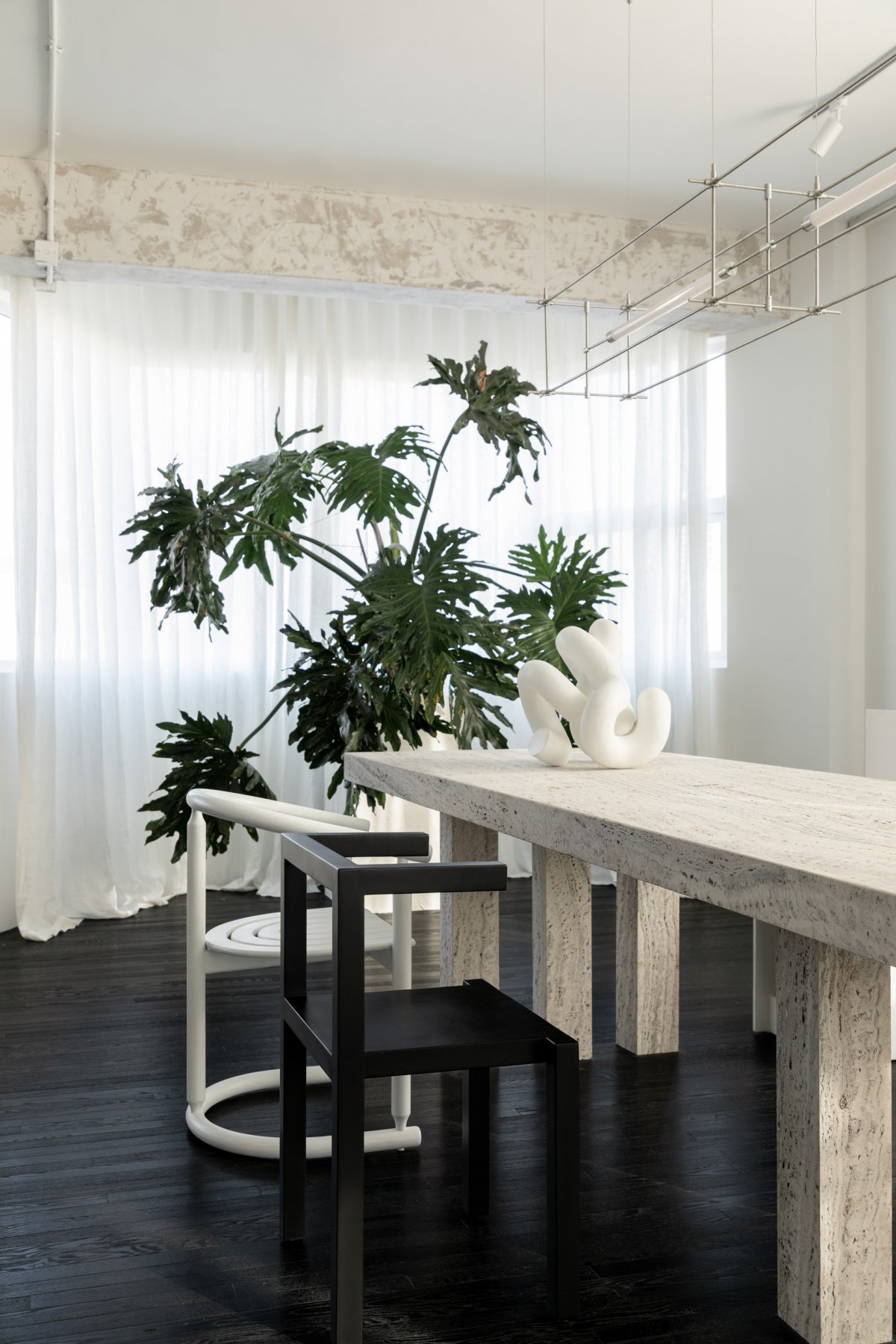
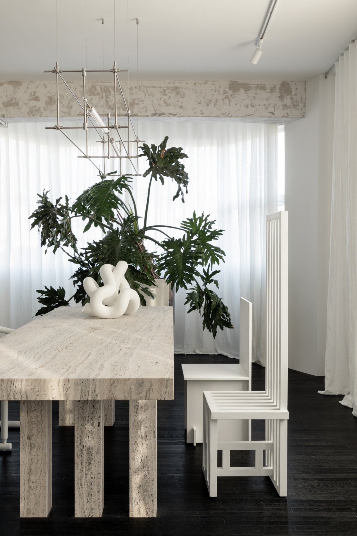
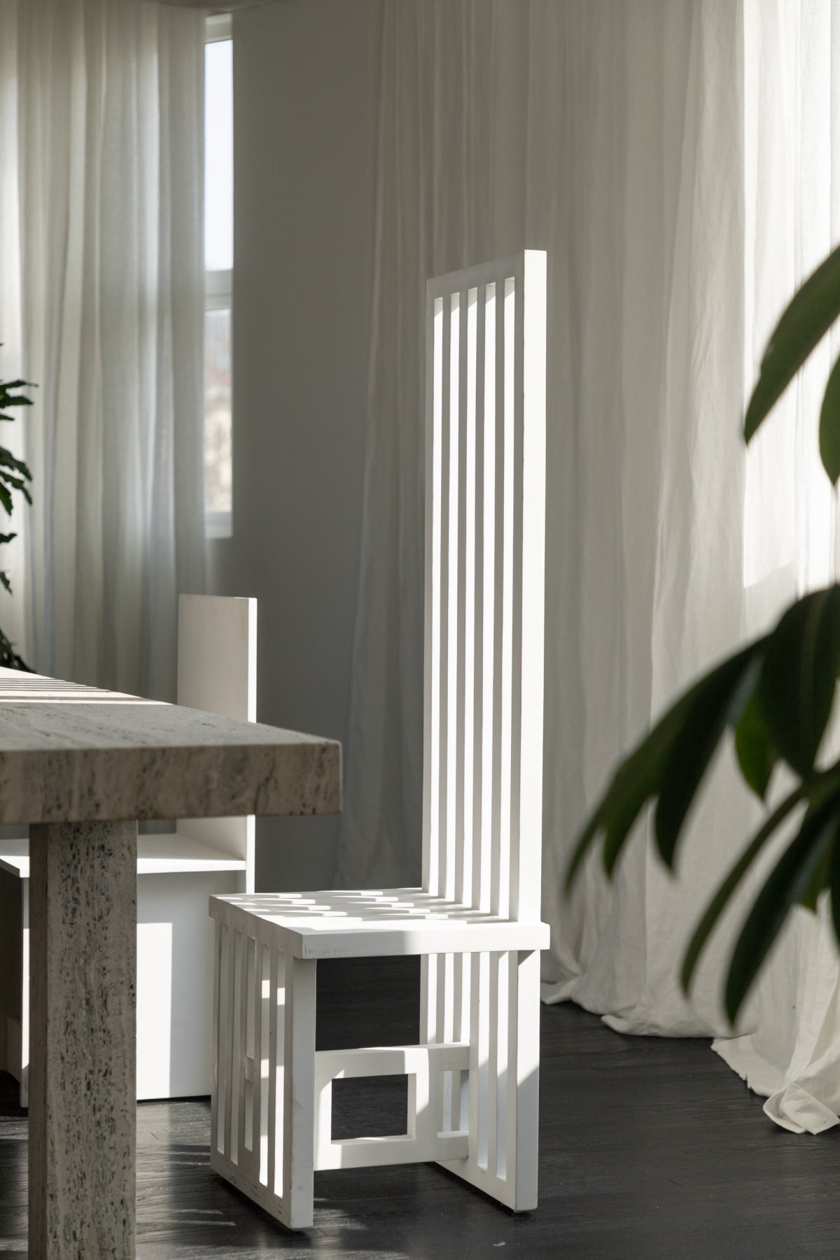
Travertine coffee table and side table are designed by Liu Chang for this space, the geometric shape changes and reorganizes, echoing the sculptural sense of the sofa.The sunniest area is at the corner of the L-shaped window, where a long travertine table is placed, with four seats of very different shapes standing on either side. Above the table hangs Mario Tsai's Mazha Lighting, with its slender lines crisscrossing the floor, inspired by the scaffolding of a construction site in the city. Each of the four chairs has its own personality. "Choose the one you like the most to sit" is the psychology of each person in this area, and it is also an interesting interaction between people and furniture.
Every piece of furniture and every object is interesting enough to spark a conversation. The designers even made DIY decorative fences for the plants, and the textured white surfaces blend perfectly into the space. From renting this place to finalizing the design, Liu Chang spent only one night, perhaps there is also a wonderful destiny between people and space. For him, this office is not just a place to work or a place to settle in a busy city, but a place where the thinking and ideas of the moment are cohesive and the emotional value is above all.
- Interiors: NOTHING DESIGN
- Words: WM Studio Photography

