Oskar Kohnen takes a simple yet striking approach to the interior scheme of this paint store in London. Stepping away from precious materials and overly complicated detailing, the studio focused on Bauhaus and the iconic interiors of early modernism that utilised nothing more than paint and colour.
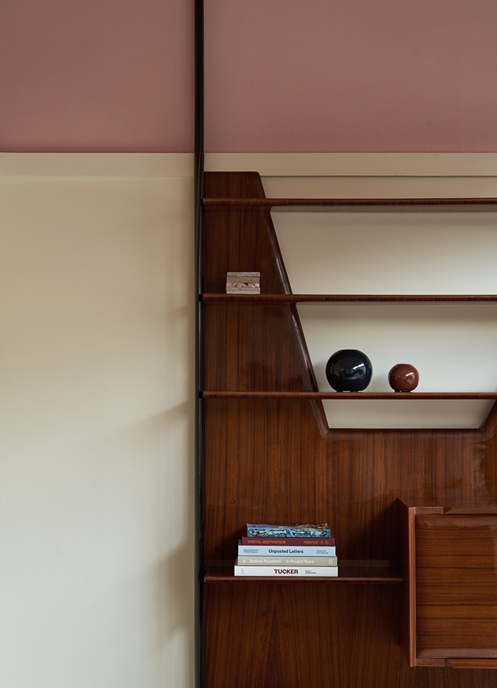
Taking notes from the past, Kohnen applied two bands of colour in the interior—pink and white—complemented by a baseboard highlighted in a glossy deep black. “Our design was driven by the notion of paint as a transformative material; the simple application of colour is one of the most immediate & intuitive ways to create a space throughout history,”Kohnen explains.“This was a conscious stripping back from the complications and excess of maximalism, a desire to create something beautiful in an altogether more humble way.”
Lick is a community driven company that aims for its stores to be experimental spaces for customers to test paints in and get involved in a more meaningful sense beyond the sterility of tester strips. With that in mind, Kohnen sought to impart an atelier-like feeling that would aid in the idea of looseness and facilitate a sense of informality.
An expansive counter and communal table and chairs give customers space to paint and experiment. The concrete tile floor, arranged in plains of colour with random asymmetric patterns, refers to Robert Mallet-Stevens’Atelier Martel in Paris and its workshop-like feel. The peg board shelving and the enamel metal details with black rubber frames are reminiscent of the classic atelier.
- Interiors: Oskar Kohnen Studio
- Photos: Alexander J. Edwards
- Words: Qianqian


