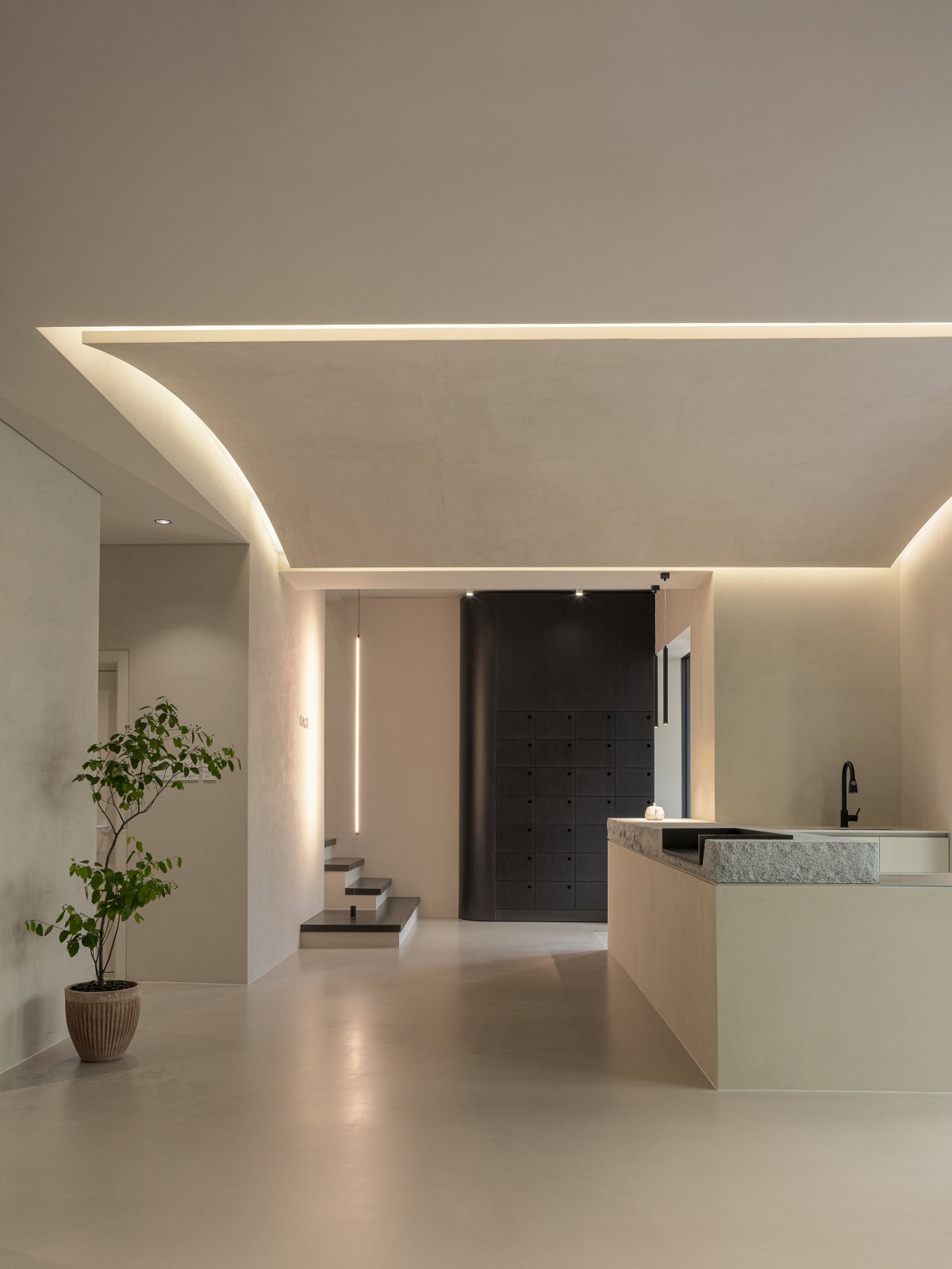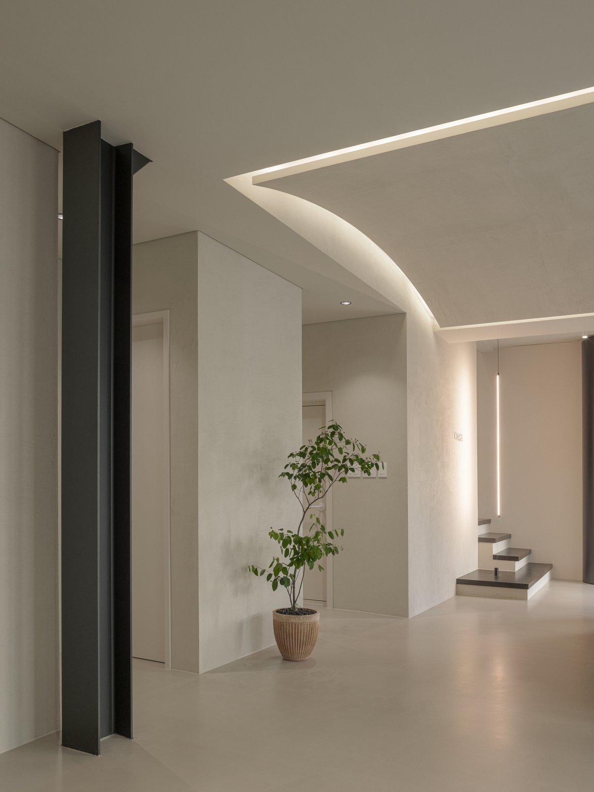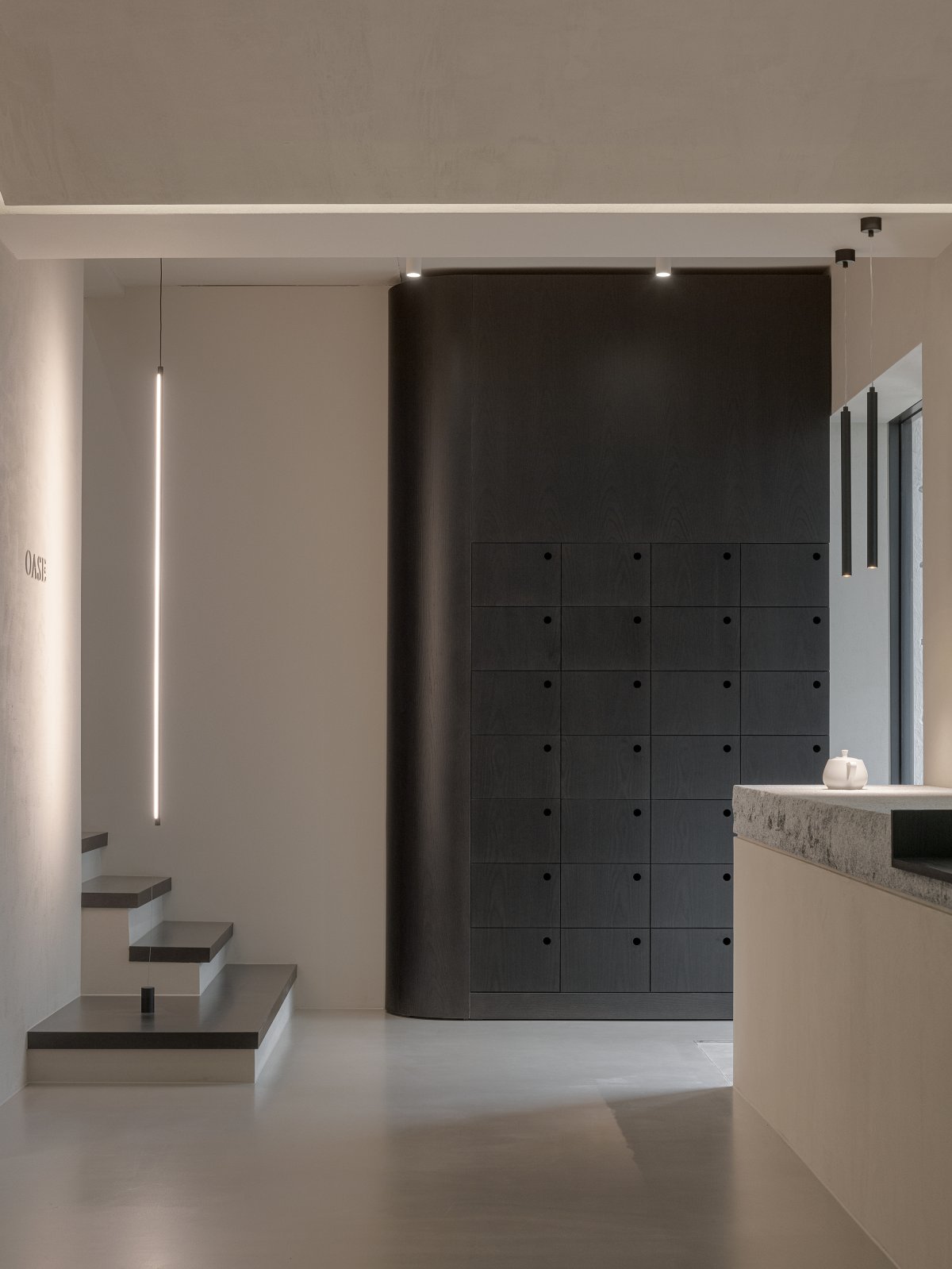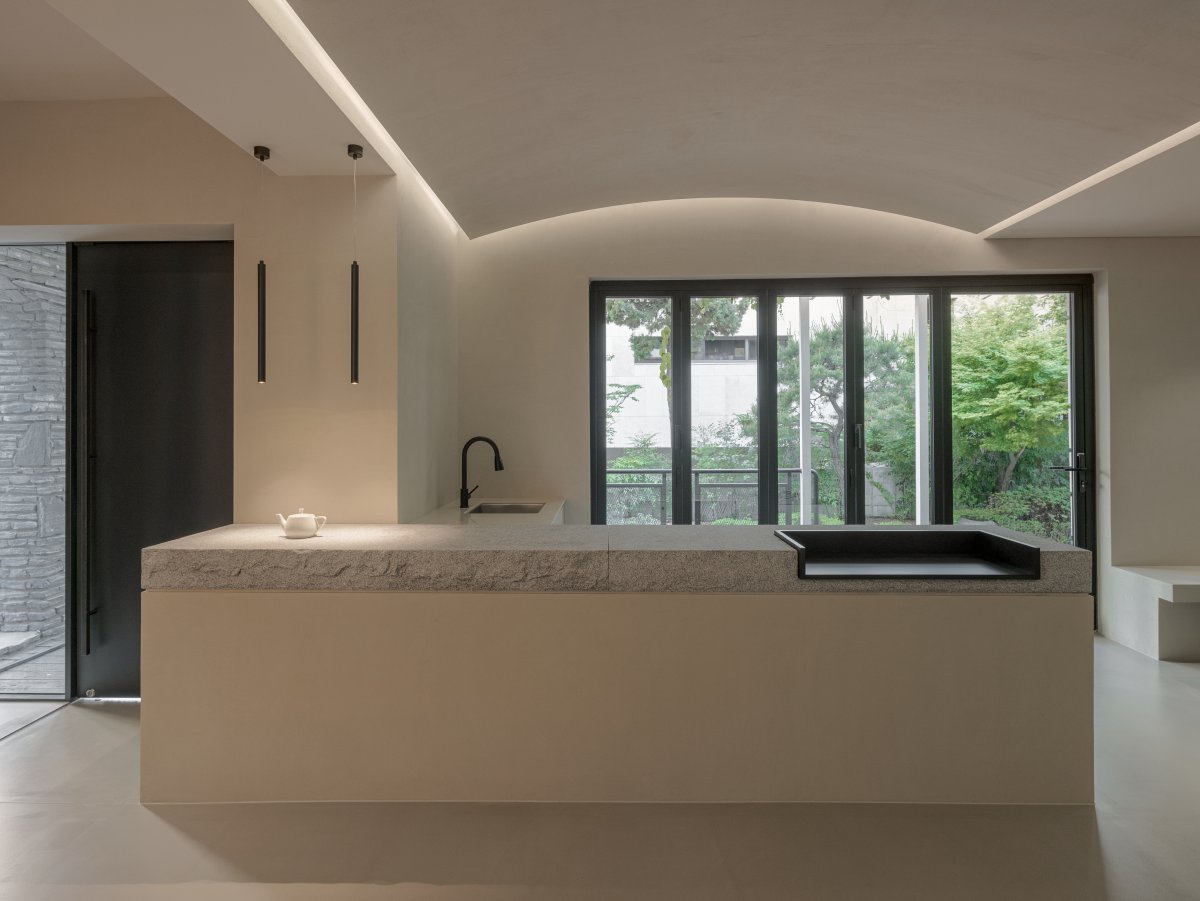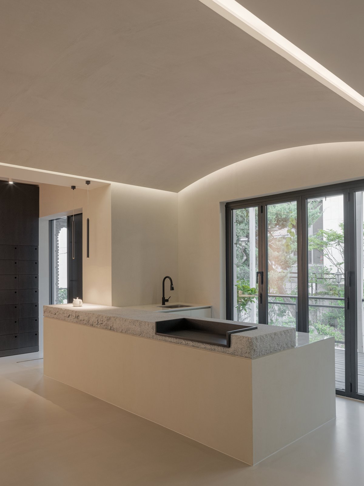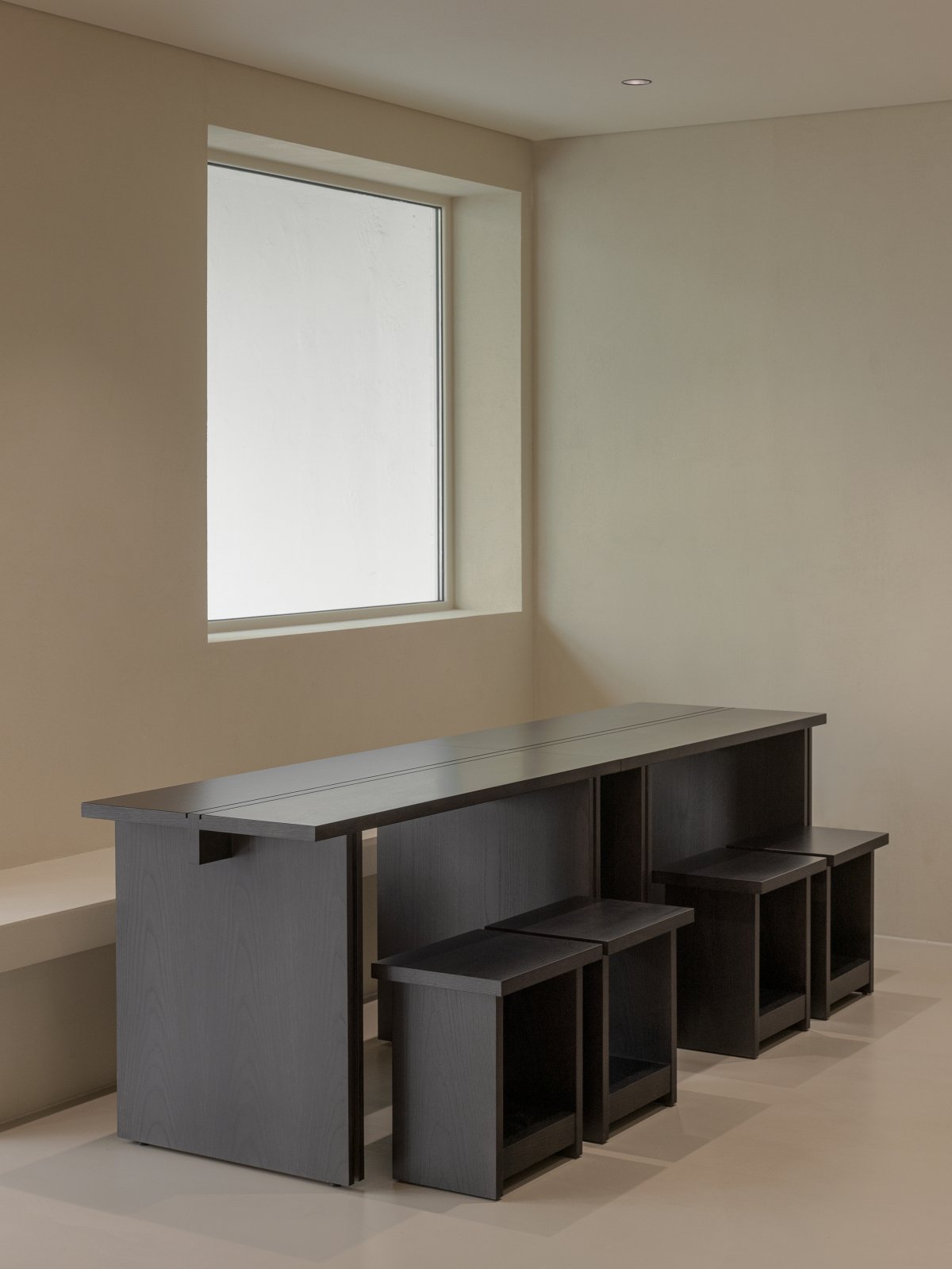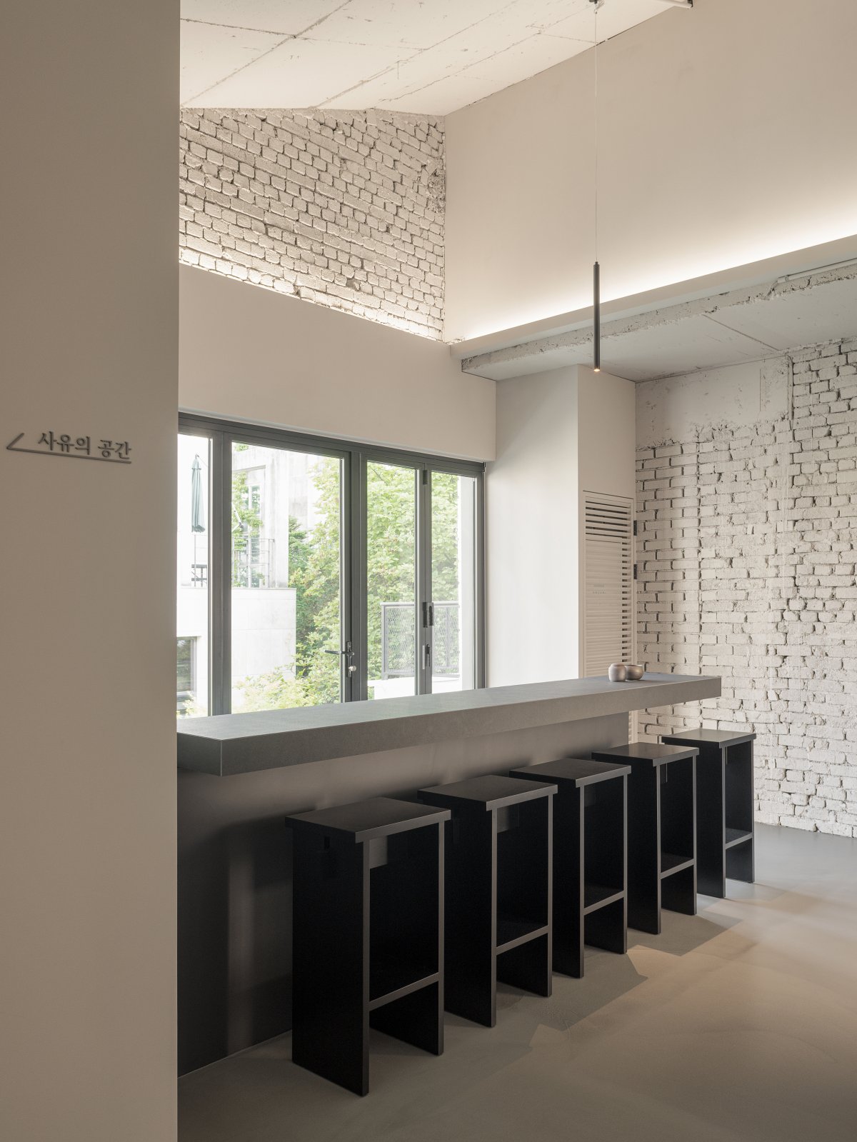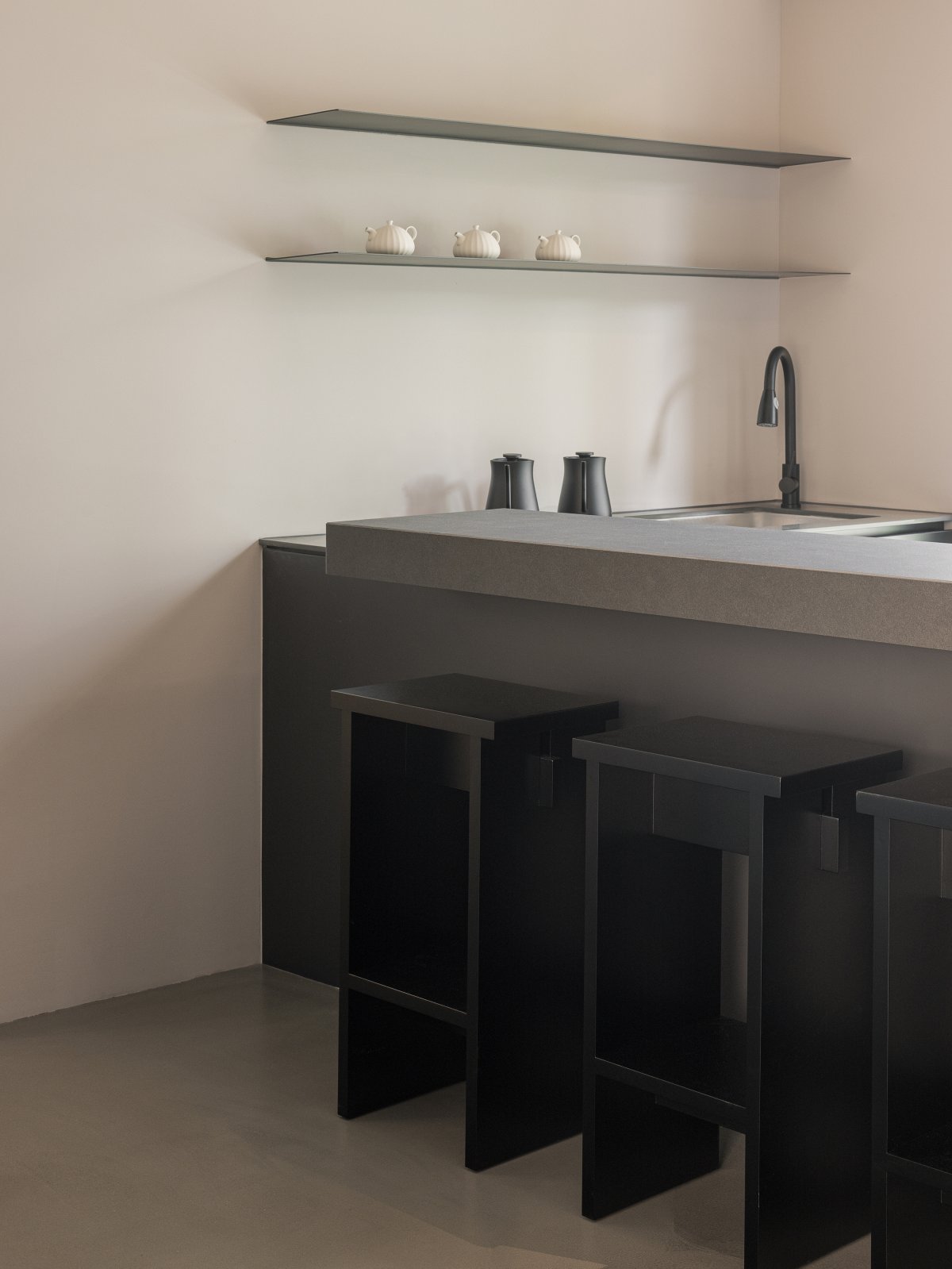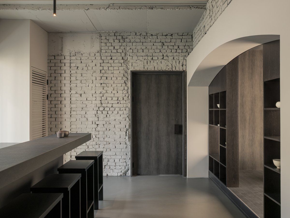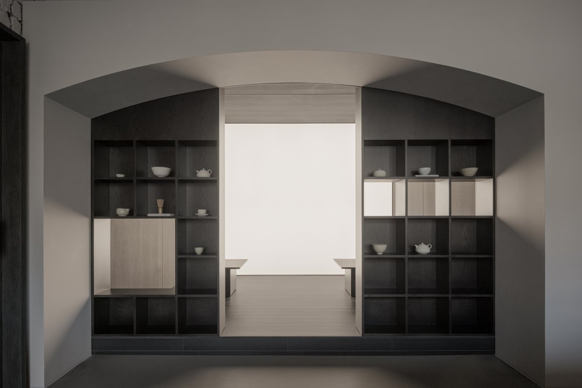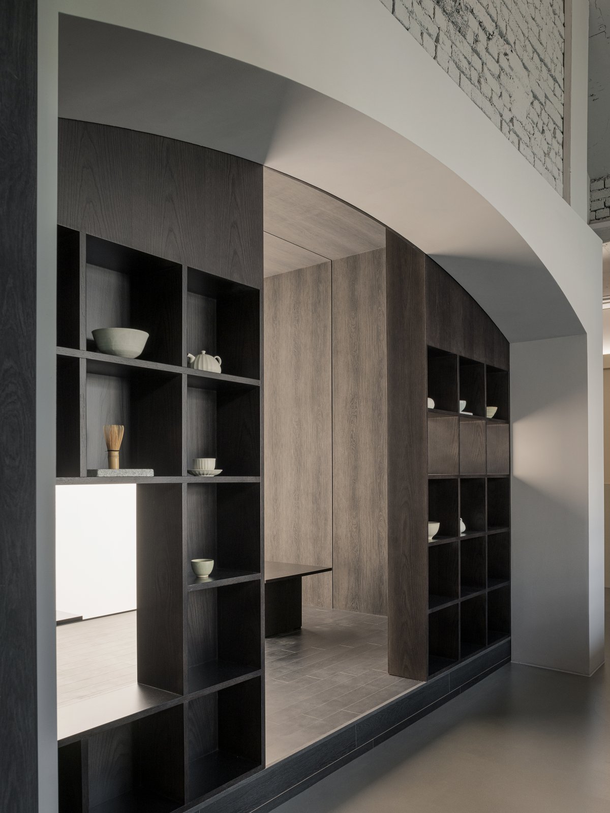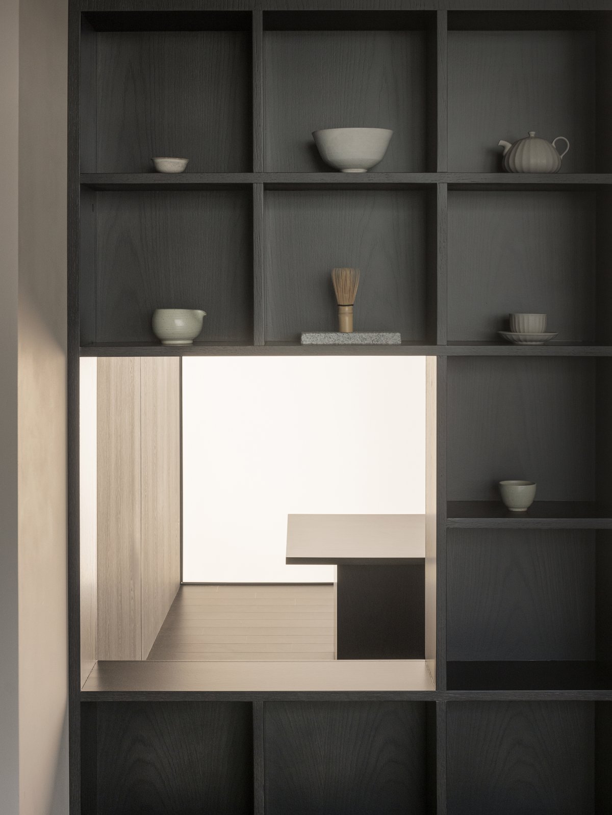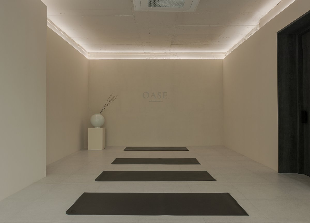
It is a wellness center that focuses on yourself, not just a place to do Pilates or yoga, to achieve peace of mind and body, and also provides tea service. Various noises from the coffee shop. Like a sound from a TV or radio that is not fixed to a specific channel continuous, monotonous sounds. However, it is said that these noises give a lot of relaxation and calm the mind.
Surprisingly, the regular and monotonous fine noise of white noise makes it more immersive rather than completely blocking the sound, so it is not a flashy and intense design, but a space to help you focus on your mind and body.
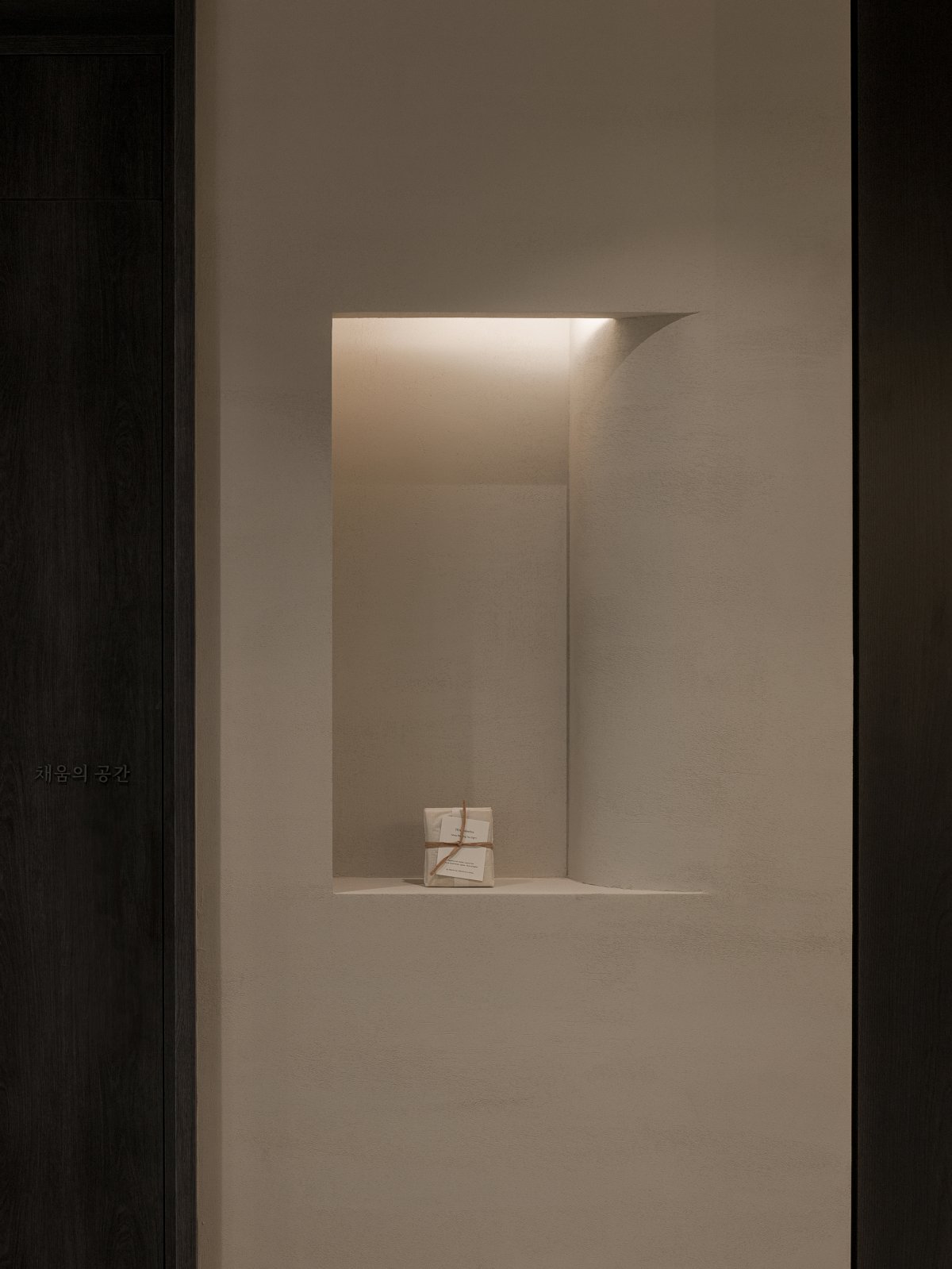
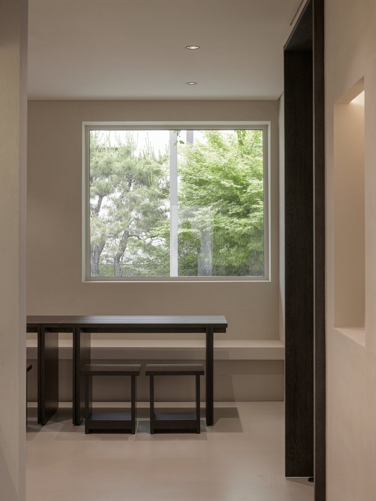
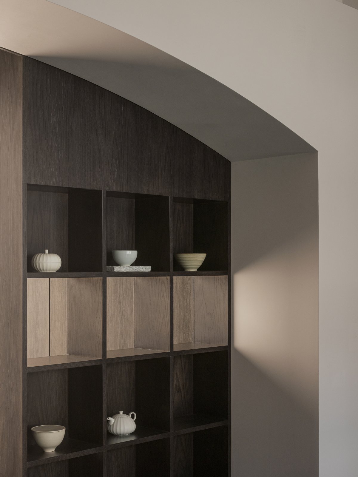
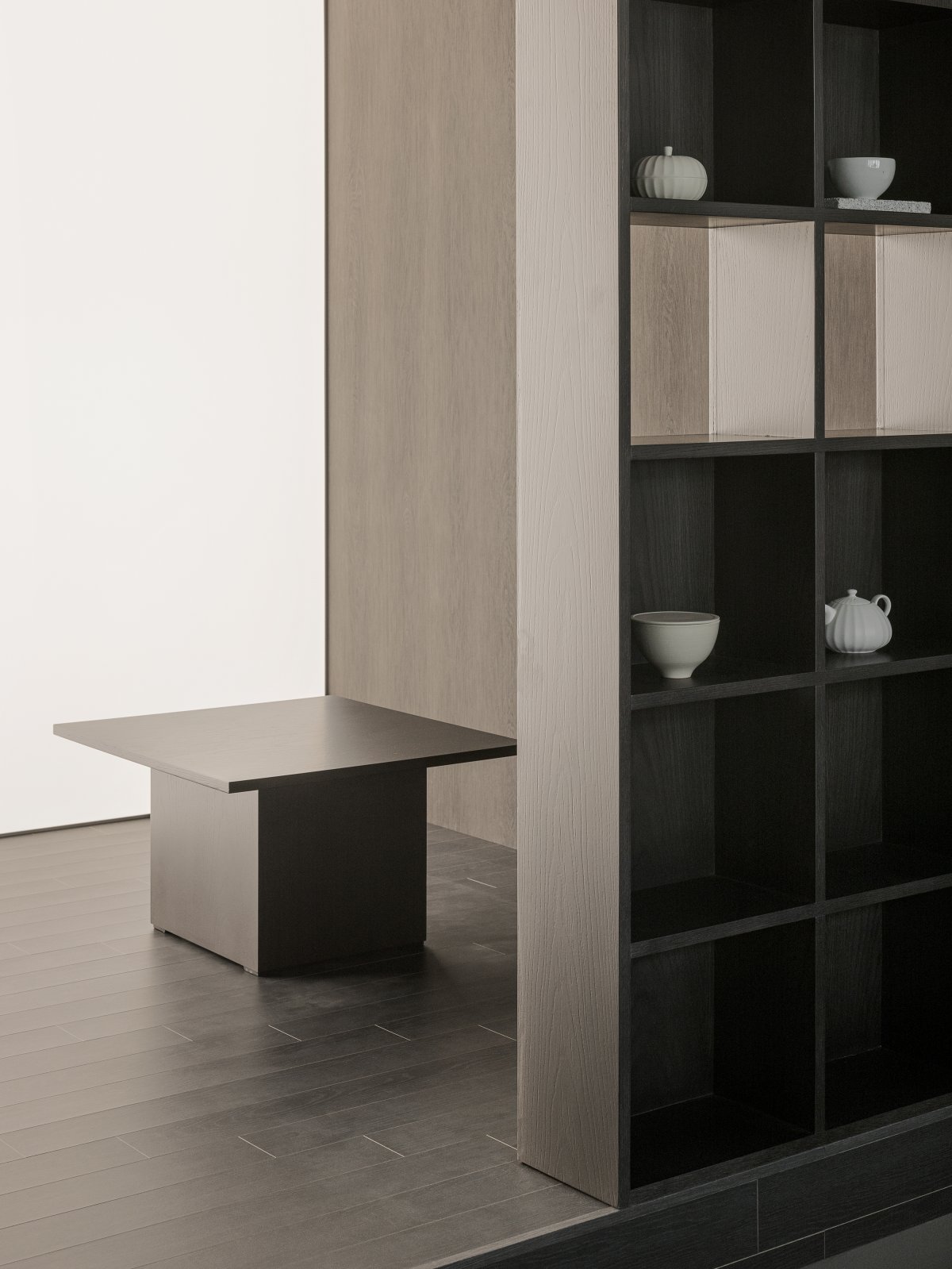
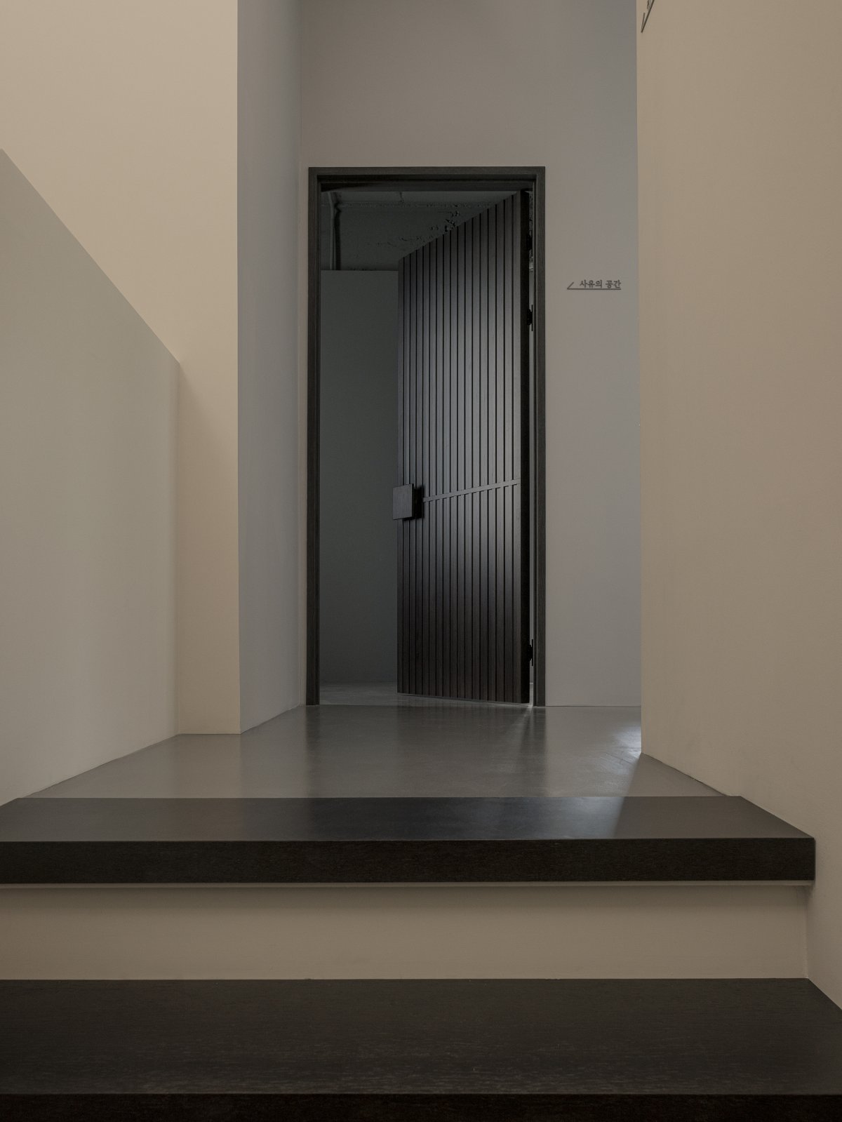
The materials for wall finishes, floors, and furniture were mainly used to resemble natural textures rather than artificial ones. The design was designed to be as simple and simple as possible without artifice, and smooth arches were used in the upper ceiling of the counter and at the entrance to the tea house, giving the effect of concentrating on the space itself.
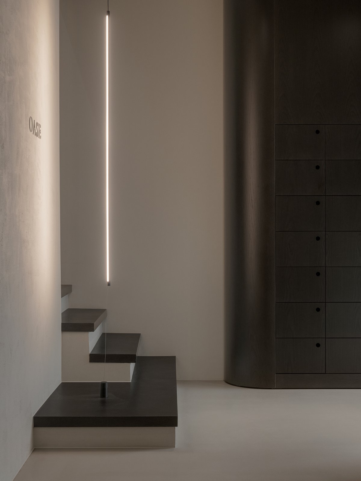
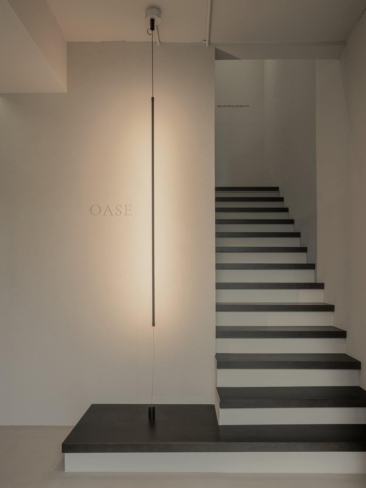
The main logo was attached to the entrance using a thin and long rear indirect lighting. All signage, including the main logo, was designed to permeate rather than reveal in accordance with the paint color. In the space on the first and second floors, the layout was laid out so that guests could see the nature outside, so that they could feel the nature while staying in the space.
- Interiors: Plainoddity
- Photos: Yongjoon Choi

