When Right Angle Studio was engaged to design a family office’s workplace, the client posed a particular challenge in response to this: to design an office that encourages staff to return to the office and resume a normal working pace similar to pre-pandemic times.
After consulting with the staff, Right Angle Studio decided on a design direction that will allow them to be engaged in a more casual environment to feel connected to the office. Beyond the apparent benefits of an aesthetically pleasing space, an office design that prioritises staff well-being is equally relevant in today’s world.
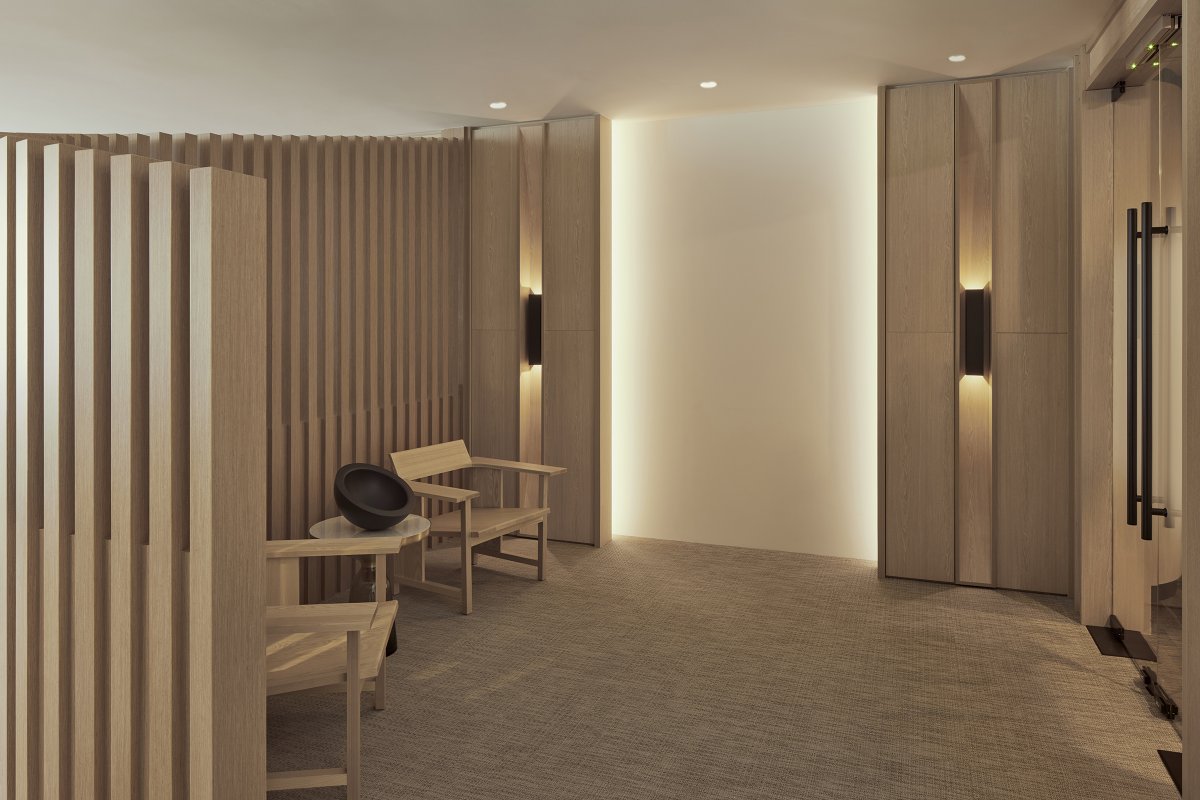
A strong sense of tranquillity defines the space, beginning from the entrance. A descending timber trellis wall screens the work desks from the common corridor outside T Office, which sees ample public foot traffic. This feature also helps to create a pace of slow reveal for guests, and is a smart mode of concealing structural columns and the electrical distribution board.
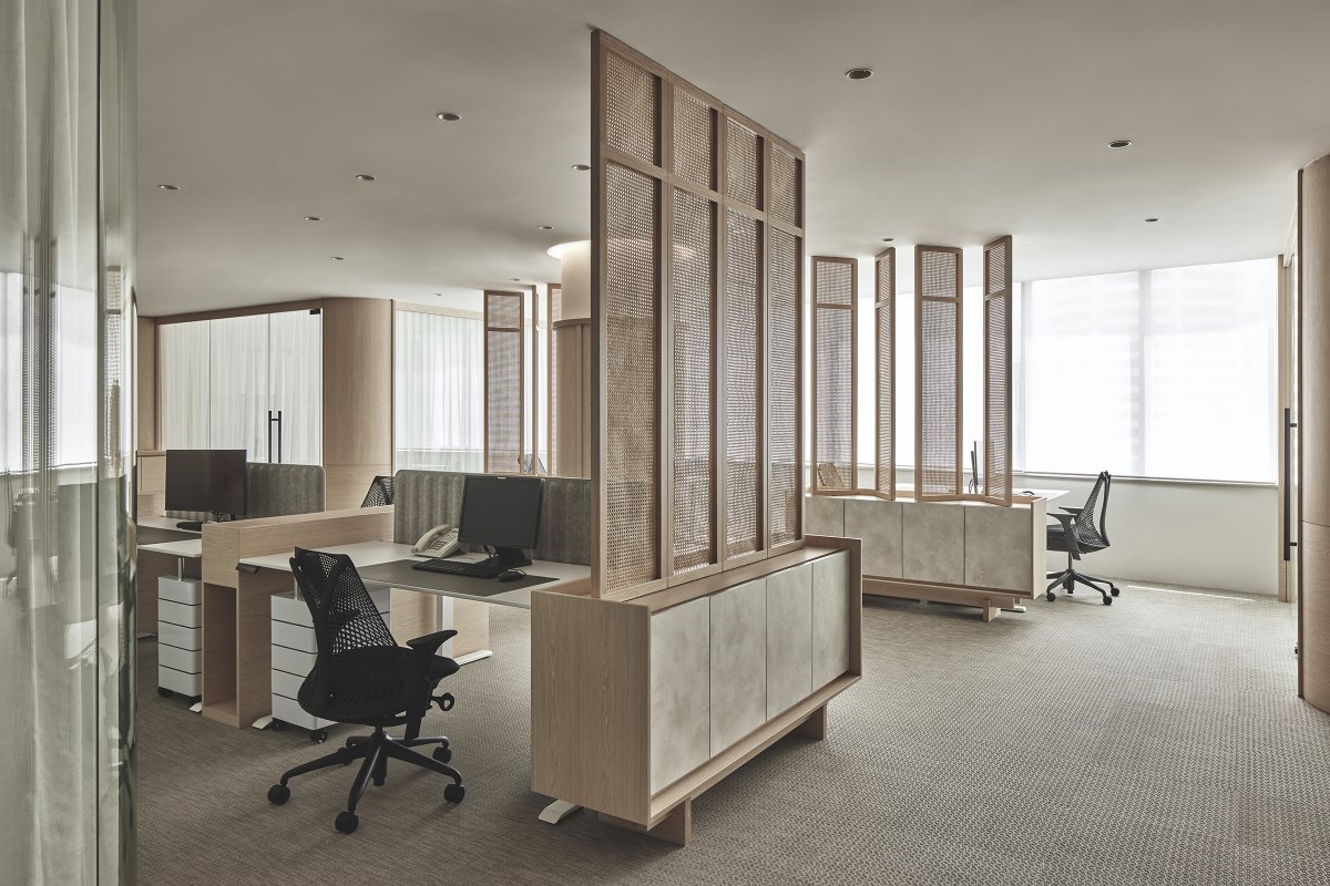
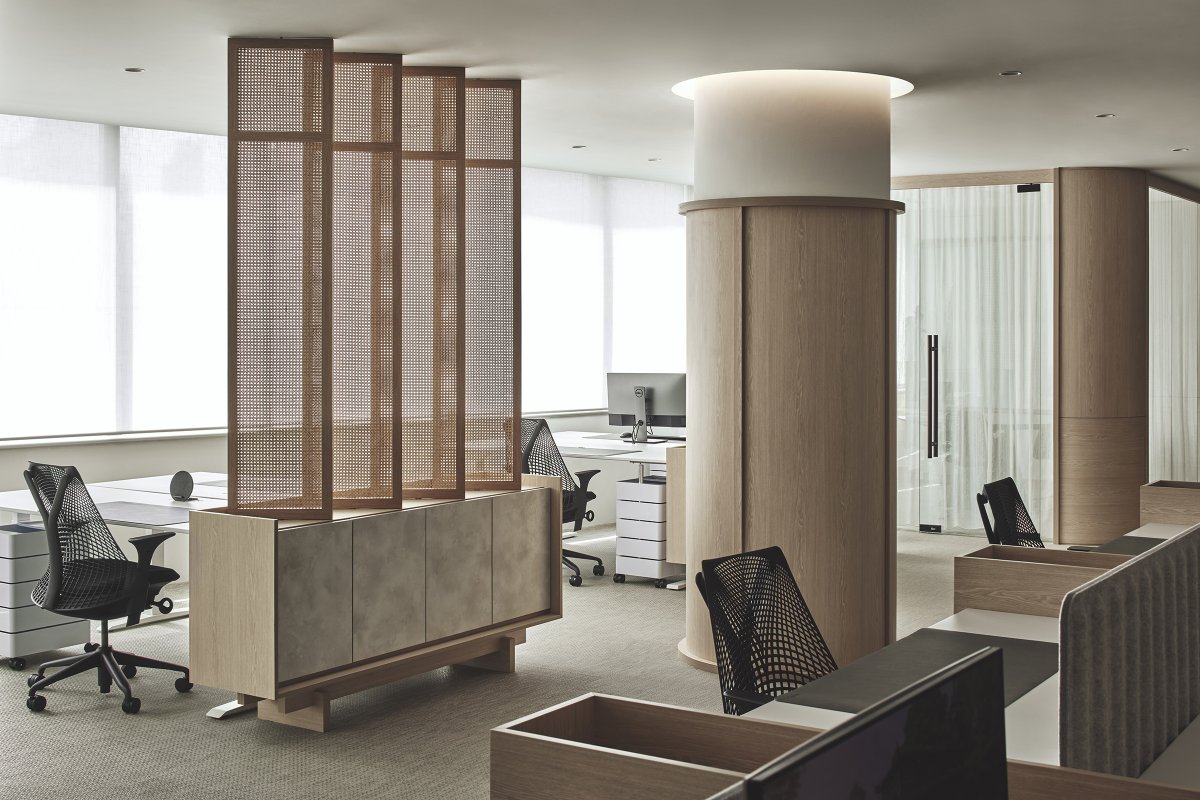
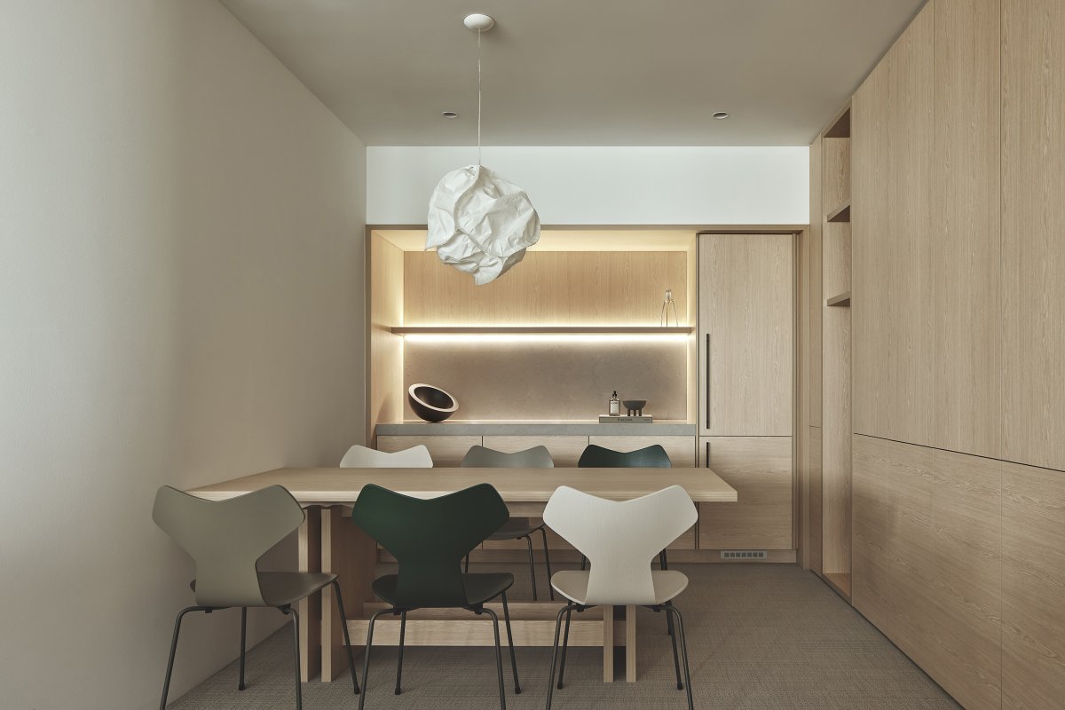
Natural wood ash veneer is the main material employed to achieve a genteel, timeless and holistic palette. It is applied to all the joinery as well as the wall panelling that wraps around columns. The open-plan layout with a modest footprint of 2,000 square feet has meeting rooms, the pantry and the director’s room tucked to the edges, separated with glazing.To create a sense of engagement without sacrificing privacy, Alex introduced a custom-designed swivelling screen divider with a storage base.
The furniture selection targeted long-term comfort and soft lines. There are Sayl office chairs from Herman Miller, environmentally friendly Falk chair and height-adjustable desks from Omnidesk™. Filing cabinets in the main space with a wall panelling design and soft translucent curtains in the meeting rooms complete the overall sense of domestic calm.
- Interiors: Right Angle Studio
- Photos: Studio Periphery
- Words: LUO JINGMEI
