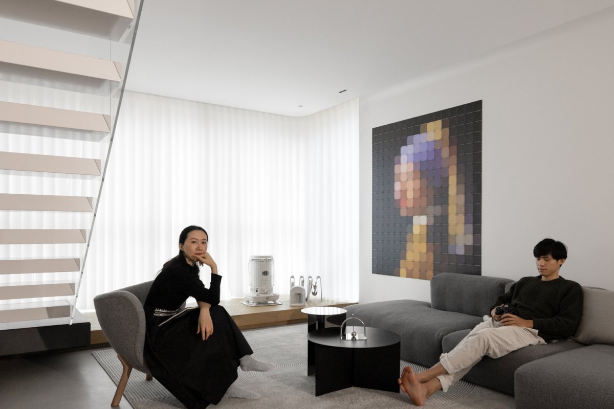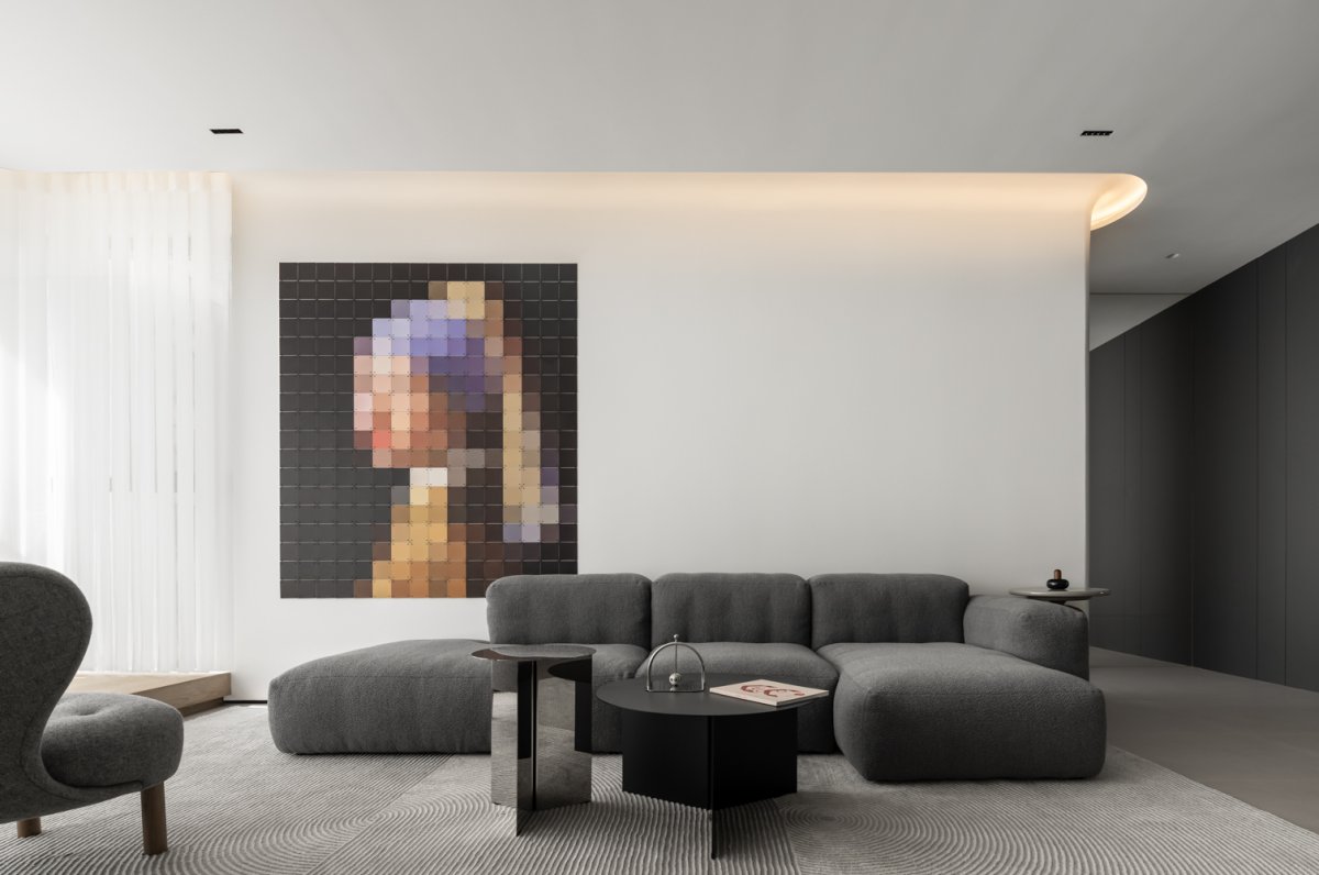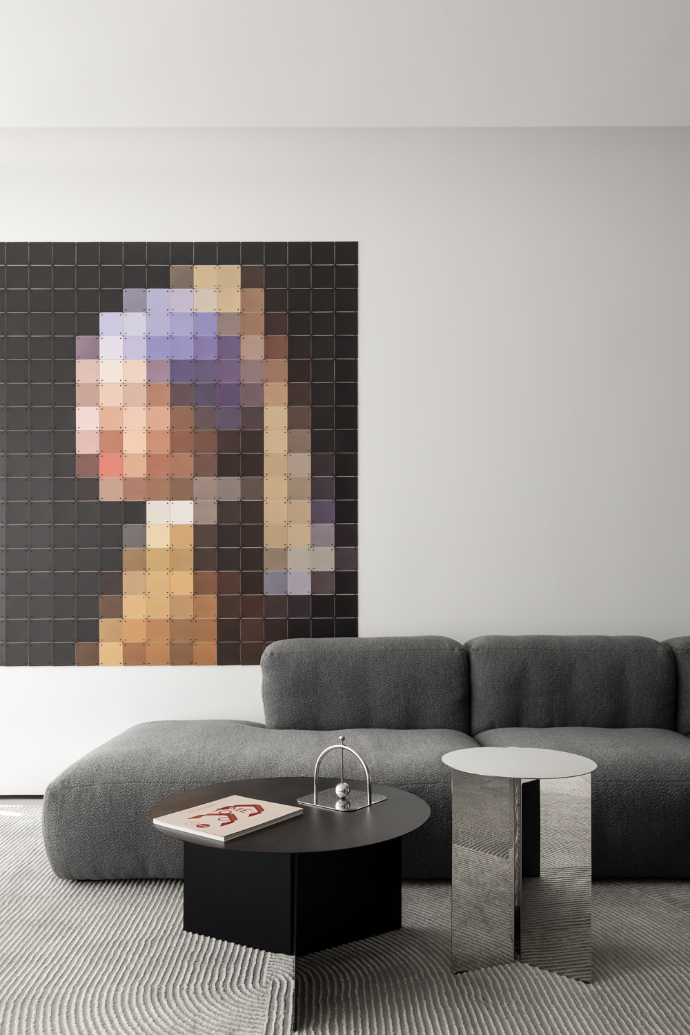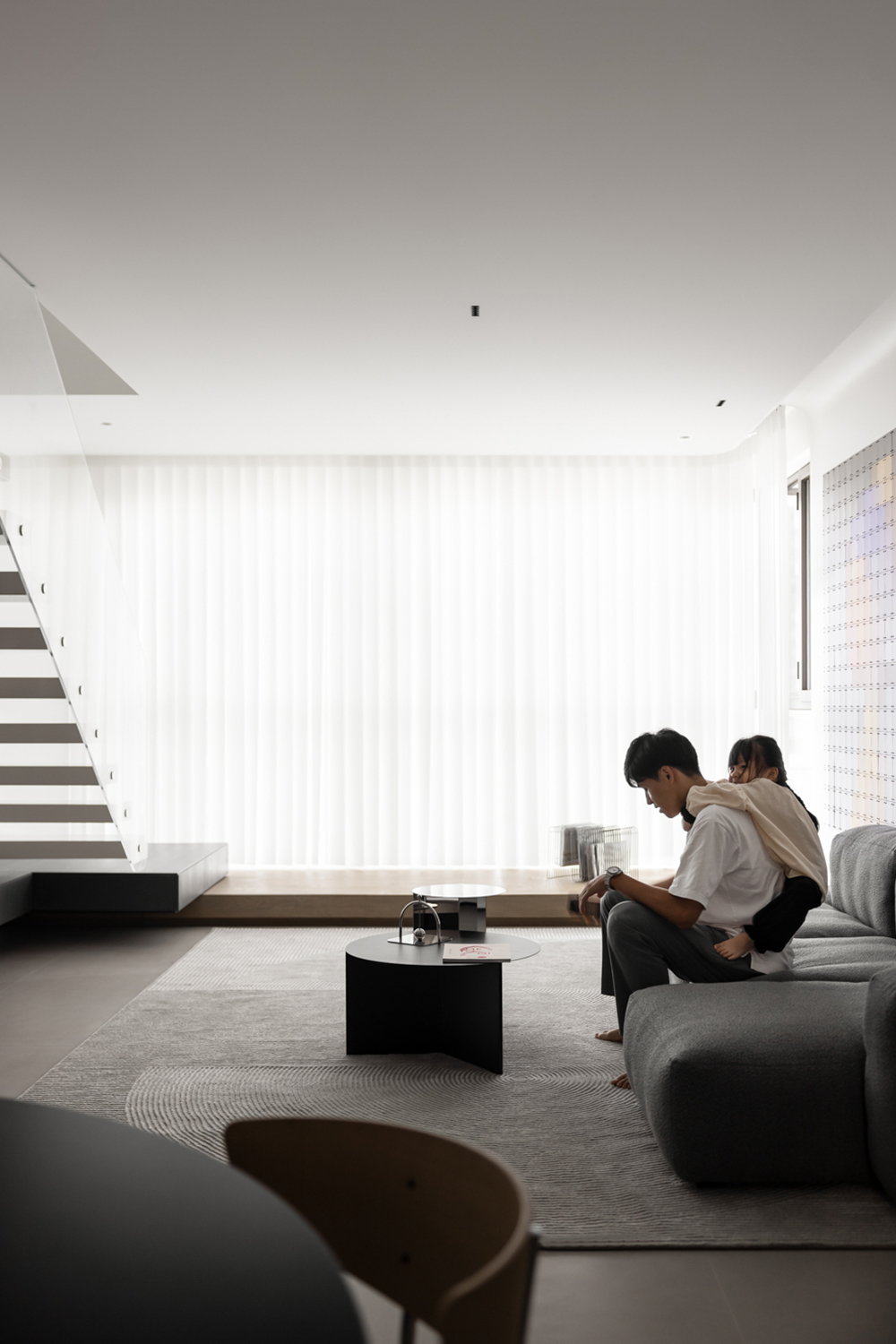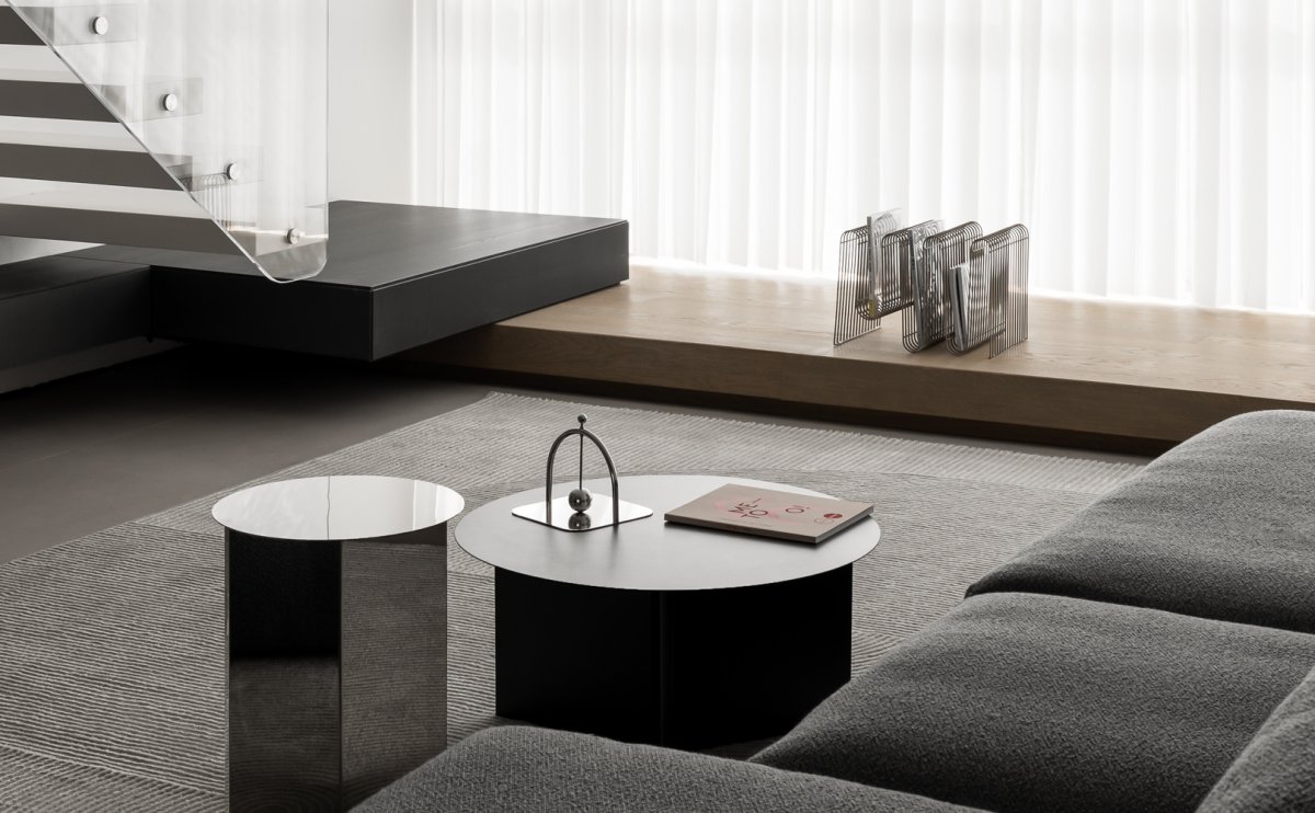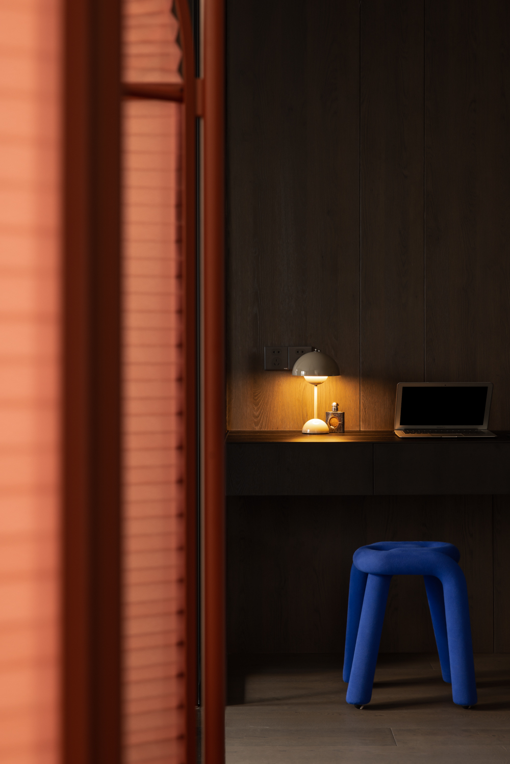
The owner of this case is a pair of appearance level aesthetic are very online small couple, she in order to decorate this love house, not only compared the major decoration companies and studios, more reported class self-study decoration knowledge, the all-powerful owner, after reading our first draft scheme to give a high degree of affirmation.
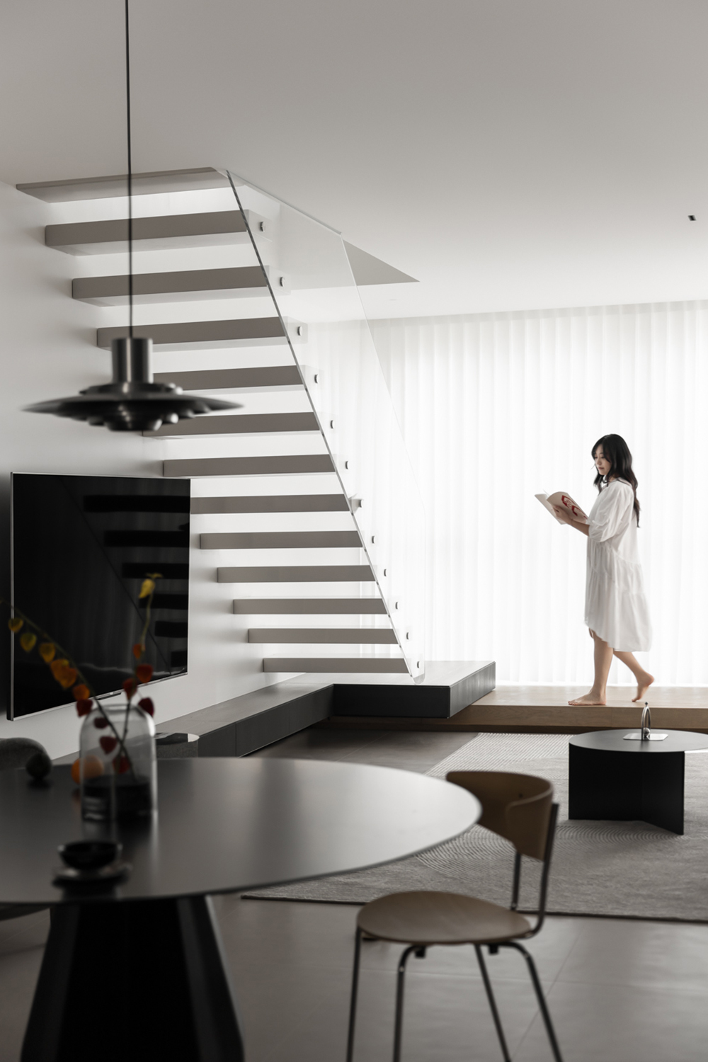
The biggest advantage of this house is that it has a 6-meter high, nearly 20-level light surface. Through the planning of the upper and lower Spaces, the living room on the first floor and the master bedroom on the second floor can be bathed in the light and shadow of nature.
In the first floor space, two complete bedrooms with comfortable quality are obtained through a small amount of demolition walls. The living room with enlarged actual space and the negative space become an independent laundry room. On the second floor, however, the space is integrated with no aisle space, a hotel-like master bedroom suite, and more freedom of movement.
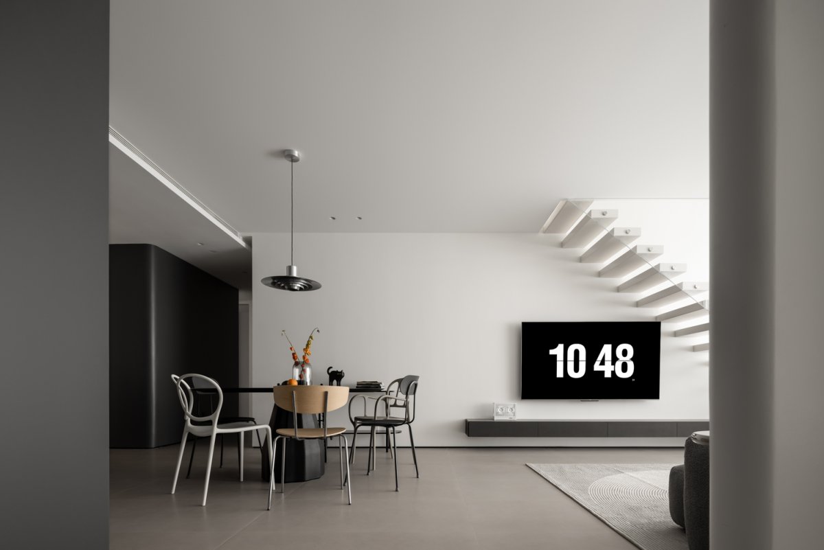
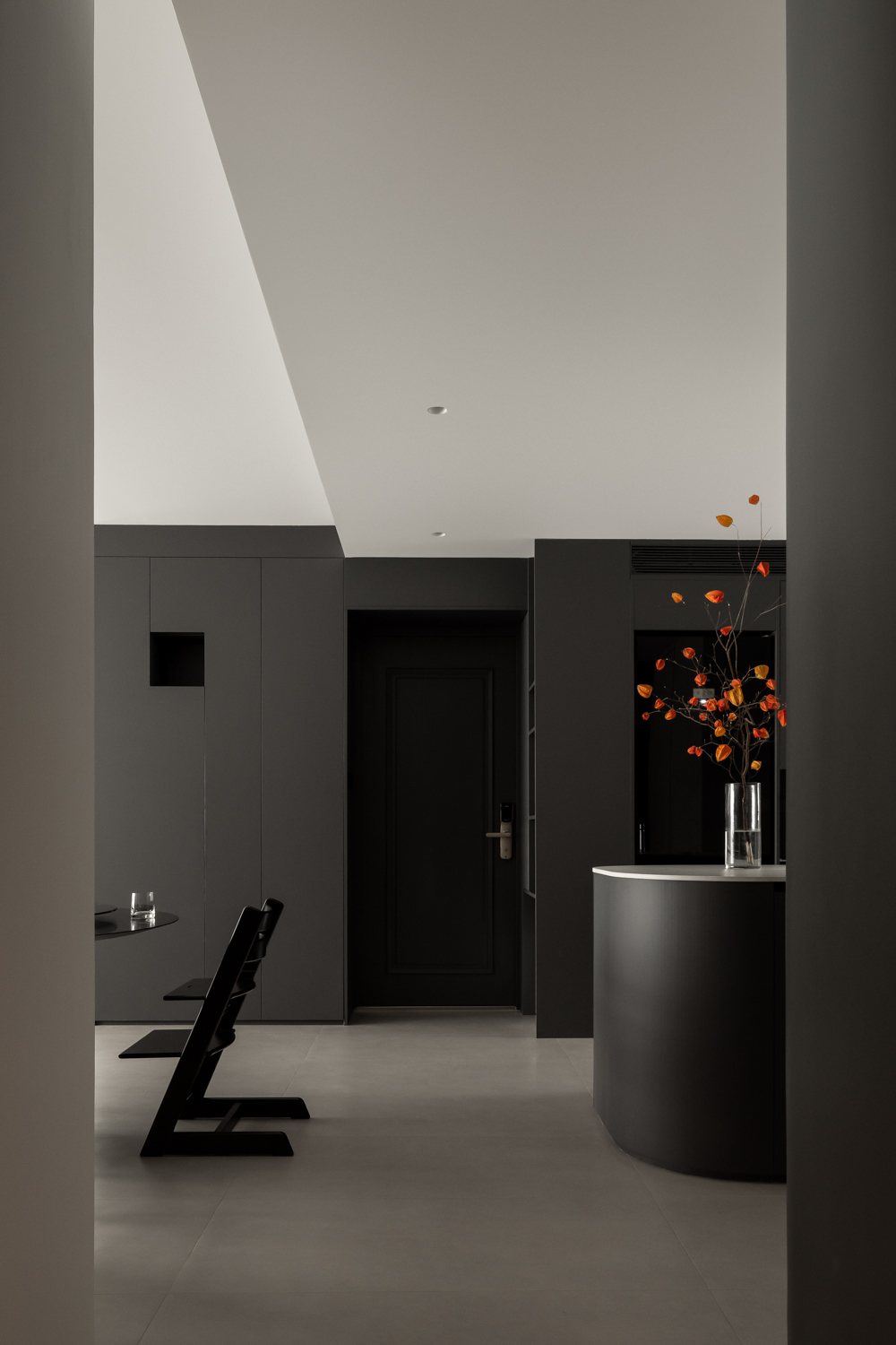
The grey box with the function of entrance cabinet cleverly hides the bearing columns and pipes, etc., and uses the alcoves and slots to create the golden proportion between virtual and real, turning the original structural defects into the highlights of the space.
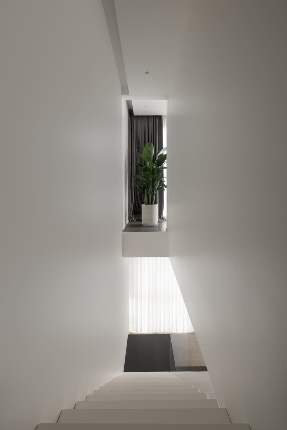
The staircase serves as a transportation hub and a dynamic guide to the upper and lower levels, and is regarded as the center of the whole space. White piano painted floating ladder, let the whole space become more light.
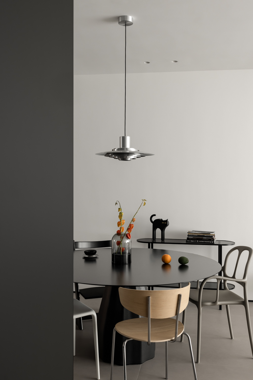
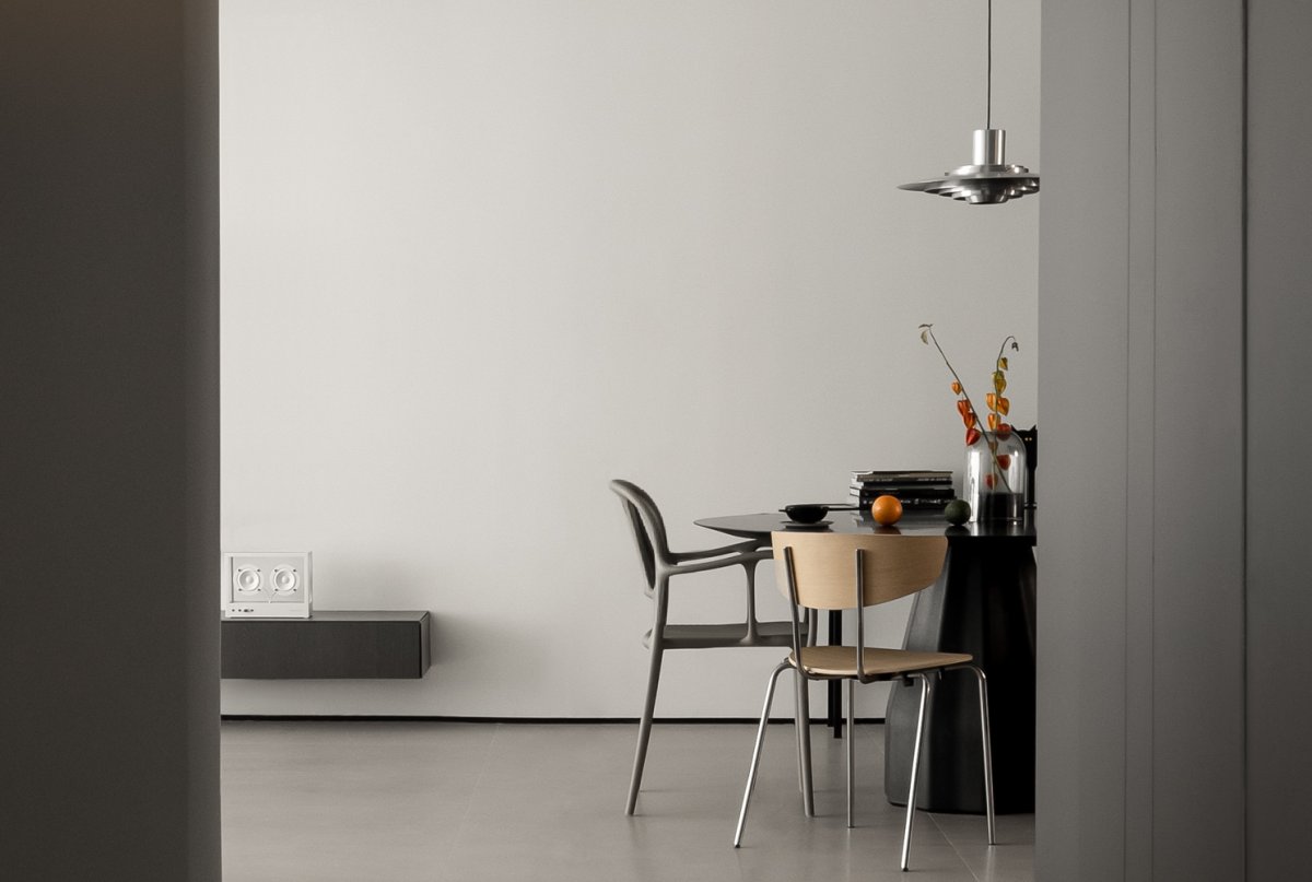
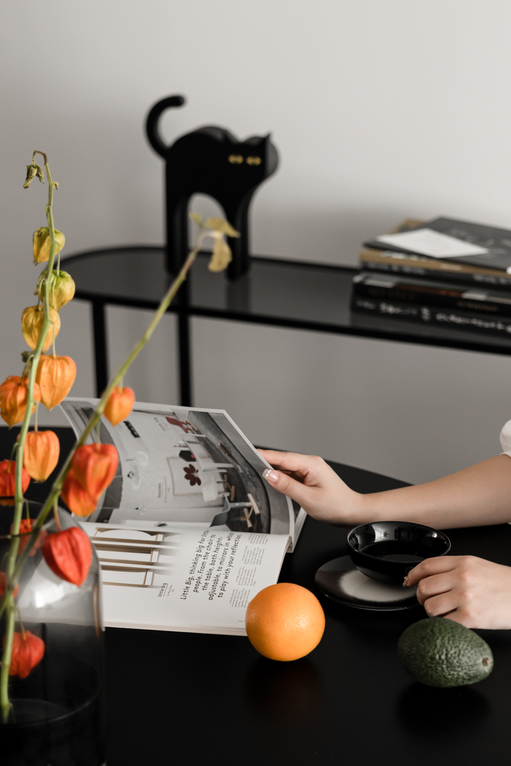
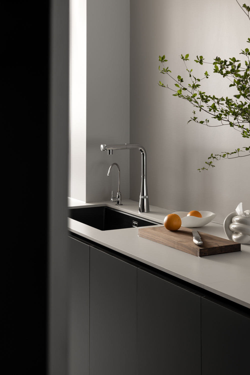
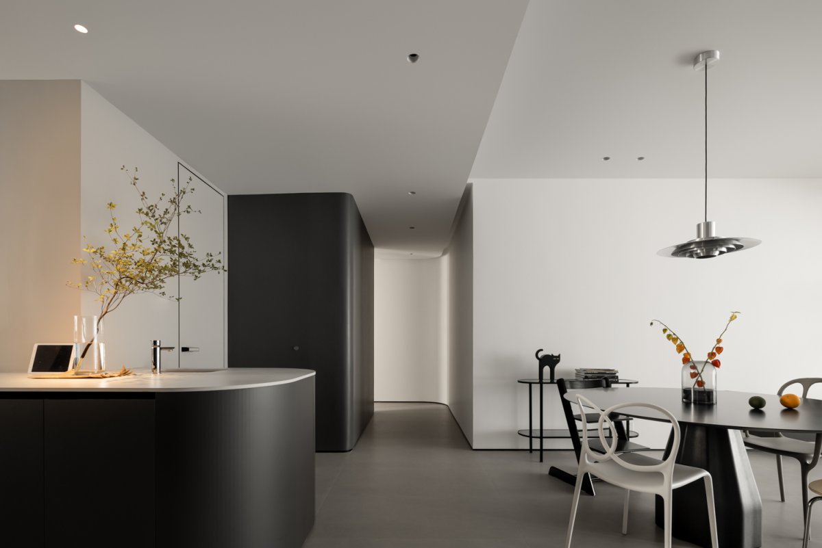
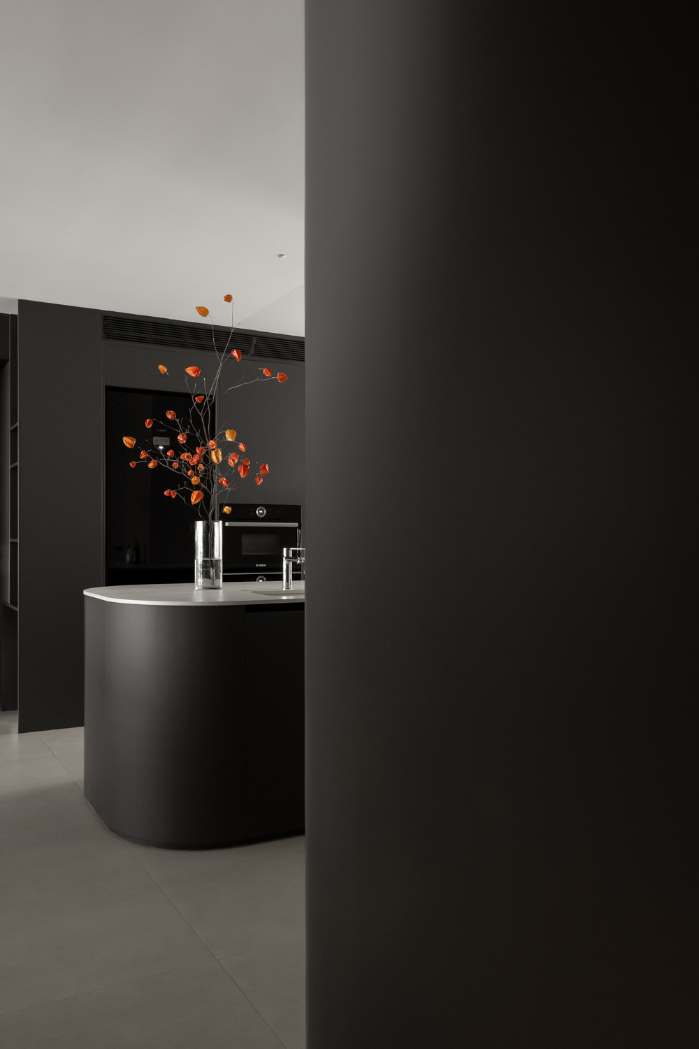
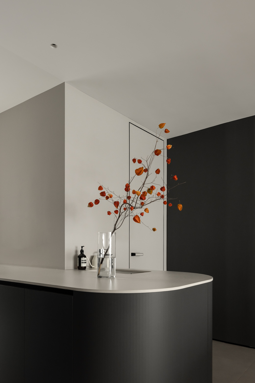
The kitchen has been transformed into a super high-quality Chinese kitchen + western kitchen, which makes up for the lack of space in the original restaurant. The extended multifunctional island also makes the two life scenes of cooking and dining seamless, and the moving line is smooth and free. The fresh-looking kitchen also has a powerful storage function. The dining room connects to the living room and kitchen, where you can often see a family playing. Different chairs complement each other in shape, making the space very interesting.
The washbasin is like an island in the middle of the kitchen and bathroom two functional areas, serving the whole floor space, whether it is entering the door or before dinner, it is very convenient to wash your hands in this position.
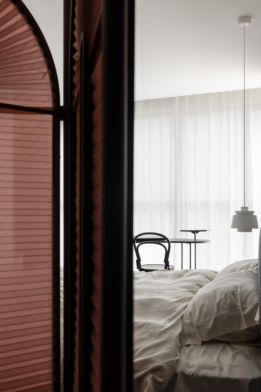
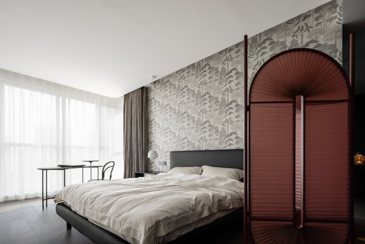
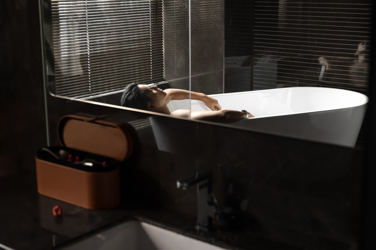
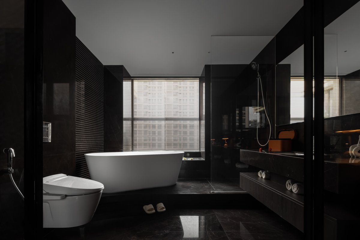
The master bedroom bathroom is a strong dark style of the hotel, we plan according to the spatial scale, the bathroom space with simple lines, open space let the action more freely, creating a lazy noble and calm atmosphere. Minima Moralia screen, curved outline and light pleated fabric material, coupled with the strong color of the whole body, very attractive in the space, very infectious.
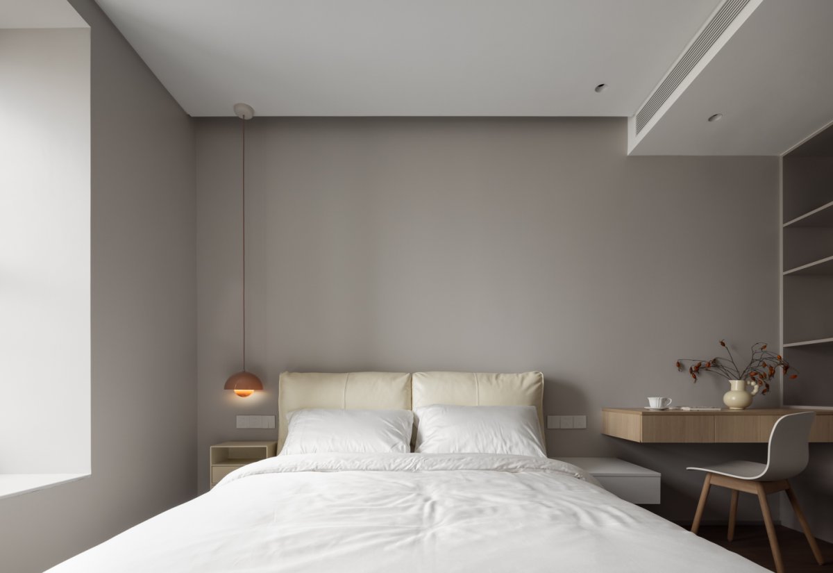
My daughter's bedroom is bright and cozy, with a creamy white bed and Montana nightstand, and a chandelier with a touch of coral powder to give the space just the right amount of gentleness. Footlights outside the room provide safe lighting for getting up at night.
- Interiors: Ruyi Space Design
- Photos: Chuan He Yinxiang
- Words: Qianqian xie

