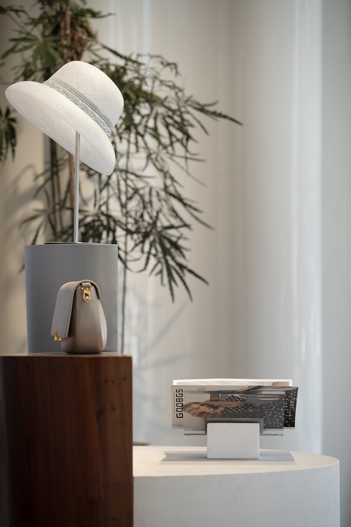
Space is the box of products. It sets aside the definition of style, does not attach to the current and popular style, and allows time to change, and becomes its own style.
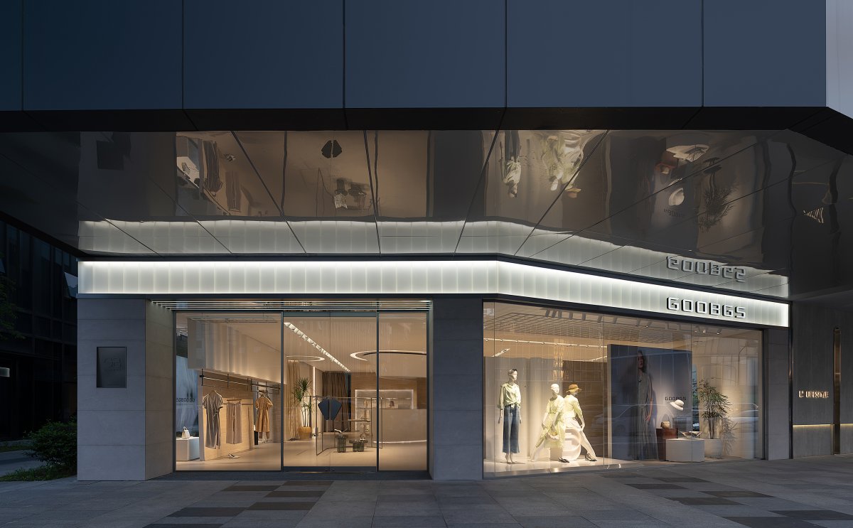
The project is located in Yishang Town, Linping New Town, Linping District, Hangzhou. The GOOBGS flagship store has the advantage of a bird's eye view, and both facades are storefronts facing the street. In the design, it is necessary to pay full attention to the image of the external development.
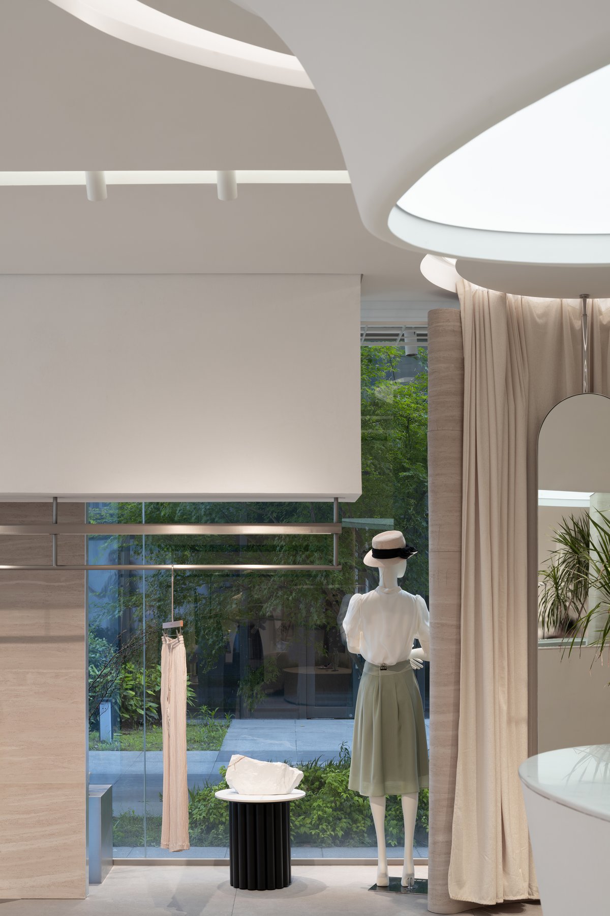
During the day, the transparent art glass is layered like the pleats of haute white.The roof of the long cantilevered eaves is made of mirror material, extending the interior scene outward.The entrance adopts the backward space to enter, and enters the room through the transition of the floor mat. The use of soft light, the first suppression after Yang space treatment, so that customers have a sense of enlightenment. The designer hopes that when customers enter the GOOBGS space, they can enjoy the unique emotional atmosphere of the brand at the same time. This kind of atmosphere is expected to coexist with temperament and aura, rather than specific colors and shapes.
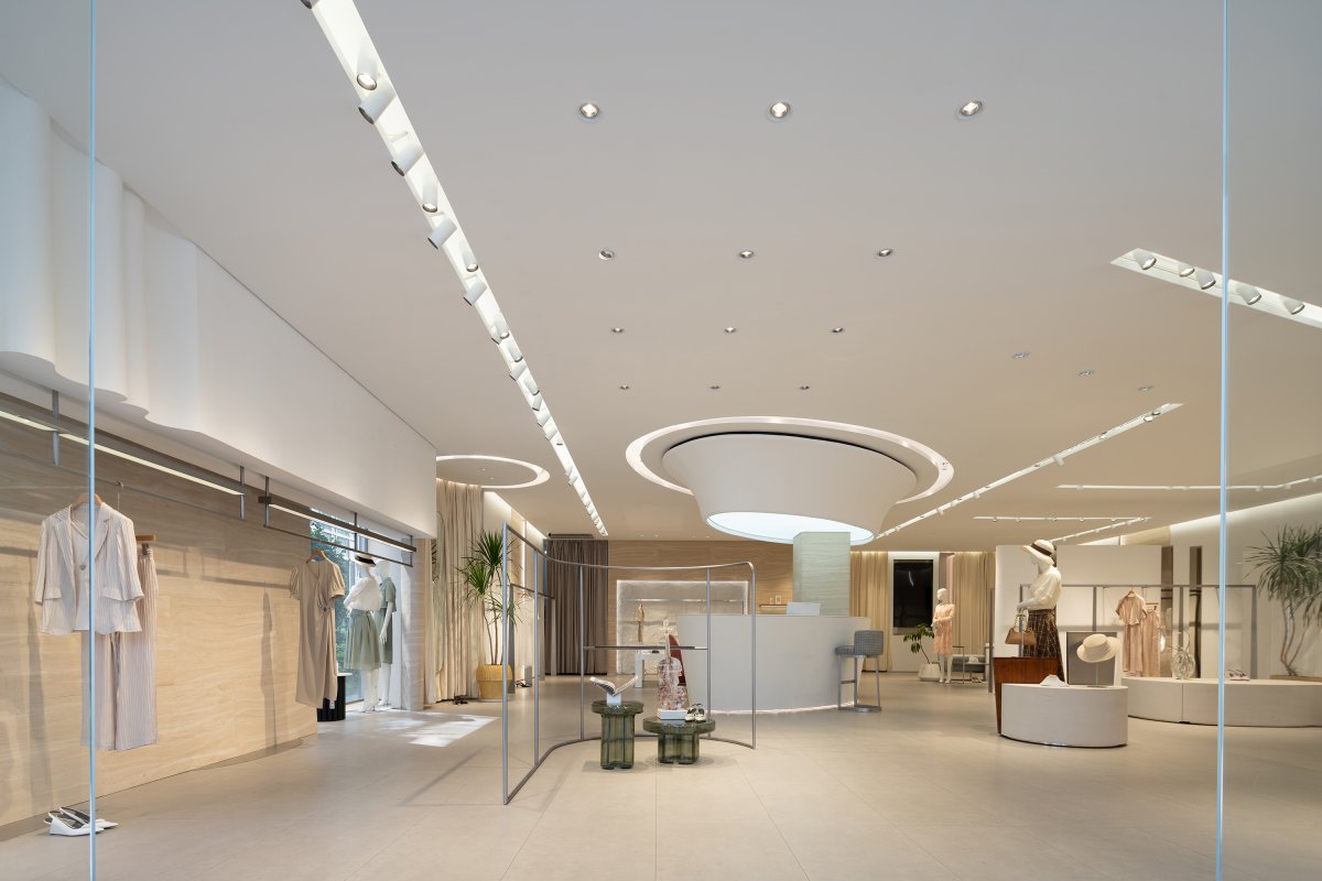
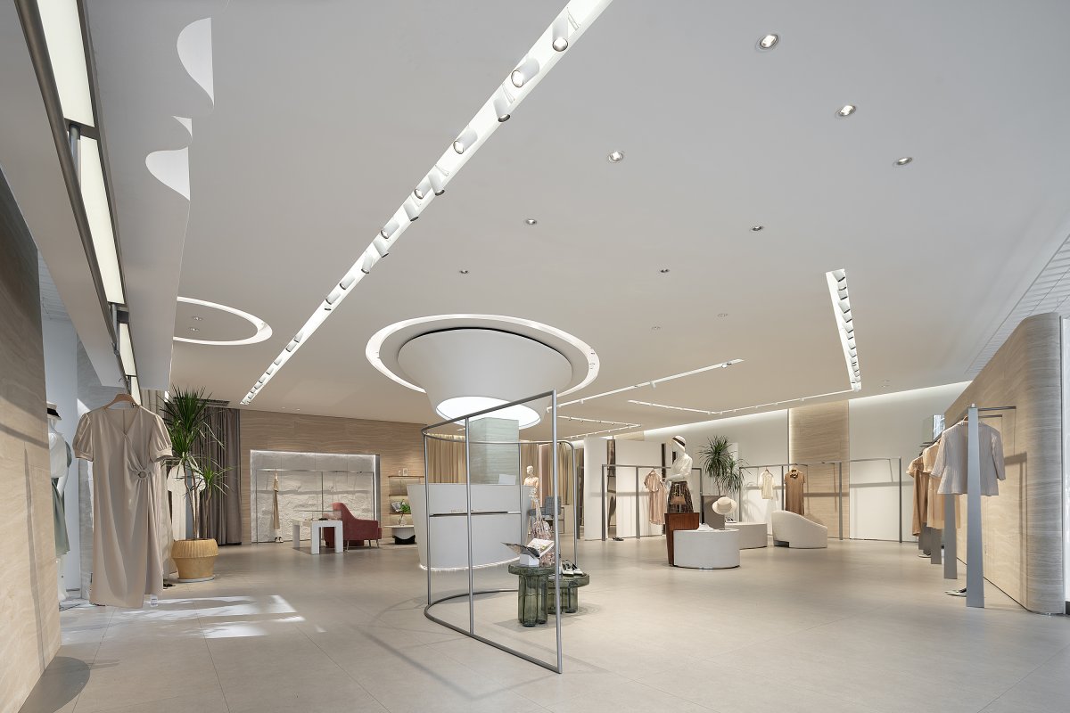
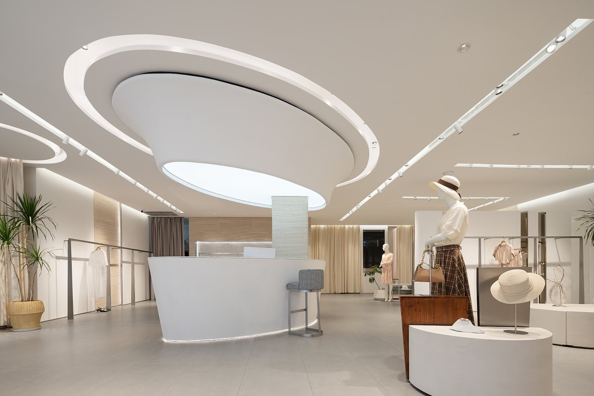
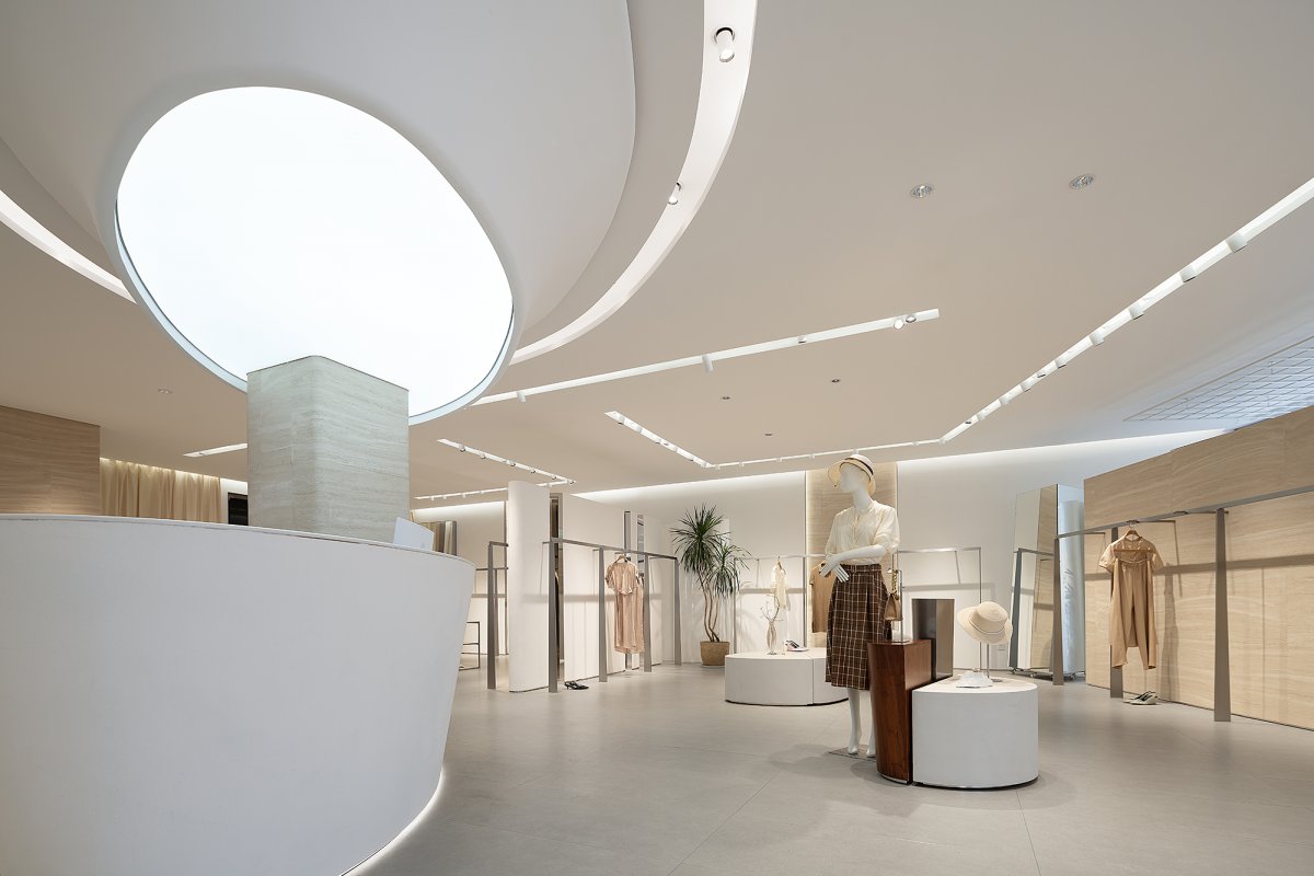
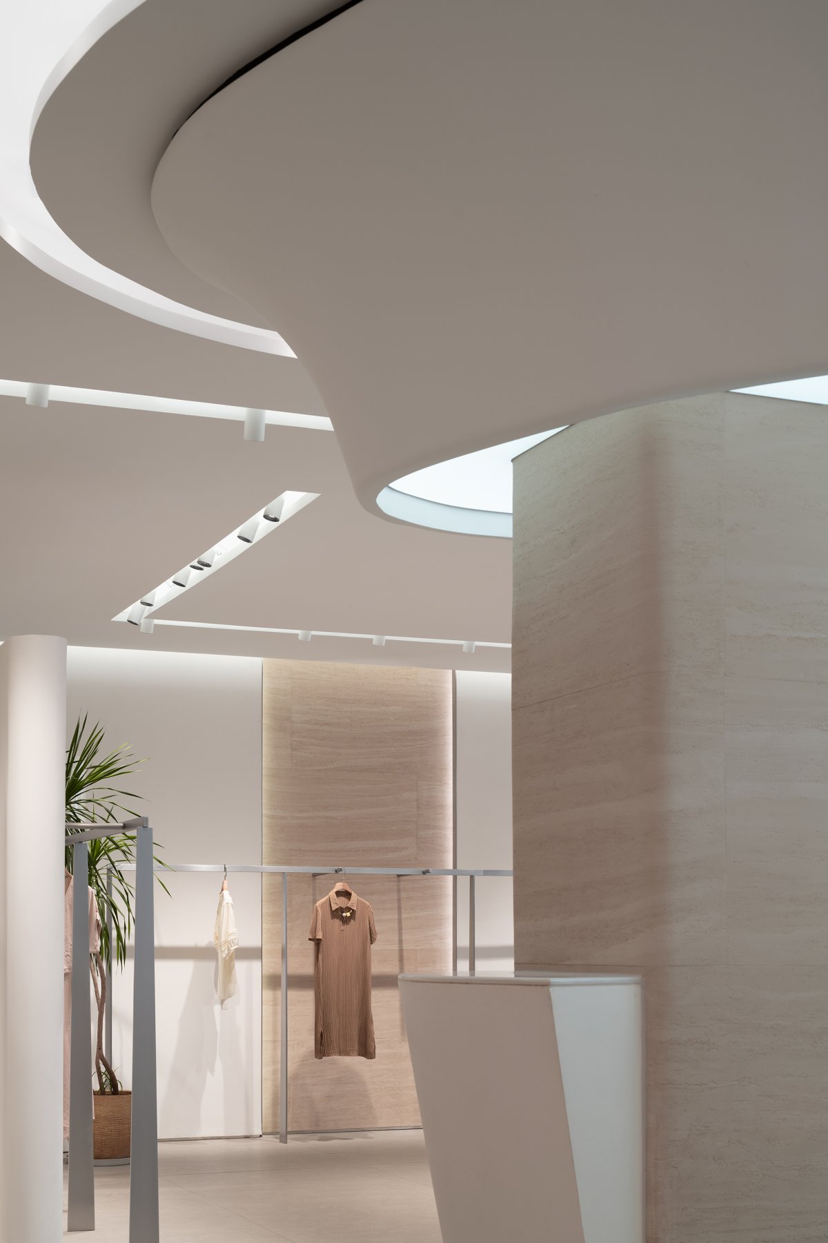
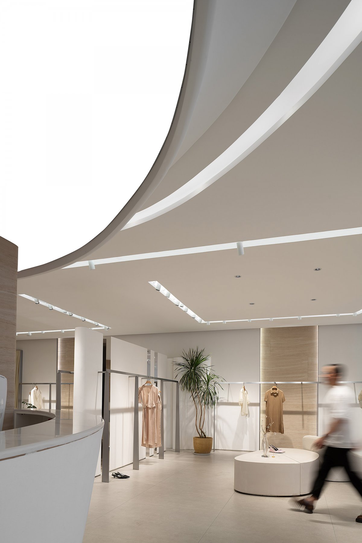
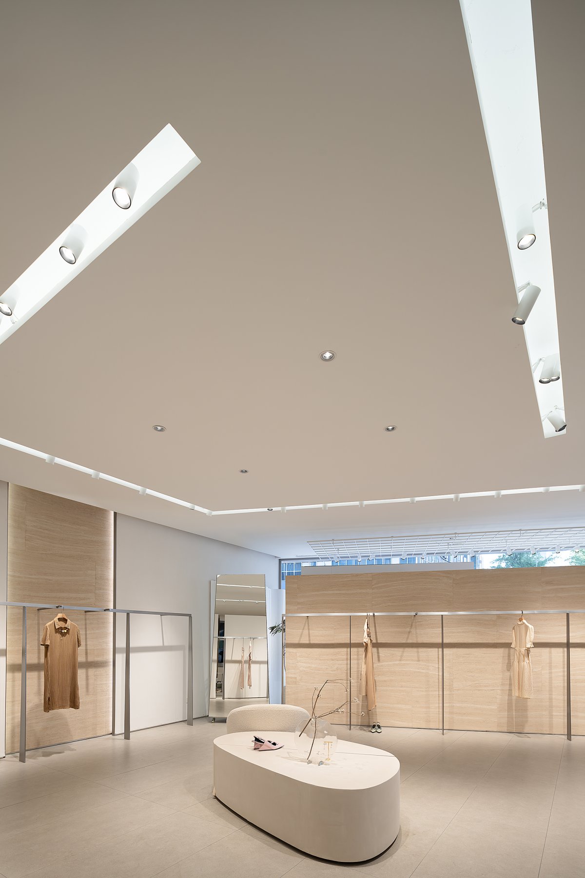
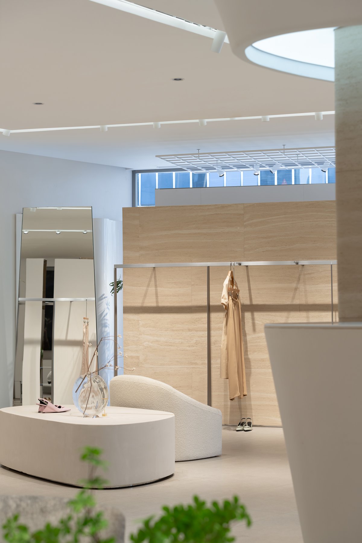
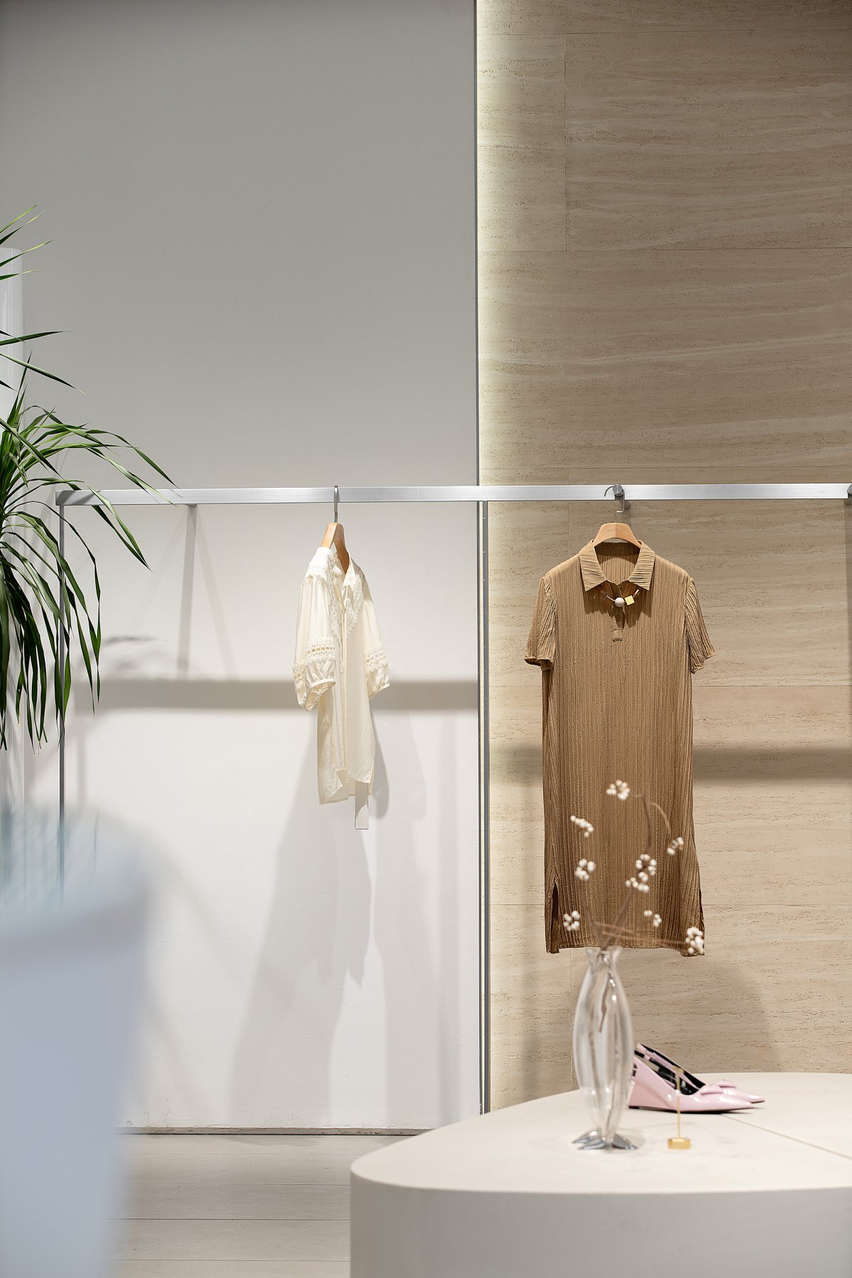
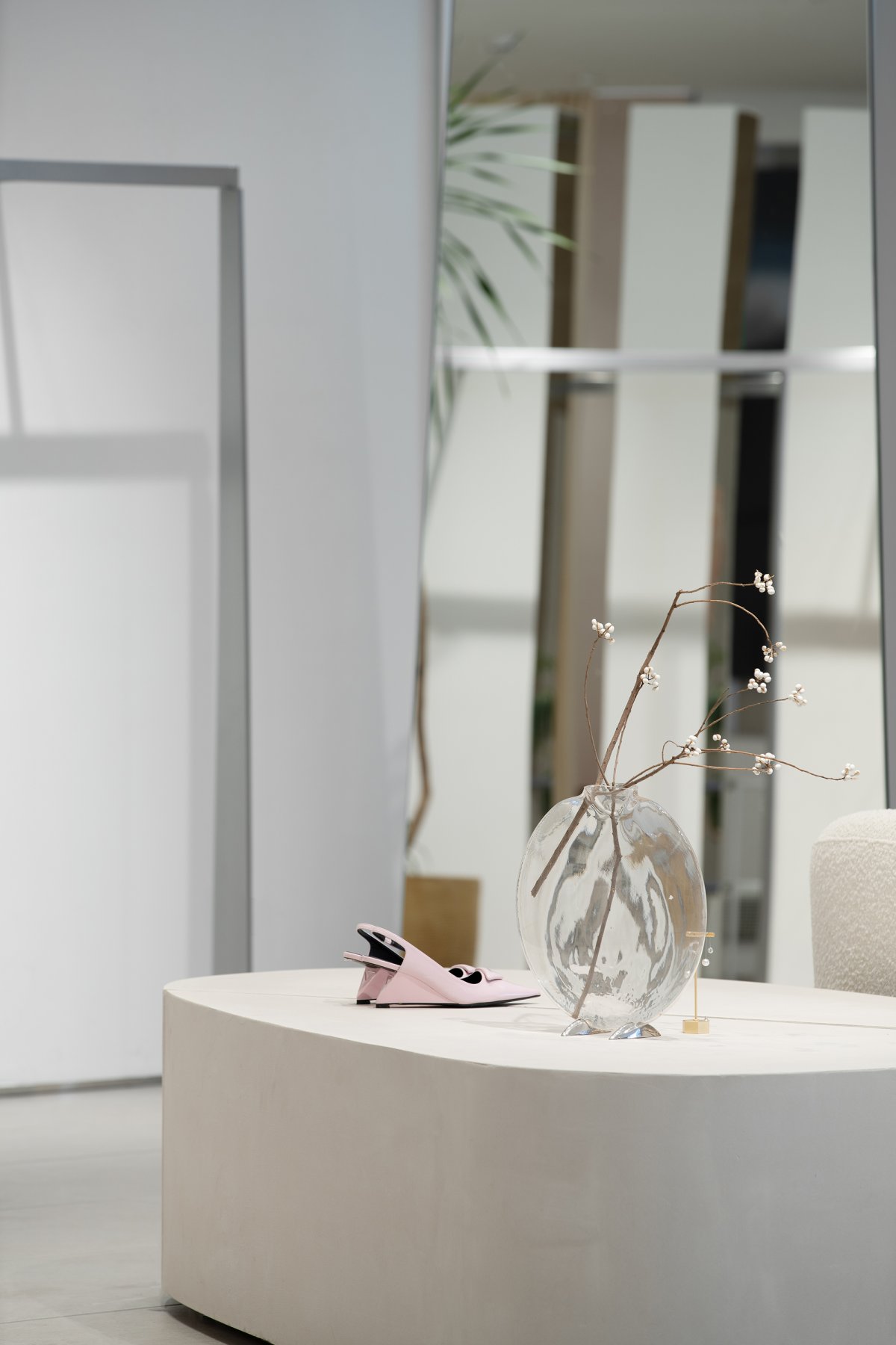
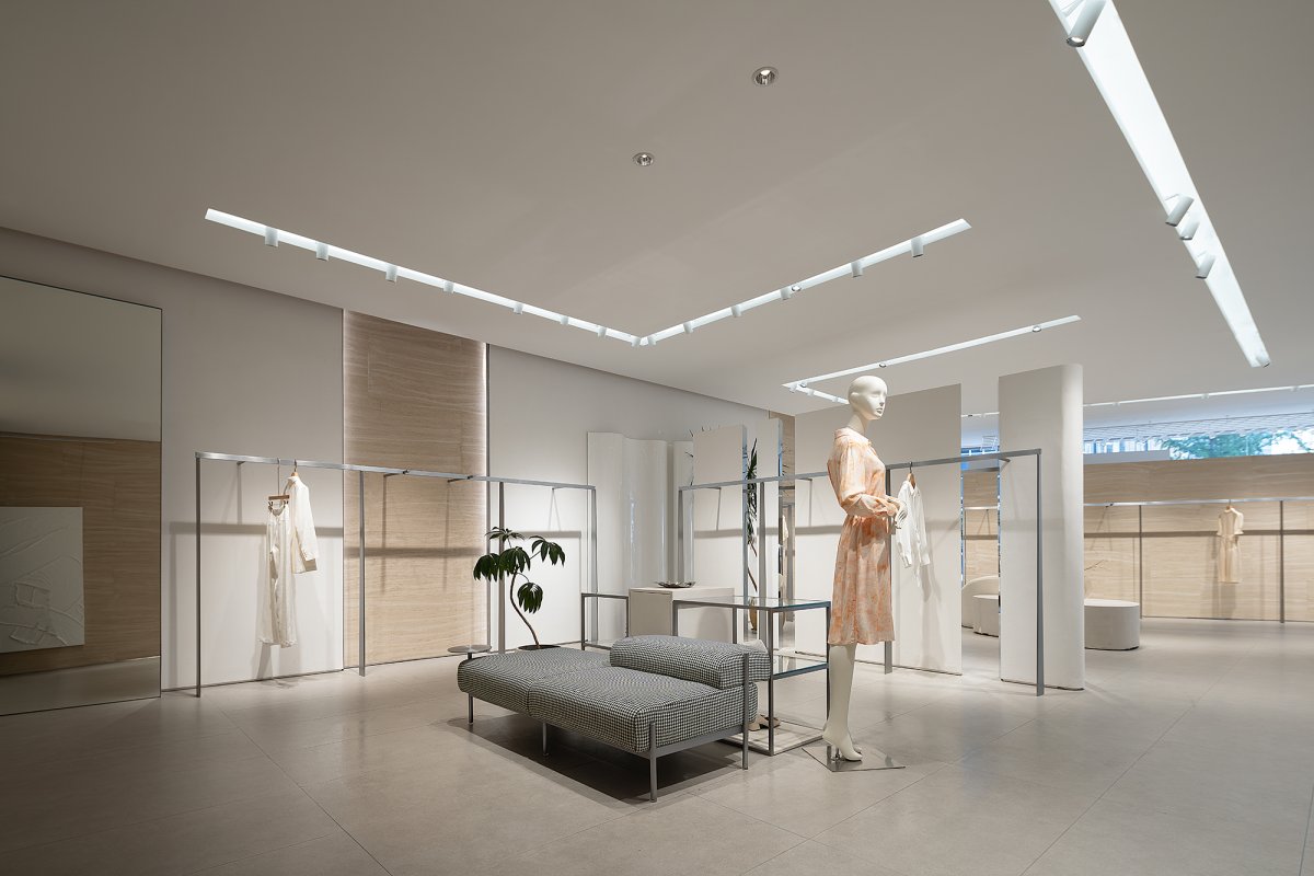
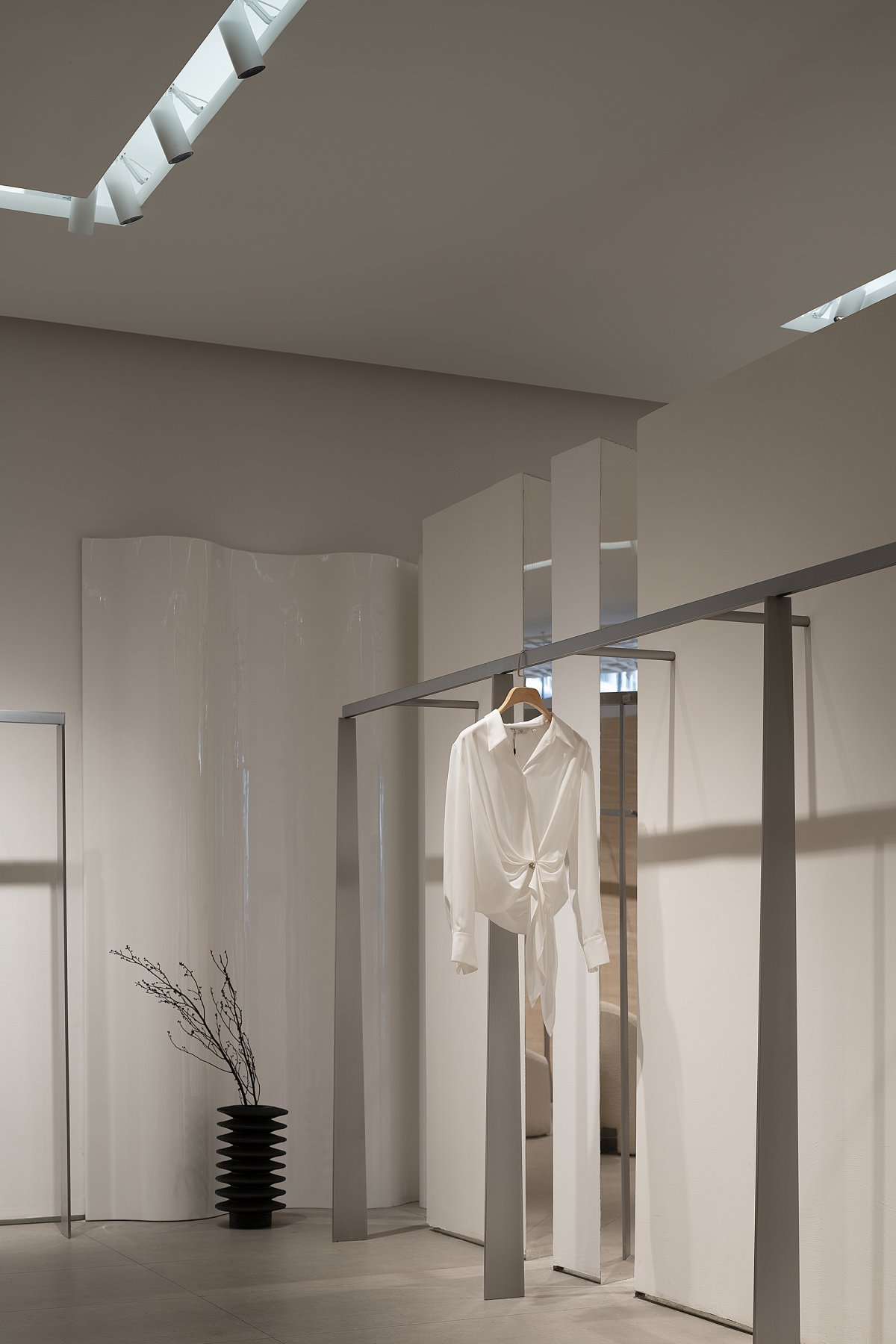
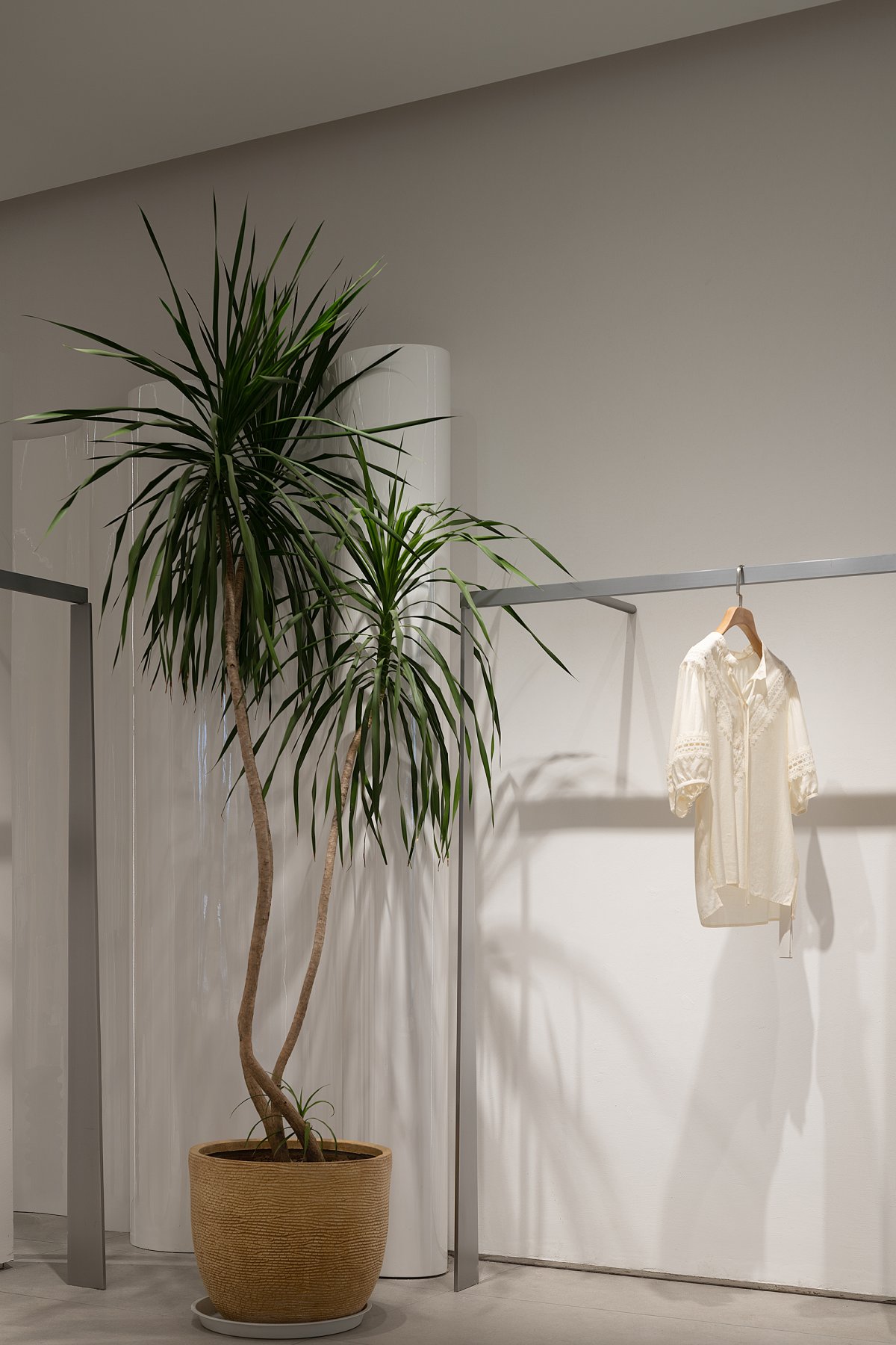
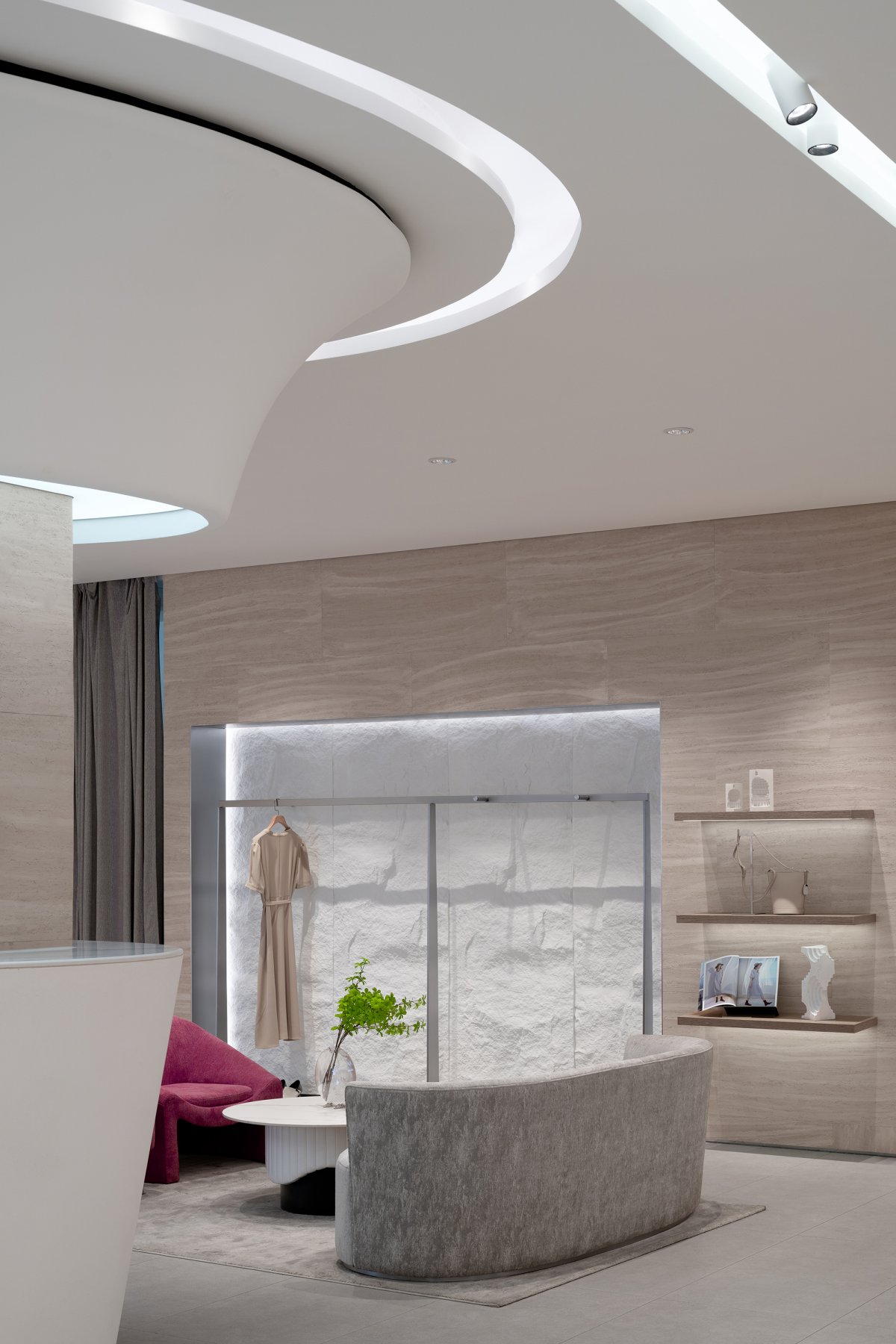
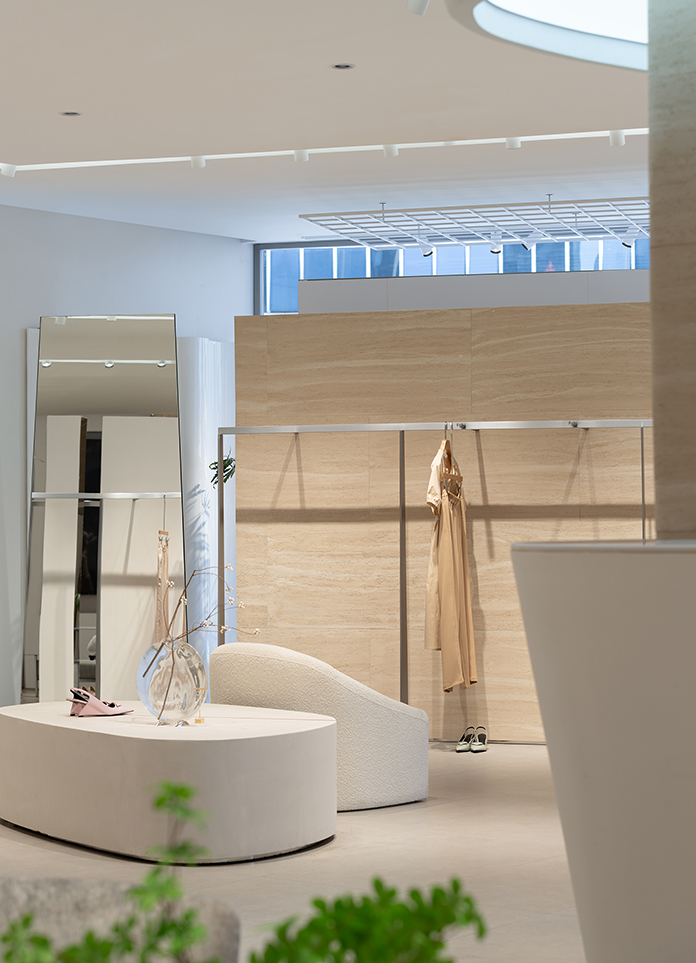
The main body of the space color is off-white, and the local use of cave flagstones for embellishment. The simple and pure space has better tolerance for the product. White is a minimalist and versatile color, and it is also the color that makes all the colors brilliant, bringing, relaxed, comfortable and relaxed space. Through the shape of the general block and simple, crisp lines to the space to bring unique brand vision, to avoid the fleeting fashion, create a unique brand image, lasting. The ceiling strip not only increases the expression of beauty, but also increases the diffuse atmosphere of the whole space light. Indirect lighting brings a relaxed and elegant space feeling.
As the flagship store of the brand, service is very important. The service desk is placed in the center of the space in the design, serving the whole body like a heart. The curved surface below, similar to the shape of ingot, supports the whole body and serves as the visual focus of the space. The facade of the cashier, the elegant curve shape.The treatment of different materials and shapes in the wall design brings diversity to the display. The regional partition is composed of building blocks, which are also light colored. The elegant piano paint curved surface modeling makes the wall transition more silky. Different angles of tilt are intergrated by mirror material, and the design form that does not reach the top releases the connection between the facade and the ceiling.
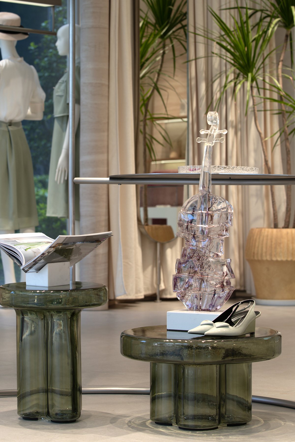
Design pay attention to nature, quality, pure, withstand the test of time, soft installation to increase a little jump color and device, more interesting space, bring more flexibility for the later period.
- Interiors: Tizi Design
- Photos: YJF Architectural Space
