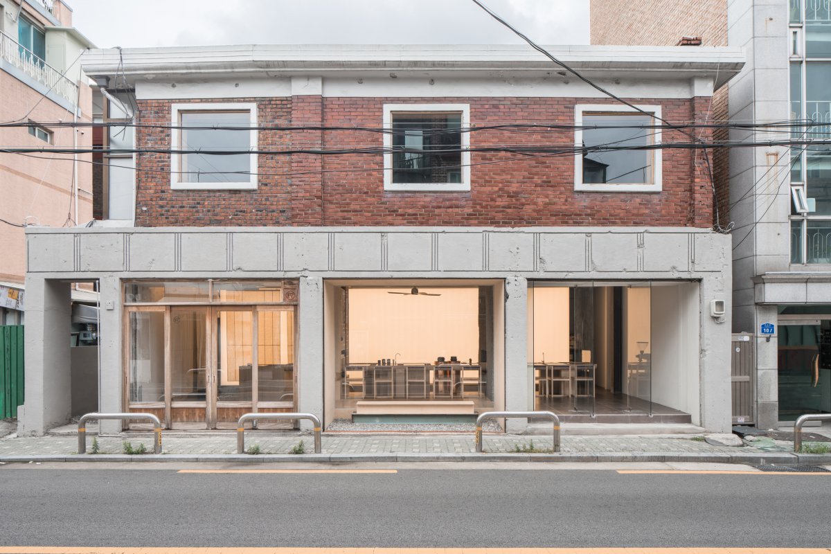
The building location, Mangwon-dong, is a residential complex that is rapidly changing due to the inflow of a new commercial area. The building which was built in 1974, has been expanded and transformed several times and requires structural reinforcement.
The first floor of the building consisted of three independent commercial shops and the second floor was used as a family home, which was the common type of building in Mangwon-dong. Workment aimed to meet the commercial needs of Eert, who has presented an experimental space on the subject of urban rest while respecting the memory and time of the old building in the old neighborhood.
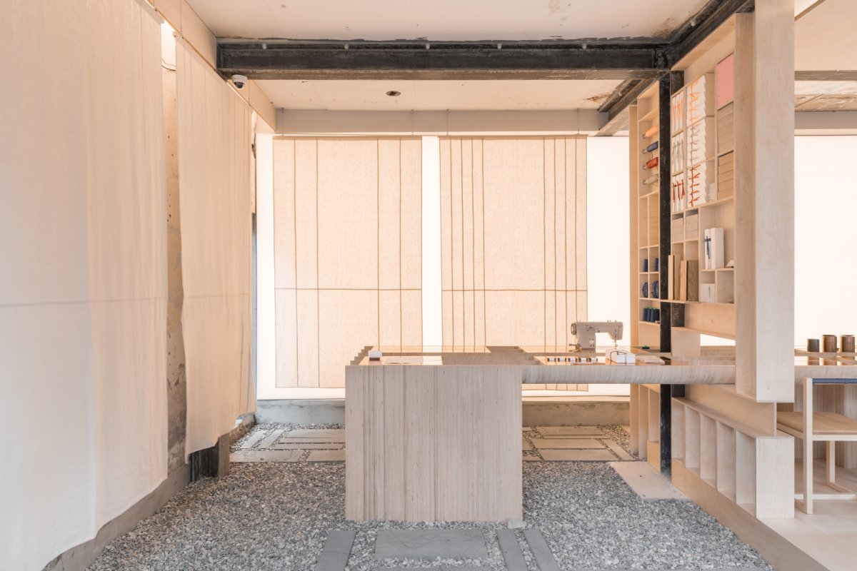
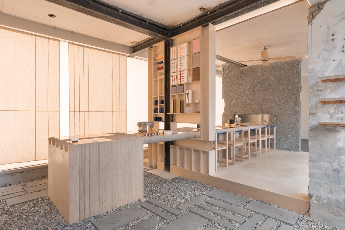
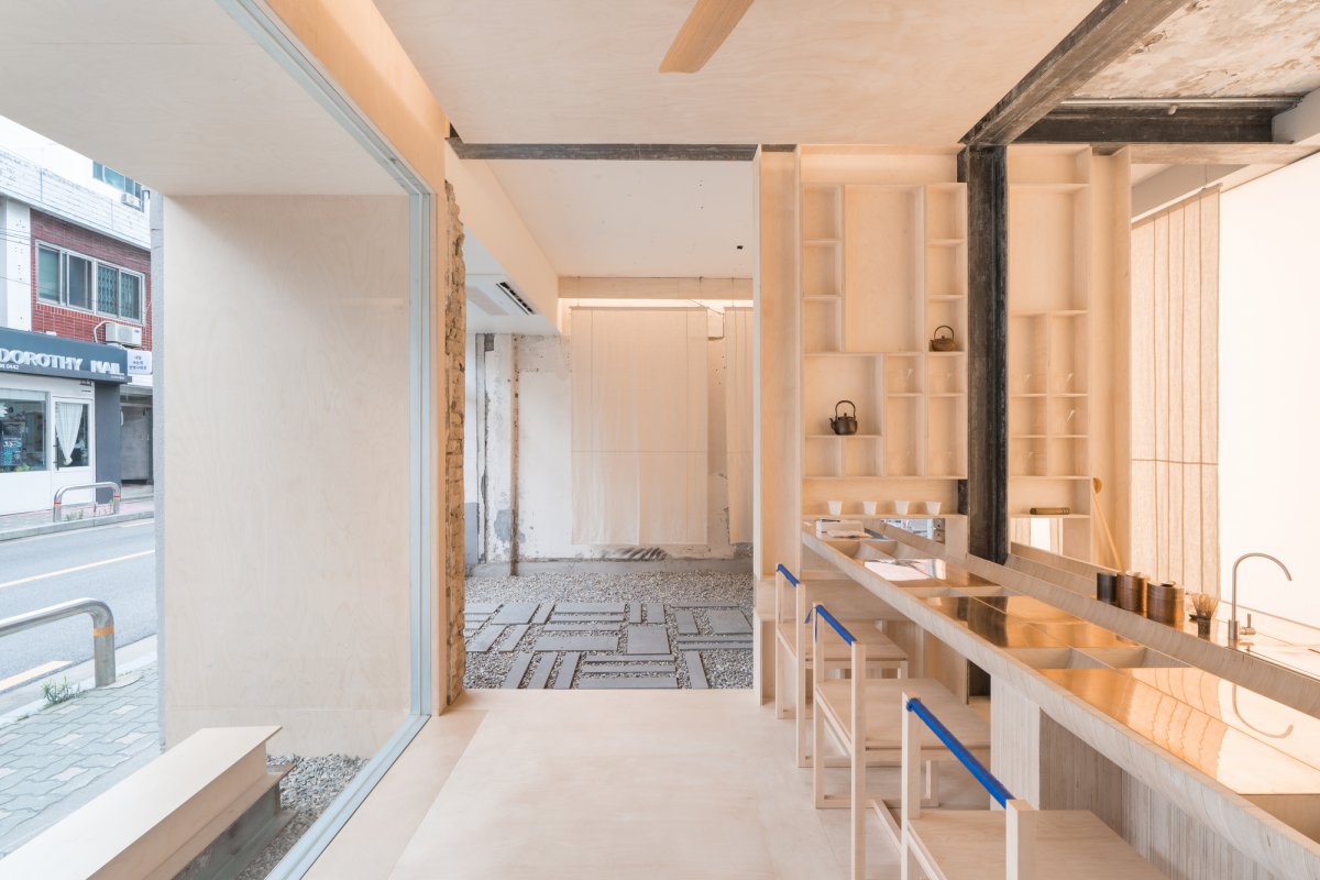
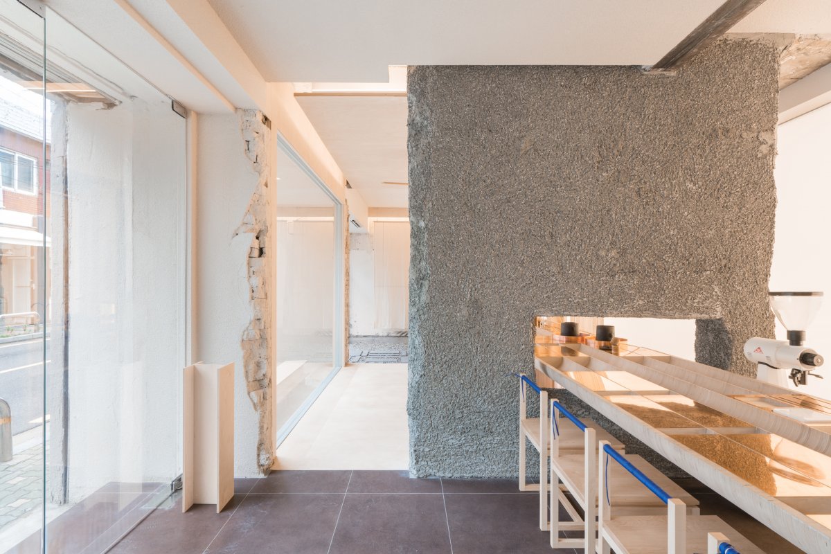
The first floor, where there were three different shops, is divided into a space for information and packaging, a space for brewing tea, and a space for brewing coffee. The three spaces designed using the existing spatial configuration have different finishing materials and space organization and continue the context of the Mangwon-dong, which consists of small shops.
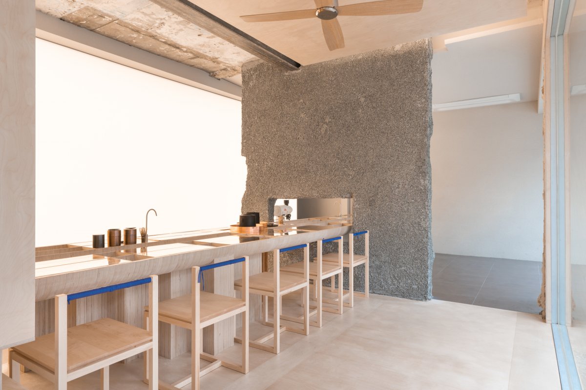
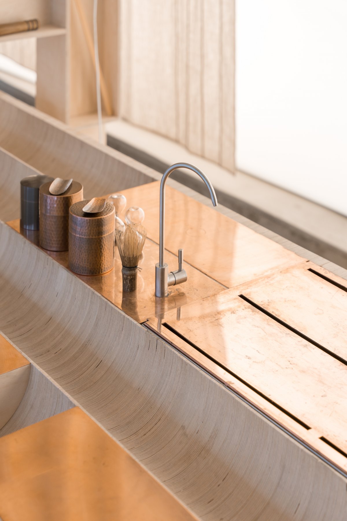
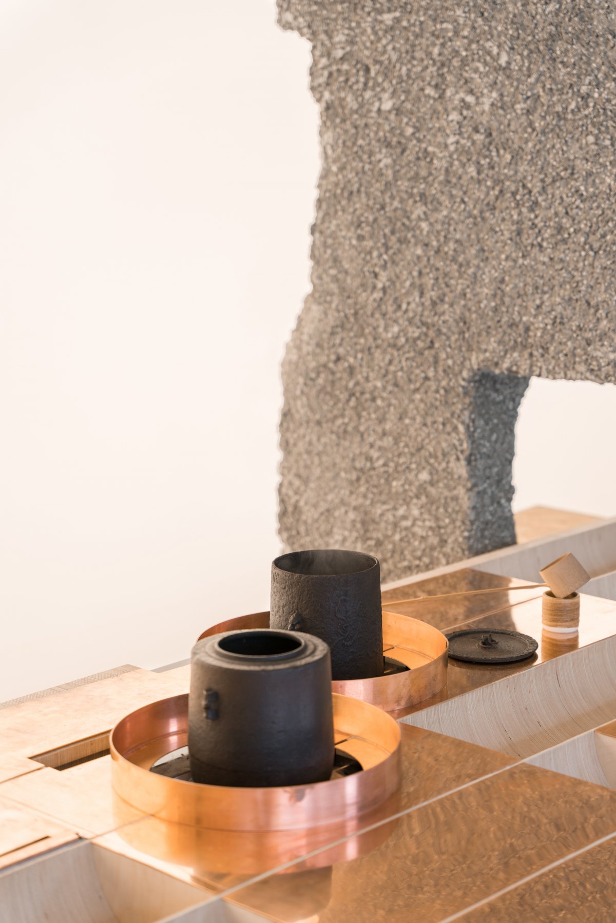
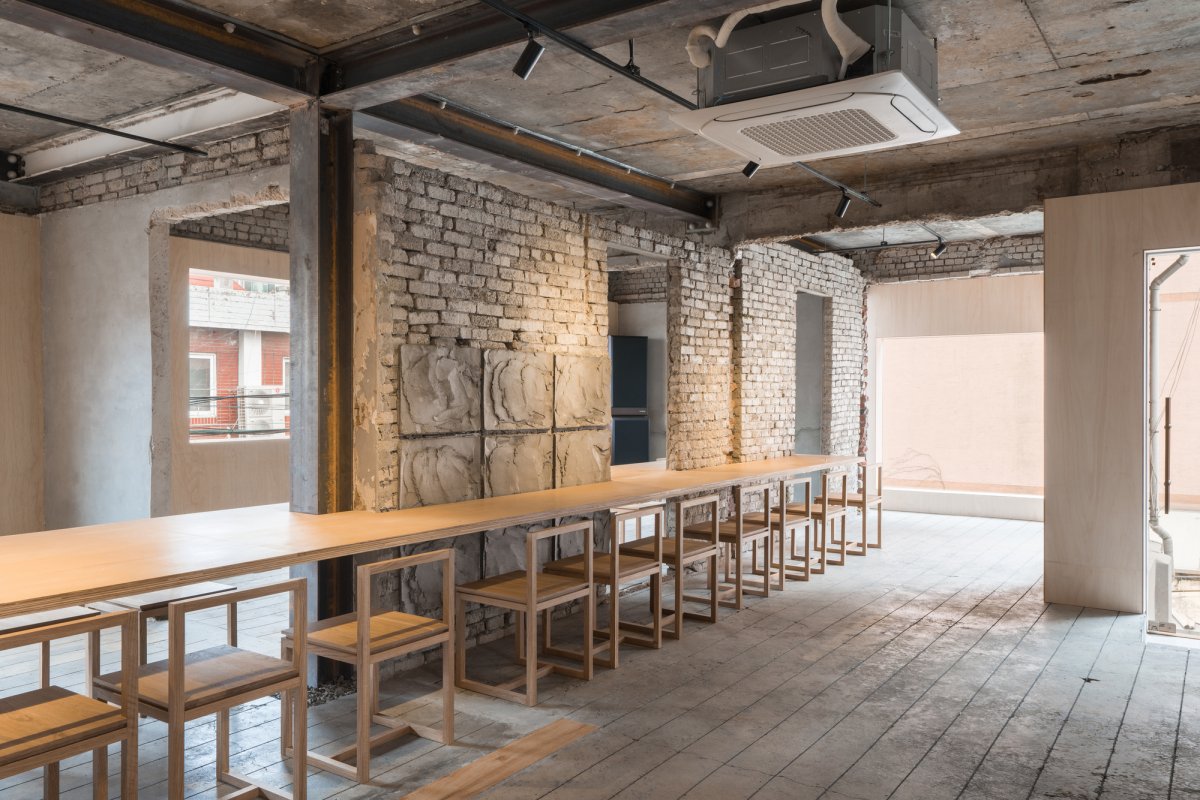
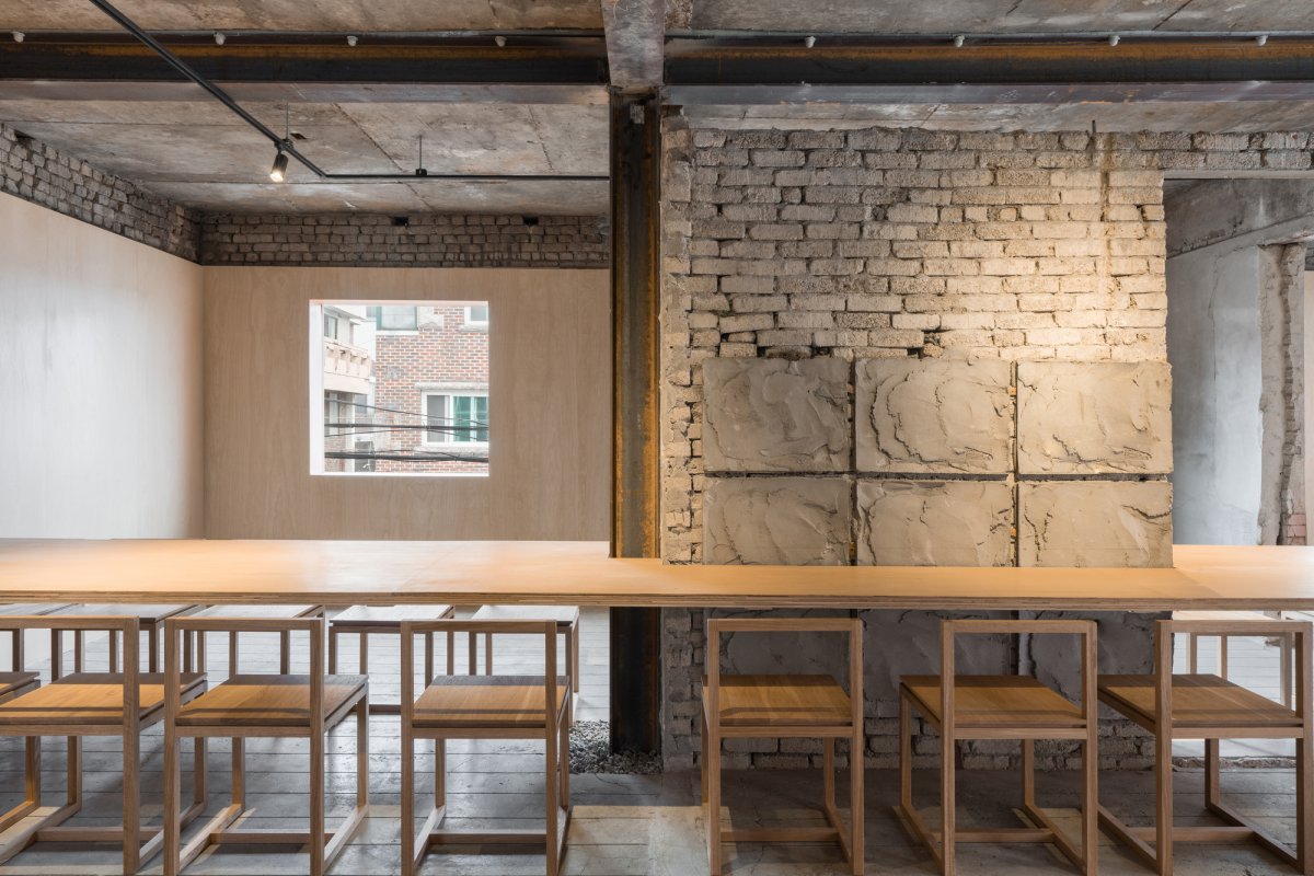
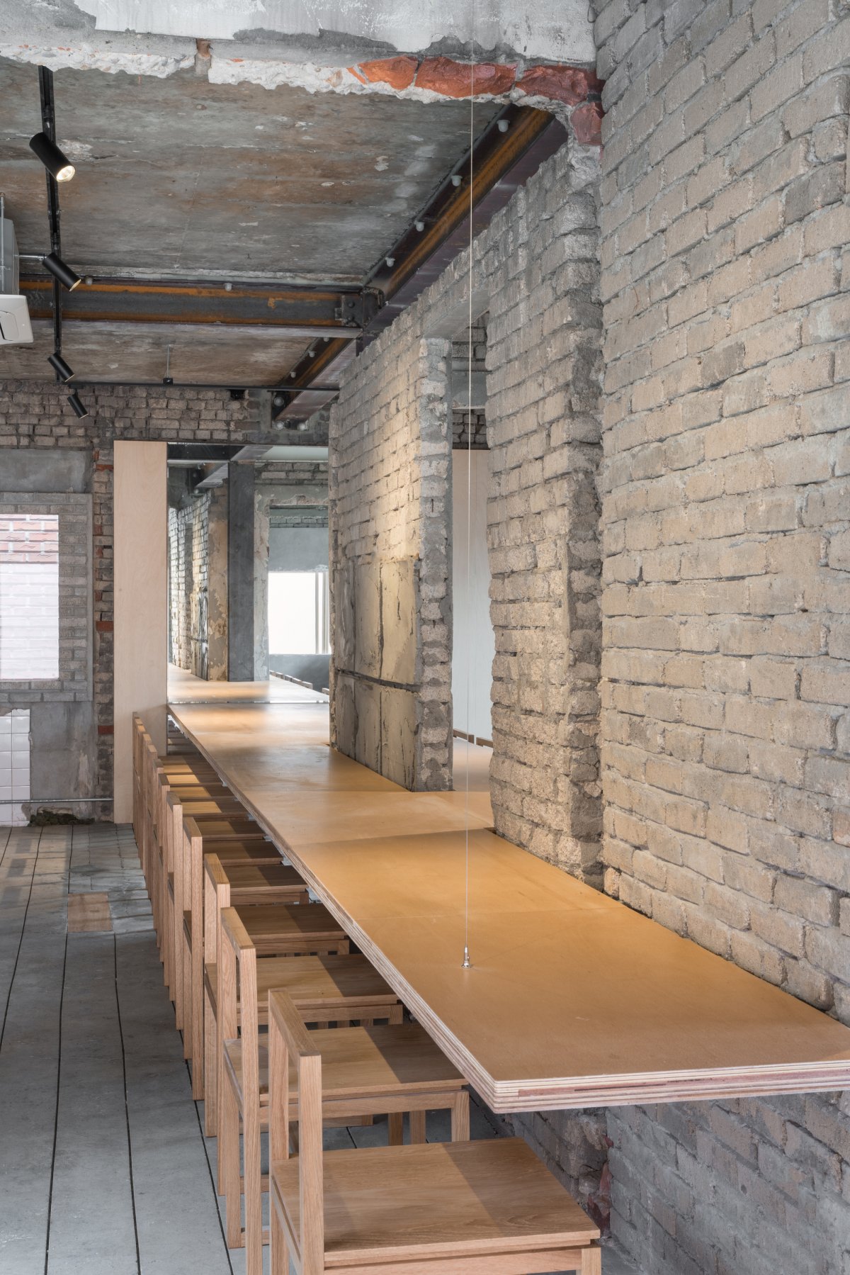
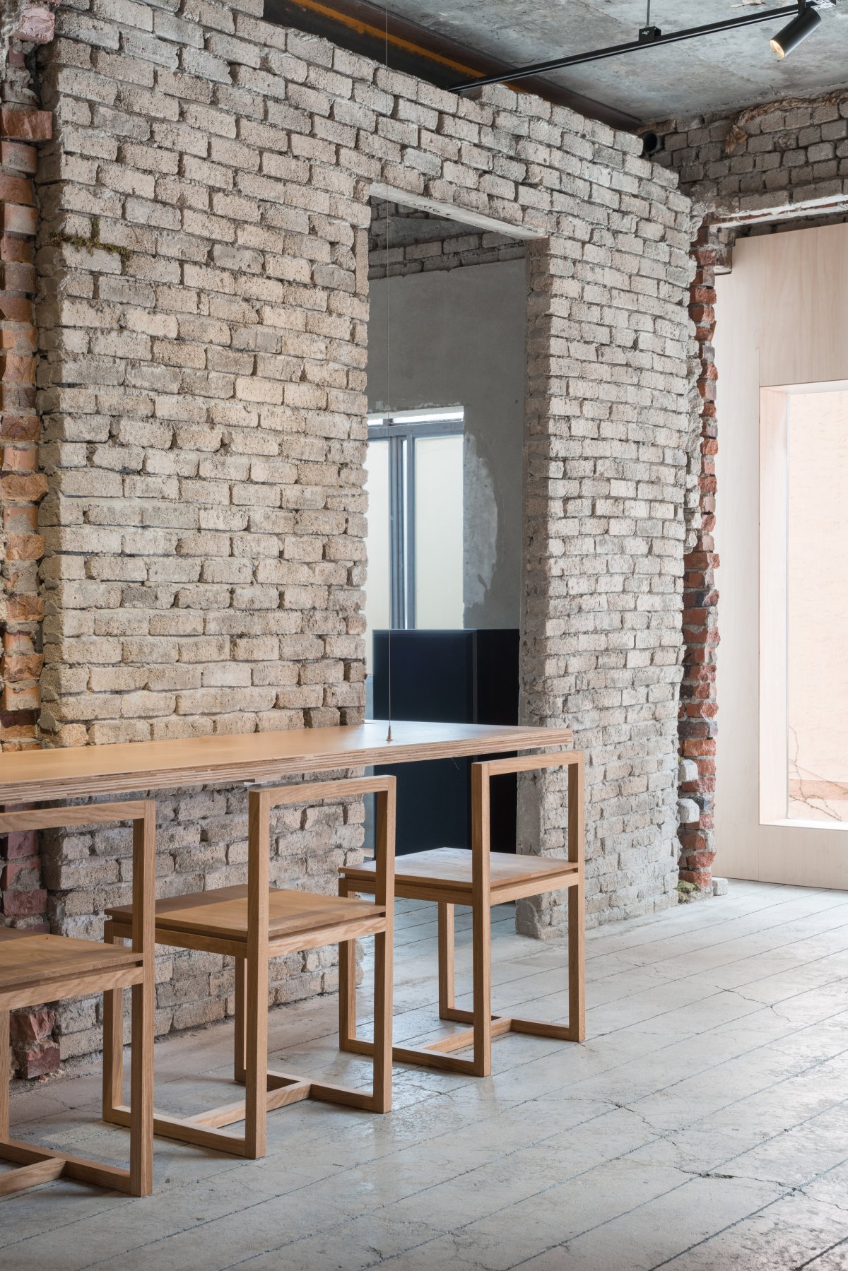
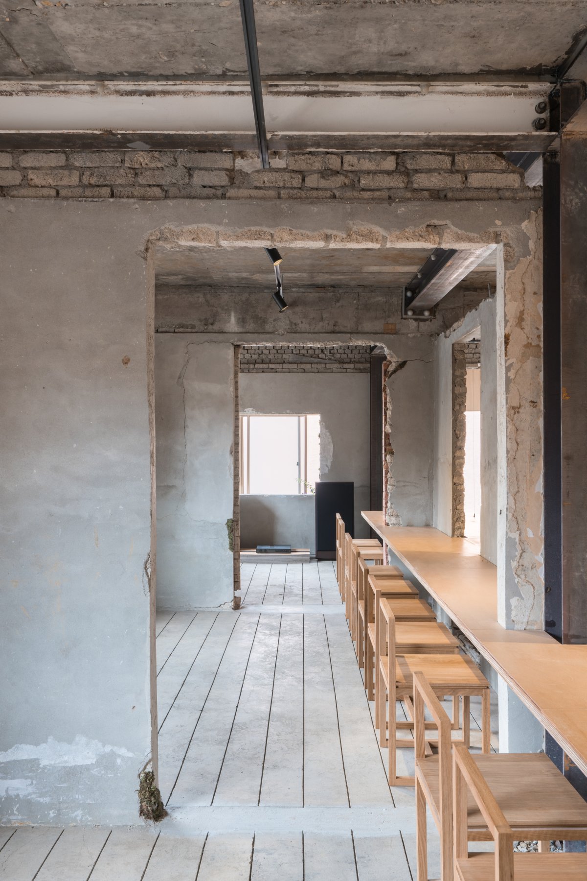
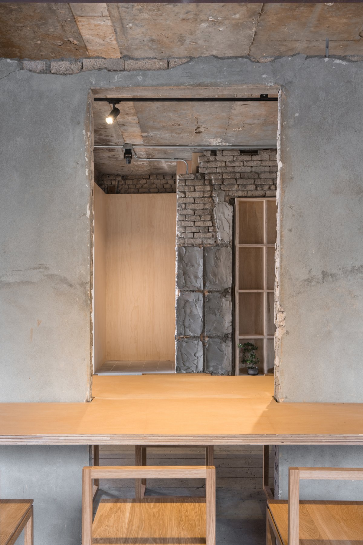
The long table in the center, which reinterpreted Eert's zen garden, connects three different spaces. The wall lights behind the table allow focusing on the act of making coffee and tea and provide customers a wonderful experience. This light illuminates the traces of the existing space and newly designed elements while at the same time illuminating the streets and attracting people's attention.
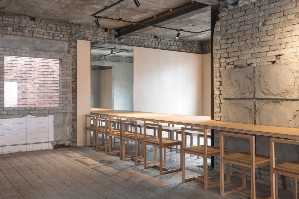
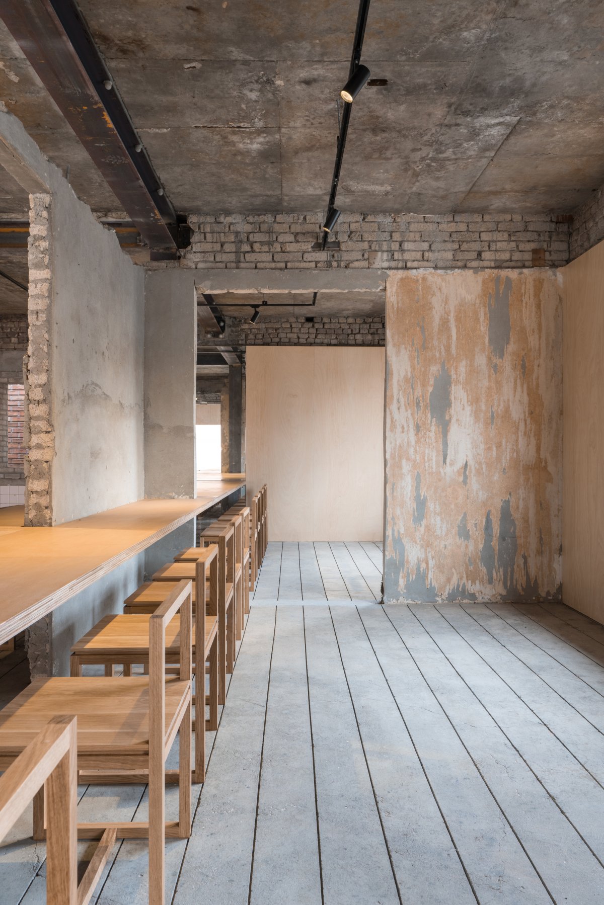
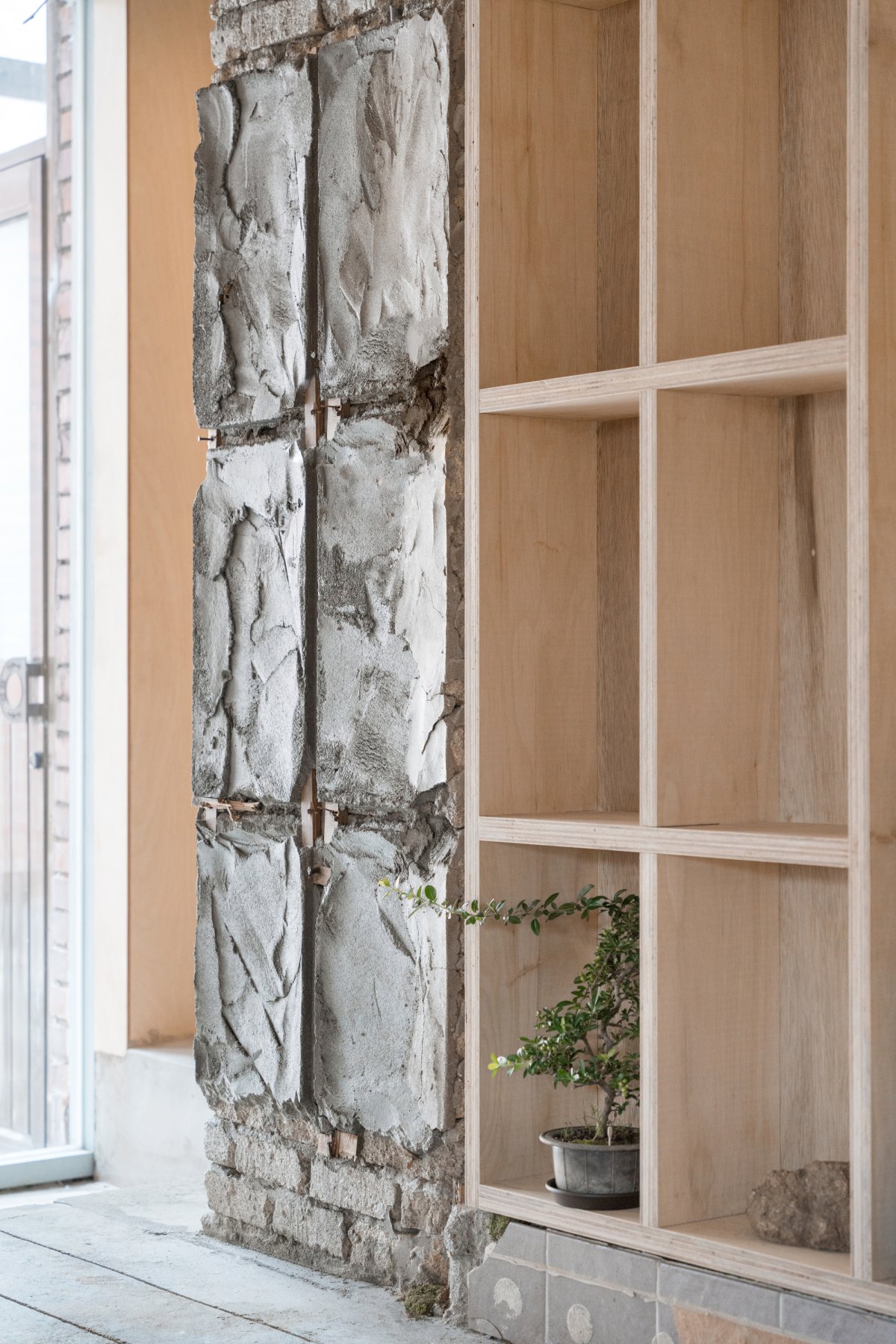
If the first floor was a space to focus on making tea and coffee, the second floor should be a more comfortable space for people to use. The walls, which lost their structural role due to structural reinforcement, showed a common space organization of the home. So, Workment demolished these walls to a minimum when connecting the entire space. Consequently, the wall served as a decorative part of the interior, serving as a furniture structure for the long tables surrounding the wall, as well as blocking each other's attention.
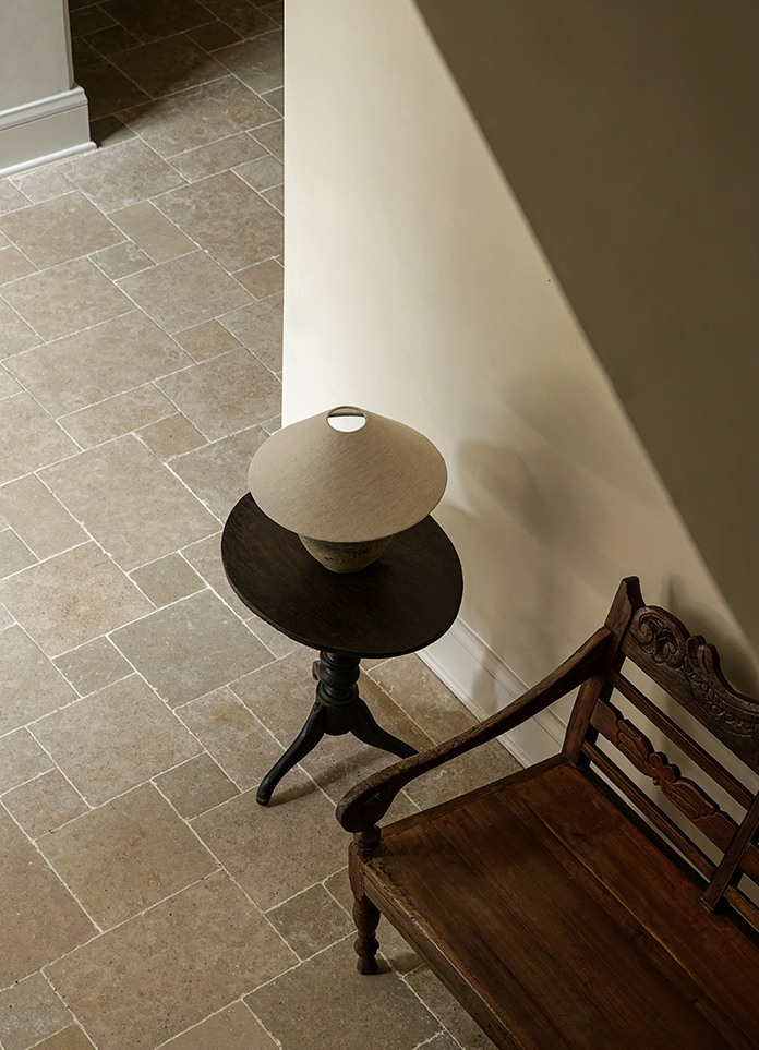
Workment also focused to surface finishes such as wallpaper, floor coverings, and ceiling decorations commonly used at home. The grid of floorboards was carved into the floor, the ceiling decoration was used lighting, and the sash frame was used as decoration of the counter to create a unique atmosphere for Eert by unfamiliarly reconstructing the familiar materials demolished in the existing space.
- Architect: Workment
- Photos: Yousub Song
- Words: Gina
