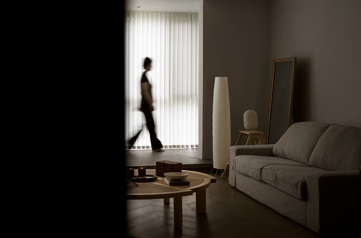
Le Corbusier once proposed the concept of "architecture walk":
The observer's path through the architectural space,
As people move forward,
The flowing space expresses itself,
Architecture should be "passed" and "traveled".
The owners are an interesting young couple with childhood sweethearts. They borrowed the words of Zhu Guangqian to express, "If people can't get rid of the shackles of practicality and utility, and look at the world from a certain distance, then this rich Huayan world, in addition to being useful It has no other meaning than the desires of eating and drinking men and women."
At the end of 2019, when we received the male host's comments "about the ideal home", a poetic picture of life came to mind. (You can read the owner's letter at the end of the article)
When we look through life
When exploring the meaning of life in small details
This gives us infinite inspiration...
Therefore, we began to think that in addition to considering the complete realization of various living functions of the space in the design of private residence space, it is also particularly important to properly penetrate the artistic beauty.
Beauty does not need to be compromised for practicality. The space and the occupants can interact comfortably and harmoniously, so that the quality of life, emotions, dreams, and each other can be confirmed and grown together.
The first inspection site, the space field is transparent, especially each room has a balcony, but the north and south units are narrow and long, "the hall is not a hall, and the road is not a road".
So, how to prevent the balcony from becoming an accessory of the house?
One way is to break the rule of thumb.
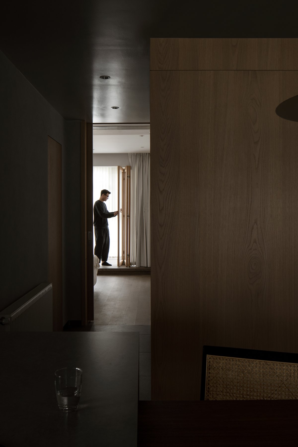
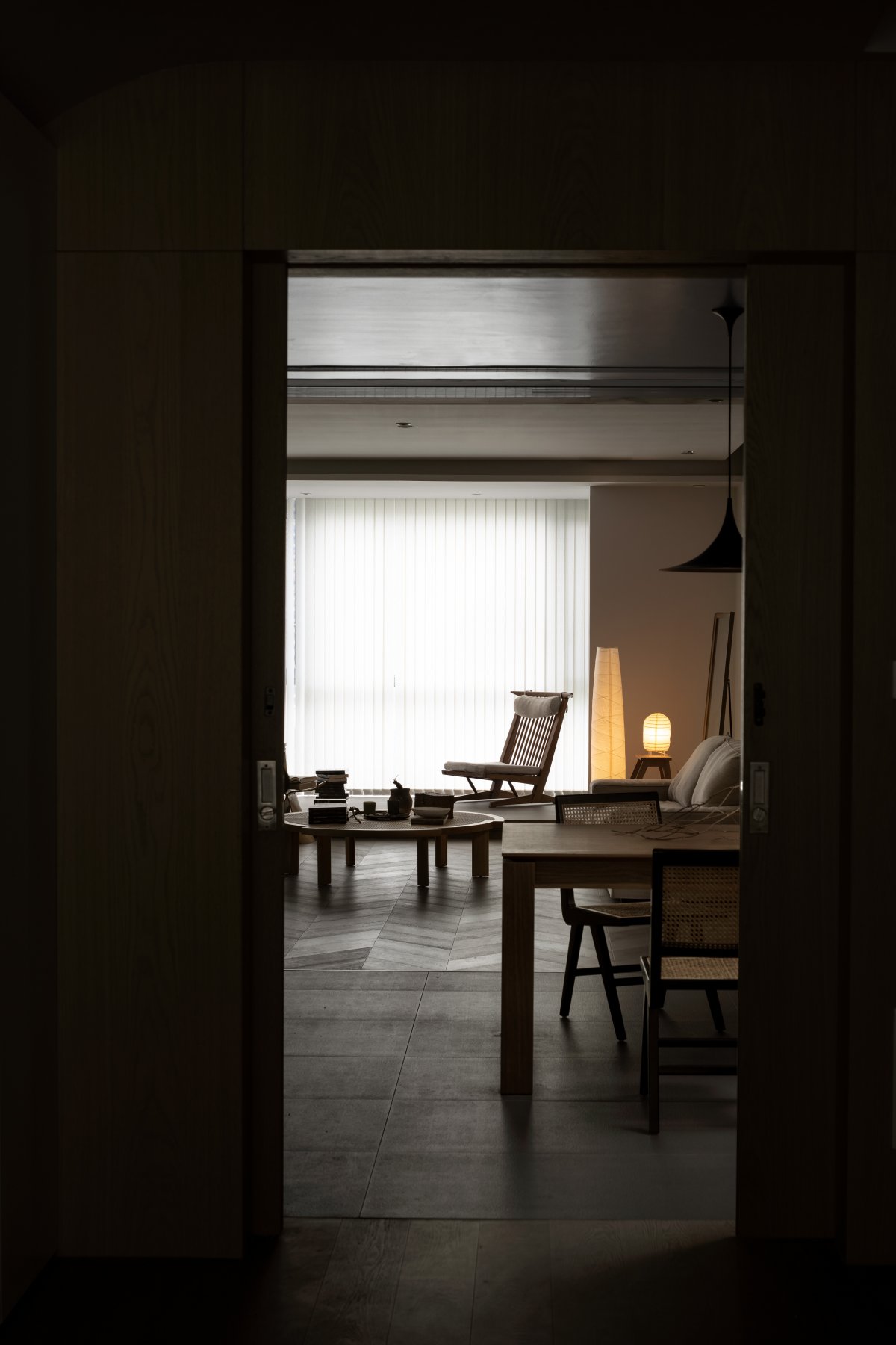
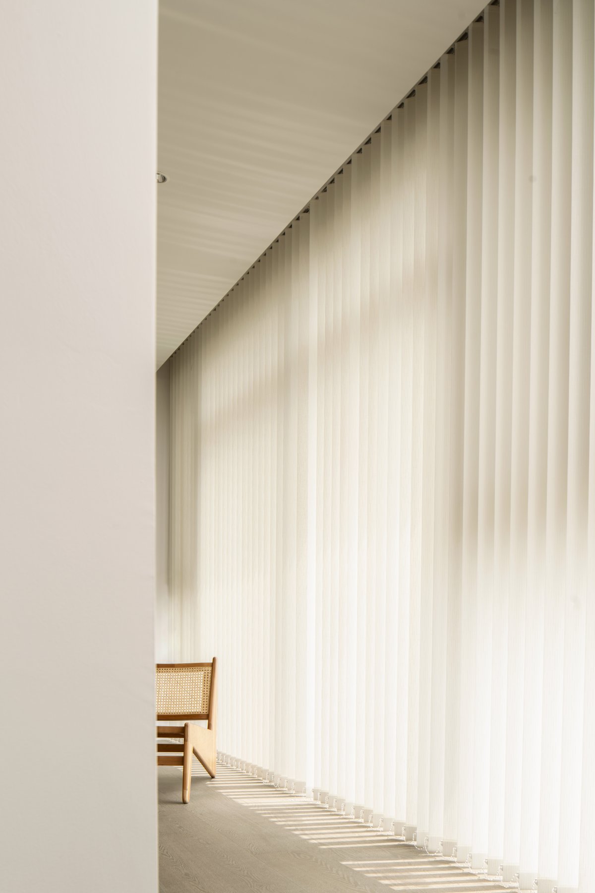
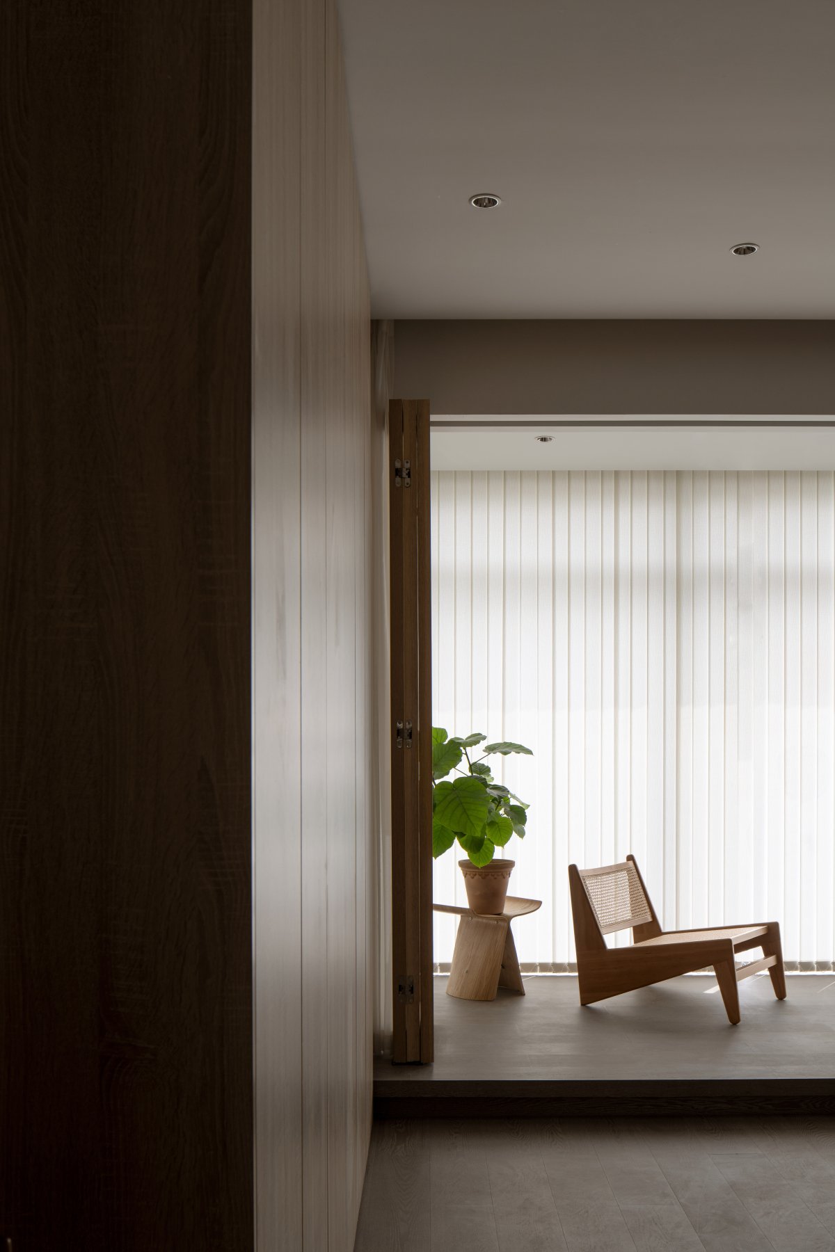
"Gallery" is the core concept of this case. "Corridor" is a landscaping element often used in Chinese classical gardens. This time we introduce the concept of "garden" to create a corridor. The moving line leading to the master bedroom makes people not simply walk into the room, but have a swimming behavior, interspersed with the scenery outside the balcony in the process of traveling, and strolling in the space.
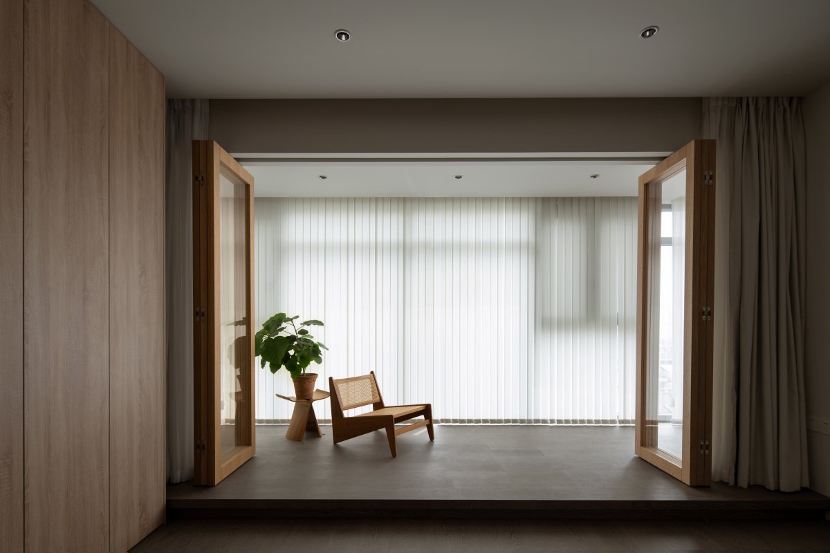
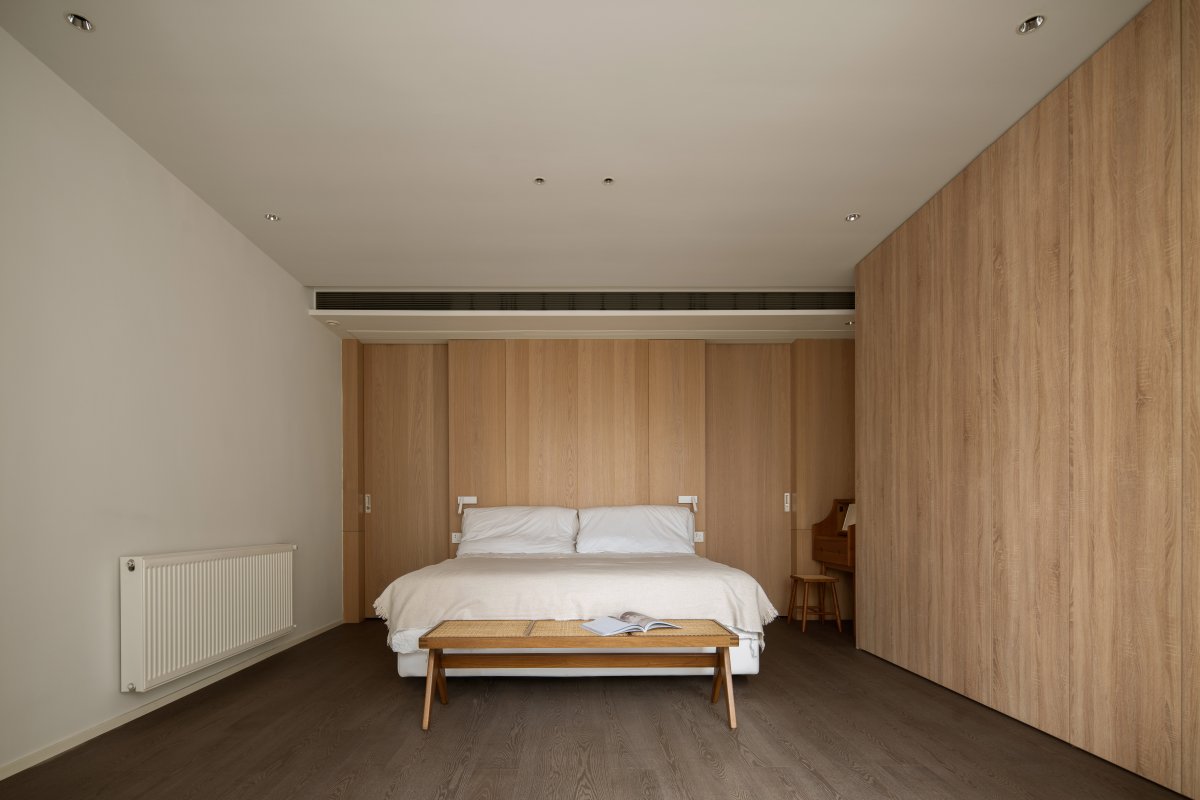
Implement the idea of "corridor", use lightweight partitions, re-divide the space, increase the area of the open space, and allow air and natural light to circulate indoors. The master bedroom’s foldable glass doors ensure visual fluidity, and the wall finishes work together with natural light to create a harmonious and warm family atmosphere.
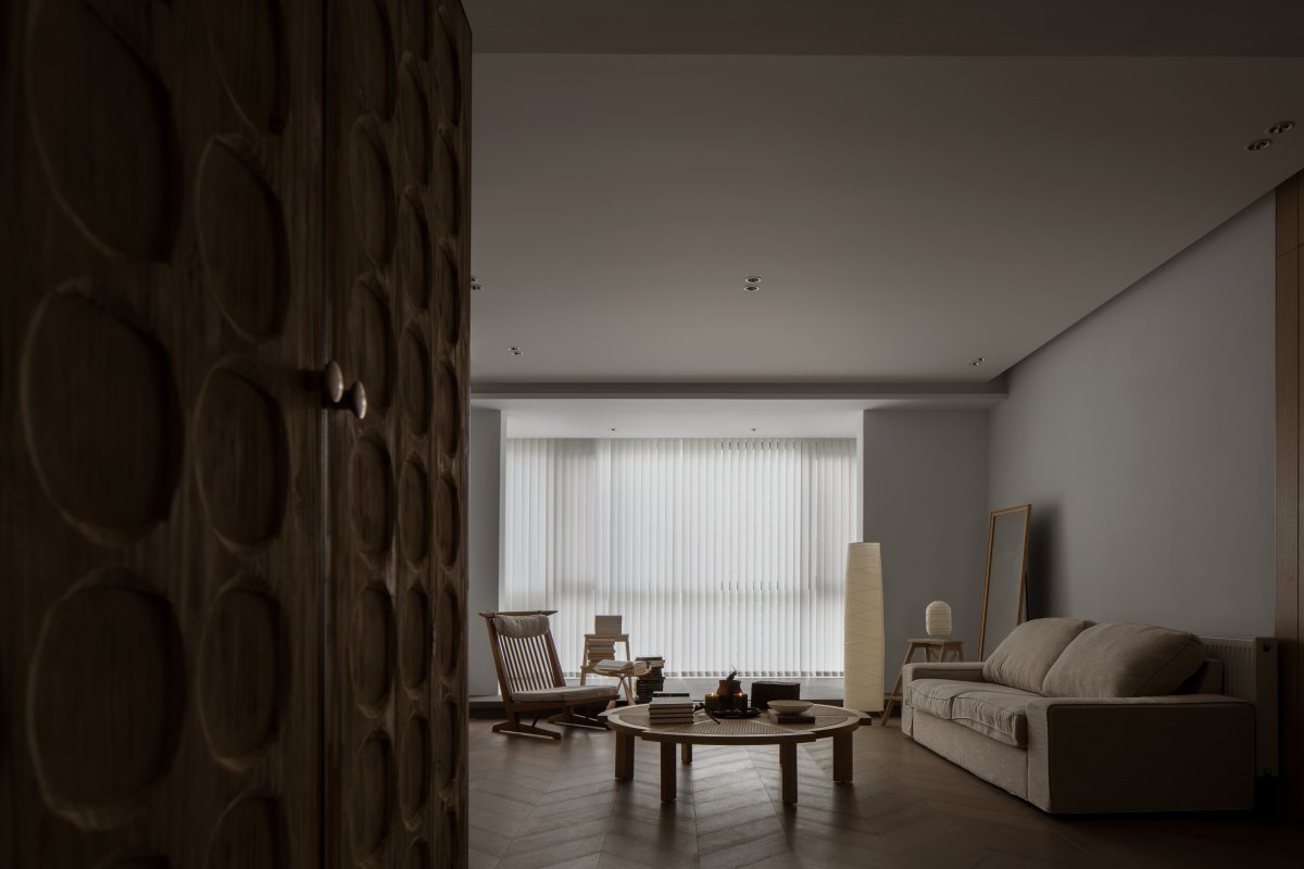
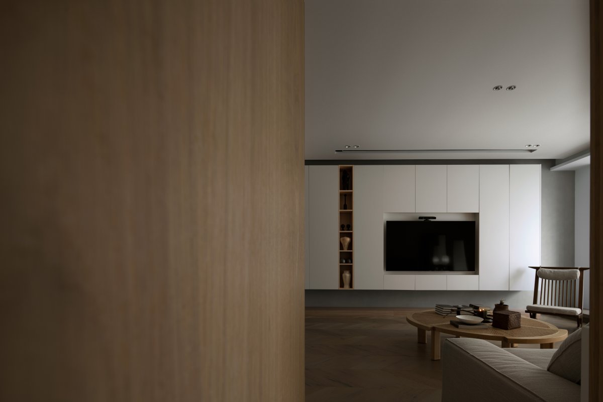
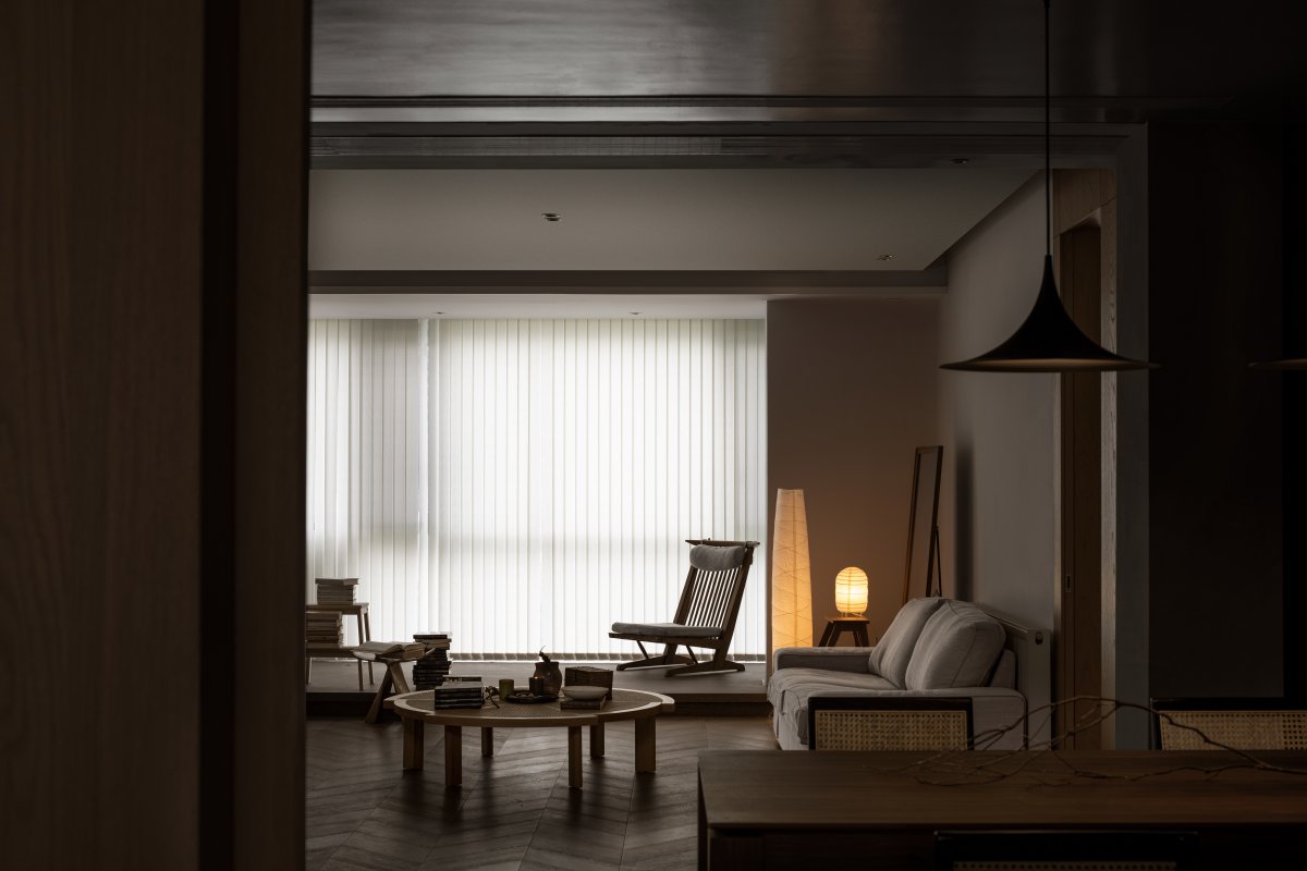
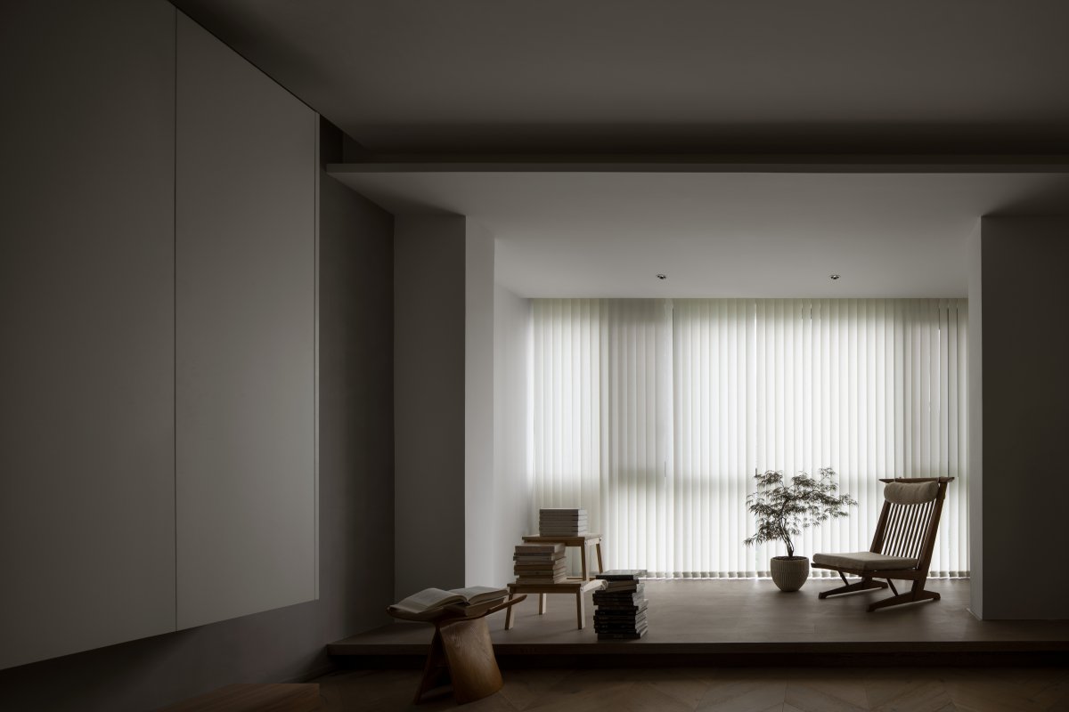
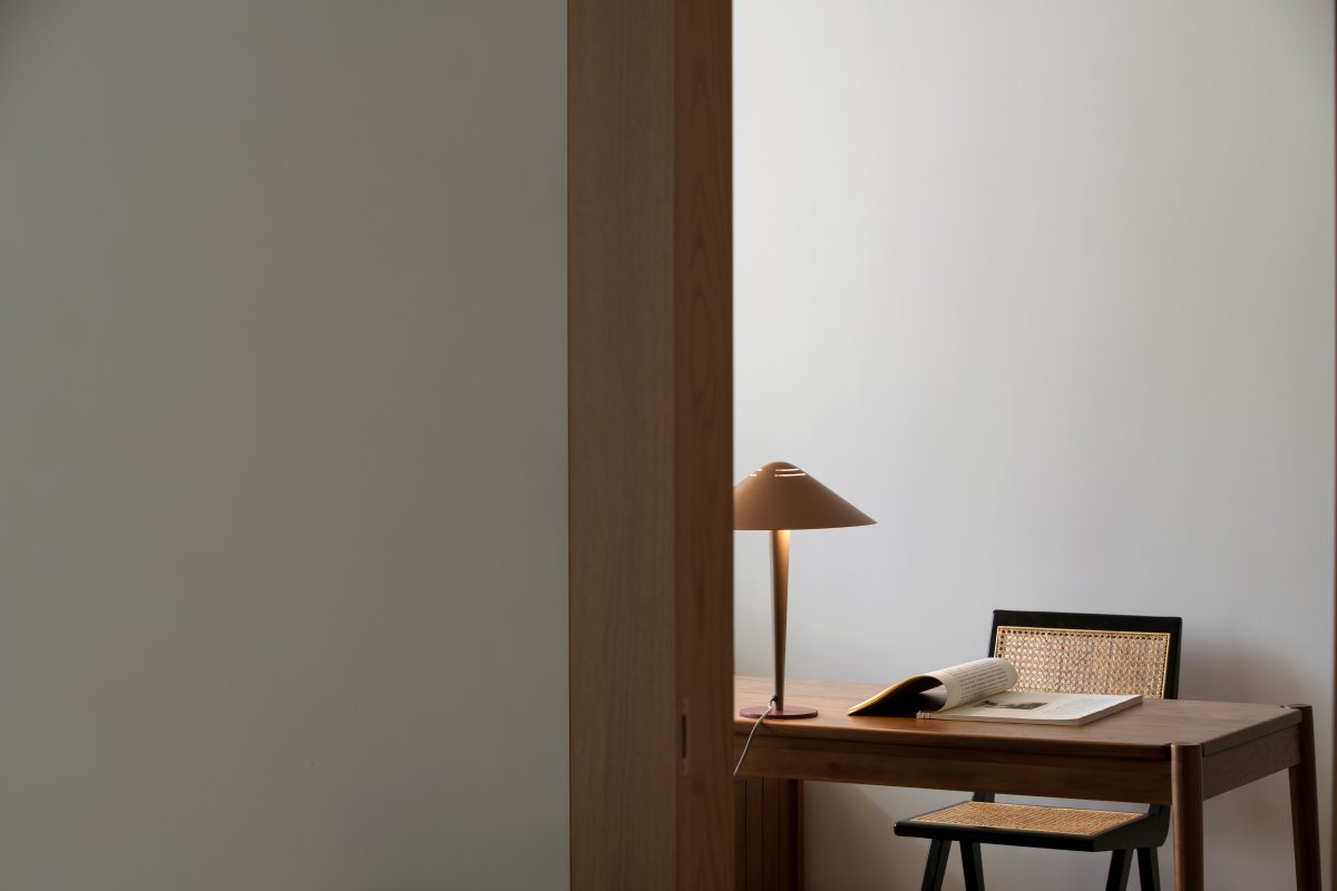
Although the living room is on the north side, the sense of light and scale is very good, and no more additions have been made. Both husband and wife enjoy their own space. As a leisure place for playing games and watching movies, the original general appeal of the visitor function lies in them. Not very strong. Therefore, compared with the bedroom, the living room is a subordinate space, which can be regarded as a hydrophilic pavilion in the garden.
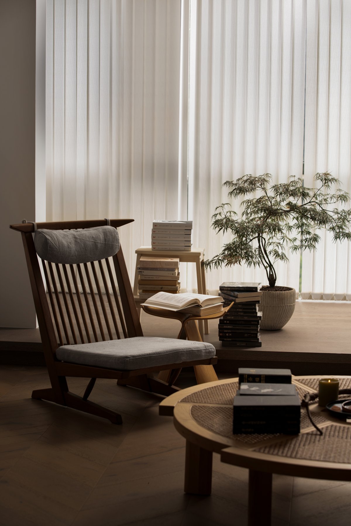
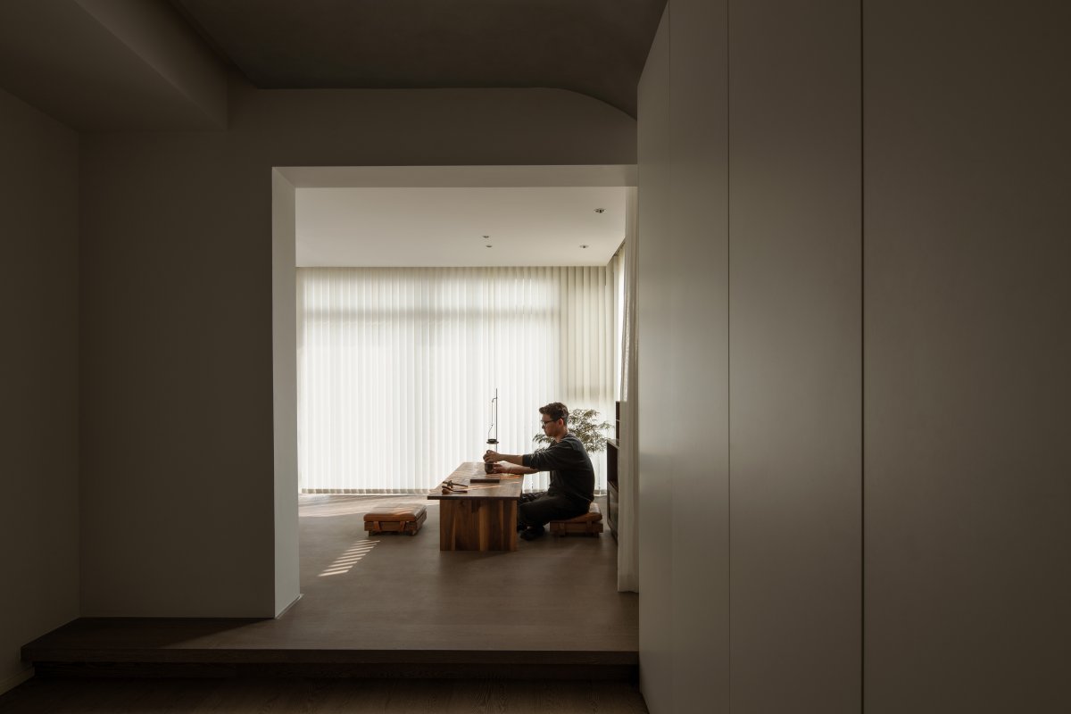
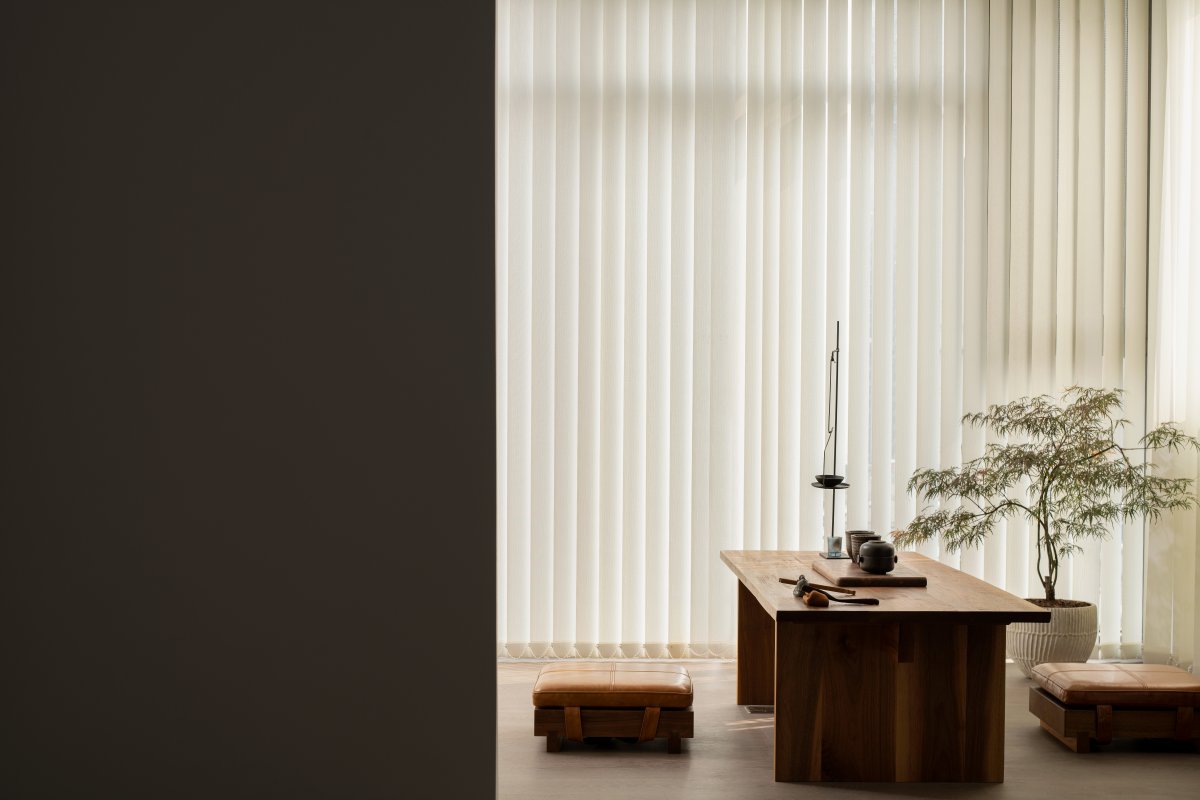
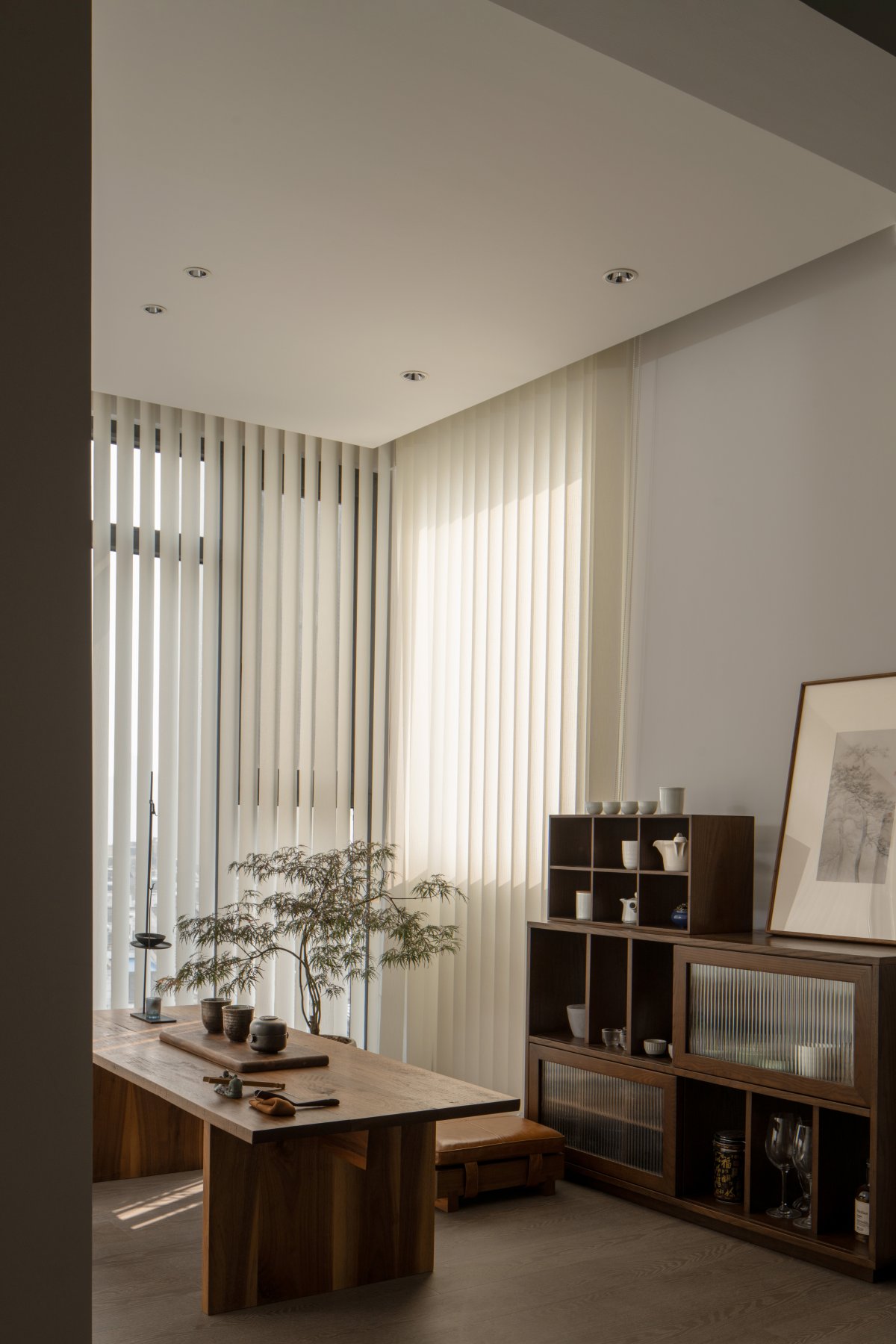
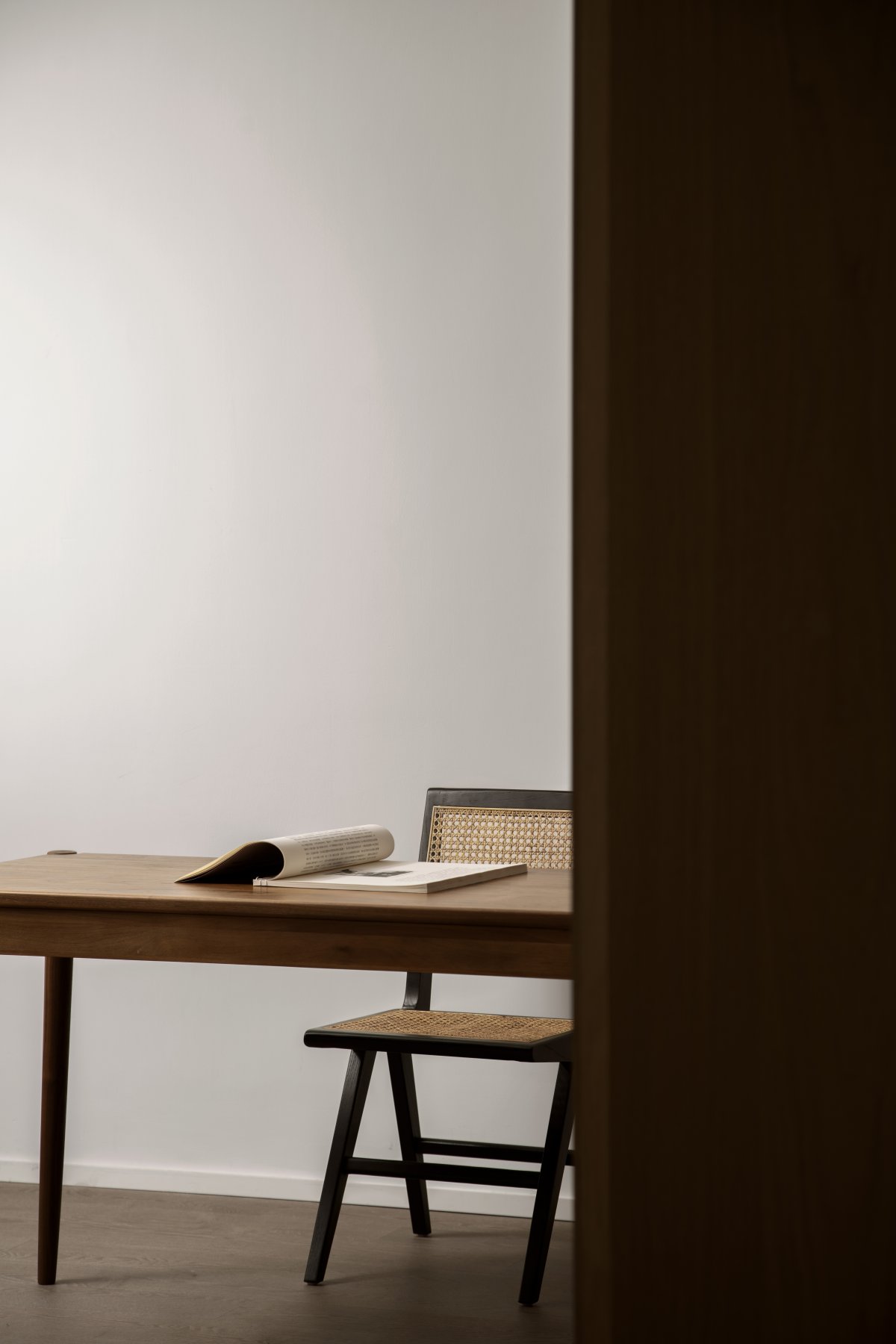
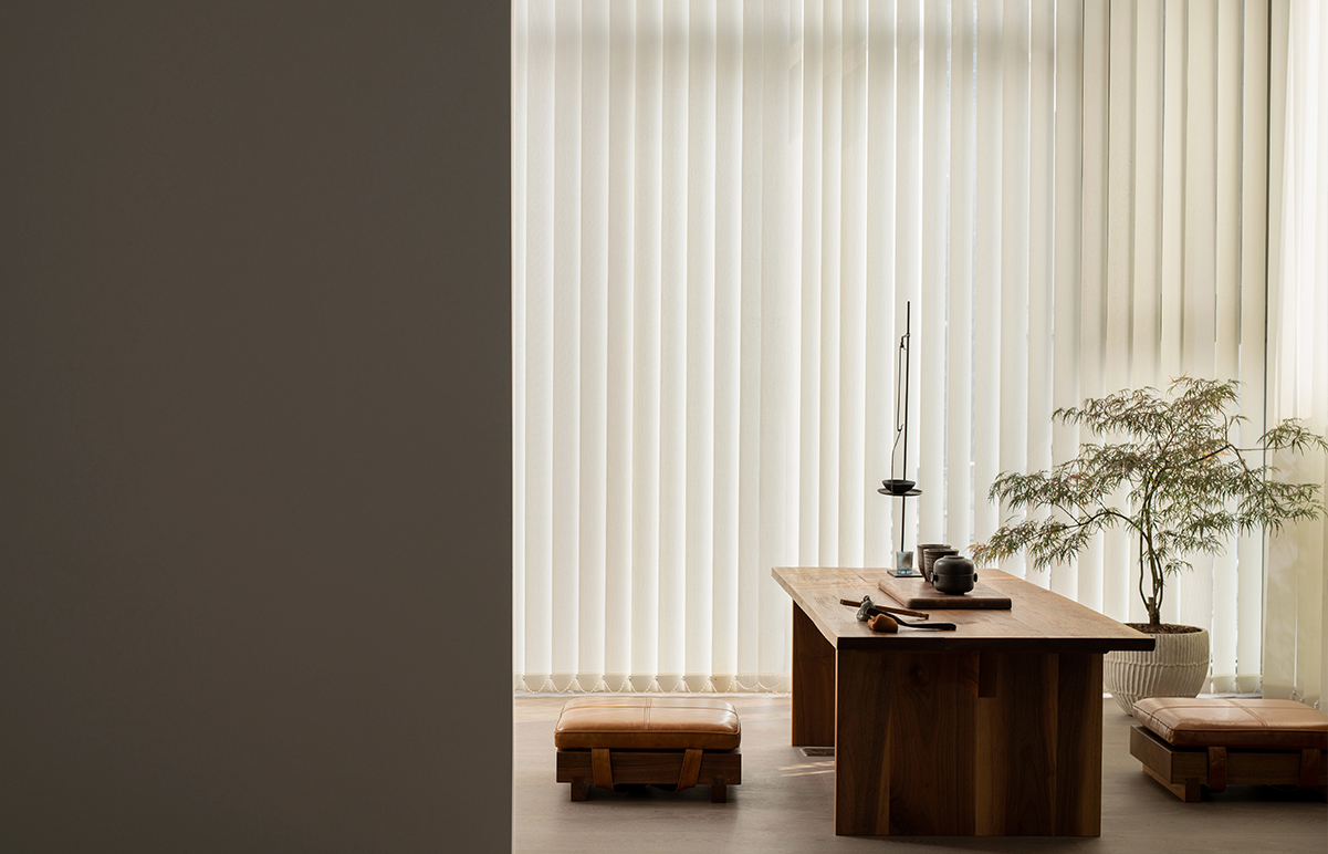
The overhanging platform and "eave" can further blur the sense of boundary of the balcony and break the rules of the original residential function definition, otherwise there would be no so-called "balcony", only the boundary between indoor and outdoor. The study is like a secluded corner scattered in this large garden, without adding too much, I hope to retain the emptiness of this place, only people and books… People finally get along with themselves and have such a space to spend a quiet time with themselves. Before entering the master bedroom, there is a secret tea room. The seven-meter "tea room corridor" has a wide view and connects to the city skyline. It is a world in the male owner's heart.
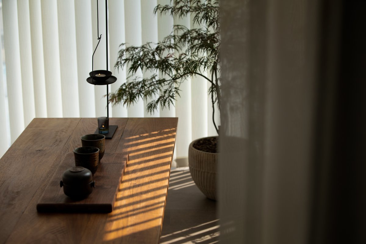
The corner of the tea room serves as the end of the "corridor", which is the starting point of the atmosphere of the whole house. The secluded tea room is free from the shackles of practicality and utilitarian, endowed with emotions and associations. Just like the sketches in the garden, after returning to the bedroom in the evening, you can stay here and enjoy the time for one person and one tea.
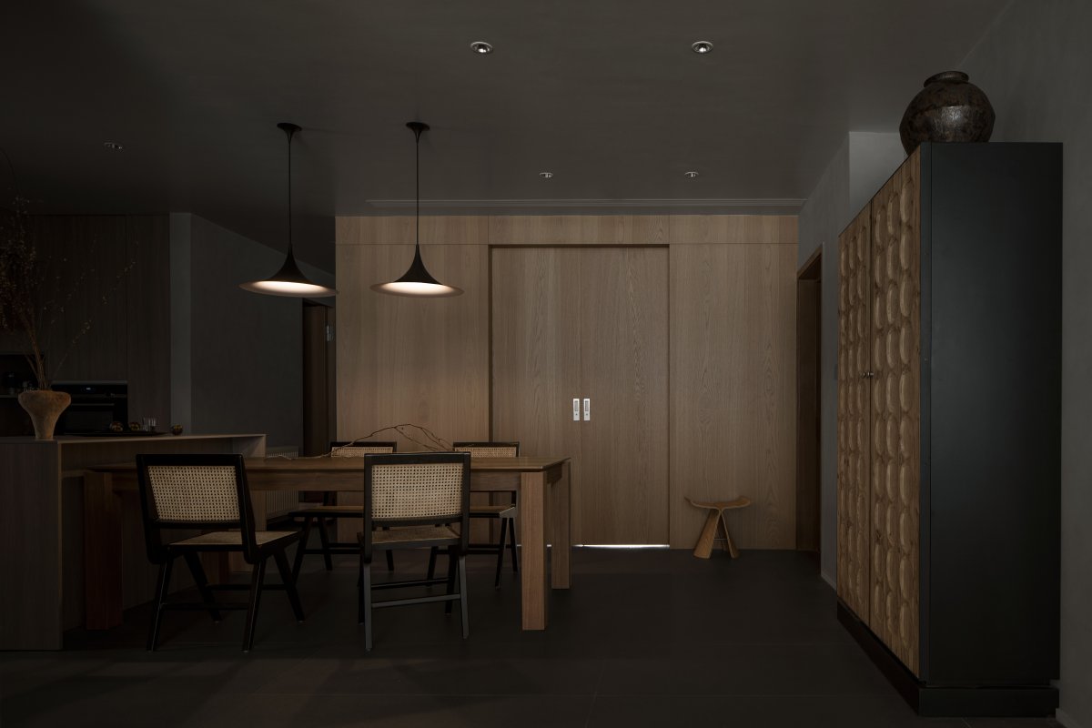
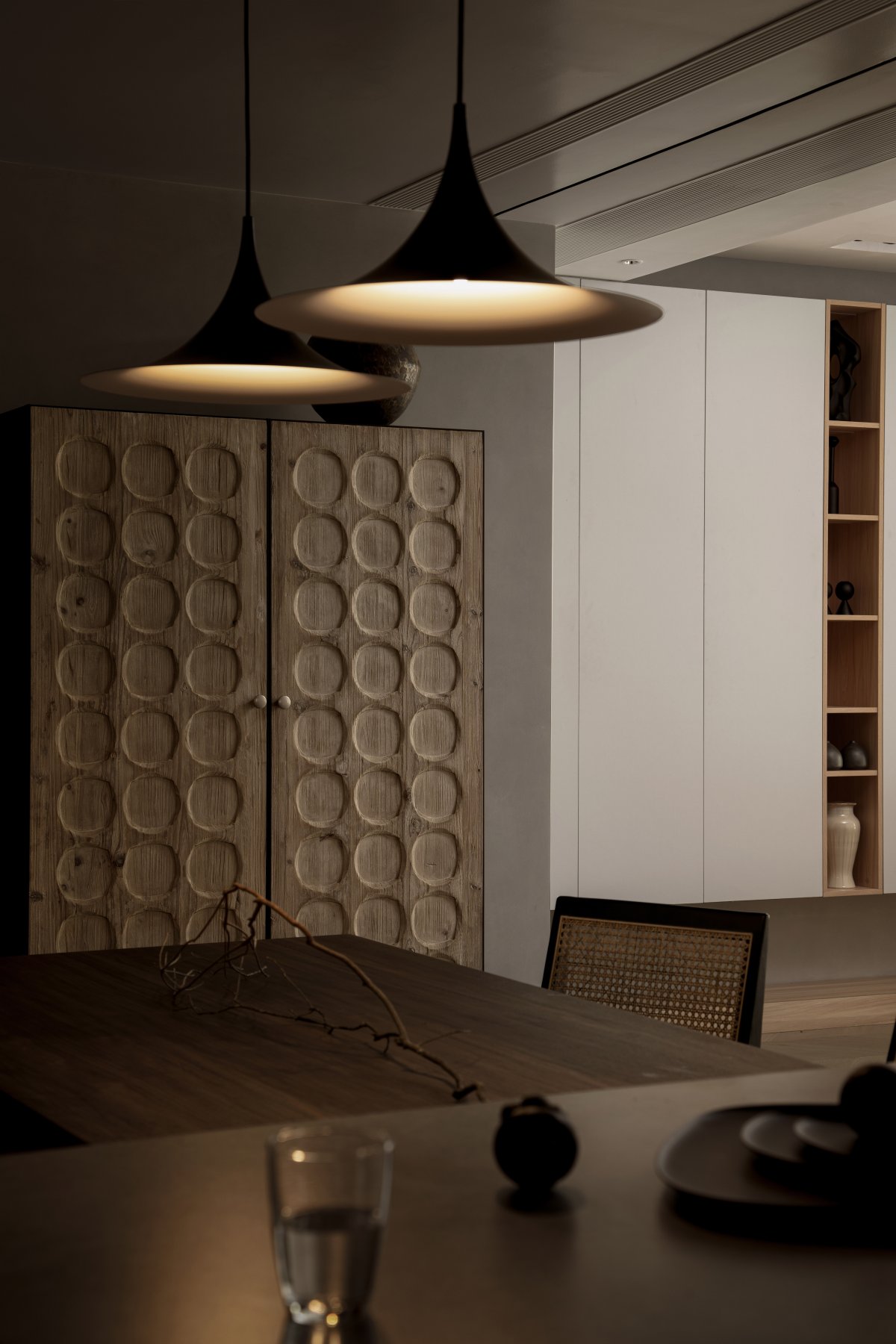
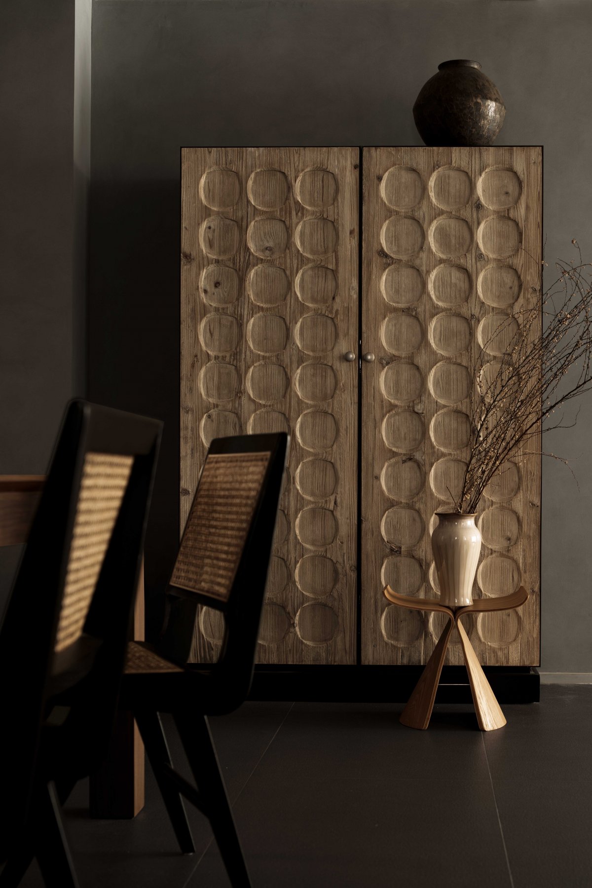
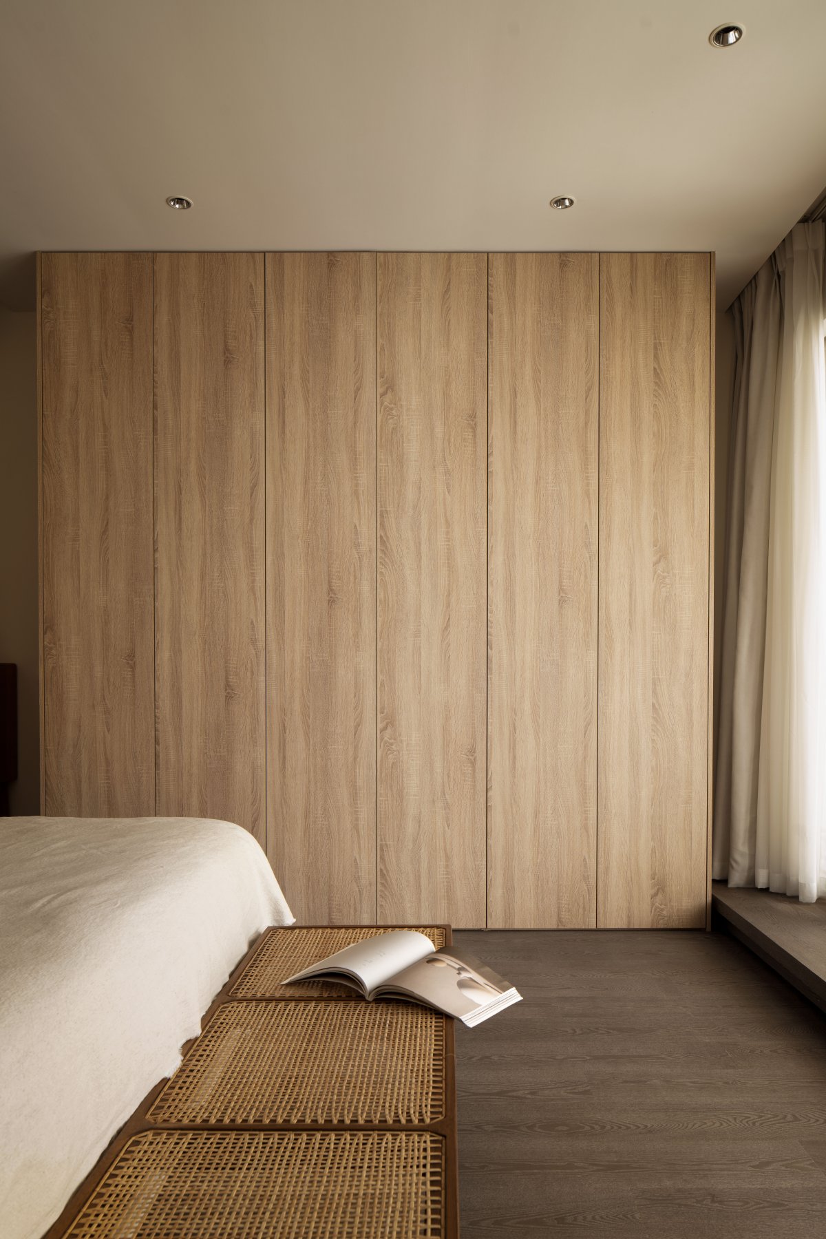
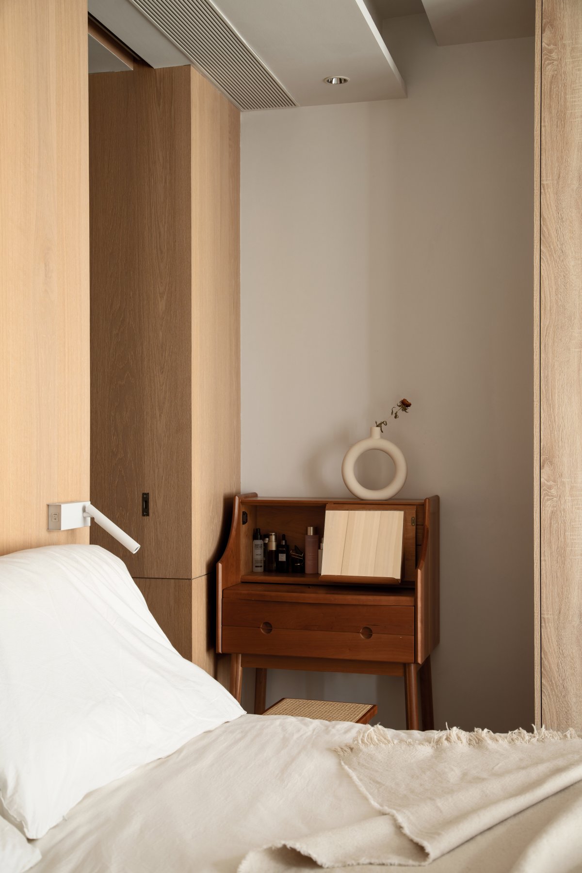
The door to the master bedroom and the door of the master guard use the same wood finish as the back of the bed, allowing the master guard to "hide" from sight. Considering that the owner eats breakfast at work every day, a shortest route to the kitchen and dining room is reserved from the master bedroom, which makes the behavior more efficient. At the entrance, a stylish cabinet is used as a shoe cabinet, which blurs the sense of separation between the entrance and the kitchen.
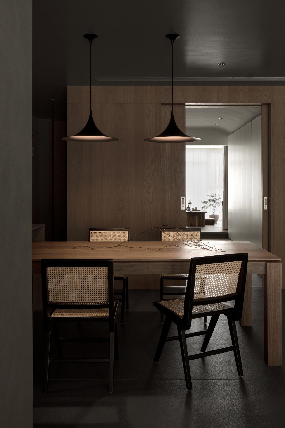
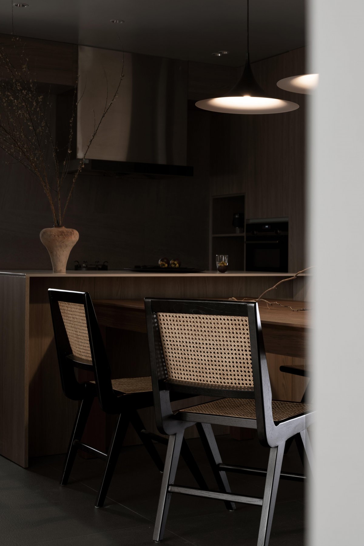
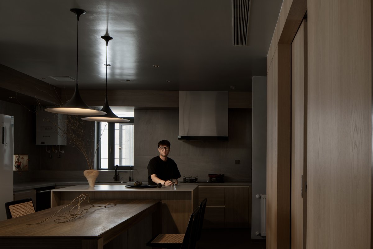
The dining and kitchen area is set to open cooking and wrap-around circulation. It is hoped that the owner can freely enter the restaurant from every part of the room. It is also a restaurant with a sense of boundlessness that we want to describe. We hope that the family dining environment for two people can be more relaxed and free from restraint.
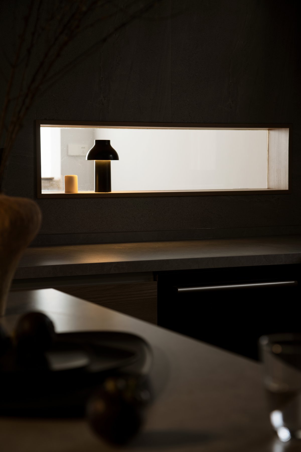
In terms of materials, we wanted to create a warm, casual effect. Space materials choose matte natural wood grain finish, imported rough cement art paint, matte white latex paint, matte white door panels, matt slate, and grainy matte gray tiles are used in kitchens and bathrooms to create space for Tranquil ambience. Confined to the fireworks in the kitchen and the wind in the wilderness, to create this poetic dwelling. At the same time, I hope to use the migratory line to mobilize people's behavioral perception and increase the sense of experience on this basis. We let the artistic beauty run through it appropriately, so that the space and the occupants can form a comfortable and harmonious interaction.
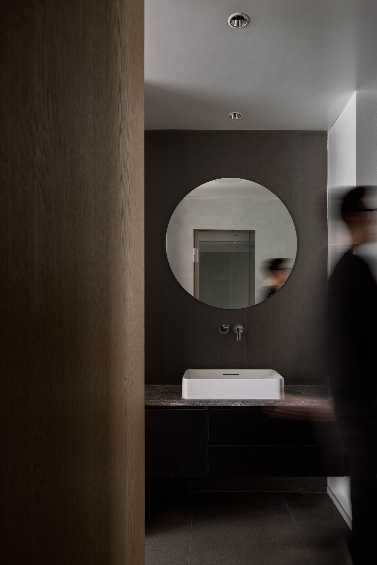
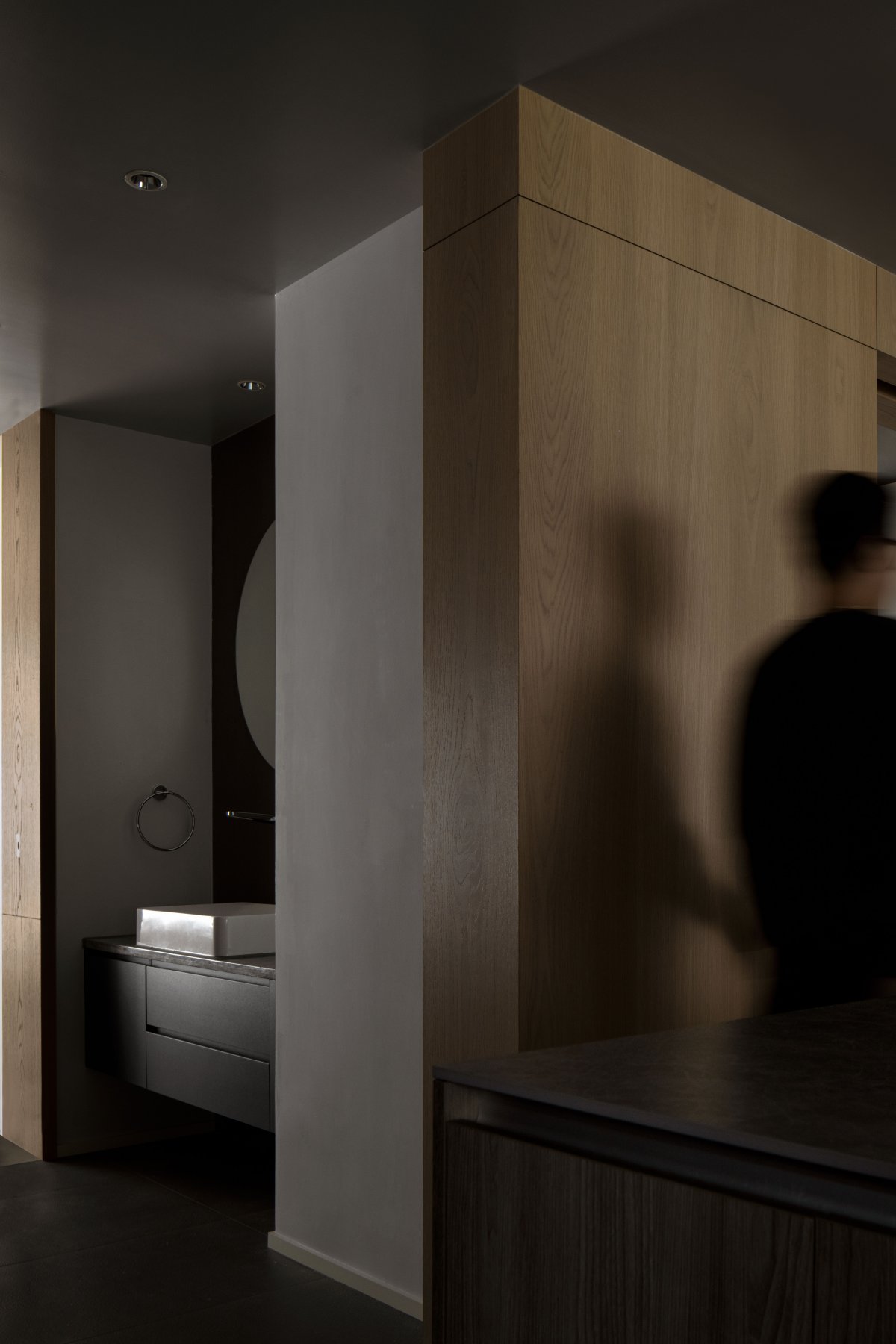
From the kitchen to the public bathroom, a small part of the second bedroom is borrowed to form the dry area of the public bathroom. The countertop basin is matched with a stone countertop and a circular mirror surface, which is more simple and quiet. The cabinet below adopts the same color as the ground, which weakens its sense of existence and integrates it into the whole space.
Pushing the door, hanging toilet, half-glass partition, and ultra-white frosted glass for the privacy of the main bathroom, make the bathroom transparent, and also solve the privacy problem of public health.
The master bedroom pushes open the door hidden behind the bed, where the master guard is located. Following the same sorting method as the public bathroom, the wall-mounted toilet, the partition of half glass, and the column-type washbasin bring a little novelty to this space.
- Interiors: Youwei Architectural Design
- Photos: Ashen
