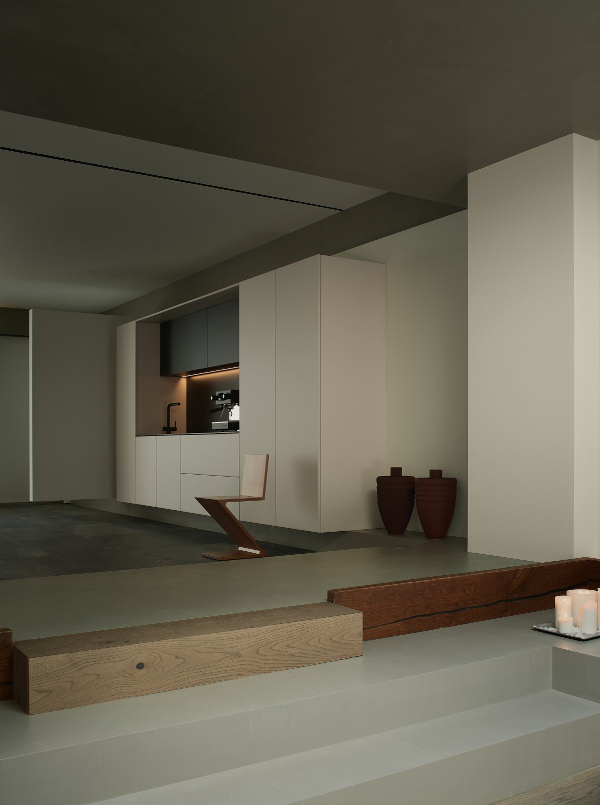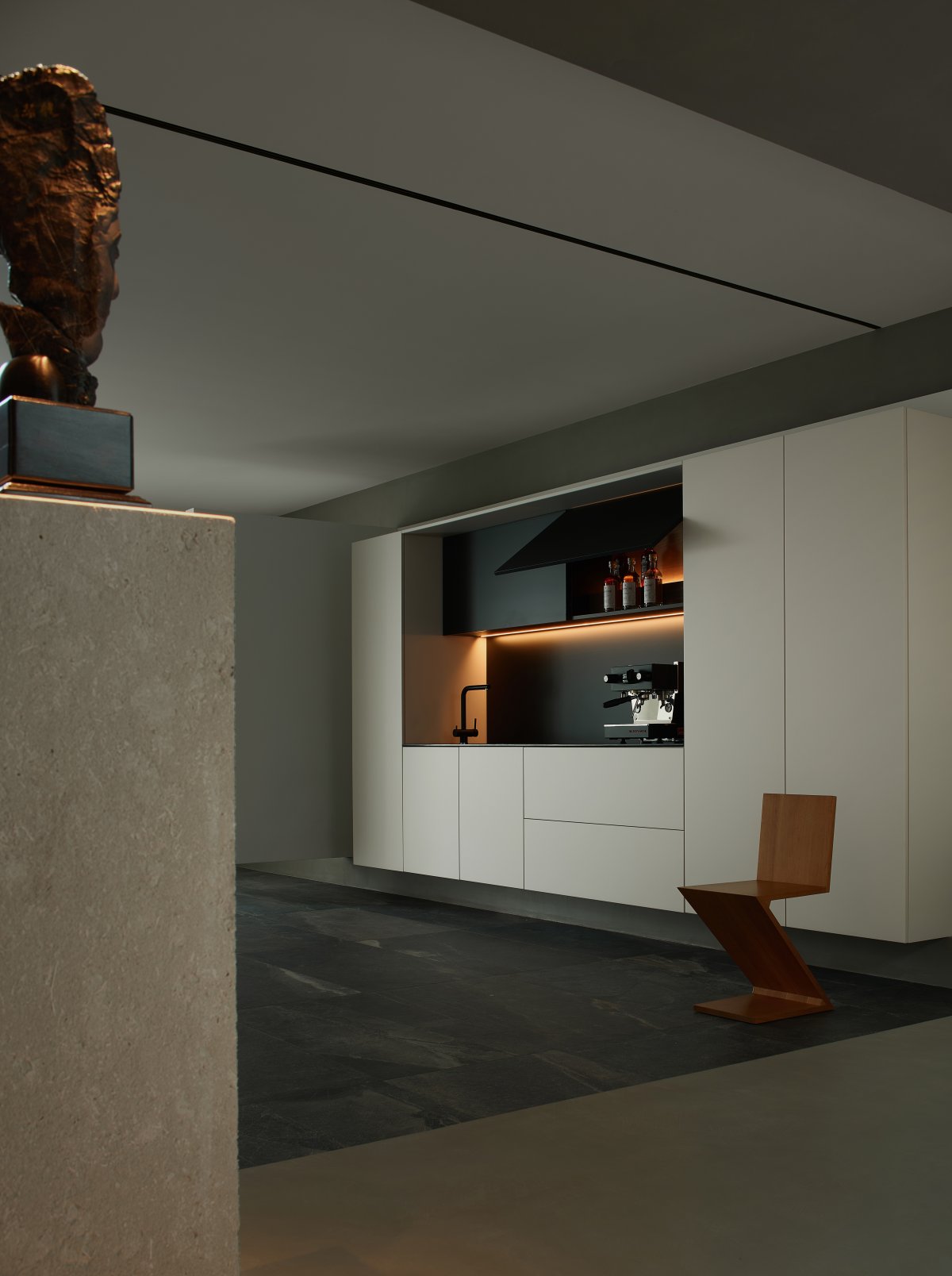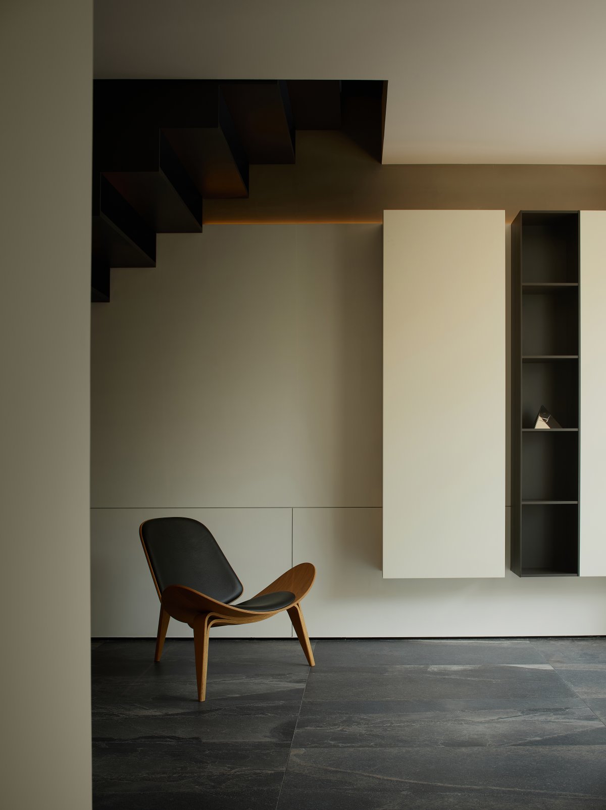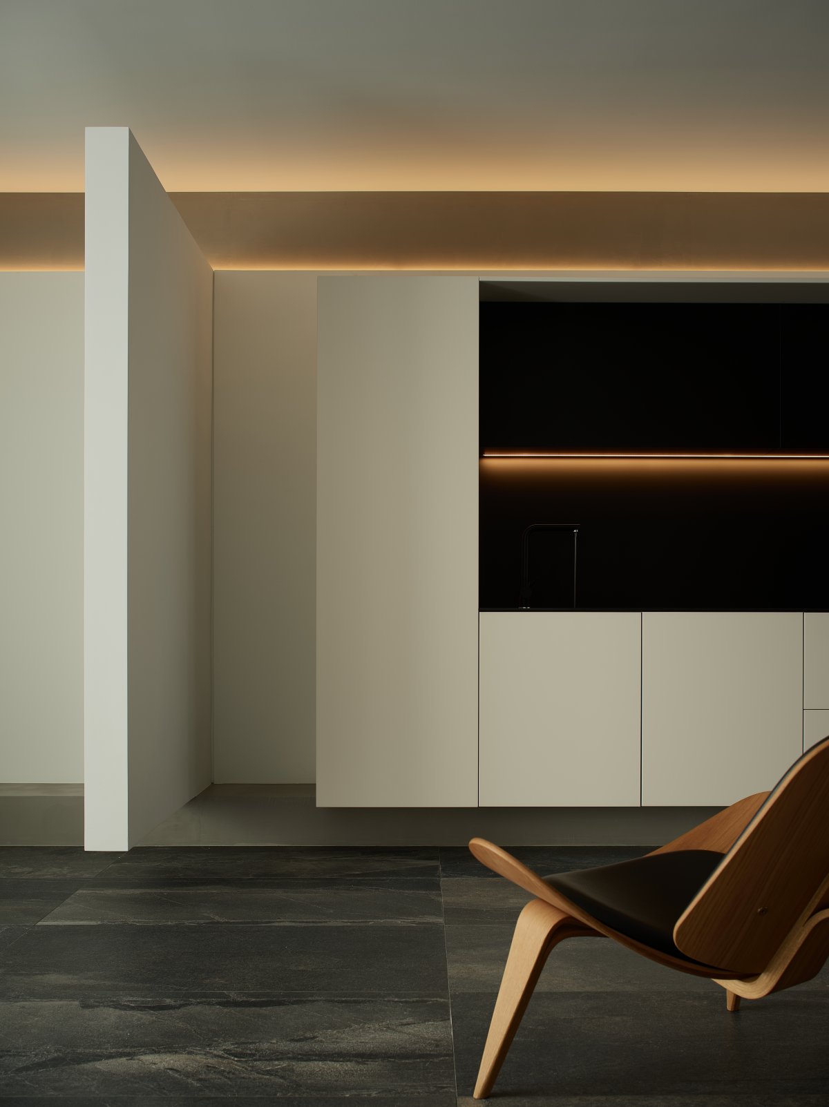
After abstraction, everything in nature is invariably generalized by mathematical geometry. Even if an ordinary plant, its trunk, branches, leaves and veins grow and combine in a more varied and ingenious way, is it possible that there is some mathematical connection that intervenes in natural things? This idea fascinated Le Corbusier and led him to enter the realm of "the content and spirit of the study of proportional scales".
Suppose a person is 1.75m tall and raises his arms to nearly 2.2m high, which is equivalent to two stacked 1.1m squares, try to embed the third square in it and test it in the way of "right-angle trajectory". This phenomenon, similar to the Fibonacci sequence, gives a human scale to the rational and "boring" numbers through the association of mathematical geometry.
Elegant Proportions
━
In 1947, Le Corbusier called the result of his research "Modulus" and made this aesthetic concept and connotation, which has the properties of natural science, public in the form of a book. As the baseline of the golden section, 2.16m appears in the Tamiya Aesthetic Museum, defining the height of the floor and the bottom of the beam. It also makes the horizontal and horizontal visual sensation in the narrow rectangular space, constituting the continuous fluidity of the façade and an elegant landscape with a special idea.
Zhang Yonghe has designed a screen called "thick and thin", whose thickness transitions from 4mm at one end to 40mm at the other end, and when light passes through, the transparency of the screen appears a natural gradation, producing a clear and blurred visual effect. Here the concept of "thick and thin" is also "clear and blurred", and there are infinite values of optimal solutions between thick and thin, and these scales or proportional relationships activate different physical forms and symbolic meanings.
The Aesthetics of Mechanics
━
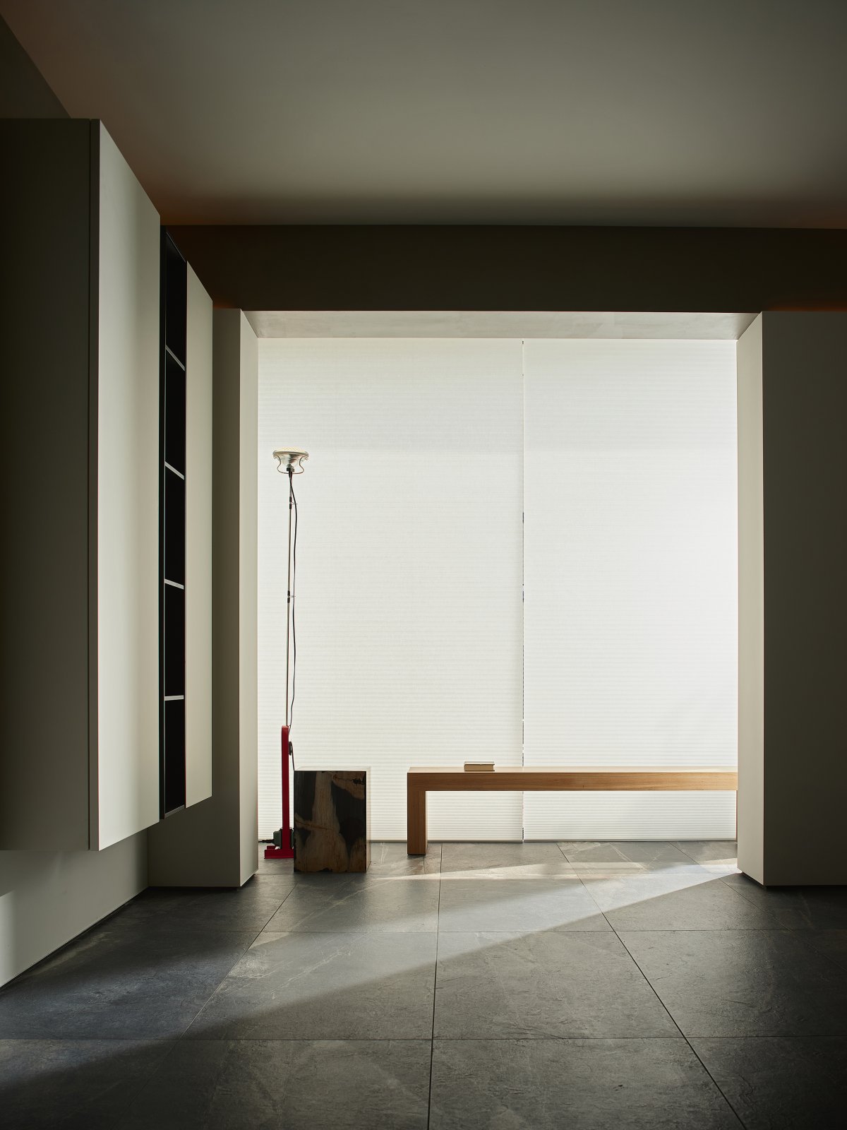
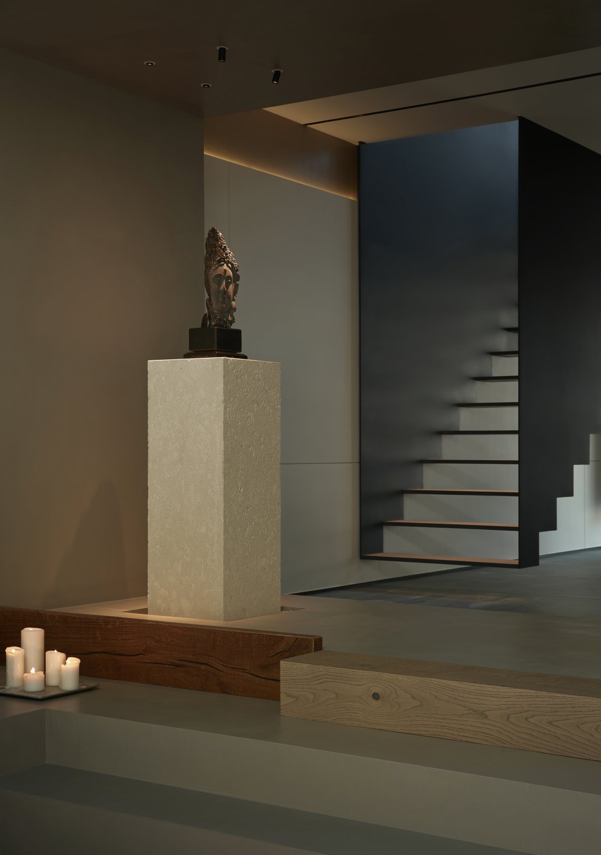
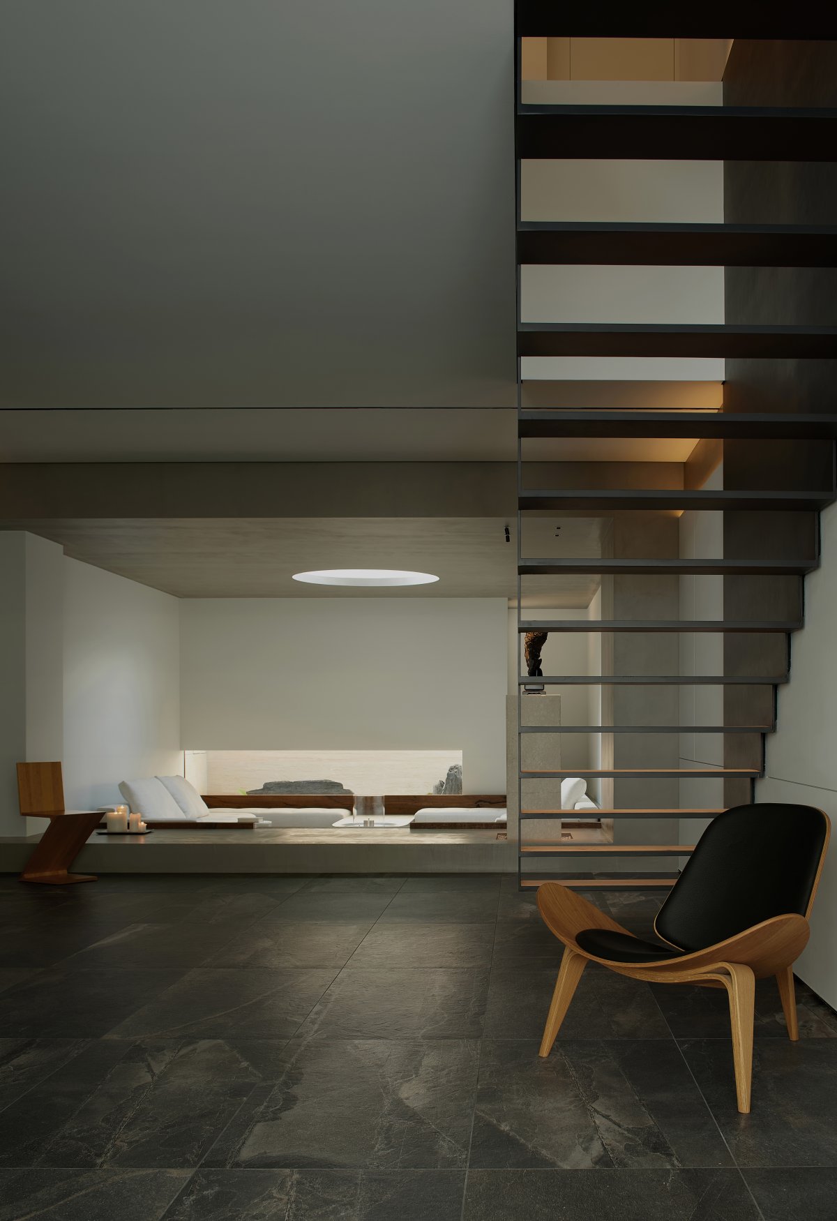
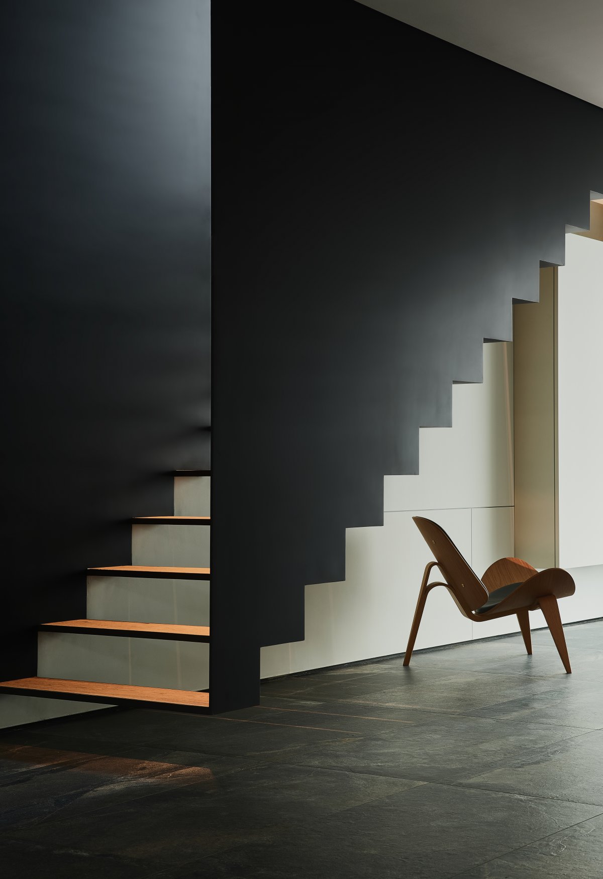
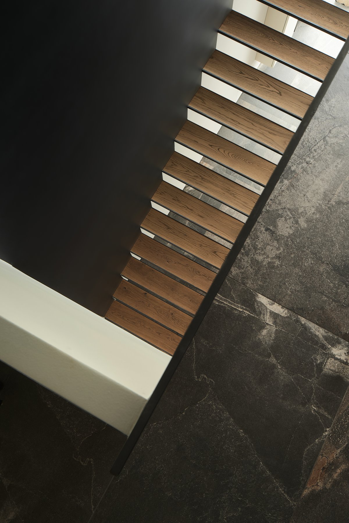
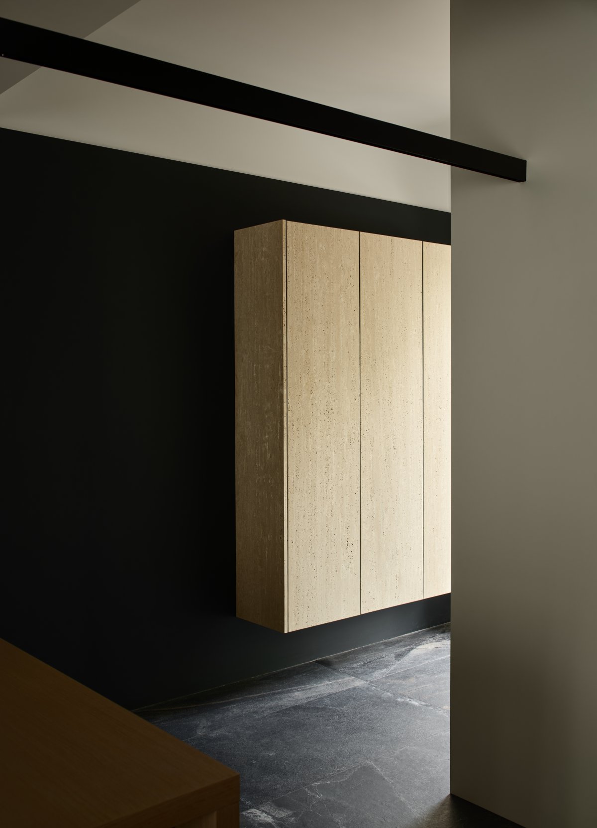
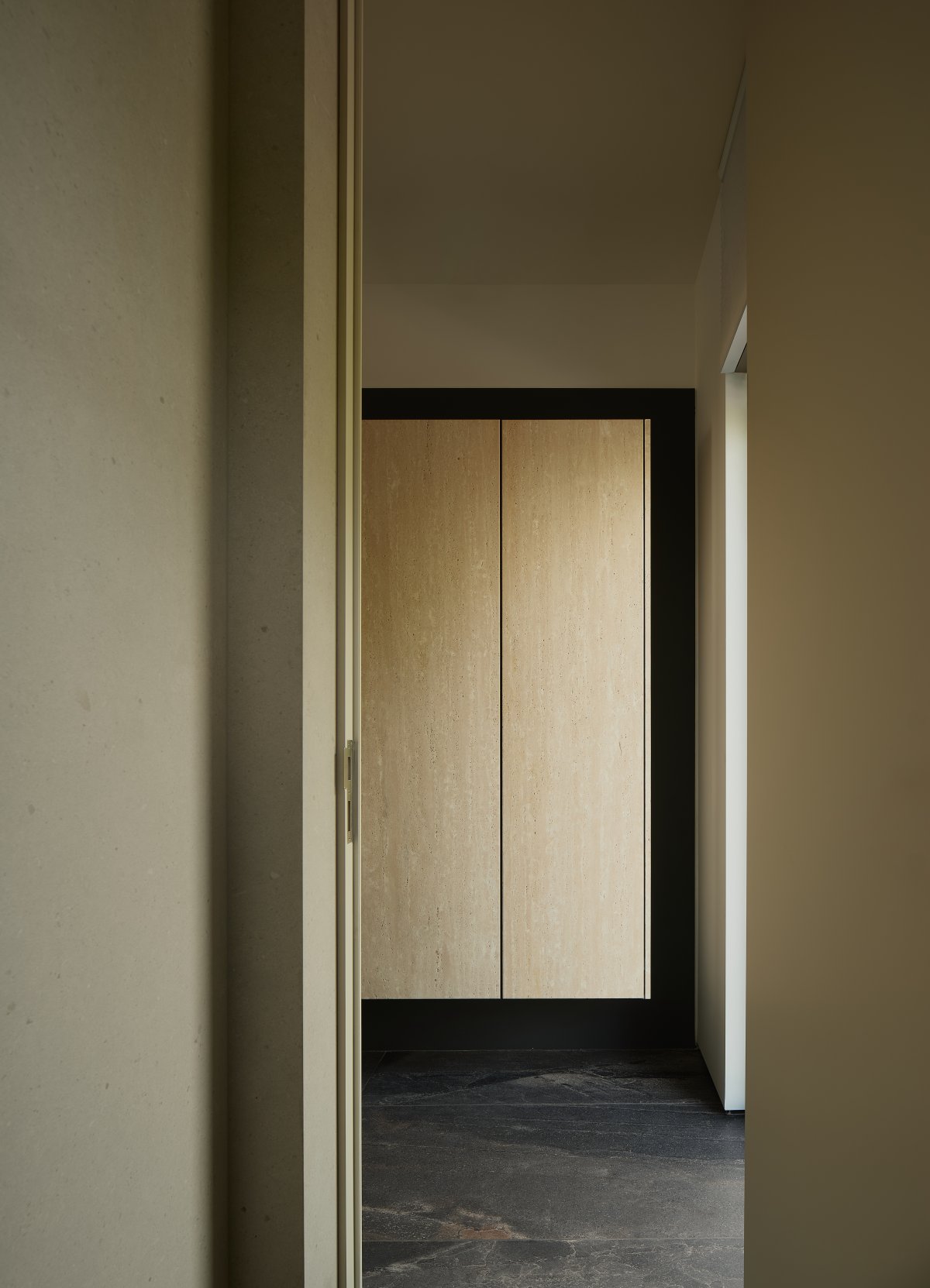
As a prelude to the entrance, a 2.16x1.4m suspended wall extends out, its single-sided support mechanics giving a visual lightness to the wall that conventionally connects heaven and earth. The independent closet and the suspended staircase to the second floor in the space echo the same way, forming a "right-angle trajectory" that is not visually visible on the plane but hidden, reflecting the ingenuity of craftsmanship and demonstrating the aesthetic pursuit and quality spirit of Tamiami Gongyi Aesthetic Museum.
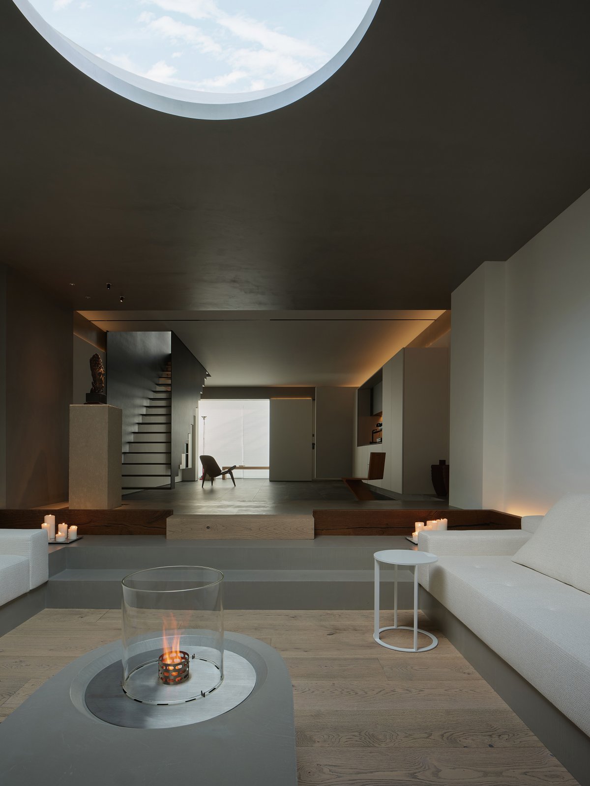
The staircase in the vertical space is an important part of the path. In addition to its real function, its slim, transparent and suspended physical form has become the main highlight of the space. All along, the key role of structure is always hidden under the surface of things, and the carefully designed and decorated surface occupies the mainstream aesthetic of daily life.
Light-Catching Containers
━
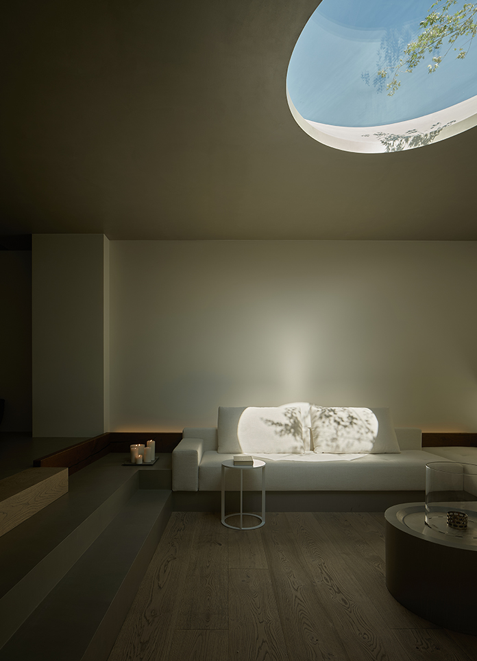
How can material architecture have a lively life? For Le Corbusier, it is naturally light, which is why he said, "Architecture is the subtle, appropriate and brilliant expression of those assembled geometries in the light." The presence of light gives things a dramatic perceptual tension and demonstrates its ability to create space and time. Light traverses through space, leading us from static to dynamic, from rational to spiritual, from limited local to infinite association.
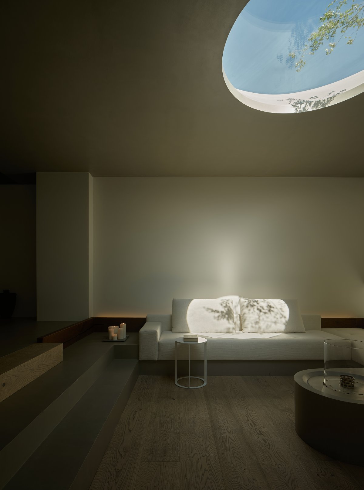
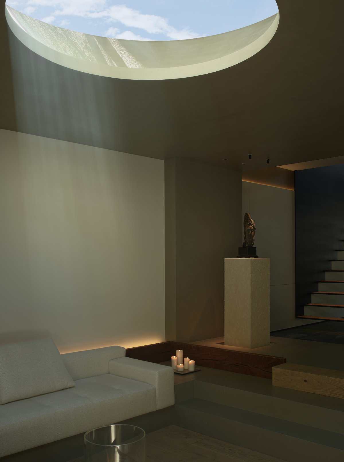
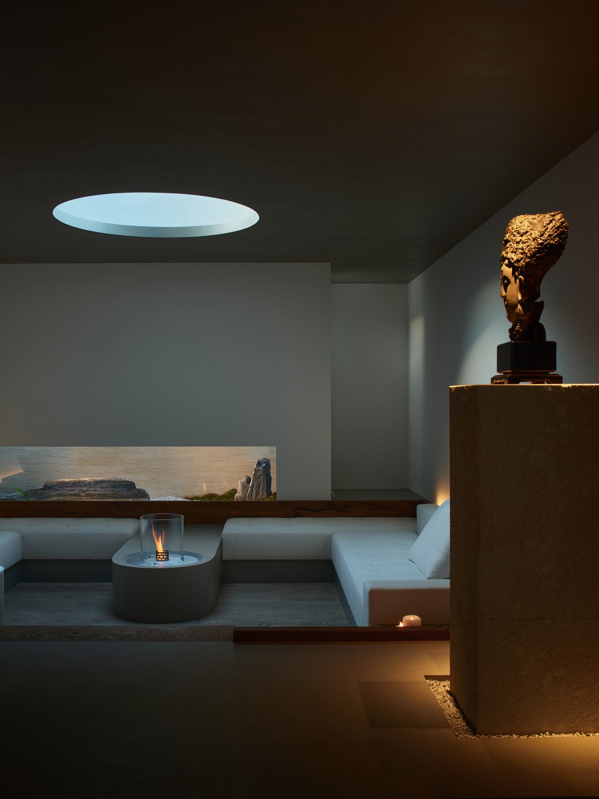
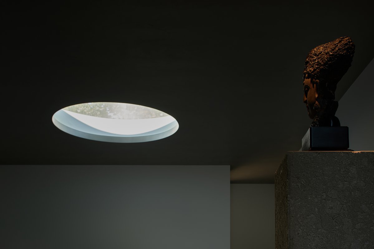
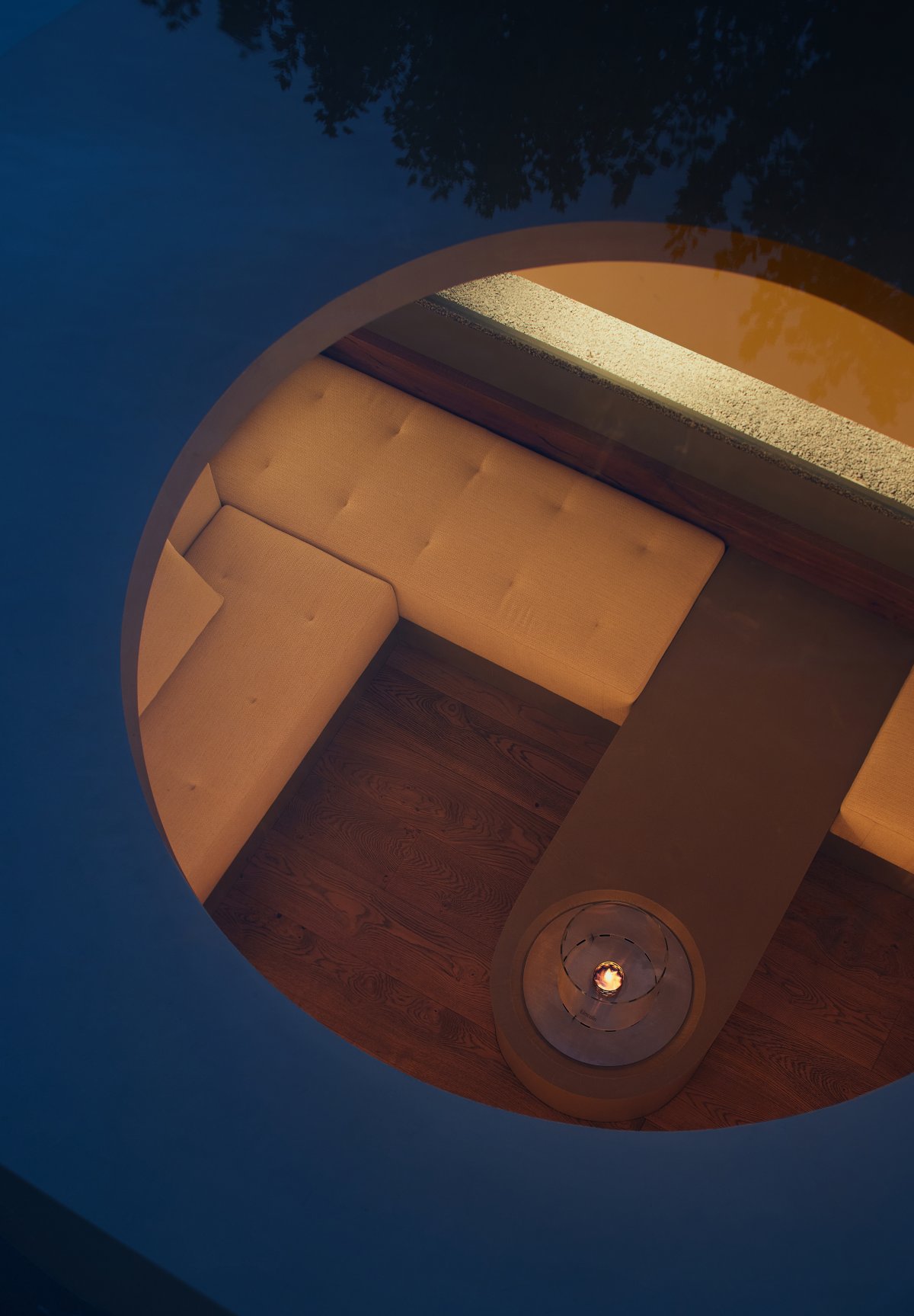
For architecture, doorways and window openings are usually destroyers of form; they must be transformed into exponents of form before they have positive aesthetic meaning. The 1.4m diameter top opening, flared out to a diameter of 1.8m, with an inclined mouth design, serves to visually thin the thickness of the floor slab, while increasing the entry of external light and creating a rising natural gravitational force. The light reveals a rich appearance with the passage of time and the change of weather's cloudiness.
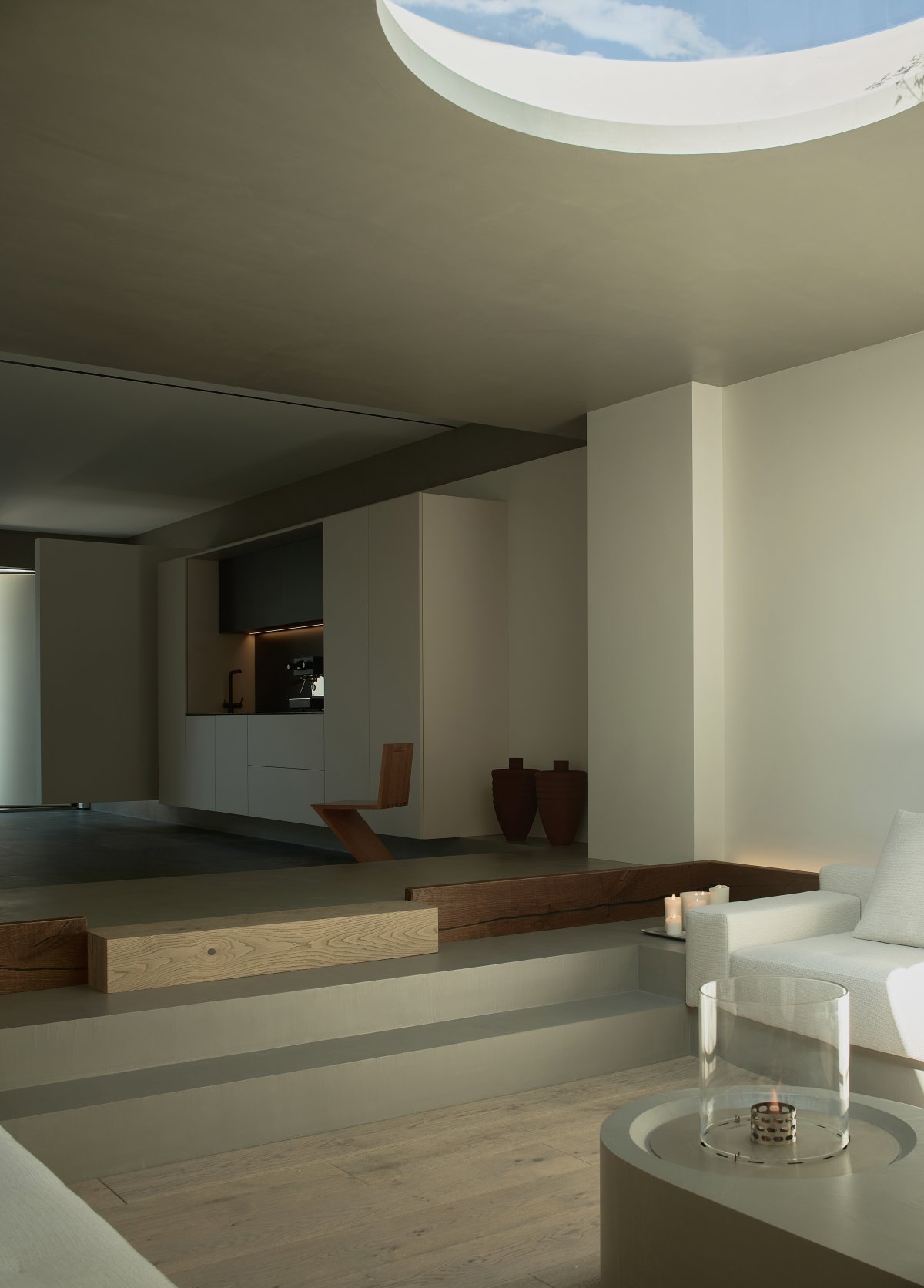
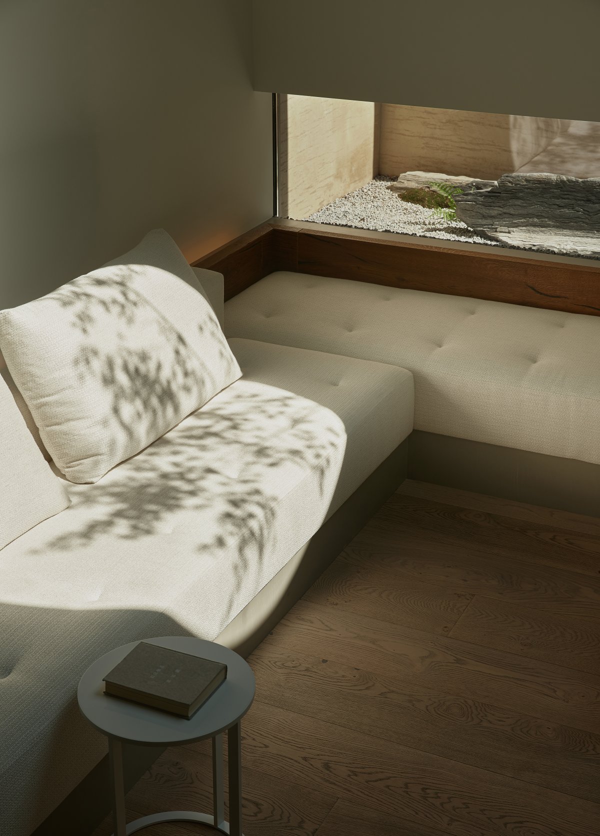
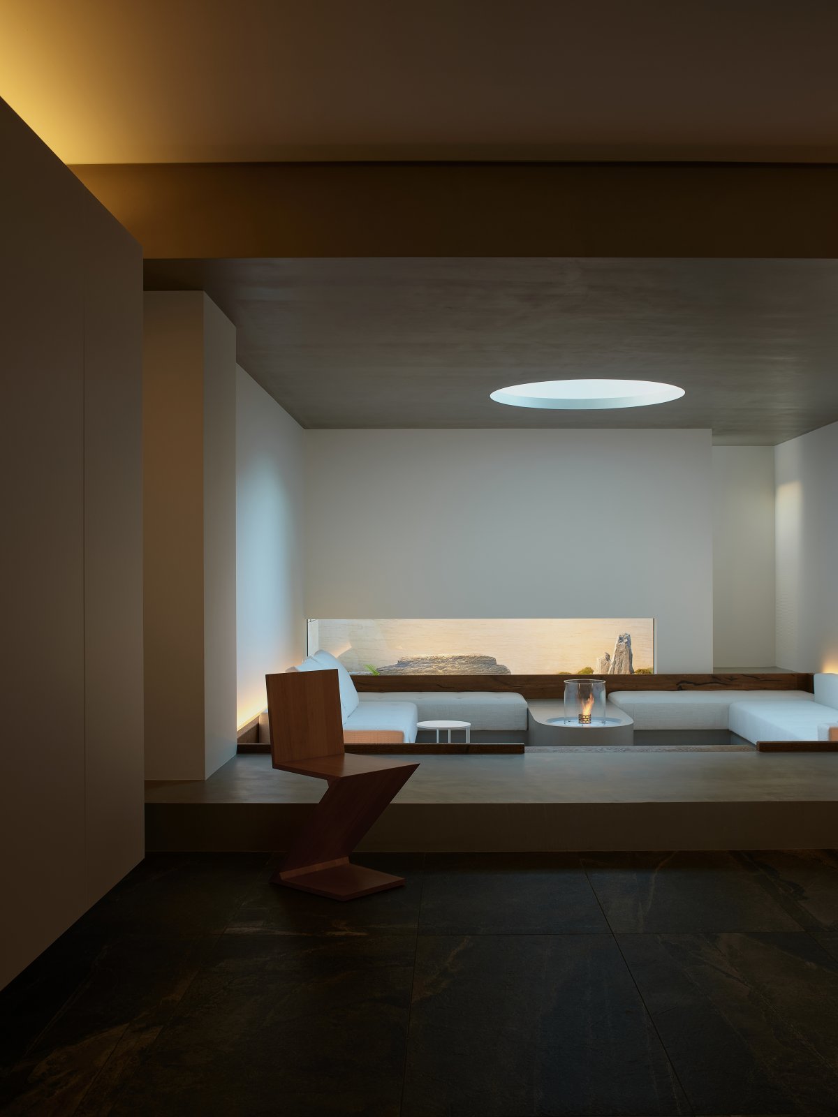
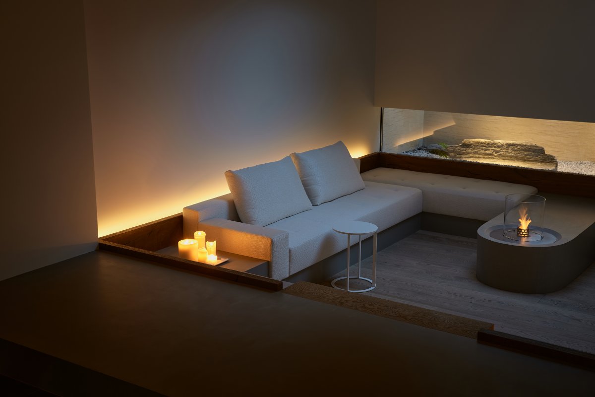
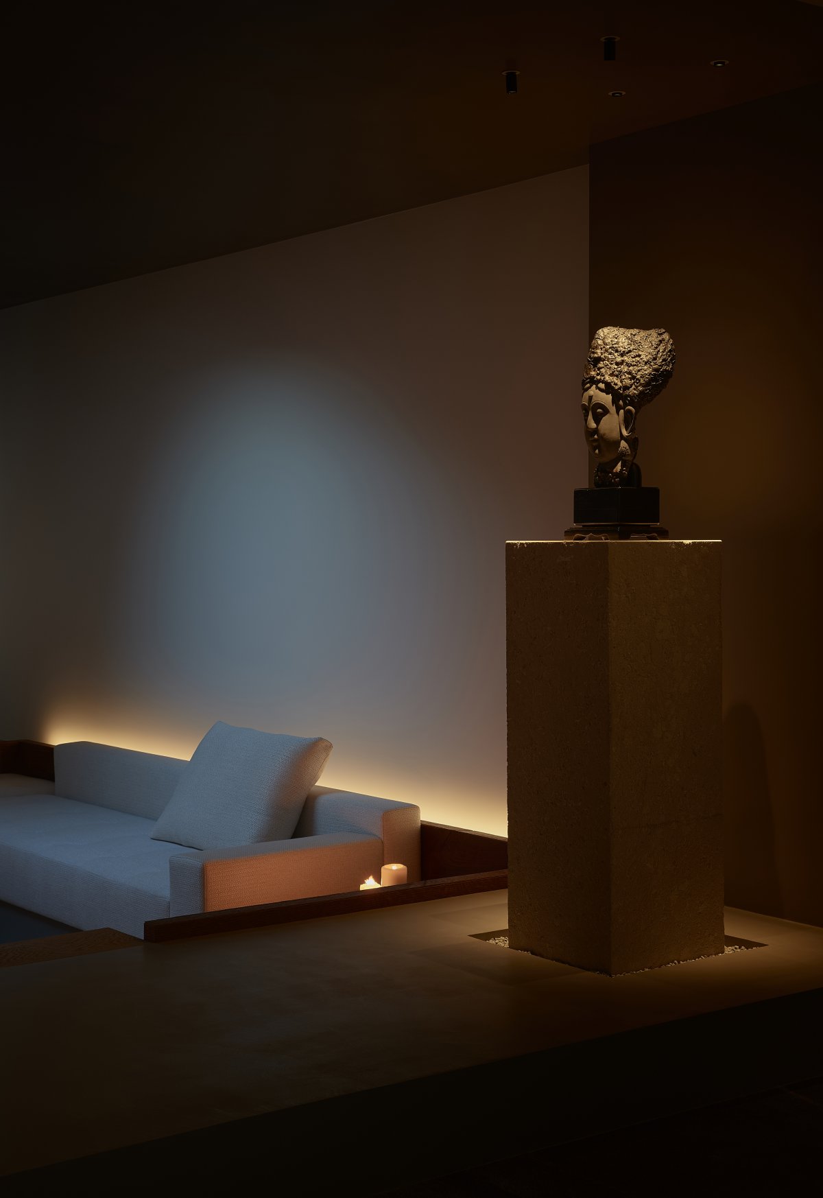
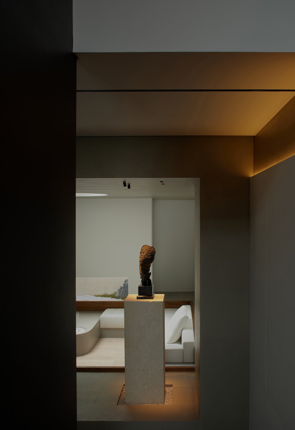
The sunken hospitality area is arranged on an axis, with a fireplace in the center corresponding to the skylight. The circle and round, though of different sizes and functions, are unanimously a gathering place of energy in the midst of a square space, where people sit around due to the special positioning of functions and light coalesces due to the appropriate intervention of the design. The sofa area is surrounded by a short solid wood 5cm above the counter top, forming a custom backrest. The bottom step down and the top gradual expansion extend the energy, visual feeling and perceptual dimension of the space with two different ways of coexistence.
The Essence Of Nature
━
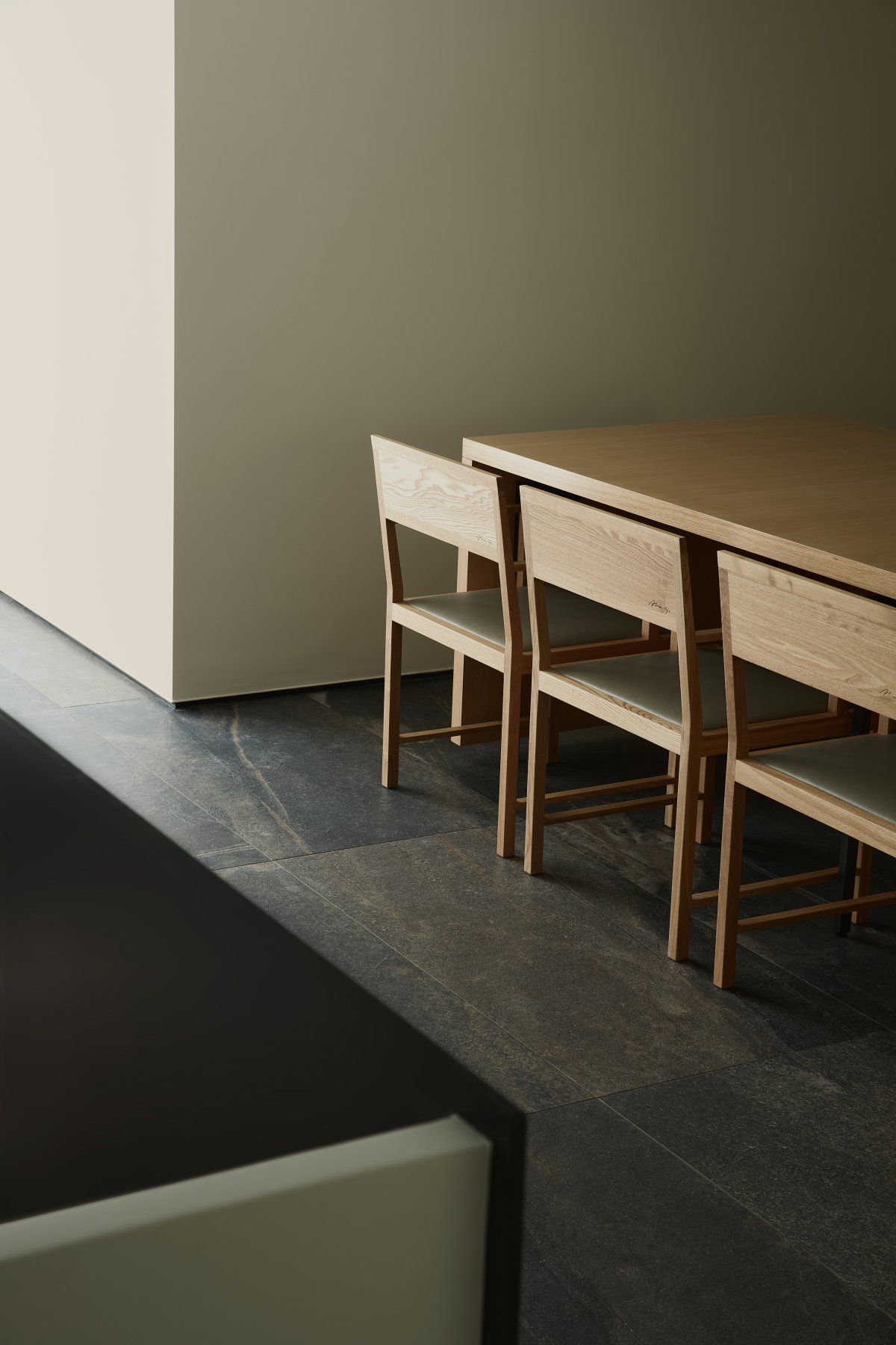
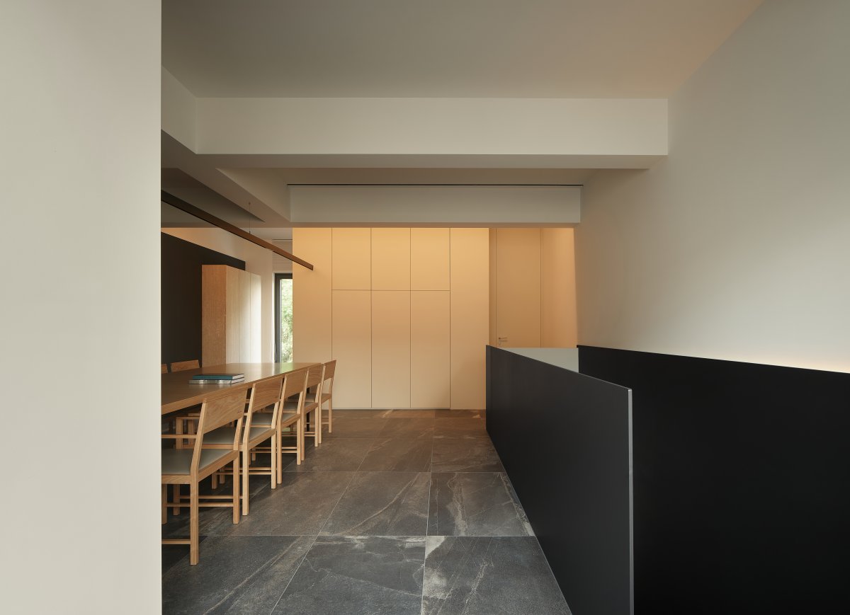
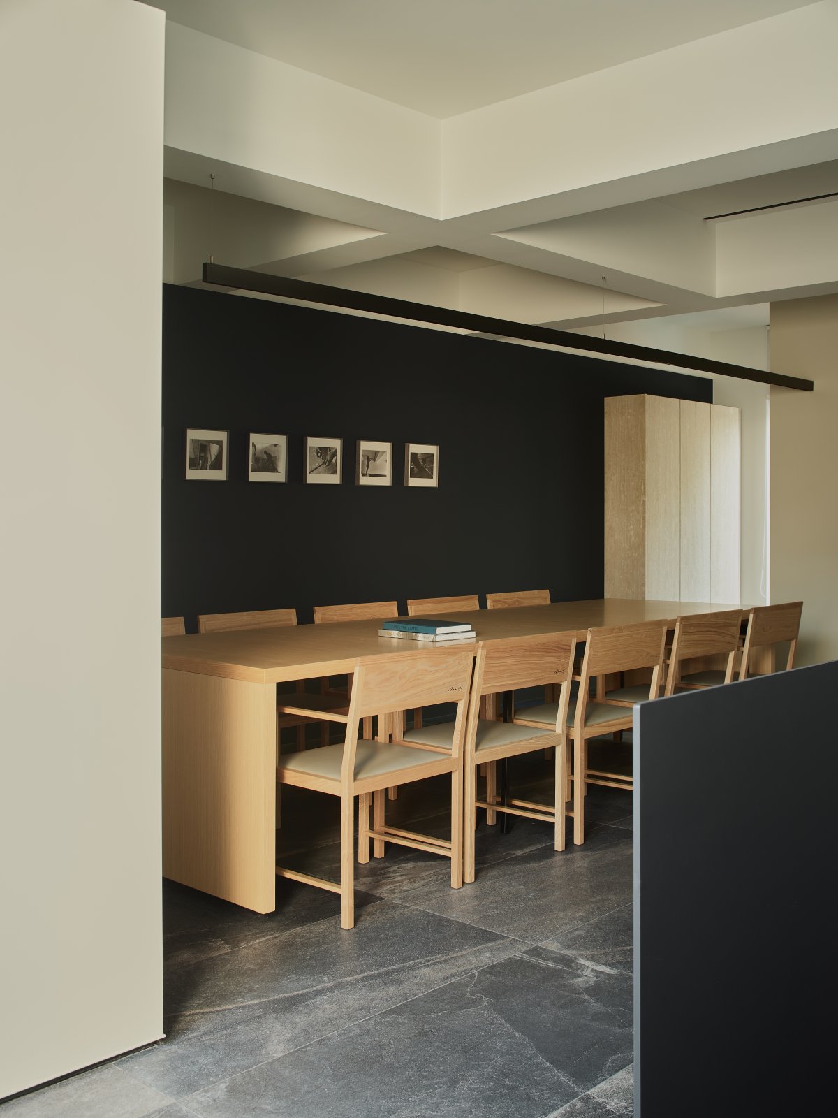
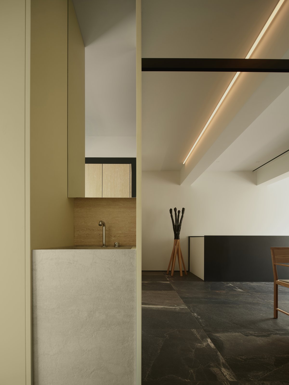
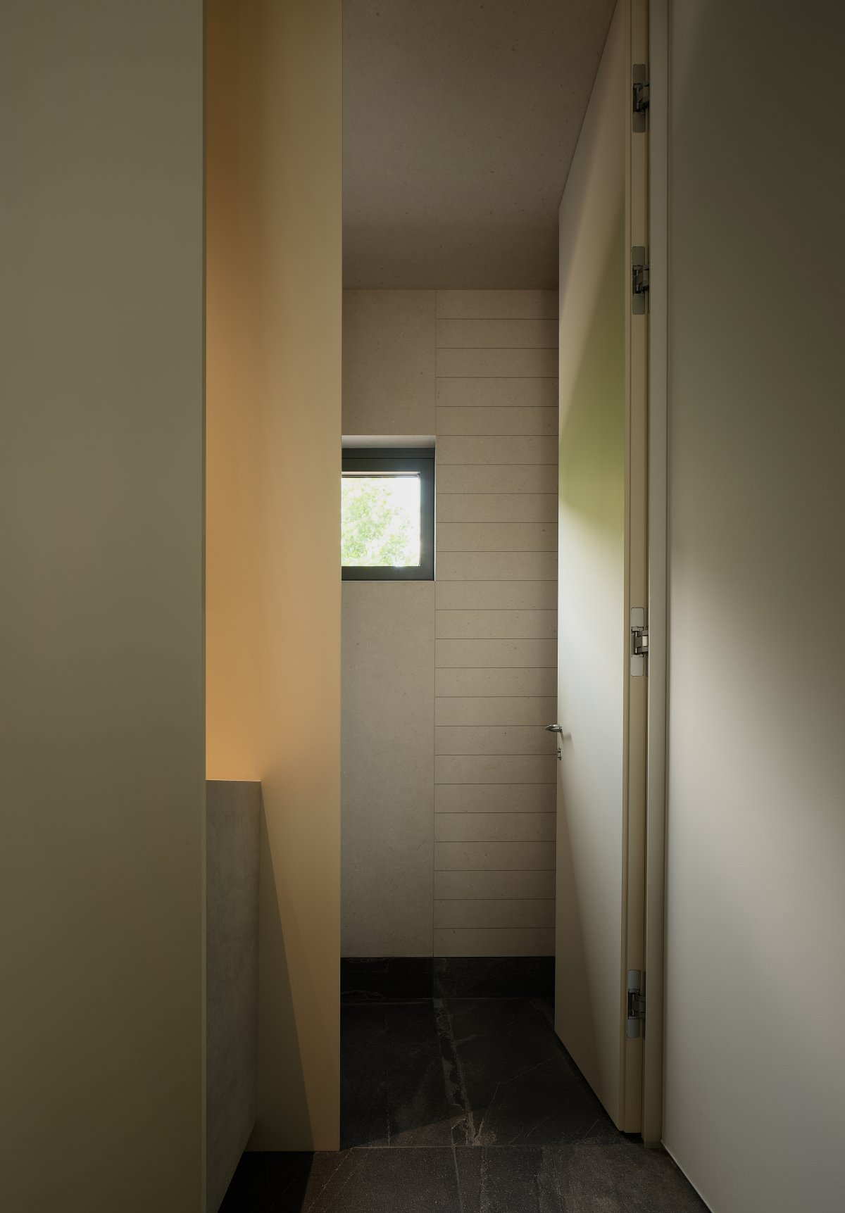
On the second floor is a separate hospitality area, where the original wooden tables and chairs are laid out in a dark "curtain", waiting for the guests to be seated and for the play to start. In order to take care of the integrity of the open area façade, the kitchen has been changed to open at the balcony; on the other side, although the public bathroom is small, it is also separate for men and women, in addition to the sense of ceremony itself, it is also a delicate respect. The exposed ceiling structure is haloed by asymmetrical linear lights and lights fixed on the side walls of the beams, and the non-homogeneous spatial structure expresses the homogeneous character.
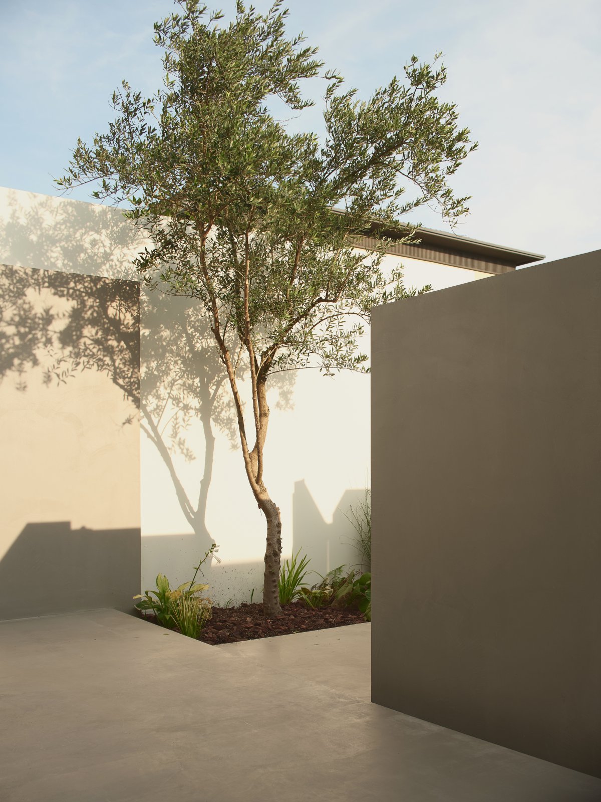
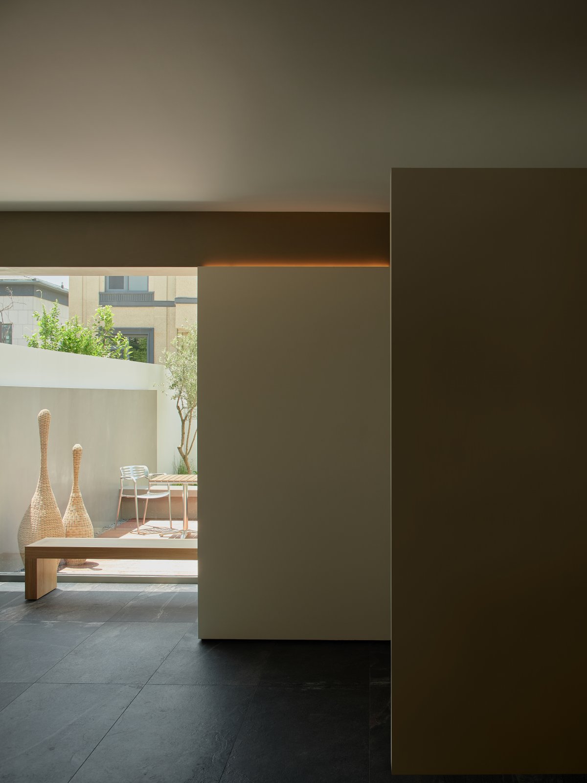
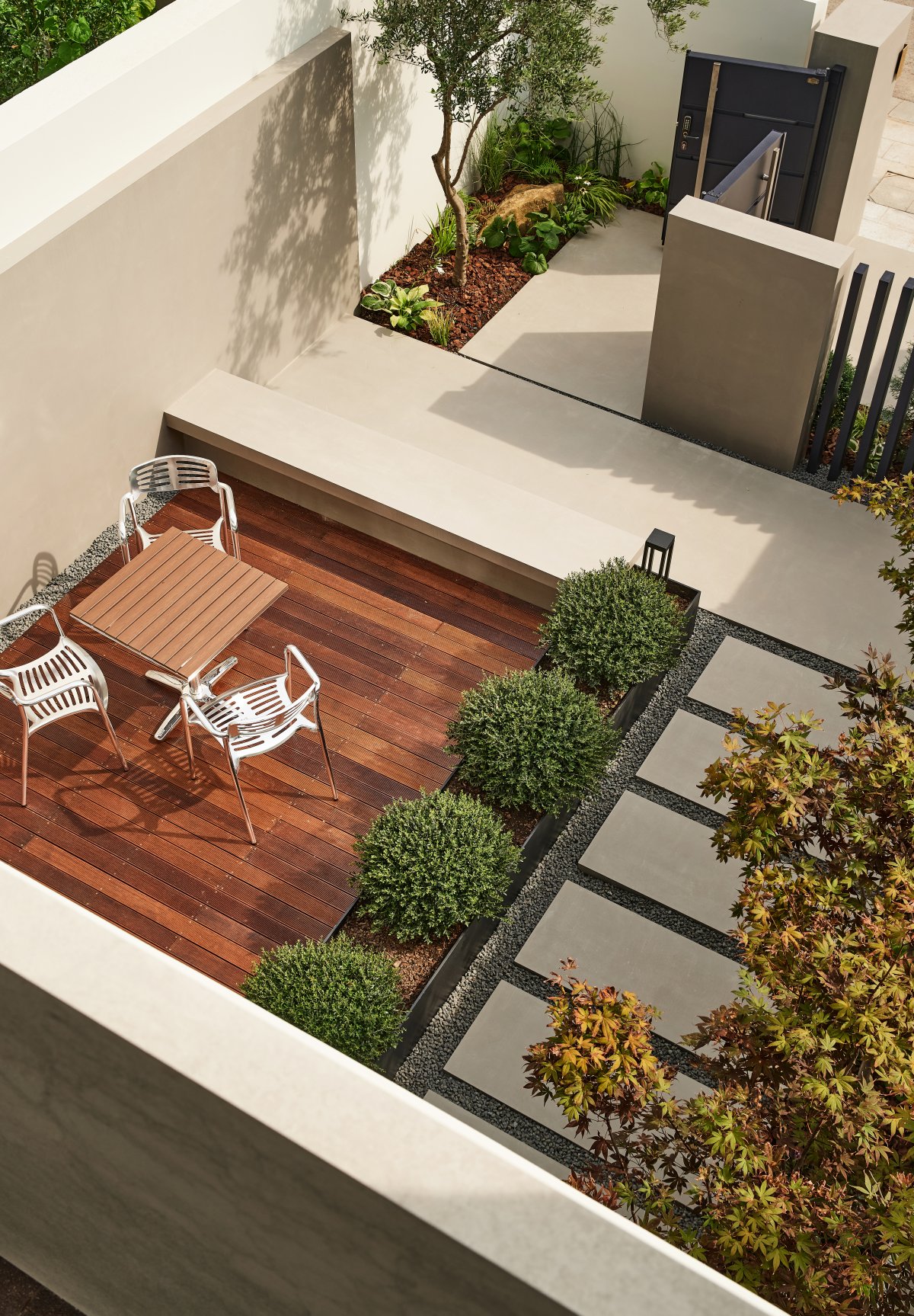
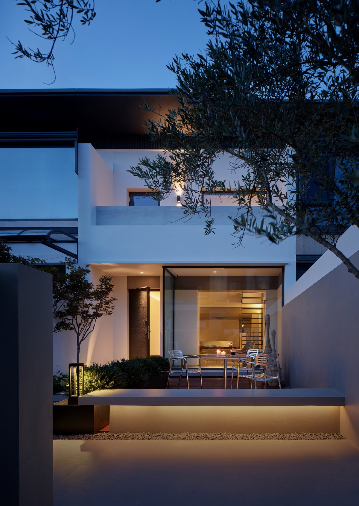
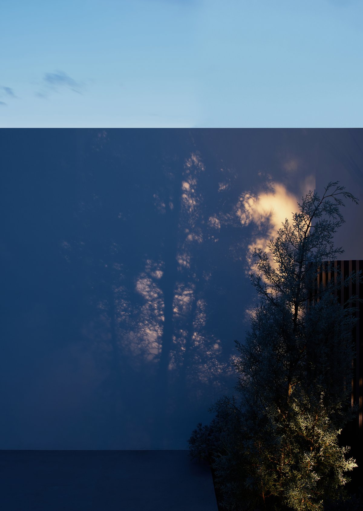
The entrance courtyard connects with nature in an open-air manner, organizing the main traffic routes while the winding and repeated paths build an Eastern-style gardening experience; while the backyard is presented in the form of a framed landscape of a certain scale, with wild rocks and green ferns growing freely under the environment of sunlight and rain, adding a lively and dynamic scene to the interior. The backyard is presented in the form of a frame at a certain scale.
- Interiors: Zhen Design
- Photos: Single Line Architectural Space Photography
- Words: Off-Words / Moon
