Guangzhou Nansha Yuexiu Mingzhu Yuejiangwan Sales Center
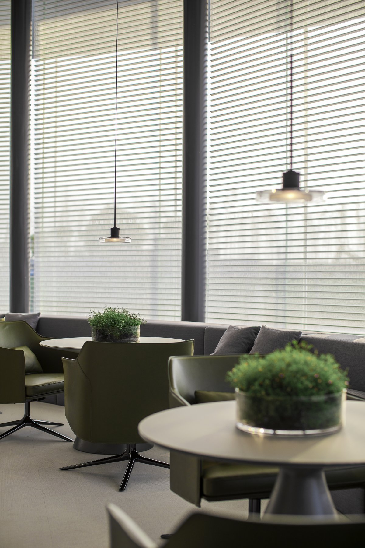
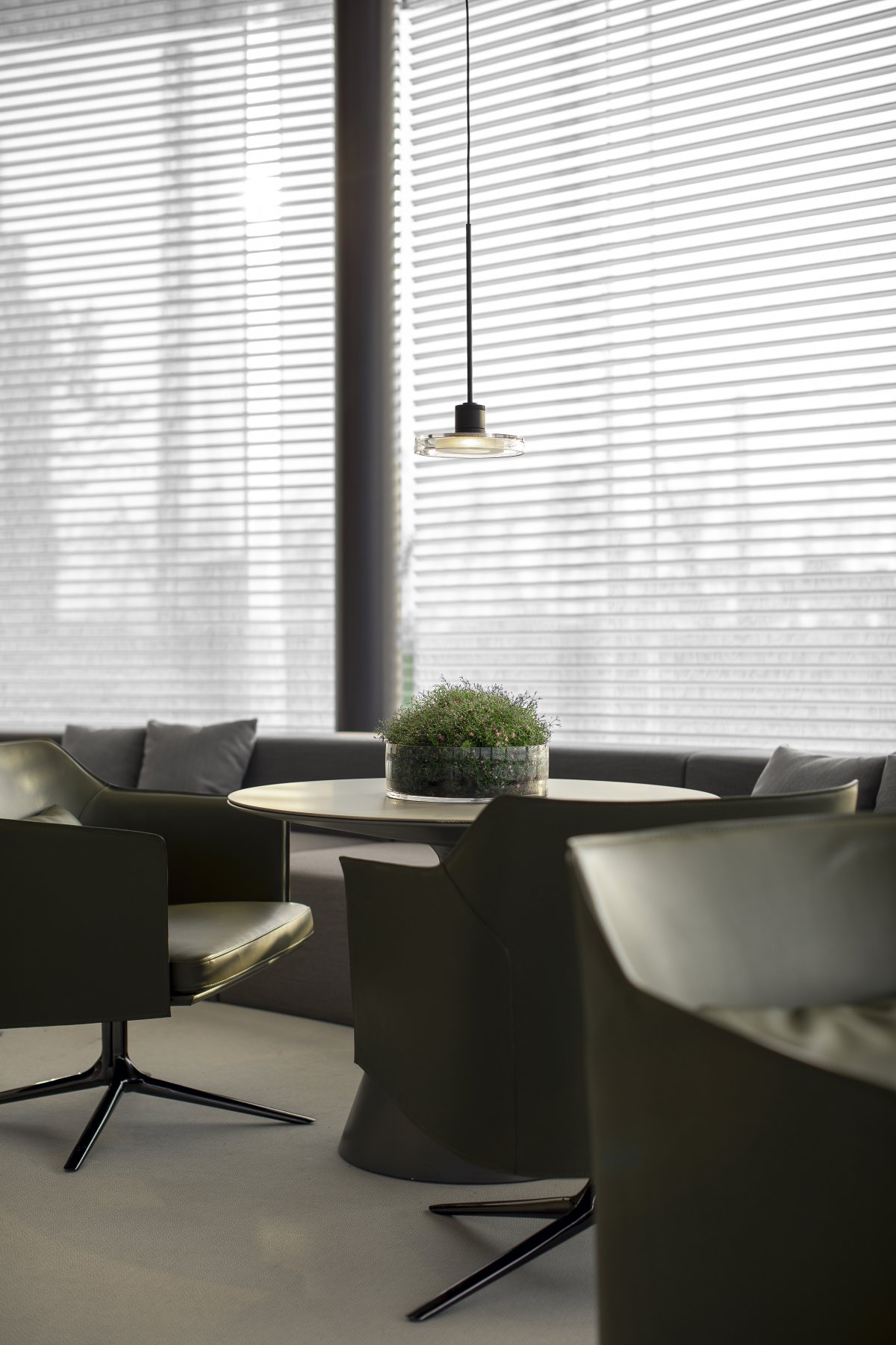
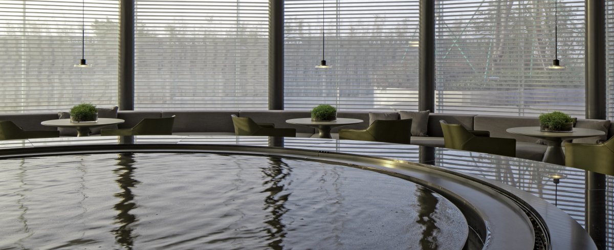
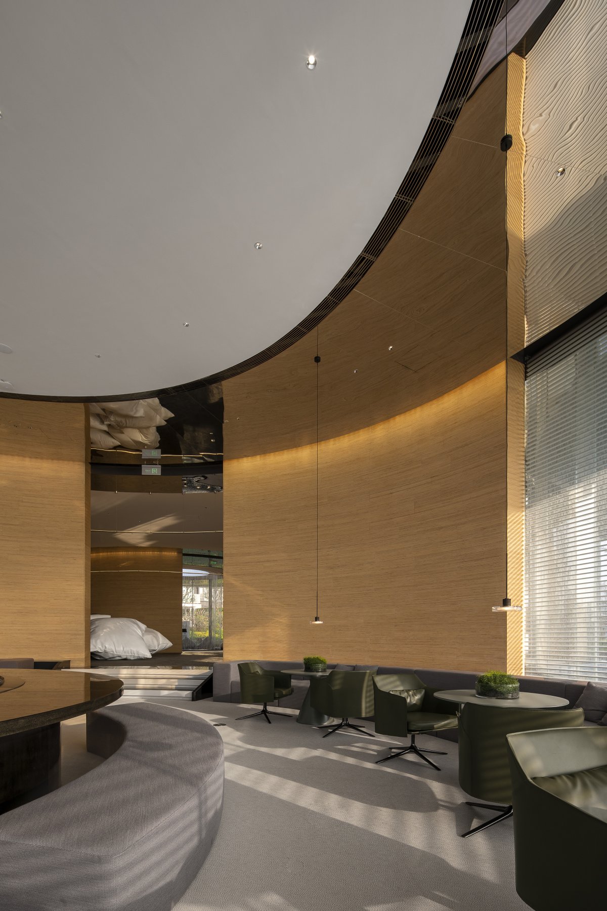
The project is located in Nansha Island, near the coastline. The spatial carrier is a flat level arc building, which is made up of five circular Spaces carrying different functional activities, meeting the daily sales function of the building, and extending it as a permanent building for an art museum or other future possibilities.
As one of the first comprehensive real estate development enterprises established in China and the founder of the first generation of commercial housing in China, state-owned Yuexiu Real Estate Co., Ltd. has changed its image of "steady" in the past, hoping to eliminate the inevitable rigid tradition of "old state-owned enterprises" at this stage, and break through the original brand appearance with a cautious and open attitude.
Project space attributes often start with the propositional composition form brought by the owner, and the key words given are always vague and inadequate. Often they know what they don't want, but they don't know what they want either, and designers need to be involved. At the beginning of the project, we tried to explore the anthropomorphic space.
Past sales space, with a high degree of dogmatism, spatial attributes clear goals, so that the user can not be questioned. It may be noble or high-end, and it is willing to express itself, but these spatial results always show a slight sense of superiority overlooking all living beings, and it is suspicious and unlovable. It lacks a sense of participation, and becomes a show of self-intoxication.
In view of the owner's attempt to reverse the traditional and rigid image, we deliberately created an "inaccurate" space in this project, hoping to break the fixed concept of the past through the space, without deliberately describing and defining a specific attribute of the space, and blur the purpose of the use of space.
For example, it does not strengthen the sales function so as to reduce the utilitarian nature of the space, or it avoids the solemn divinity on the basis of extending the function of the art museum.
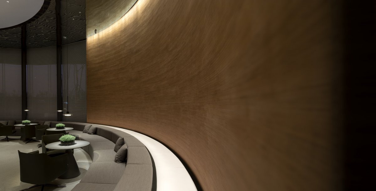
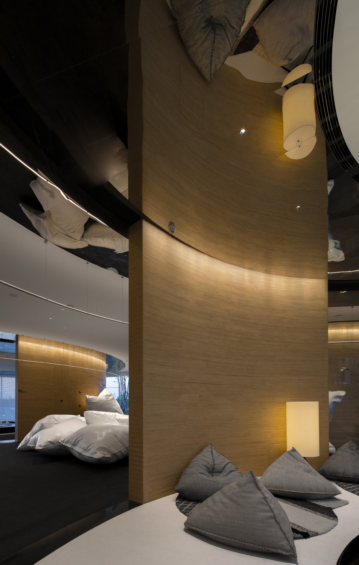
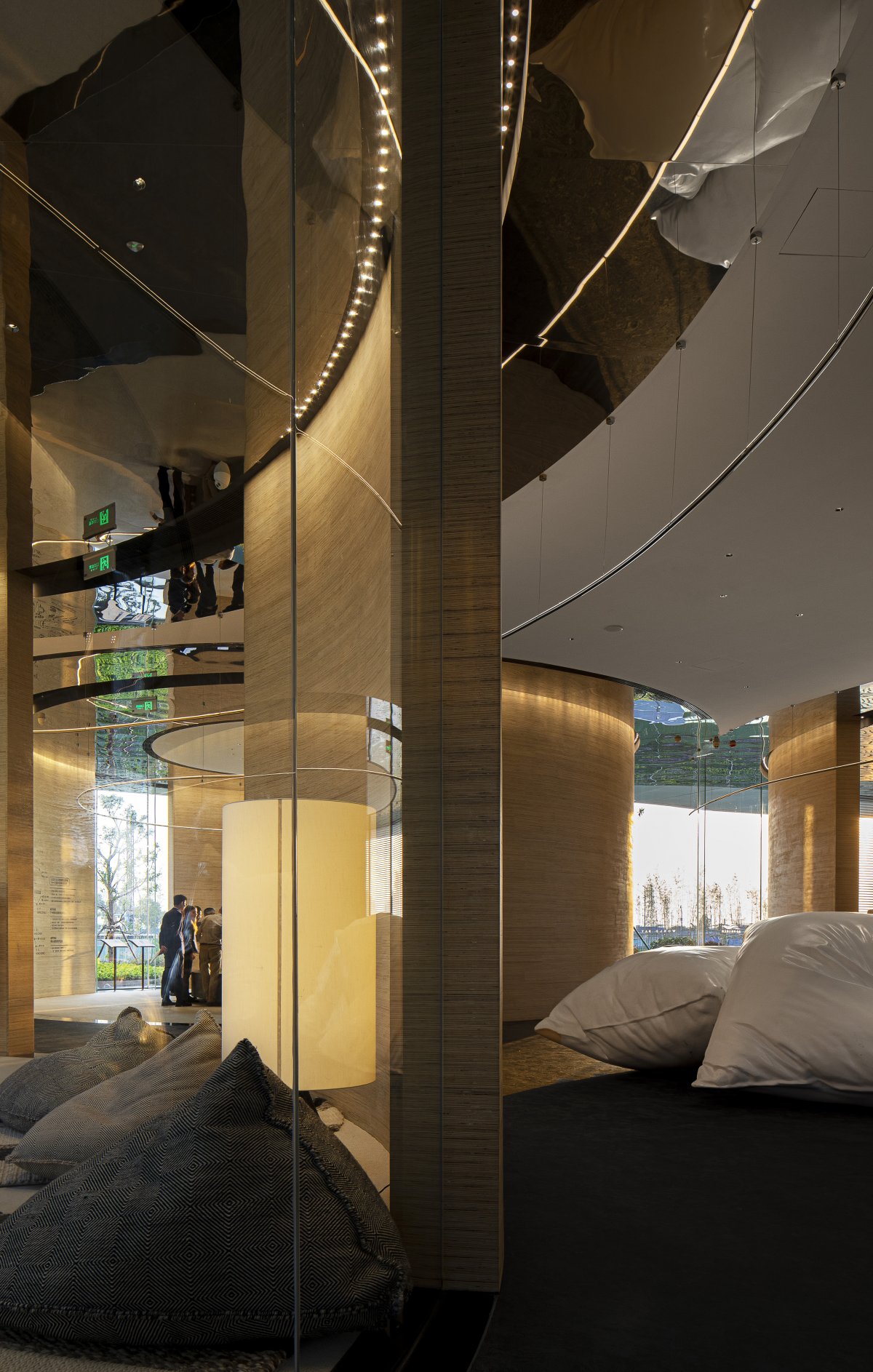
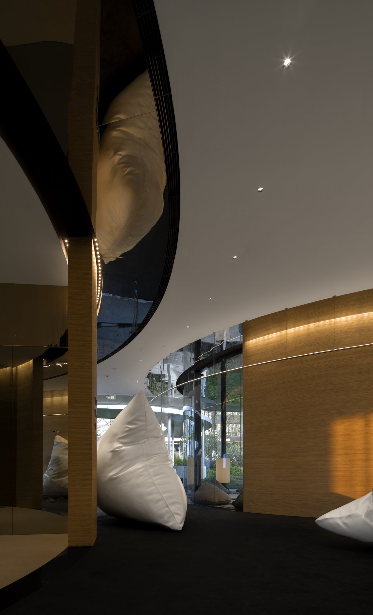
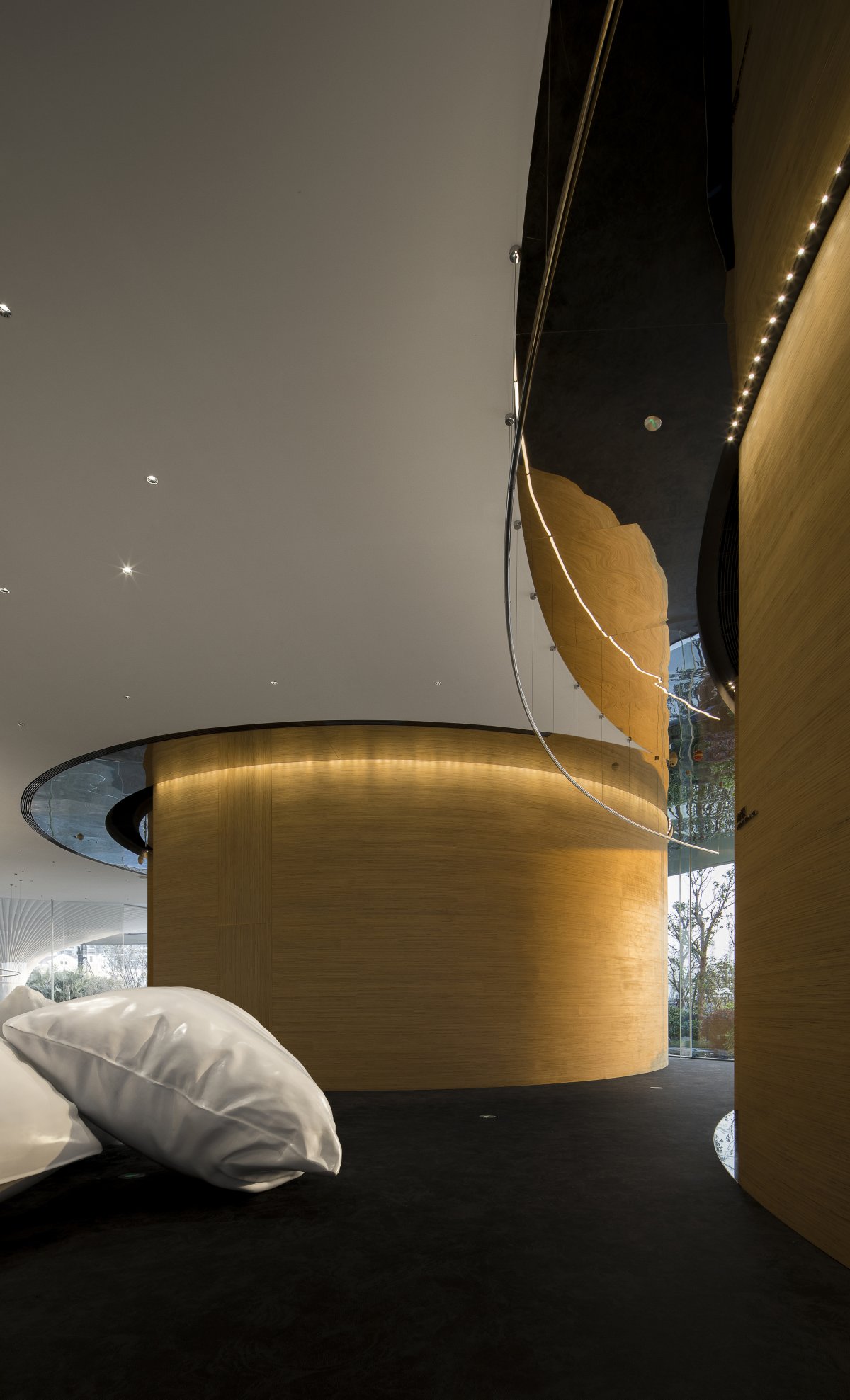
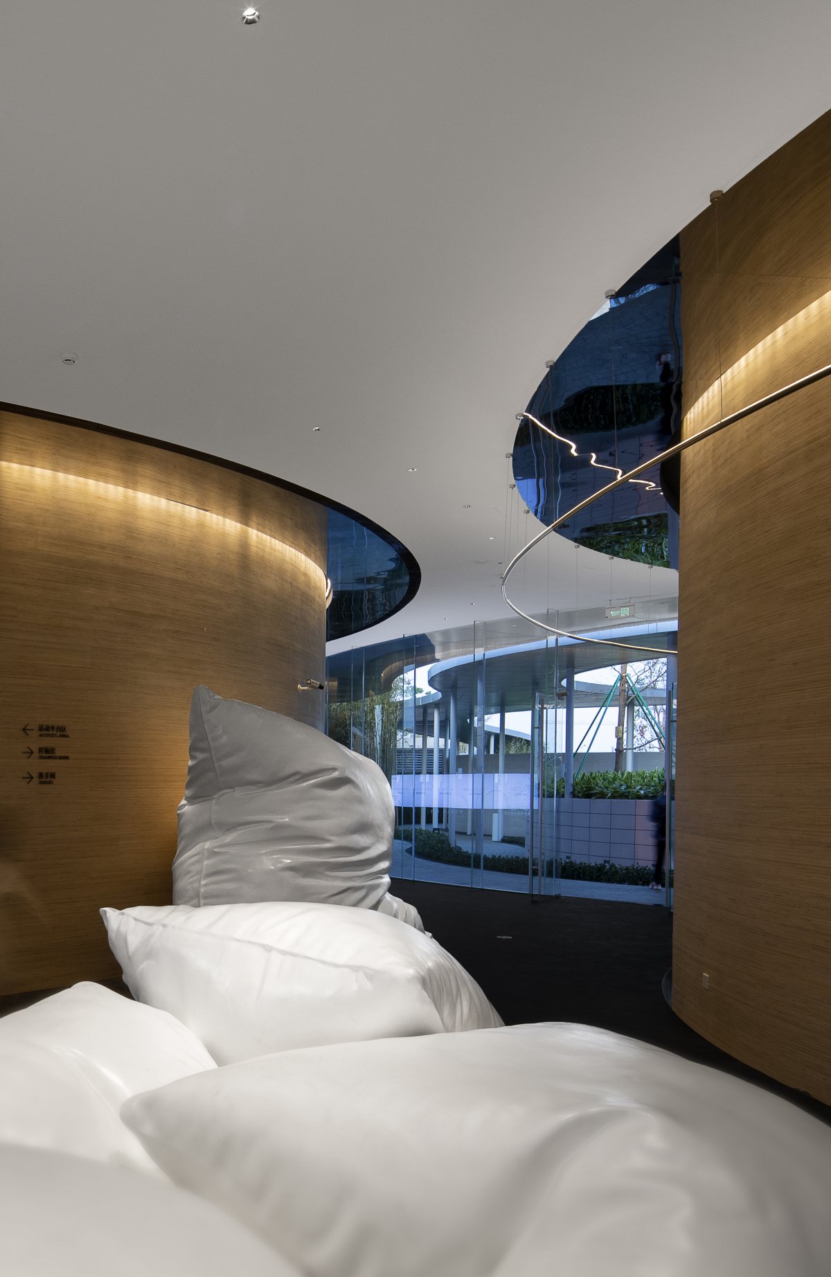
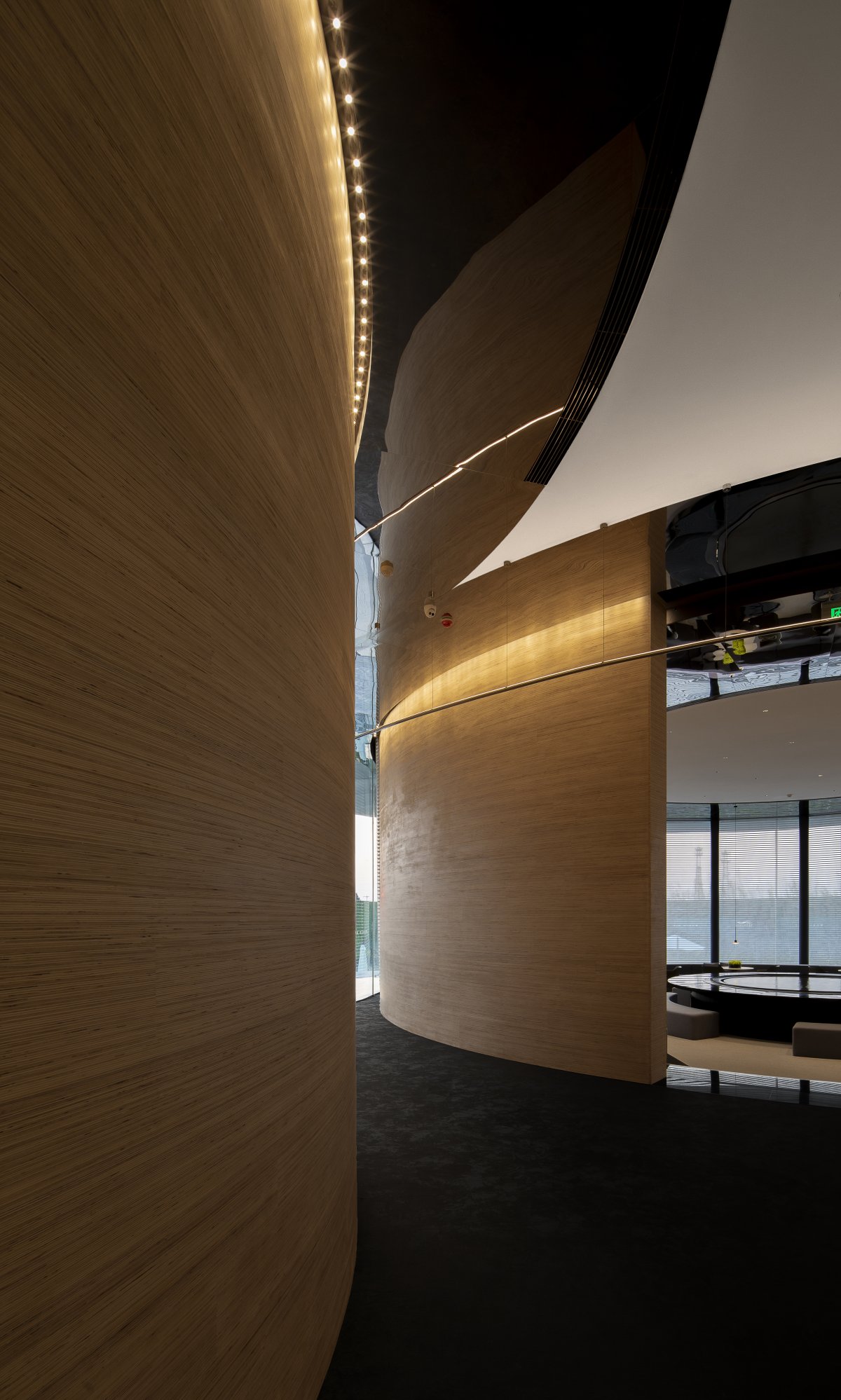
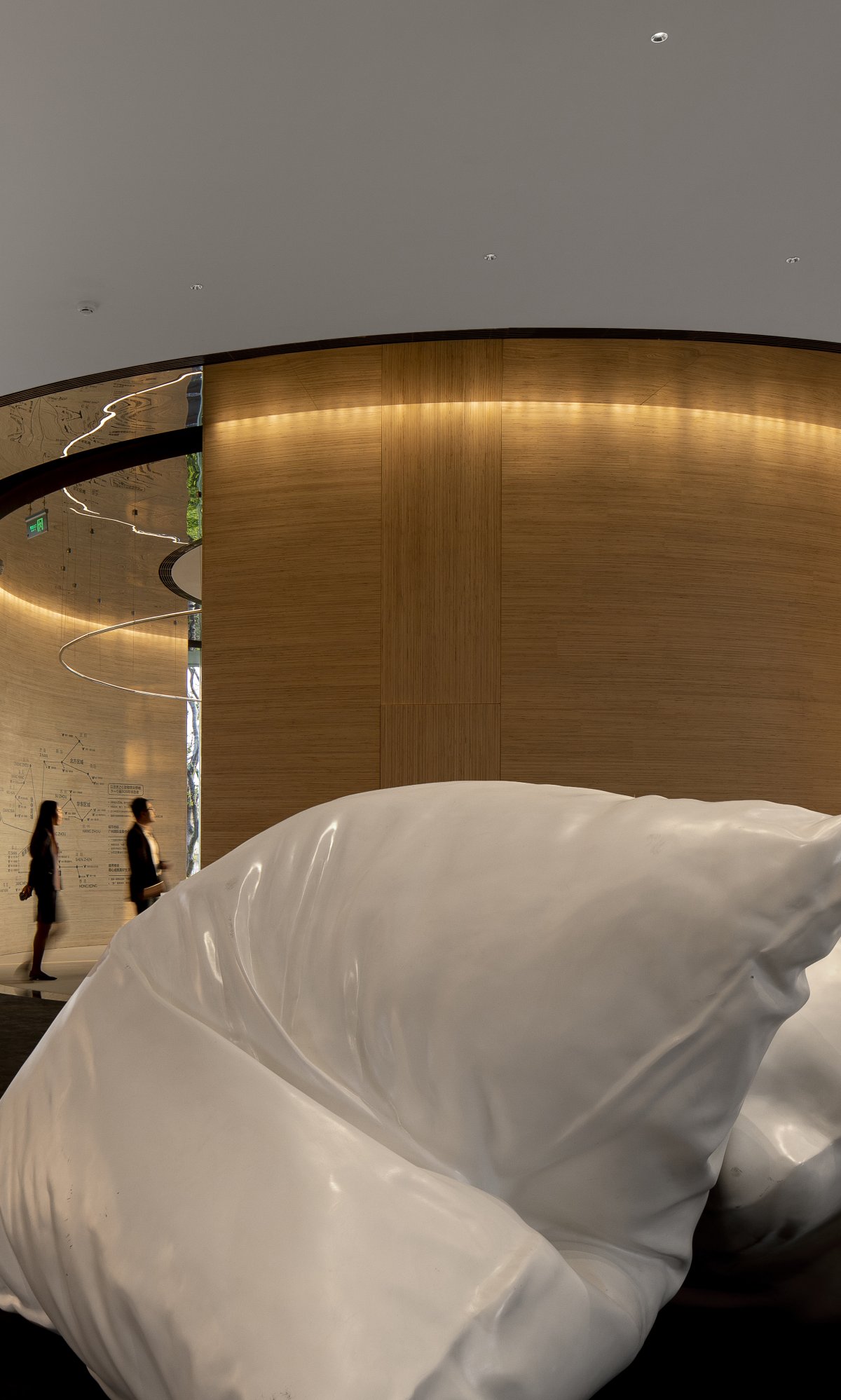
The interior of the curve space is not suitable for the short storey height. While trying to pull up the height of the storey, we make full use of the sense of expansion and extension brought by the curve visually. This subtle feeling will make the sense of spatial boundary fuzzy. Different from the behavior in the linear space moving line with a strong reach target, and the curve gives people a sense of distance, the twists and turns of the line extension, the space keeps out changeful, so that the space user more a desire to explore.
In the spirit of fearless attitude, we give up the system of traditional color matching. In the space material, we emphasize the simplicity, and use the black, white and gray technique to pull out the space level. The wood color in the space represents the gray tone in the space. Therefore, we specially developed a wall material for this project -- laminated multi-layer wood veneer, which includes the process difficulty brought by curved walls, strengthens the horizontal lines and enhances the sense of visual extension.
The circular space has not always been dominant in furniture arrangement, and we have turned this into an "unconventional" advantage.
Back to the "night talk around the stove" in the primitive civilization period, water and fire bring the sense of security of resources and the sense of belonging of the nest from the nature of animals.
As the primary functional area of the sales center -- the negotiation area, in the semi-enclosed space center with a diameter of 14m, the furnace and landscape pool are housed on a round table with a diameter of nearly 5m, which becomes the visual focus of entering this space.
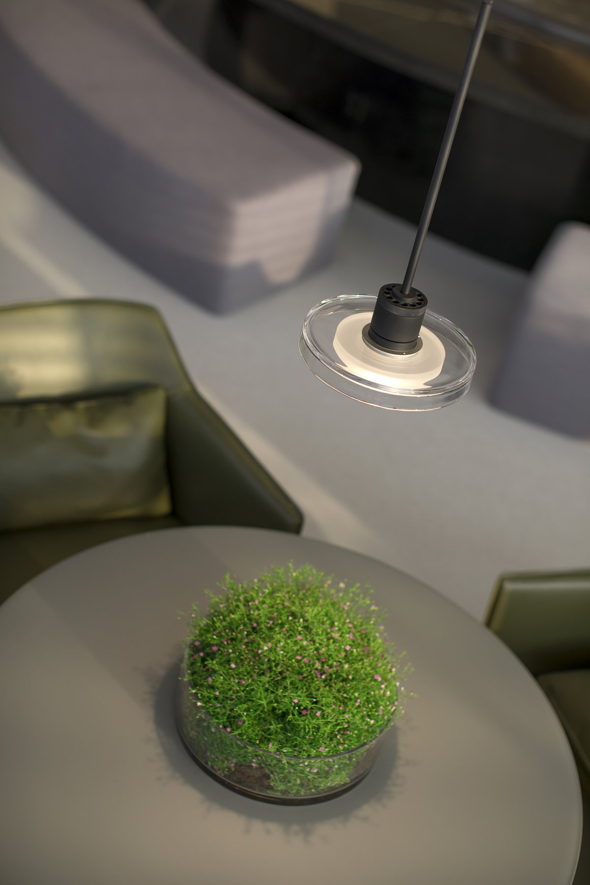
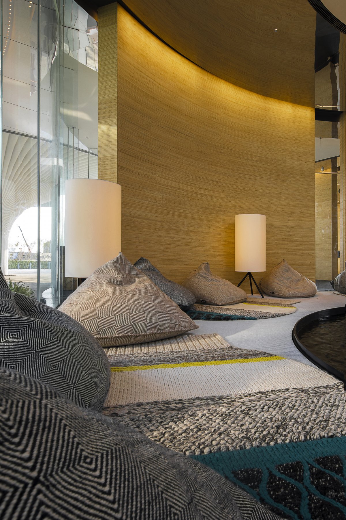
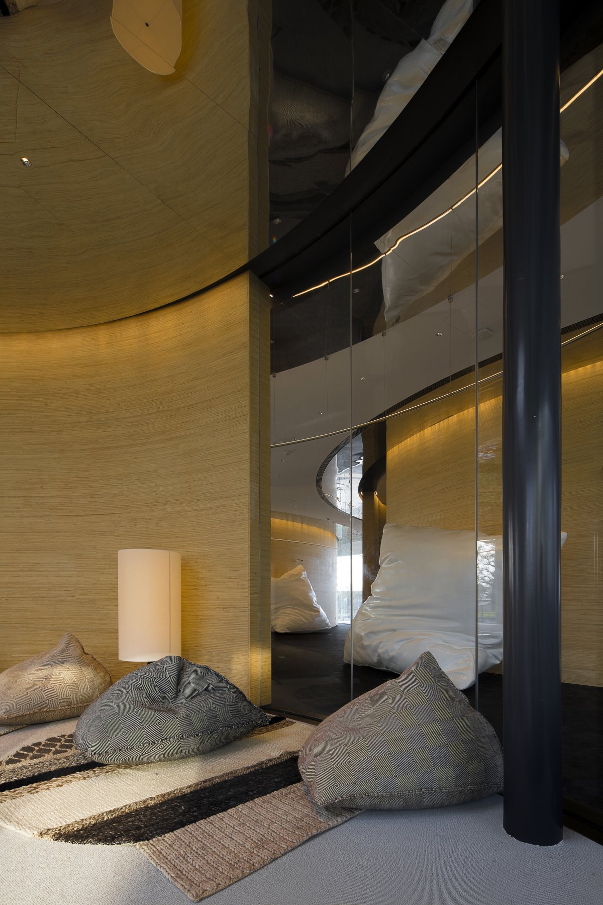
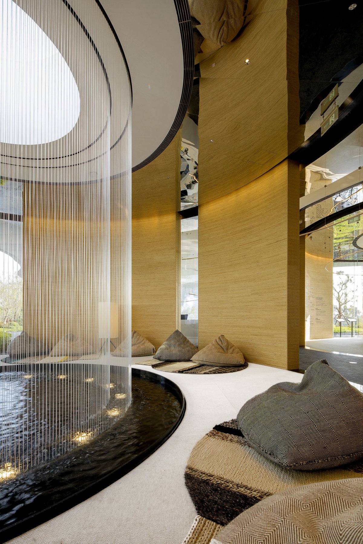
Considering the future malleability of the space as a permanent building, we deliberately made some Spaces "undefined". Sandbag seats scattered around the indoor water curtain landscape leave the space users with free functional definition. Accompanying the appropriate sound of falling into the water, the addition of floor lamps is to bring psychological relaxation.
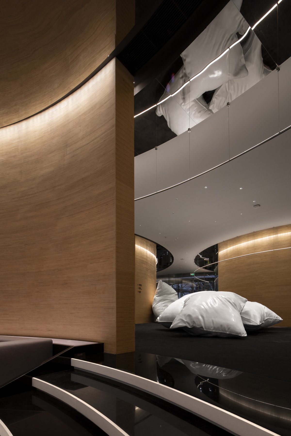
No matter in the sales space or the installation displayed in the art exhibition space, we believe that the fun is far more than the significance, the sense of humor that makes people smile in the space brings more intimacy, and reduces the deity that business or art brings over consumers.
The huge pillow beyond the conventional size has a little connection with the residential products sold by the sales department, but this is not our main purpose. We hope people will think of the simple touch and even enjoy themselves first, rather than the meaning. Blurred boundaries, extended walls and humorous installation art are all designed to create a sense of user participation in the space and enhance the friendliness of the space.
- Interiors: Vincent Zhang × DOMANI

