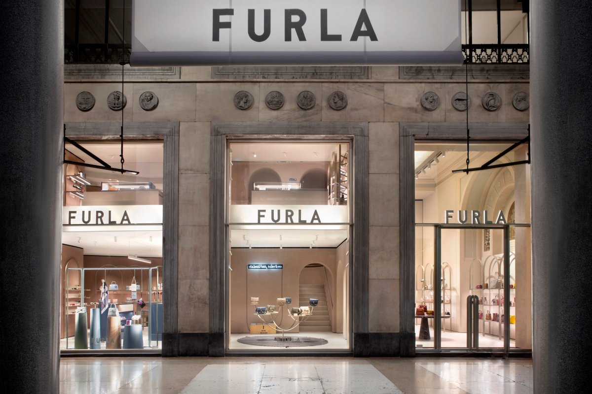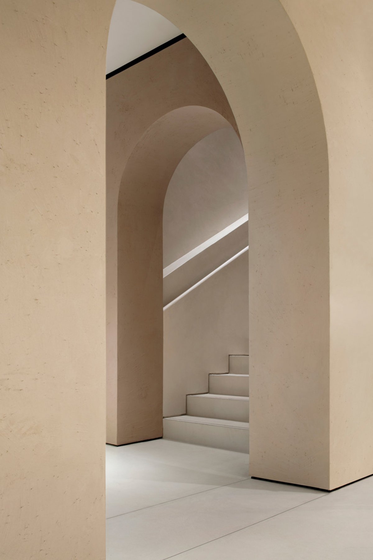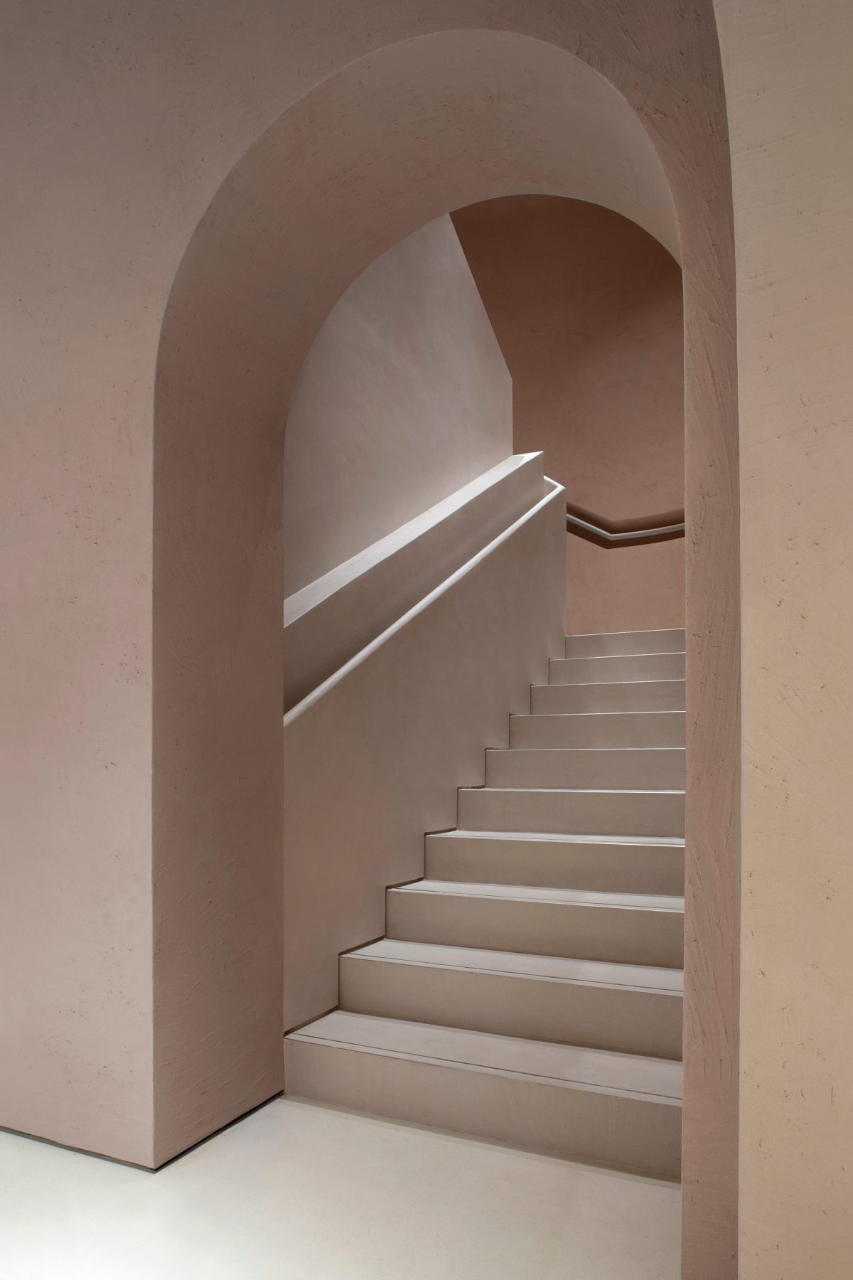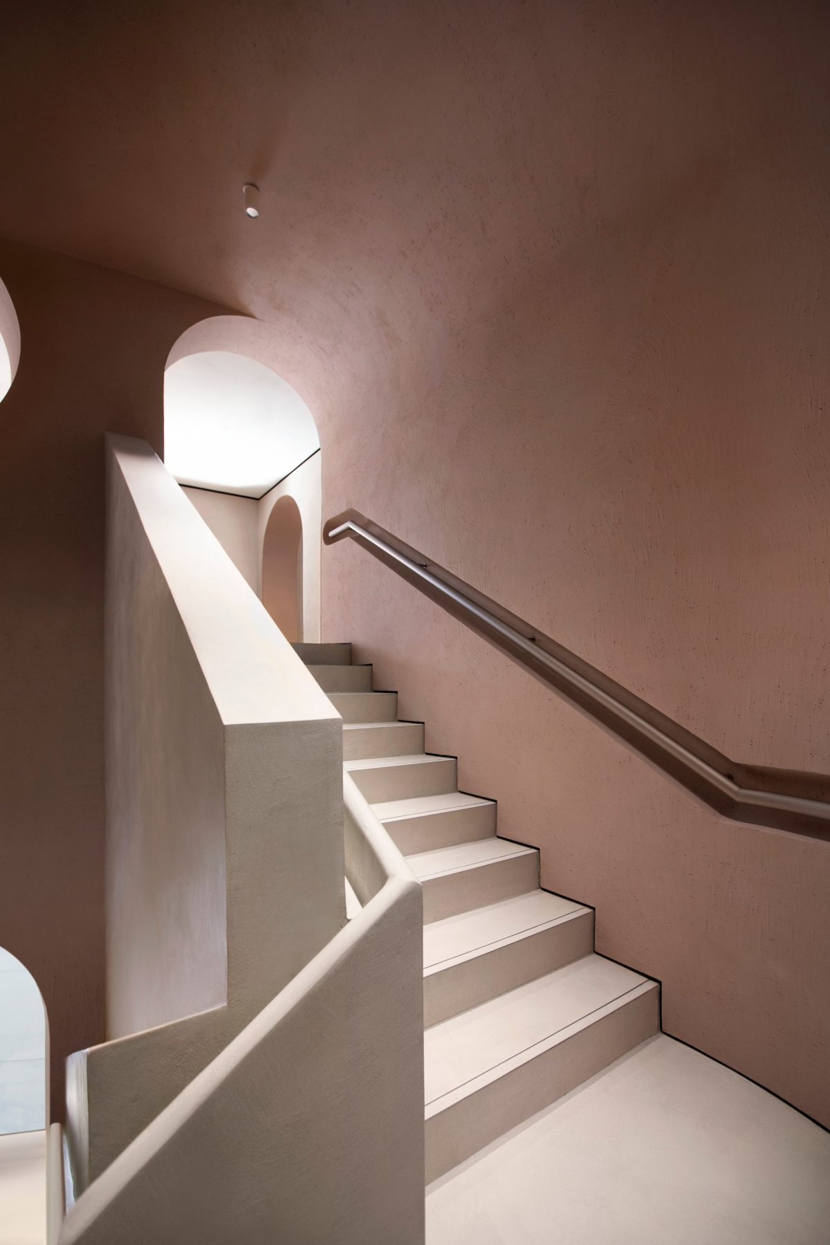
Furla has kicked off a plan aimed at revamping its key stores worldwide with a new store concept conceived by David Chipperfield Architects Milan. The concept makes its debut in Milan where Furla is unveiling its refurbished and enlarged flagship, which now occupies an area of about 240 square metres.
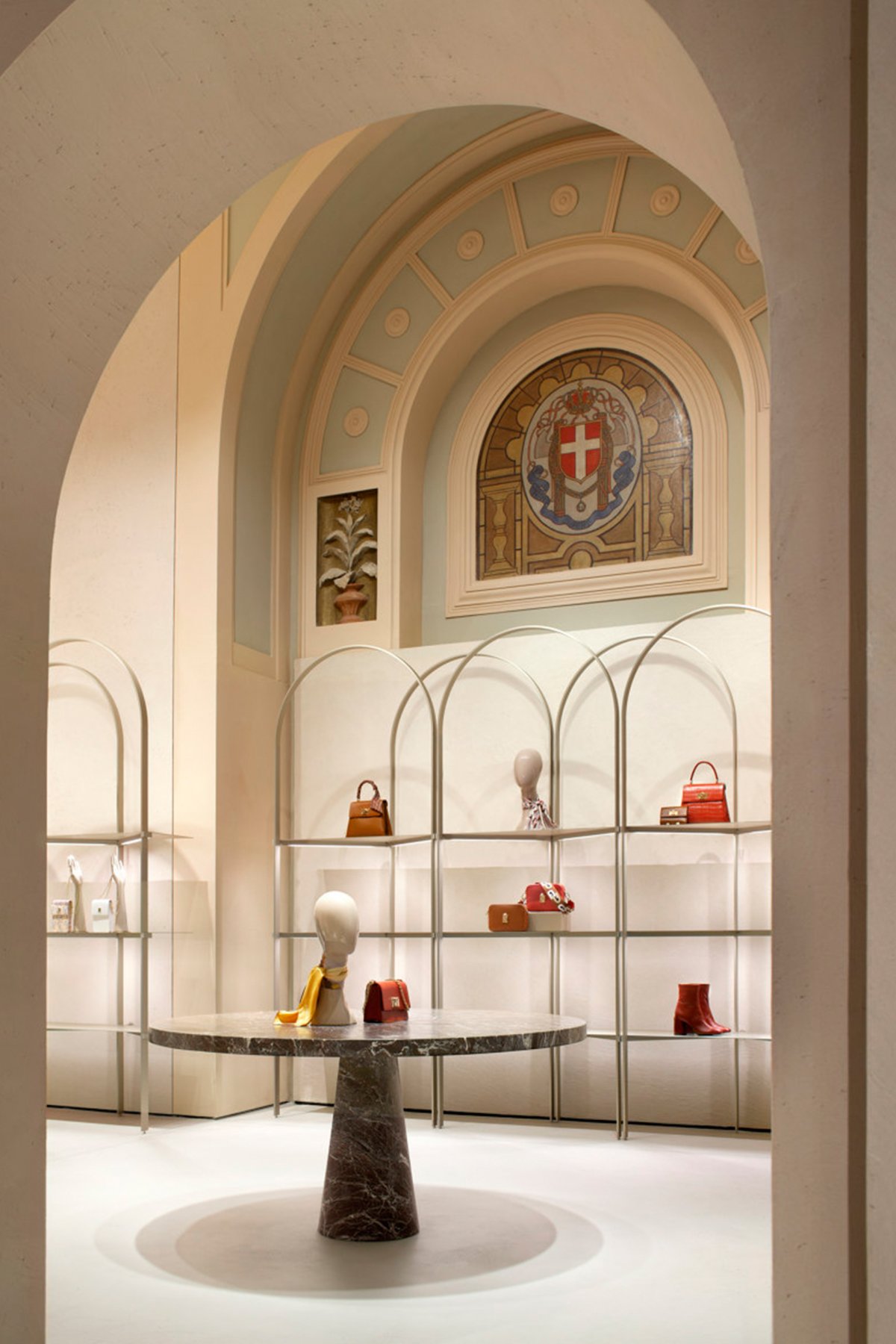
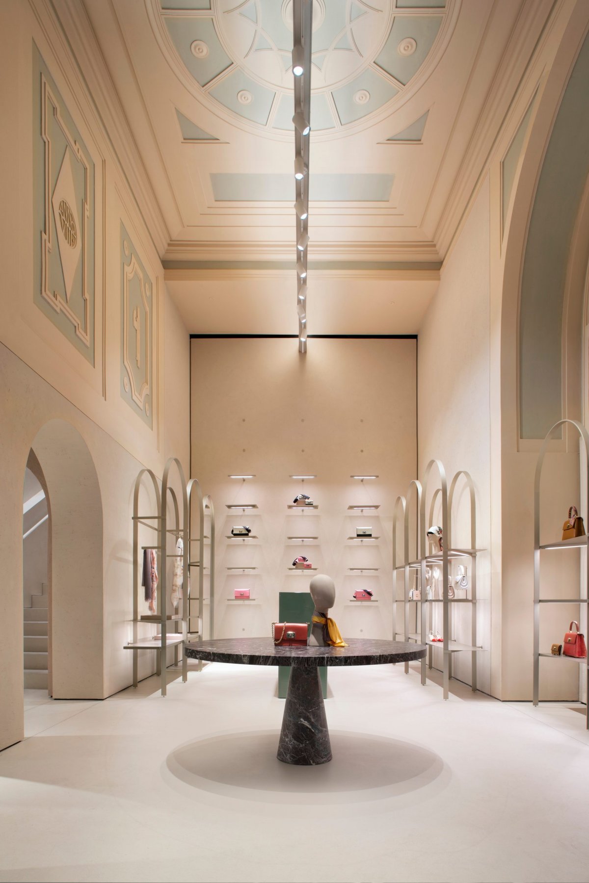
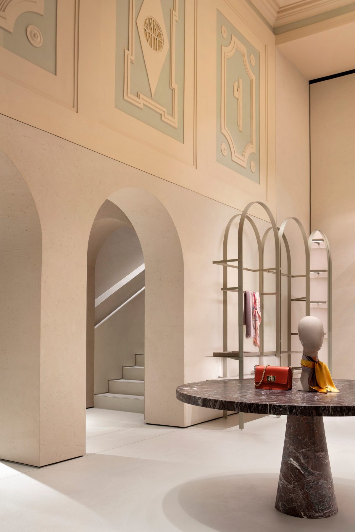
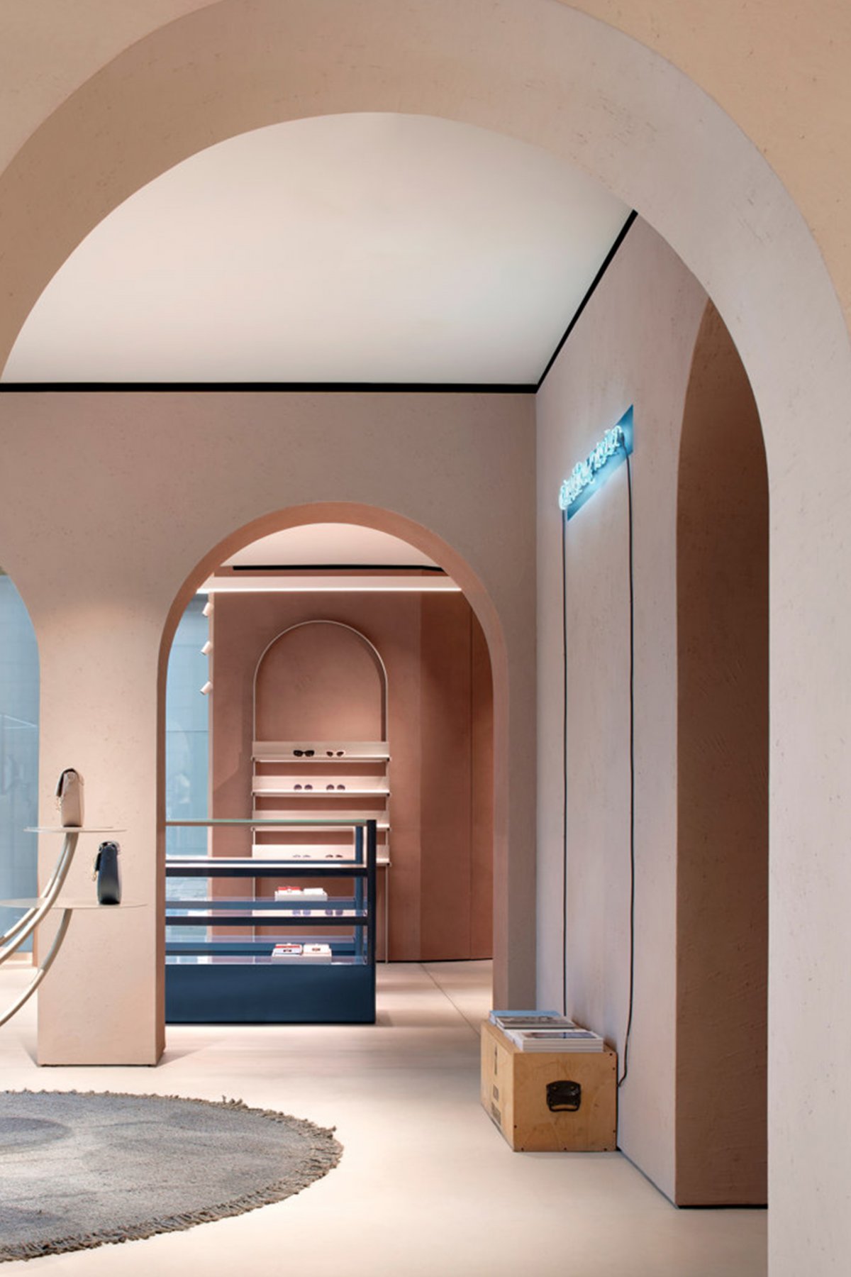
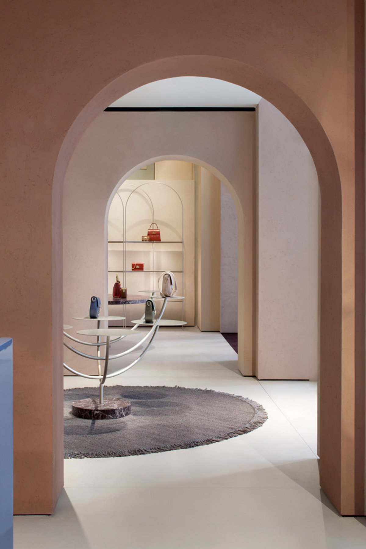
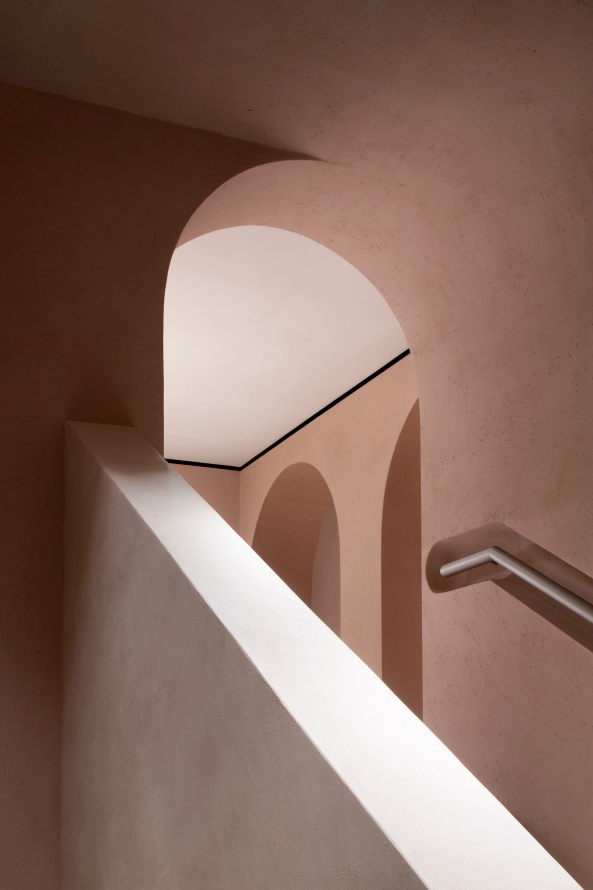
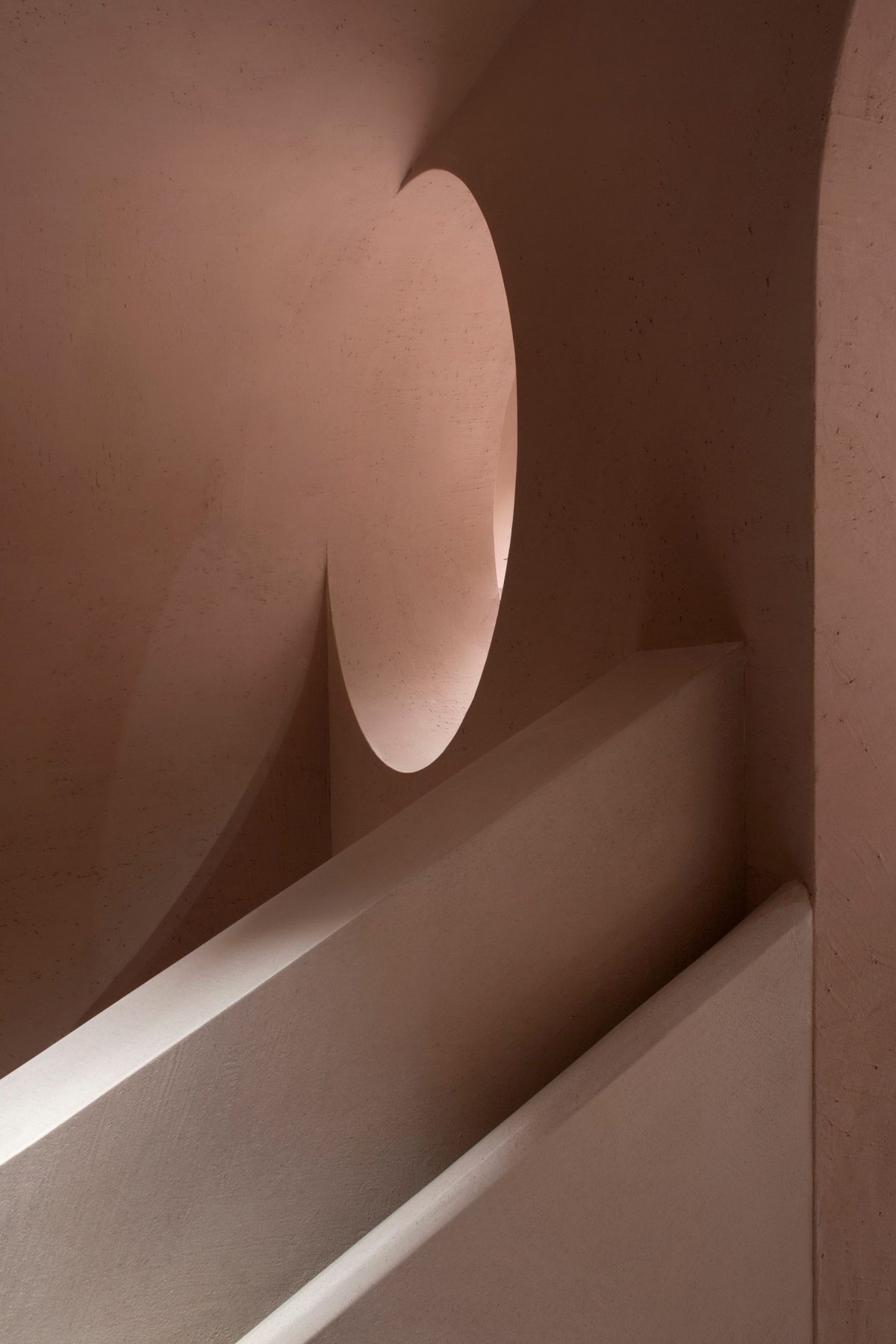
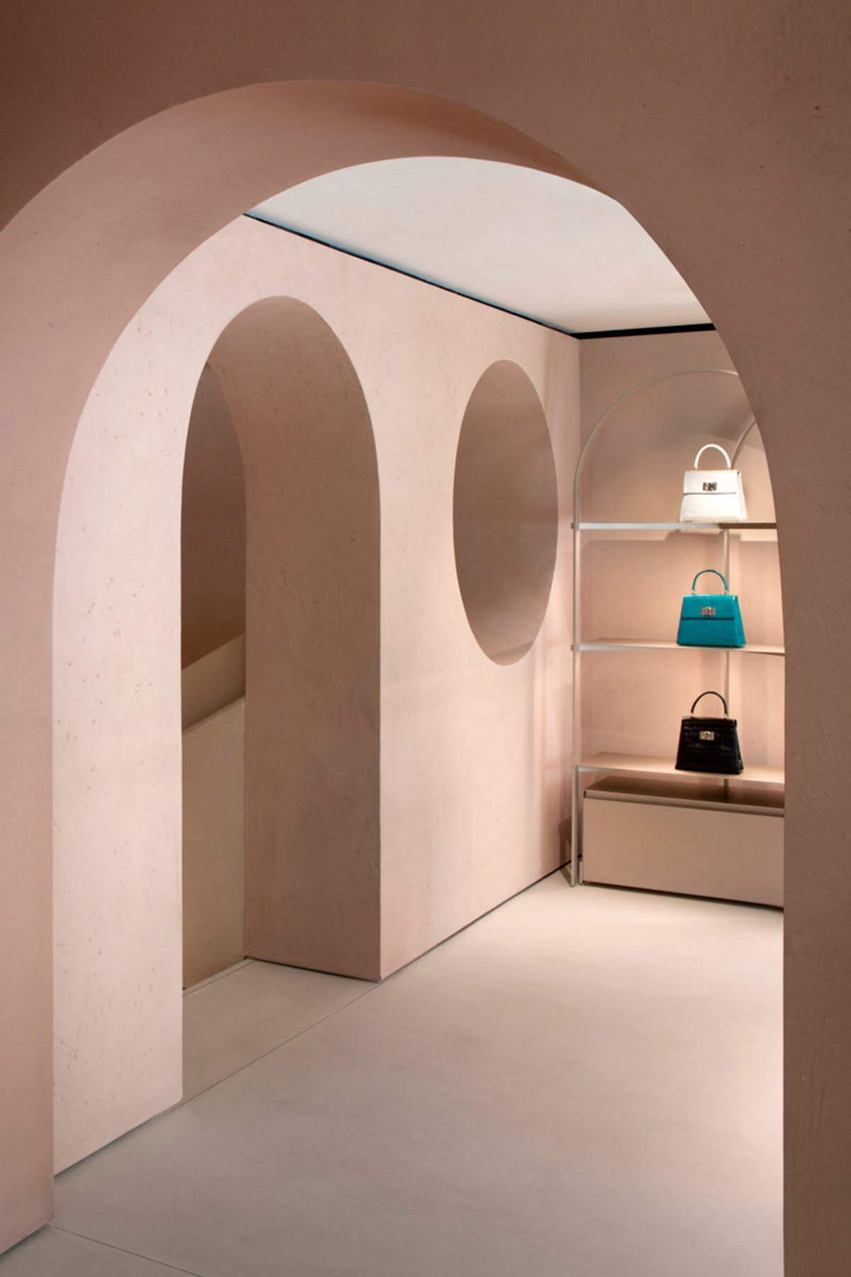
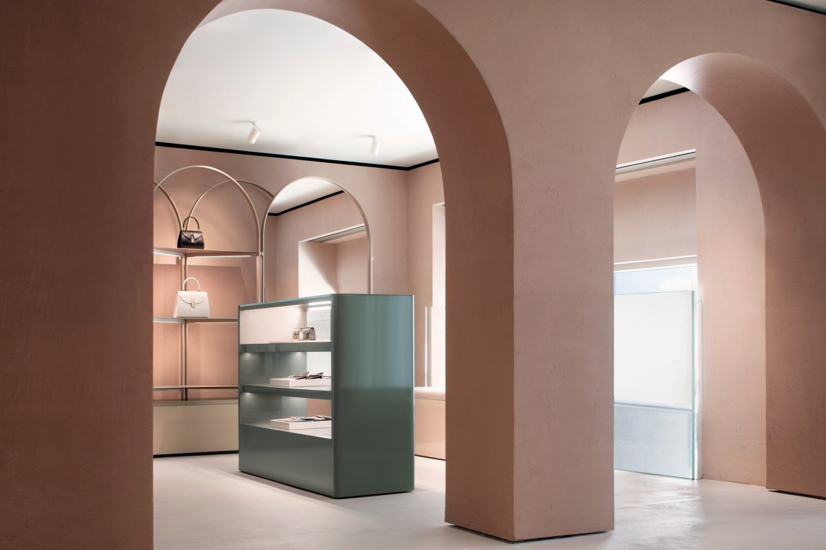
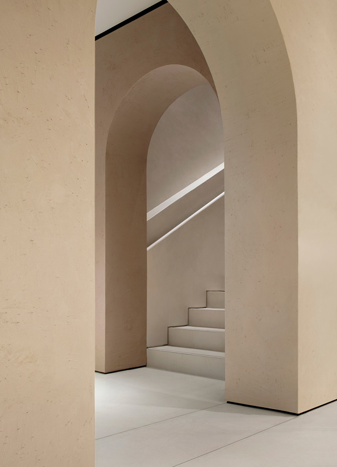
The flagship, consisting of two floors connected by a sculptural staircase, conceived as a series of essential yet distinctive rooms connected through sumptuous arched doorways.The recurring use of the arch inside the store celebrates the heritage of the brand, which was established in Bologna, famous in the world for its considerable porches. With its balanced combination of essential form and pure geometry, the arch, which also stands out in the architecture of the Furla Foundation’s palazzo, is also part of the new Furla logo.
Featuring intriguing tactile textures, the walls of the store are coated with raw earth obtained by mixing different natural clays. This rough plaster creates a charming contrast with the smooth, continuous surface of the floor covered with Italian traditional Pastellone finish.
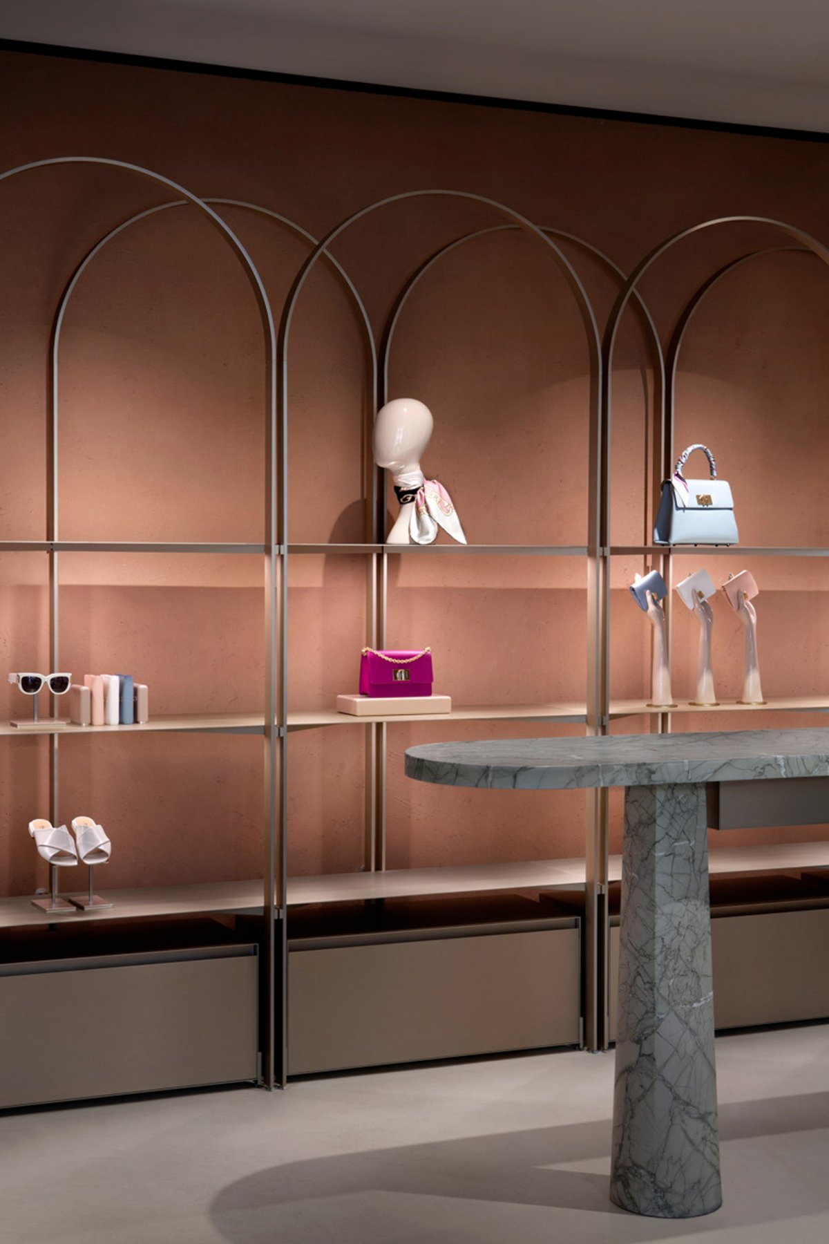
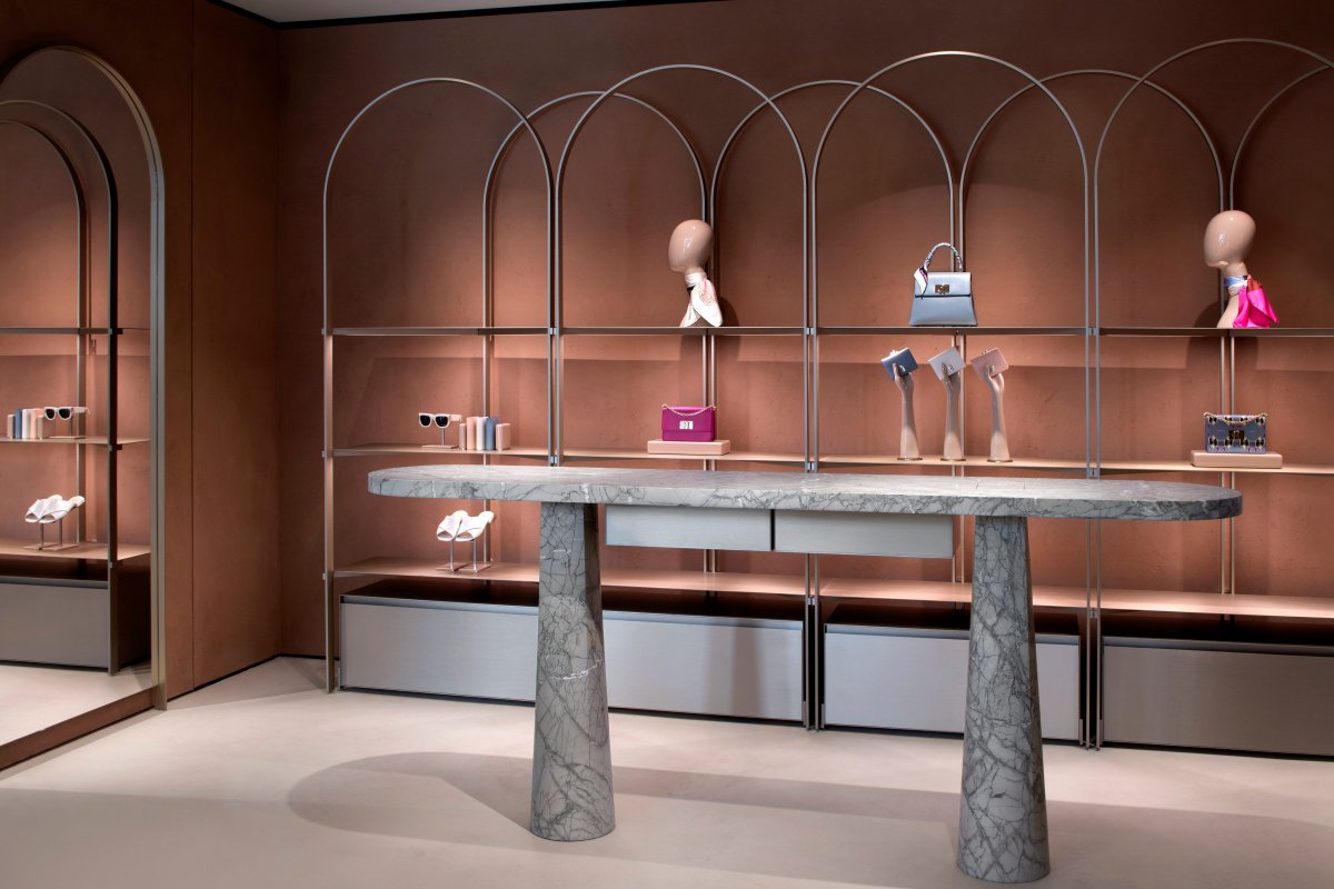
Around the perimeter, arch-shaped modular structures hold anodized aluminium shelves, defining a minimal yet scenographic setting that offers a contemporary interpretation of Carlo Scarpa interiors. The lightness of the perimeter displays is counterbalanced by the sculptural look of a series of central display elements and colourful marble that offer a contemporary interpretation of Angelo Mangiarotti tables.
- Interiors: David Chipperfield
- Photos: Alberto Parise
- Words: Gina
