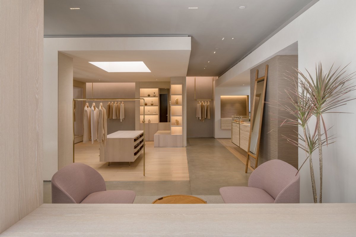
EMME prides itself on its collection of cashmere, silk and other exquisite textiles. It has chosen its first location at the Columbia Circle, a recently rehabilitated hub that is bustling with commercial and cultural activities. Among its neighbouring prominent historical and industrial buildings, the boutique has been designed as a hidden gem off the beaten track, making a connection with nature and delivering the brand’s pursuit of quality in life.
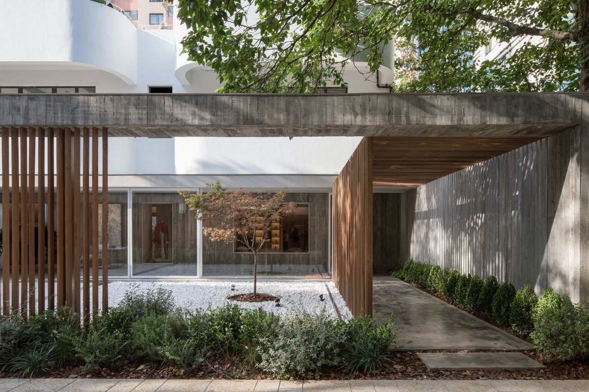
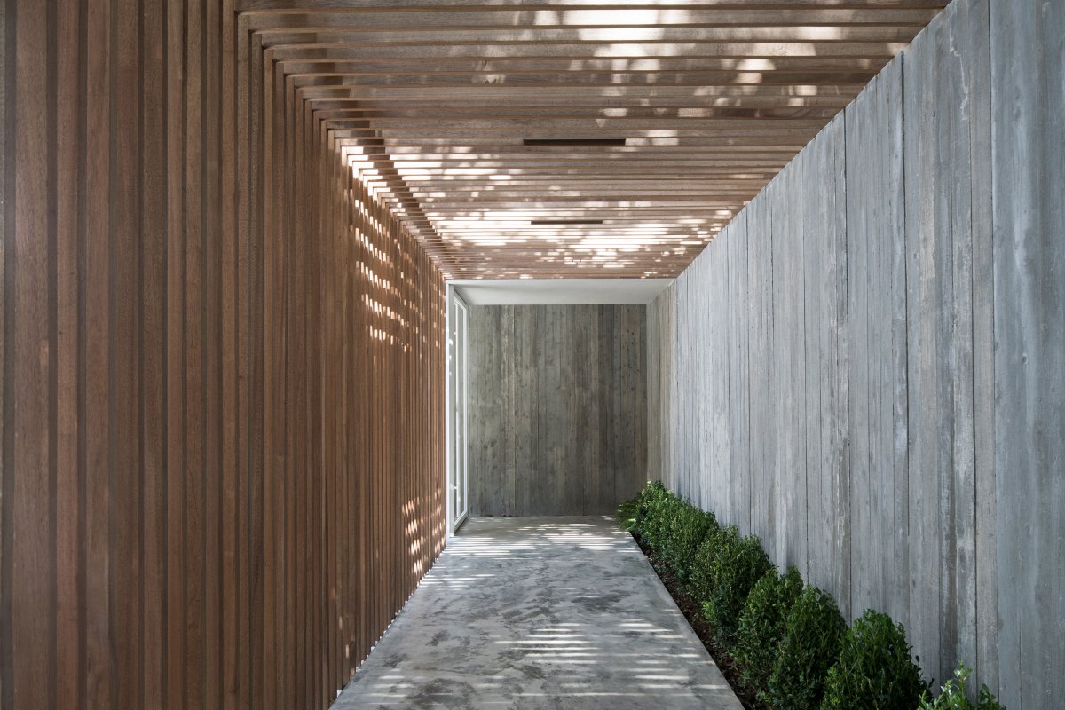
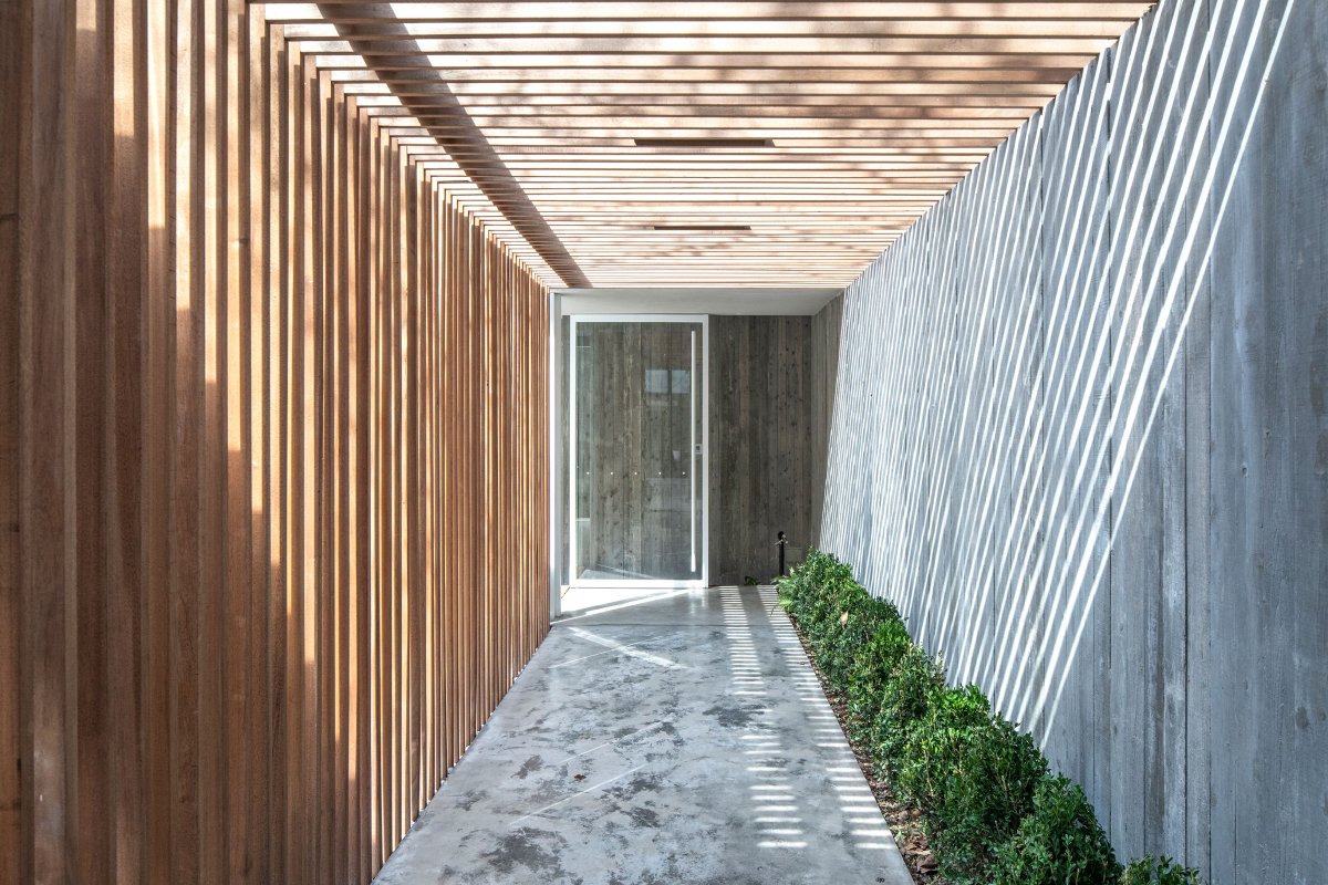
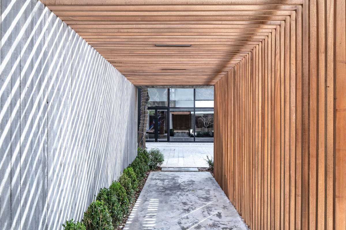
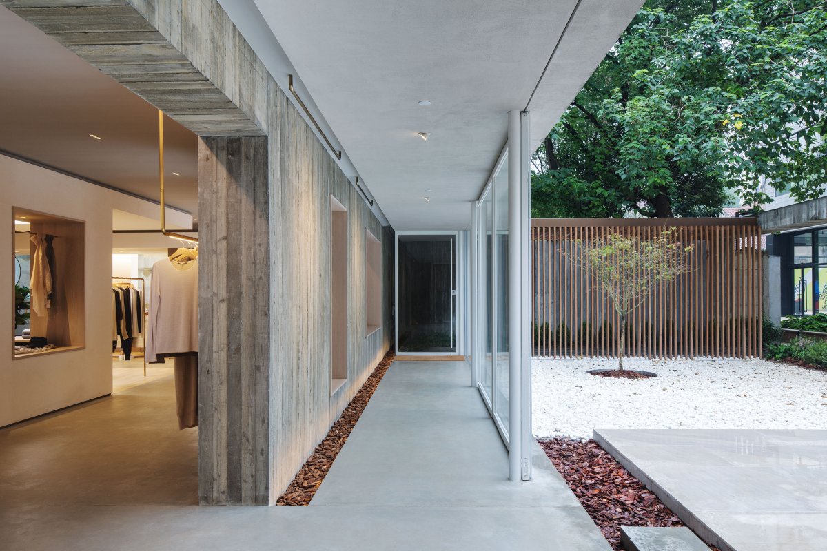
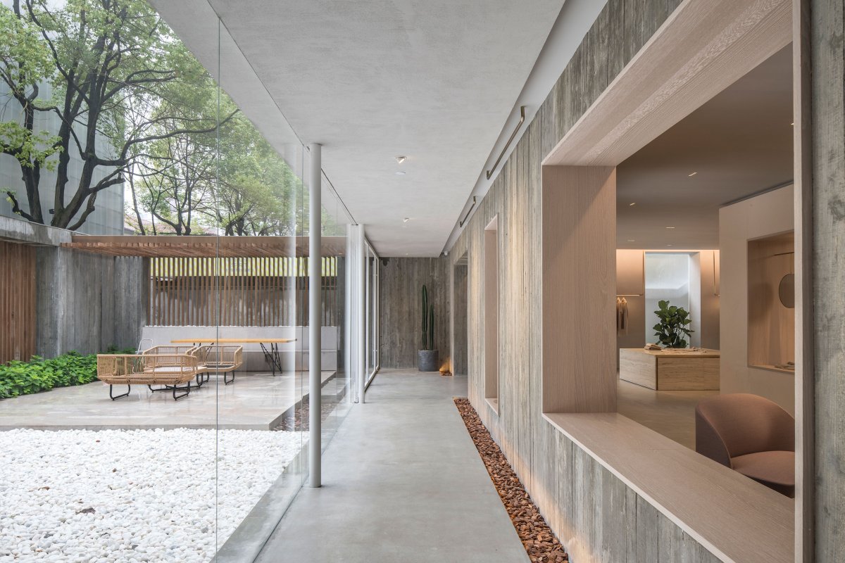
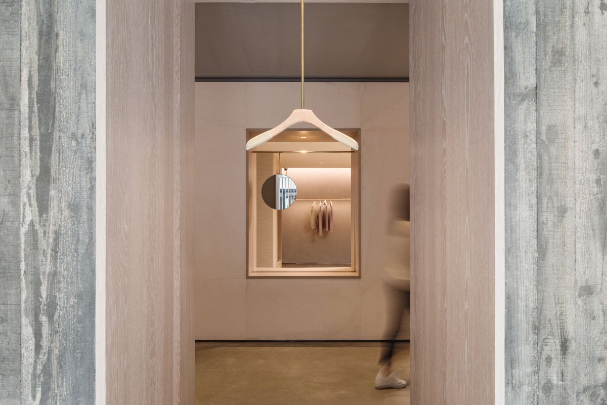
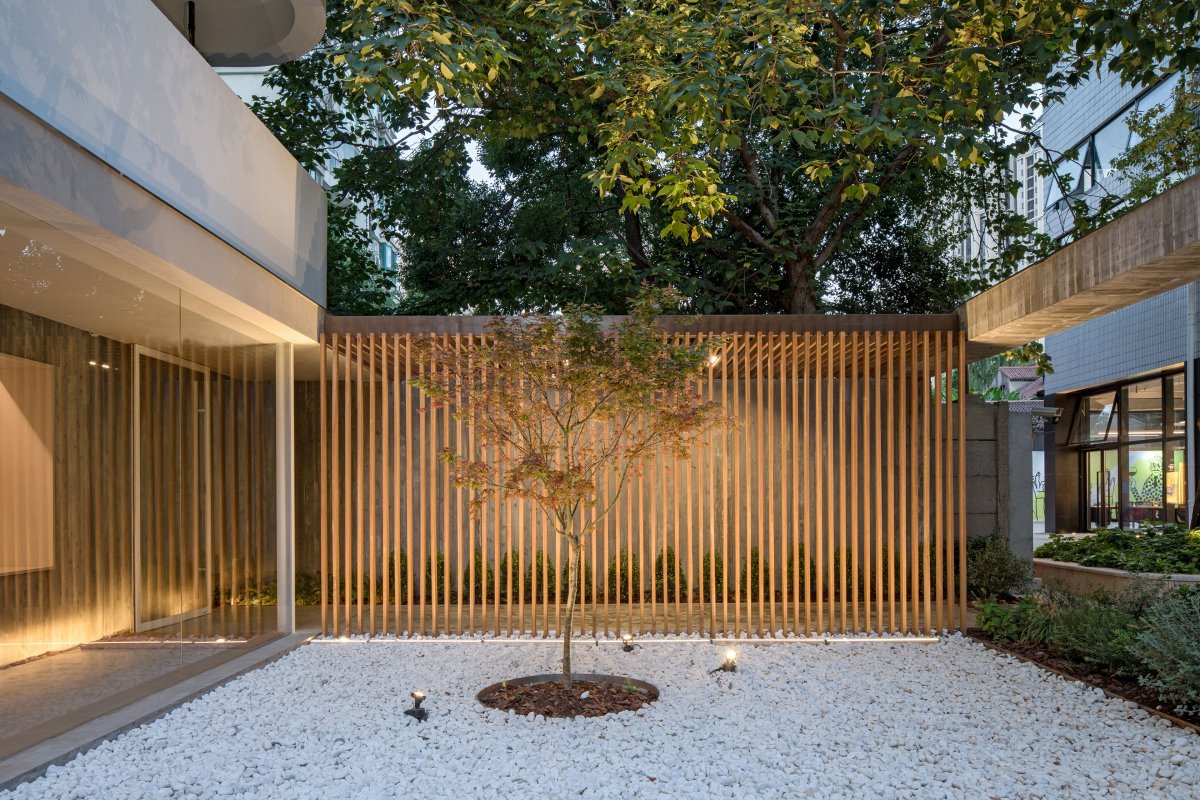
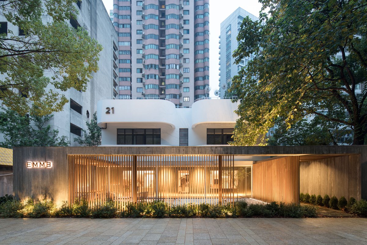
The retail site is on the ground floor of building no. 21 which is tucked away from the main street. Lukstudio sees the original shortcoming as an opportunity to create an architectural promenade. Adding a verandah structure surrounding a minimal front yard, the new storefront gives a serene first impression. The additional envelop is comprised of concrete panels with wood grain imprint and wooden slats; while the former encloses, the latter reveals. When one passes through the entrance, movement activates the see-through structure and performs a visual rhythm.
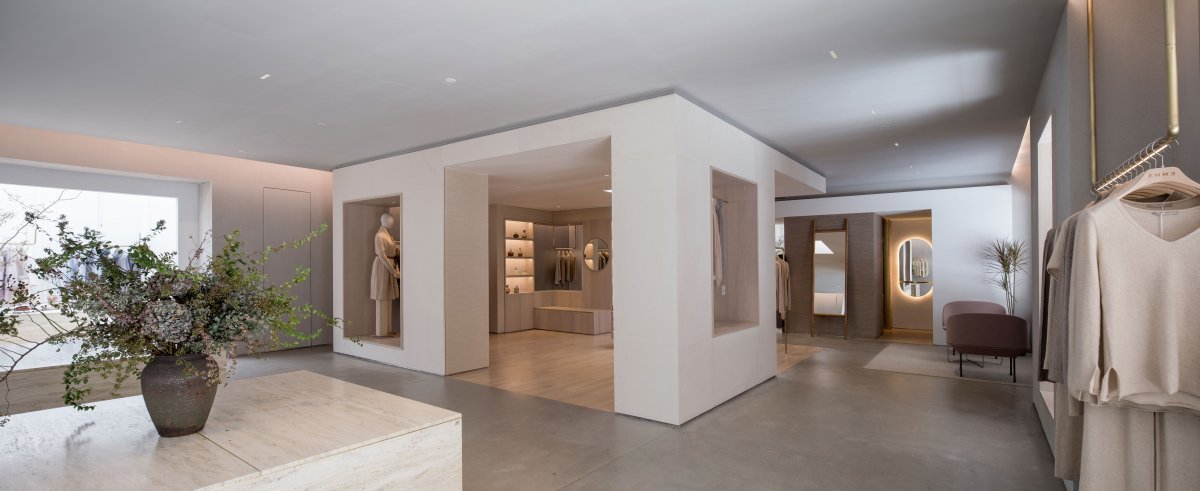
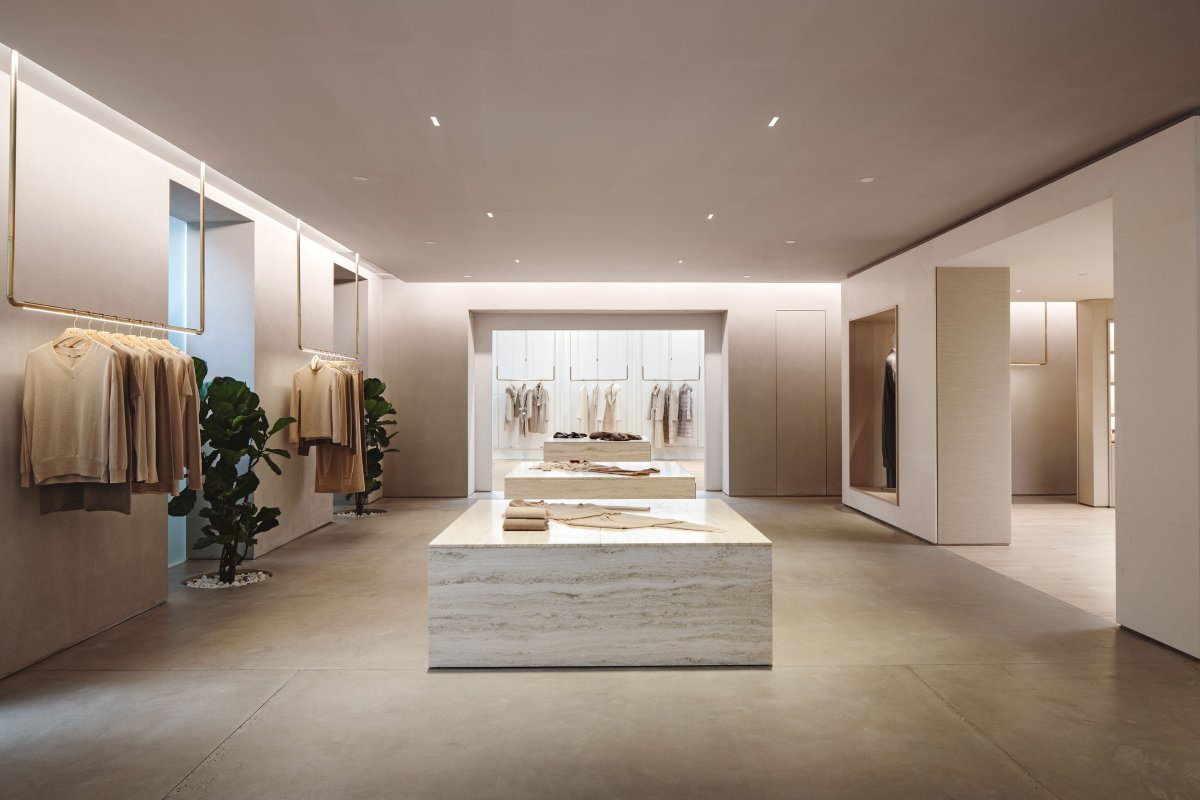
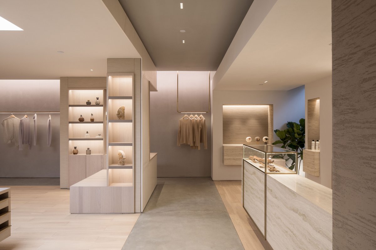
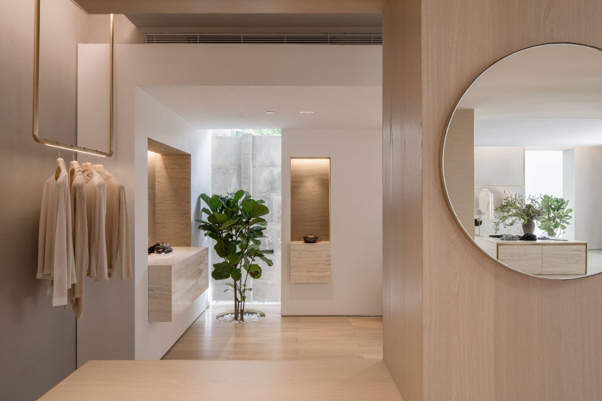
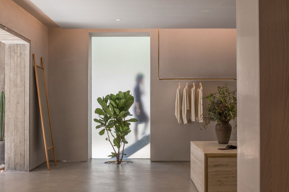
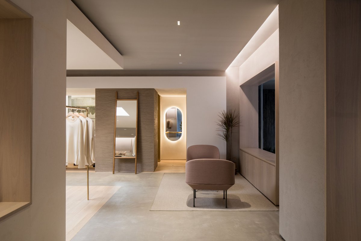
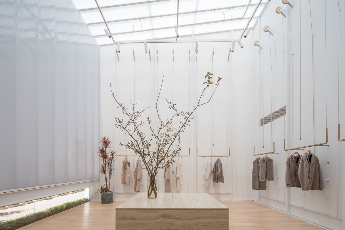
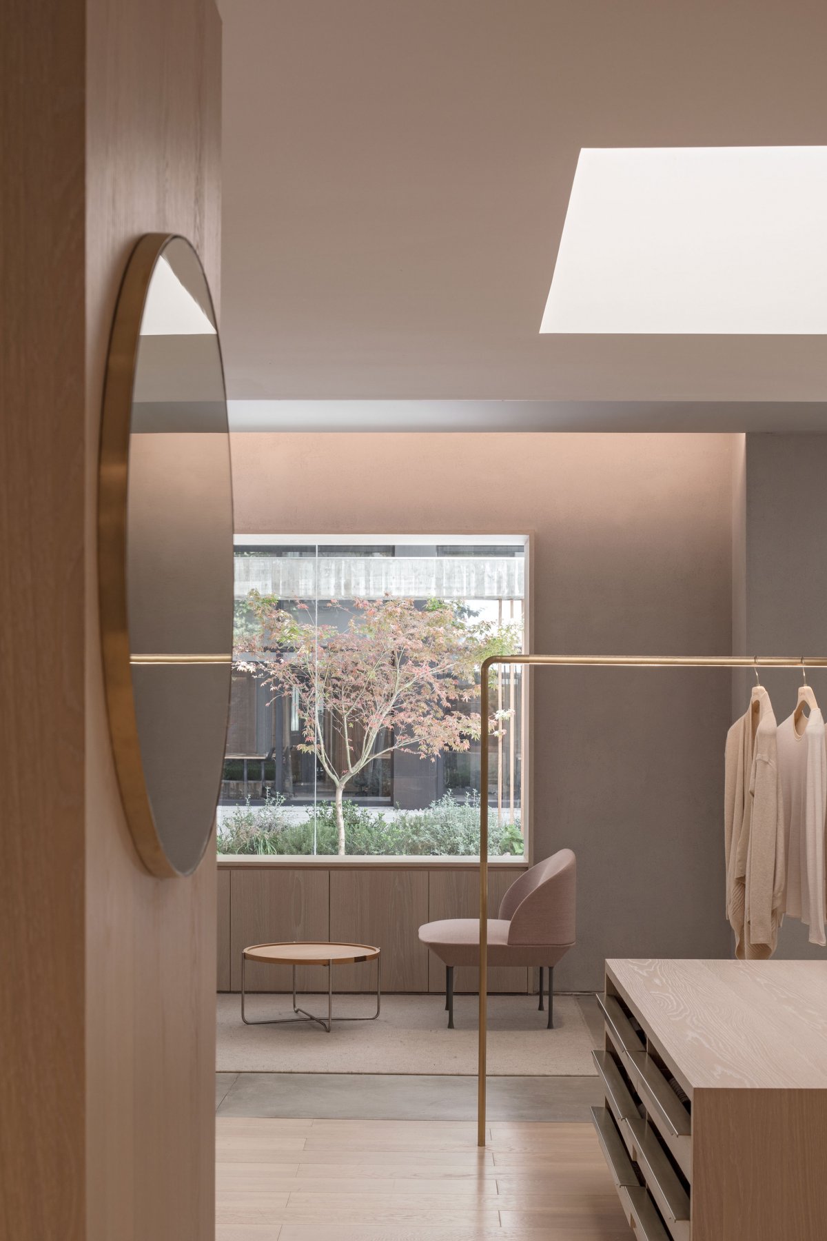
The boundary between interior and exterior is blurred to create a presence of nature in the store. The outdoor concrete wall texture is continued to the indoor gallery, visually connecting the two entry spaces into one. On a good day, a pair of sliding doors physically opens the yard to the store. Apart from framing views of the outdoor yard and planting trees within the store, the idea of nature is further expressed with materiality and lighting. A mellow palette of stone, wood and polished concrete is chosen to complement the natural cashmere garments on display. Together with the use of diffused sunlight, a cozy atmosphere is conjured to soothe the body and the mind.
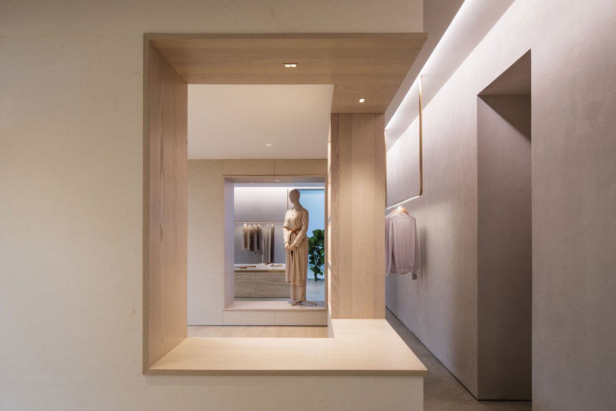
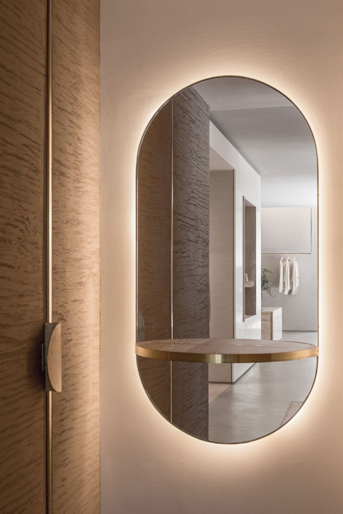
While an open floor design enables free movement in the store, the various display zones recalls different parts of a house: a parlour with central plinths and a big opening at the back leads to a sunroom beyond; a white stone-clad box greets visitors like an open dressing room; a sitting area with a view to the courtyard. The multi-room design adapts easily to the changing curation of art, fashion and home decor every season. Openings frame visual interests and create a sense of depth and continuity. Mirrors fuse the layered interiors and brings in the exterior in reflection. Every visit to the store could be a unique experience according to the time, the weather and the collection on display.
As the sun goes down, the hermit character of the store transforms dramatically as the light comes up. The verandah structure marks the passing of time and turns into a lantern, either guiding the curious passers-by inside or reminding the guests perhaps it’s time to go. A retail space that allows visitors to pause and connect with nature is extremely precious in an urban setting. Lukstudio wishes these endearing moments of simple beauty would be cherished by others who visit this urban retreat.
- Architect: Lukstudio
- Photos: Tian Fang Fang
