A Montage of Order
Brand Concept
MINEAMALIST ART IDEAS is a lifestyle brand that takes clothing as its core, with a retail space that includes coffee, vessels, fragrances, clothing, jewelry, and personal care products, among others. The design aims to express the brand's aesthetic preferences and aspirations for a better life by creating a retro and interesting composite retail space.
Design Concept
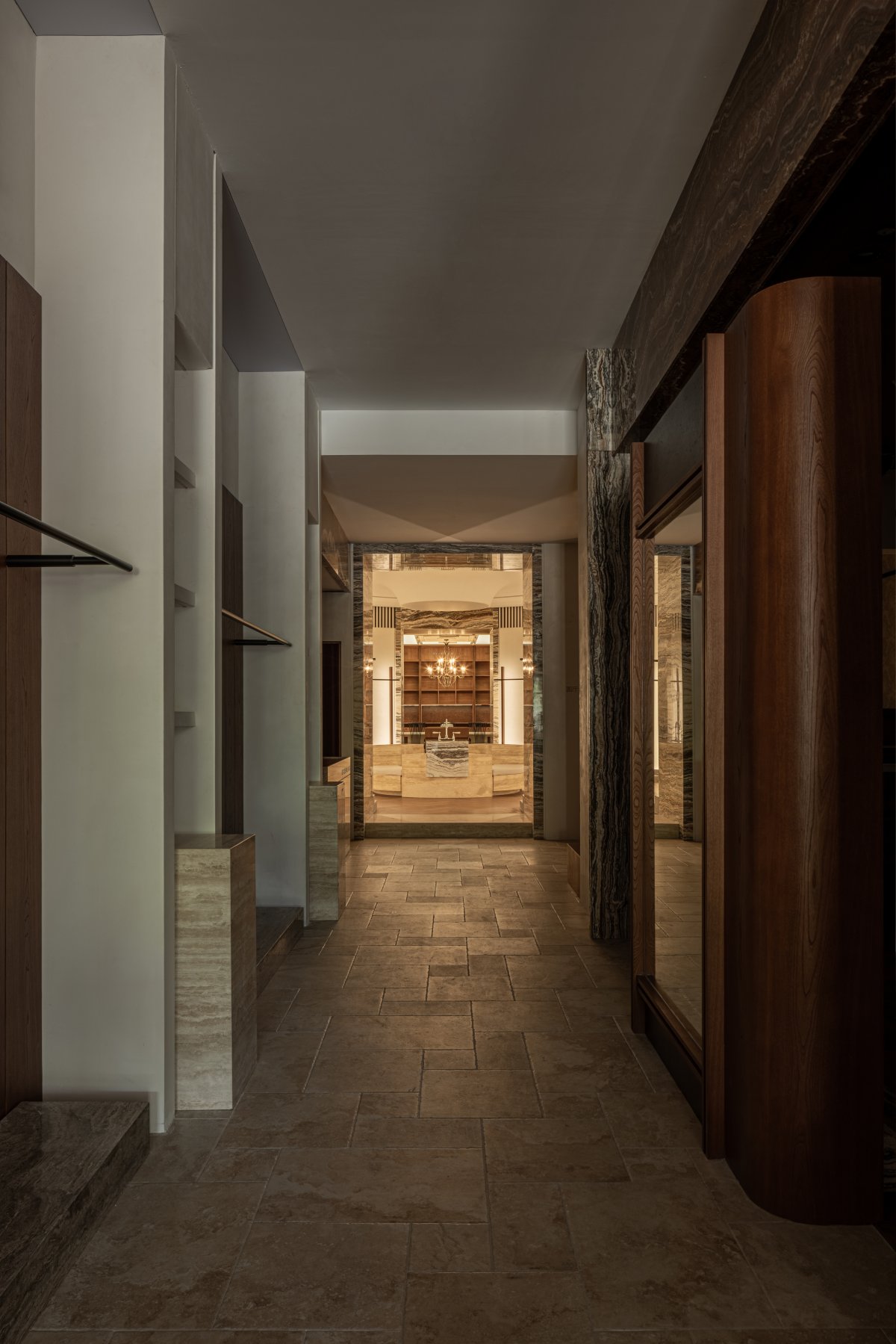
We used the technique of "montage" in space to create this long, single-span space: We sculpted a series of geometric "halls" along the axis, with each "hall" being a "space slice" that tells a different scene story. We hope to present the dramatic and interesting character of the space through such visual experiences.
The symmetrical spatial form along the central axis can effectively showcase the hierarchy and sequence of the long, rectangular space. From the sectional view, we can see that the design achieves different spatial feelings through the lifting, lowering, and shaping of the ground and ceiling.
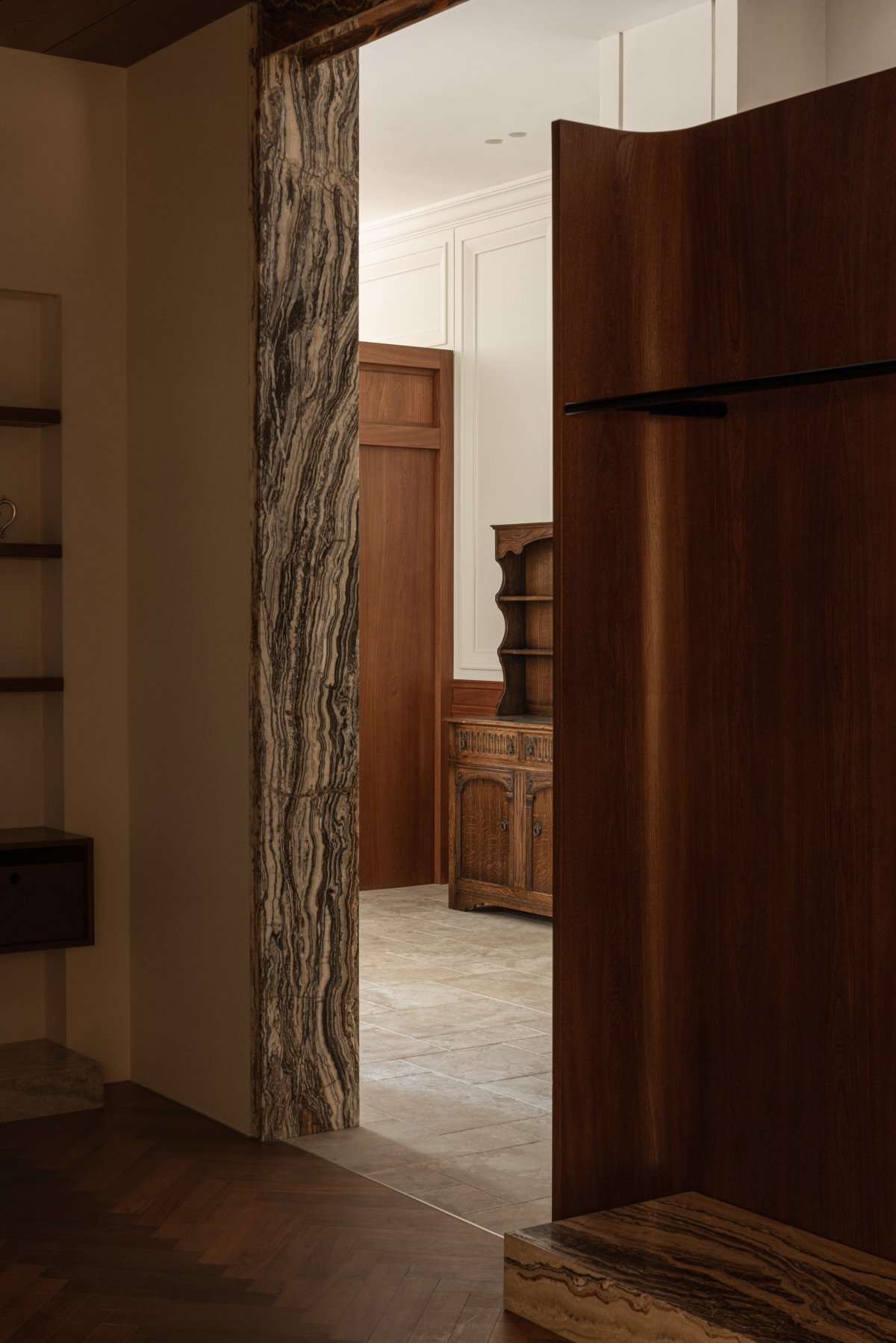
The circulation flowline is similar to the exhibition route, where visitors can enjoy the scenery as they move, thus increasing the amount of time they spend in the space and making them more interested in exploring and discovering the space and brand, leading to more interactive experiences between people and the space.
Entrance Space
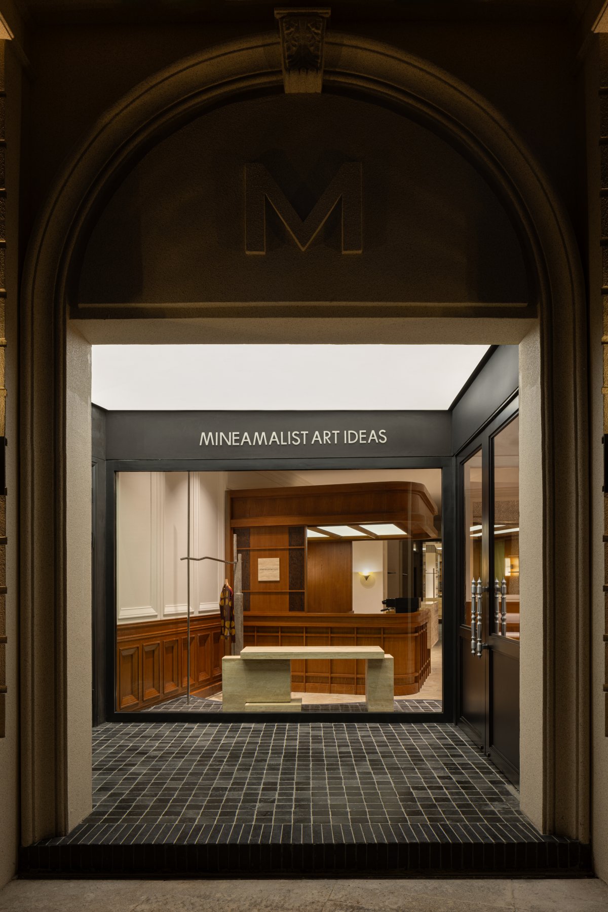
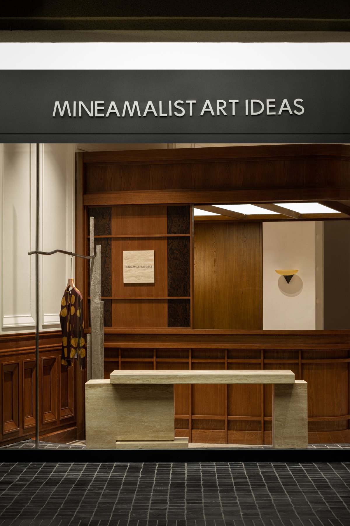
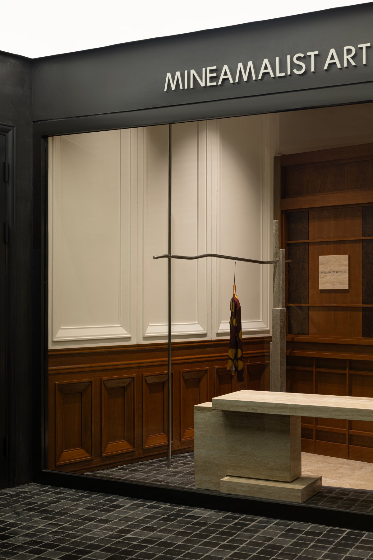
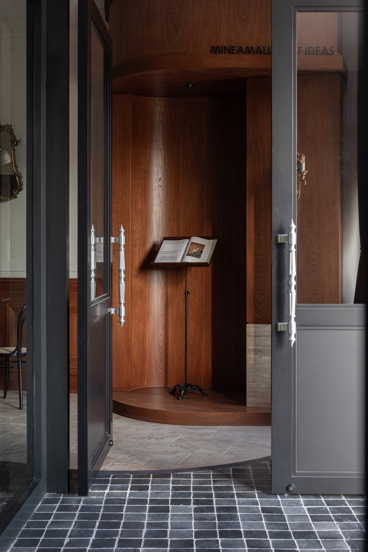
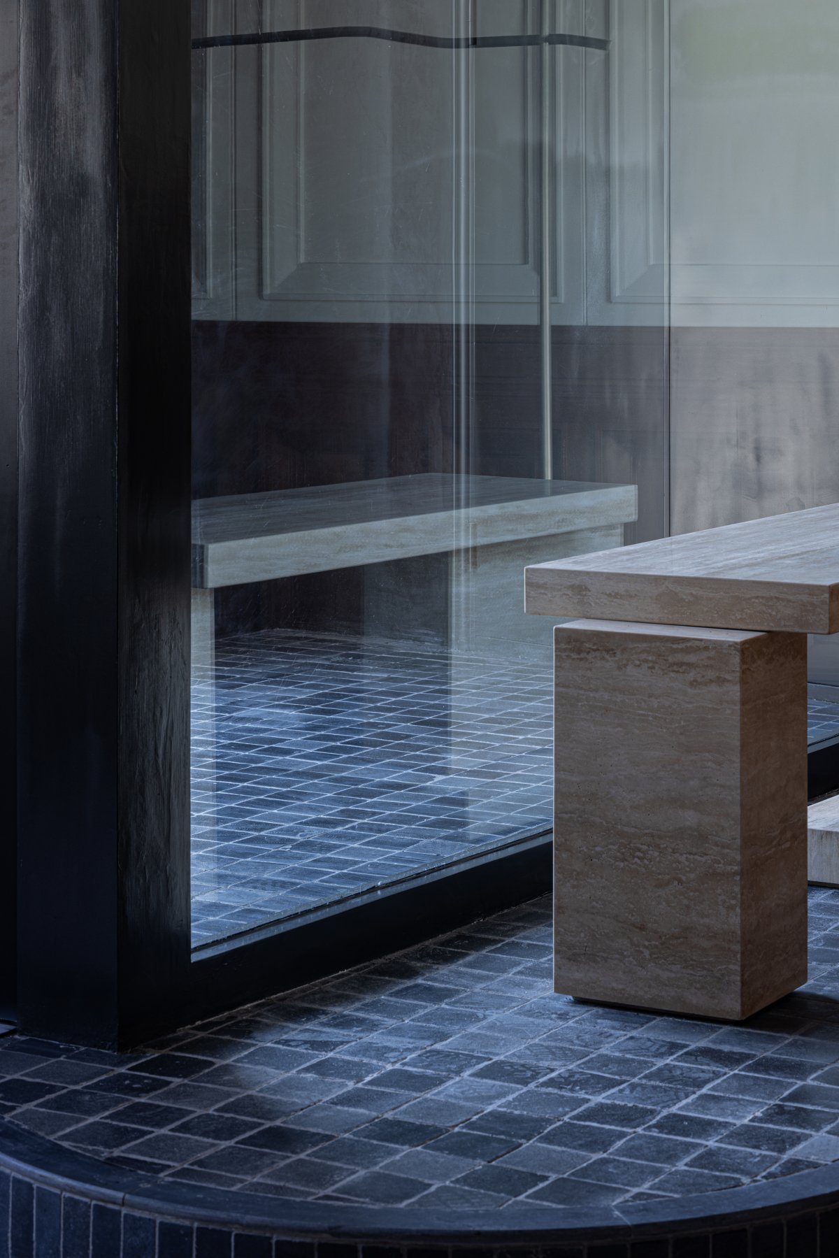
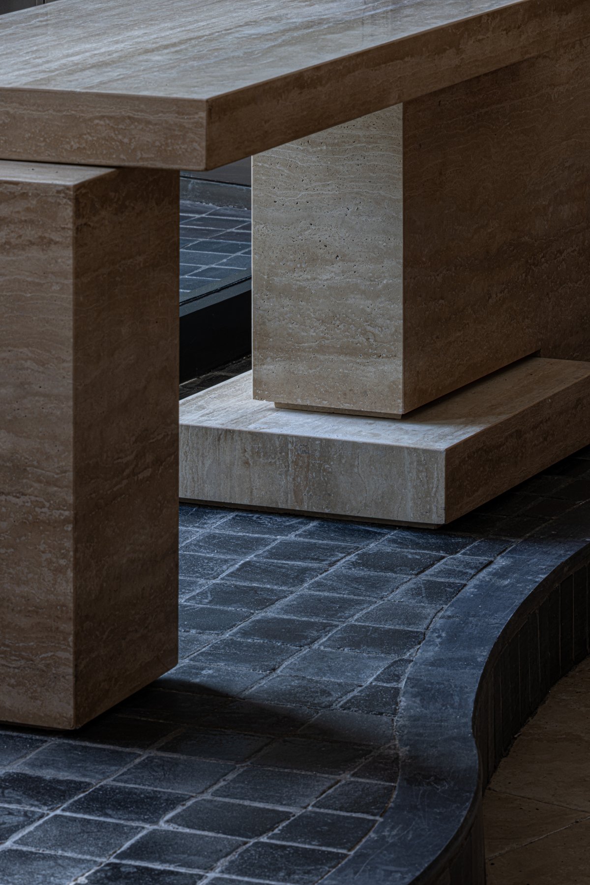
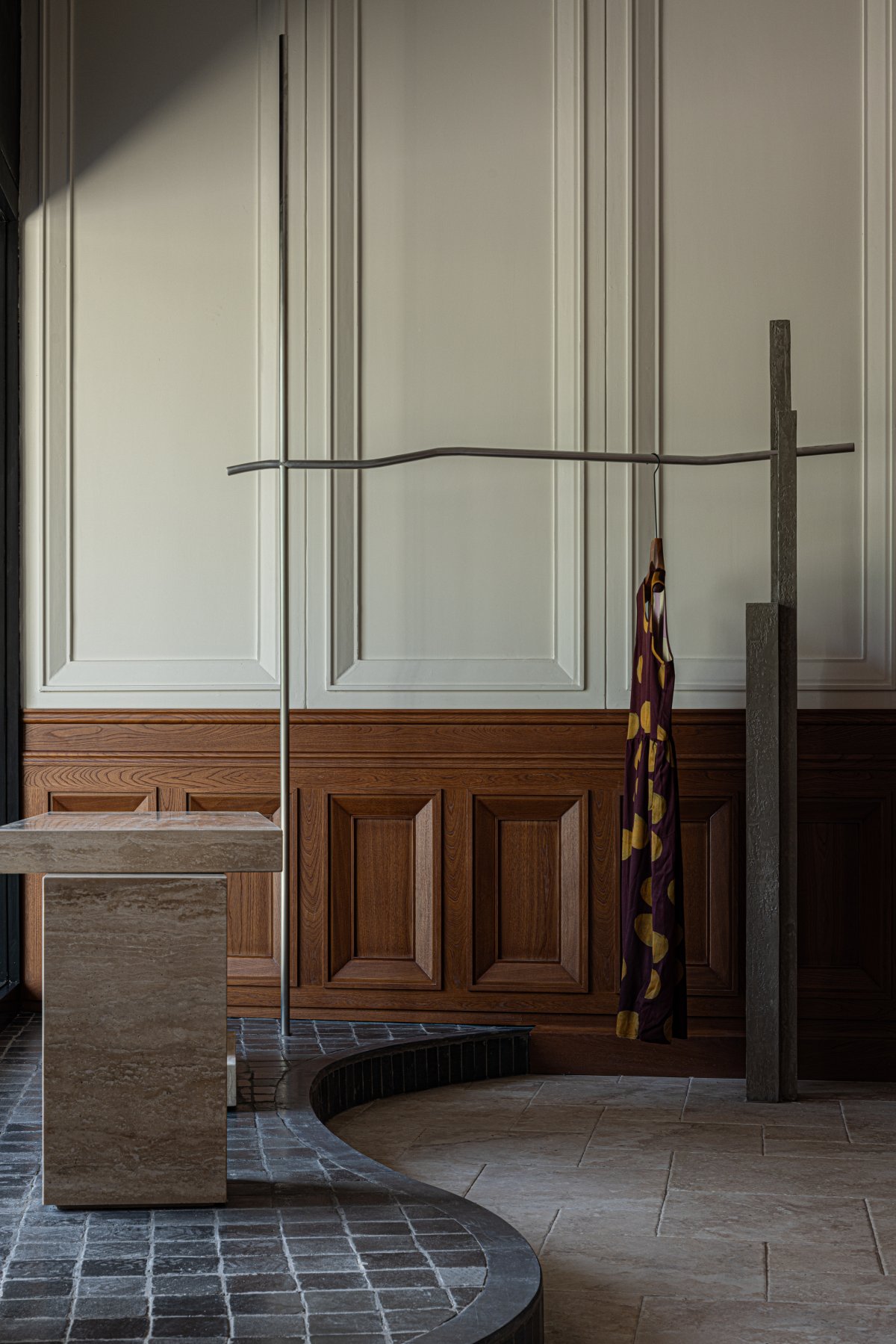
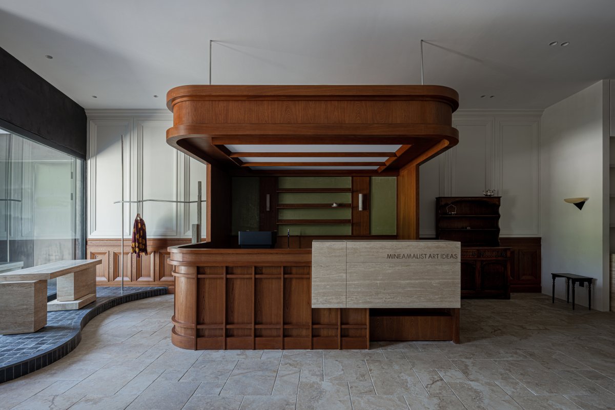
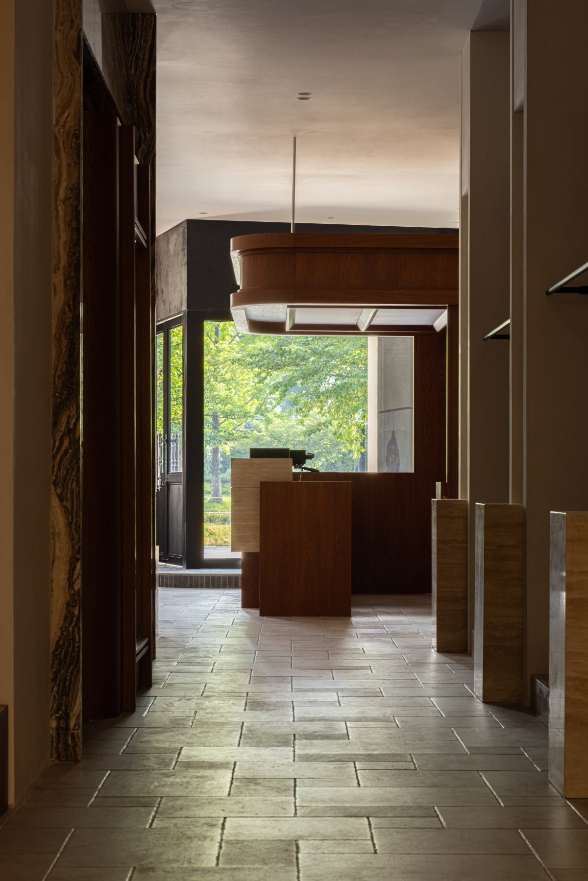
A low, stepped threshold of black cobblestones creates the entrance space, curving inward. The coffee bar, display case, and hanging rack form a complete window facade, with the starting point of the main axis also originating from here. Considering the single-span, long space feature of the building, the design fills the window with the entire span as the main display interface on the facade, maximizing the connection between the city and the store.
CAFE
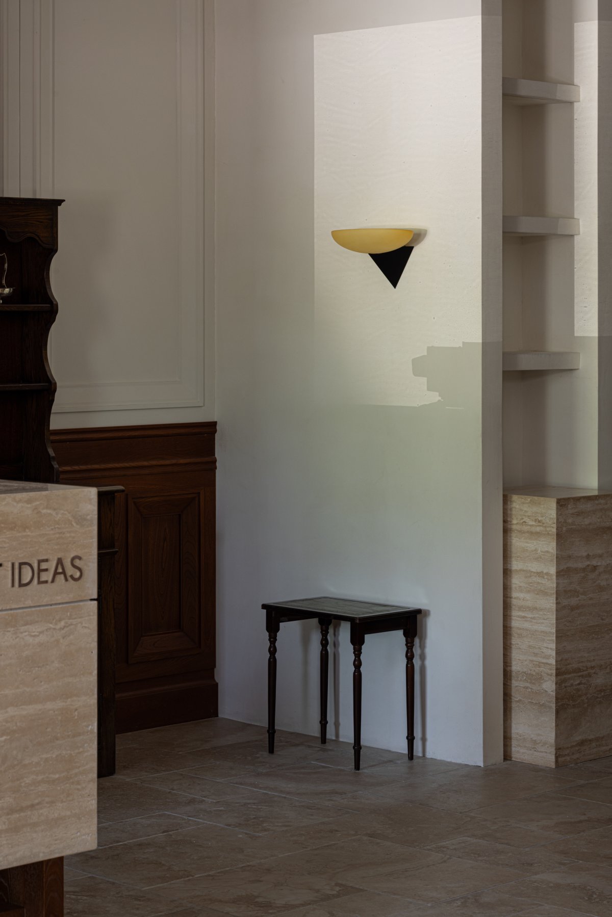
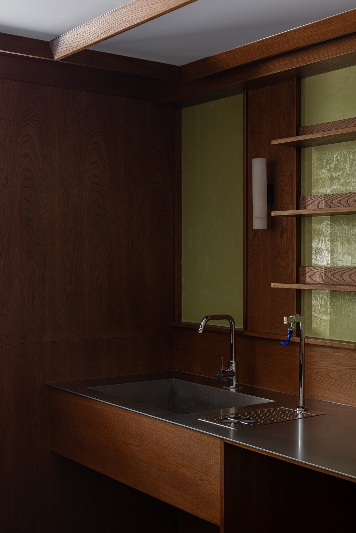
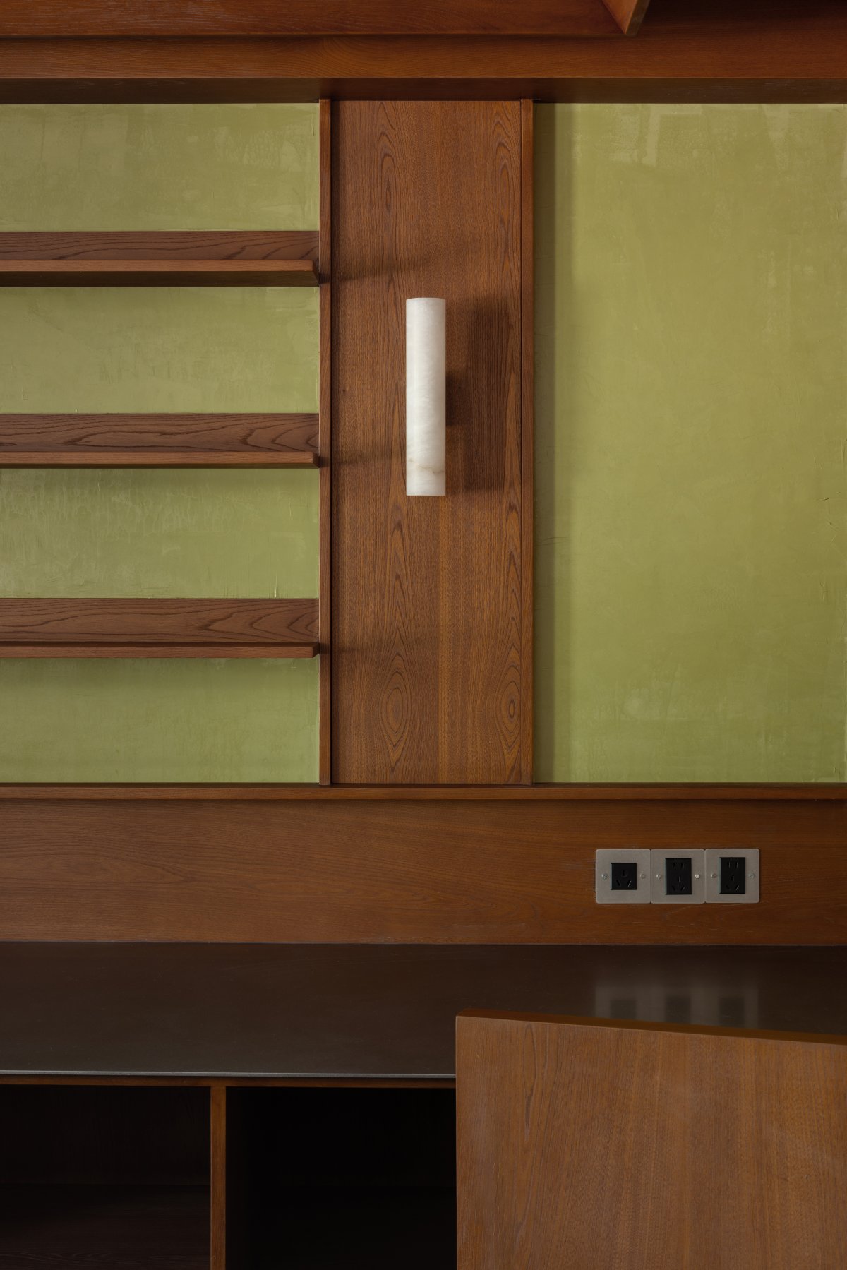
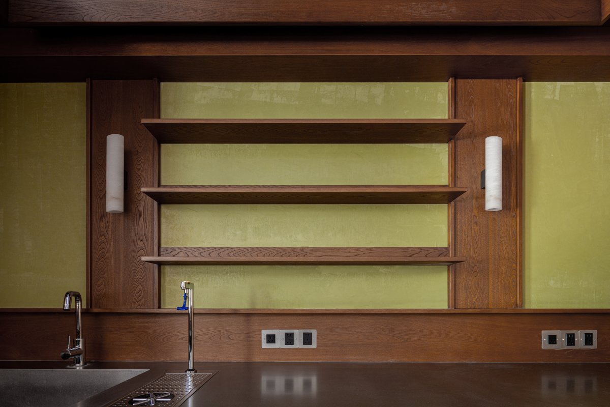
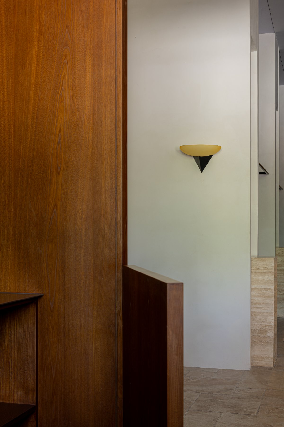
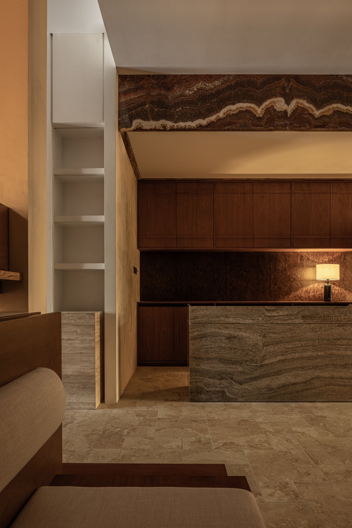
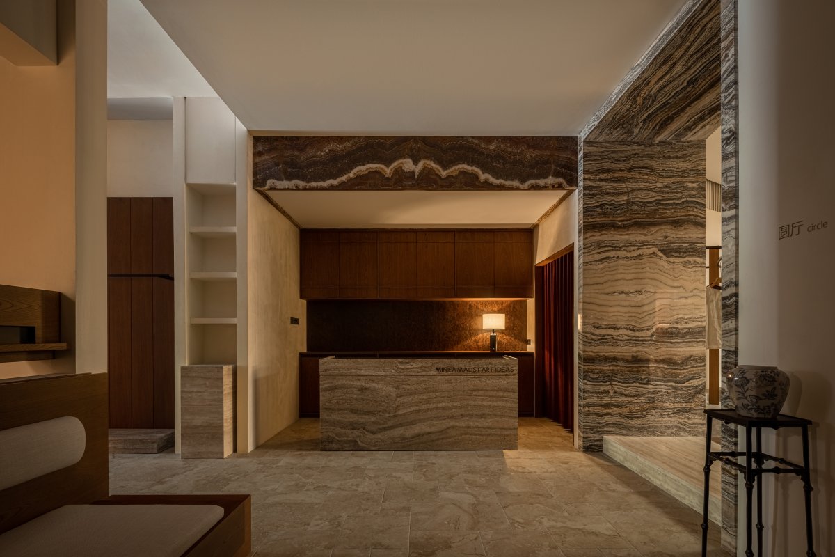
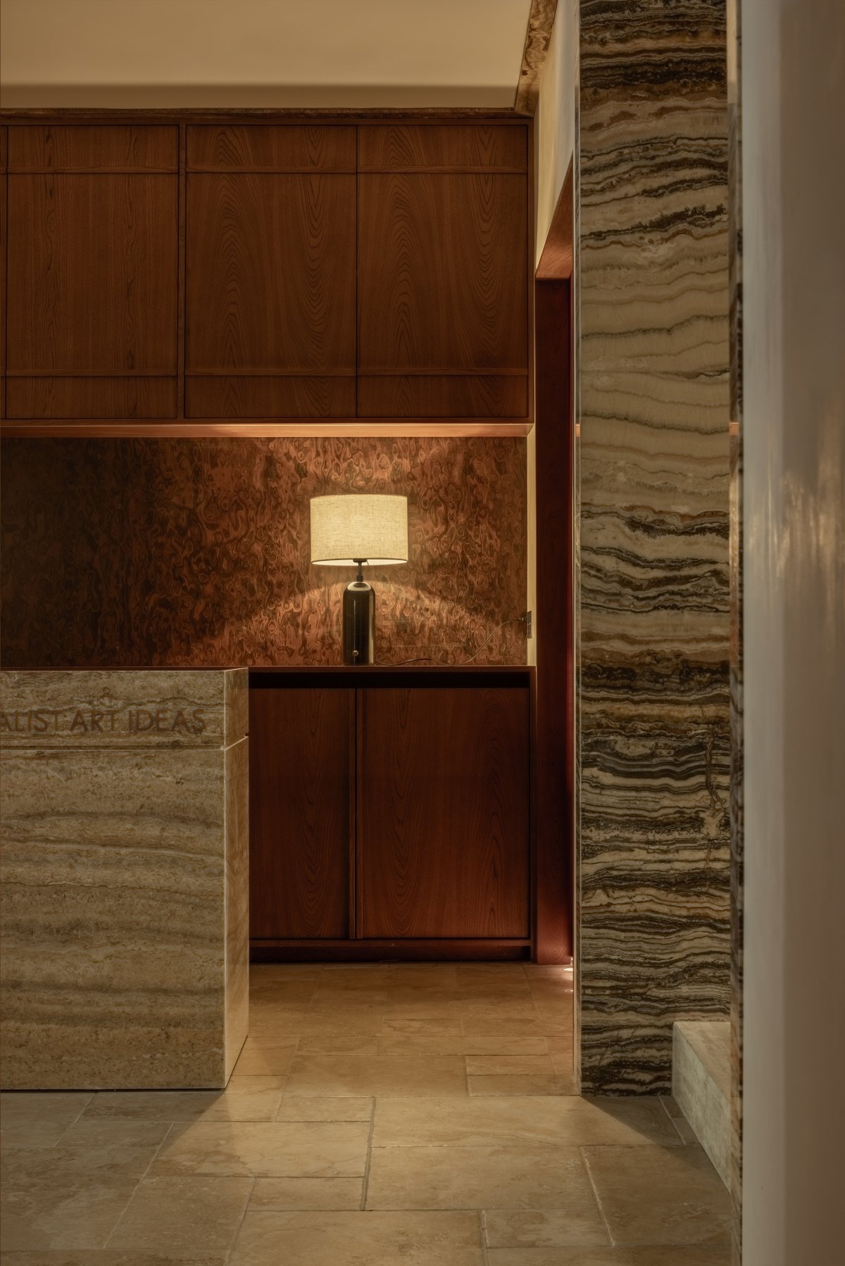
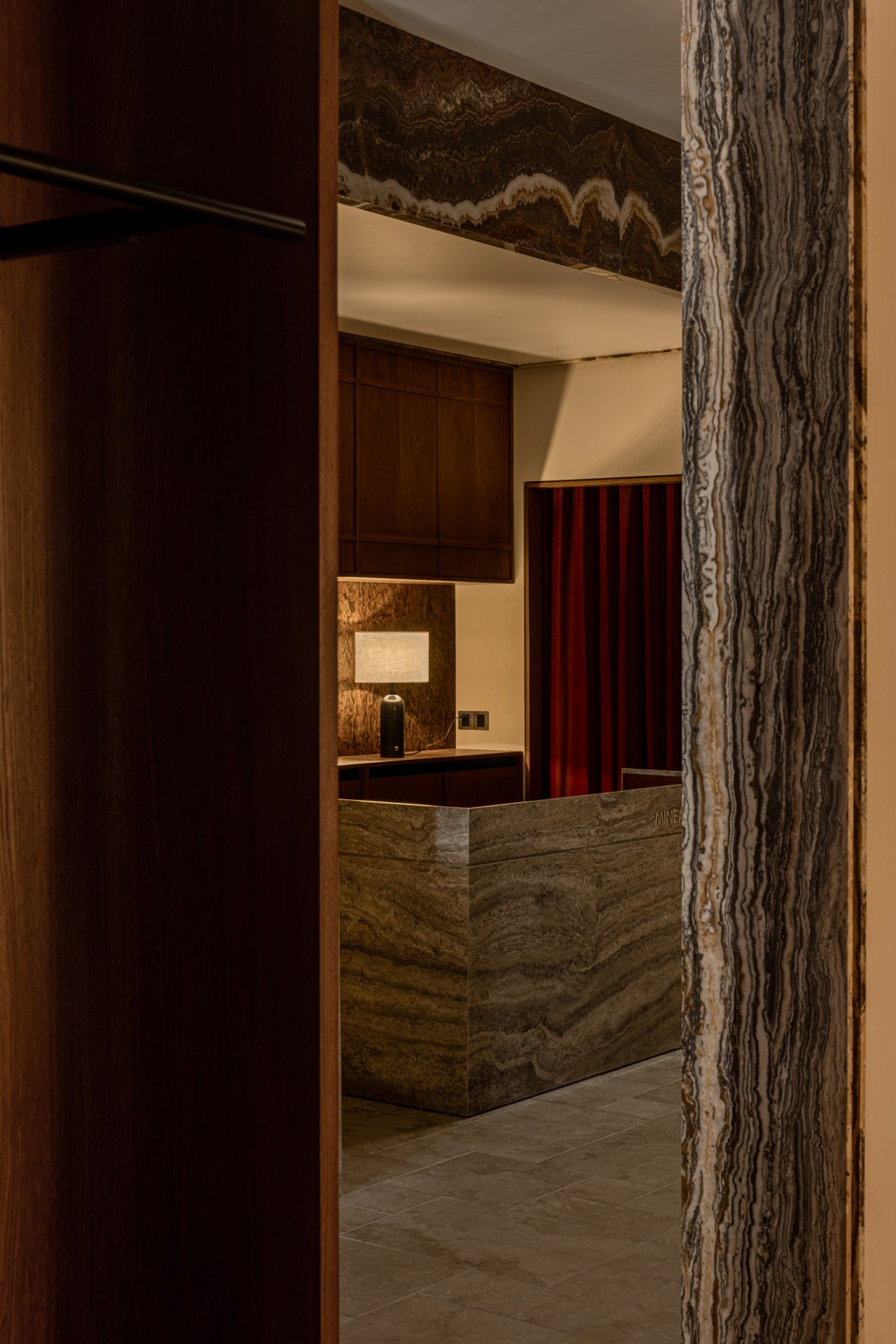
The coffee bar counter is a relatively independent "furniture" located at an important node on the central axis: it is the important background for the entrance perspective and the visual center point on the axis line for the interior space. The background of the bar counter is composed of teak wood panels, onyx wall lamps, and textured green paint. The sides are enclosed by teak wood.
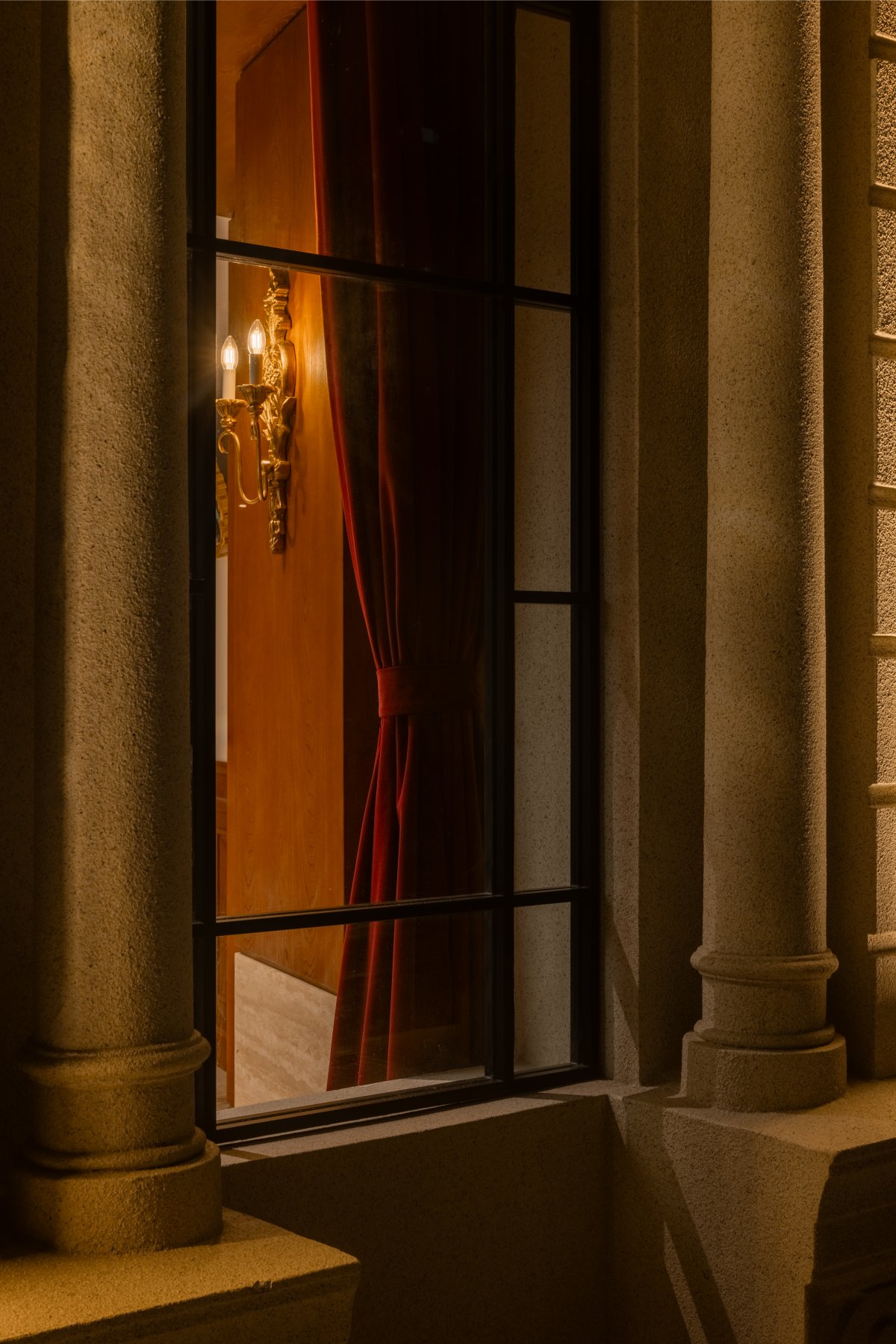
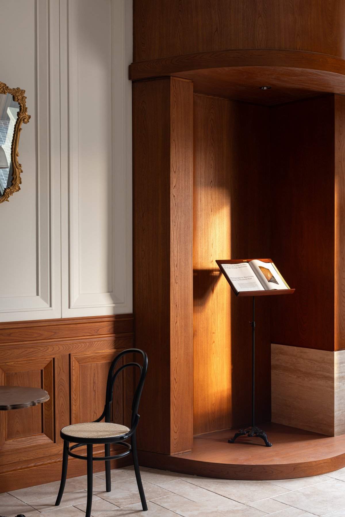
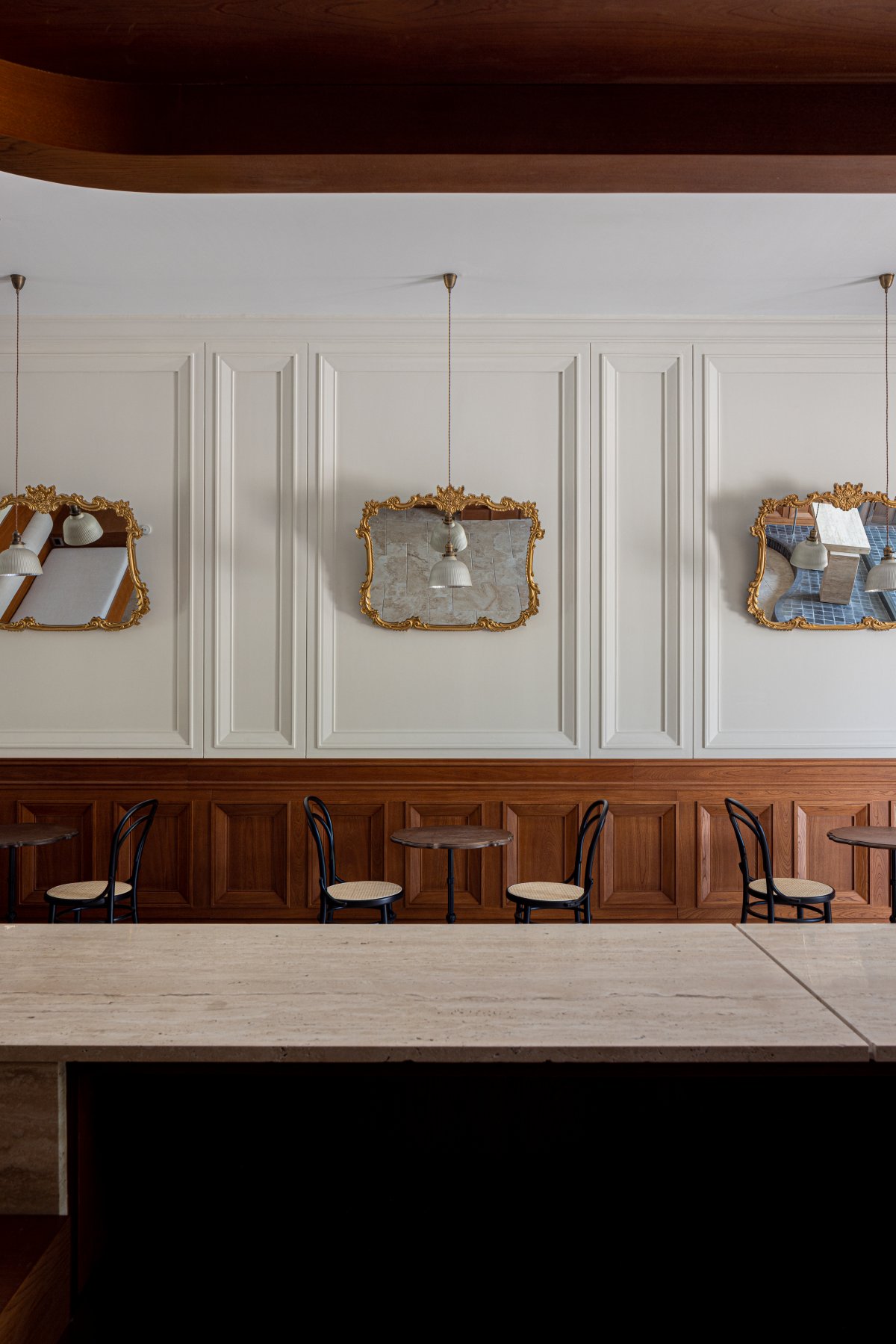
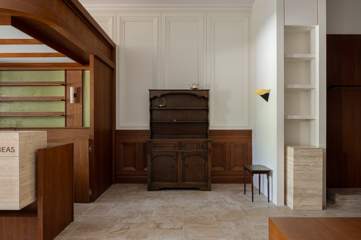
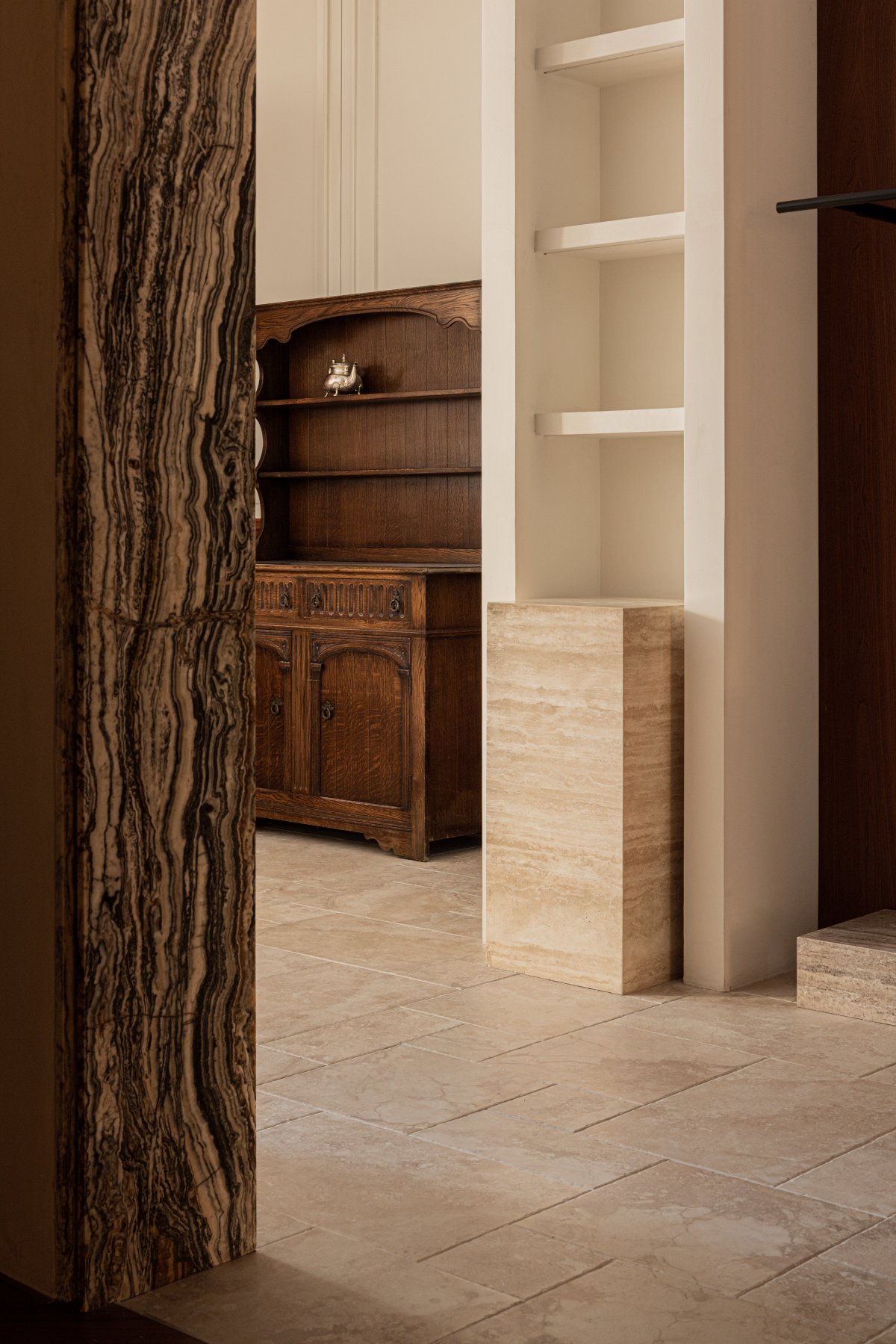
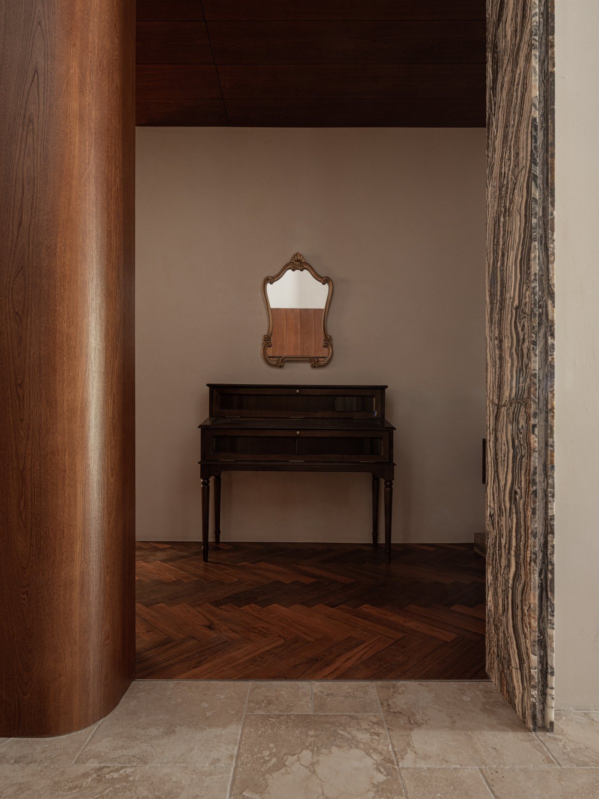
The walls of the coffee shop were chosen with teak wood panels and plaster moldings, and gold-plated carved mirrors were hung on the walls to reflect different scenes in the room and give people a rich visual experience. The groups of coffee tables and chandeliers correspond to the wall background to form a rich sequence, and the antique furniture brings a special texture to the space.
Path and Side Hall
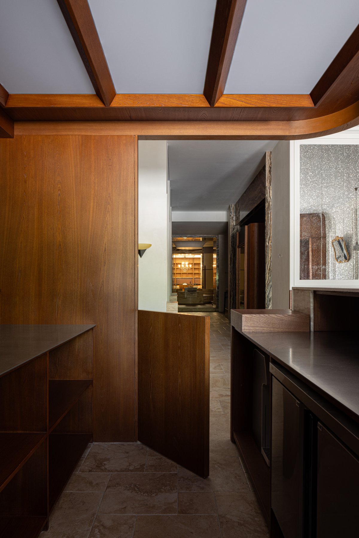
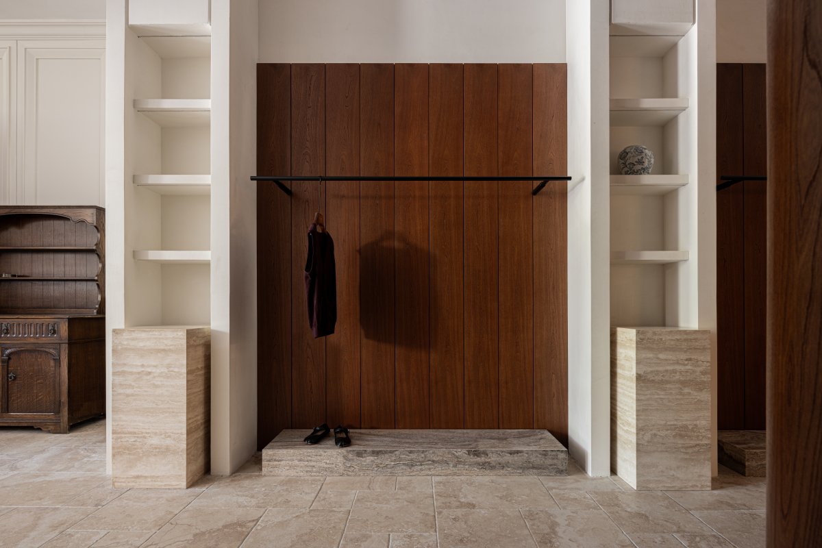
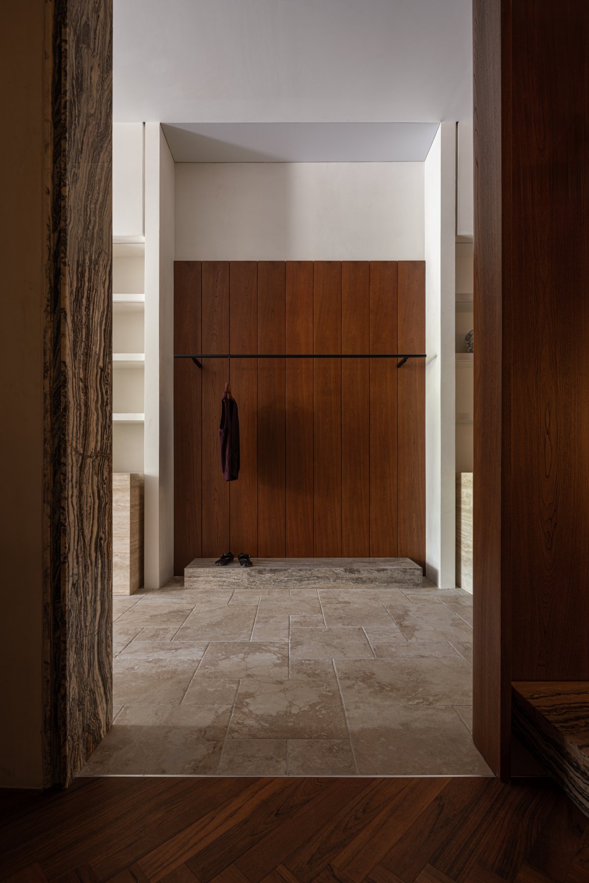
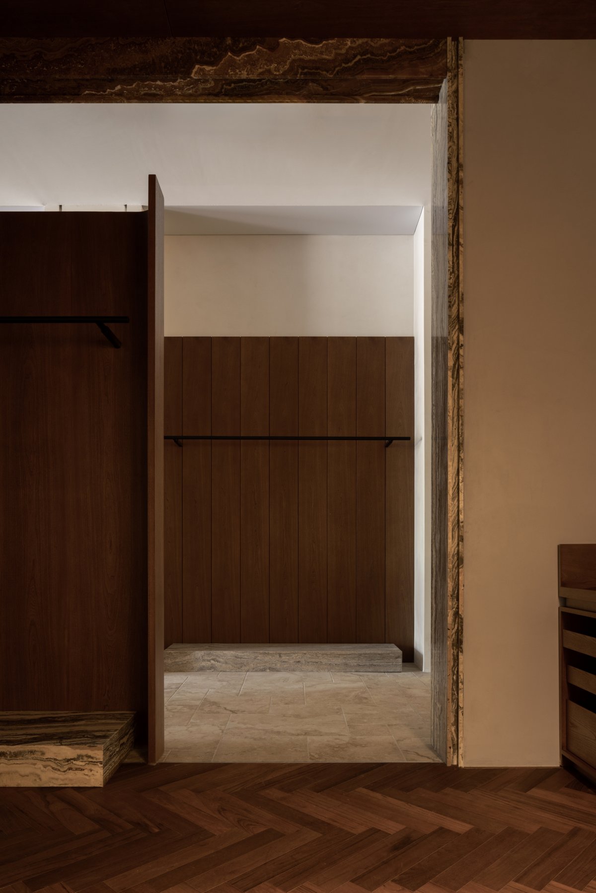
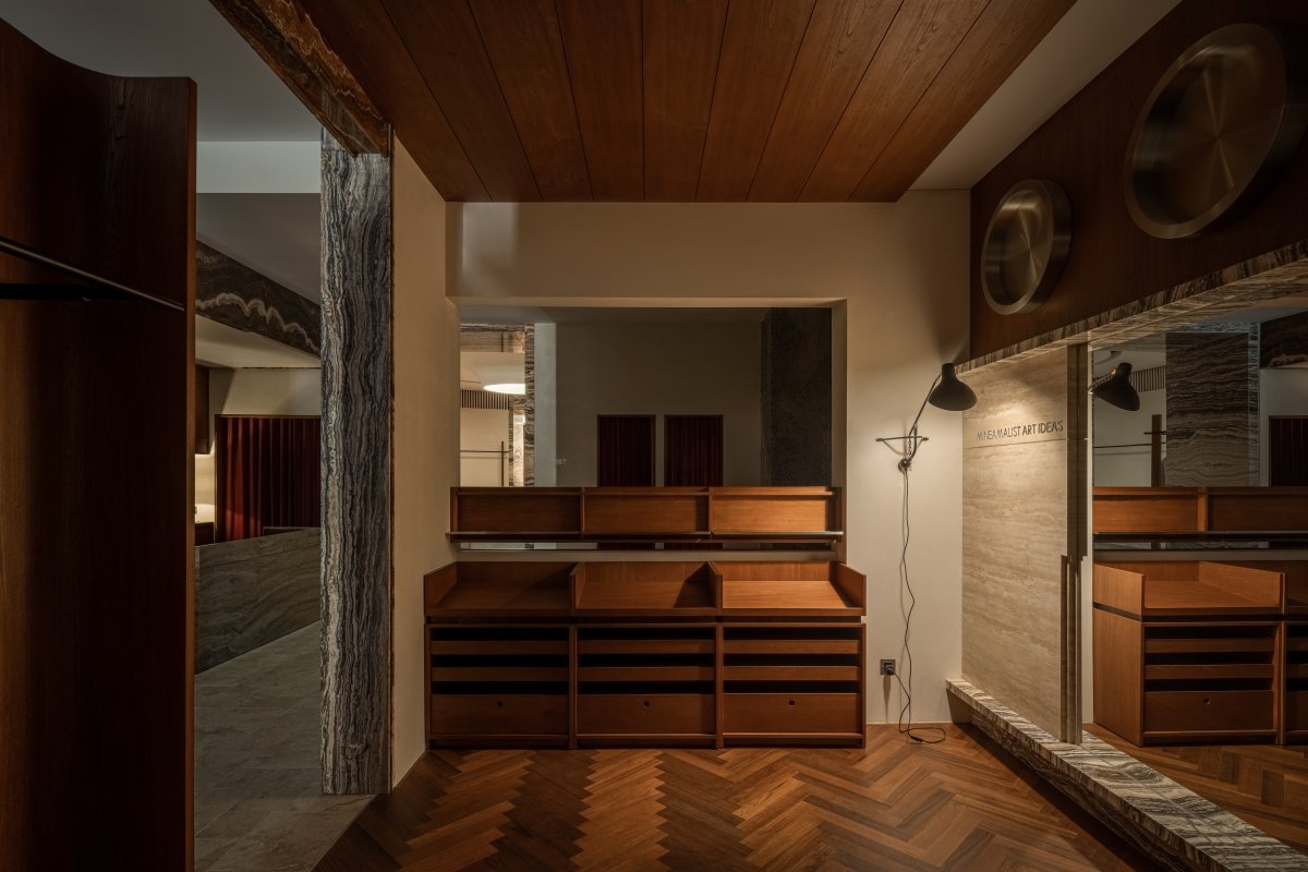
"Path" is an important passageway on the central axis, in addition to meeting the basic traffic function, it also separates the coffee shop and the retail display space to achieve a natural transition of business formats.
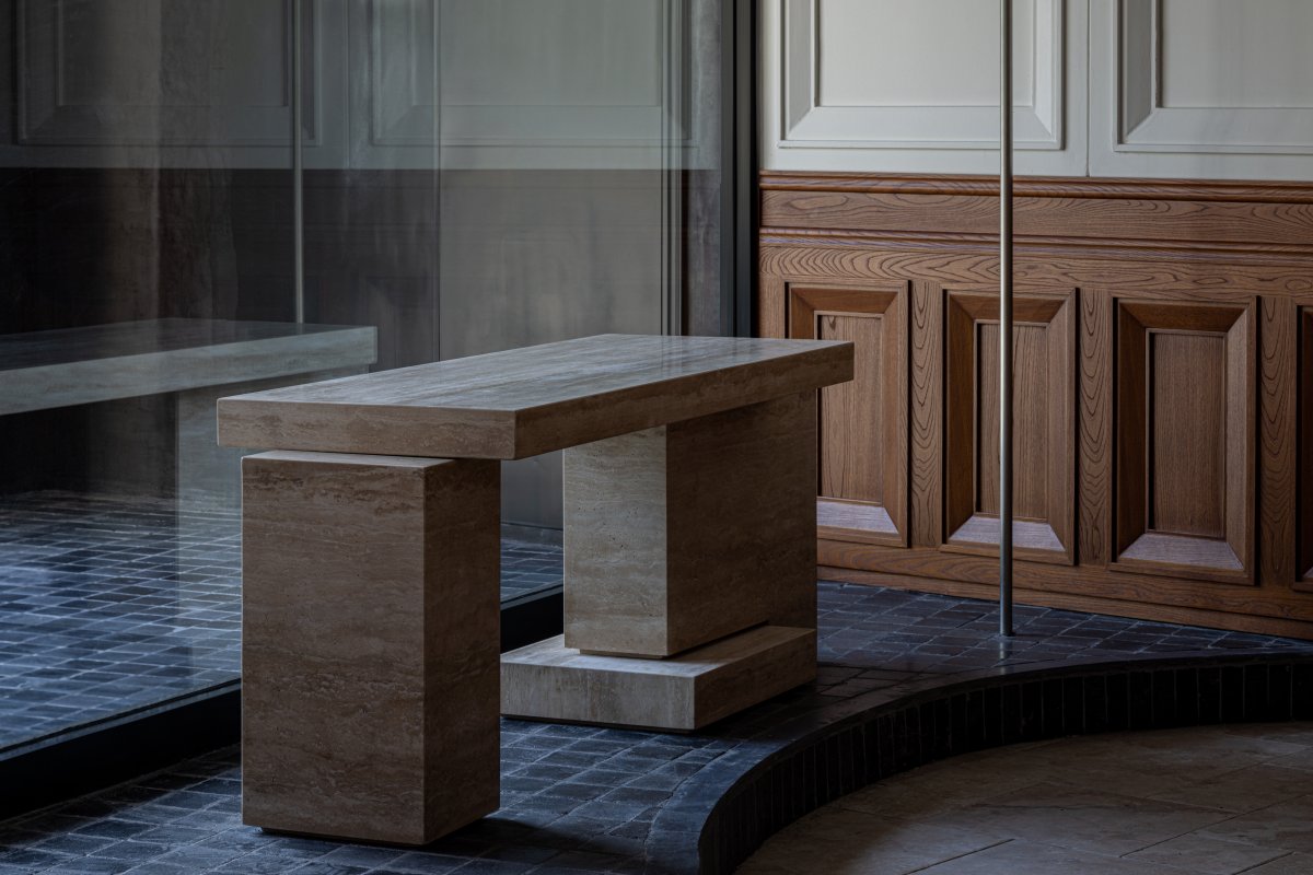
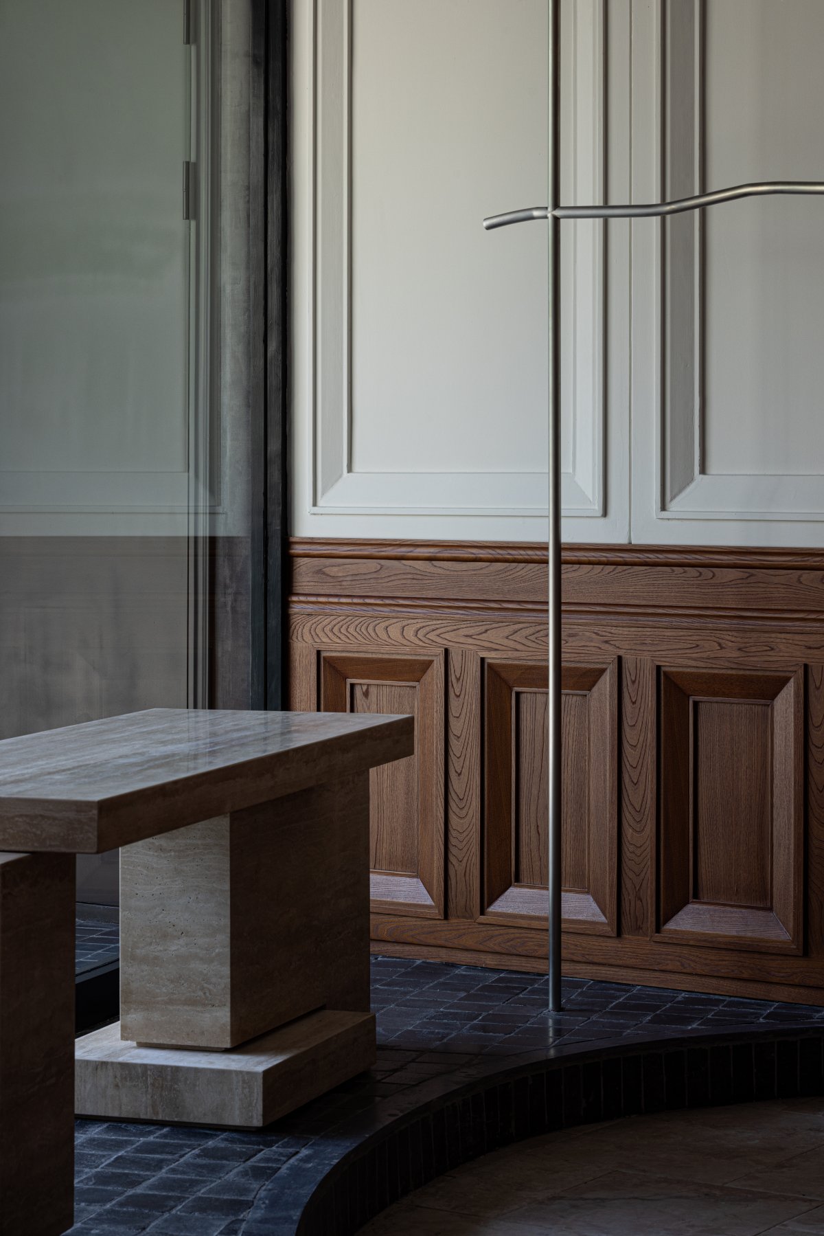
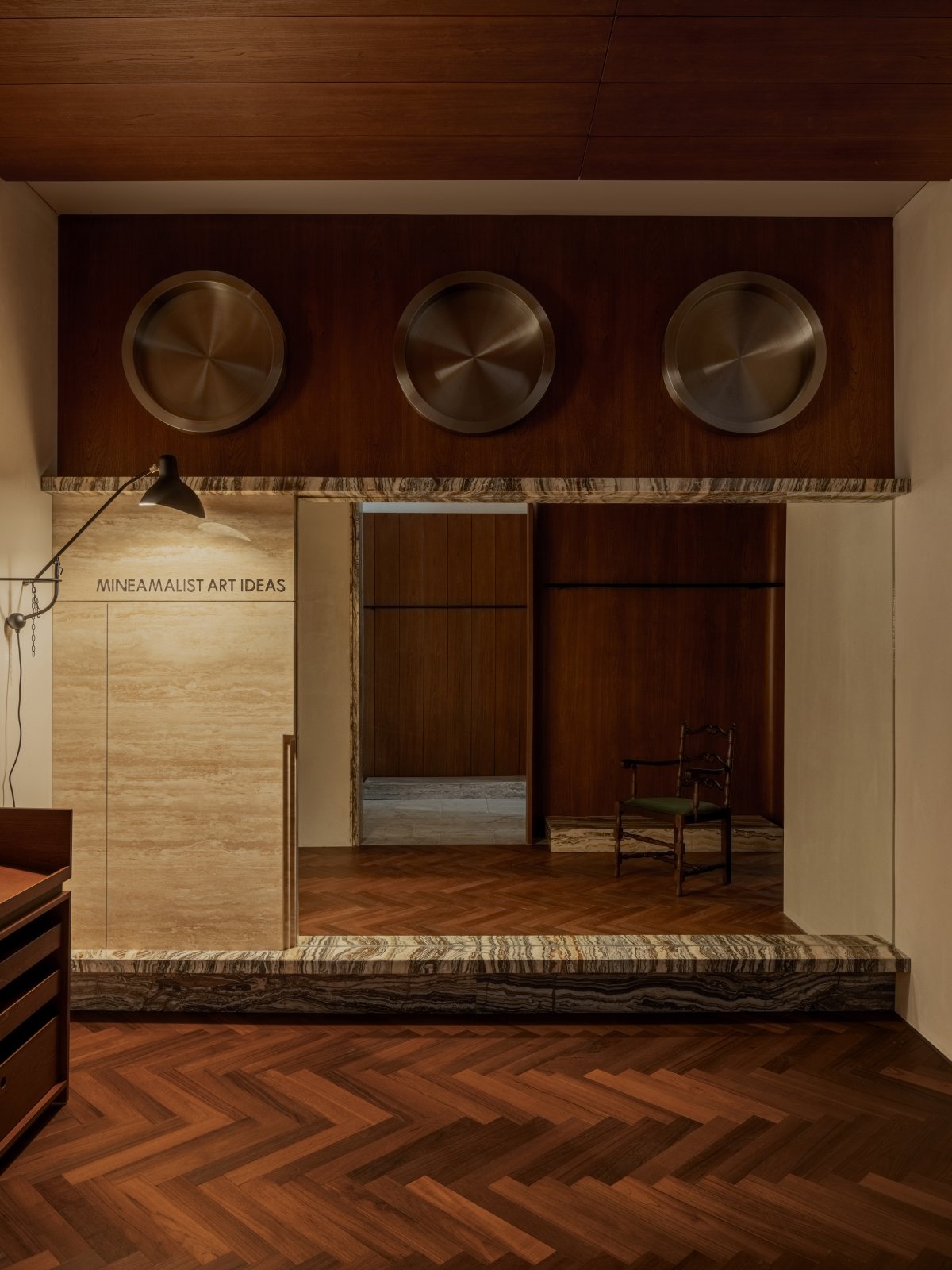
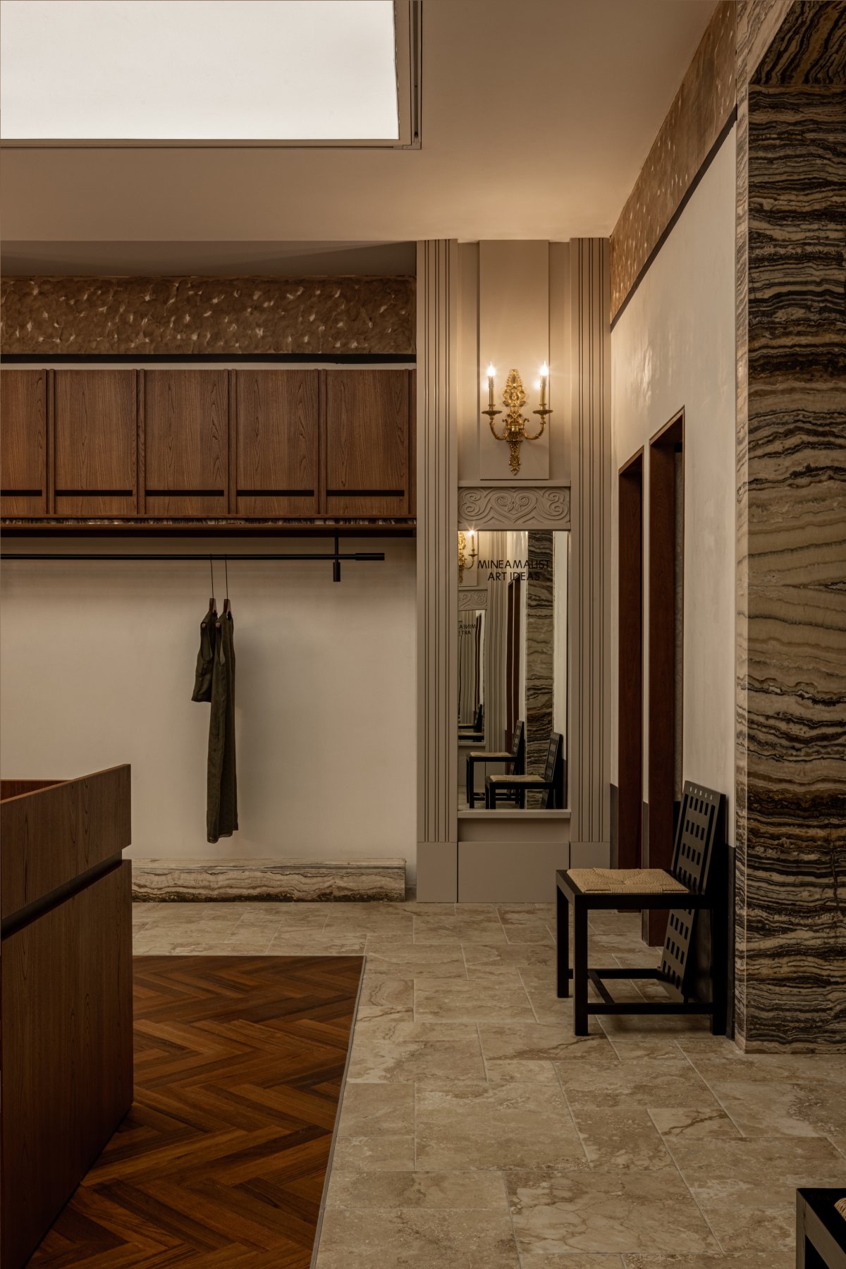
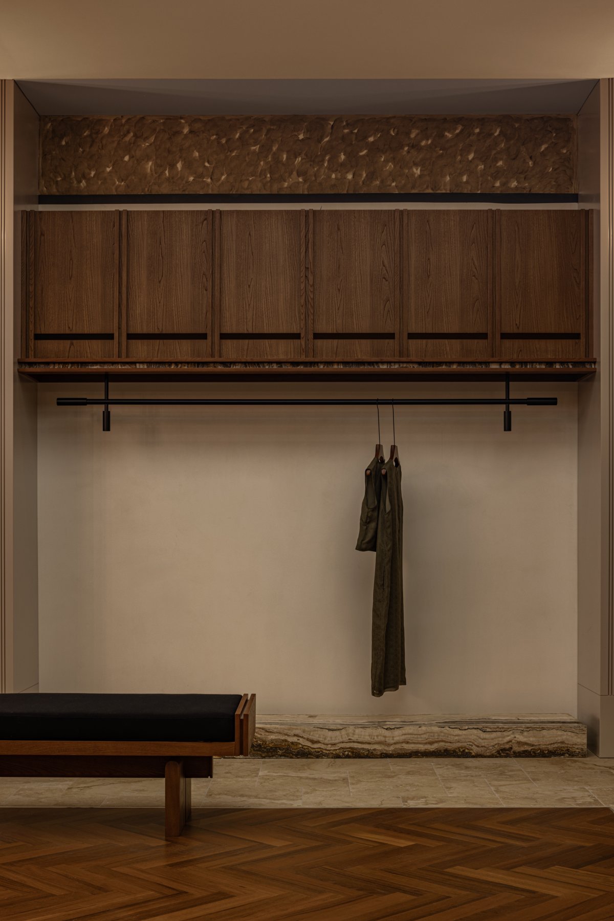
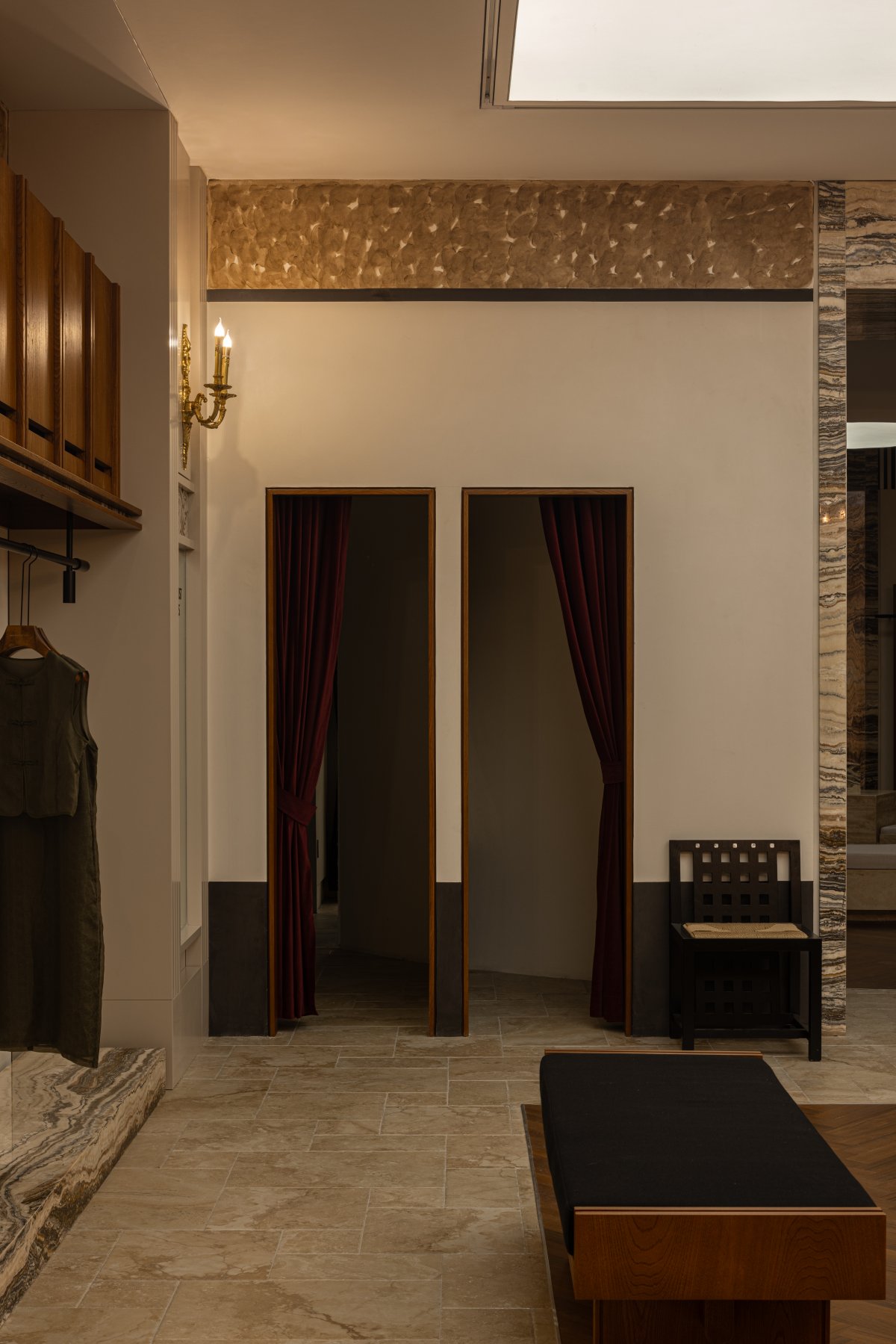
On one side of the passageway is a clothes rack and an open display table, and on the other side, a mirror is used as a partition to connect to the "Side Hall". The "Side Hall" mainly meets the display needs of utensils, jewelry and clothing, and by creating a film-like space scene, it stimulates people's aesthetic feelings.
Resting Room
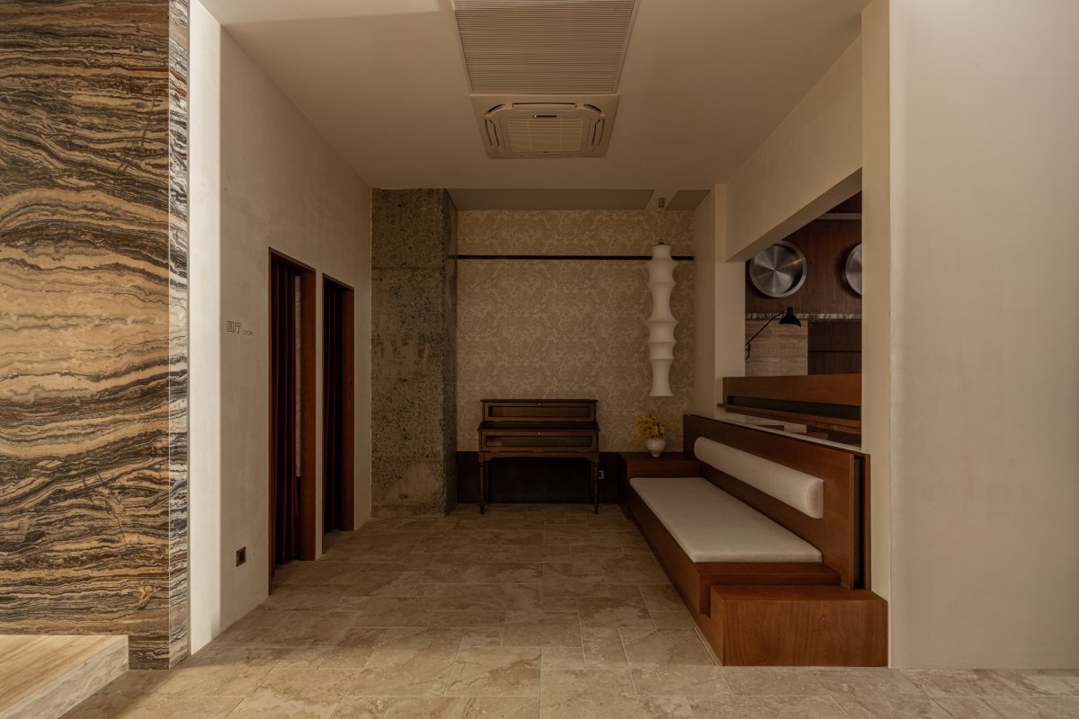
"Path" and "Circle" are connected by a transition space, which creates a pause between the front and back areas and serves as a resting room and cashier counter. Functionally, we use this pause to shape the retail space for lifestyle products in the backfield with more geometric and ritualistic characteristics.
Circle
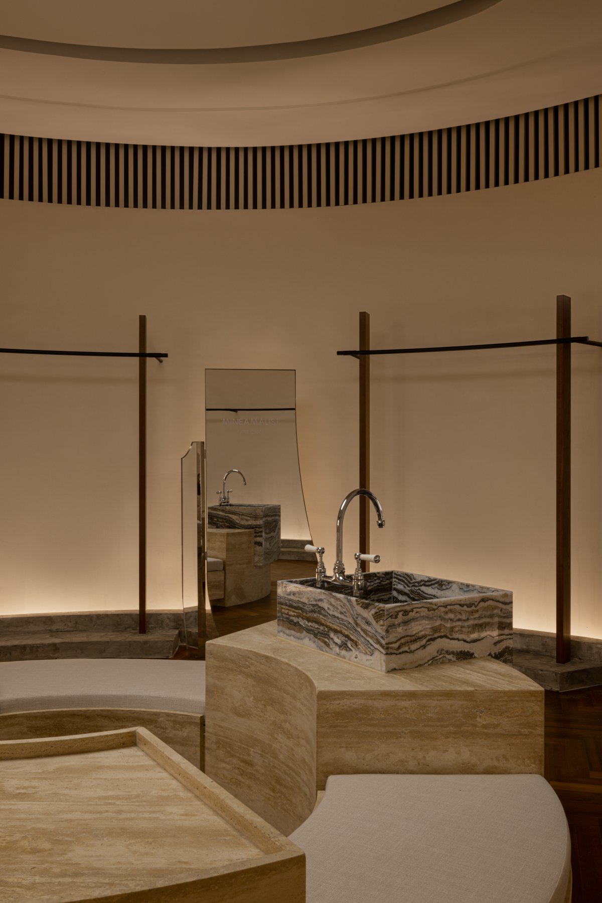
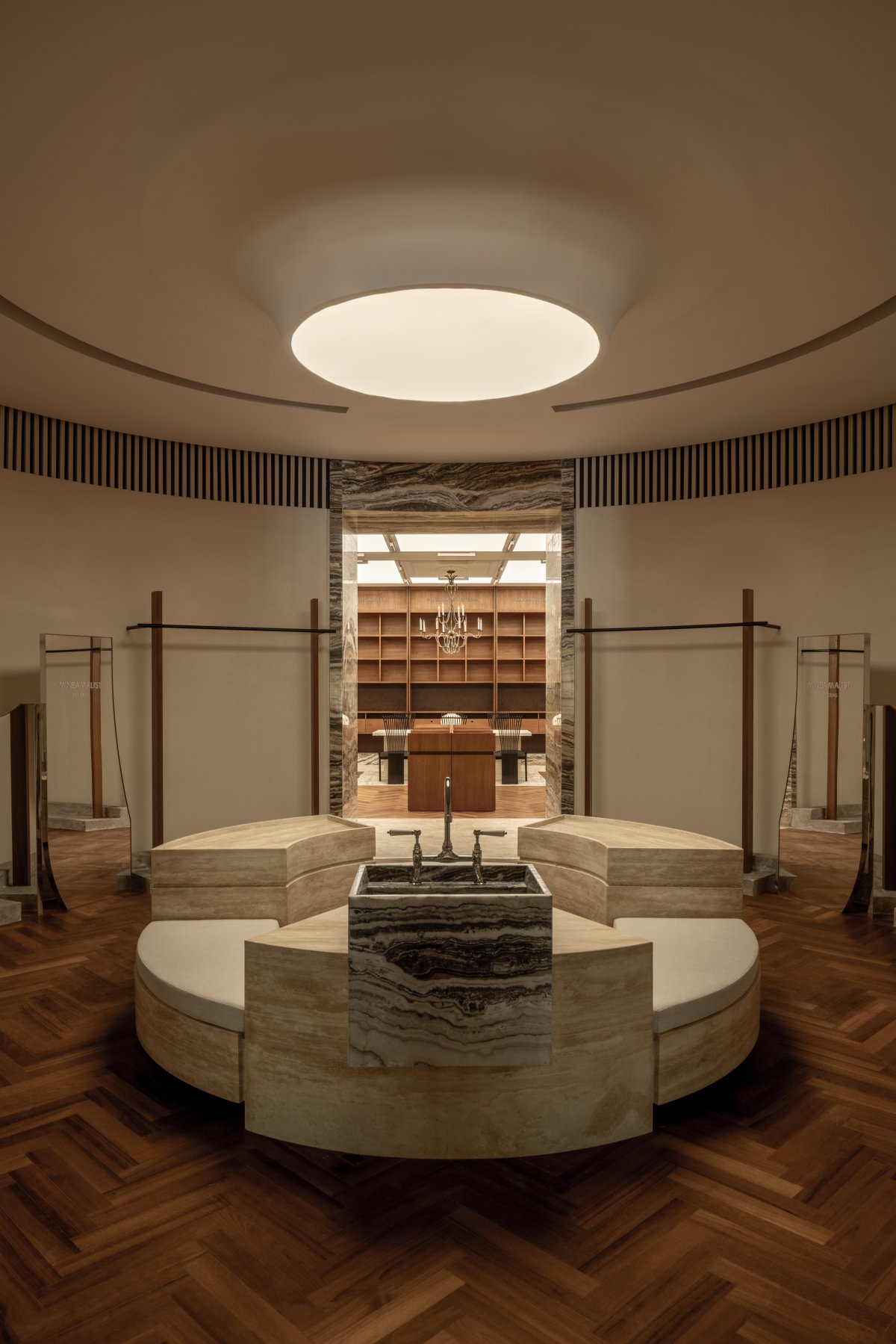
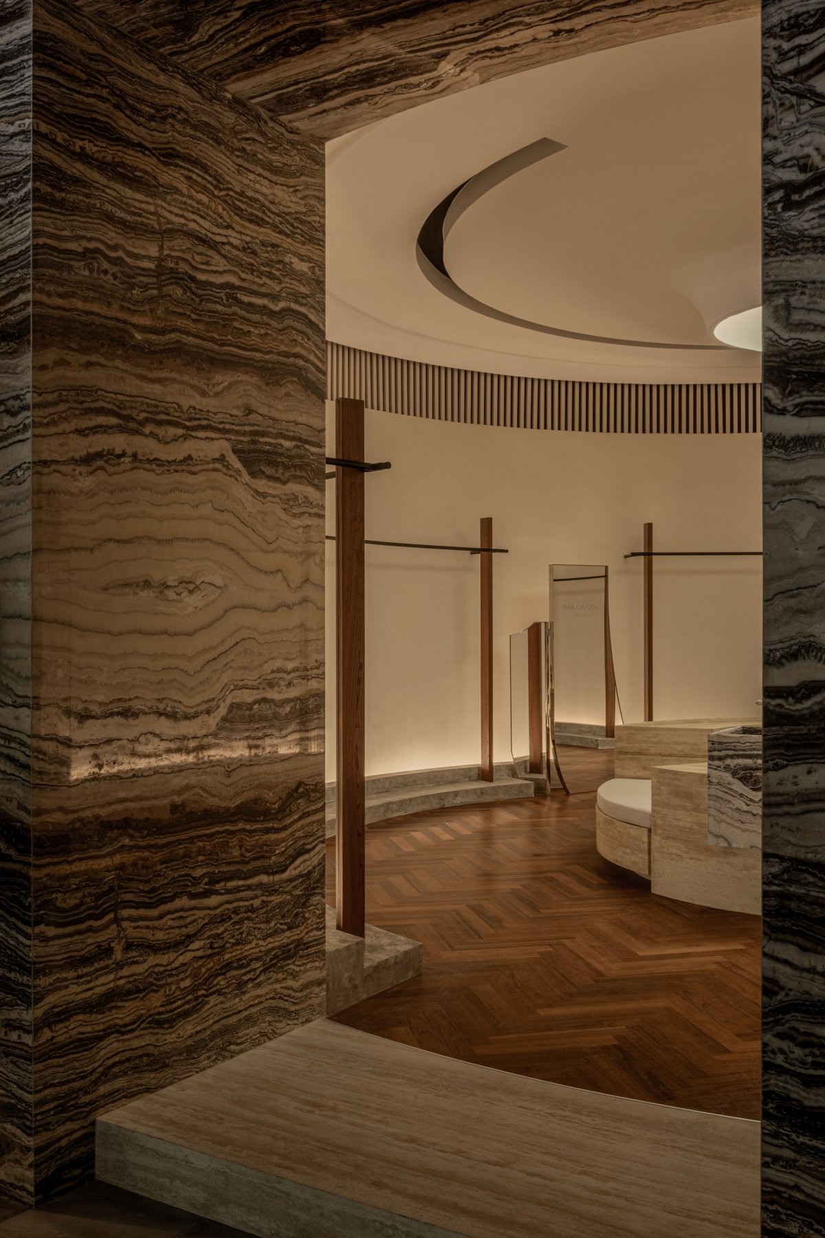
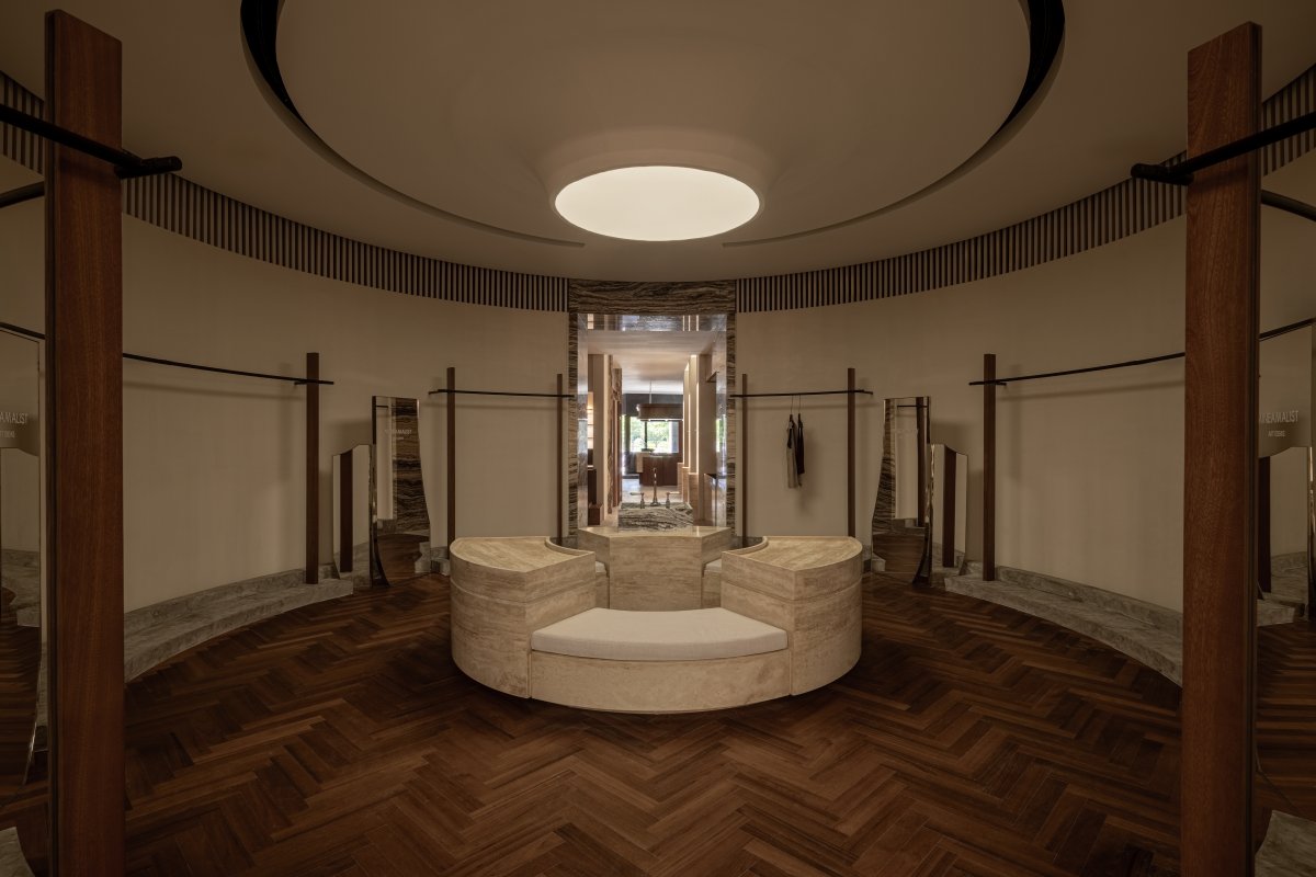
The "Circle" has strong geometric attributes and symmetry, and the entrance is created through the elevation of marble steps to create a new spatial experience. The central washbasin and resting seat are important visual focal points along the entire axis - as an experience and display of personal care products - the suspended circular light film above the ceiling echoes this, with curved hanging rods on either side and an irregular floor mirror.
Rectangle
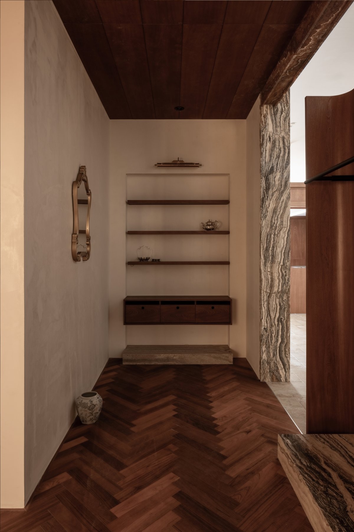
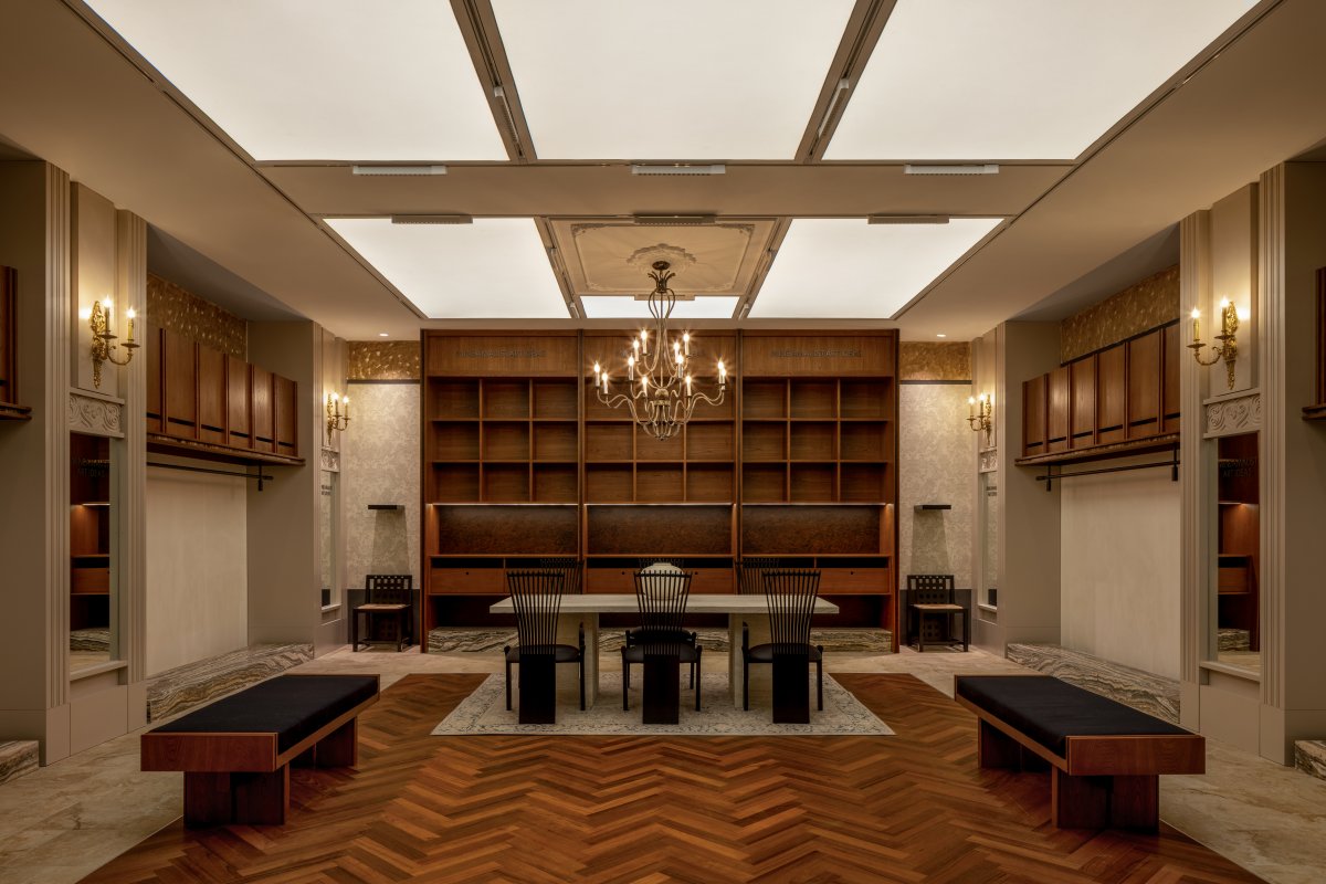
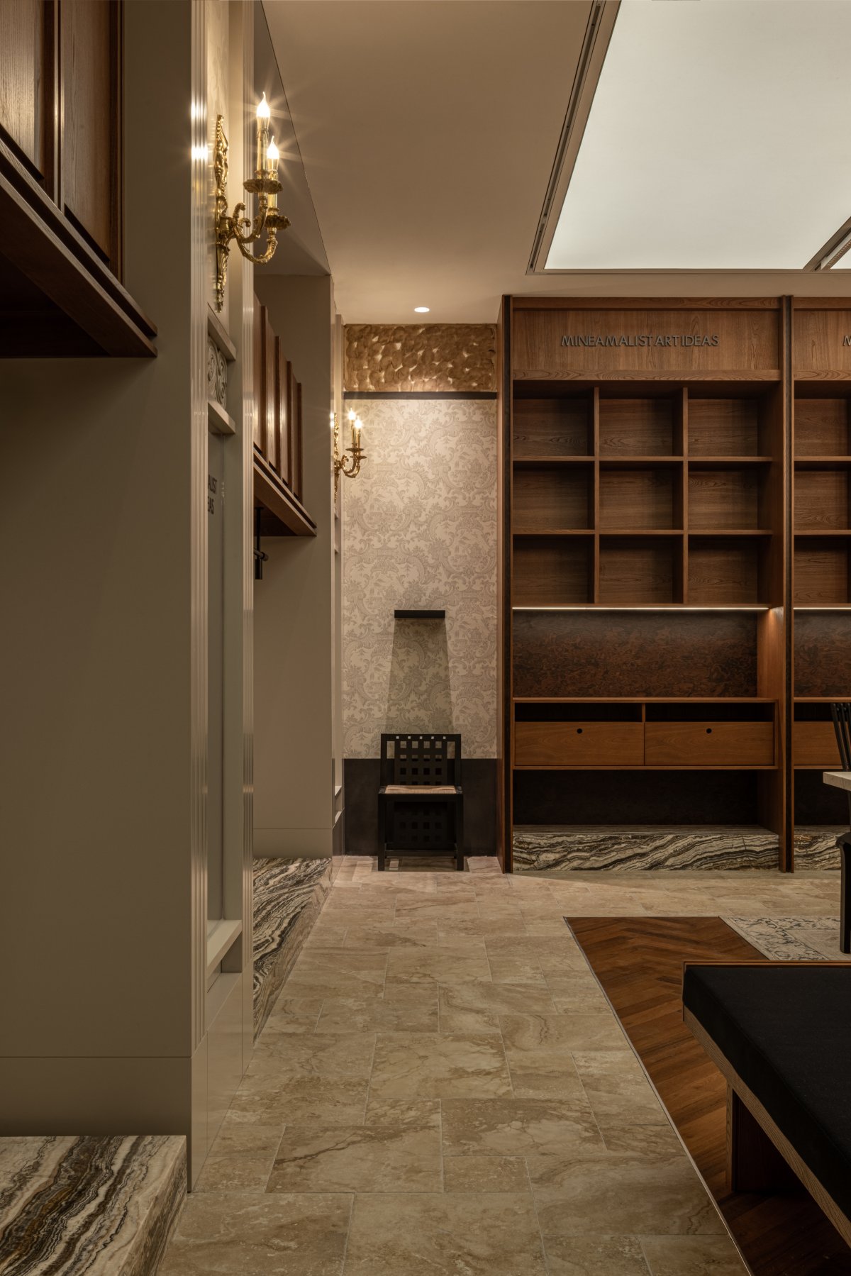
The "Rectangle" is located at the end of the axis, and is the most important "background" in the entire spatial sequence. We designed a bookshelf and paired it with a marble table and a vintage chandelier to create a rest and reading space for guests. Here, the brand hopes that the space creates not only a pleasant shopping atmosphere, but also a focus on the finer details of life, so that people can approach life with a more open attitude.
In terms of design language, we used the structure columns of the space to create classical decorative columns, enriching the column details with different scales and levels of moldings. At the same time, from the embedded mirrored columns, we can see that the design firmly attaches form to function, rather than being limited by decorative style.
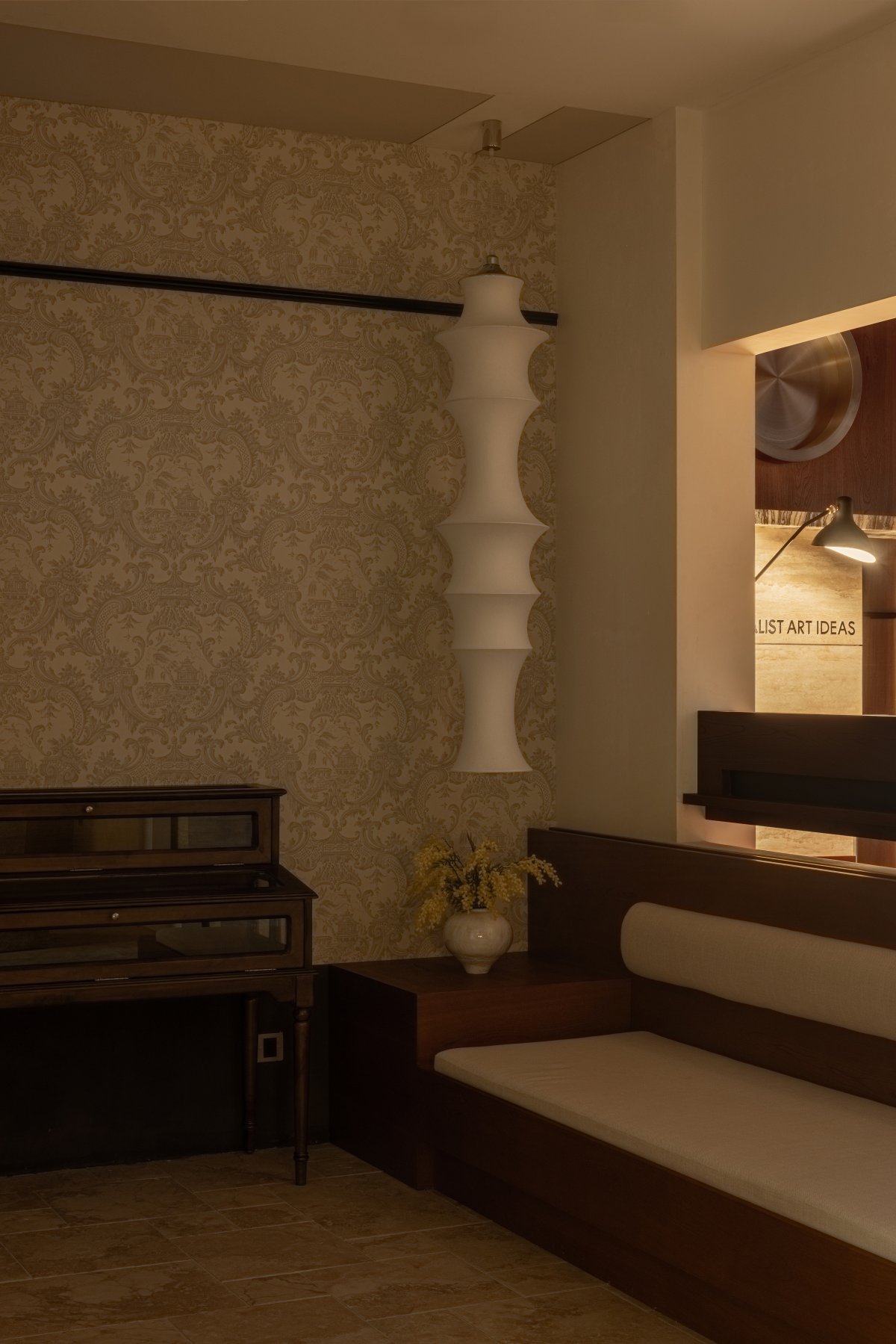
The walls are decorated with warm-toned artistic paint in a light hue, with the inner part of the ceiling painted in a lively ochre color for a circular blending treatment. The bookshelves on both sides are partially covered with Cole&Son's Chinese-style wallpaper...We hope to create a space and items with proportionally balanced and aesthetically pleasing proportions through in-depth exploration of materials, colors, and details, and build a commercially dynamic space with rich design language to evoke emotional resonance.
- Interiors: MAI Architects
- Photos: ACT Studio

