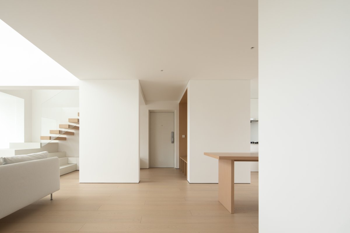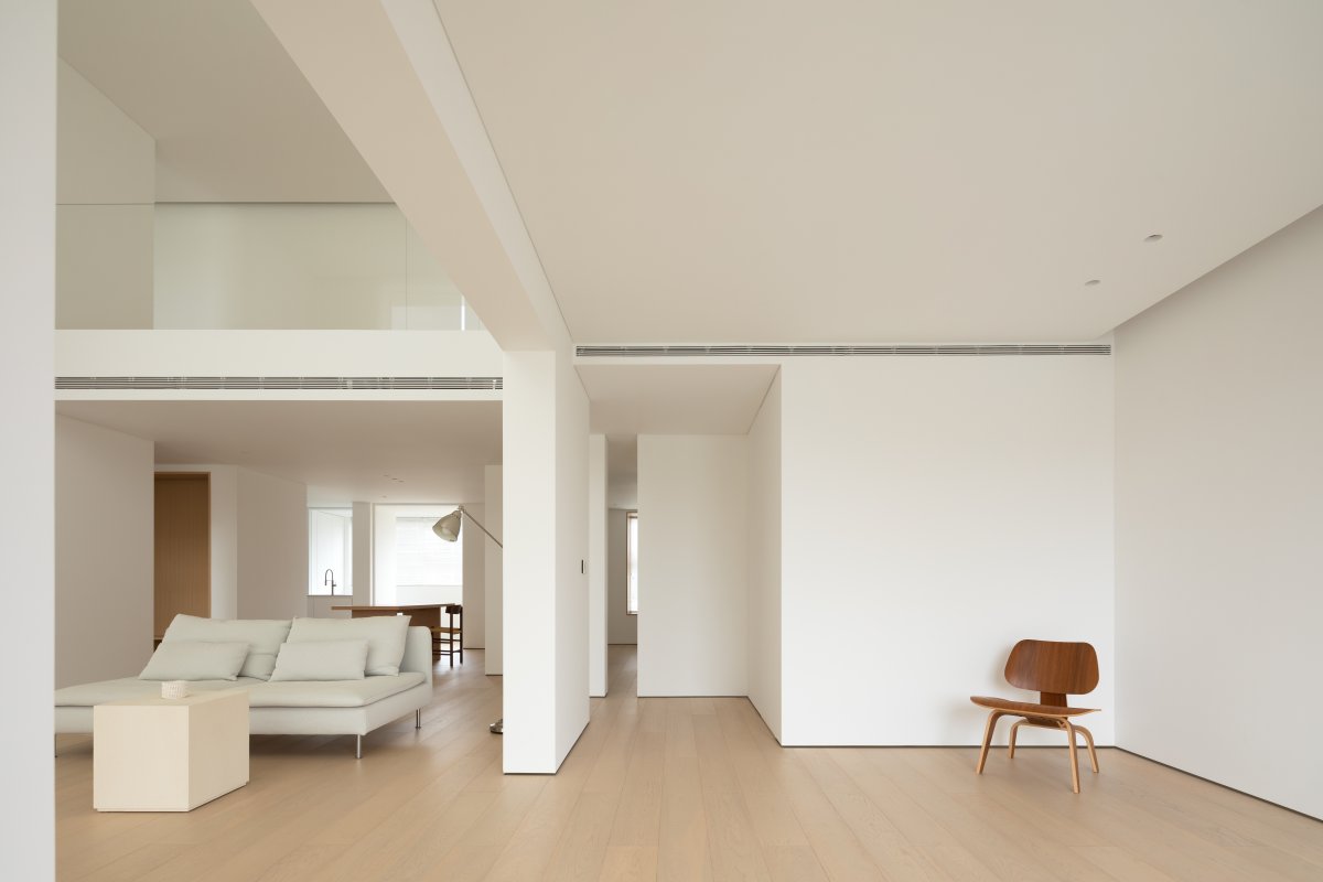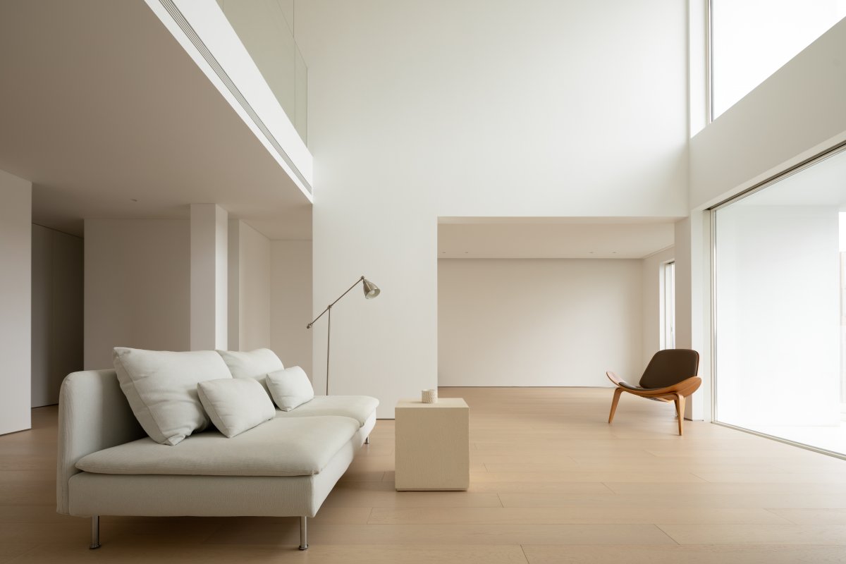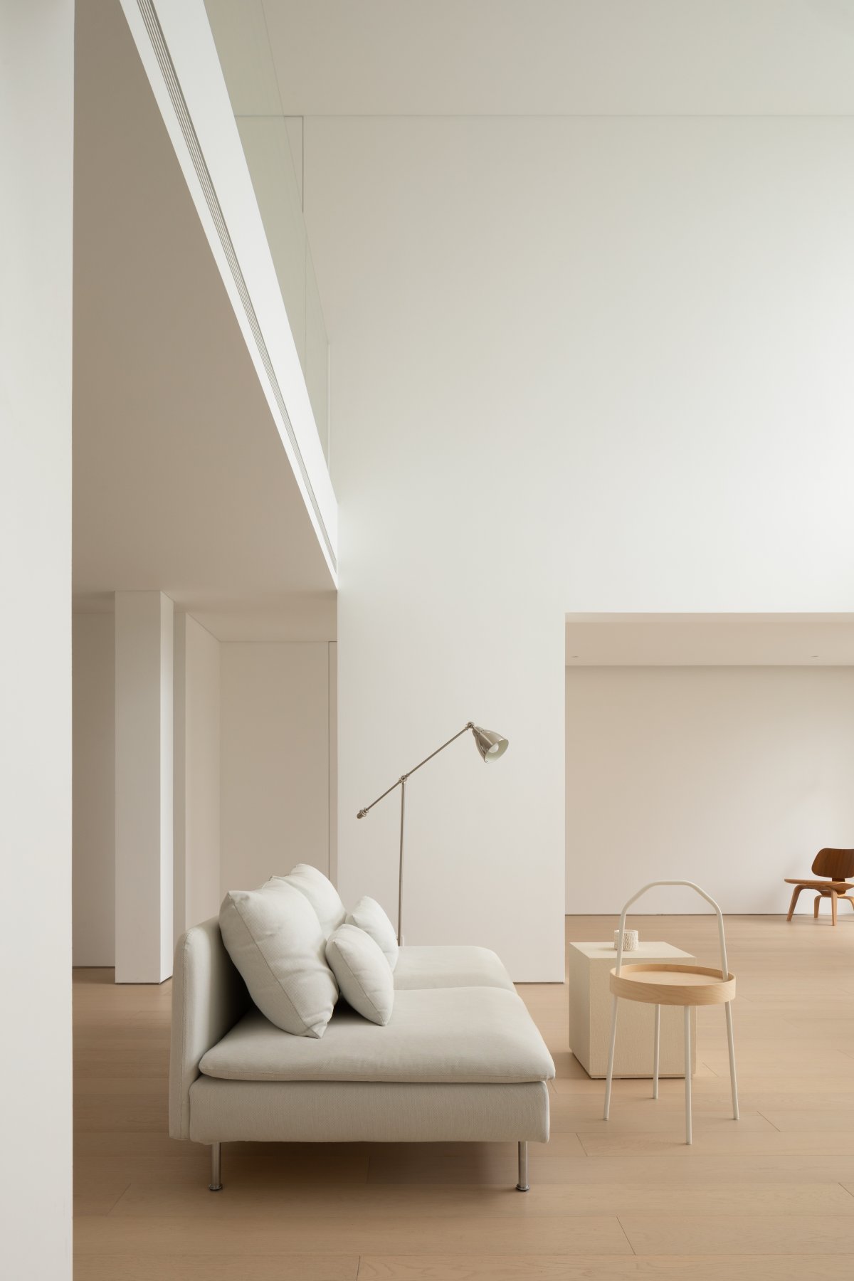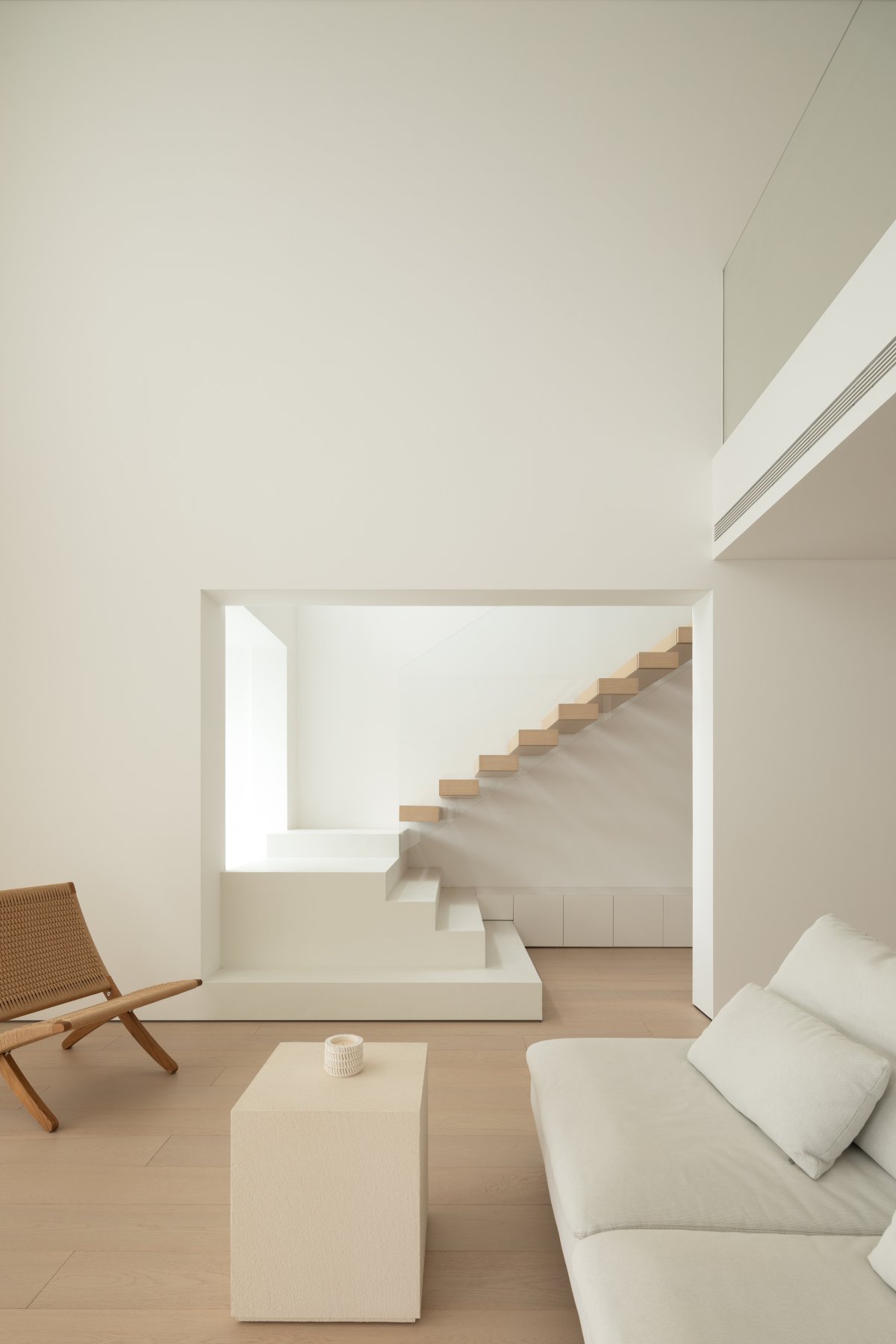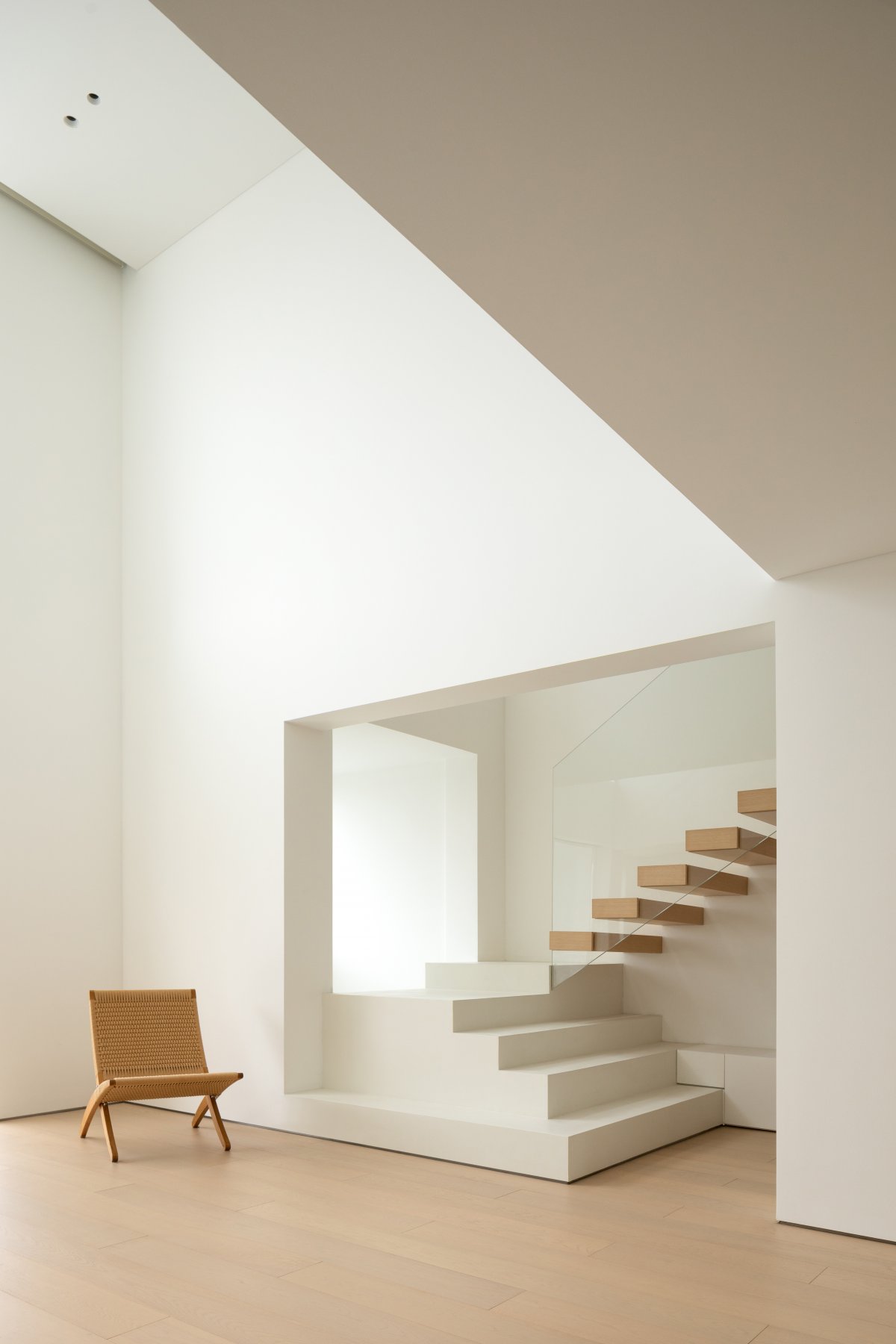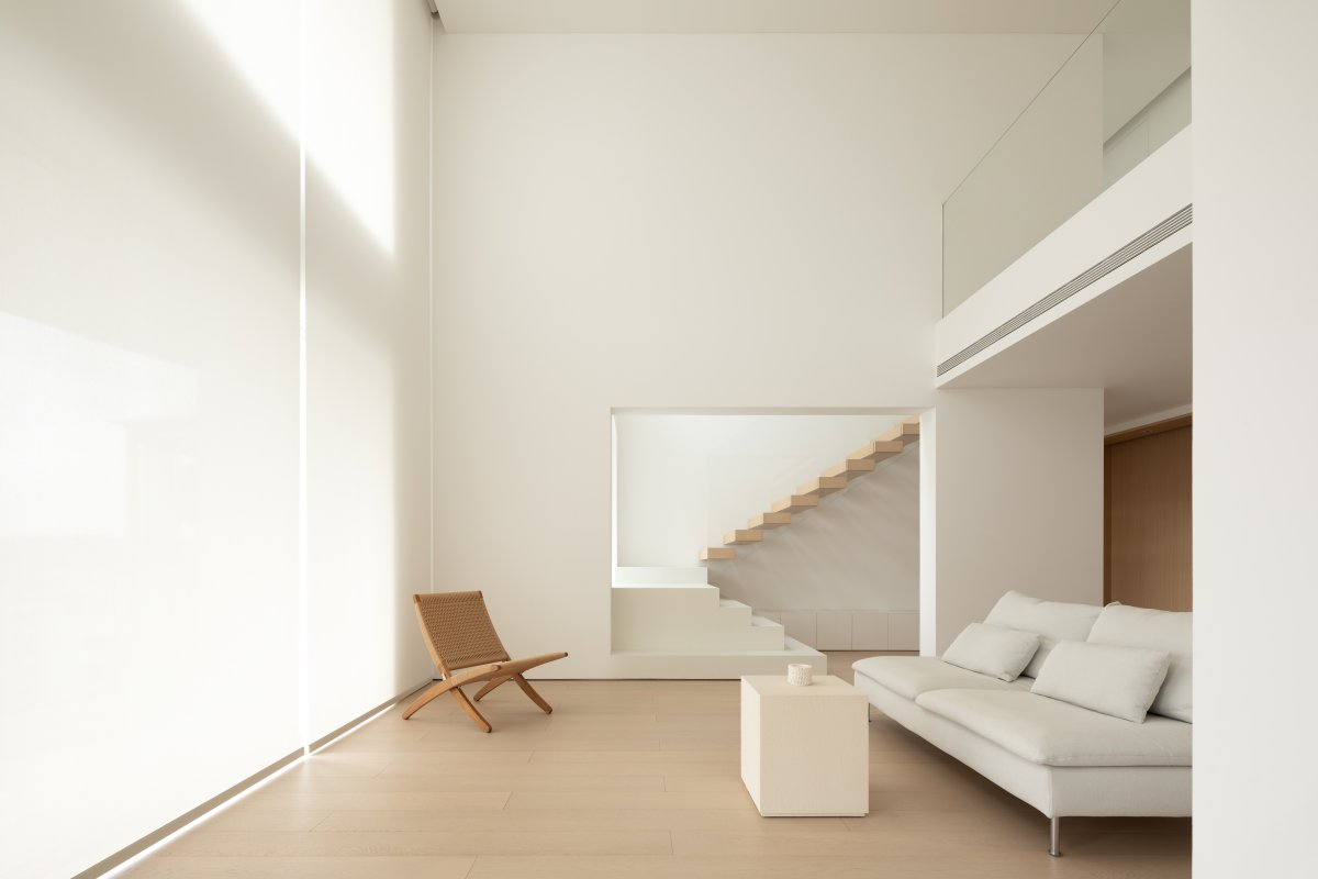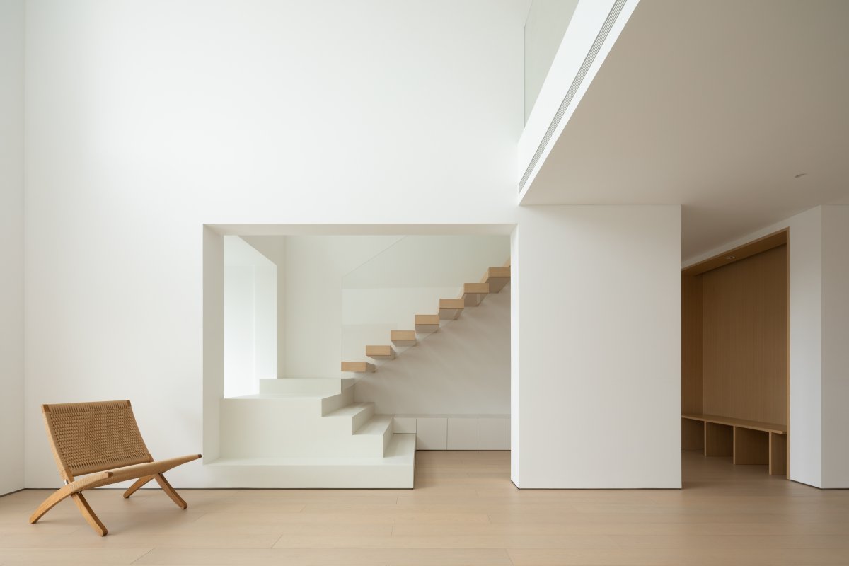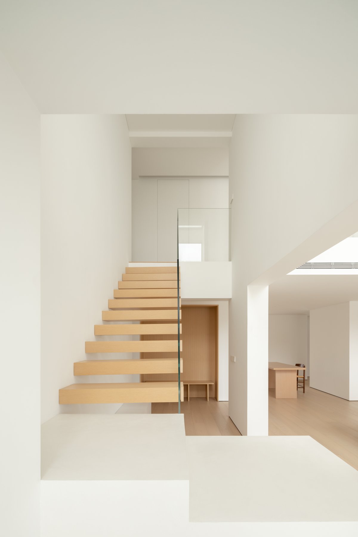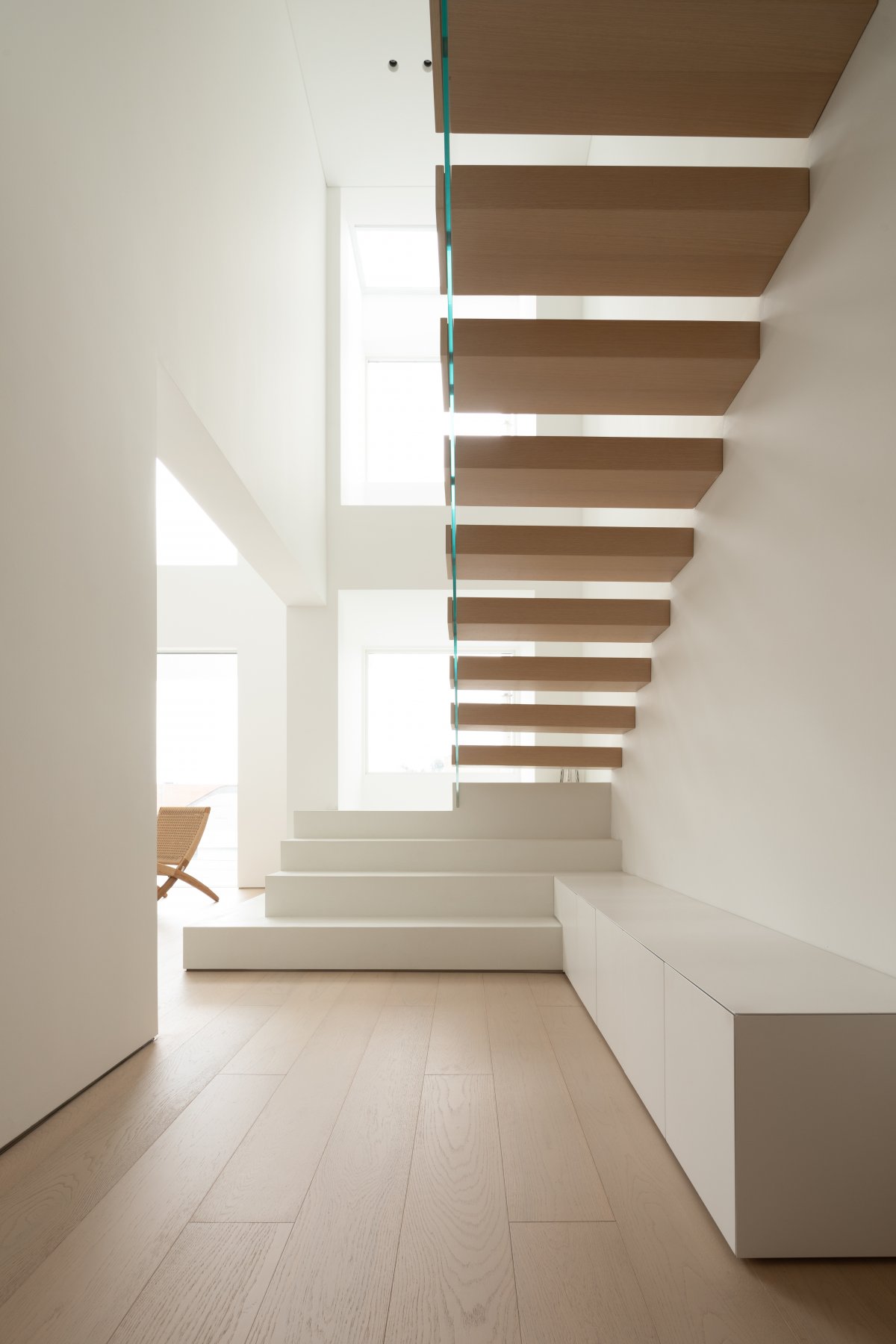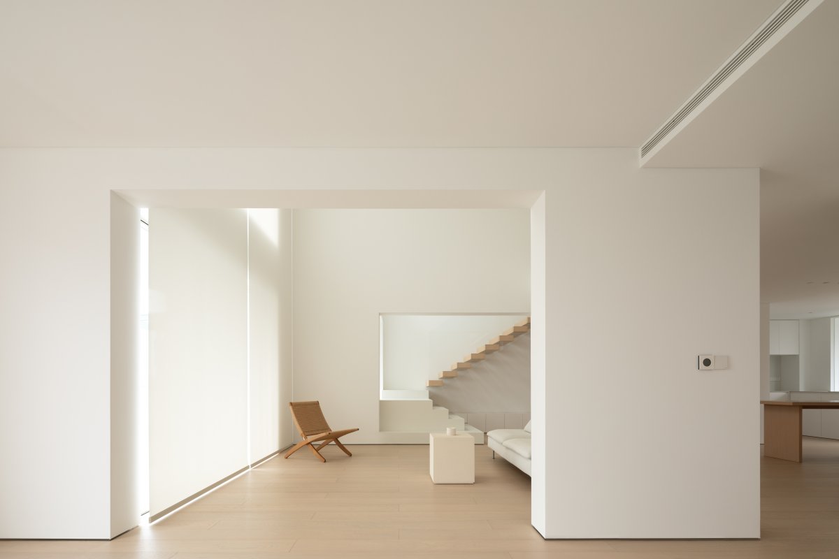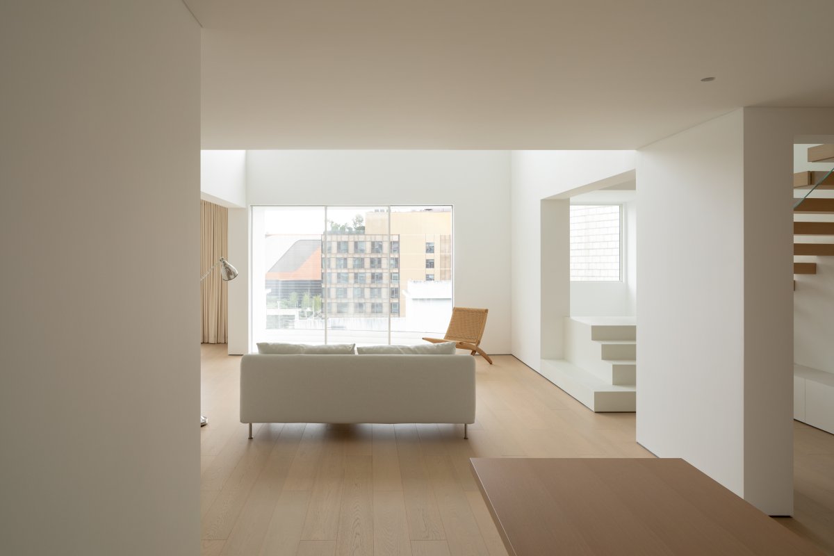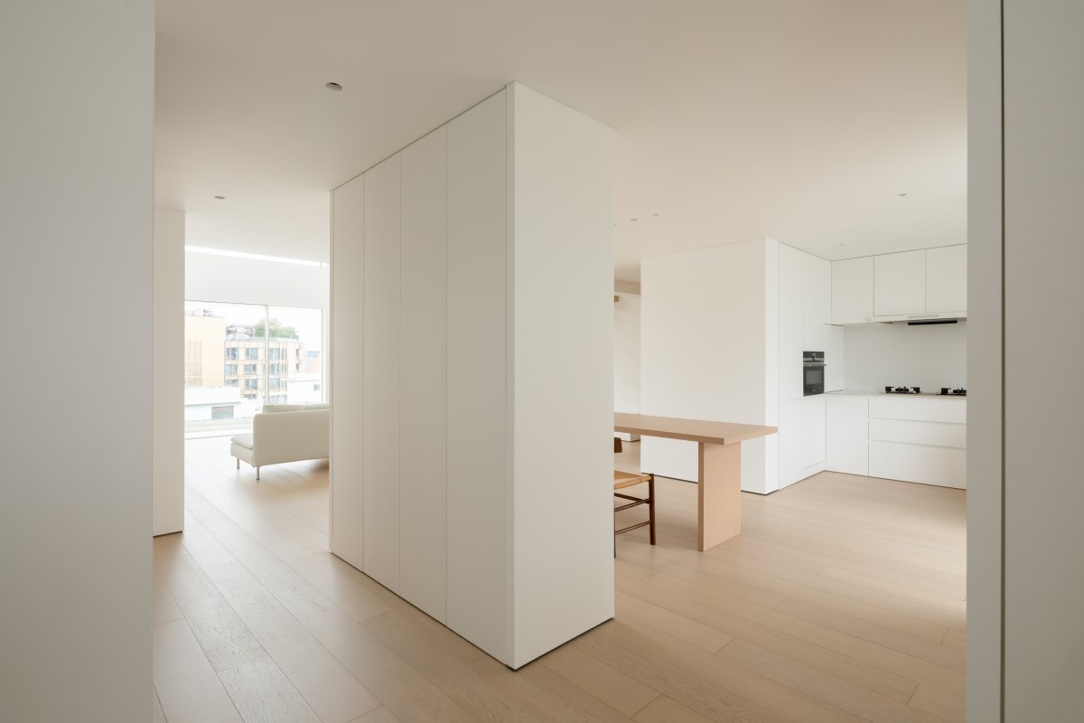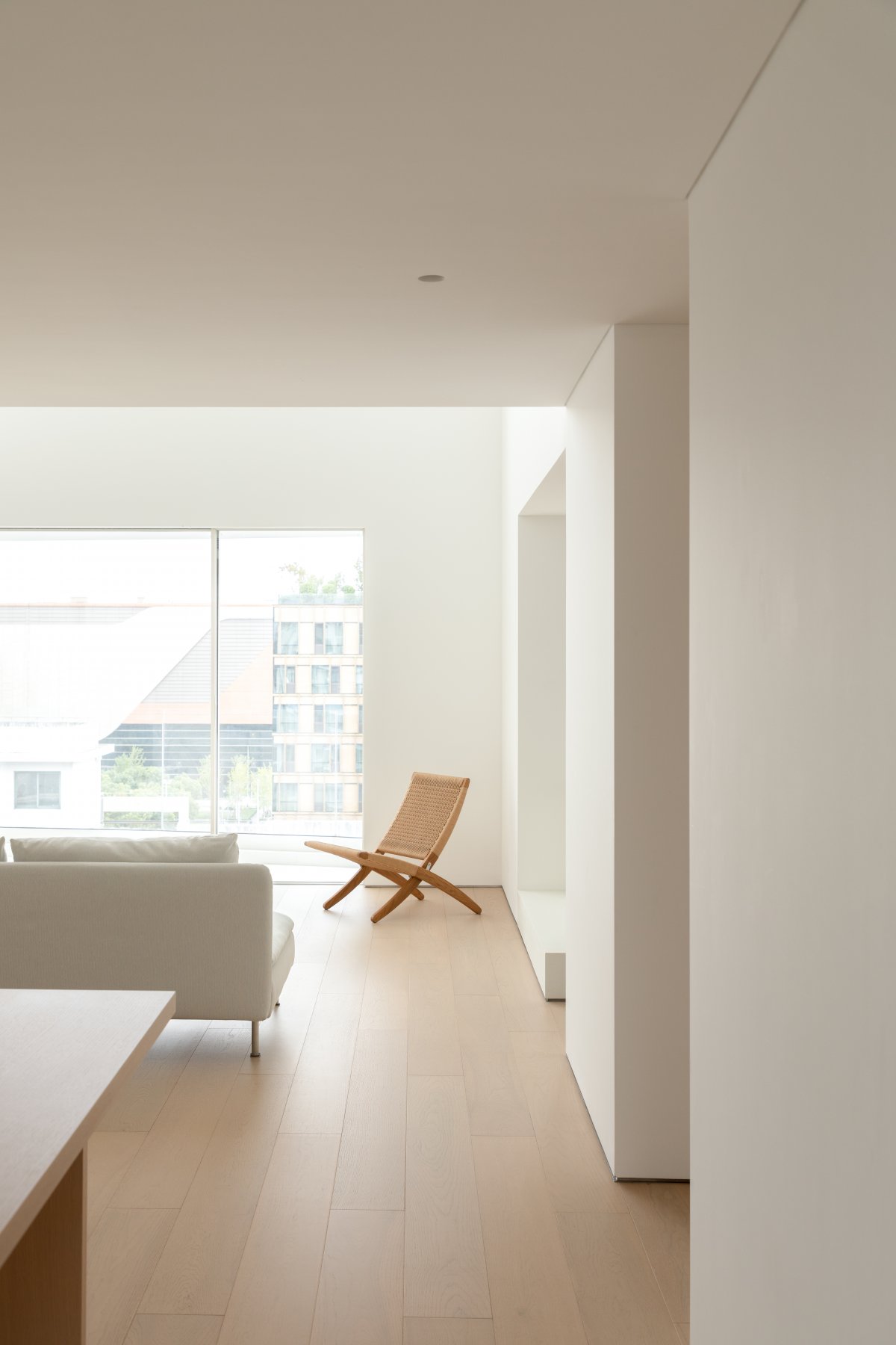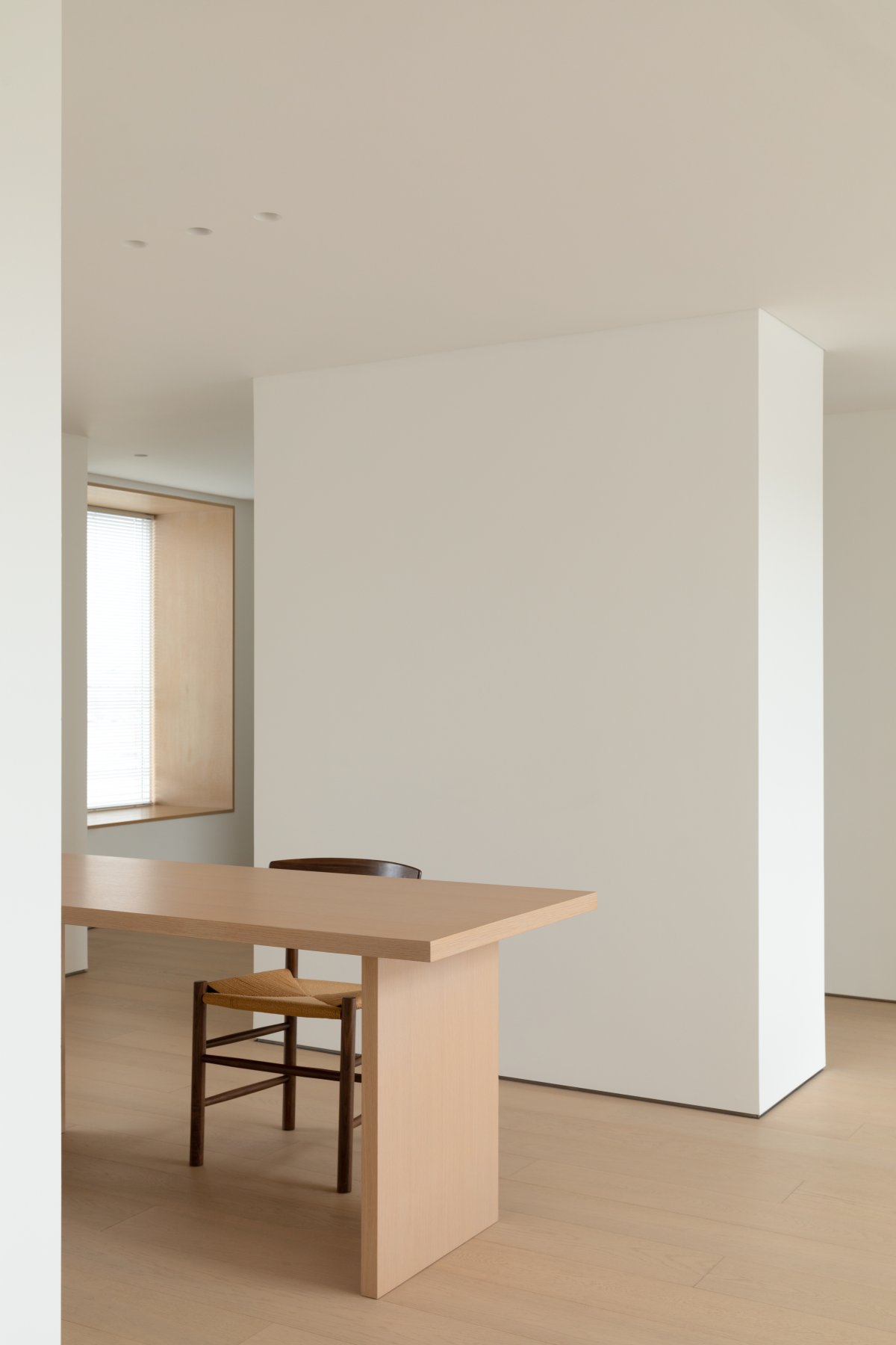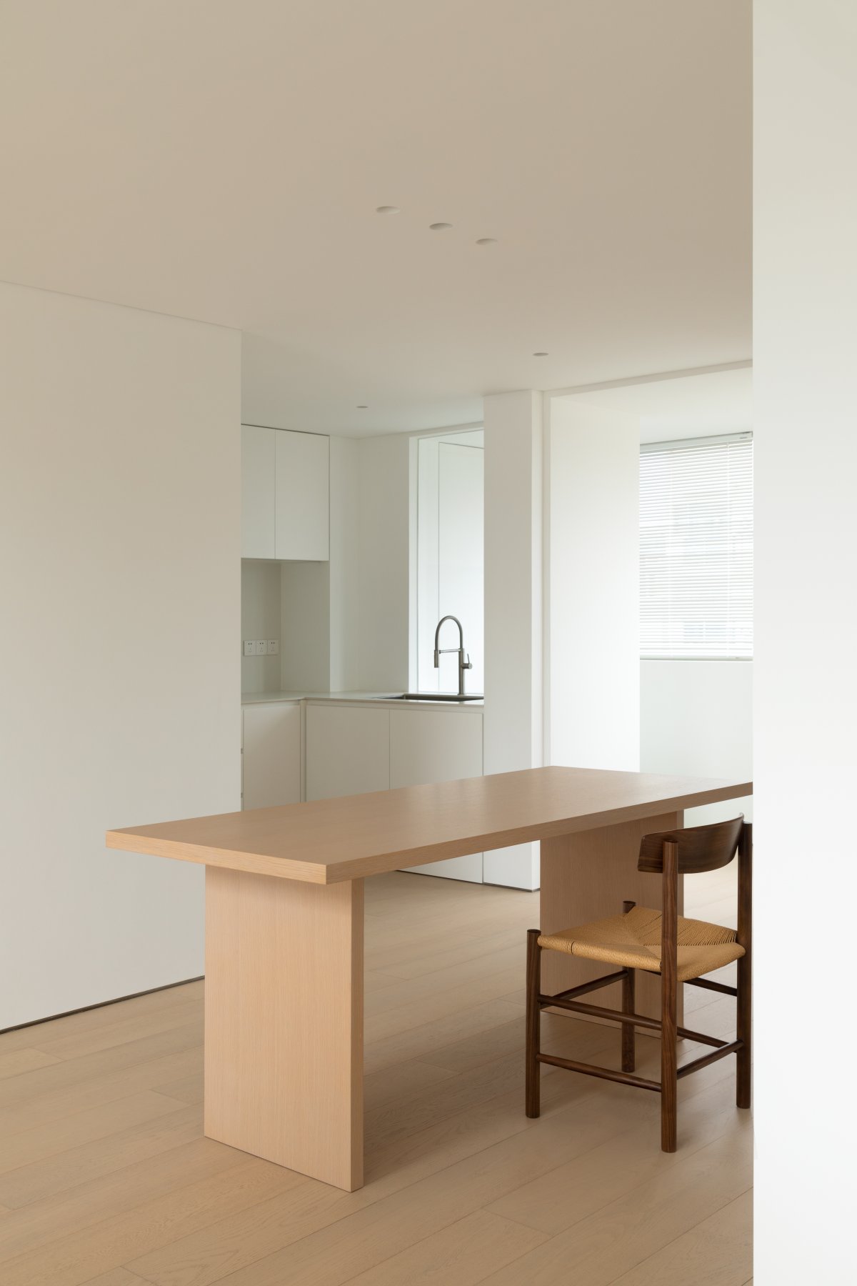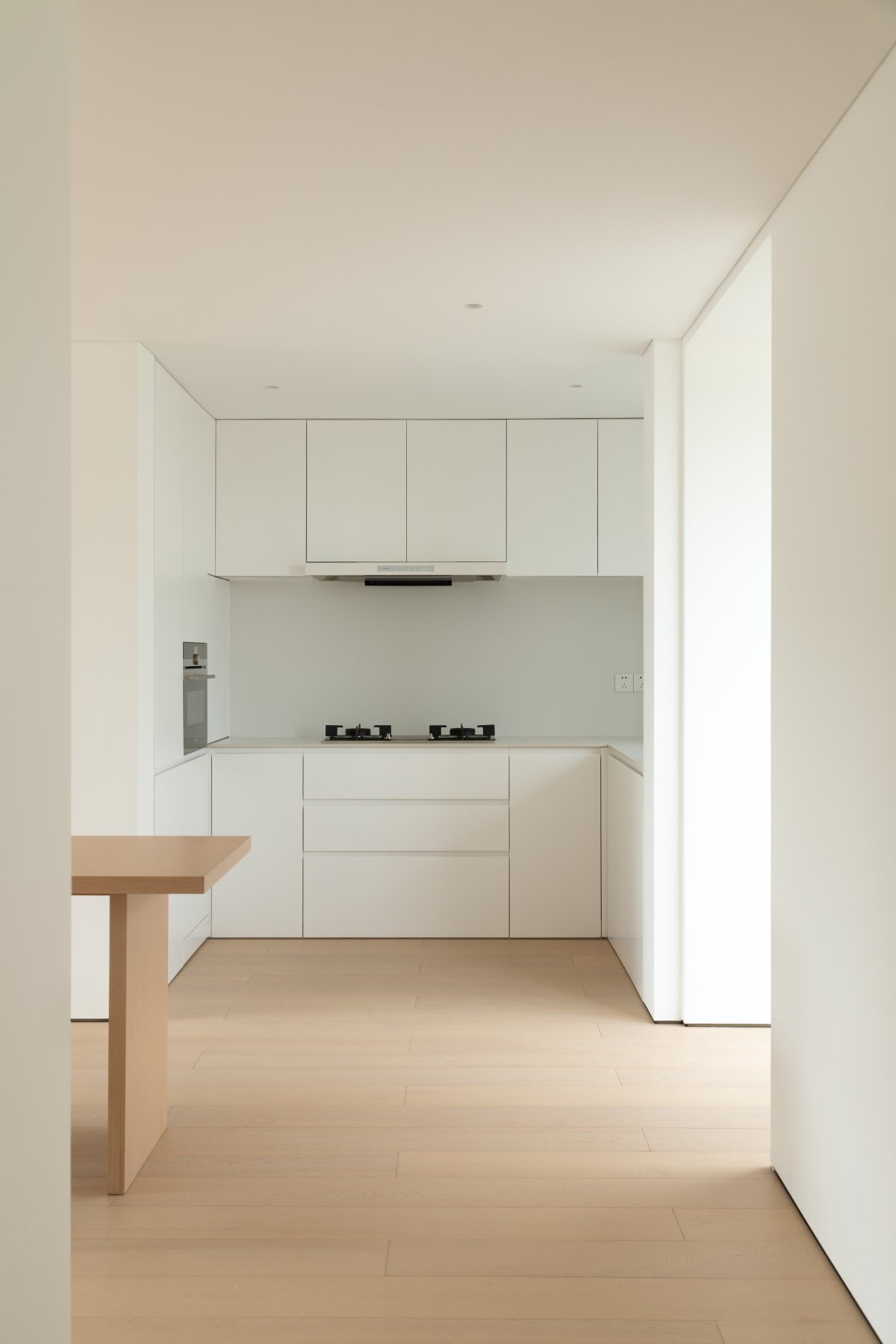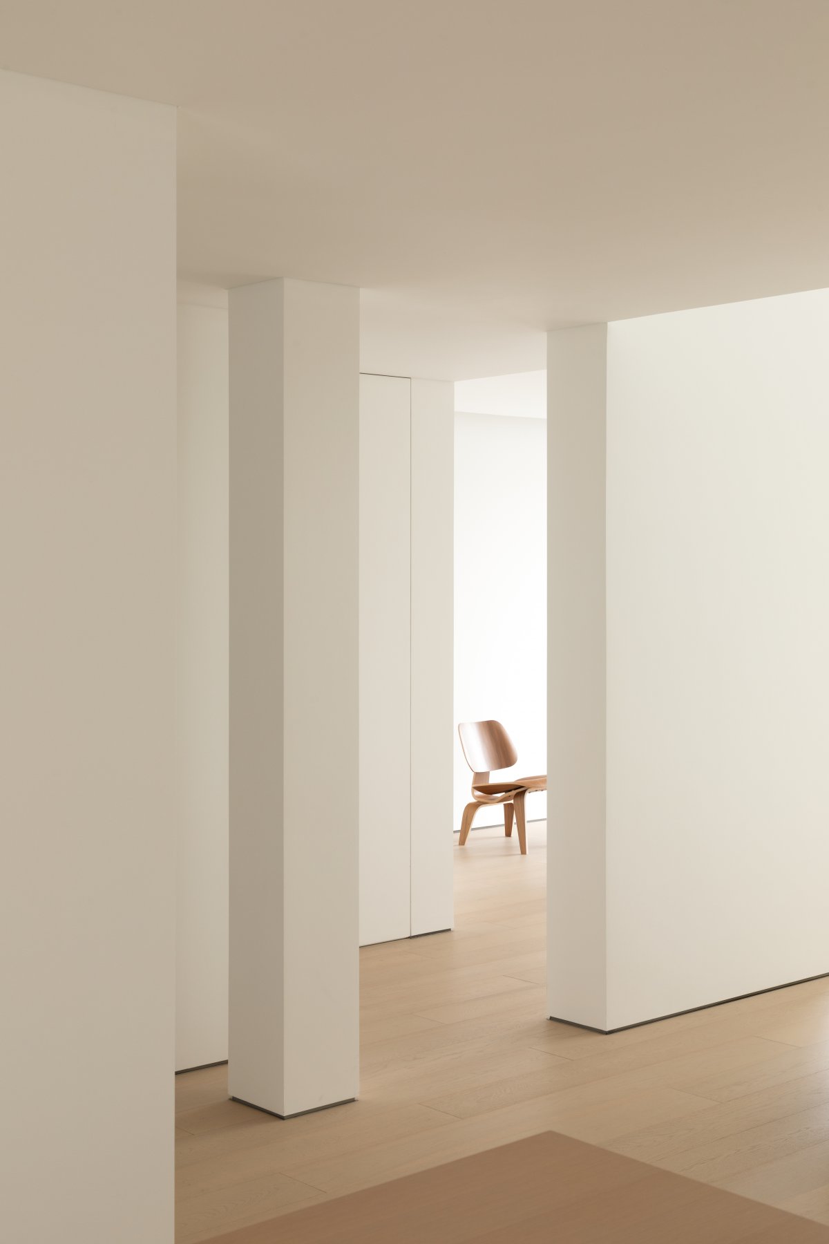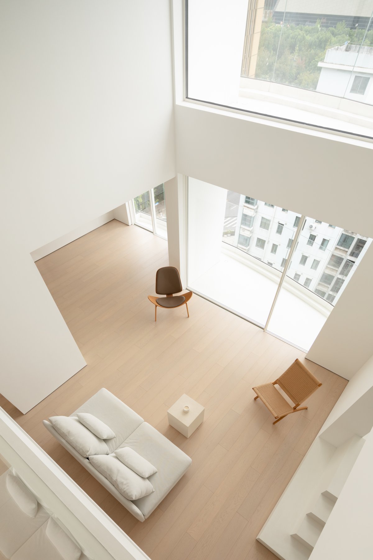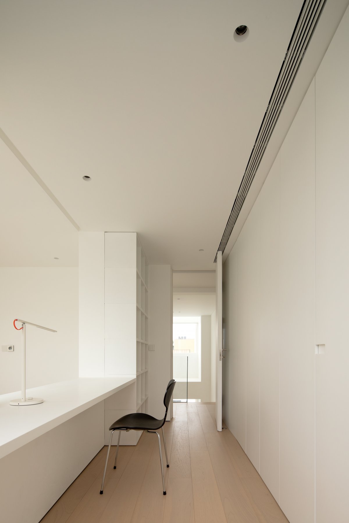
The plan doesn't strictly define the functional framework of the public space, it depends on the users' living habits and spatial characteristics, to create more unrestricted possibilities for the interior. The minimalist openness is the core concept, and the interior design is pushed into the field of architectural sculpture by thinking about plasticity and function.
The customized entry door unifies the entrance and the interior, a detail that effectively avoids abrupt visual perceptions for the overall open and flowing field.The entrance part uses the construction technique of wooden box to create the visual tension of material and structure.
The public space on the first floor is made of warm wood near the ground and the façade that needs to be touched, while the cold colors and vertical lines are near the top and the position where the visual center of gravity exists, ensuring a warm touch while shaping a hard and minimal space. By exposing the walls, the design's established field framework is stripped away, allowing the building substrate to be presented in geometric coordinates.Open flow is maintained between modules with different functions, and units with different properties are placed in open areas that are independent and interrelated.
The design intentionally breaks the traditional mindset of pursuing closed and connected spaces by presenting the walls in an absolutely bare and sculptural way, forming a unique geometric aesthetic between continuous and fractured in and out. The design breaks down the boundaries between modules and exposes the open internal structure. At the same time, the matrix-like sequence of wall changes reveals the functional attributes represented by the different axes. Ring beam meets the storage space required for air conditioning and ventilation equipment. The visual sense of volume becomes figurative and more tense in the sense of perception with the suggestion of white.
The window frontage is designed to present a dynamic, centerless module system, without established spatial lines and paths, without patterned forms and functions, stretching the sight distance to the greatest extent. The wall structure and the staircase with a hidden presence as part of the space and the furniture construct the interior with harmonious proportions and architectural scale.
The designers gave the dining and kitchen modules a larger scale relationship to enhance the open and interactive experience of being in them. Using the wall of the dining and kitchen space to divide the path, a new migratory route is derived to activate the interest of walking around the building. The flooring system and furniture are made of original wood, contrasting with the pure white panels and walls, and the overall use of functional and organic design completes the development of the dining and kitchen attributes. The walls establish a flush relationship with the cabinets and surrounding functional partitions on the façade system, providing a more flexible organization for kitchen operations.
Starting from the staircase, the space is redistributed in a new way. Pre-buried cantilever profiles into the wall in advance to strengthen the architectural aesthetics between the steps interspersed, making the staircase an important longitudinal device through the first and second floors. The minimalist staircase wrapped in original wood texture gives a warm visual feeling, the tempered glass handrail does not add any visual burden, and the overall sense of suspension is created just right. Overlooking the living module, the absence of chromaticity makes the space clean and fresh. The invisible door without border handle and the back wall are integrated to create a coherent and continuous visual effect. As the boundary of space movement, the design uses "architectural thinking" to present the corridor façade, and the minimal detailing creates a deep depth change in the scene.
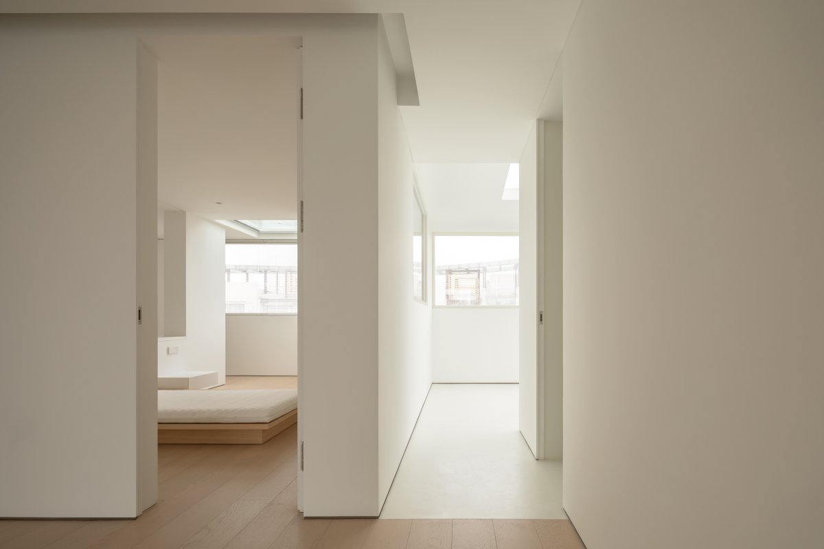
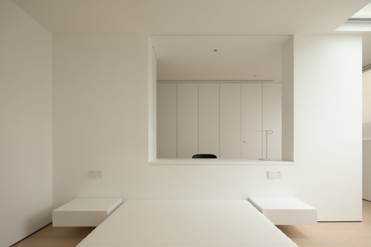
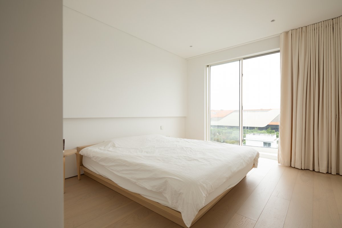
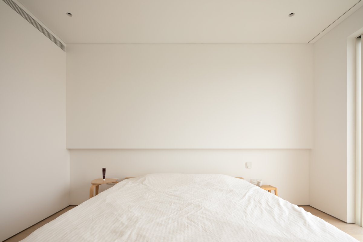
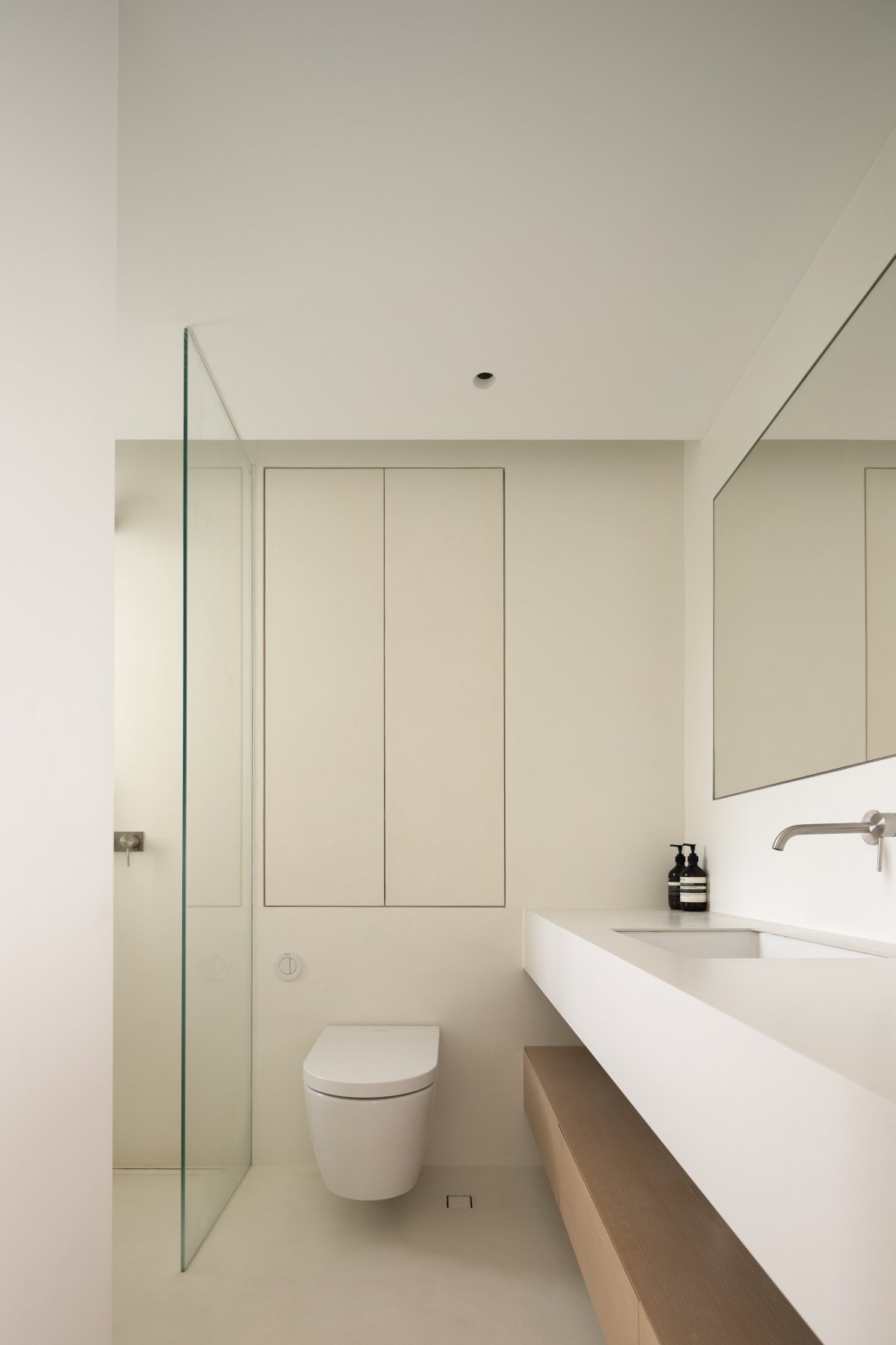
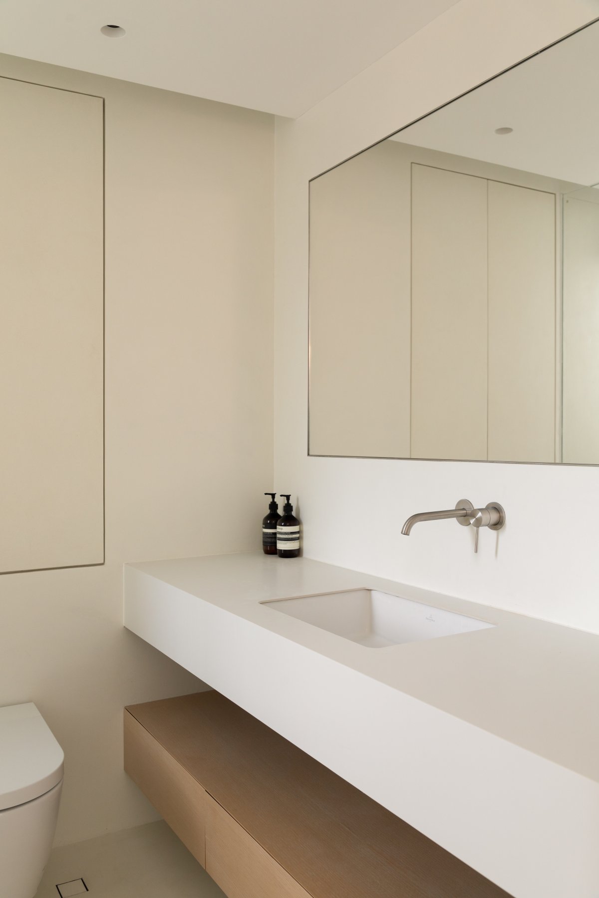
The bedroom retains the basic functions, and the whole is placed into the existing layout around the hollow partition wall as an axis, with different functions unfolding in turn to define a new resting space. The skylight brings in natural light and makes the space more three-dimensional. The amount of light transmission is finely controlled by the matte white louvers. The entry of light needs to be controlled, and the dispersal of vision also needs to be restrained, and the hollow partition wall after compressing the range of vision can instead focus on a richer scene experience. The guest bedroom eliminates superfluous subjective content to extend the boundaries of minimalist sensuality. Flush sliding doors on the right side link the interior space to the curved terrace of the exterior area. The simple flat façade lines bring out the sculptural sense of the building by restraining the redundant element piling. The modular combination of wall-mounted toilet, wall outlet faucet and niche cabinet explores the minimalist visual and formal value of the washroom space, while ensuring that practicality is the primary factor, giving the material its most basic shape.
- Interiors: NOTHING DESIGN Wen Bin
- Photos: WM Studio Photography

