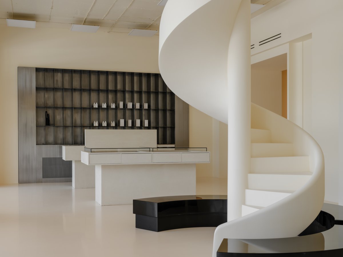
Primerochnaya—A multi-brand concept clothing and accessories store representing multiple brands and designers. The store occupies 192 square meters of the first floor of a residential building. The overall concept implies a visually unifying space for several brands.
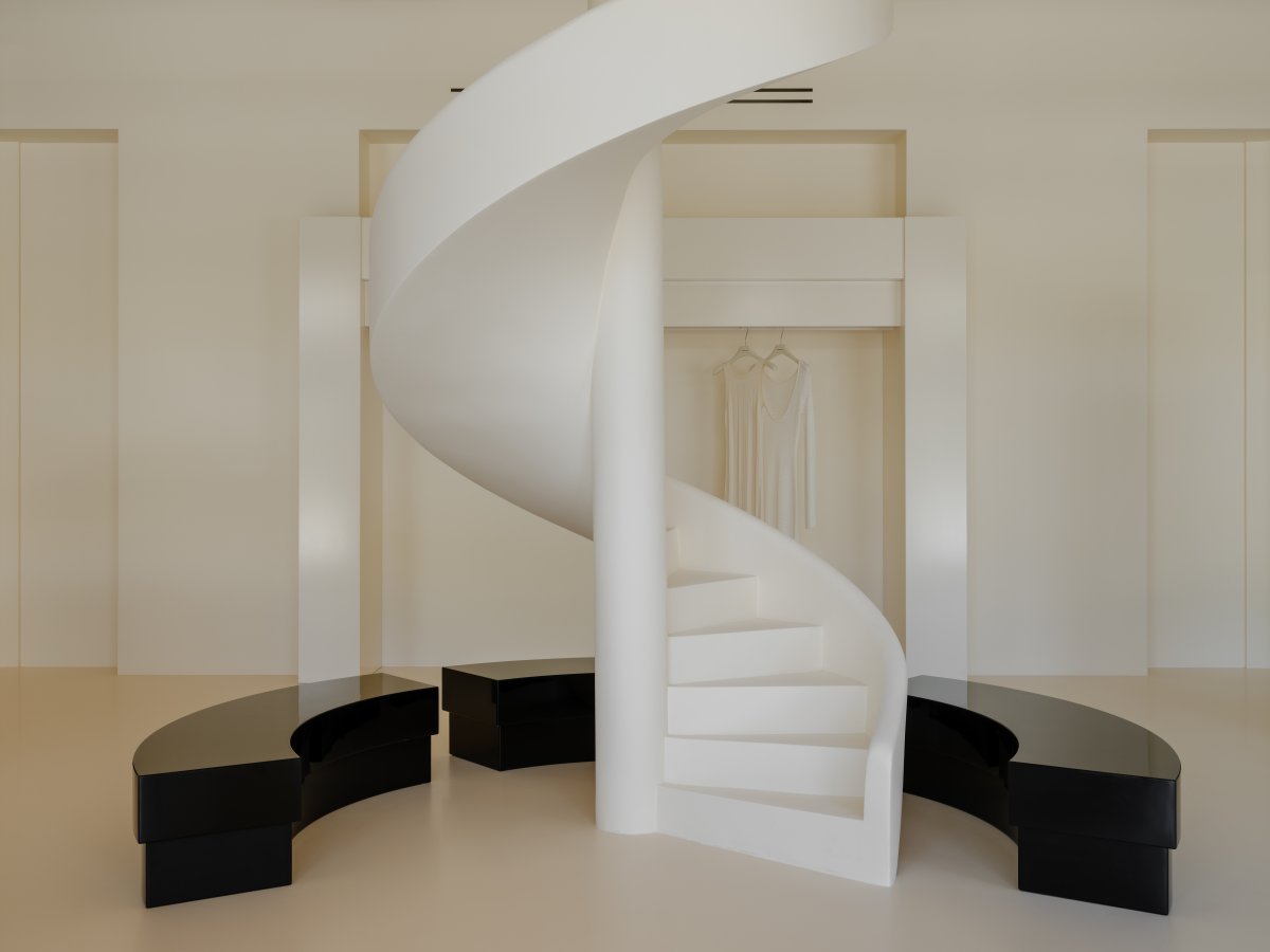
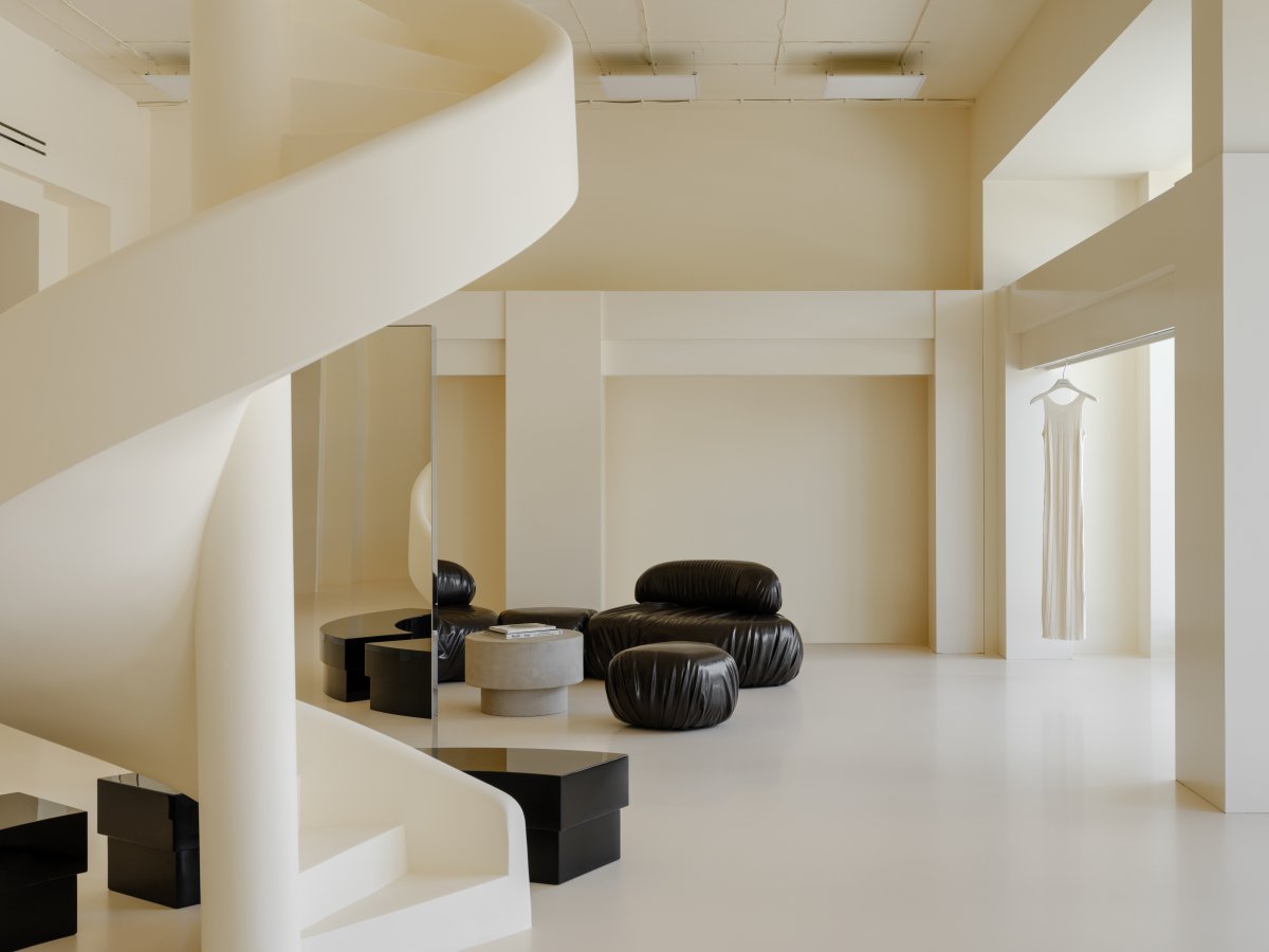
The initial shape of the space was tricky, with many protrusions of load-bearing walls, columns and beams. When designing the layout and the floor plan, the existing wall architecture was adjusted in order to achieve greater symmetry and harmony of the space. Lined axes connect doorways, niches and main dominants. One of the architectural solutions in this space is that the openings are decorated with massive architectural elements.
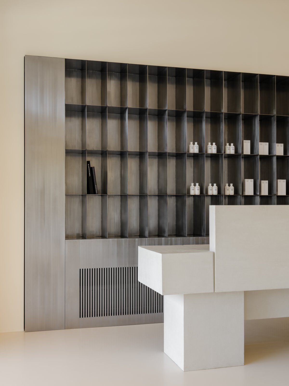
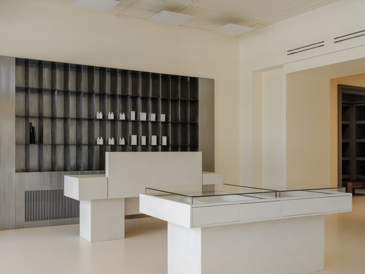
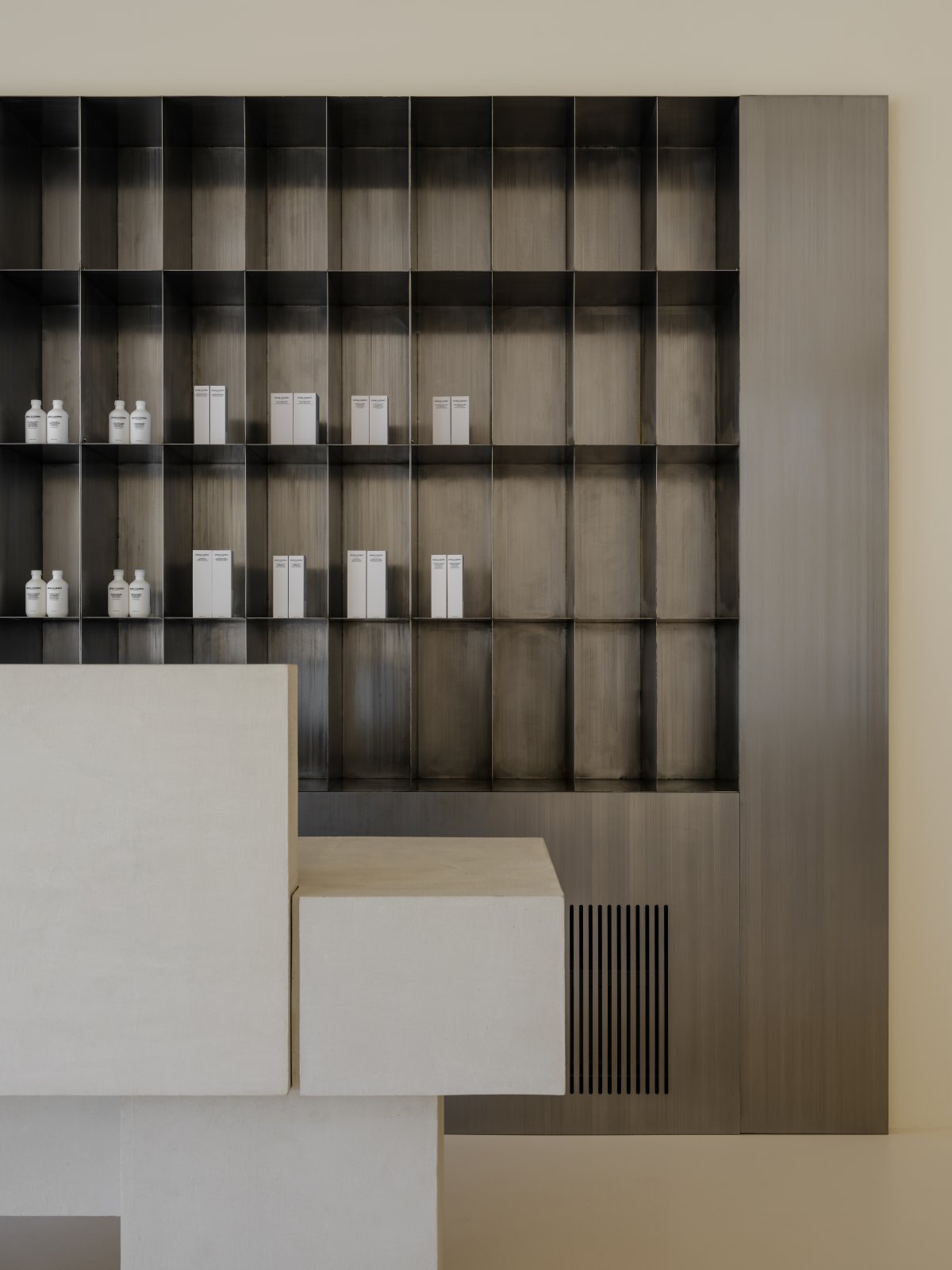
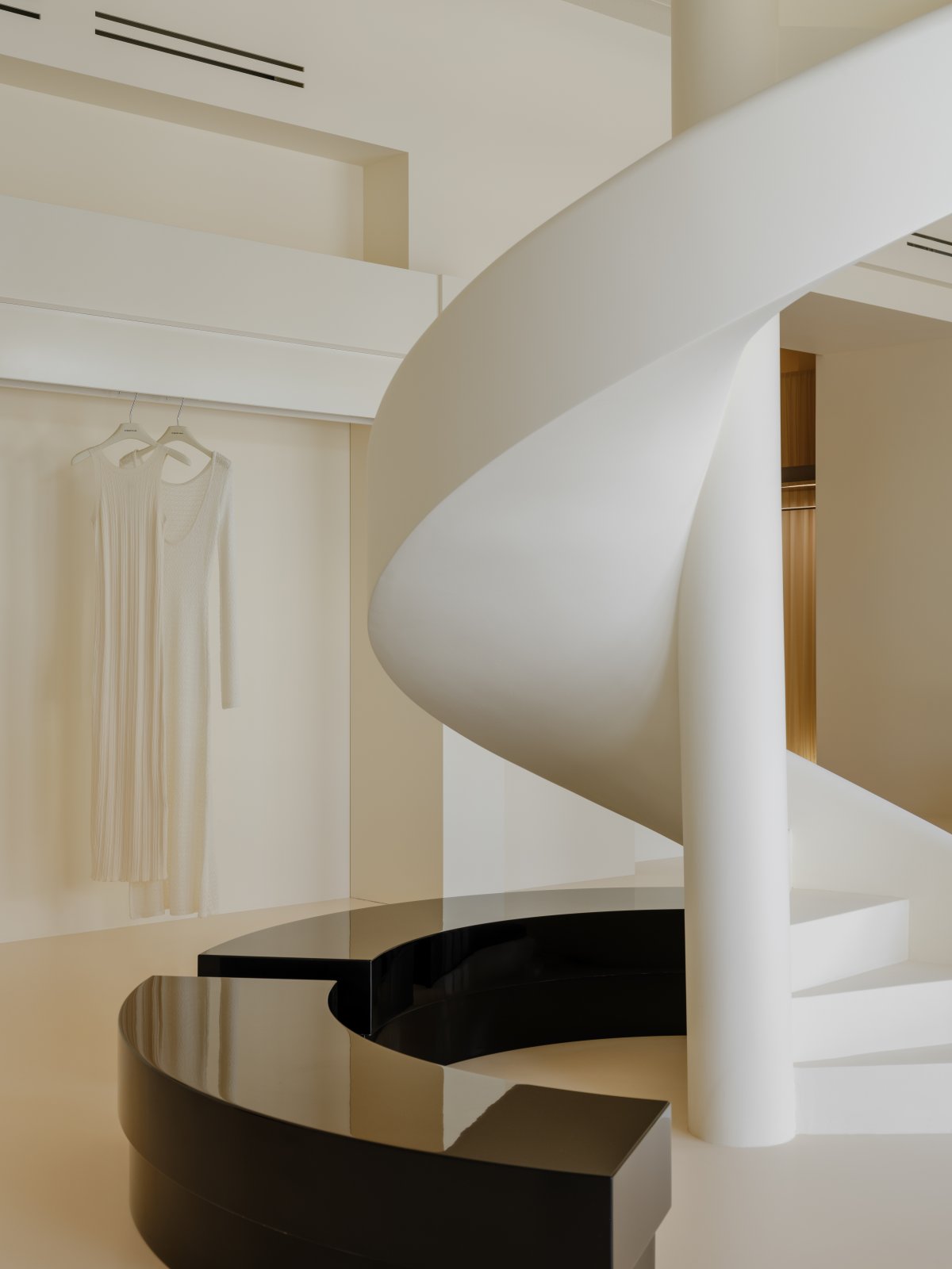
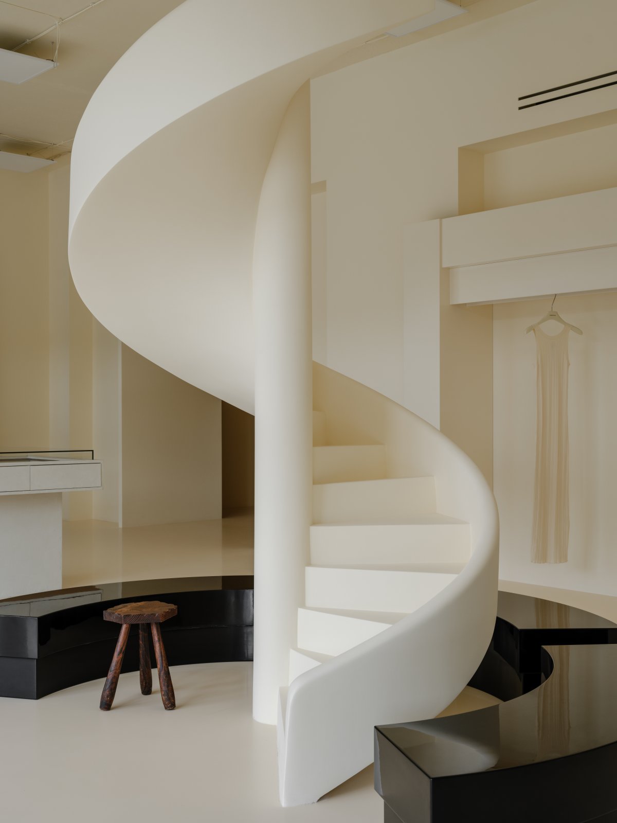
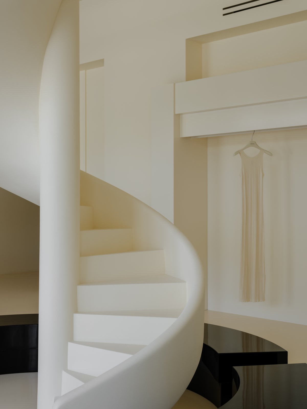
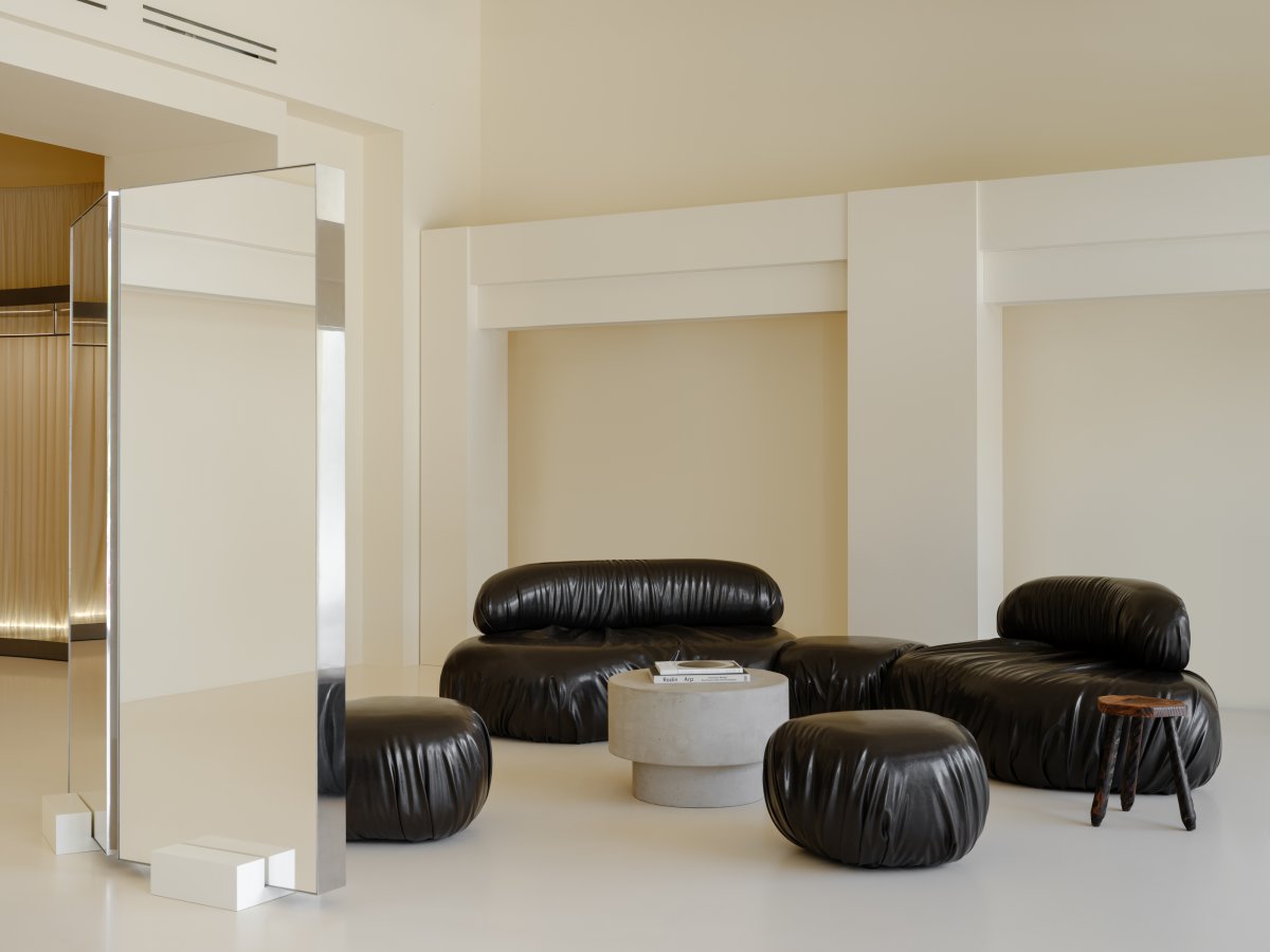
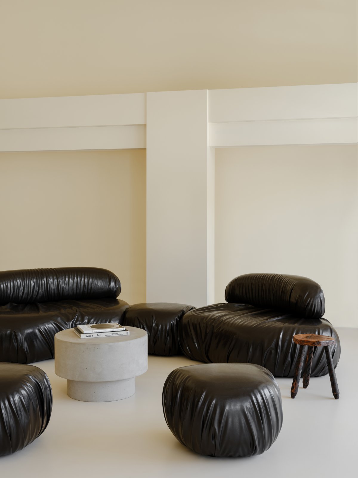
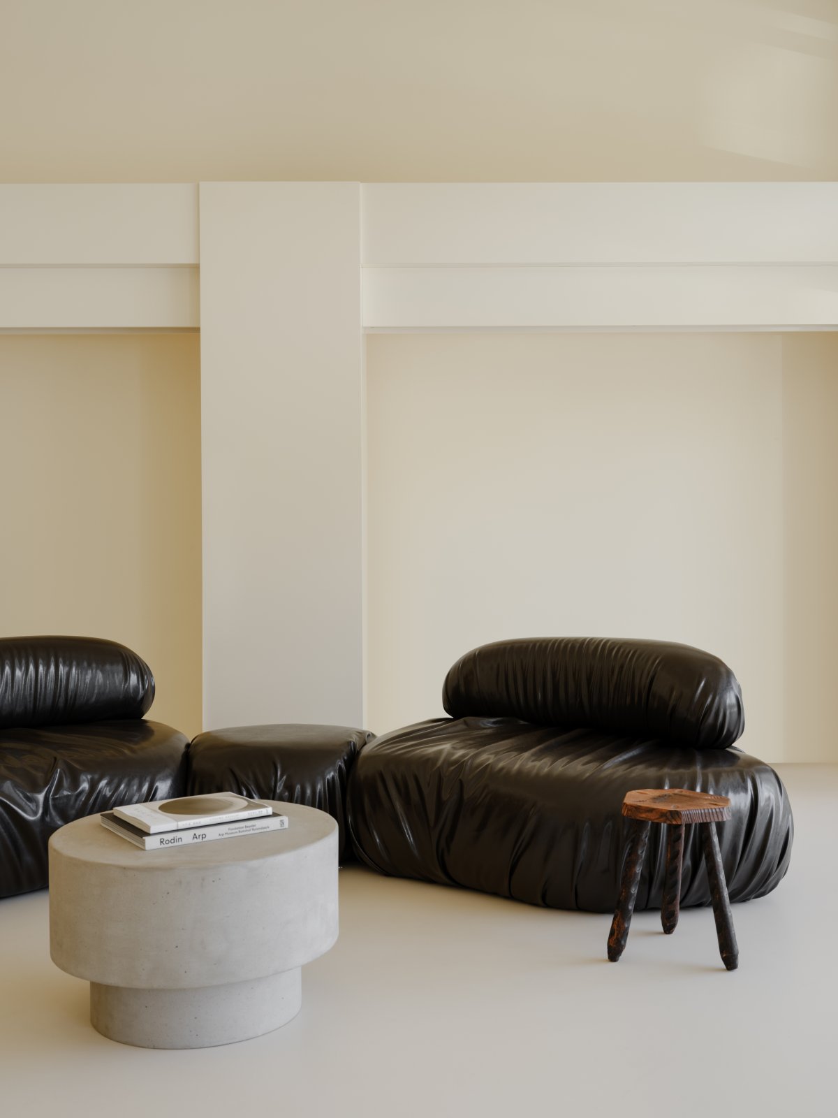
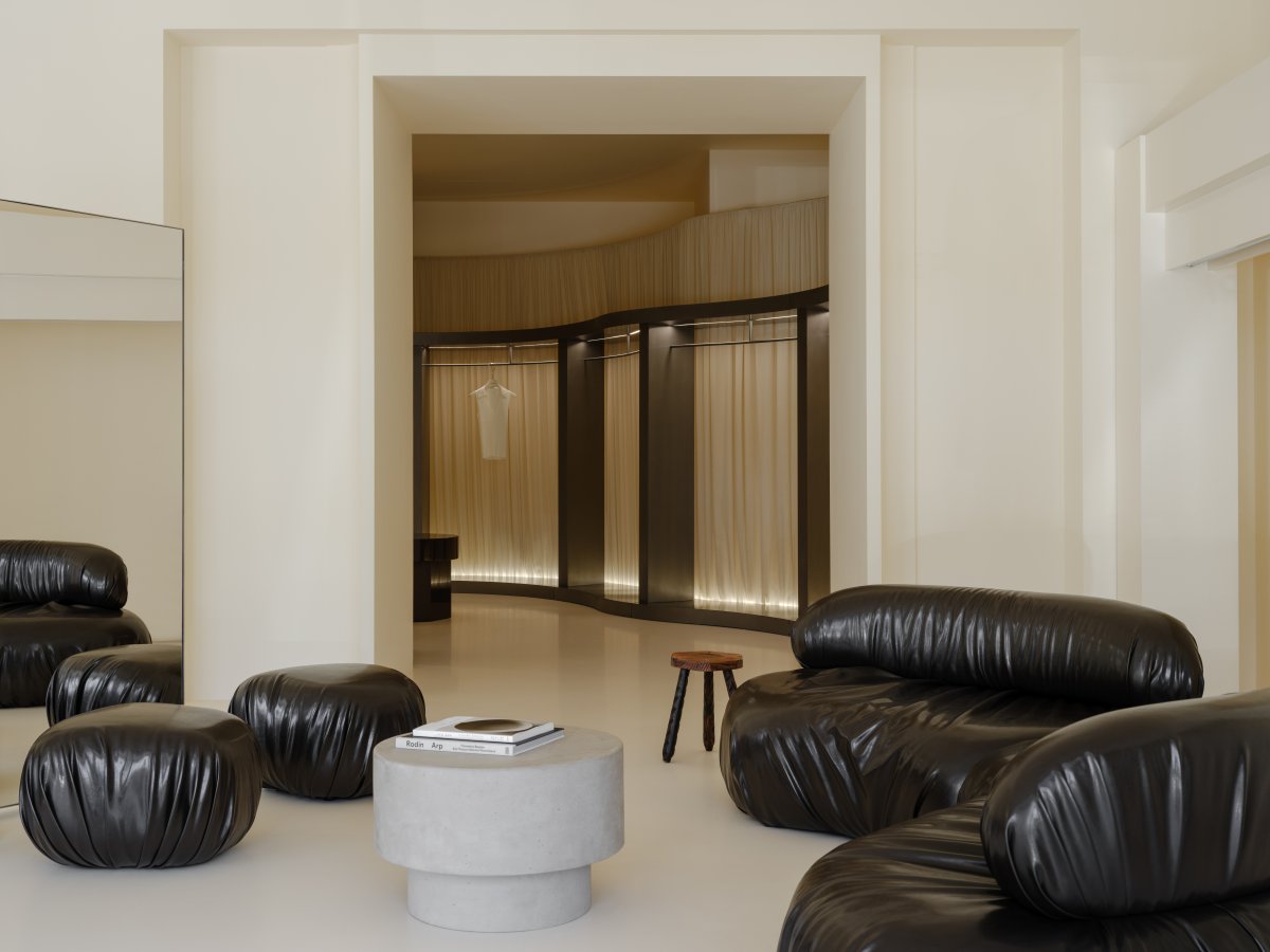
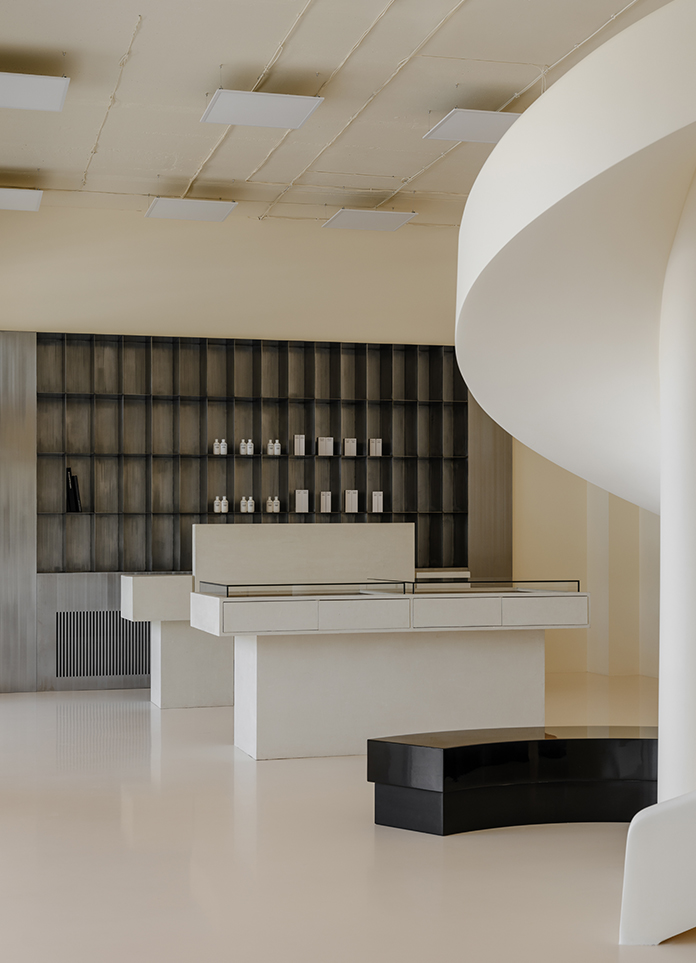
The space accommodates 3 exhibition halls. The largest one of them is located at the front of the store, past the main entrance. Here, a system of rails, done in the same color as the walls but with a semi-glossyfinish, is designed along the perimeter. It does not "disrupt" the visual comprehension of the space. On the same axis with the entrance, there is a decorative staircase that serves as an elegant display for various items. A checkout counter and a jewelry table in a microcement finish are located on the left side of the hall. A metal rack for showcasing cosmetic products and accessories serves as a backdrop to the cash desk. The right side is occupied by a sofa group and a mirrored screen.
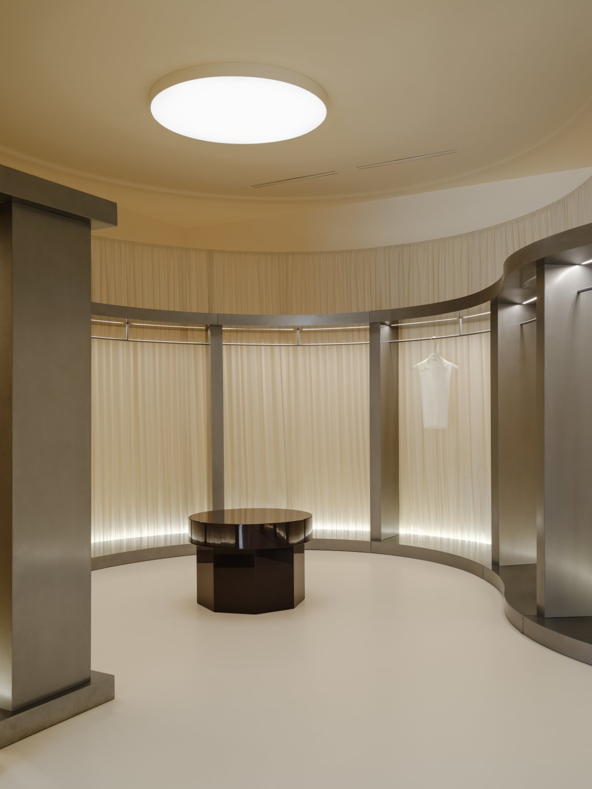
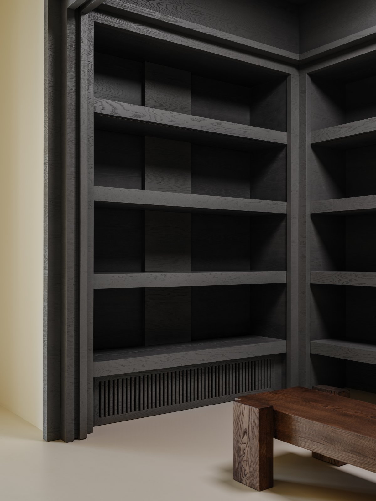
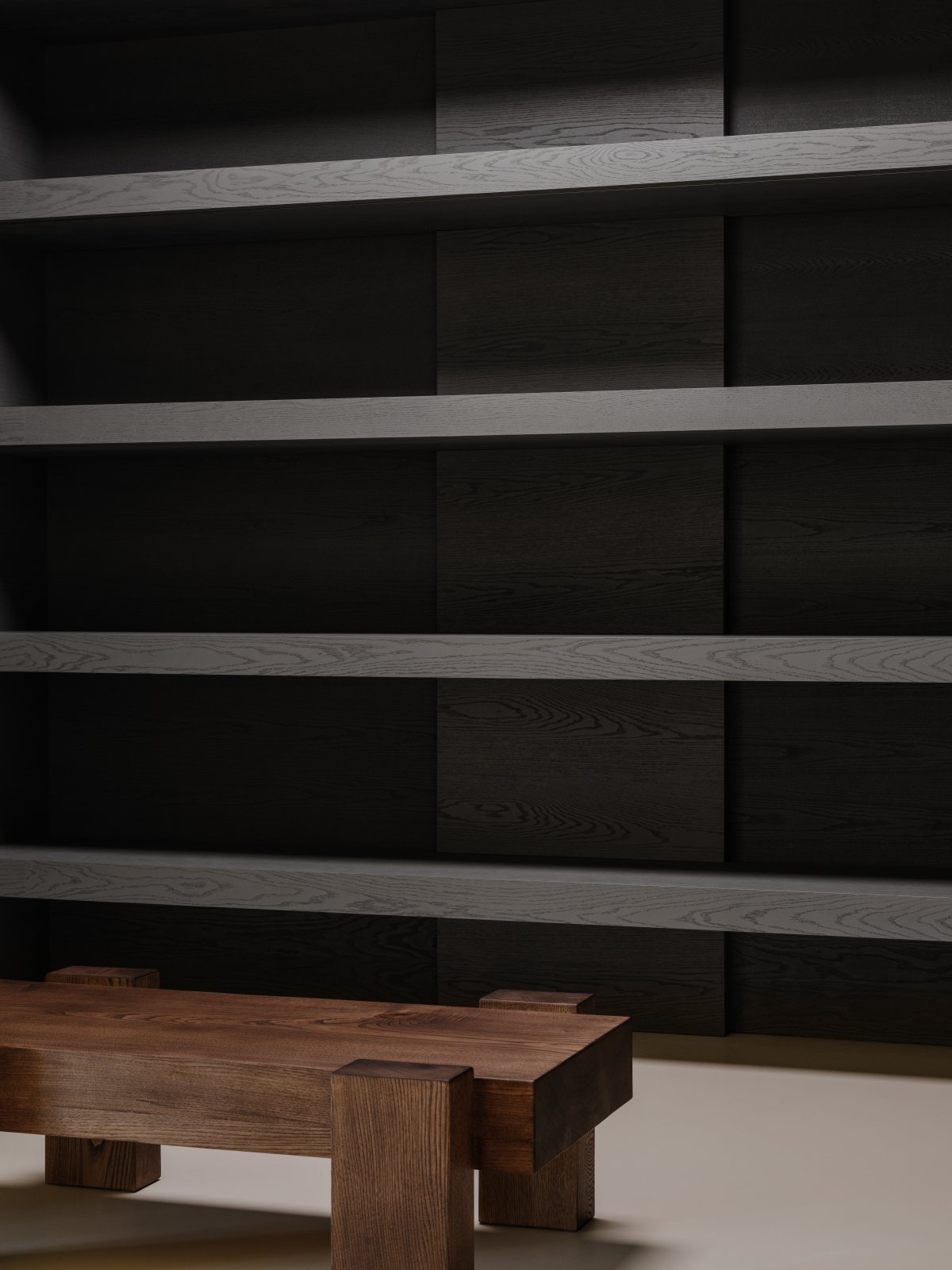
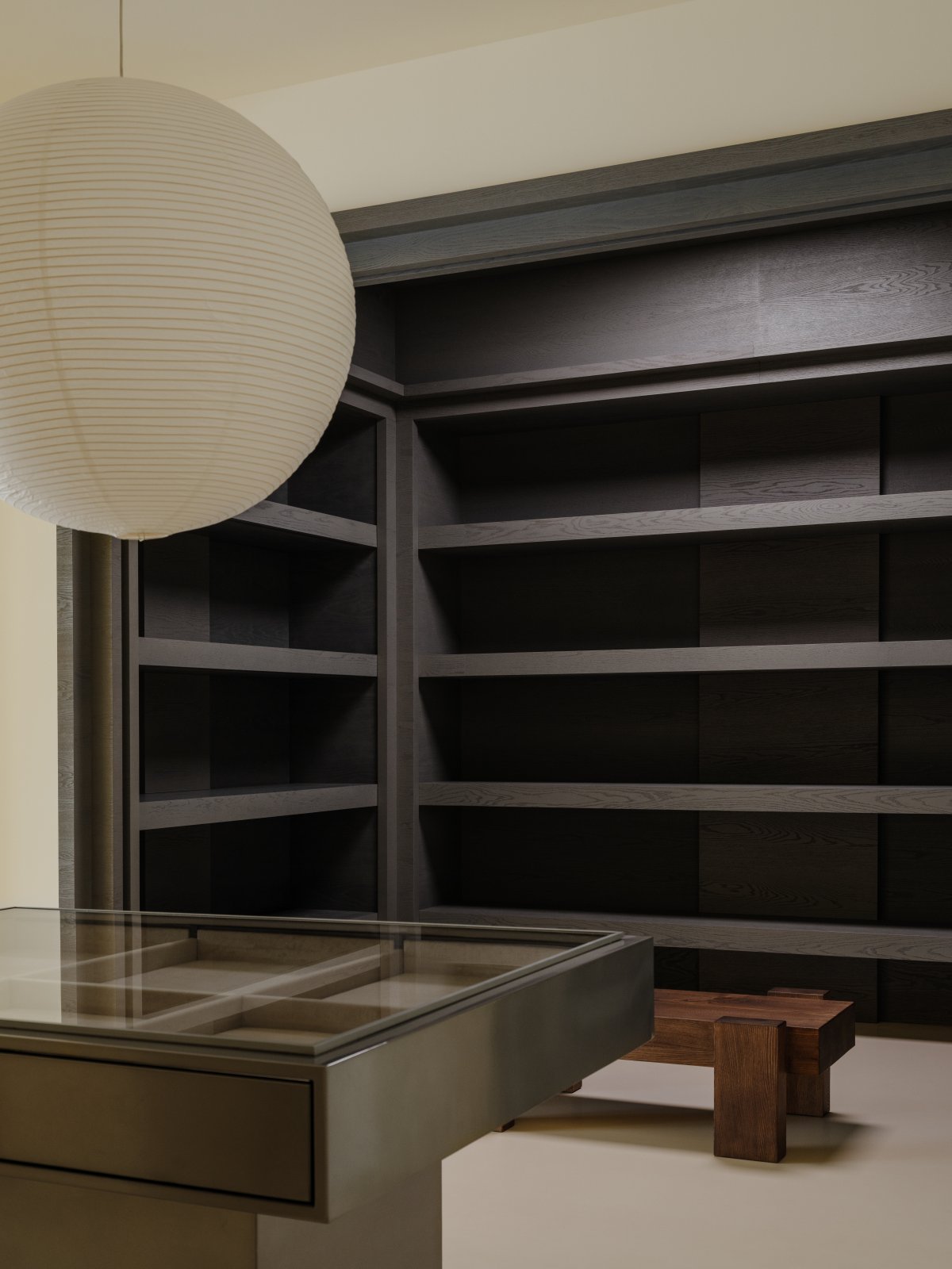
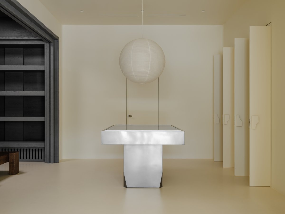
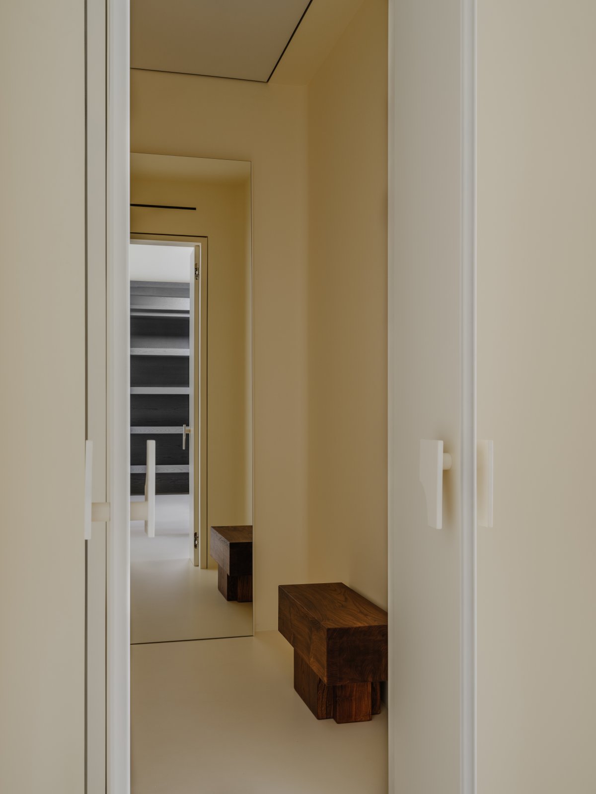
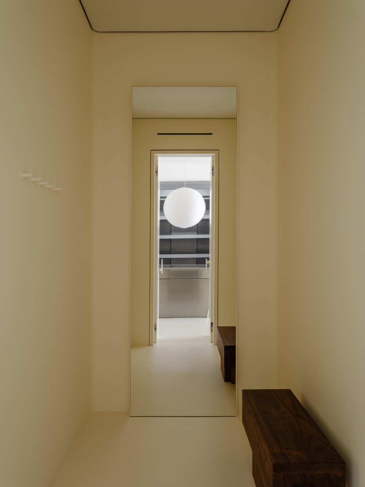
The ceiling here was not covered with plasterboard, same as in all the rooms, in view of budget optimization, so the lighting system used suspended panels. They give uniform illumination, and additional spotlights highlight specific areas for accents. The lighting design plays an important role is creating the space. The room with the center metal table for jewelry display is a transition room. It has 3 fitting rooms on the right and a veneered room with shelves on the left. It gives access to a corridor with a restroom and a storage area. There are no plain or bare corners and transitions in the entire store.
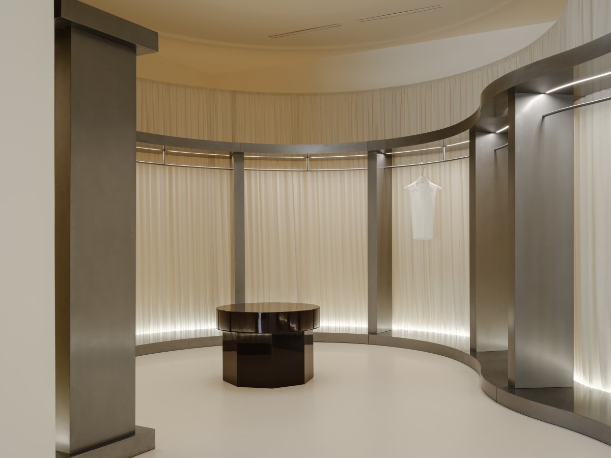
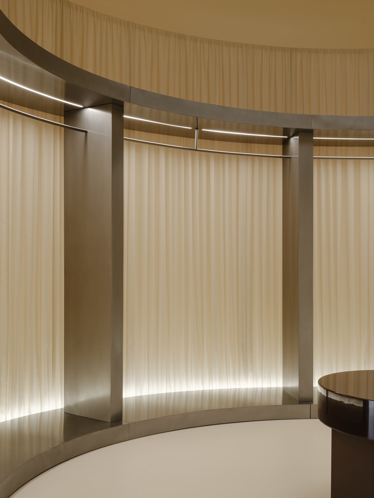
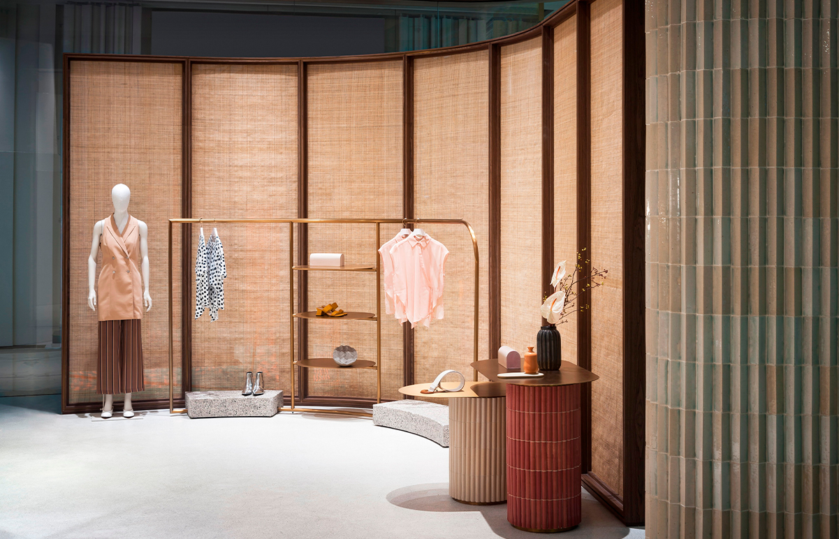
The next room - on the right - is the “fabric room”, as we call it. The perimeter walls here are curved, and I prefer calibrated spaces to irregularly shaped rooms. In order to allocate the budget wisely, it was decided to leave the irregular shape of the room and not to correct the walls with drywall. The solution here is to decorate the space with a single smoothing element. This is how a single steel rail with fabric was created, wrapping around the entire perimeter.
- Interiors: Polina Ditsman
- Photos: Mikhail Loskutov
