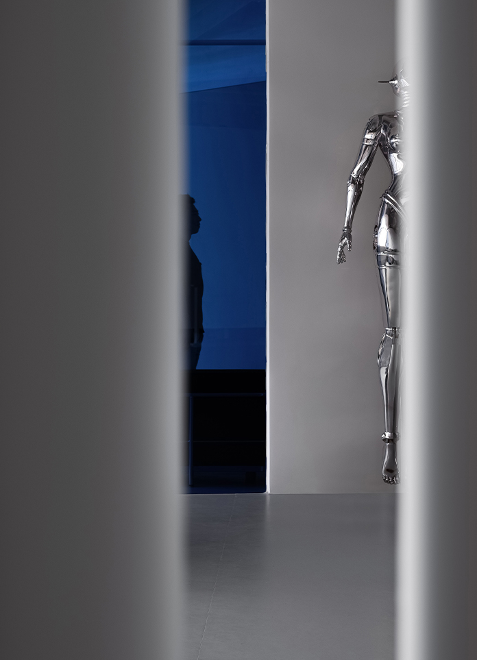
Traces of light and shadow
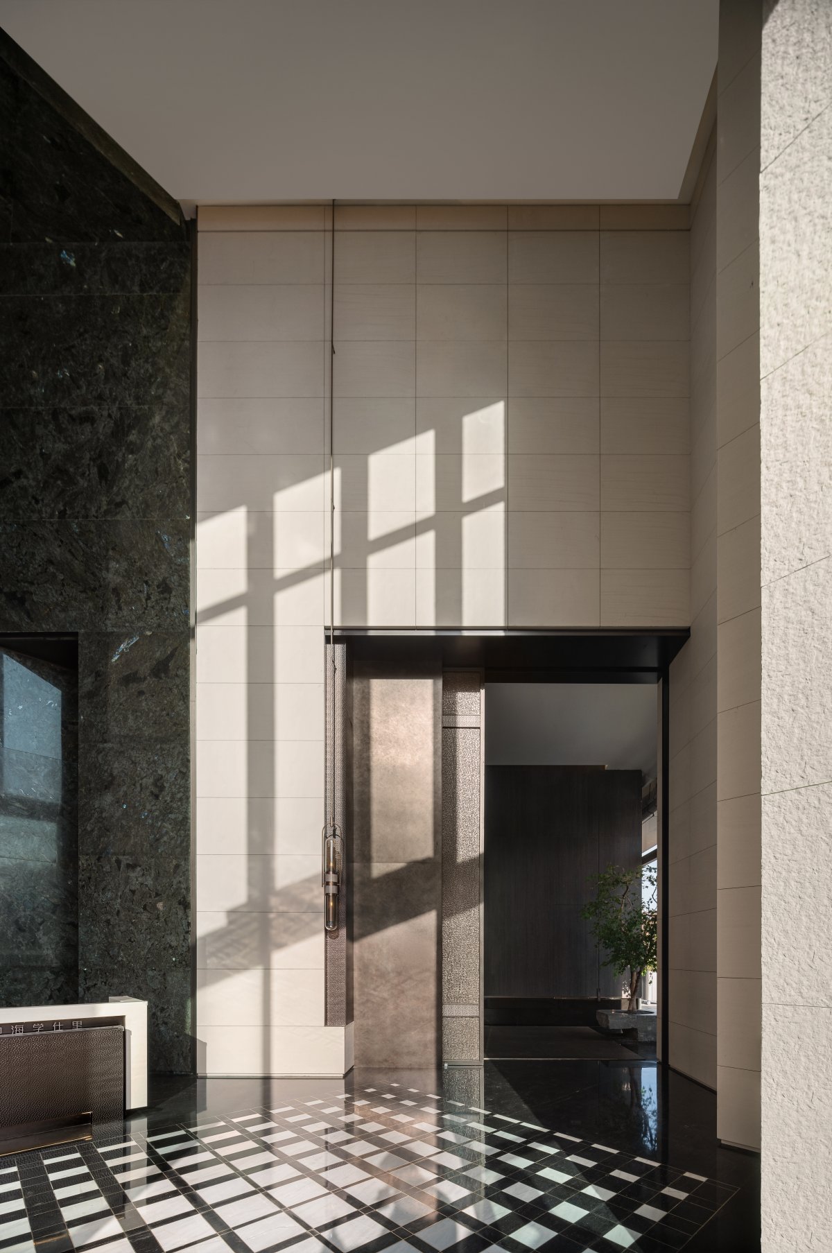
The entrance adopts symmetrical design techniques to enhance the visual appeal of the space and people's sight is quickly captured. Stepping into the space under the psychological suggestion, the symmetrical elements balance each other, and the space presents a sense of order.
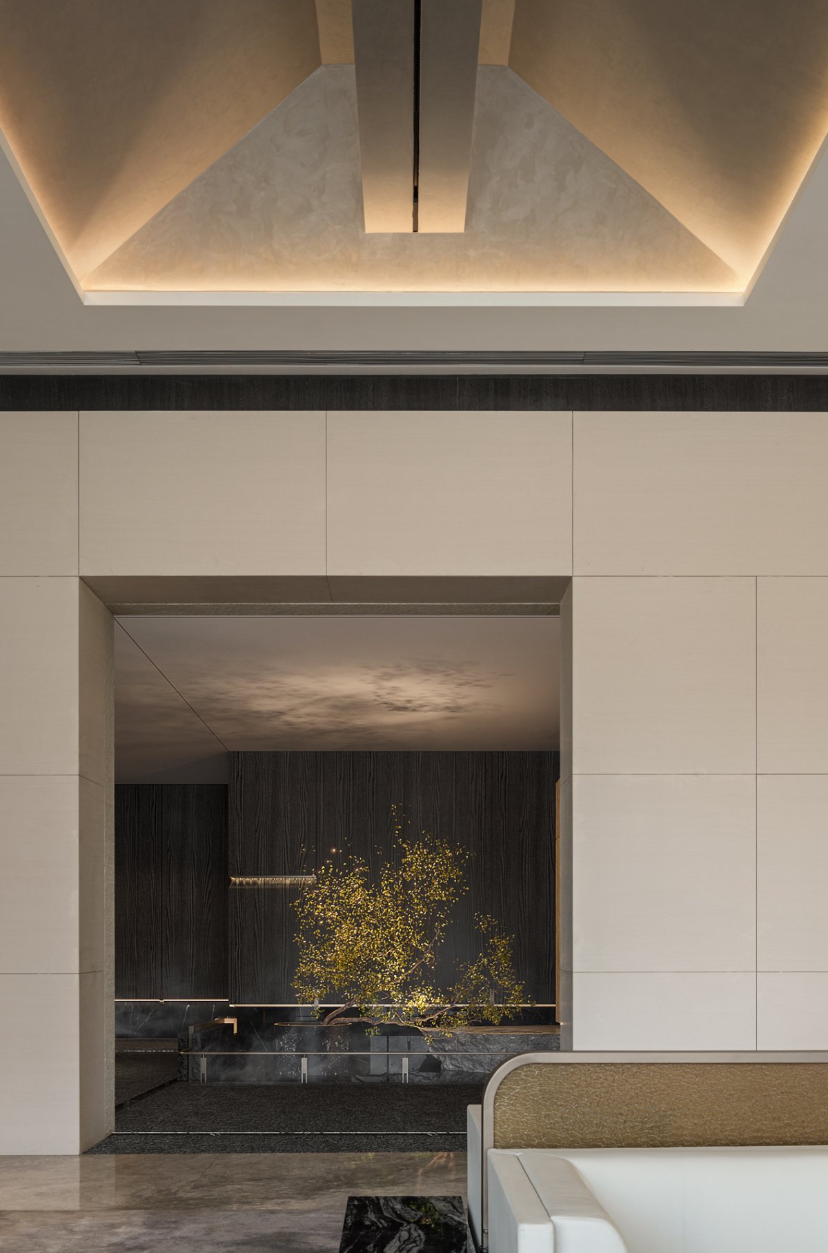
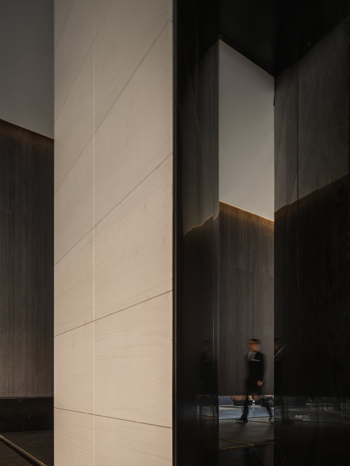
The opening of the "double wall" becomes a "filter light". The entrance of the hole is large enough to allow the light to enter, which not only regulates the quality of light injected into the space, but also produces visual interleaving, enriching the visual experience and making the free adjustment of light possible.
The traditional characteristics of Shanxi ancient architecture are extracted to create a sense of spatial order and integration. Architectural design techniques are applied to the form of the space.
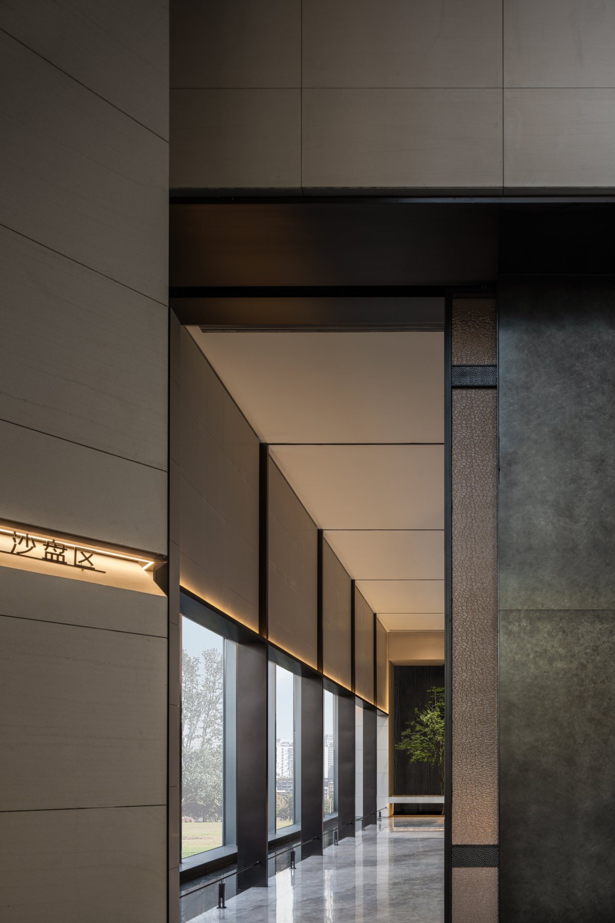
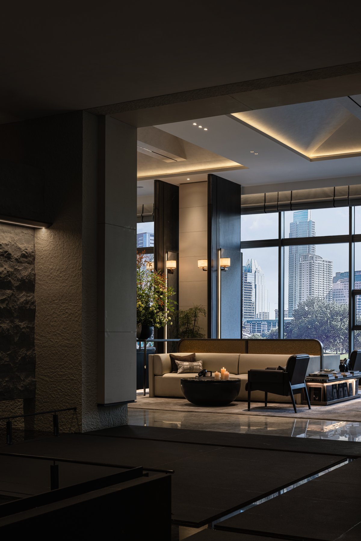
Research Commune Design prioritized the use of natural light for lighting, with large windows, glass facades and other forms integrated into the design to inject daylight, reduce artificial lighting, and establish a connection between interior and exterior.
Between inside and outside
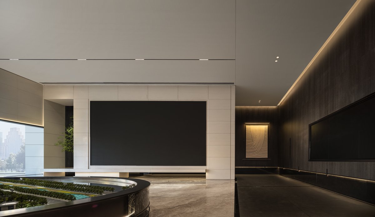
Adjust the height of the curtain wall so that the light enters the space in an oblique way and finally focuses on the sand table area. The interleaving of light and dark inside and outside creates a sense of hierarchy in the space.
The interspersed structure of the building space blends the intricate elements together in a clever way. The sand table area is dominated by dark wood veneer, grey floor and sand rock, embellished by antique copper stainless steel, making it a strong contrast.
Abstract the form of light, through different orientation and node characteristics, give the basic skeleton structure of the site. And in a very romantic way tells us the beauty of life.
The use of light to establish visual continuity inside and outside the space, blurring boundaries and creating a vast field.
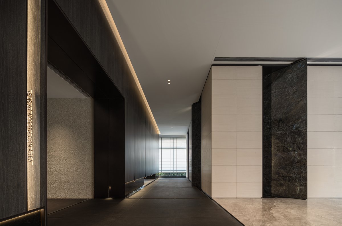
The application of architectural techniques breaks the monotonous spatial layout, and the wall is constructed in layers, cutting the space with different functions.
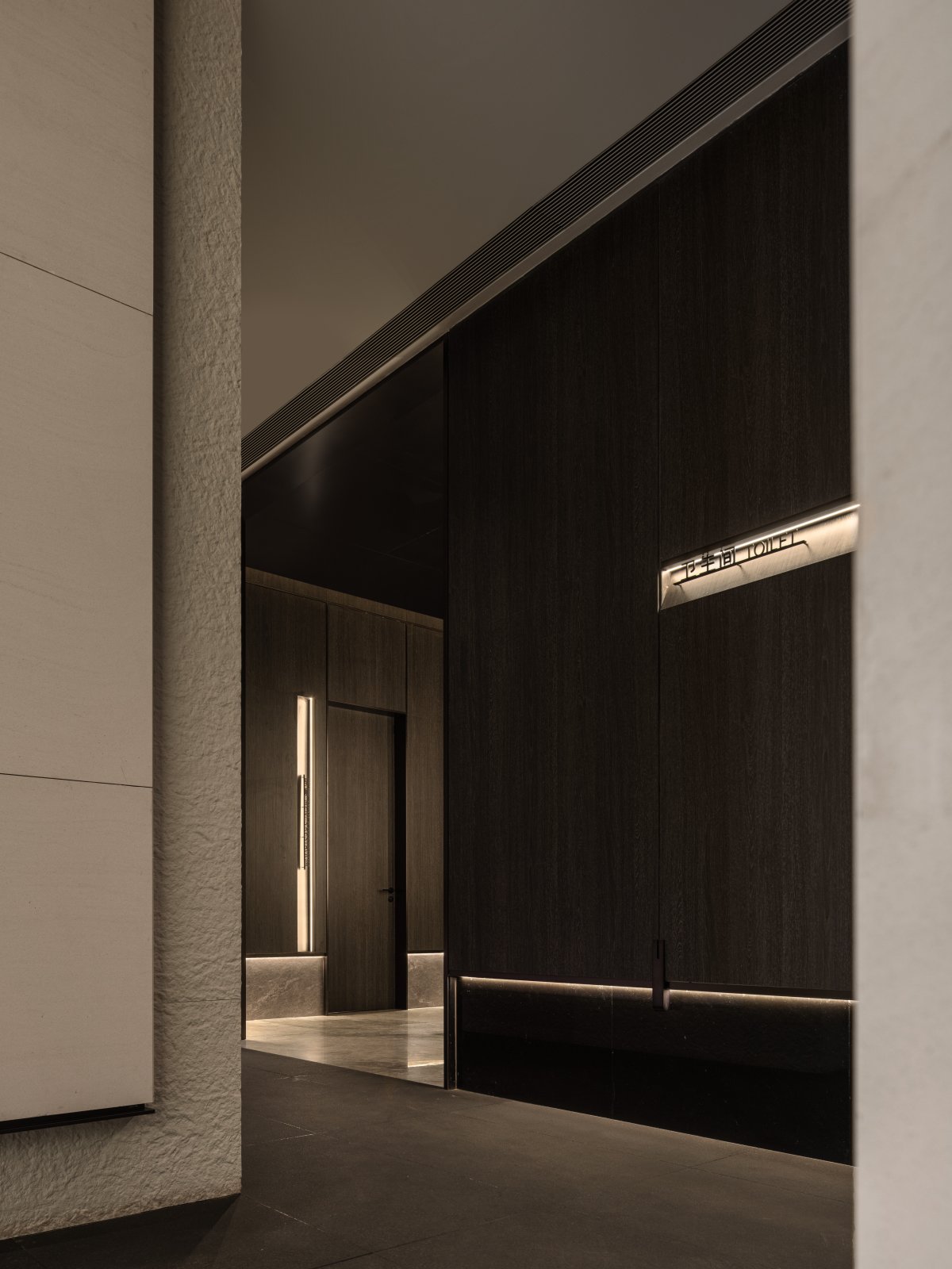
The alternate use of rough and light textures accentuates the geometry and texture of the spatial environment.
Organic rhythm
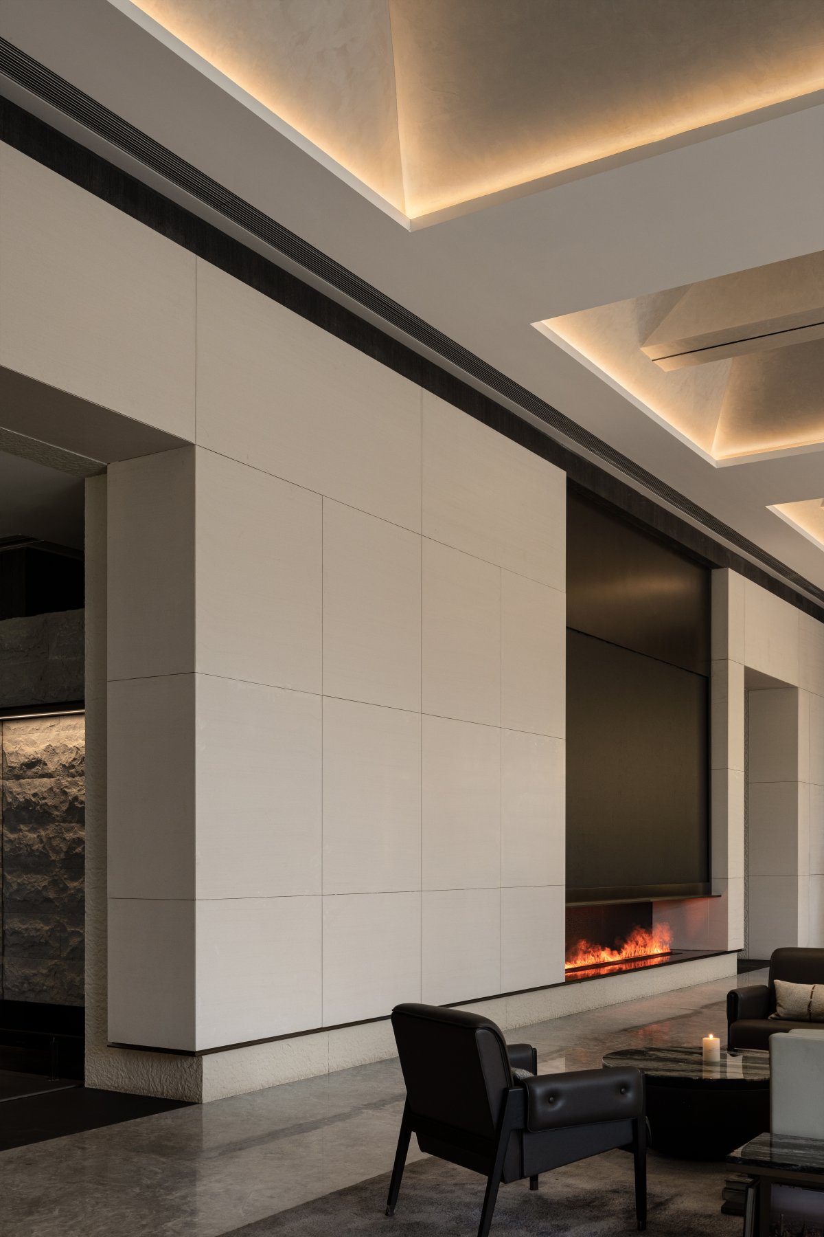
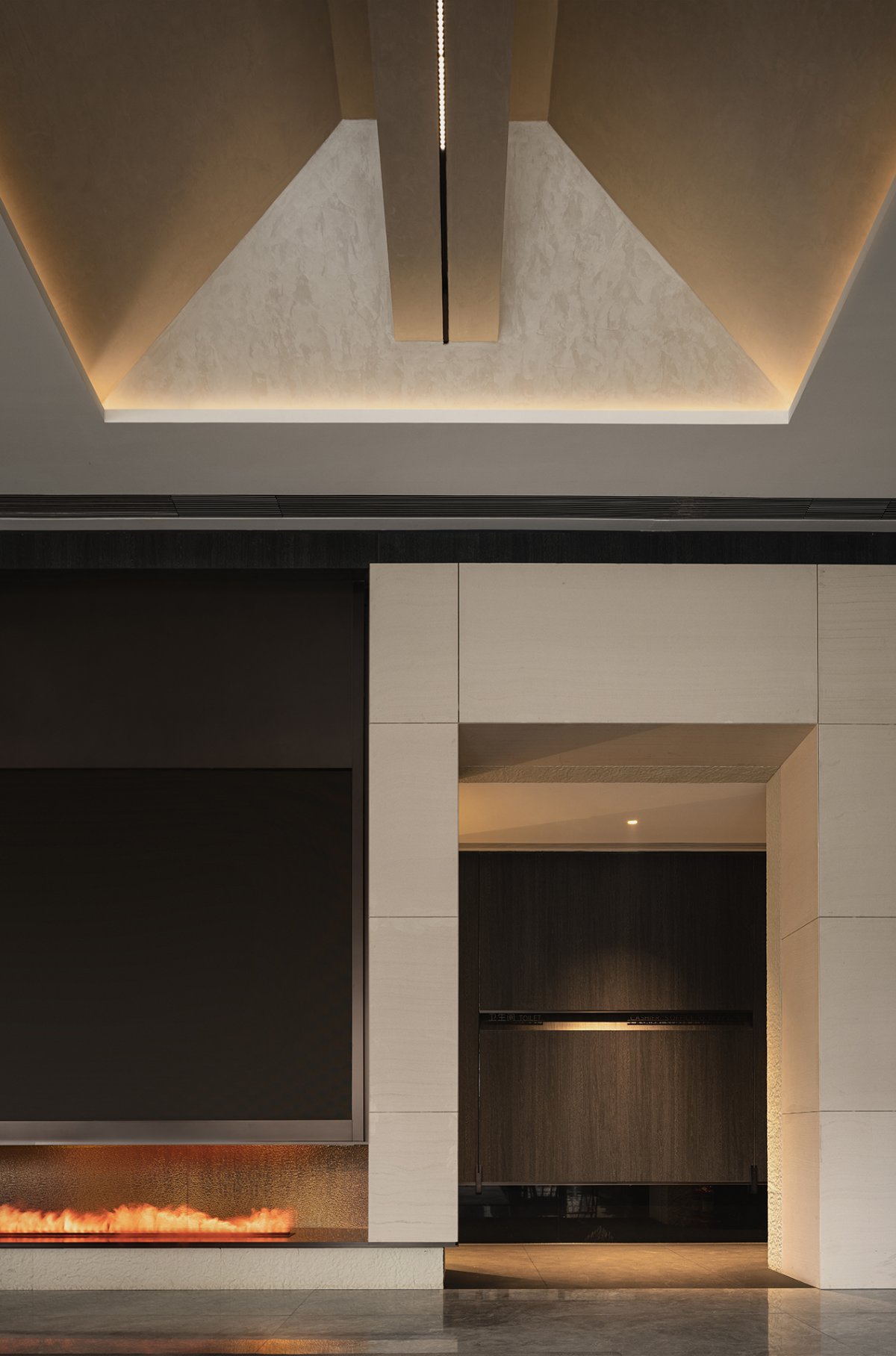
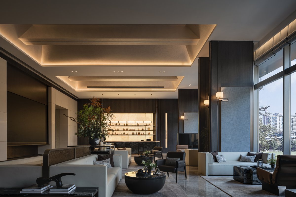
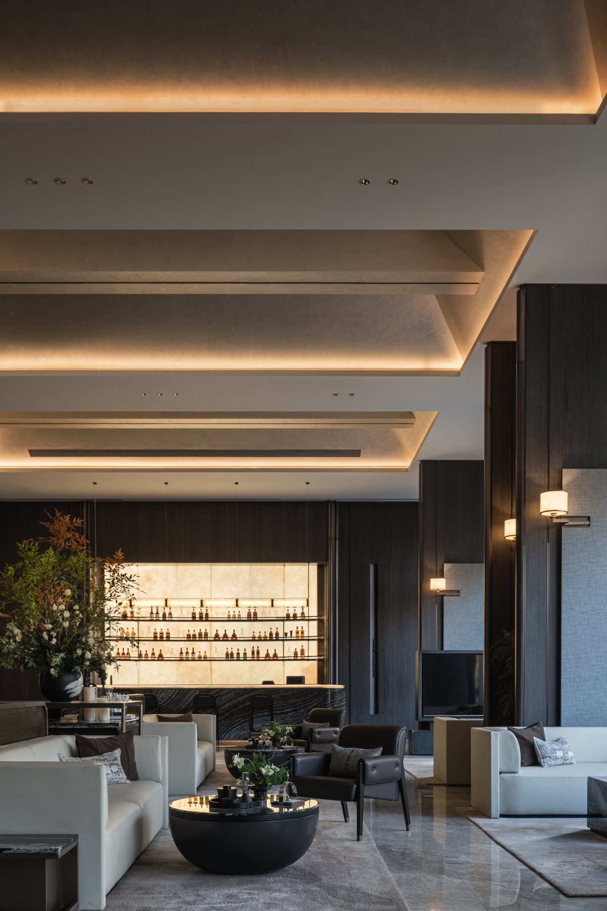
For beams that cannot be removed, the designer uses concave and convex rectangular array to eliminate the existence of beams, and the space presents an organic sense of sequence.
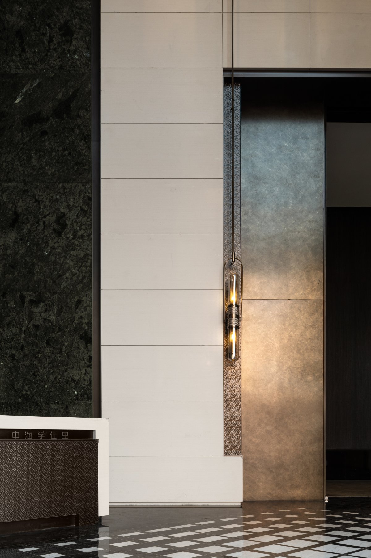
The use of gray texture paint as the base color, more emphasis on the tension of the top surface. Wall lamps render atmosphere and summon inner peace.
The concave and convex design method responds to the vestibule, and this characterization is scattered into one.
The negotiation area is dominated by large areas of light-colored sand and rock, and the wall cloth increases the sense of warmth. The light-colored wall on the left side echoes the natural light transmittance of the floor-to-ceiling window, making the space bright and atmospheric.
Functional lighting is used to create a space atmosphere and enhance the function and use of the space. Subtly illuminate different areas.
Through diffuse reflection, the light collides and reflects on the walls of different materials, making the space more vivid.
- Interiors: Research Commune Design
- Photos: Chu Yi Tu Zhi
