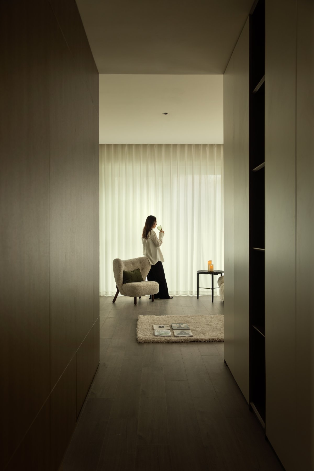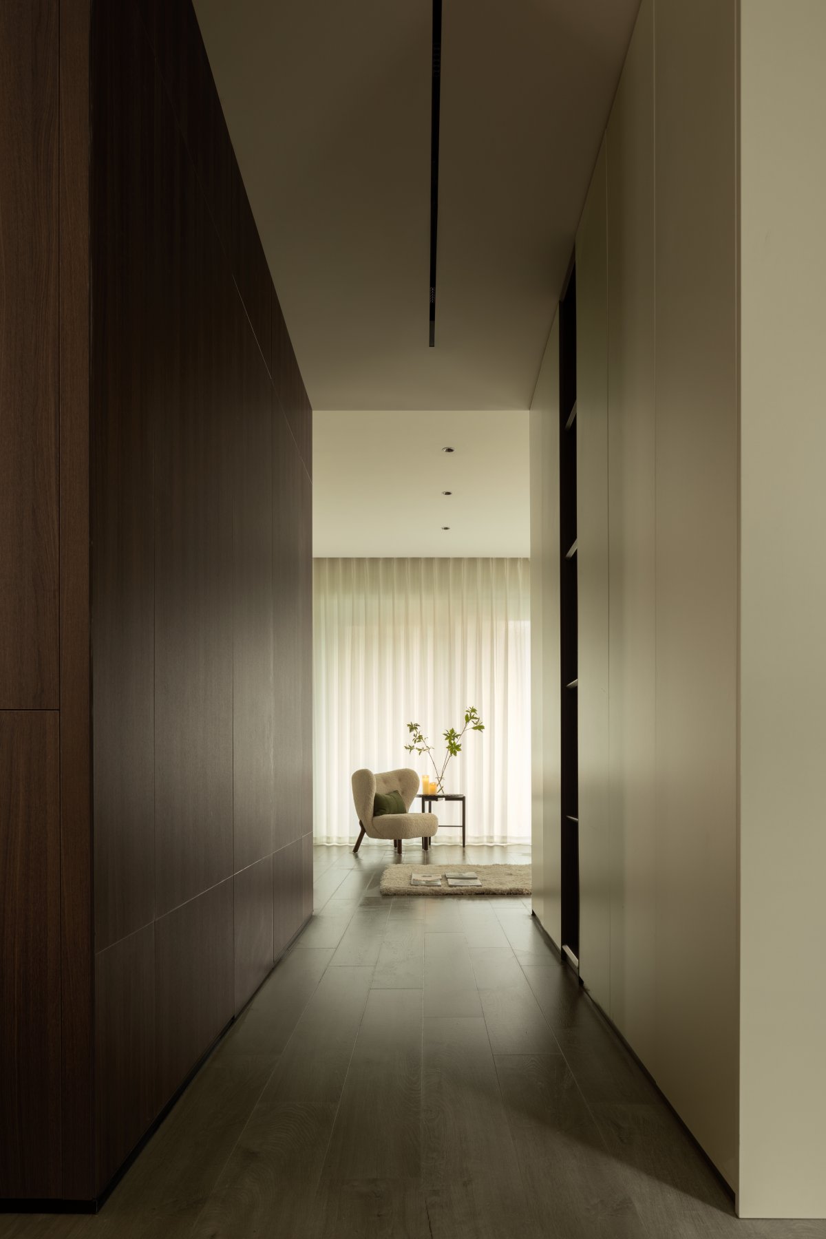
Home, is the best embodiment of the aesthetics of life, can be a warm meal between a tea; It can be the details from stitch to stitch; Or it could be the human touch that comes and goes.
After communicating with the owner, the designer, in order to match the owner's quality of life, takes fresh, natural and comfortable as the theme, and integrates the enthusiasm and tranquility of summer into every inch of space, so that you can feel cool and comfortable in the busy life.
Everyone has their own goals to pursue, and although there are different ways of expressing them, one thing remains unchanged, which is the pursuit of quality. Therefore, home has become the best embodiment of the aesthetics of life.
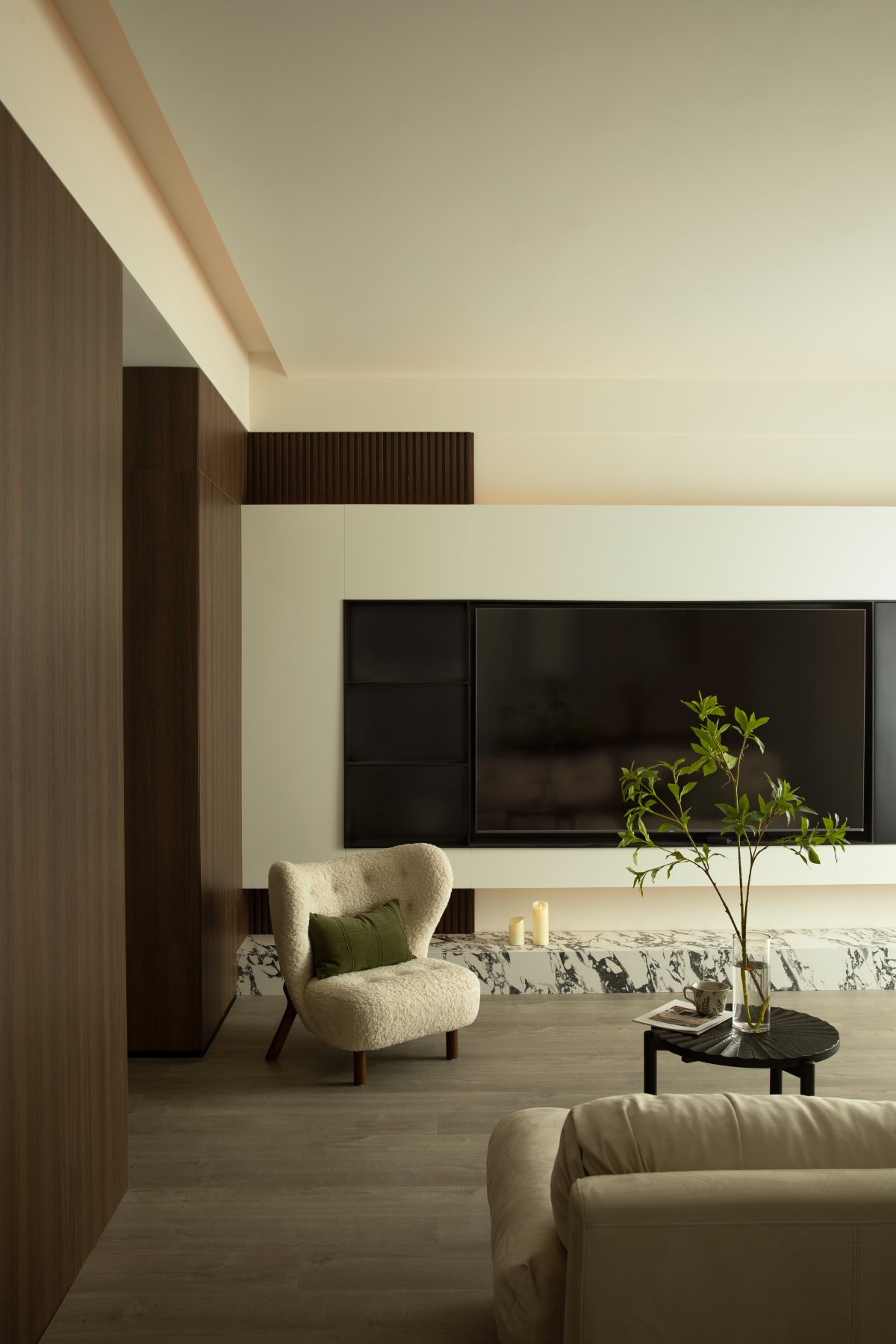
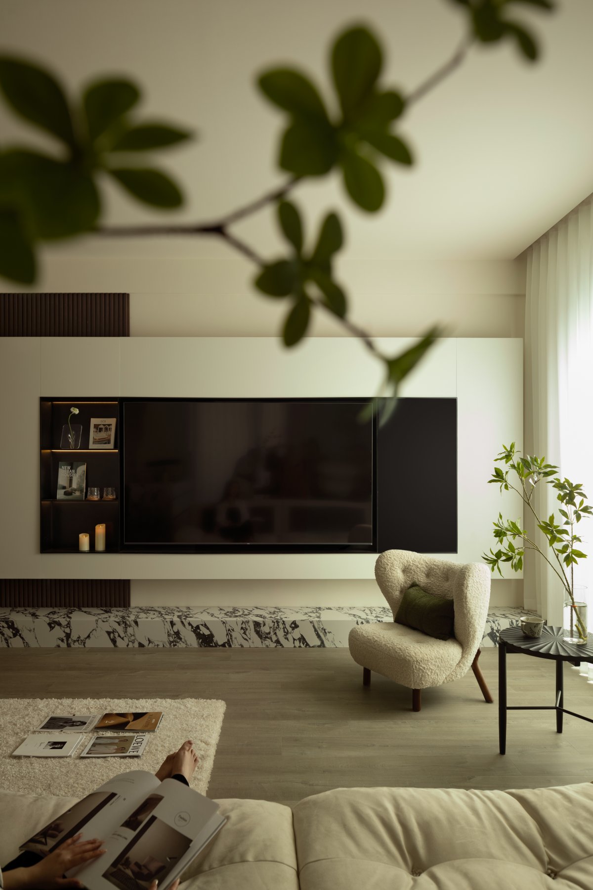
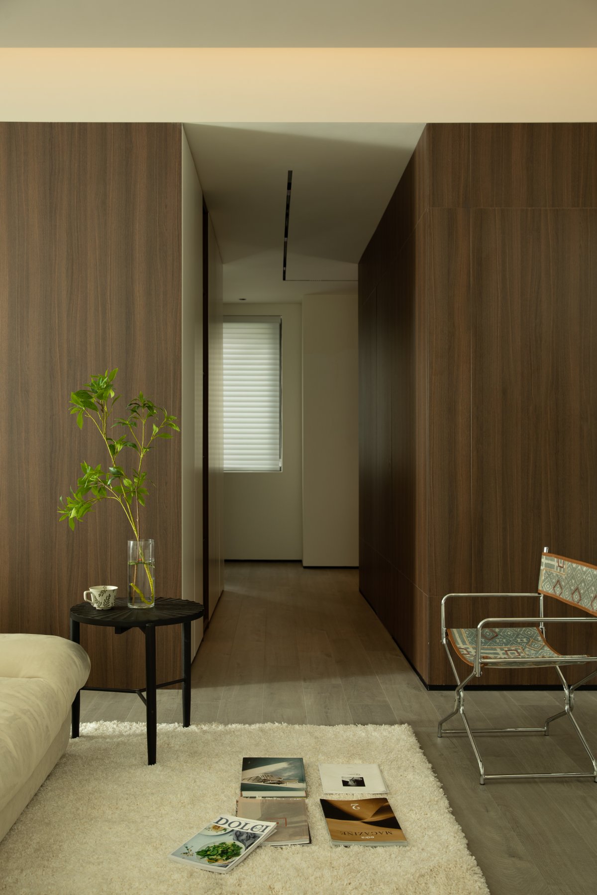
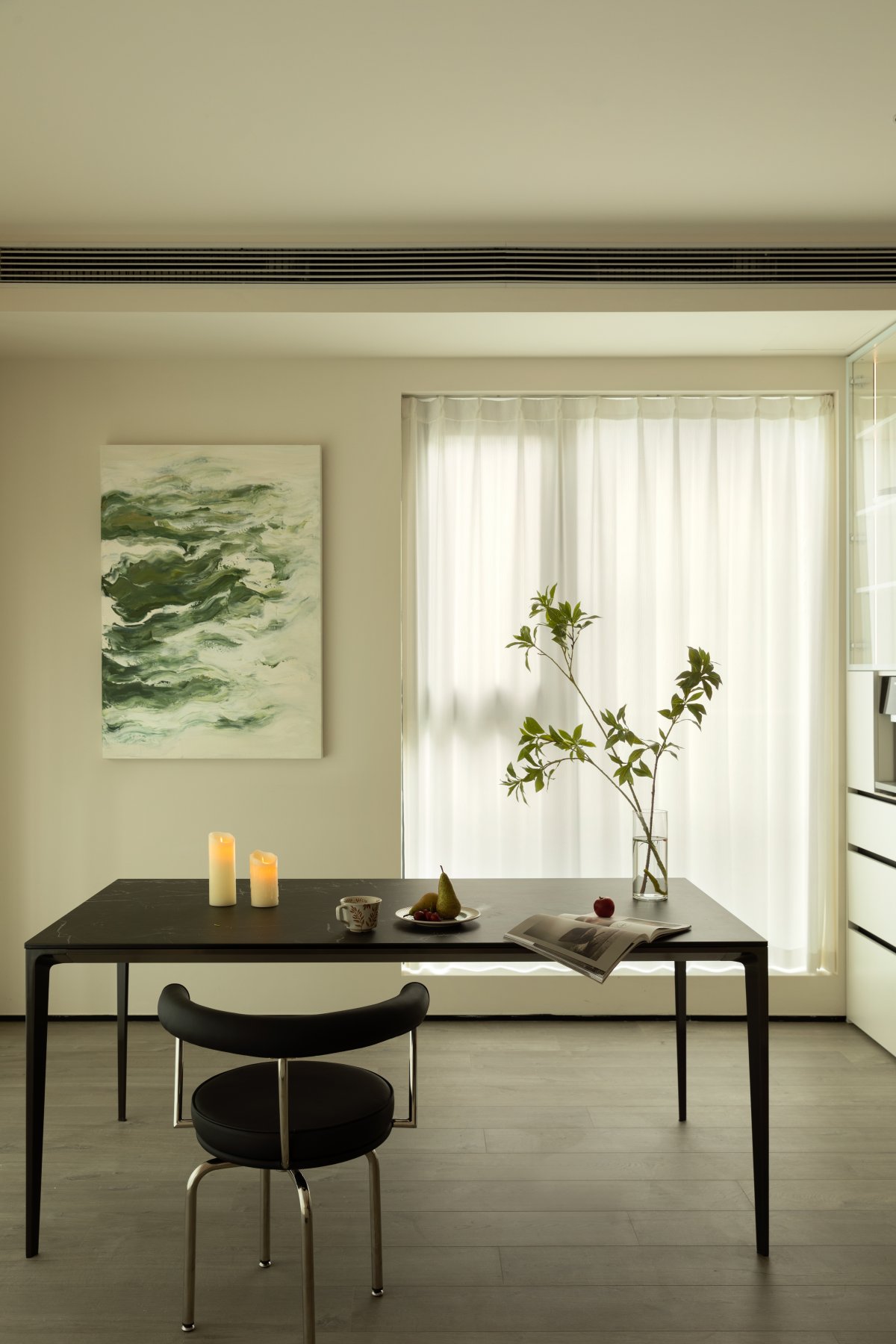
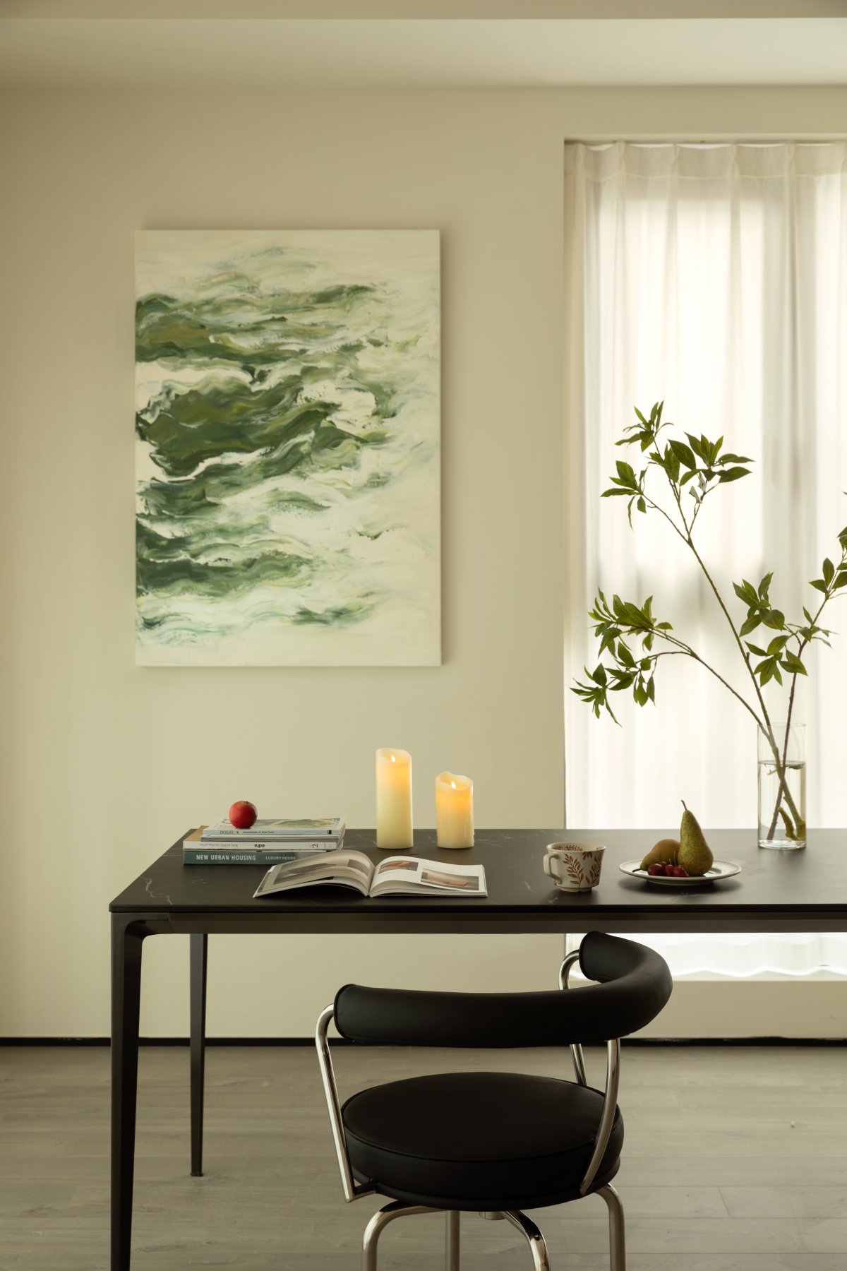
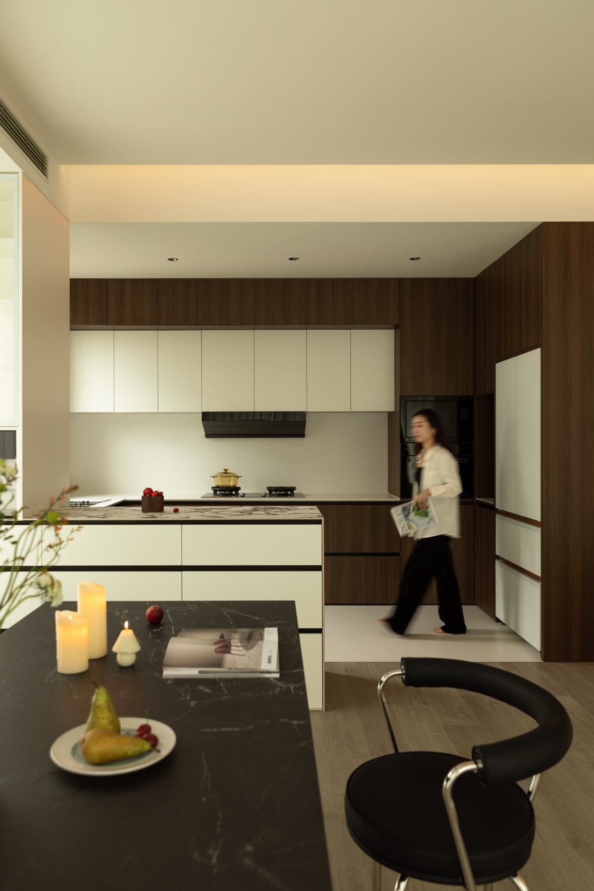
The living room and open kitchen on the second floor are in the same space. White and brown tones are released in this space, which becomes a space for family members to accompany each other and share happiness. Every corner, every piece of furniture, and every decoration should be one's own preference and emotional sustenance.
The large-screen TV is embedded in the beige wall. It has your favorite color, bright and simple, and the style makes people feel warm. Lying on the comfortable sofa every day can relieve fatigue and relax the body and mind. While satisfying functionality and comfort, we maximize the beauty of the overall design, from color to matching, from materials to fabrics, to make it unique as you want.
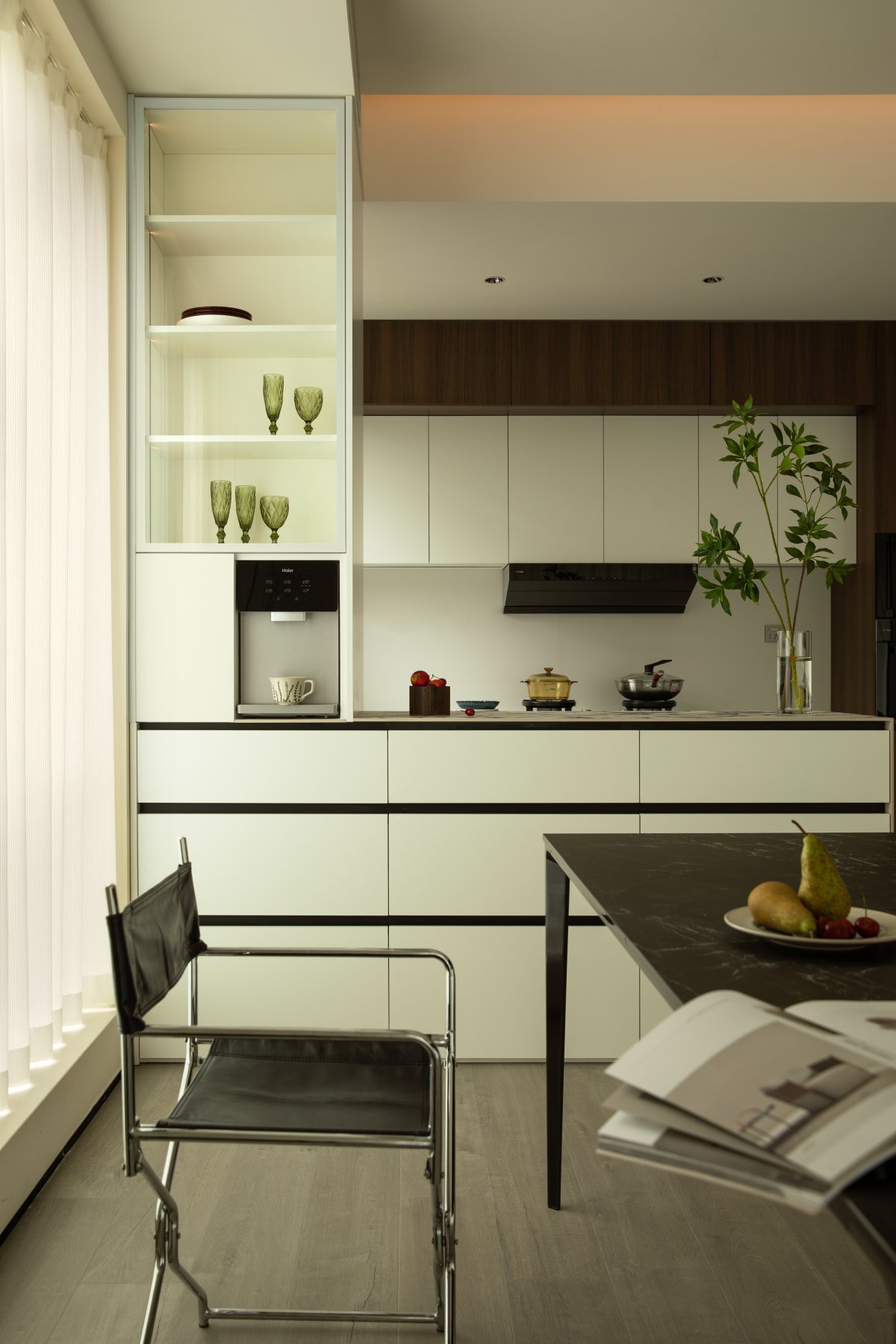
Good design is not just about lines and colors. After the designer and the homeowner have fully communicated, they can better understand how to adapt to life and enhance the home experience. With a large French window behind, the kitchen is larger and brighter. White + wood color makes the space look clean and neat. Three meals a day, four seasons, tea tasting and reading, why not have fun.
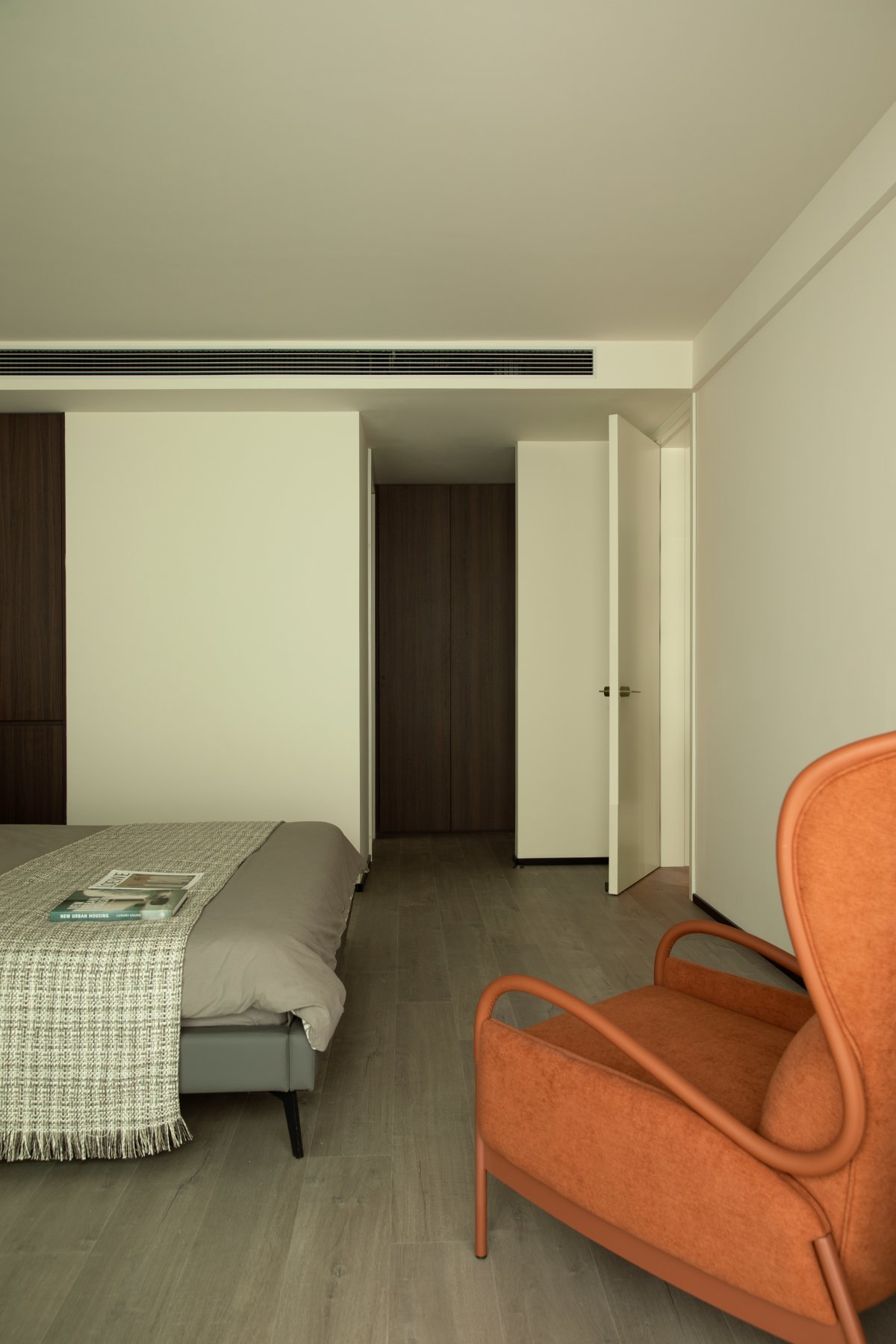
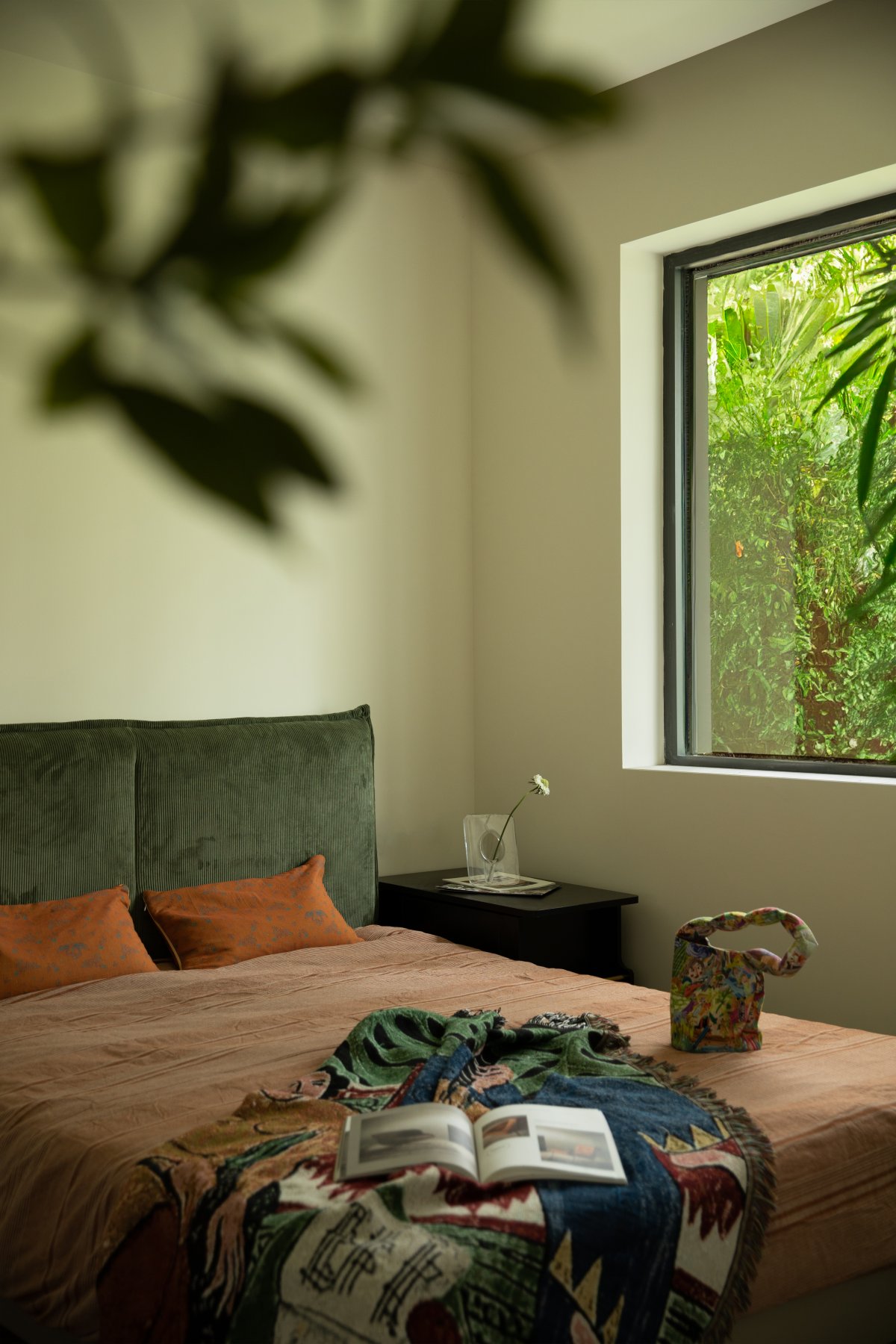
The guest bedroom on the first floor uses a just-right orange hue in both soft and hard furnishings, allowing the designer to create a strong visual sense in the space, abandoning the usual simplicity. Such a bedroom is also a fashionable place to rest.
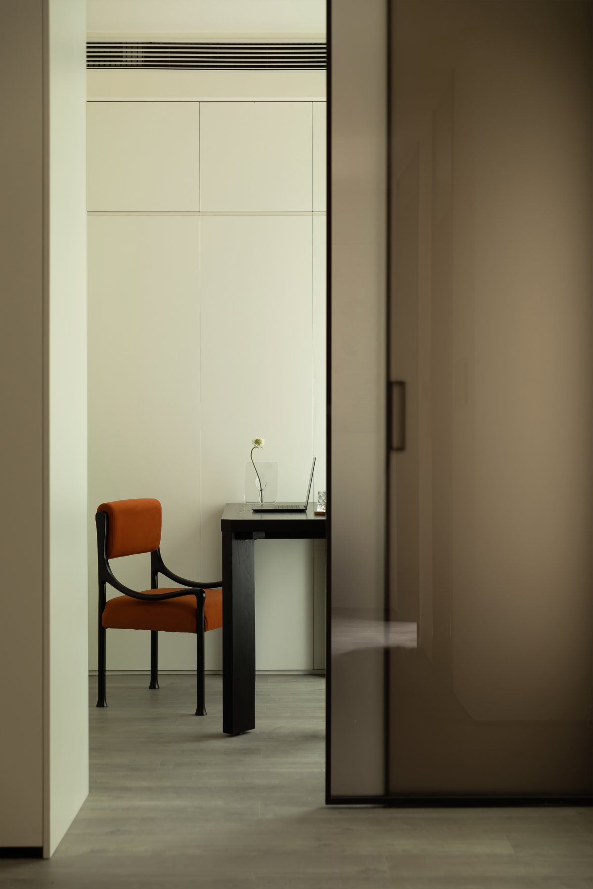
The study room has a simple layout but is not elegant. It is quiet and undisturbed, which is more conducive to work and study.
The corners are treated with right angles, and the wooden storage cabinets are concealed and beautiful, with a clean and neat texture. Every need of your life is met, and every board and brick is chosen to fit in perfectly and match the present.
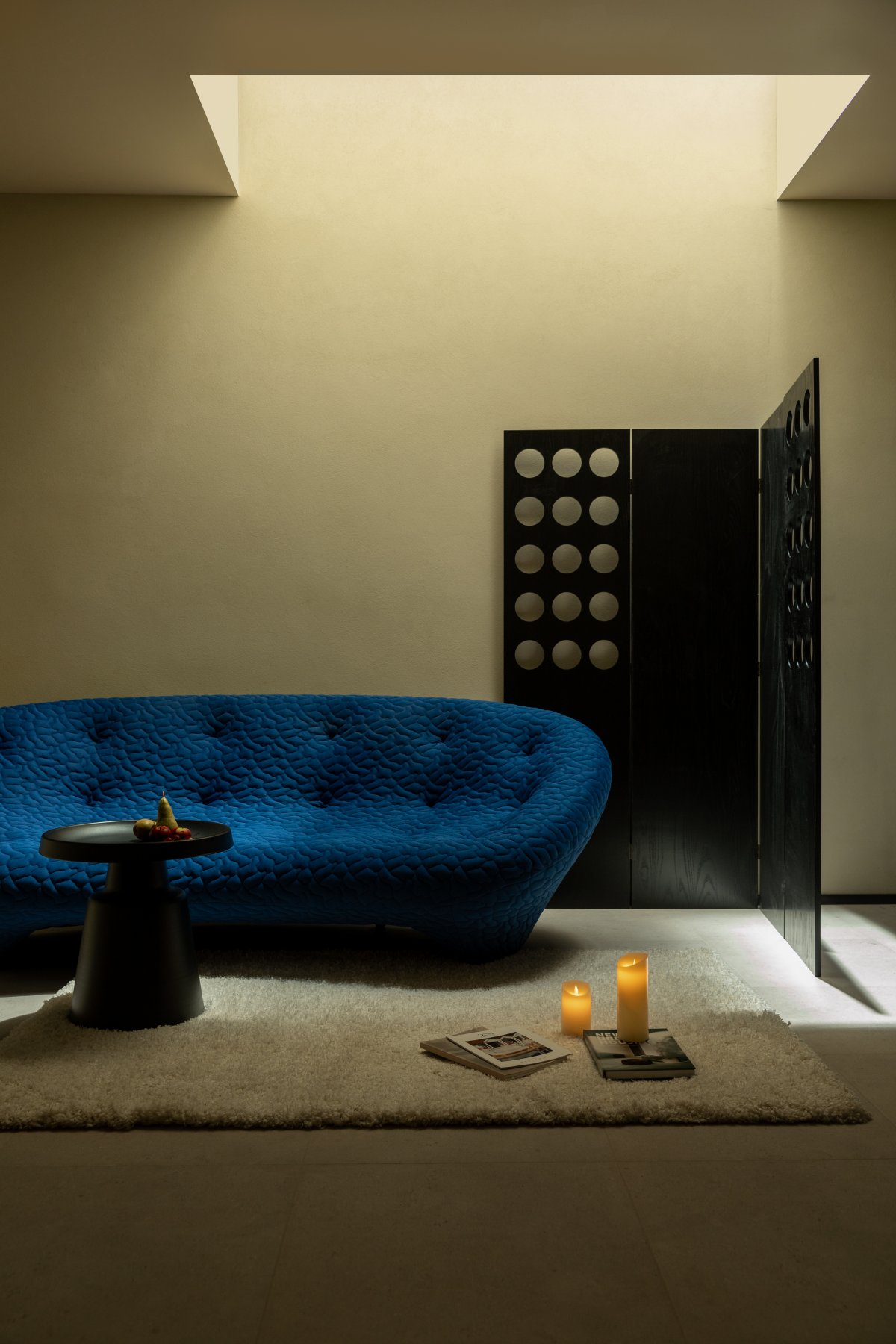
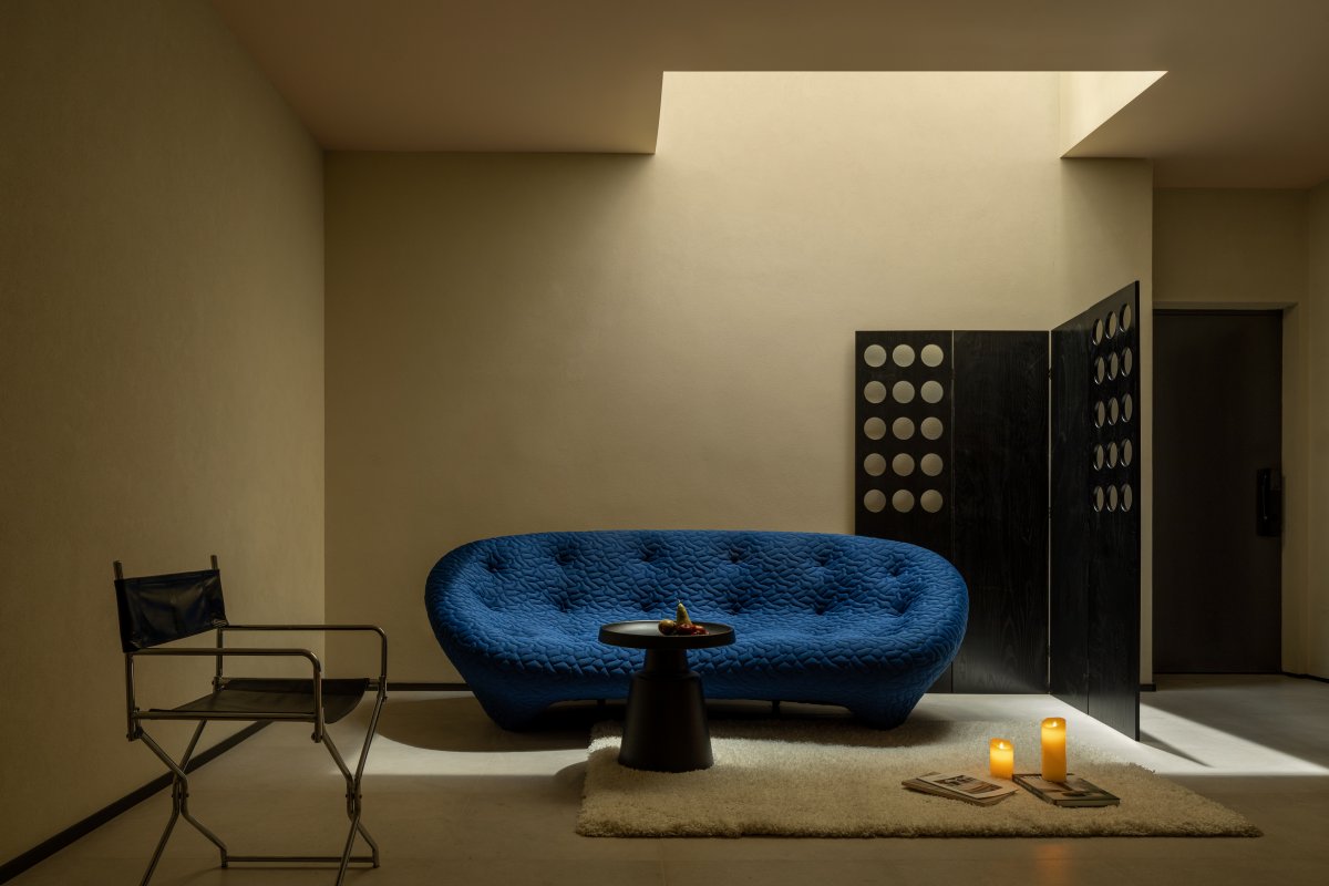
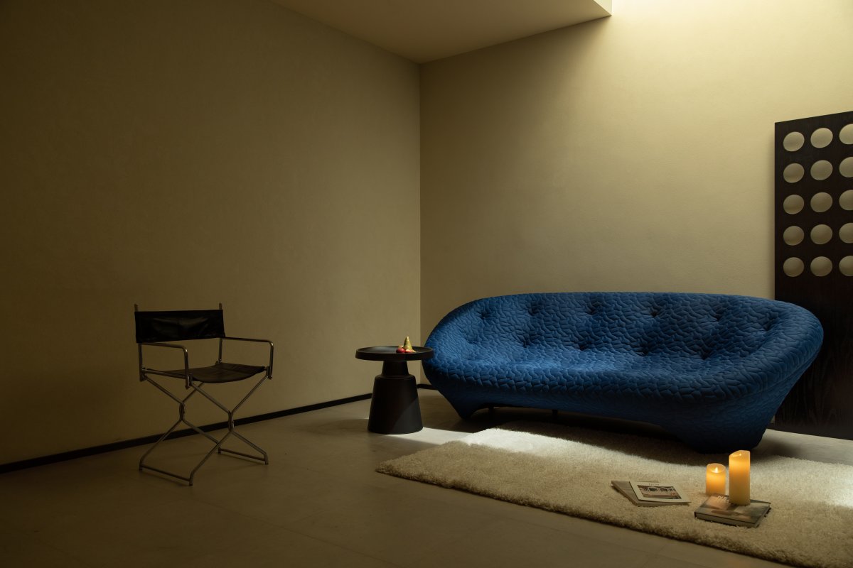
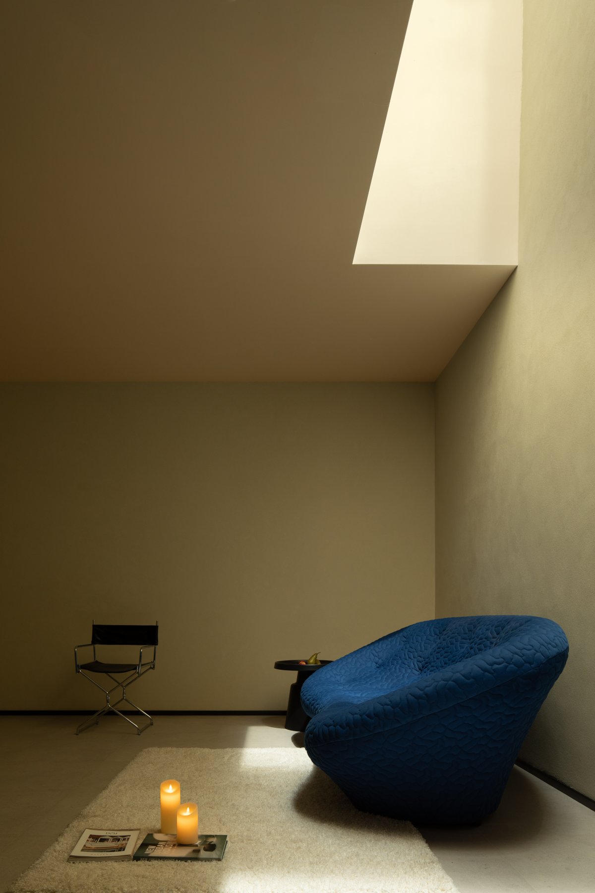
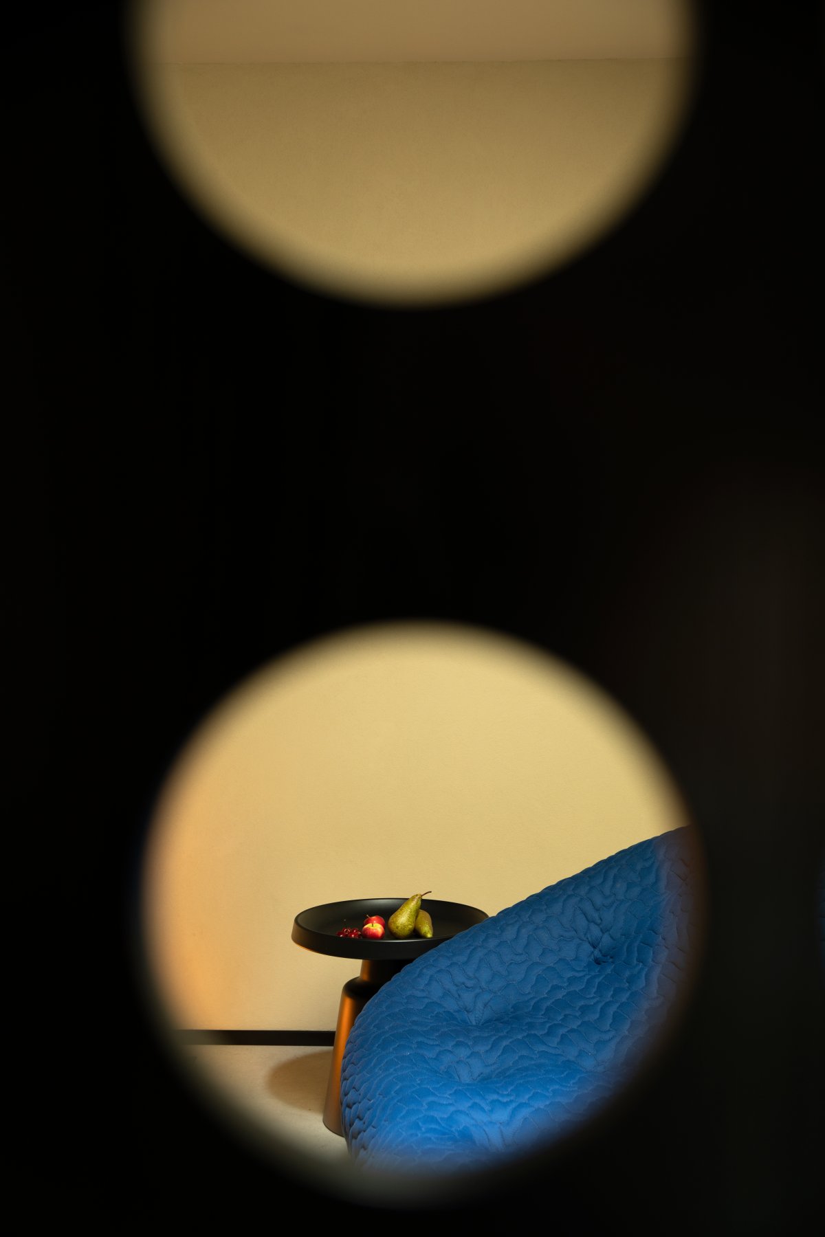
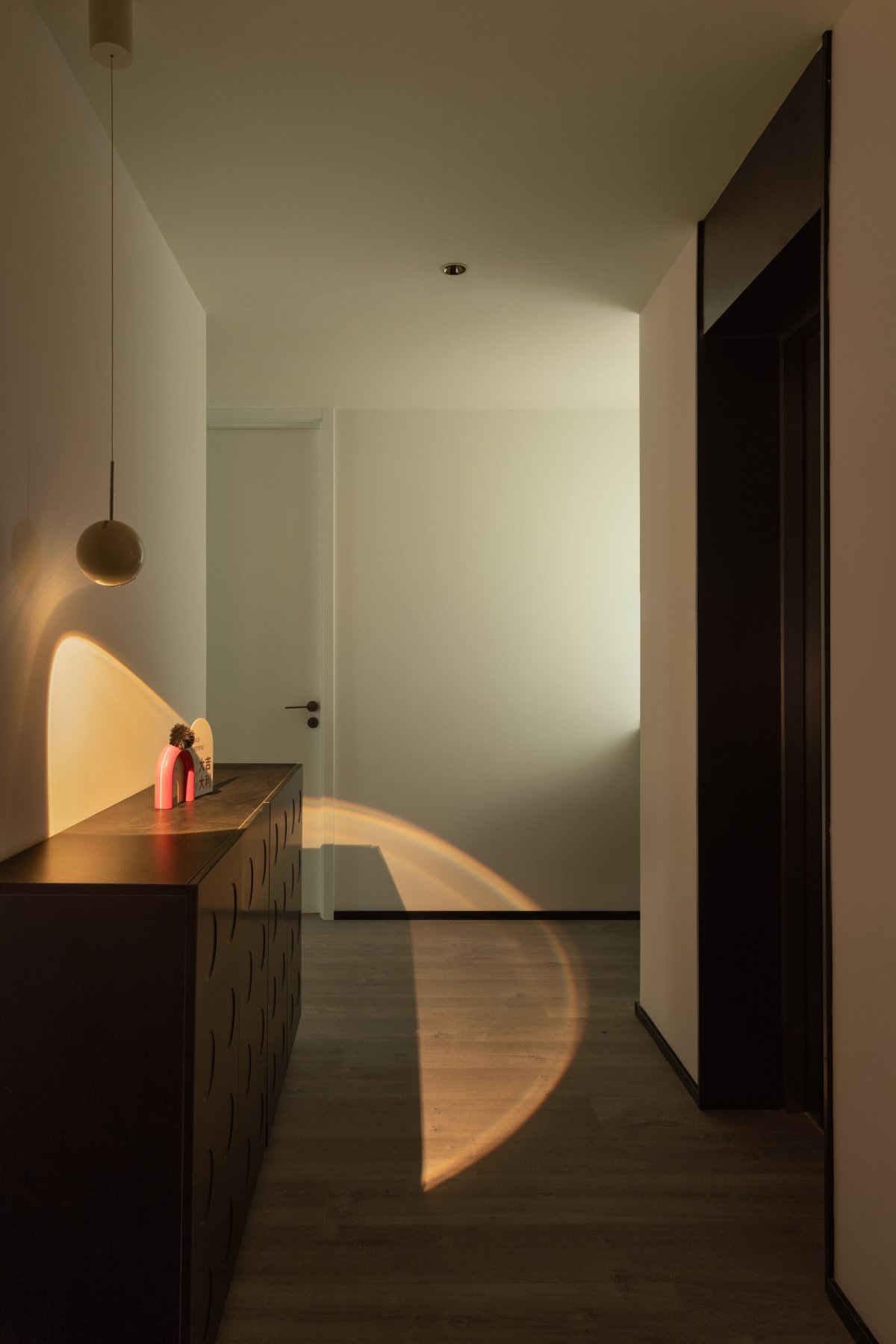
Although the B1 floor lacks light, the designer cleverly introduced a lot of natural light, making the entire space look more spacious. The sunset and sunrise interweave to create a unique and delicate beauty.
Light and shadow interweave to create a unique picture, making people feel as if they are outside the world, and also making the entire space more three-dimensional and providing a new visual experience.
- Interiors: SHIYU Design
- Photos: Hanmo Vision / Robyn

