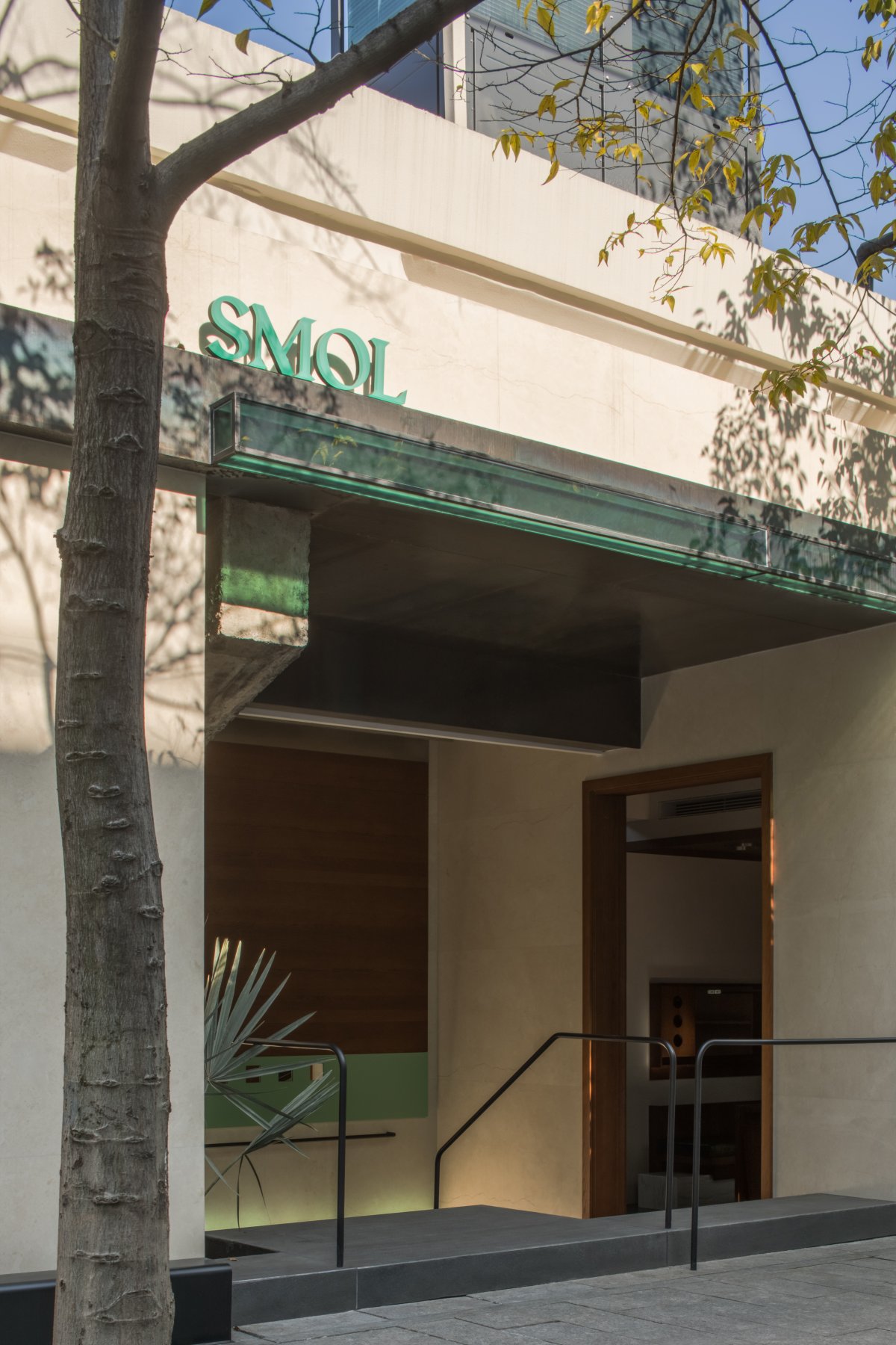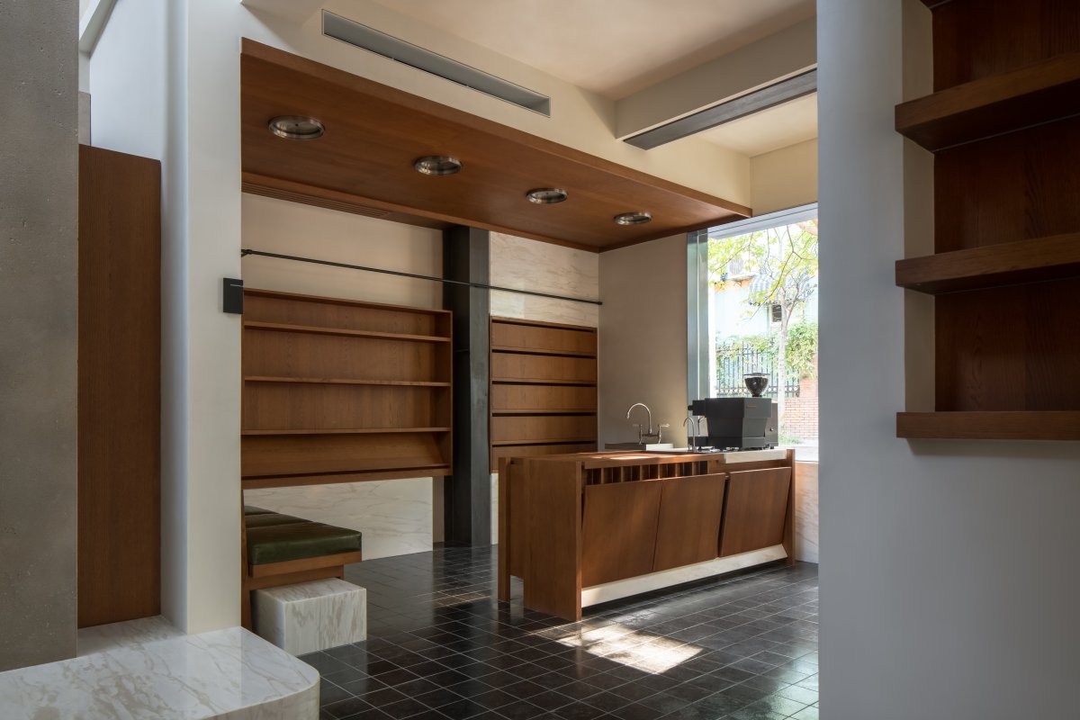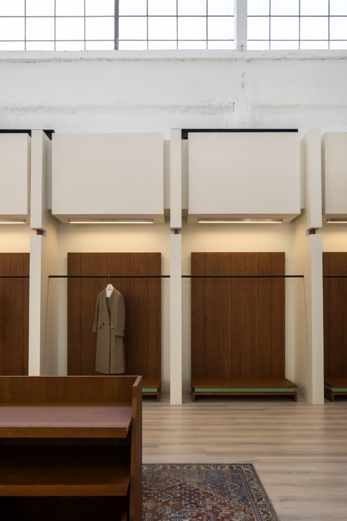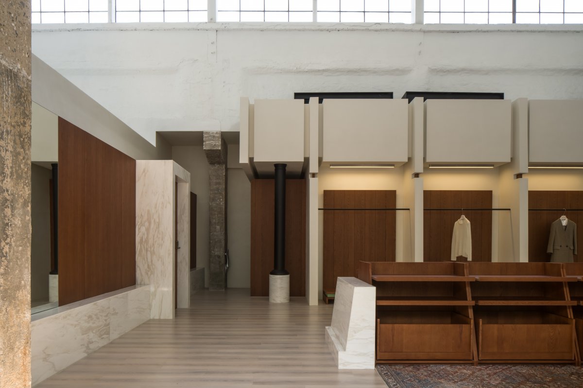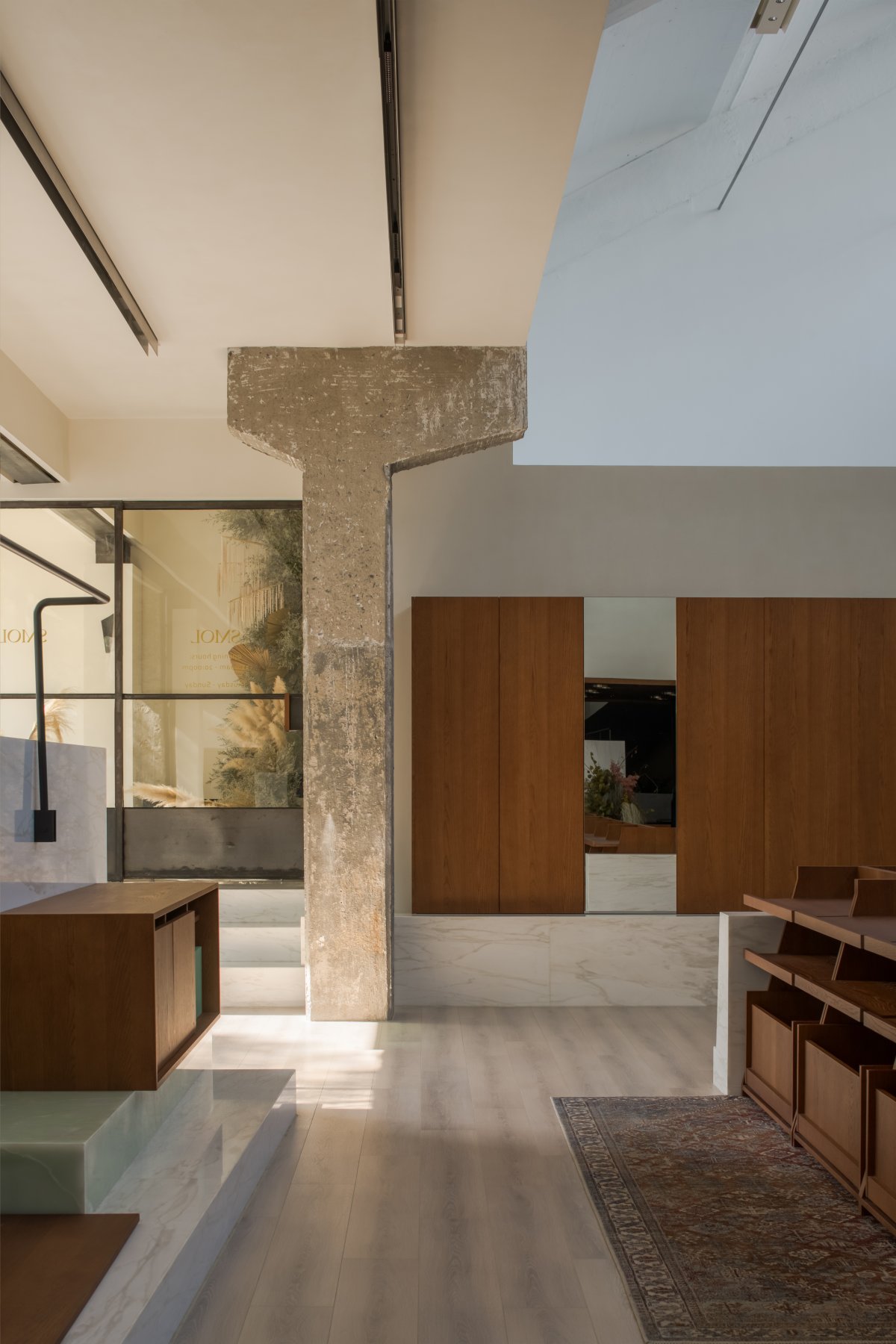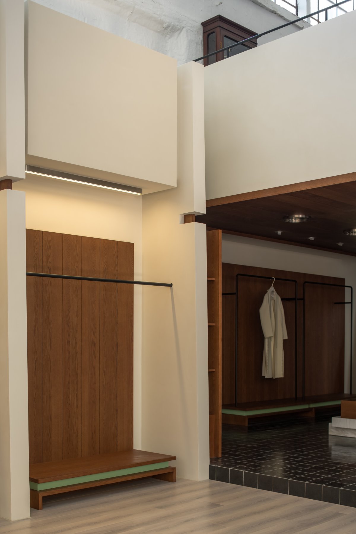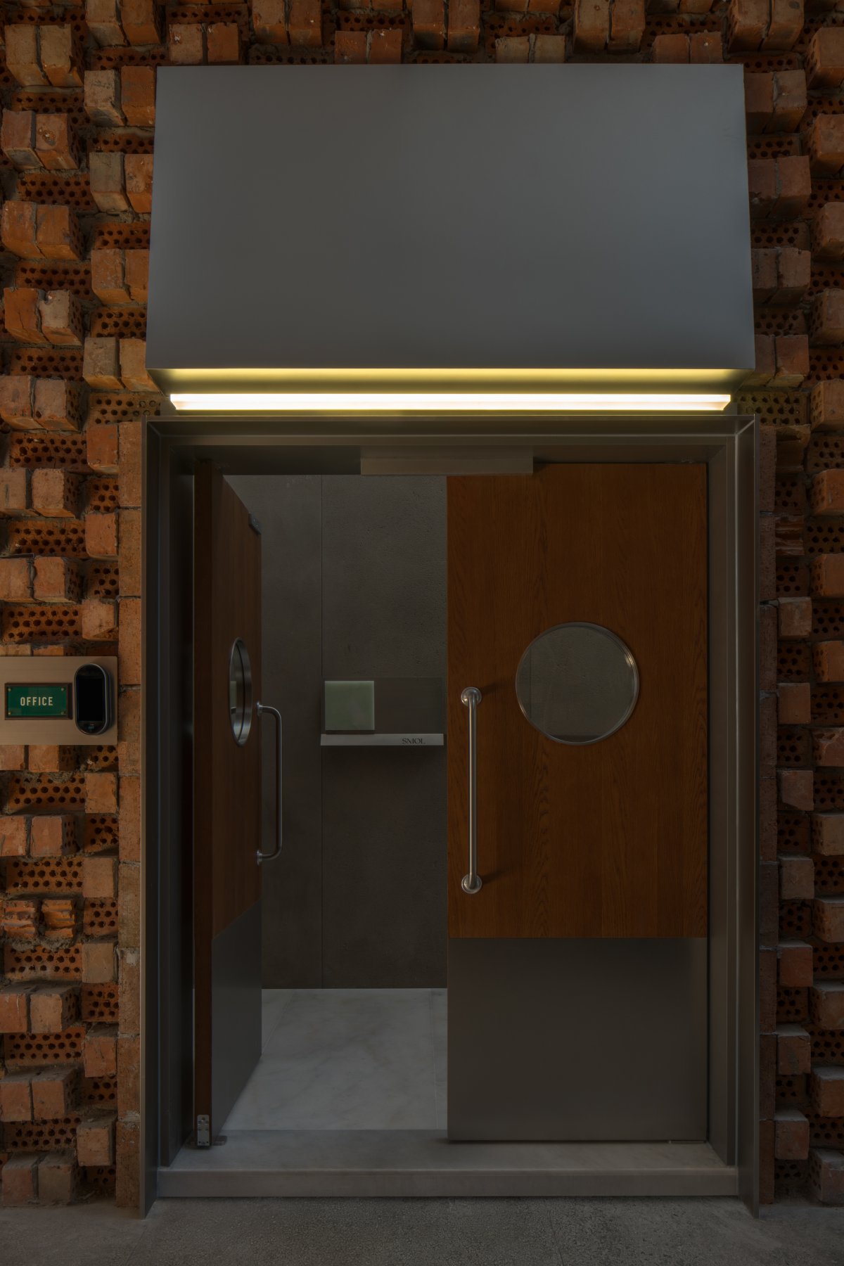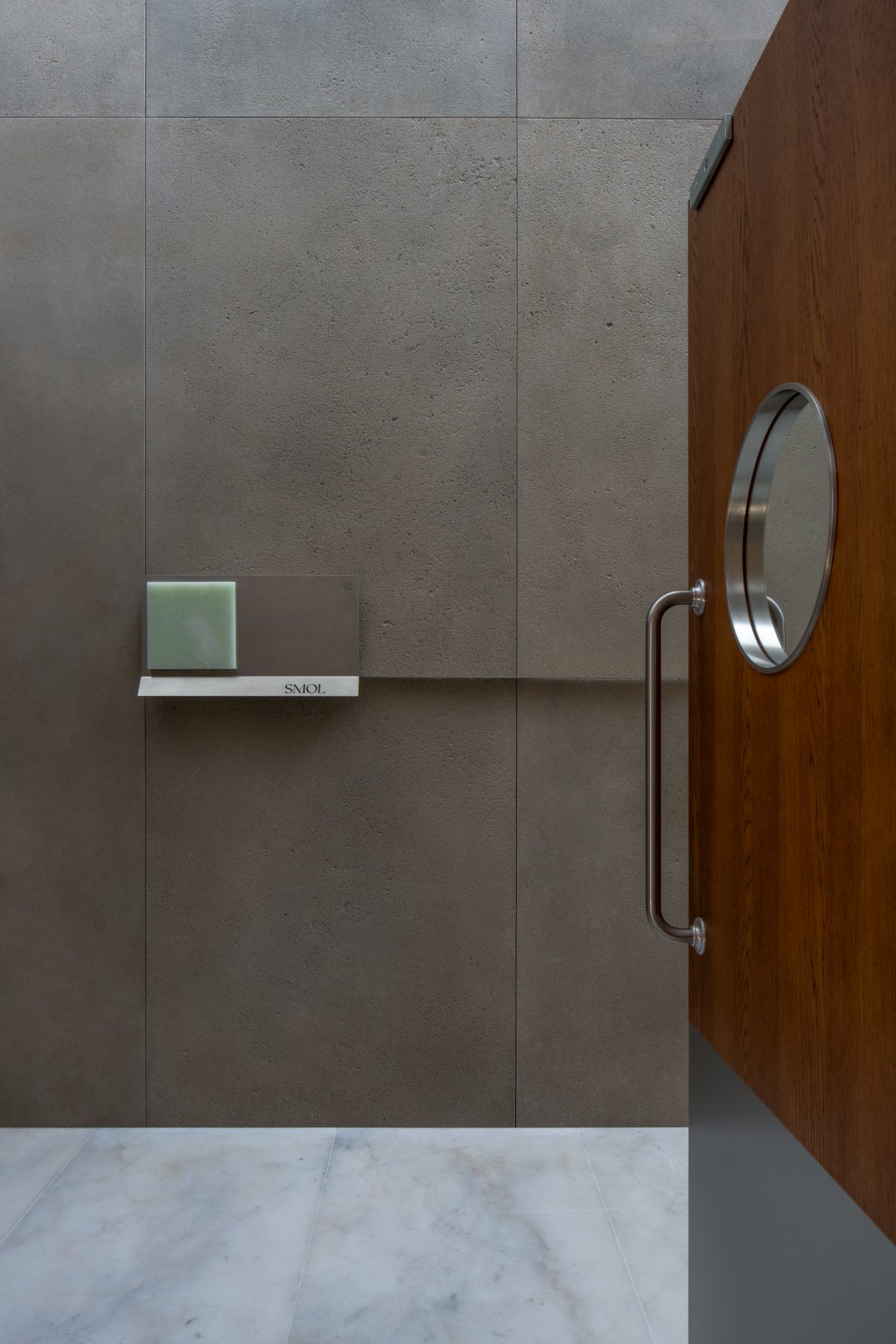
The project is located in the old-fashioned Soviet industrial relics of Hangsilian. We need to divide multiple scenes including design, warehousing, office and retail comprehensive fields in the site with an area of 1,300 square meters.
How to rationally plan each functional area in such a multi-span continuous space to maximize the use of space without destroying the original buildings is the main difficulty of our design. At the same time, on the basis of solving the difficulties in the layout of the original building space, how to better integrate the interior building into the original building and give full play to the characteristics of the original building is also the key problem we need to fix.
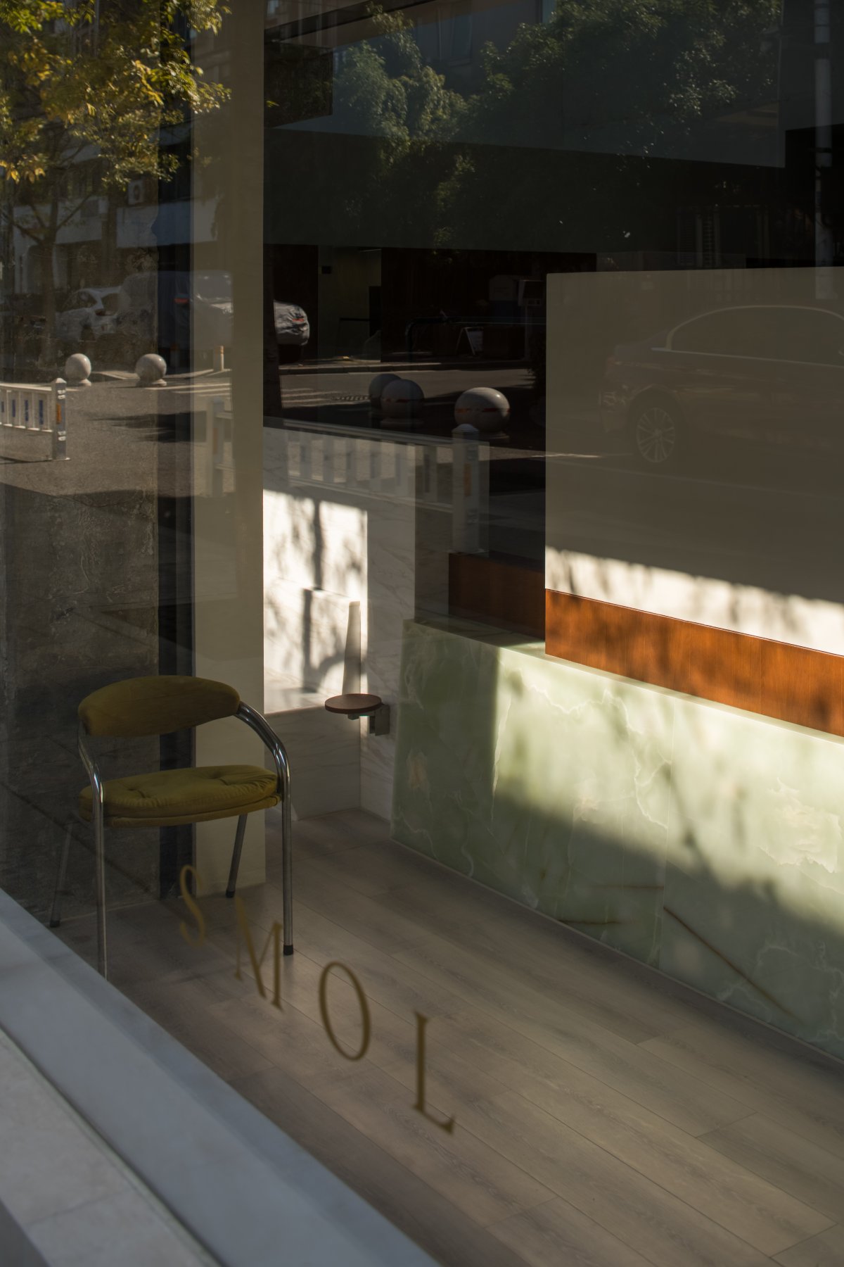
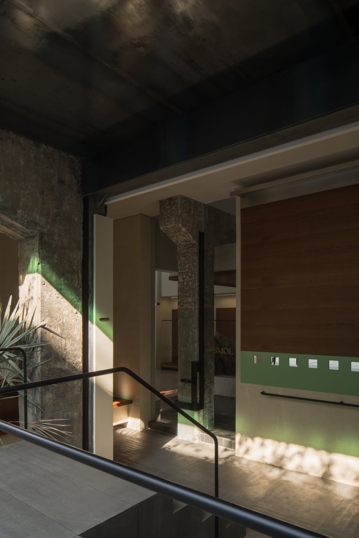
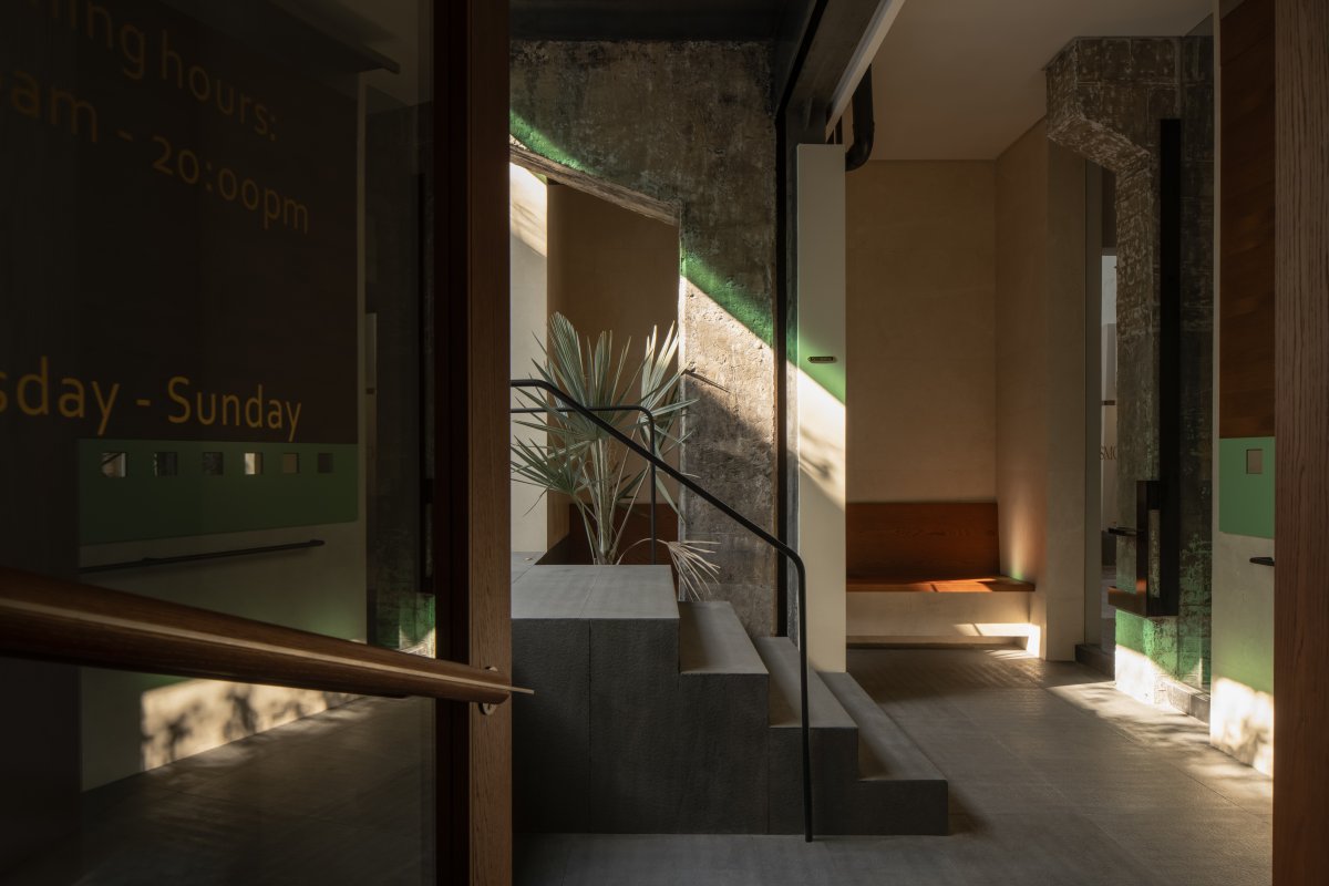
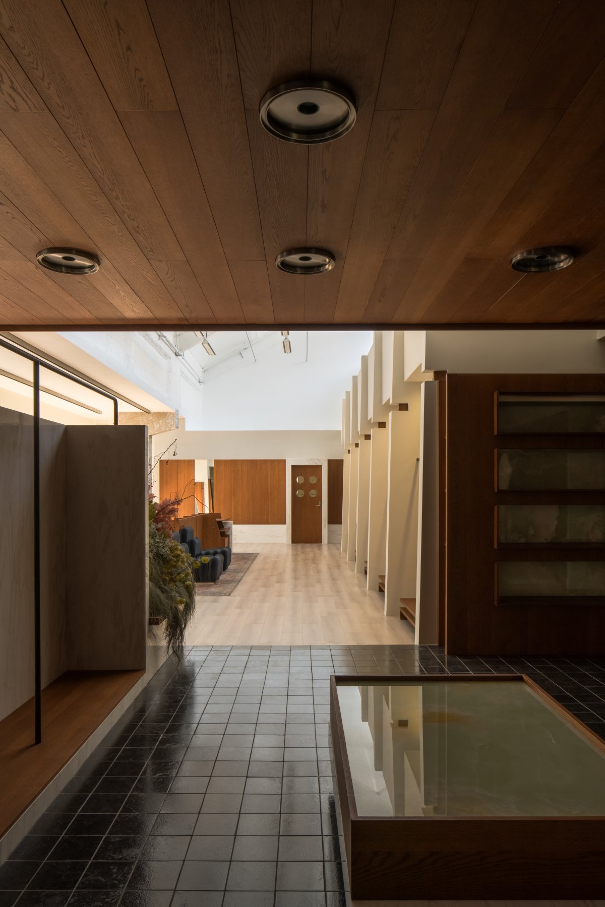
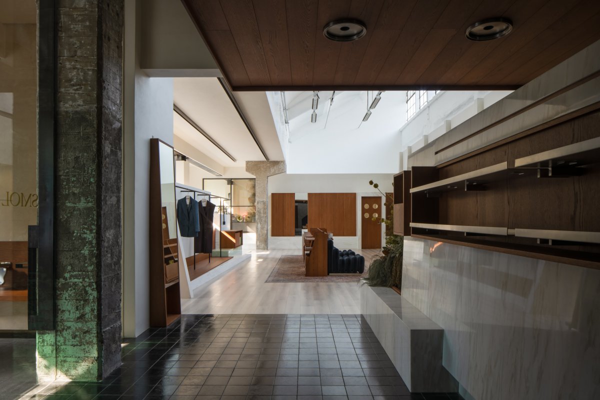
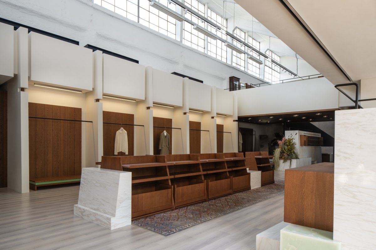
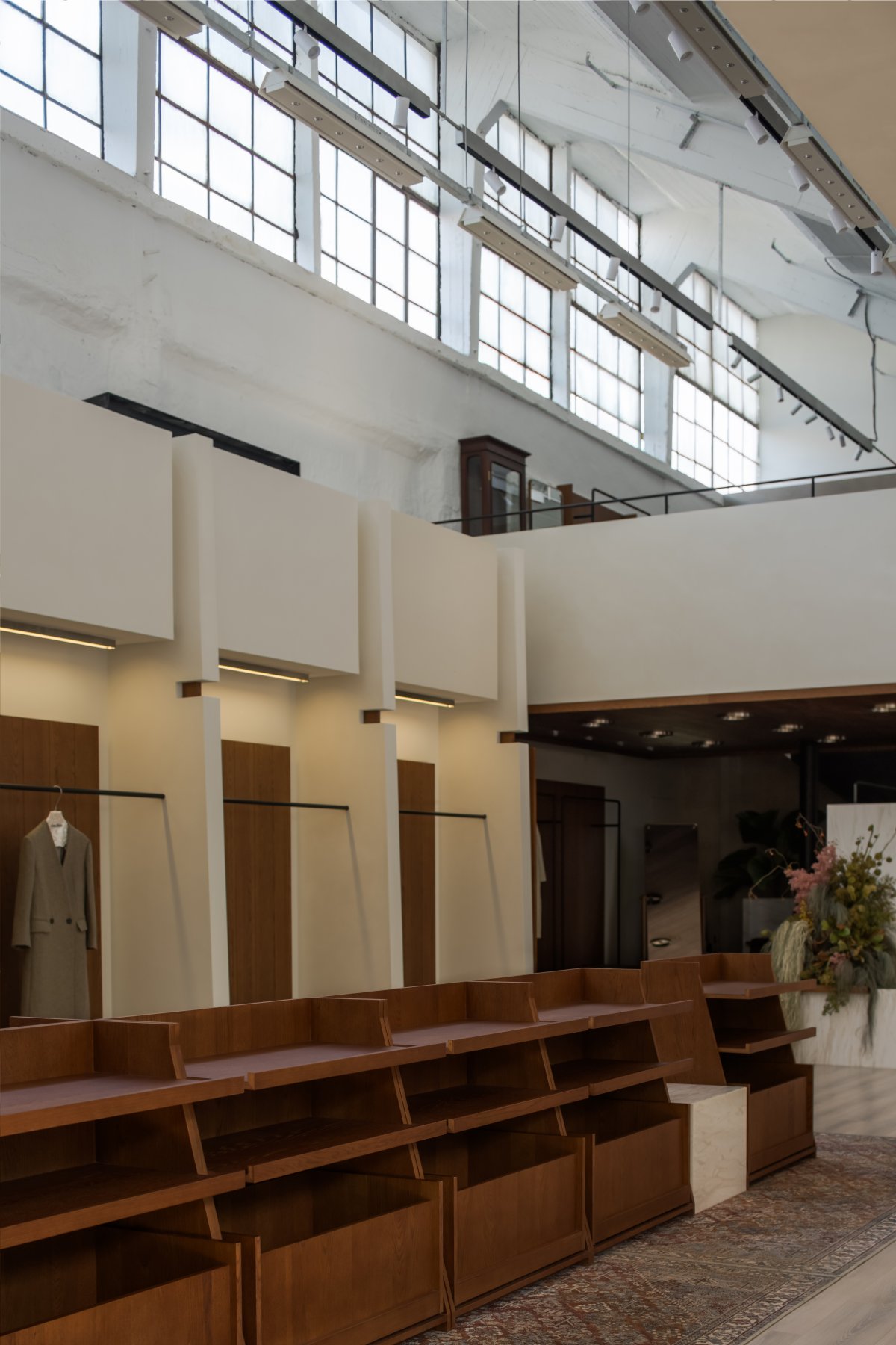
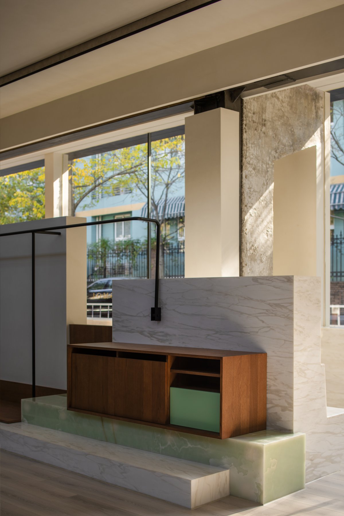
Regarding the retail space in the front yard, we choose to arrange the entire retail area facing the street in the space by using the original building shape in combination with the surrounding environment and the direction of sunlight, and set up a sunken section at the entrance based on the height difference between the street and the space, so as to stress on the entrance while maximizing the gathering of people and increasing the stay time of customers. According to the internal form of the original space, we set up different scale exhibition forms and second-floor spaces in the entire space to enrich the visual effects of the space while meeting the retail and use functions.
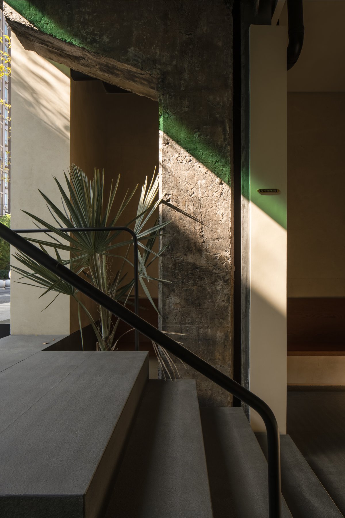
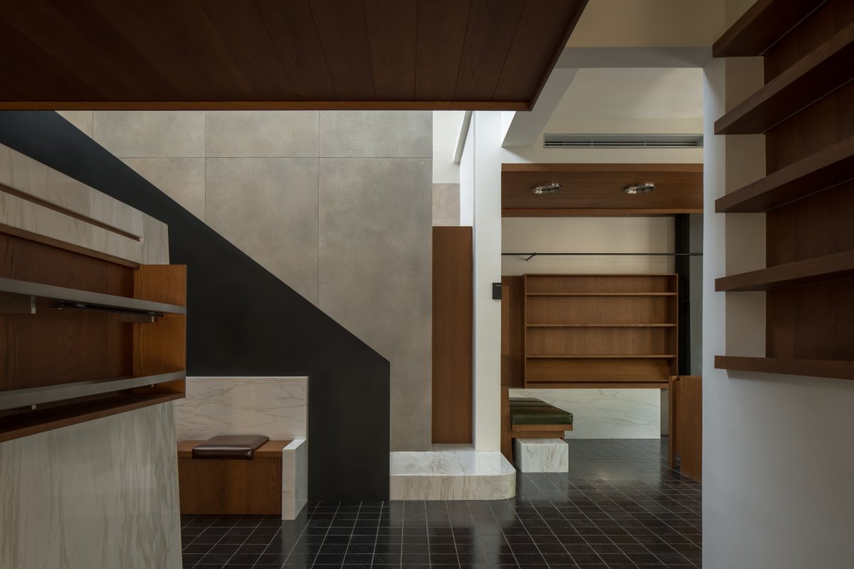
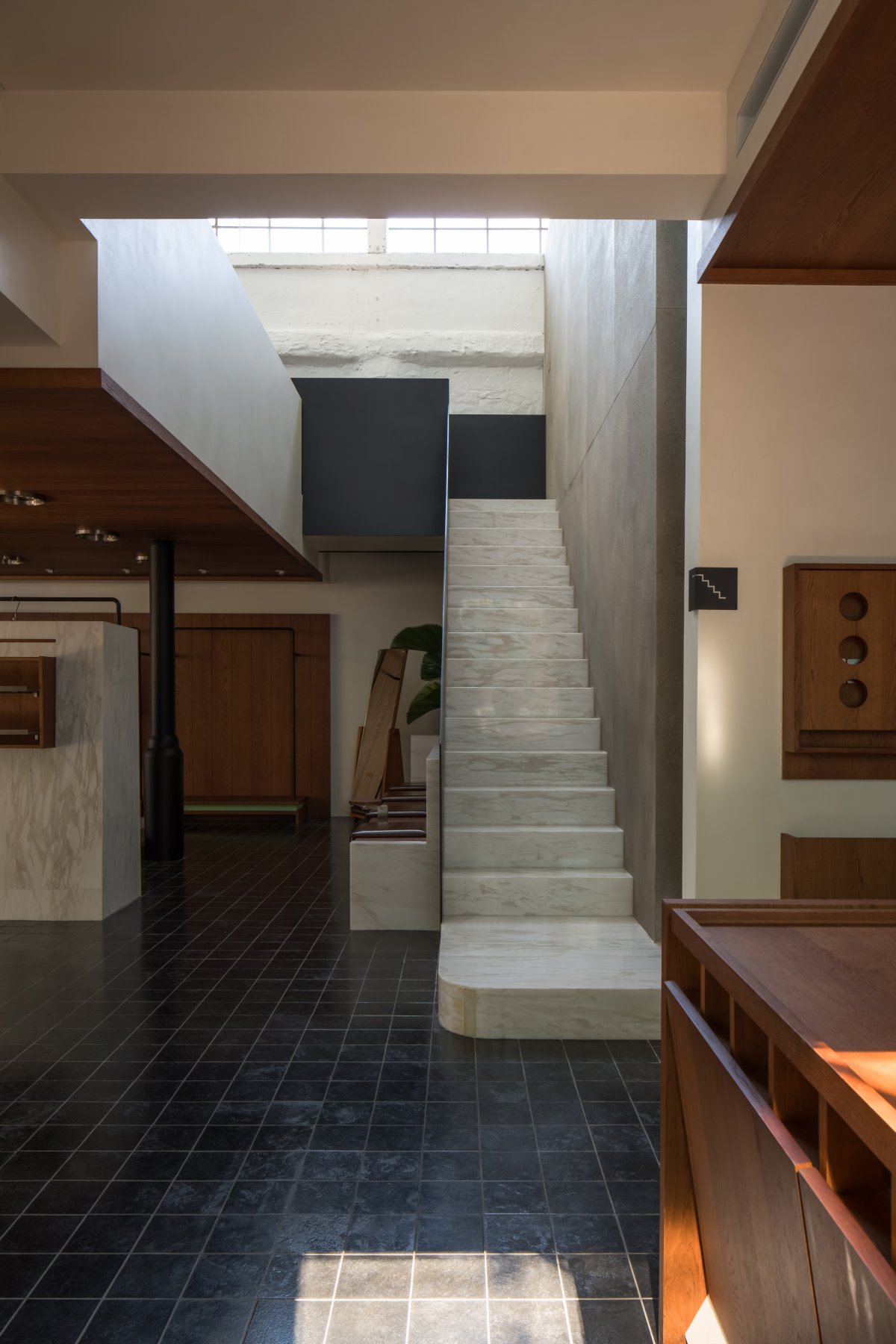
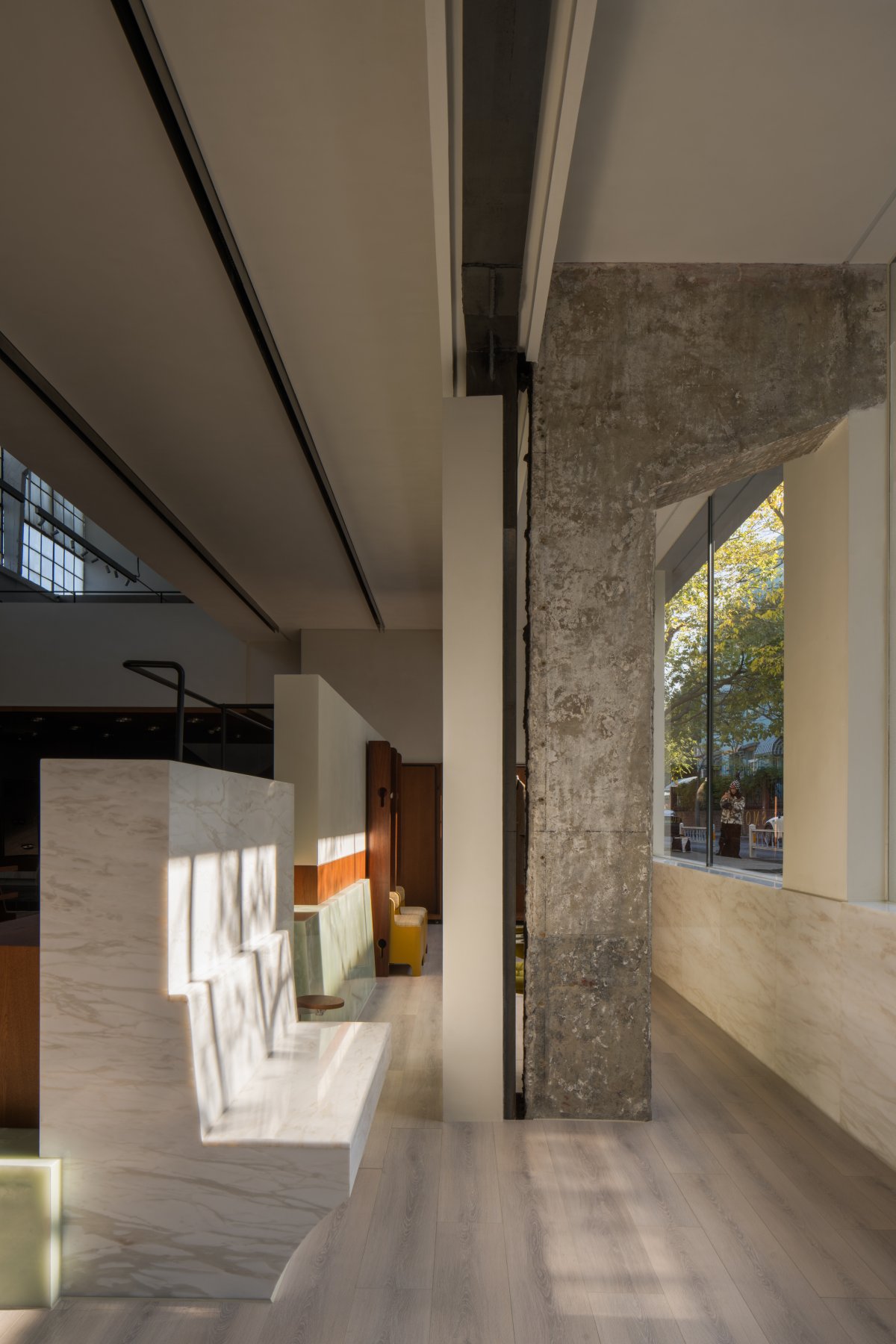
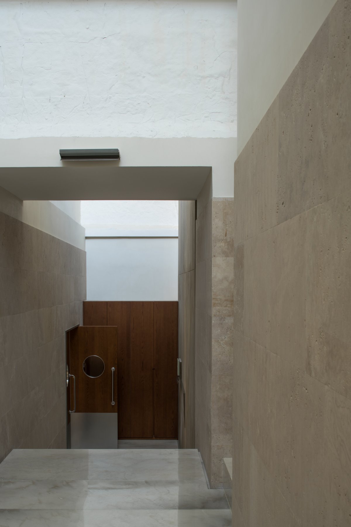
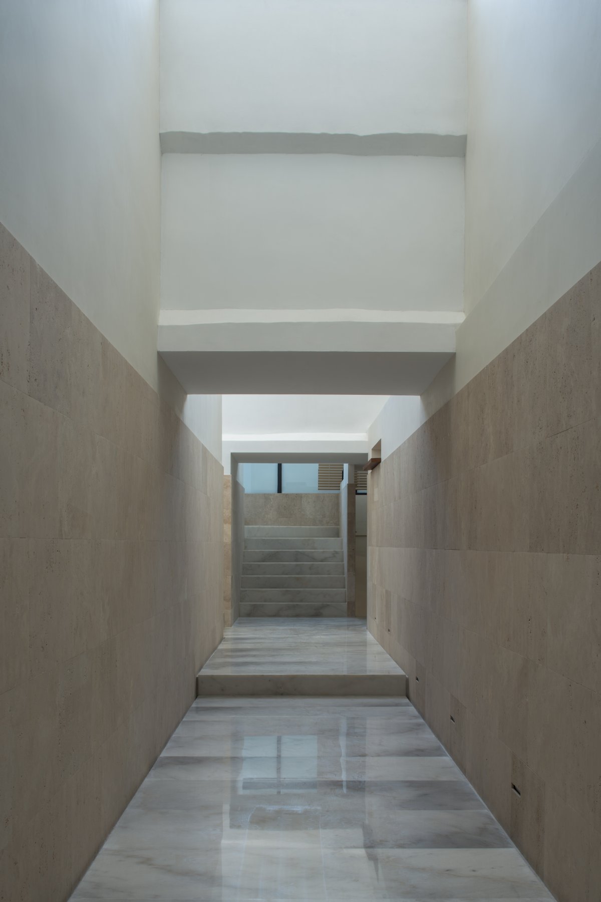
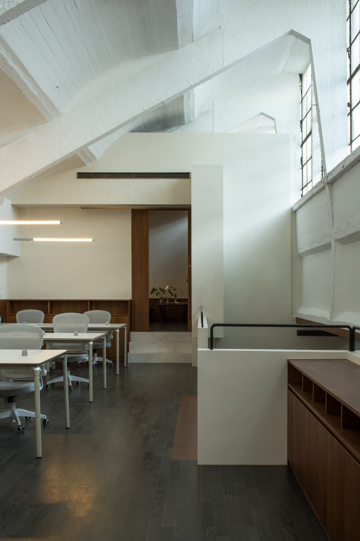
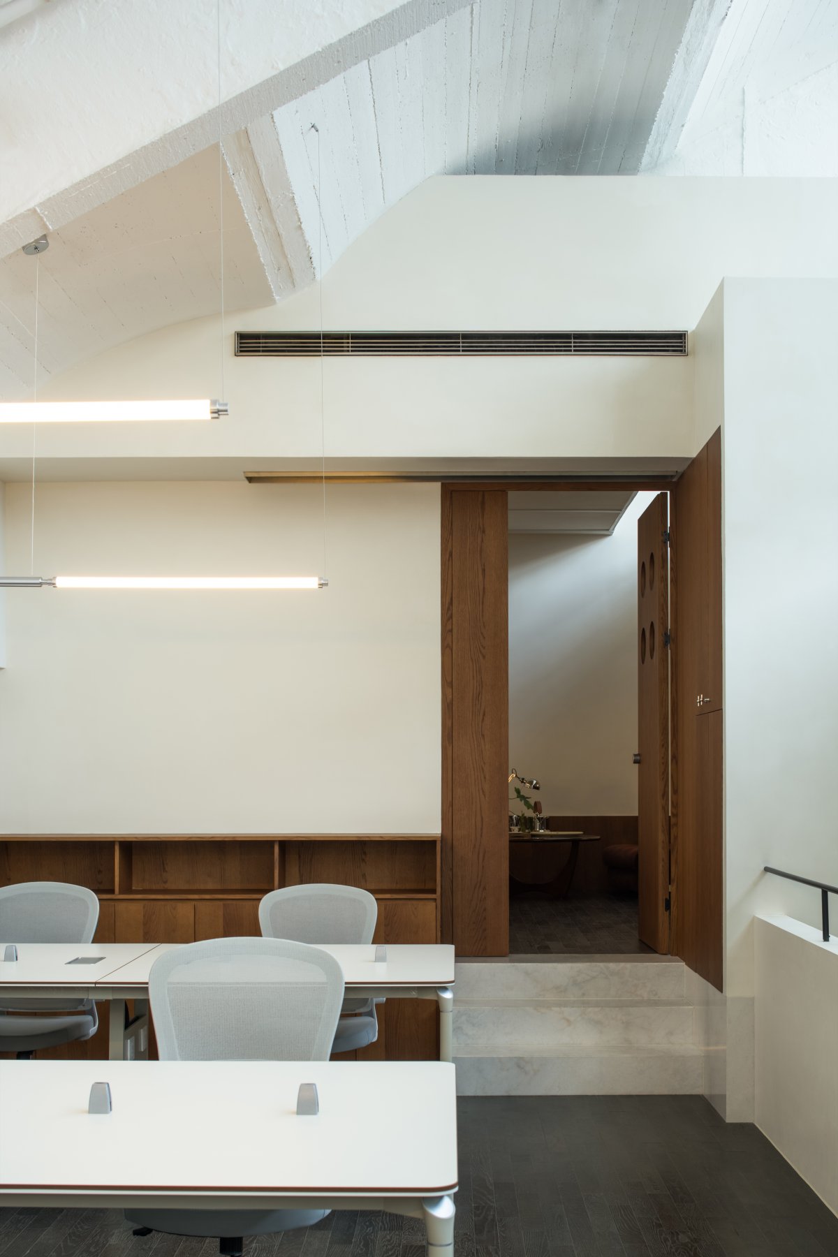
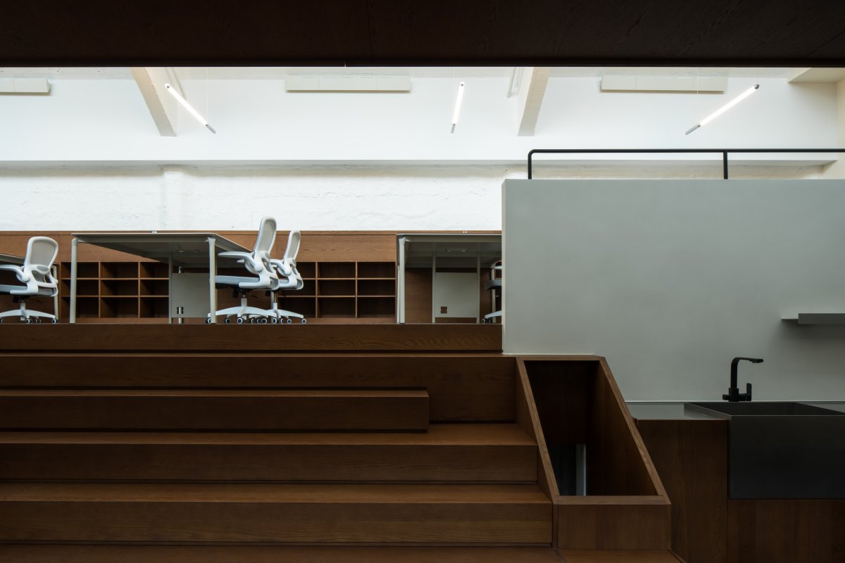
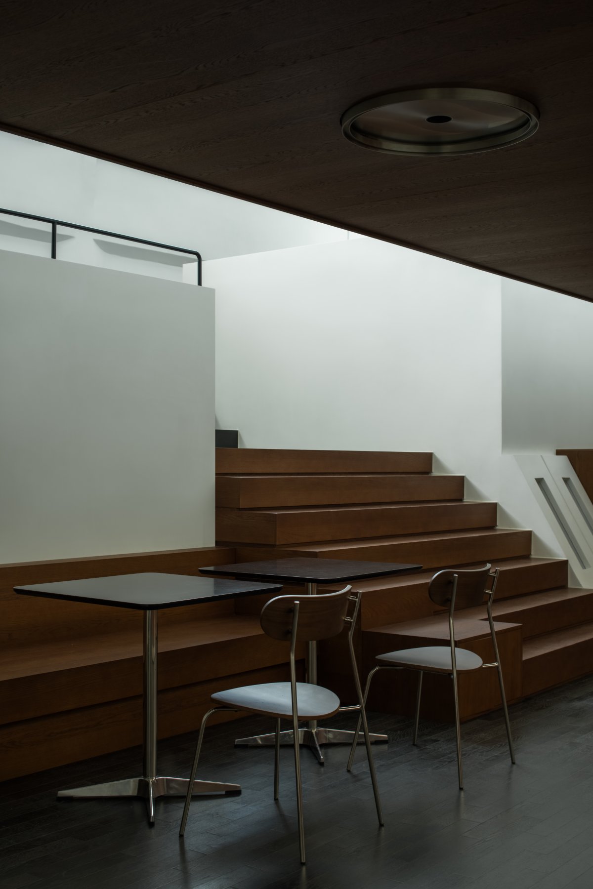
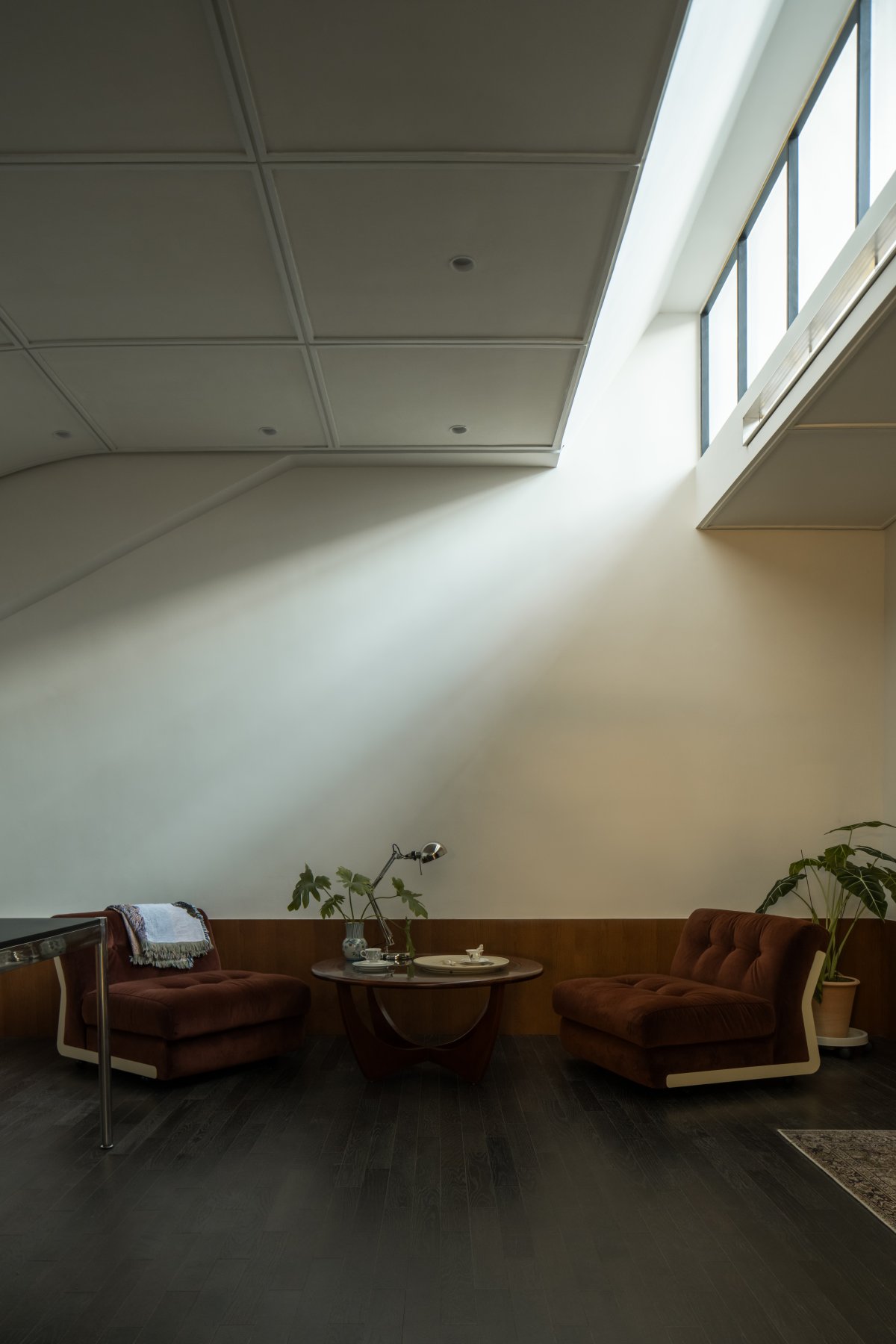
In the layout of office space, we turn the low truss area between the original two trans-districts into a sunken public activity area, and at the same time solve the problems in office space interoperability and low truss space that are difficult to use. In the setting of the main channel, we make it run through the entire architectural space in the form of stairs in order to connect each functional area in series to the maximum extent, so that the main channel can obtain more natural lighting and also better display the original architectural form in the space.
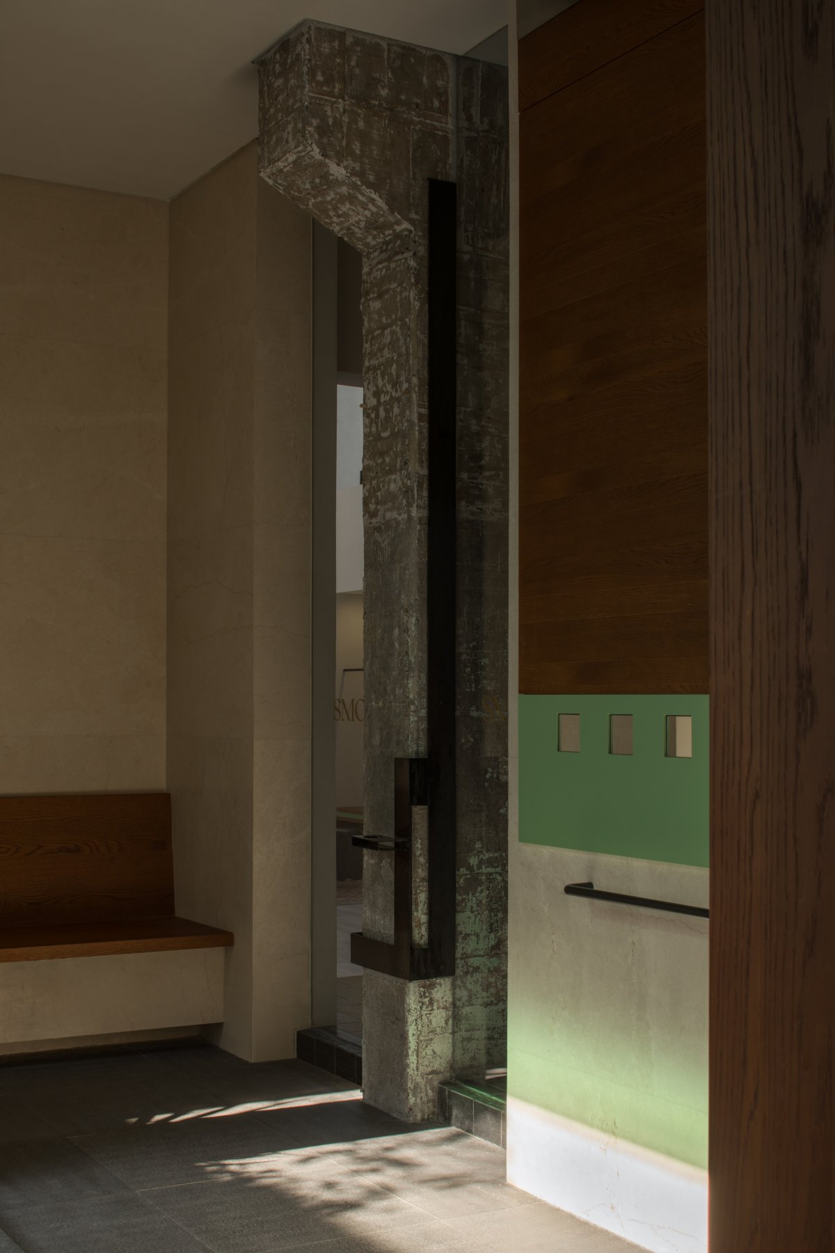
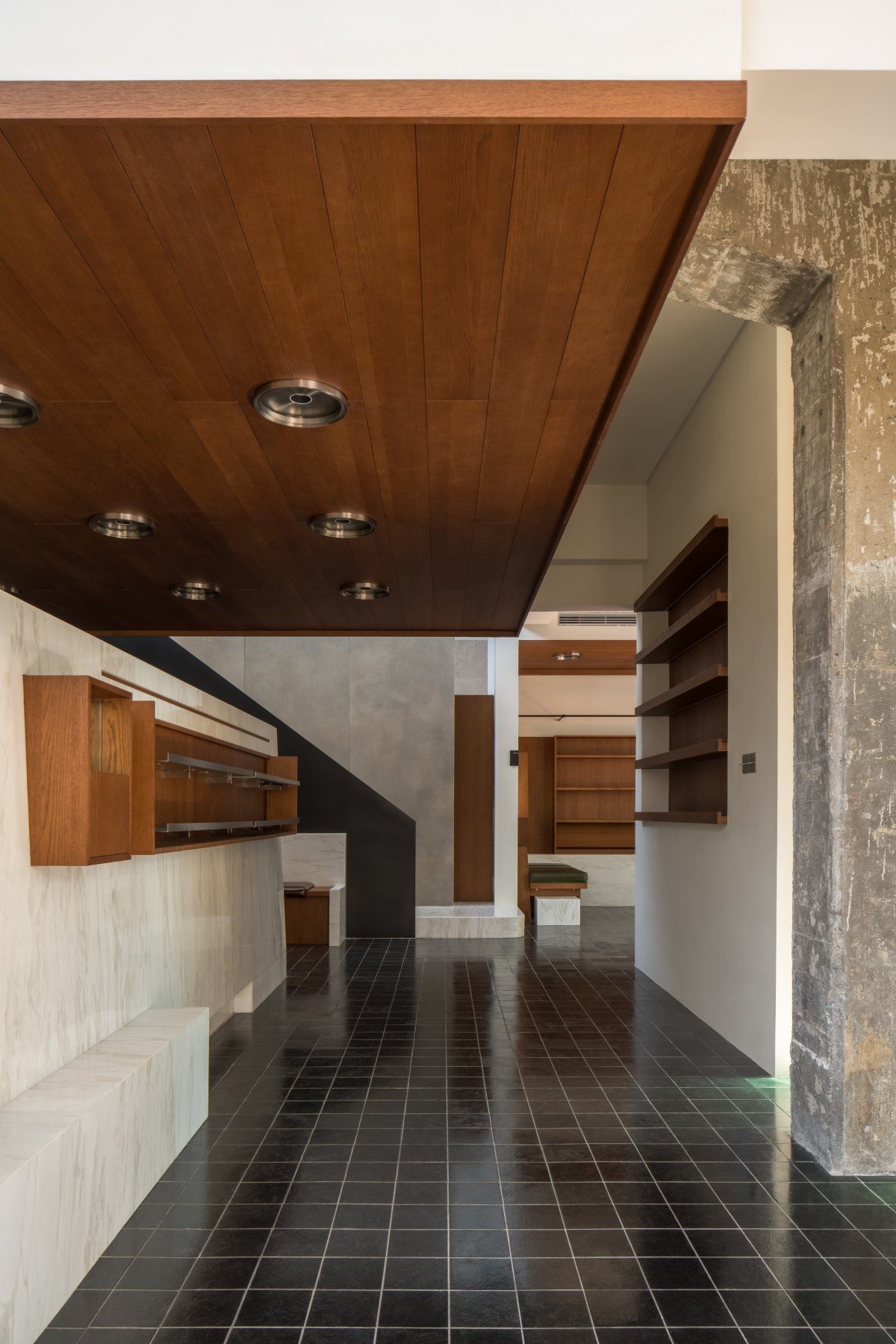
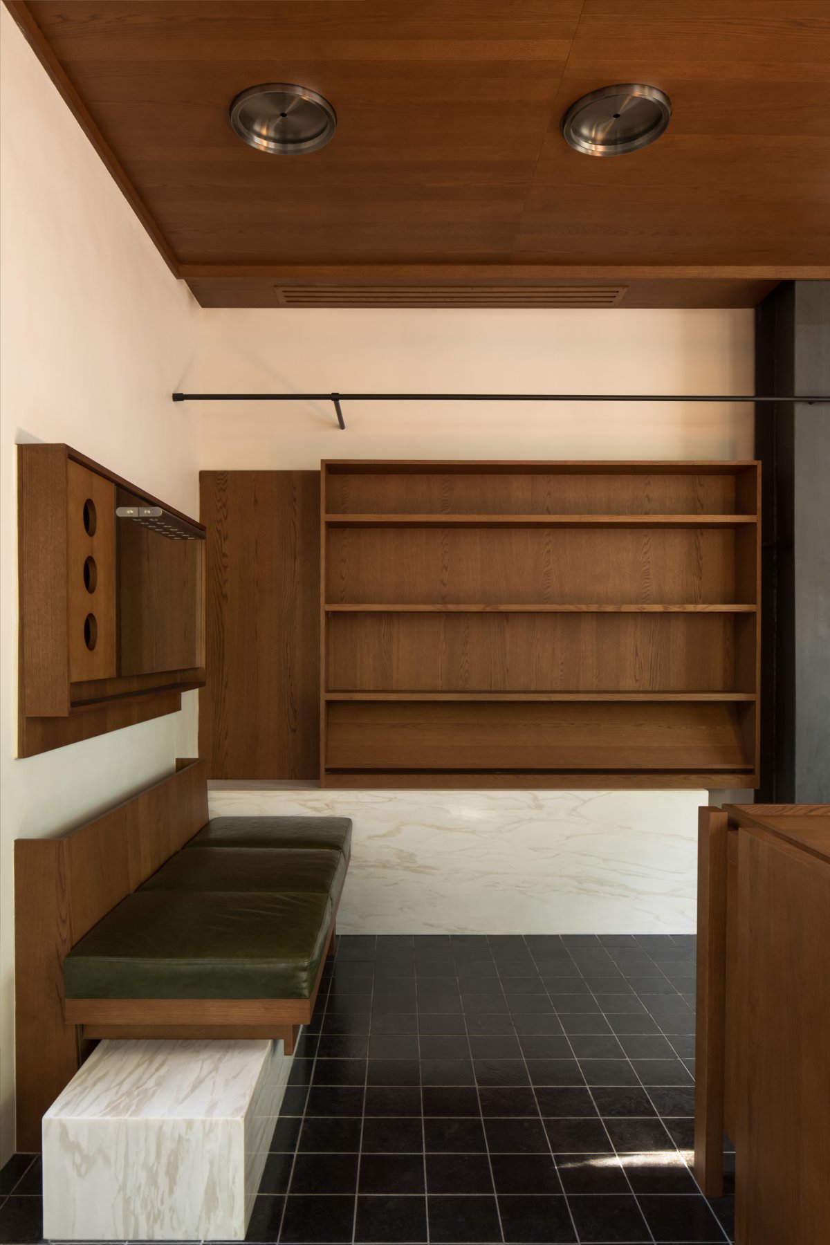
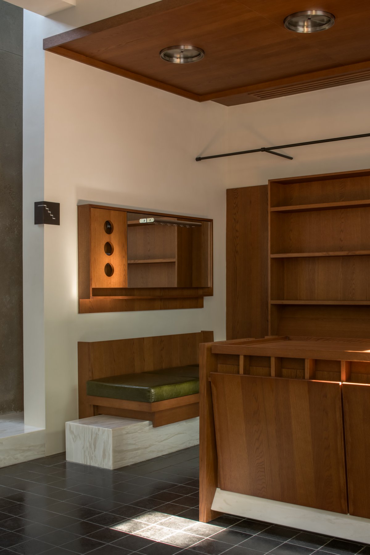
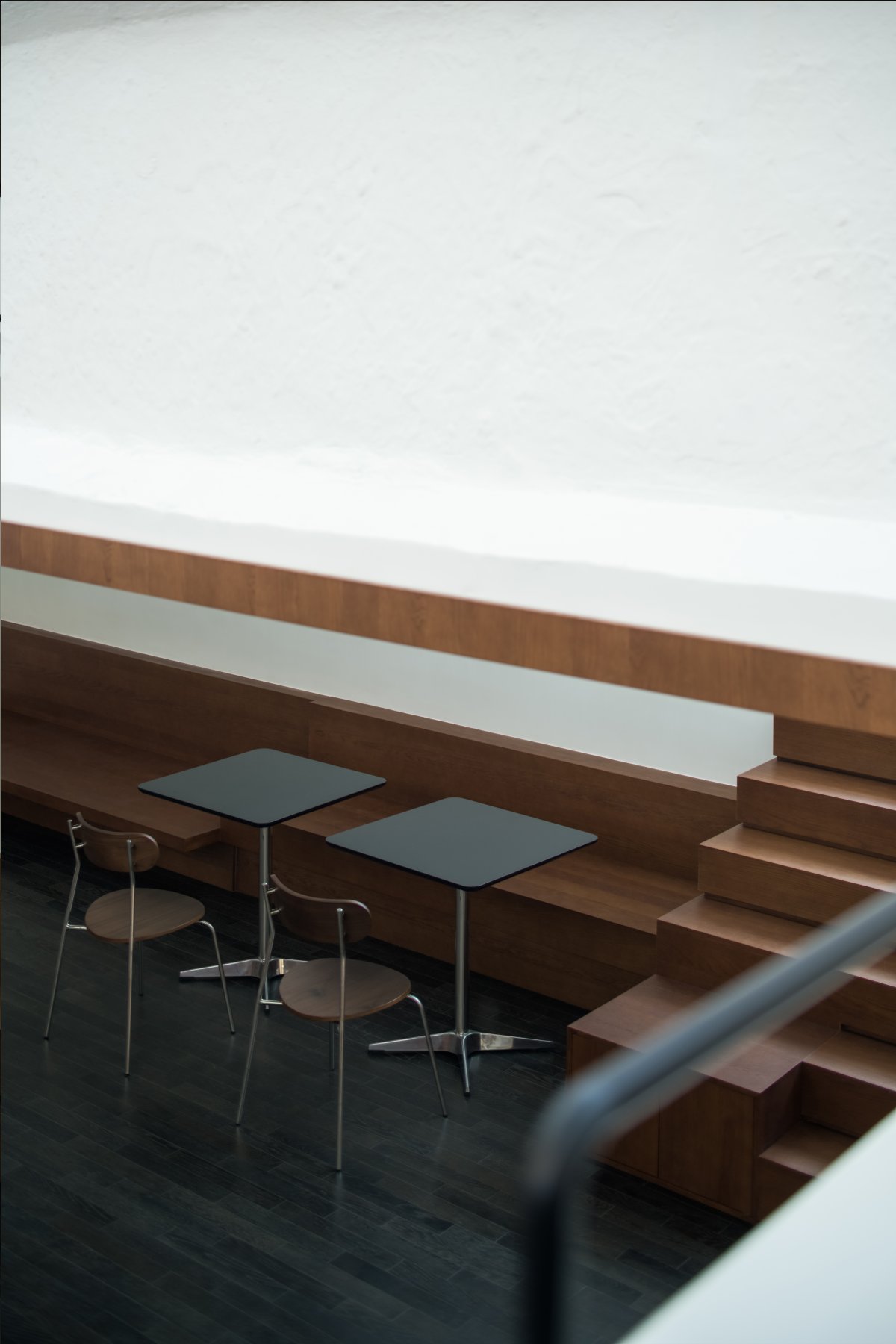
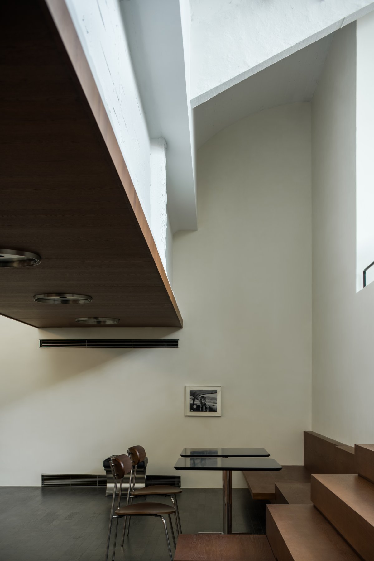
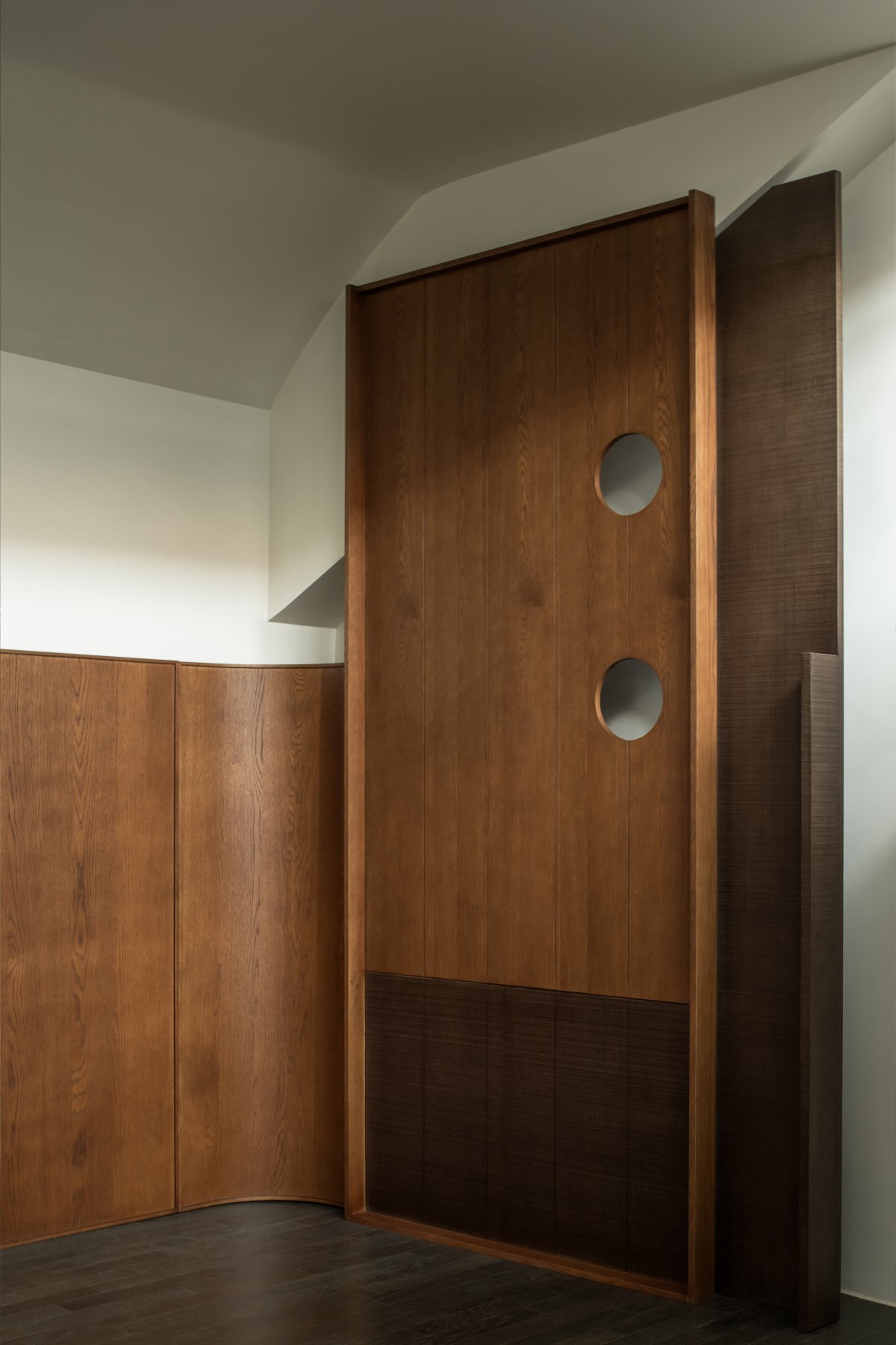
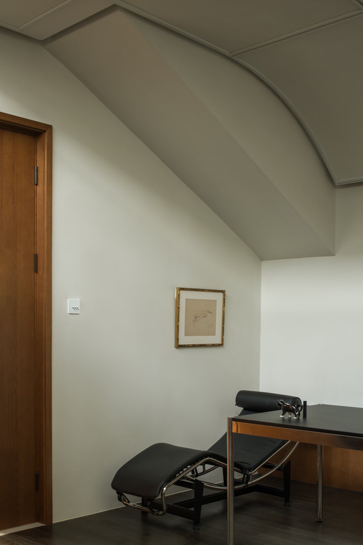
In the interior decoration of the space, in order to match the brand image to the maximum degree and fit the historical sense of the original building, we choose natural materials such as wood and stone to decorate the space. Also, in order to better feel the charm of the old industrial buildings, we combine the new structure with the original structure in the partial treatment of the space, making the original structure better integrated into the space. In order to enhance the brand's detailed requirements for space, we have designed a series of furniture combining functions and spatial shapes in the space. According to the original spatial form and style characteristics, we have designed a series of lamps and lanterns exclusive to the space, trying to meet the lighting needs and at the same time make the entire space more integral and unified.
- Interiors: Shire Space
- Photos: HereSpace He Chuan

