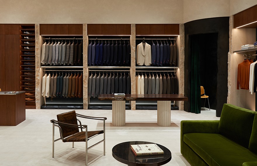
Comfortably relaxed and naturally elegant are the attributes menswear brand FULL MONTY wants to convey in their fresh take of the suit. FULL MONTY hopes that the suit can become an everyday attire which expresses the personality of its wearer, changing the traditional connotation of formality and seriousness. Studio Glume recently designed the first brick and mortar store for the menswear brand combining a distinctive contemporary style with humanity and craftsmanship.
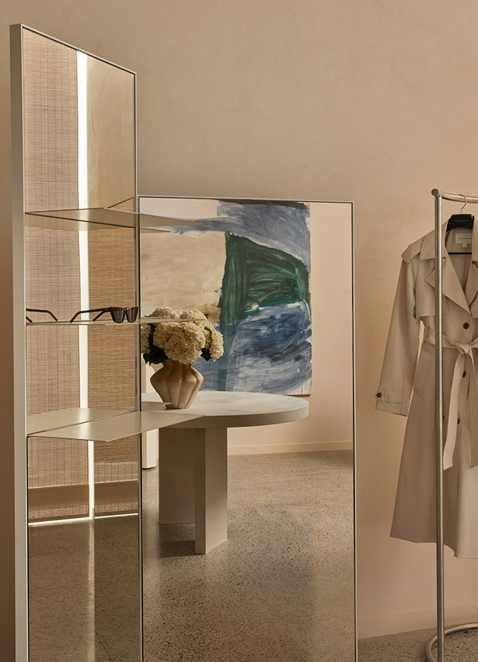
Men's formalwear expresses a sense of proportion and the pursuit of details and texture. Studio Glume integrates this concept into the space. Density in its layout, a selection of rich and exquisite materials and the overall rational order of the space adorned with subtle details are intertwined to provide the space with depth and an interesting and vital atmosphere.
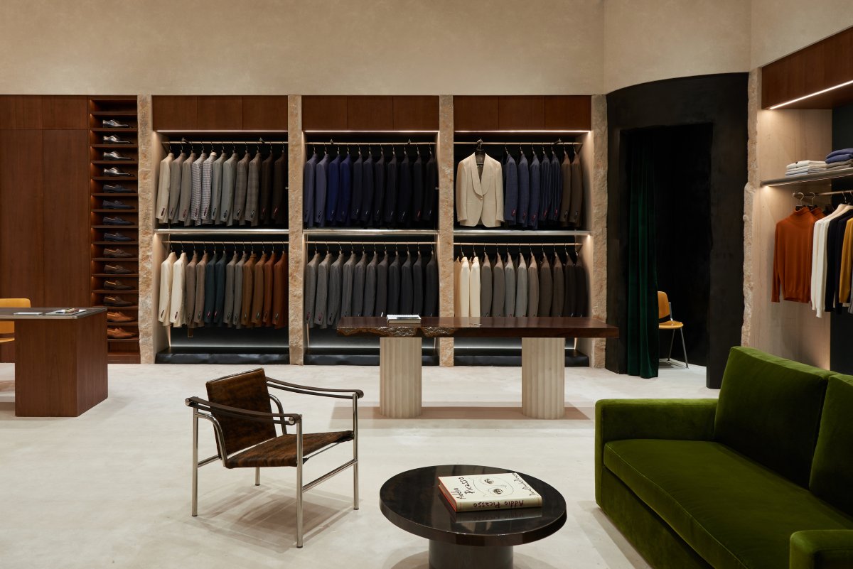
The door of the store is made of warm sandstone, traditional materials are presented in a simple and neat shape, reflecting the blend of both the spirits of classical and contemporary inspirations. The old lacquered metal folding in the window echoes the details of the velvet sofa, the old aluminum workbench and other elements present inside inserting a certain level of emotionality and warmth within the delicate atmosphere, while breaking the tendency to pursuit perfection and its inherent sentiment of alienation. The green colors from the different materials of the sofa, fitting room curtains, folding window bring an unexpected twist and a certain level of richness to the space.
The store is a semi-open layout with two walls and four big columns, one of which is open to other areas of the mall. The designer combined the preexisting characteristics of the site with functional requirements of the brand to design a tightly rhythmic display area, using the corner column to design an arc-shaped fitting area placing the fitting mirror front of one of the columns. Such treatment not only ensures the orderly feel of the store but also maximizes the space utilization.
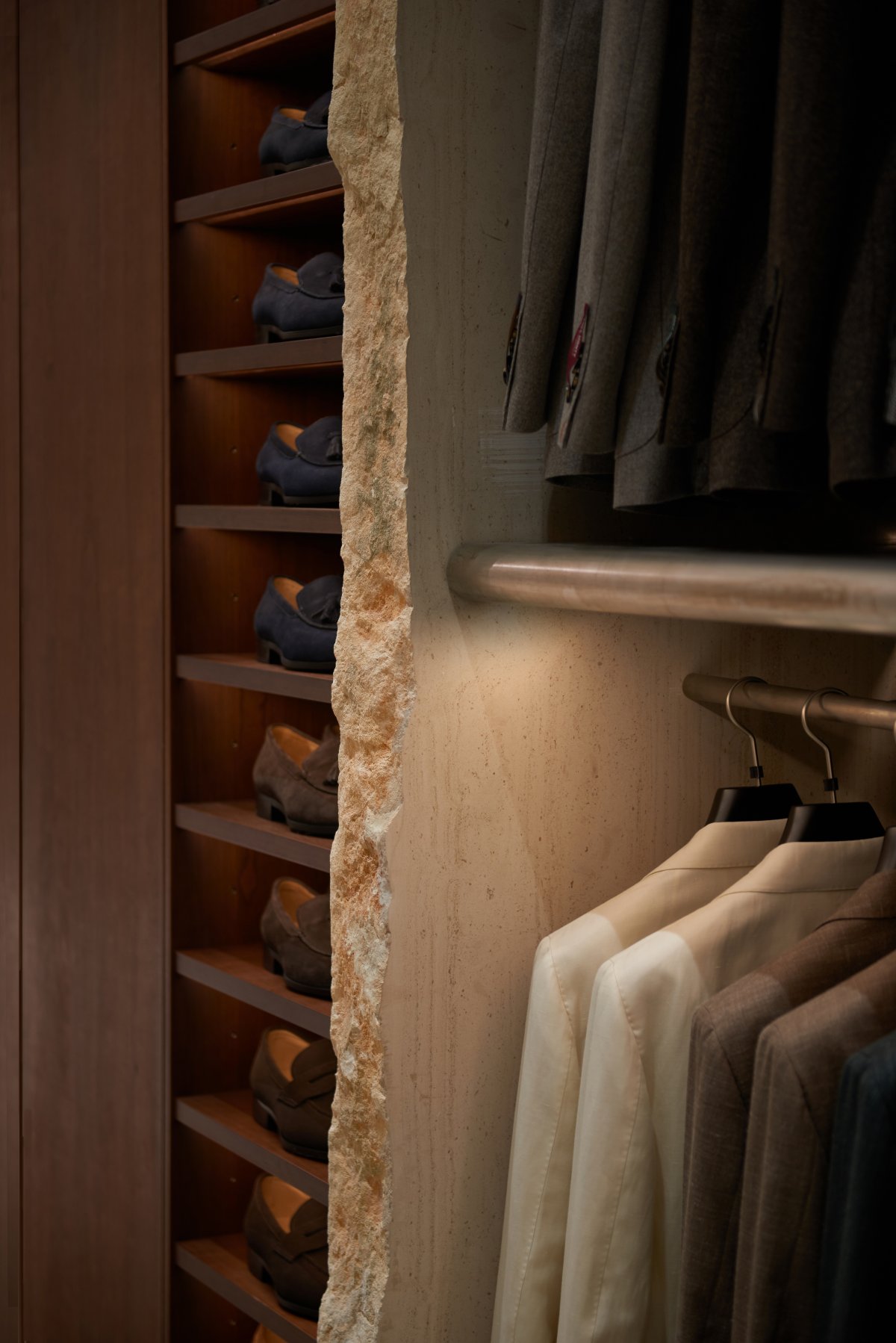
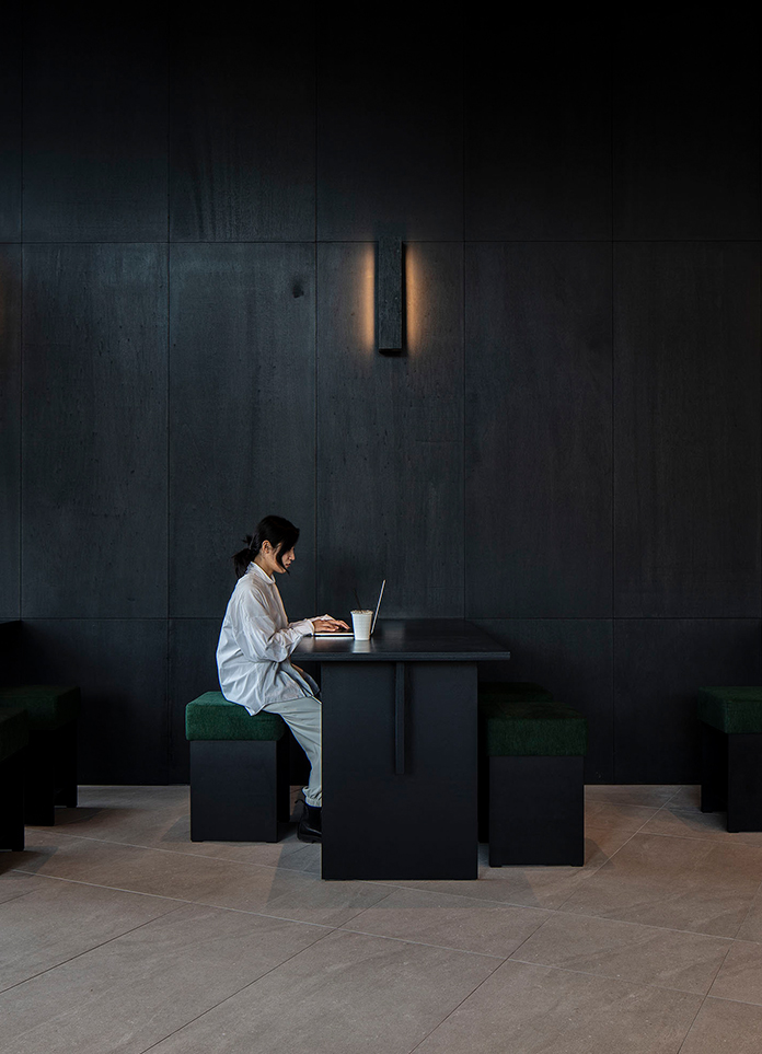
The sofa and coffee tables, display tables and the cashier counter are laid out rhythmically in the space, creating a smooth flow and forming a relaxed spatial relationship with the clothing display area.Dark wood is used for the store display and furniture, creating a calm and settled space color tone.The product display is defined by natural stone, and the edges of the stone are deliberately left rough. The display table also retains the special natural imprint of the wood. The coffee table in the rest area is hand-made from brass, and the square stools are simply cut and polished from solid wood. Simple materials convey the power of nature and stimulate imagination. Classic armchairs, well-crafted furniture and neatly displayed clothing show the beauty of humanity and reflect the power of nature.
The space design for FULL MONTY’s store expresses delicate and rich emotions transpiring through a rational and rigorous appearance. Studio Glume finds a balance between respecting classical connotations while expressing modern times in this space design just like FULL MONTY blends the past and the present in its brand aesthetics through clothing design.
Project Information
Project Location: Shanghai Pudong
Project Area: 69㎡
Completion time: September 2020
Lead Designer: Wang Ying
Design Team: He Zhifeng, Lin Chenghui, Chen Yuchuan, Yang Jie
Display Props and part of the furniture: Studio Glume
Photographer: He Zhifeng


