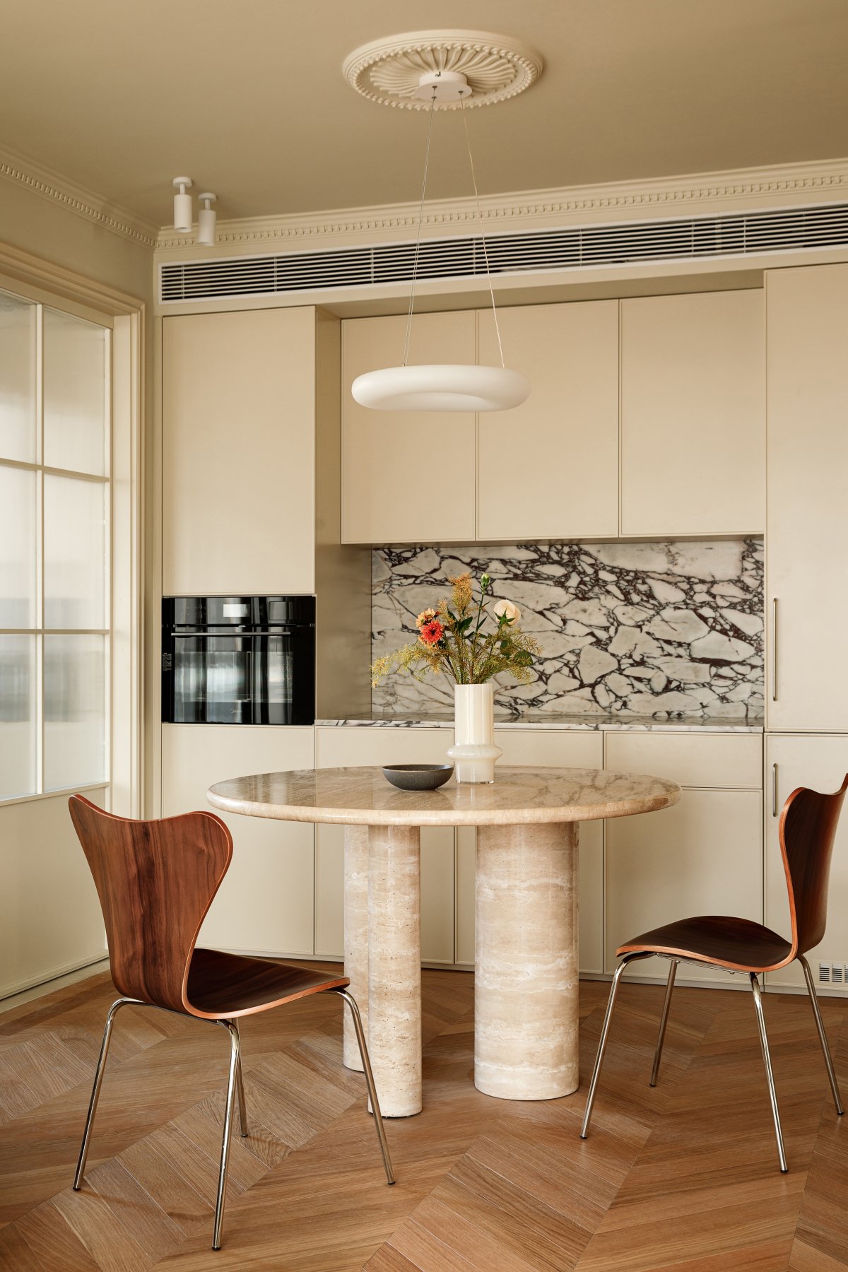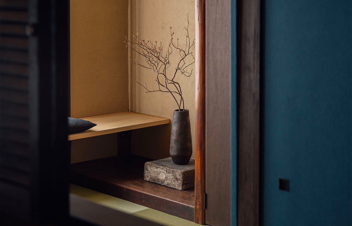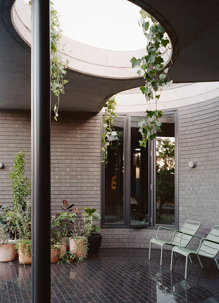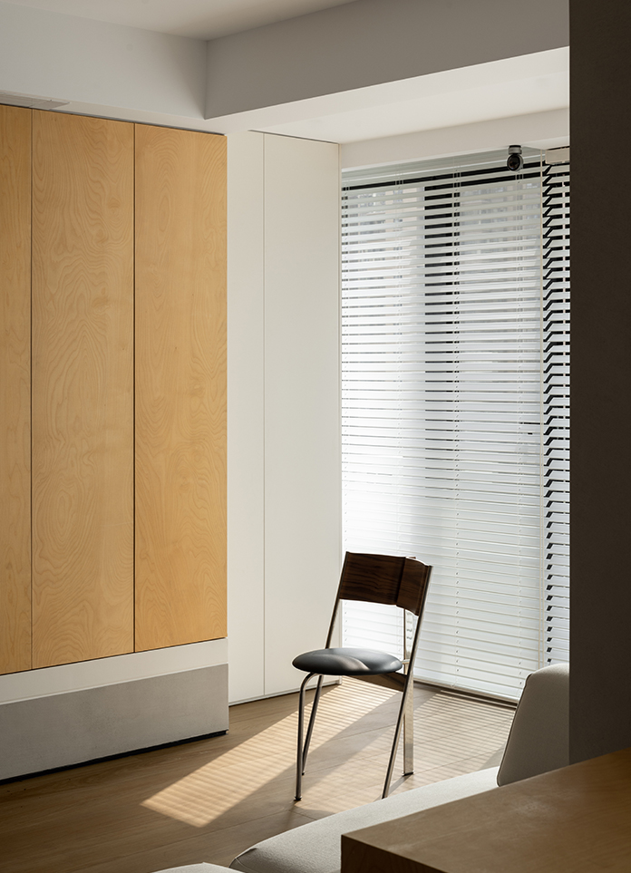
The homeowner left me with a shy and cool first impression. They are professionals in the finance industry and place great importance on taste and ambiance, but do not like complicated designs. Their only request was for the entranceway to have a sense of design, but they did not have specific ideas for other details. Taking into account their extensive foreign travel experience, we chose to combine the "light French" and "Chinese antique" styles for the decoration plan.
The original house was a large flat of 160 square meters but only met the basic living needs. At the same time, the four bedrooms provided far more space than necessary for the couple. After multiple discussions, we ultimately changed the layout to three rooms. While realizing more practical functions, we also aimed to release the potential of the space and its beauty.
During the renovation process, we intentionally enriched the space and paid more attention to the entranceway as the first impression upon entering the home. The entranceway is the first visual impression upon entering and has a crucial impact on the overall aesthetics of the house. It is the key to setting the tone of the home, enriching the spatiality of each area inside and reflecting the homeowner's taste and temperament.
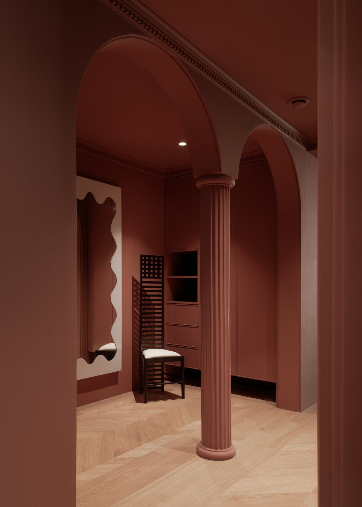
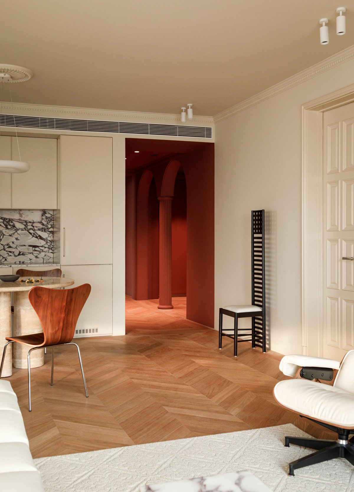
Different colors can bring different feelings to people and even affect their emotions, thereby changing their mood. We used bright red paint to cover the entire entranceway area, creating a strong visual sensation and highlighting it through color contrast. This red design inspiration comes from the auspicious meaning of "opening the door with a red color" and when the door is opened, an elegant retro atmosphere will also be revealed.
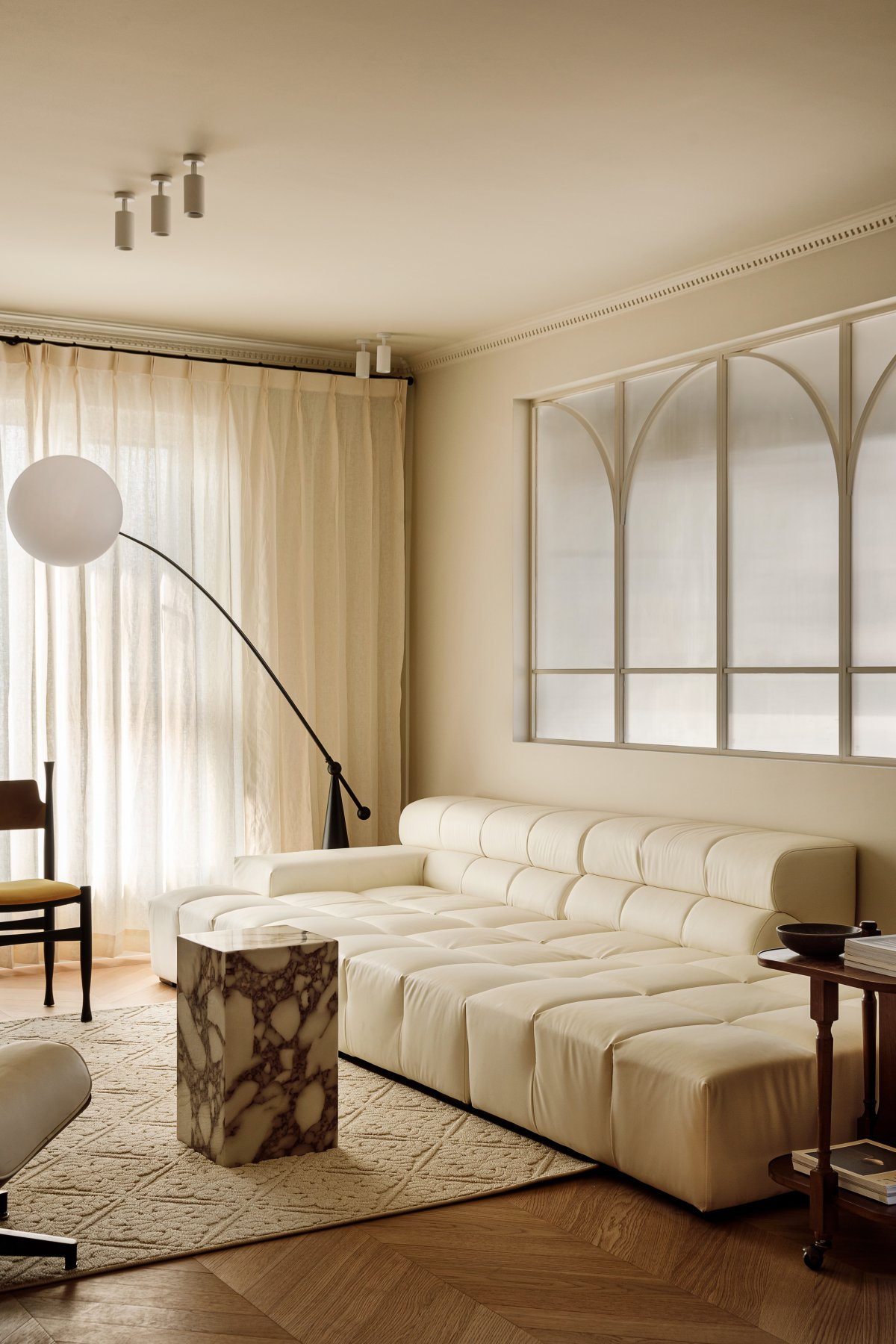
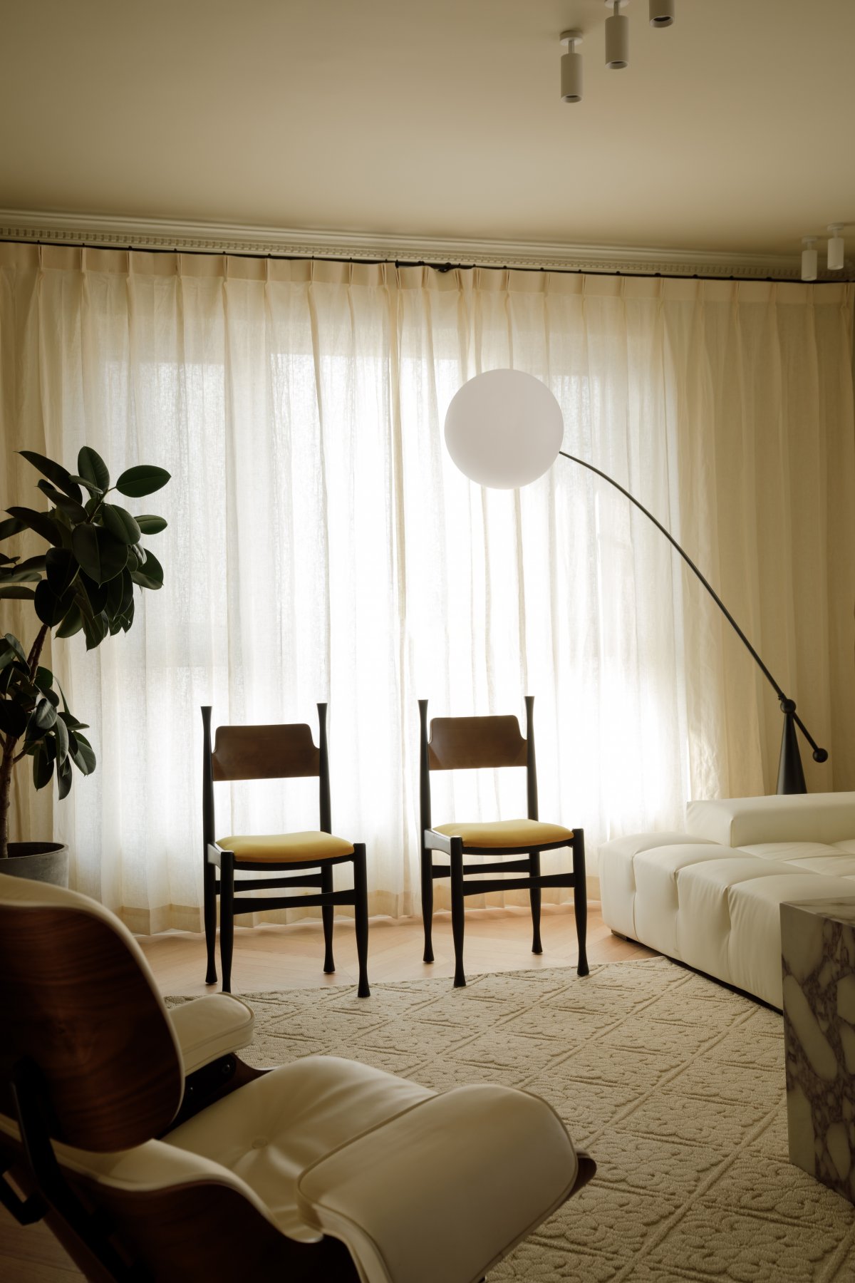
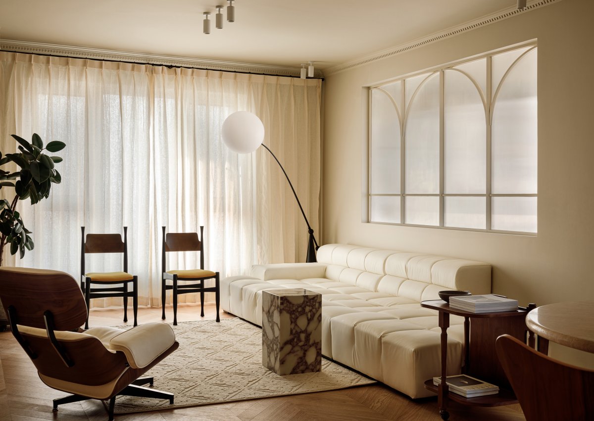
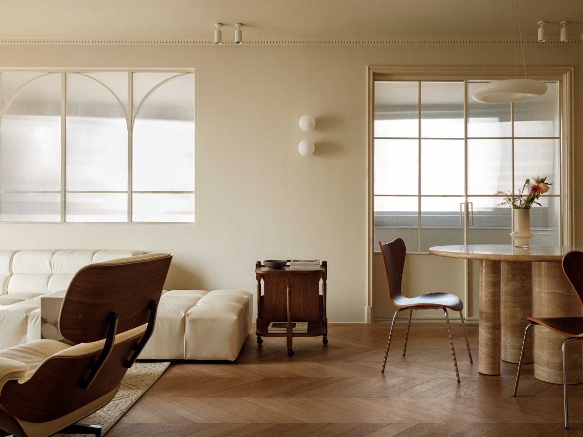
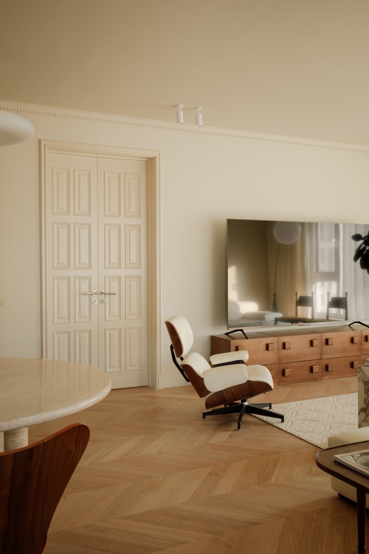
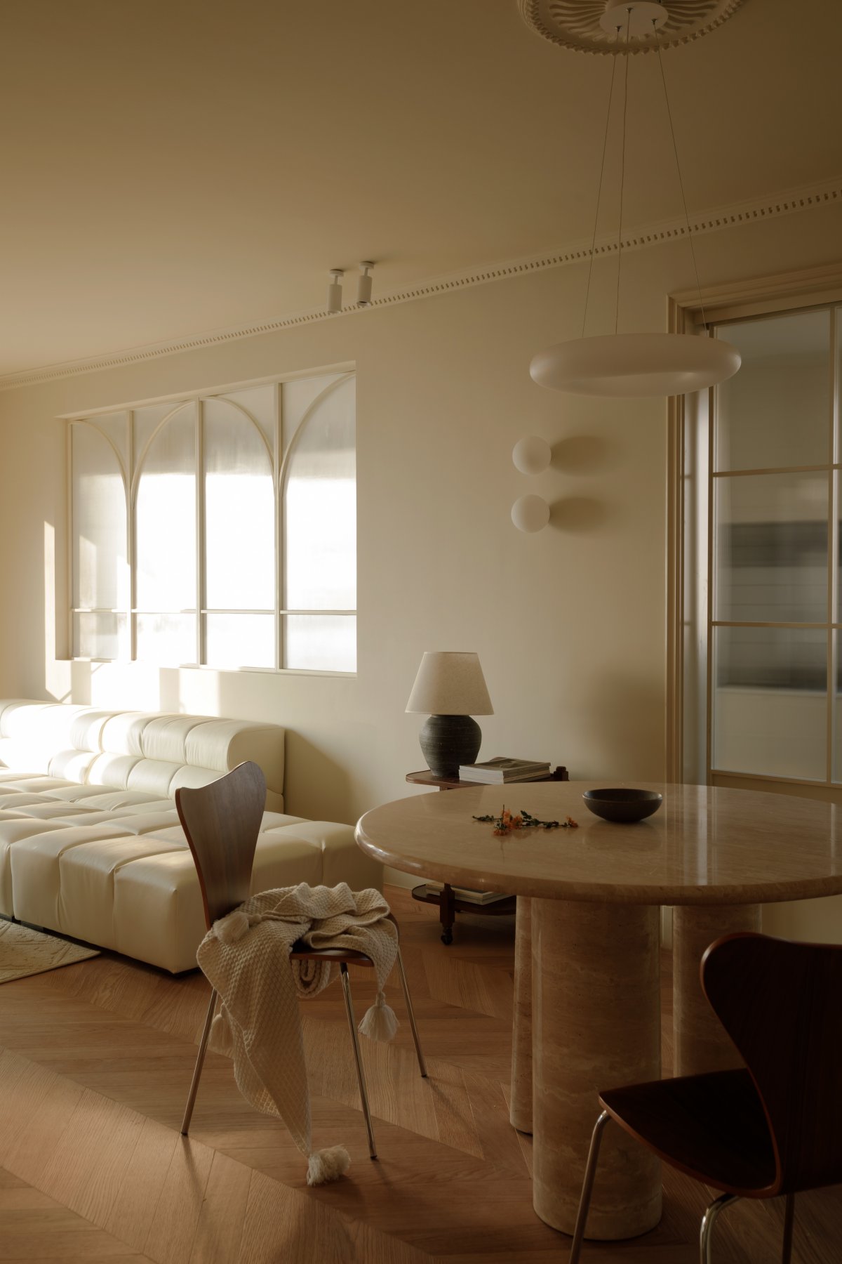
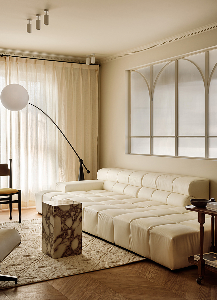
The living room adopts the design style of Chinese antique and light French, with a cream color as the main color tone, accompanied by floor-to-ceiling windows, wooden chairs, French sofas, lounge chairs, and Bulgari stone materials, creating a gentle and quality sense. The two original lighting areas are fully utilized, the original open balcony is enclosed and transformed into a living room area and a closed balcony area, effectively hiding the laundry drying area while maintaining the lighting advantages.
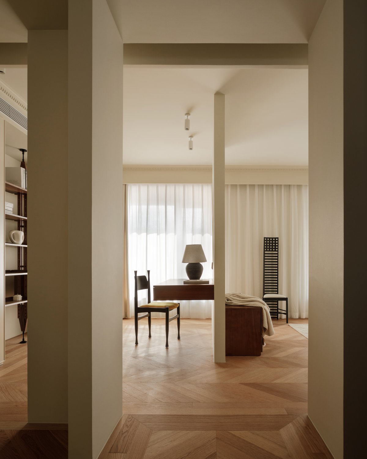
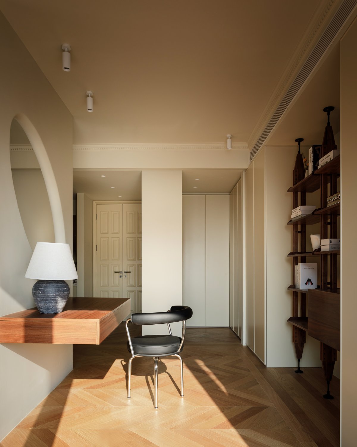
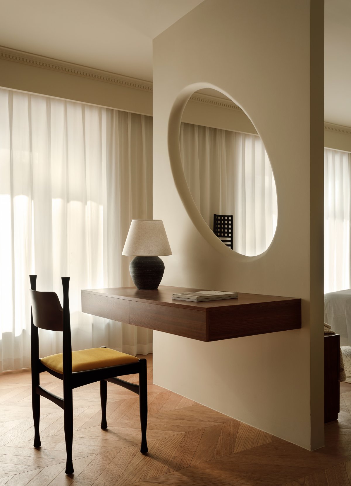
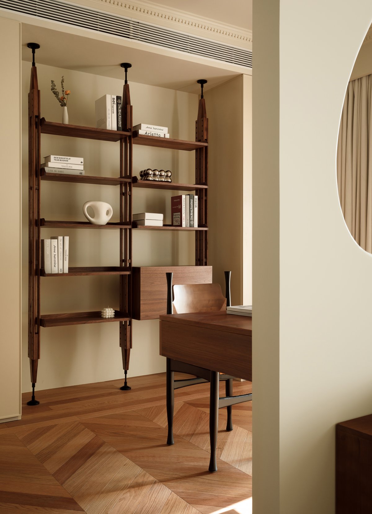
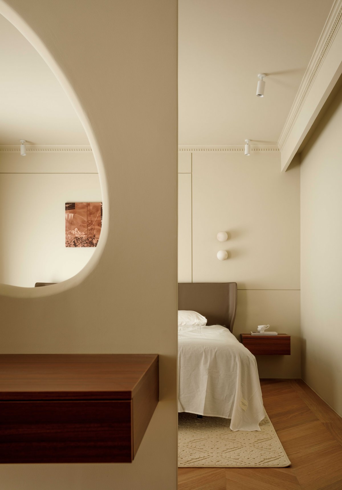
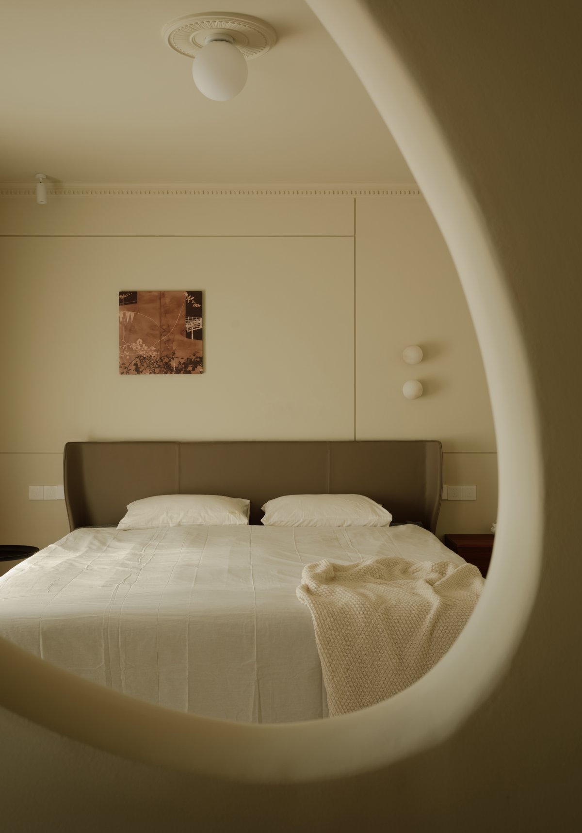
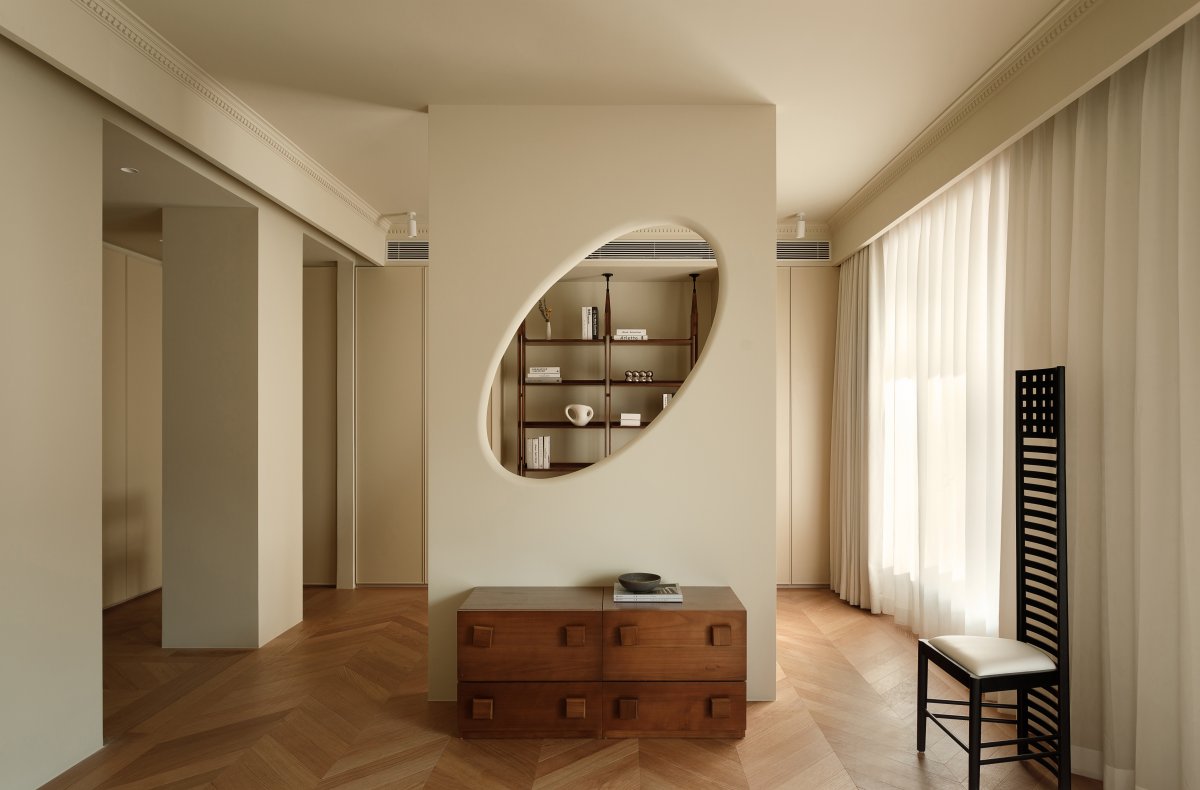
The original master bedroom was too small, so we broke down the wall between the adjacent secondary bedroom, expanded the new master bedroom area, and also designed an interesting "room within a room" to solve the functional division problem. Through the hollow wall design, the rest area and activity area are both independent and unified, convenient for communication and interaction, while also displaying the homeowner's collection. The new master bedroom uses warm white and cream as the main color tones, with simple gypsum lines as decoration, and two floating windows provide ample lighting. In the rest area, Chinese antique furniture is paired with a minimalist Italian bed and lighting to create a private and comfortable resting space.
- Interiors: WenJun Space Design
- Photos: Li Ming

