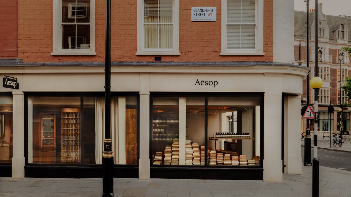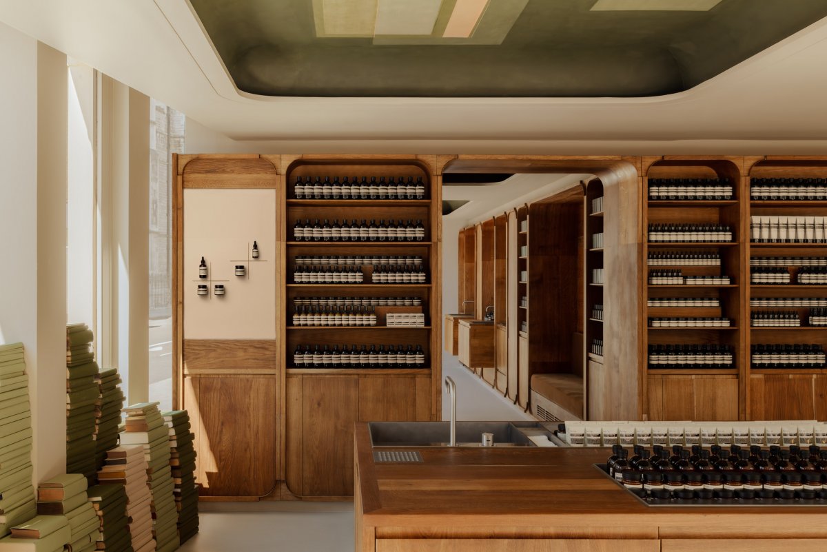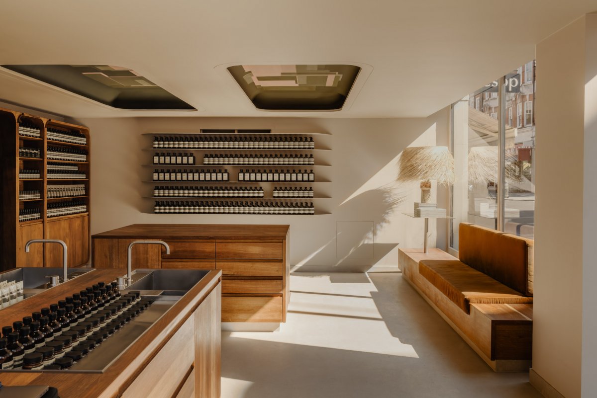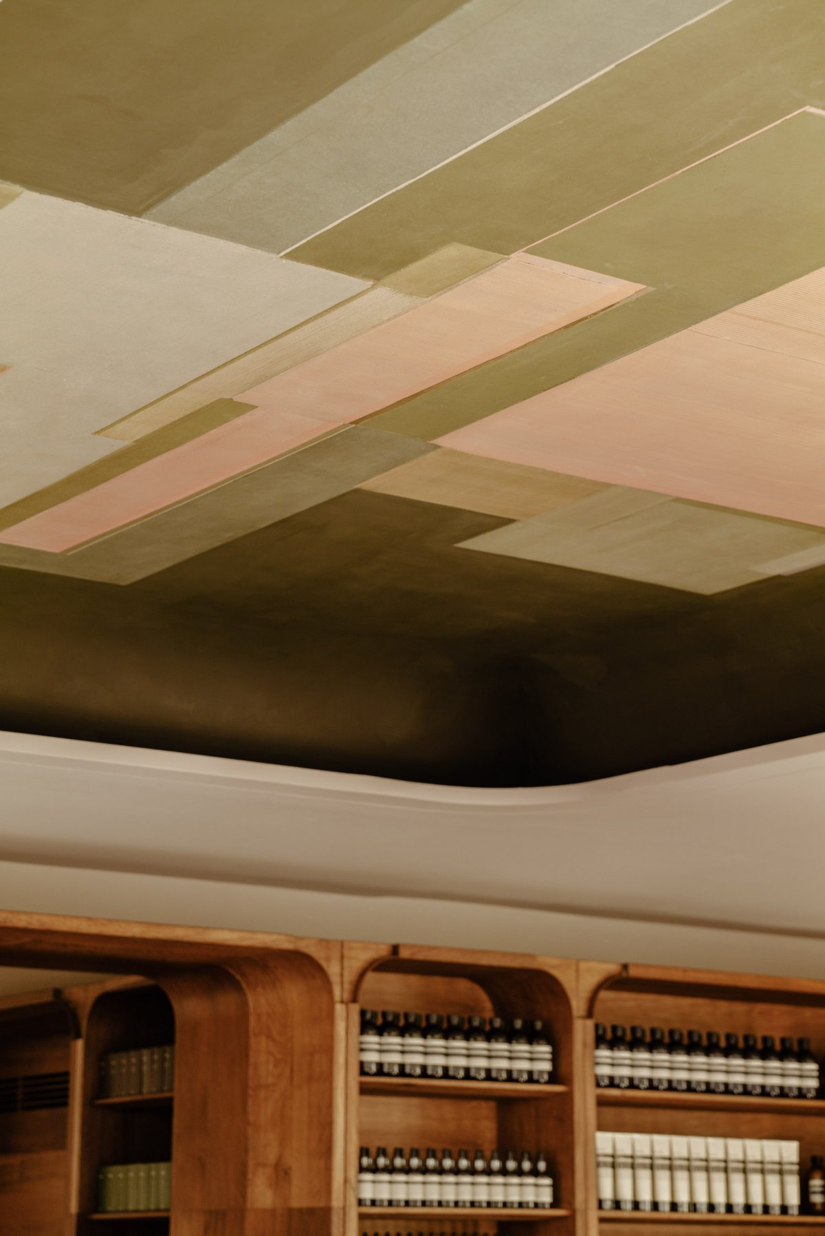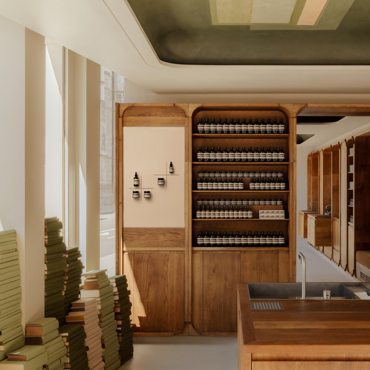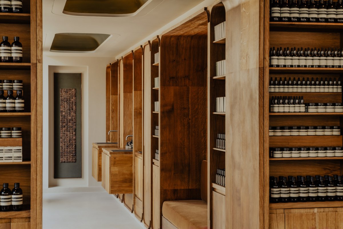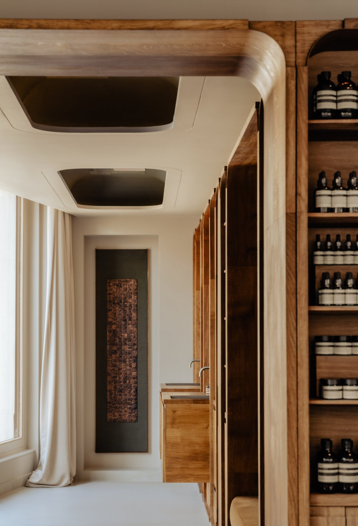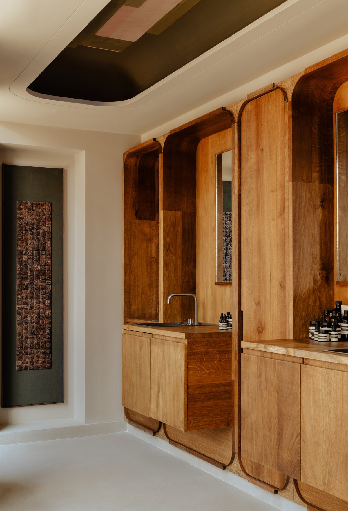
The interior of London's most recent Aesop store in Marylebone was organised to reference a bookshop and features bespoke timber cabinetry by furniture designer Sebastian Cox. Skincare brand Aesop's in-house design team created the concept for the Marylebone store, which recently relocated from its original home in the London neighbourhood to Marylebone High Street.
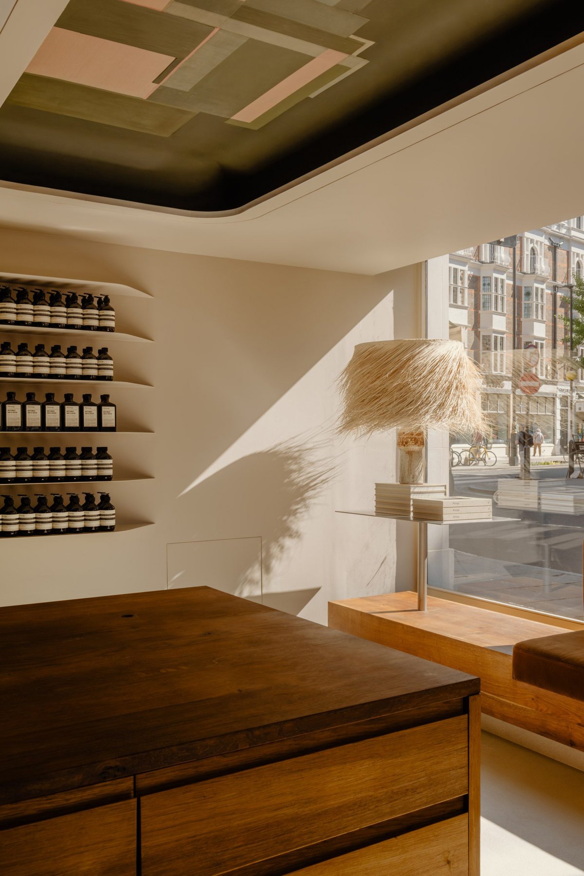
The team took "material references" from the British Library on Euston Road and attempted to emulate the layout of traditional bookshops by choosing warm timbers and towering piles of pale green books to decorate the interior. Divided into a main shop and an area for personal skin consultations, the L-shaped store features handmade cabinetry by Cox throughout. The shelving is defined by gently rounded edges, which Cox crafted from lime-washed oak and stained with linseed oil to enhance the timber's warm appearance.
Cousy was informed by Marylebone's many green squares when painting the designs, which are geometric arrangements of autumnal colours – compositions that take cues from expressionist artist Paul Klee's 1922 work Tower in Orange and Green.
"Architecturally, our design method is to connect to the context of the locale, weaving ourselves into its fabric," said Aesop chief customer officer Suzanne Santos.
- Interiors: Aesop Design
- Photos: Alixe Lay

