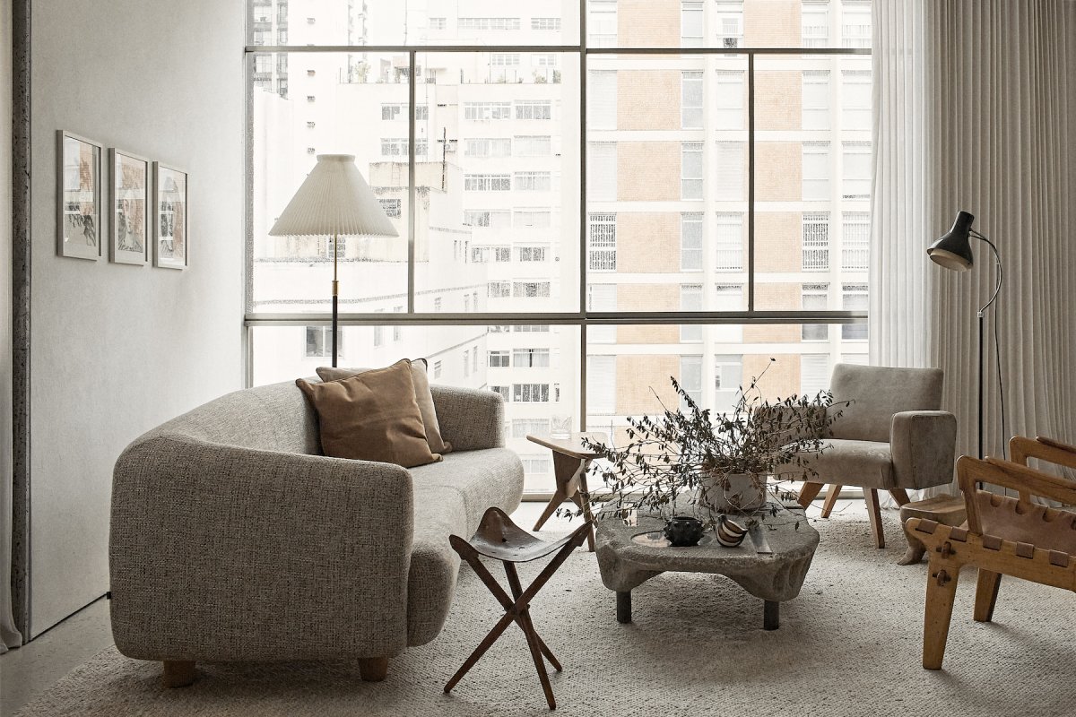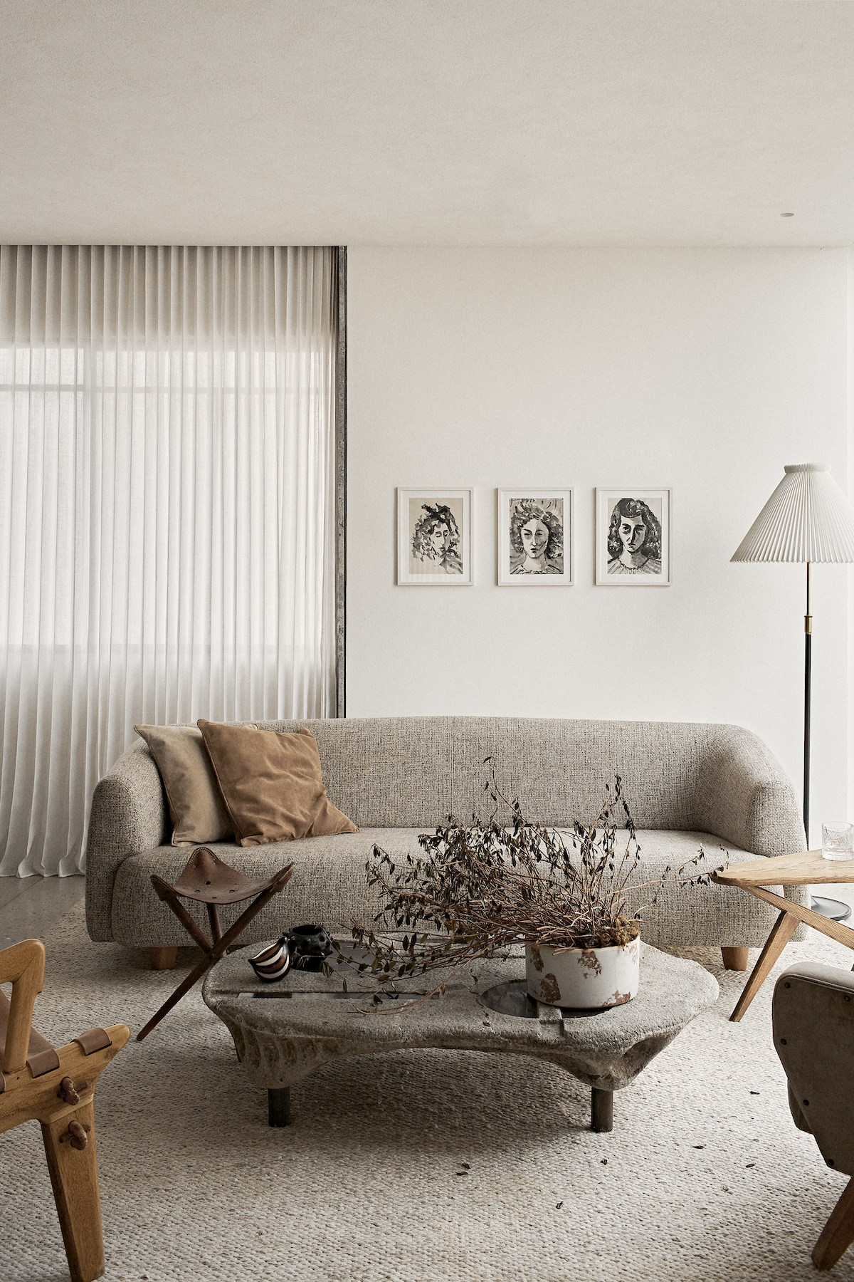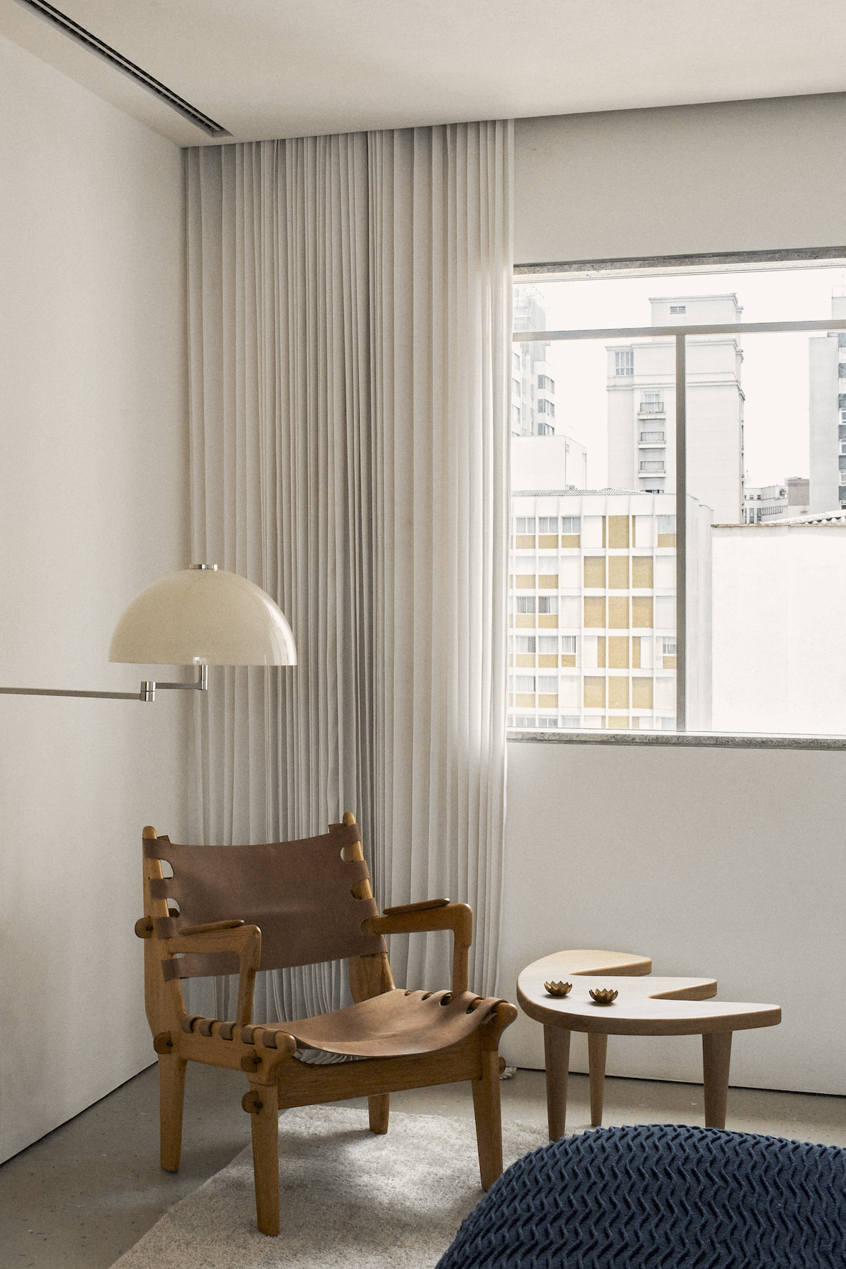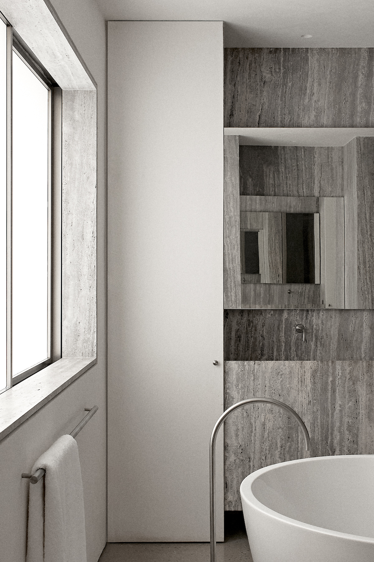
This spacious apartment from the '60s in the hyped neighborhood of Jardins in São Paulo had an outdated and fragmented plan that did not meet the client's contemporary needs. The successful yet young 27-year-old attorney asked Atelier Peclat&Chow to create generous spaces to accommodate his busy social life.
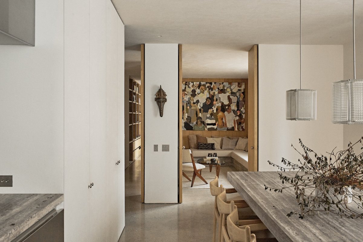
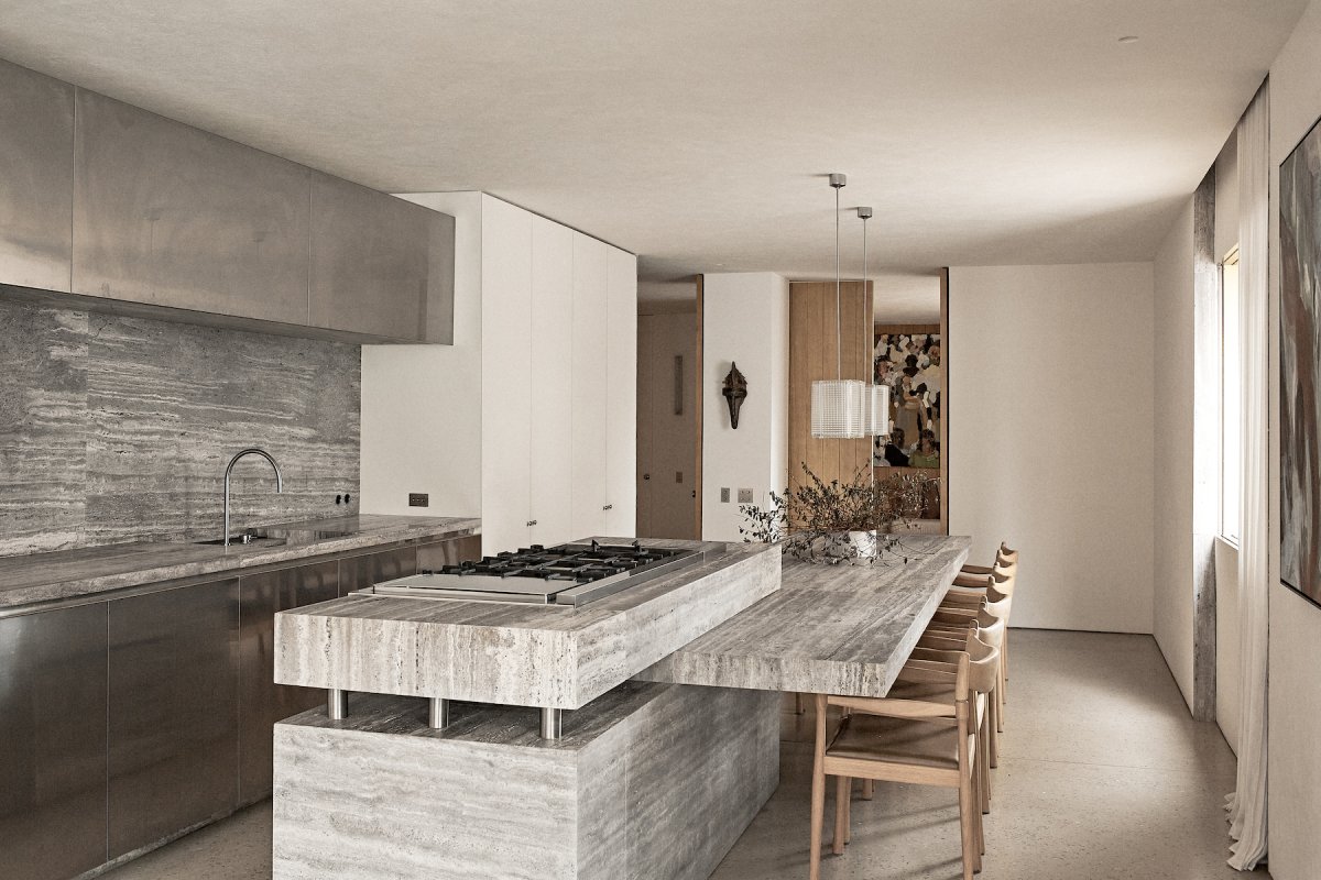
At that instant, it became clear that the design team should position the kitchen — the fire element — due to all the cultural and symbolic meaning it carries as the central point of the social area. By doing that, they instituted a relationship analogous to the spatial structure of some early peoples' constructions, where the fire most often acted as the central point of gatherings.
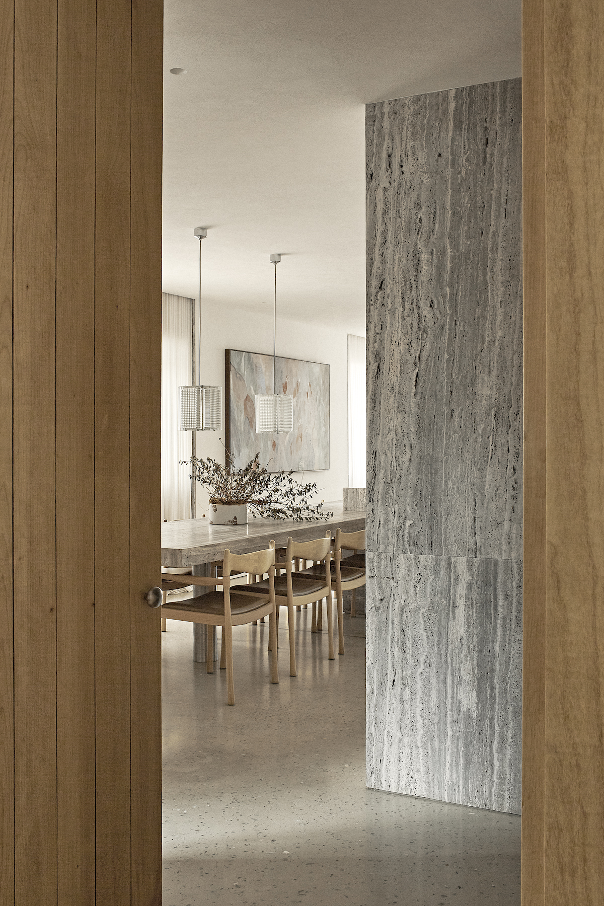
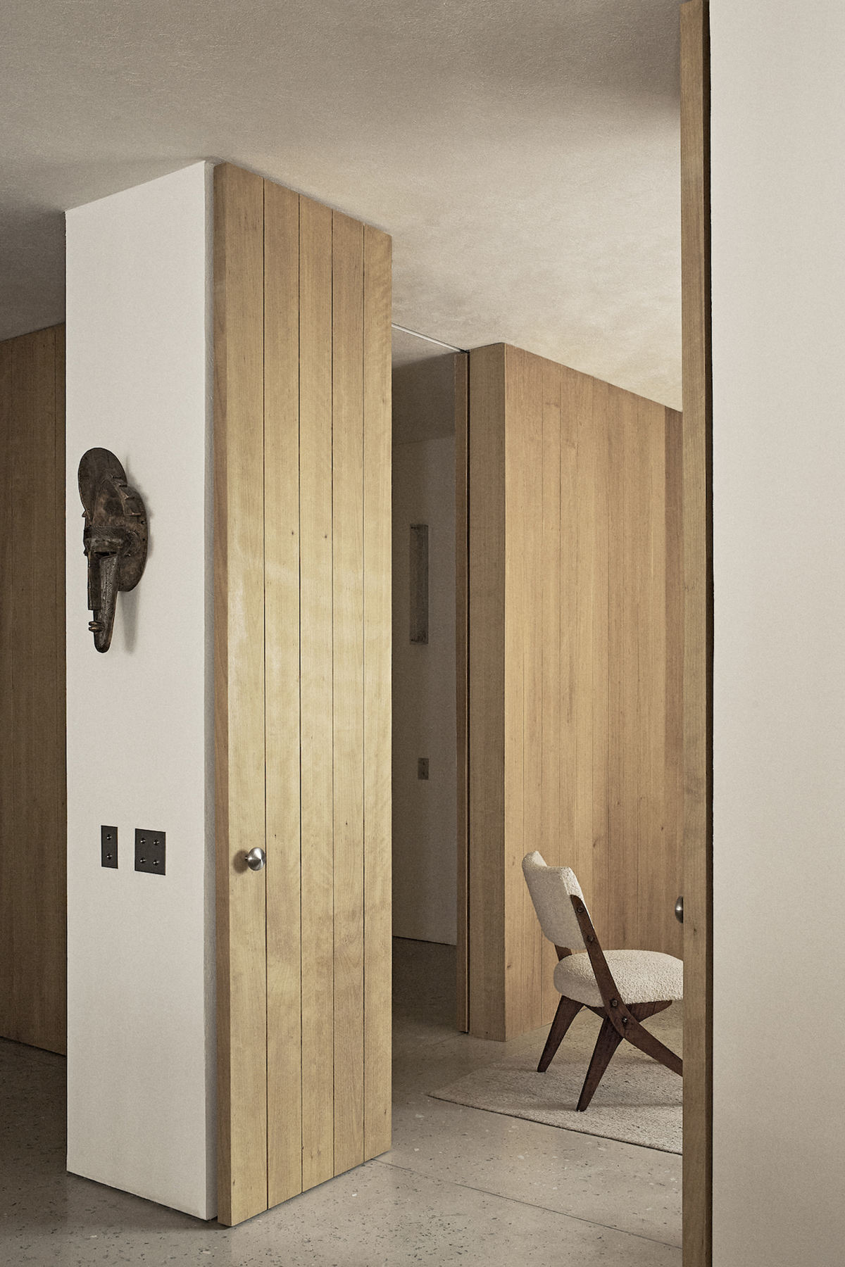
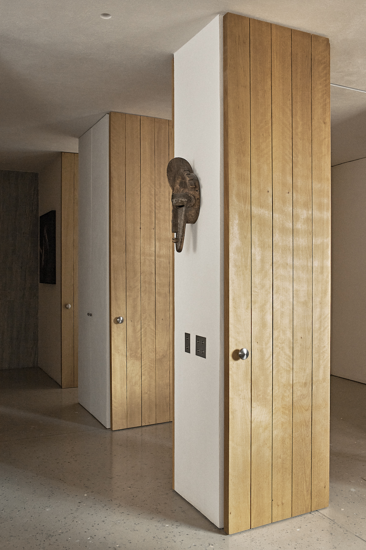
To an observant eye, the apartment has a subtle, almost invisible, hierarchy. Its unity is divided into three sections; the social, the semi-social, and the intimate. The two large and detached monolithic masonry volumes, remnants of ancient ruins, organize and outline this discreet hierarchy by creating three different passages to the semi-social areas.
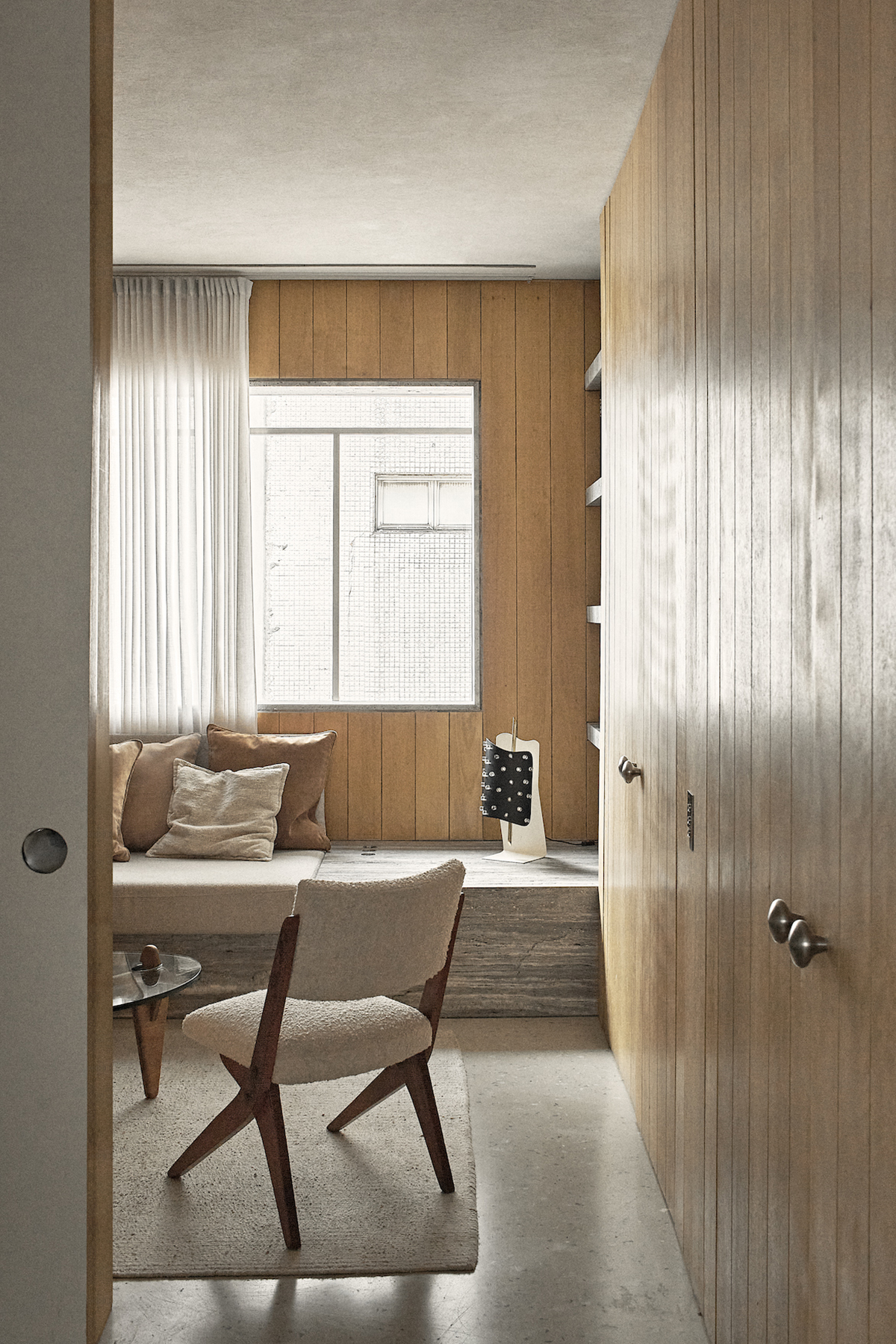
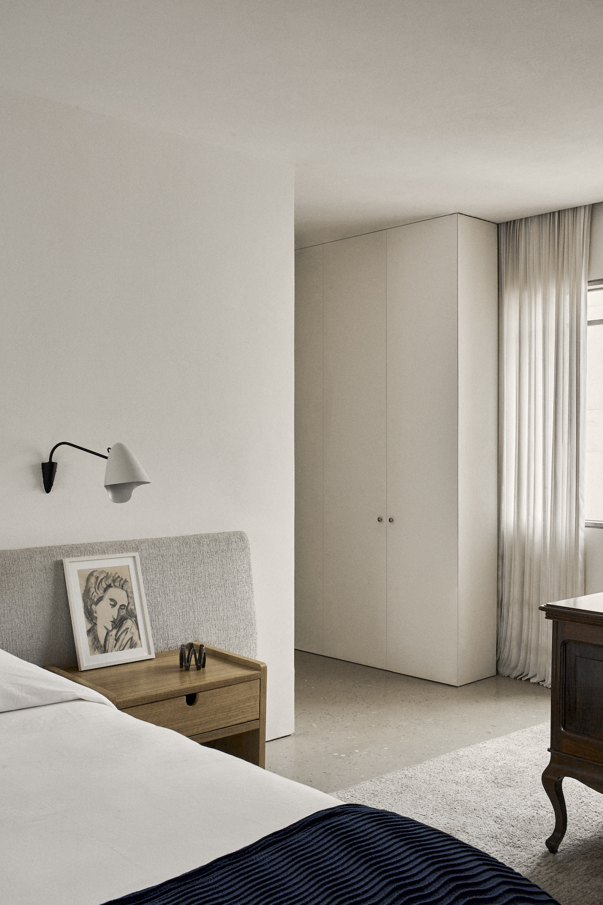
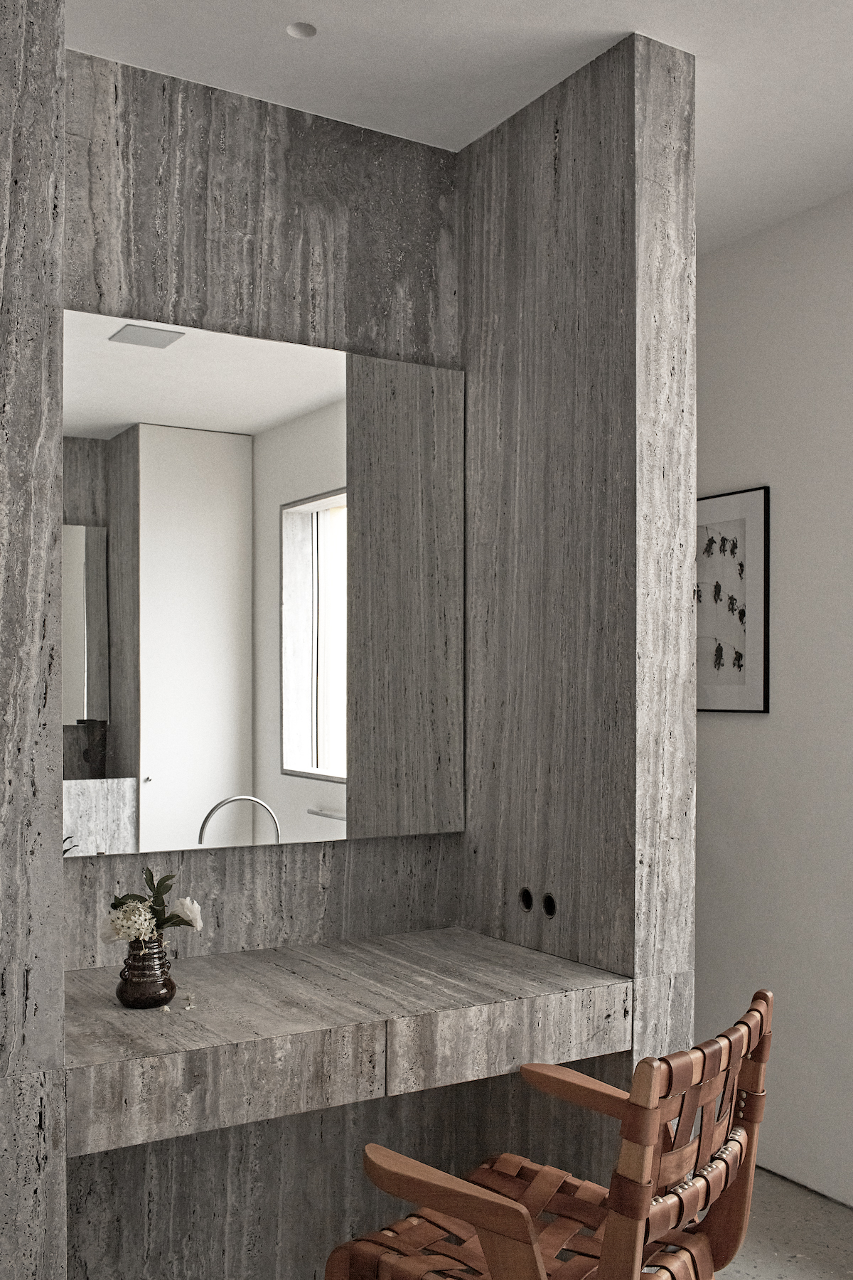
At the far end, in the most intimate region of the apartment, one finds a generous ensuite with a bathroom and a large walk-in closet. At the other end, the living room, very well-lit by its floor-to-ceiling window, is connected directly to the communal space. In contrast, the family room has a double door, which allows the metamorphosis of its purpose, at times acting as an extension of the social area, connected to the dining room, and, sometimes, intimately isolated.
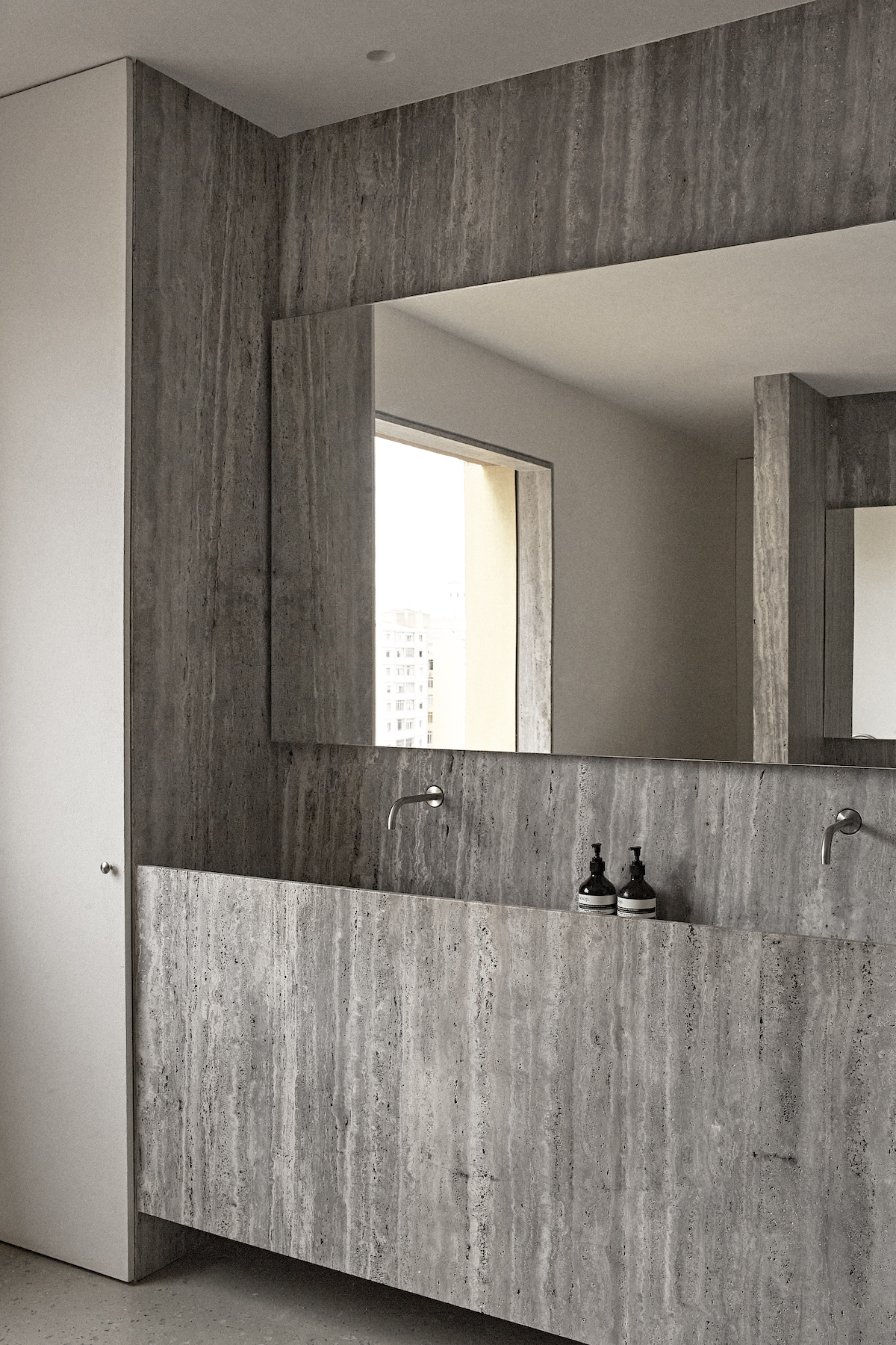
The meticulous selection and implementation of natural materials in their purest state throughout the space reinforces the monastic character of the apartment. The choice of a predominantly mineral material palette allowed us to work with three different textures and shades of gray. On the monolithic floor — made with stone powder and crystals — we opted for a slightly satin finish with a warmer tone. While the Silver Travertine used for the countertops and as cladding for some specific walls, along with the stainless steel that punctuates some elements, has a more neutral tone. To balance this atmosphere composed of a thoughtful variation of grayish shades and textures, we used panels and doors made of solid Catuaba wood and tactile natural fabrics in warm hues.
- Interiors: Atelier PECLAT
- Photos: Atelier PECLAT

