In the bustling urban life, we often yearn to find a tranquil corner for our souls to rest. Suzhou, a city known as "paradise on earth," is famous for its unique Jiangnan water town scenery, profound cultural heritage, and thriving modern economy. "INSPACE" also carries the pursuit of a beautiful life. The integration of the two not only reflects the inheritance and development of regional culture but also showcases the innovation and heritage of design concepts.
The architectural master Ludwig Mies van der Rohe once said, "Less is more," perfectly interpreting the core philosophy of design. By removing unnecessary decorations and elements, we allow the space to return to its essence, enabling people to focus more on enjoying the beauty of life.
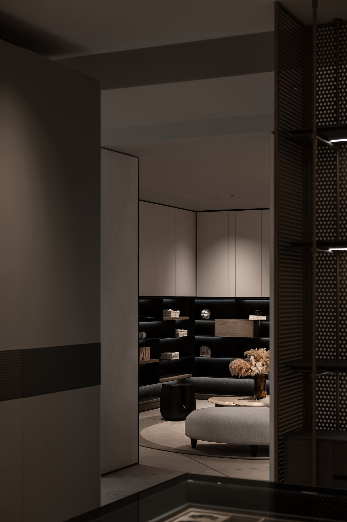
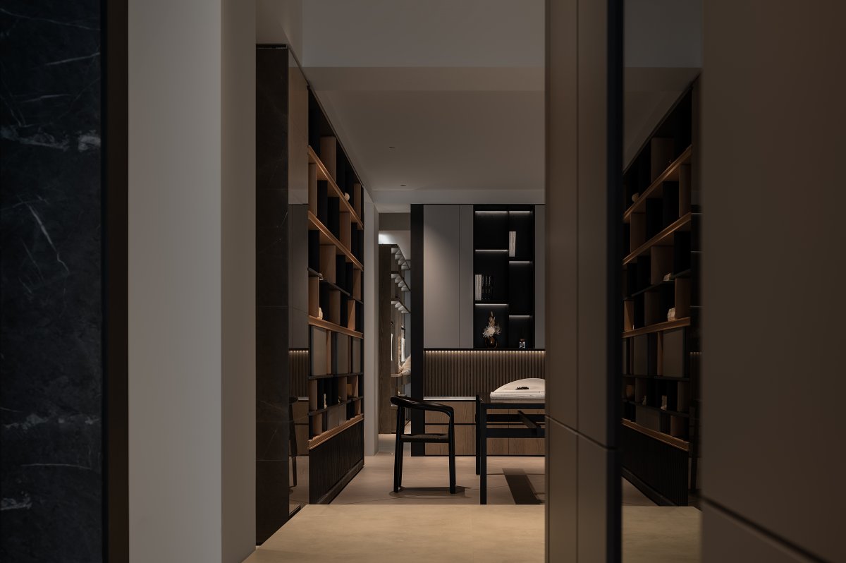
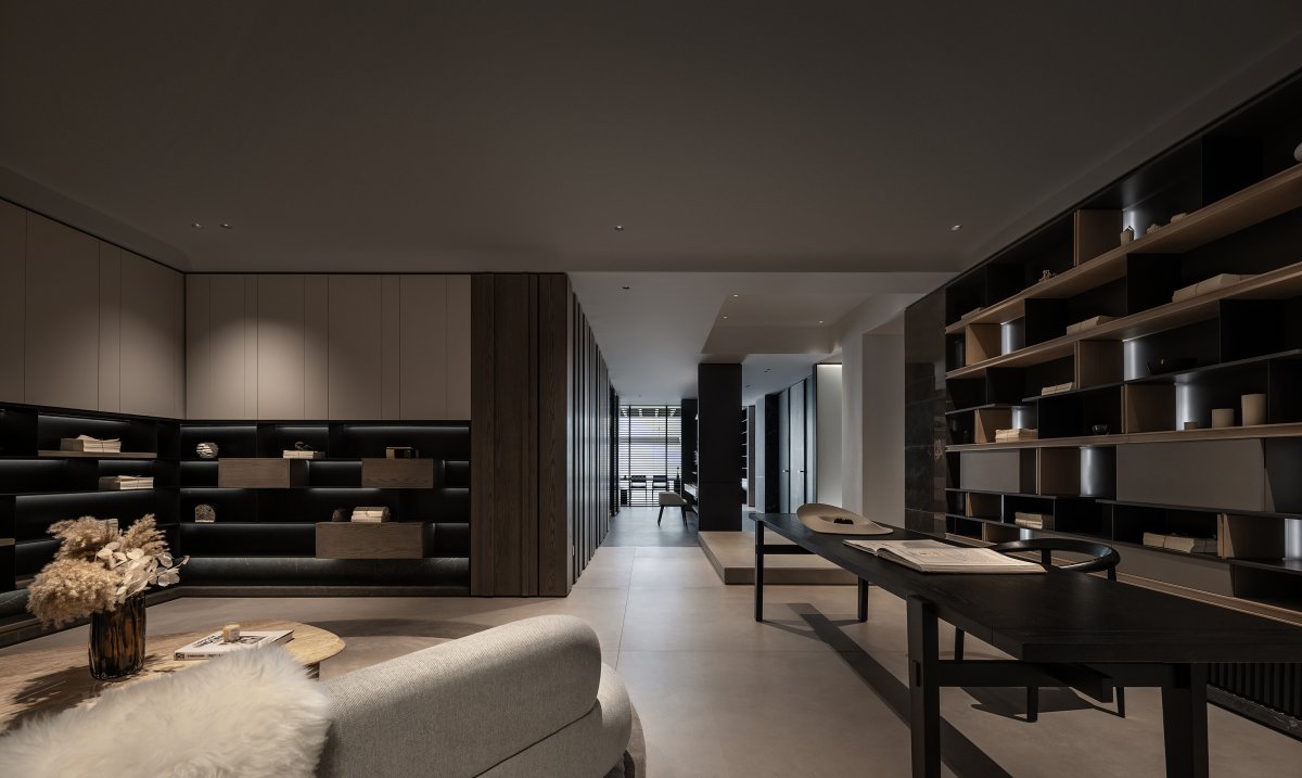
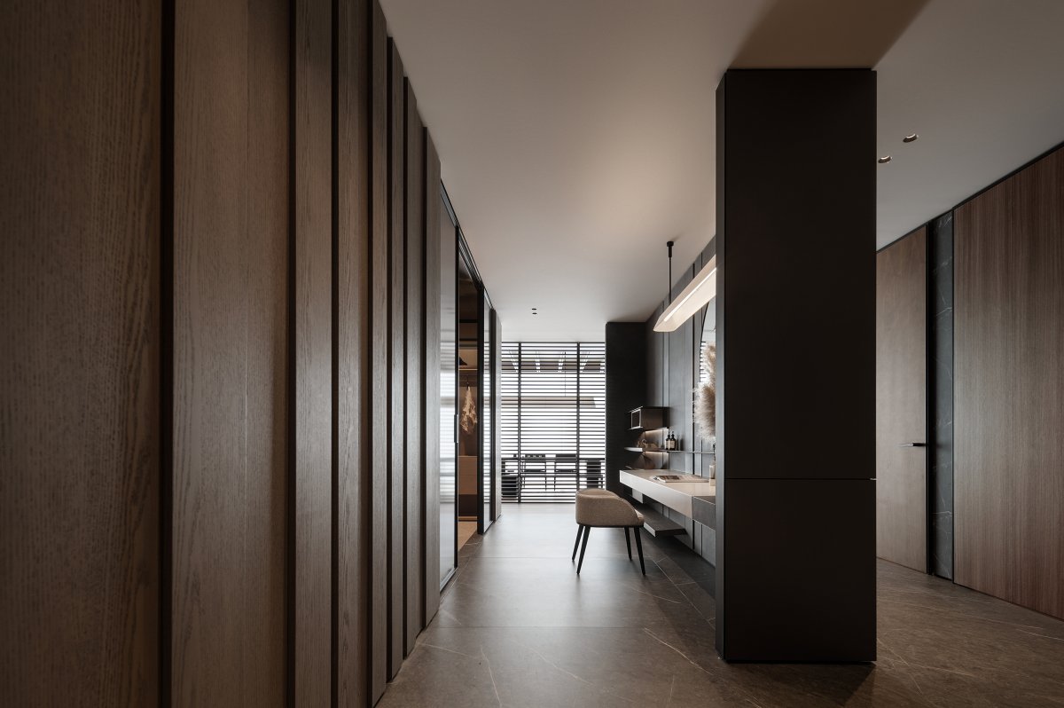
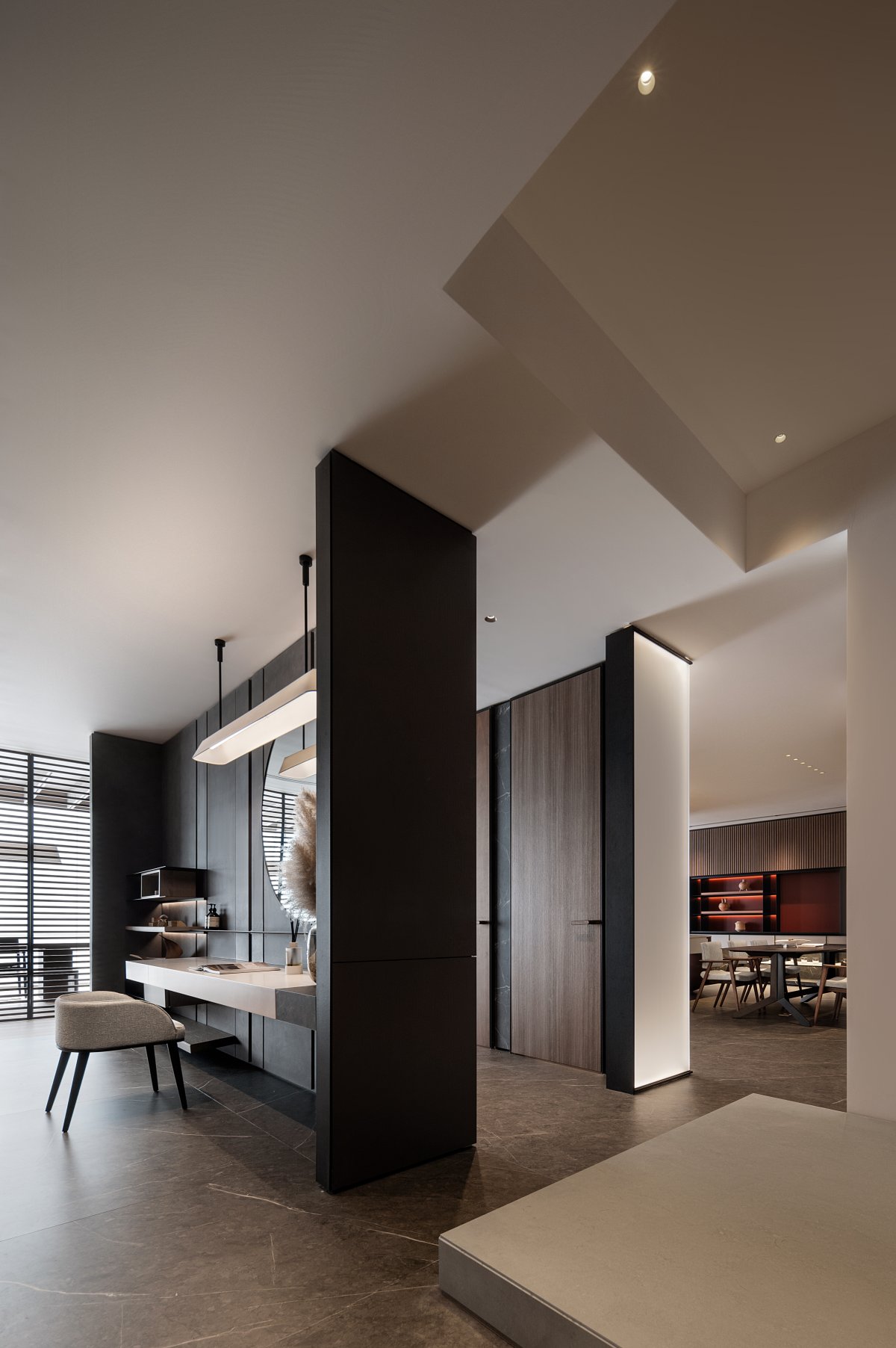
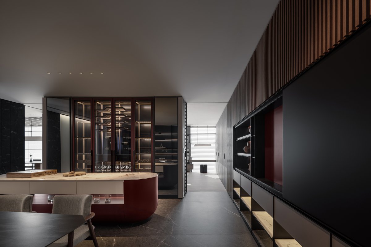
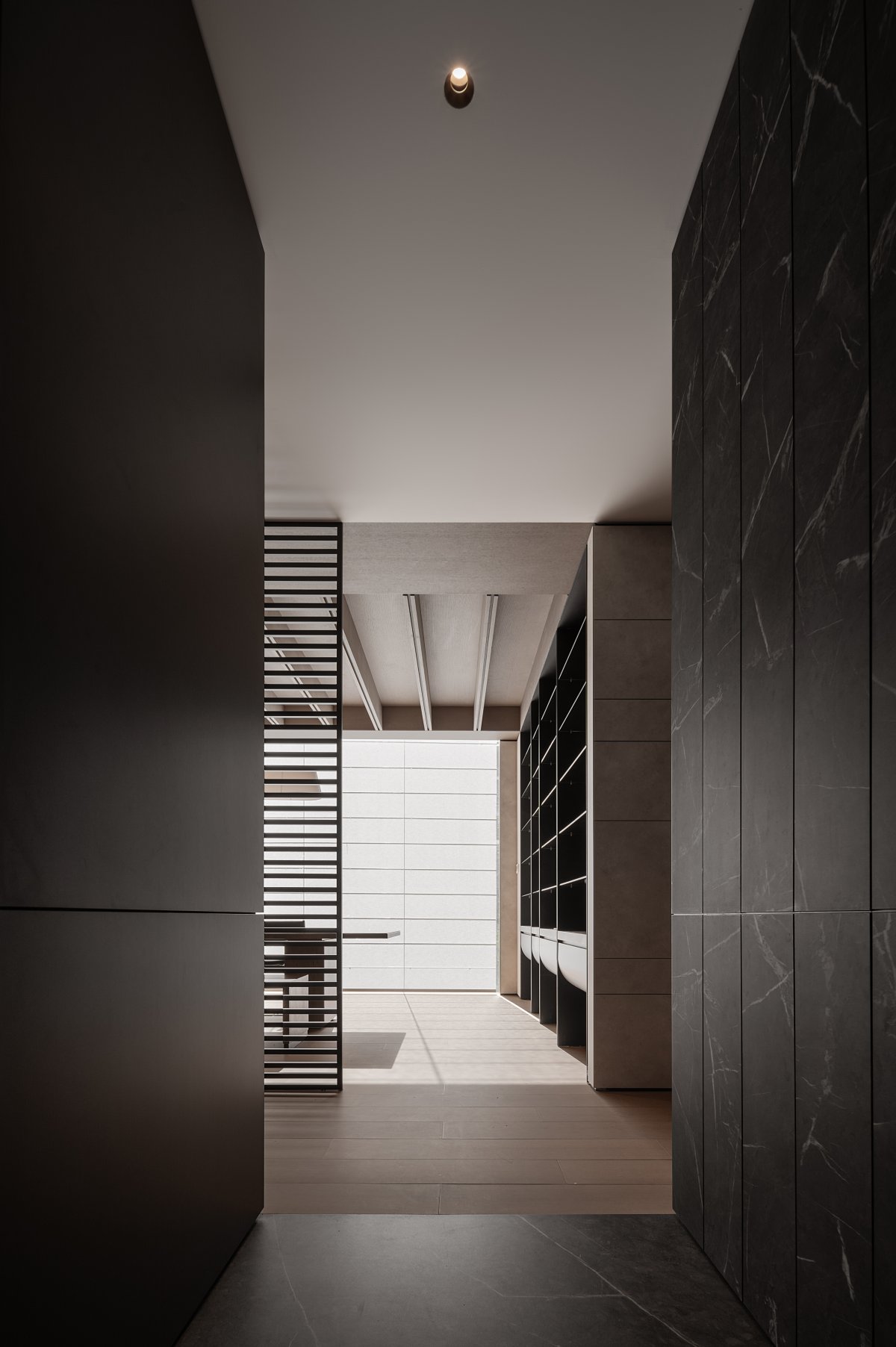
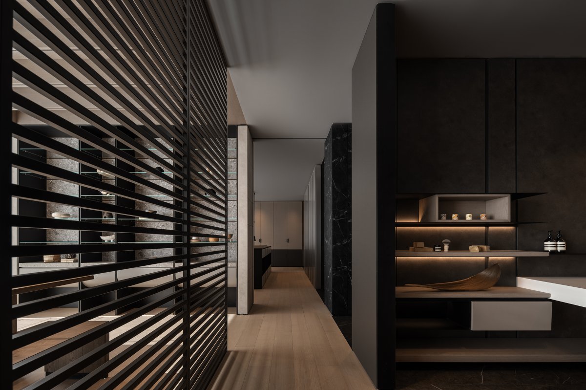
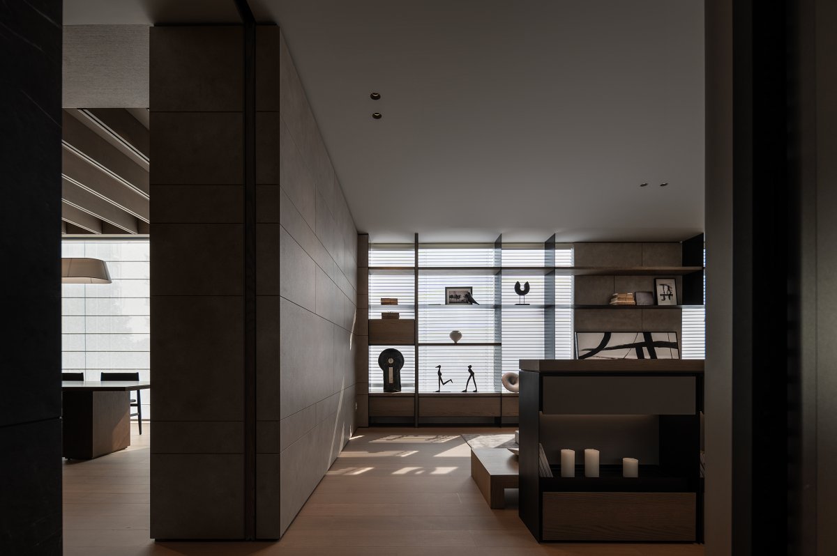
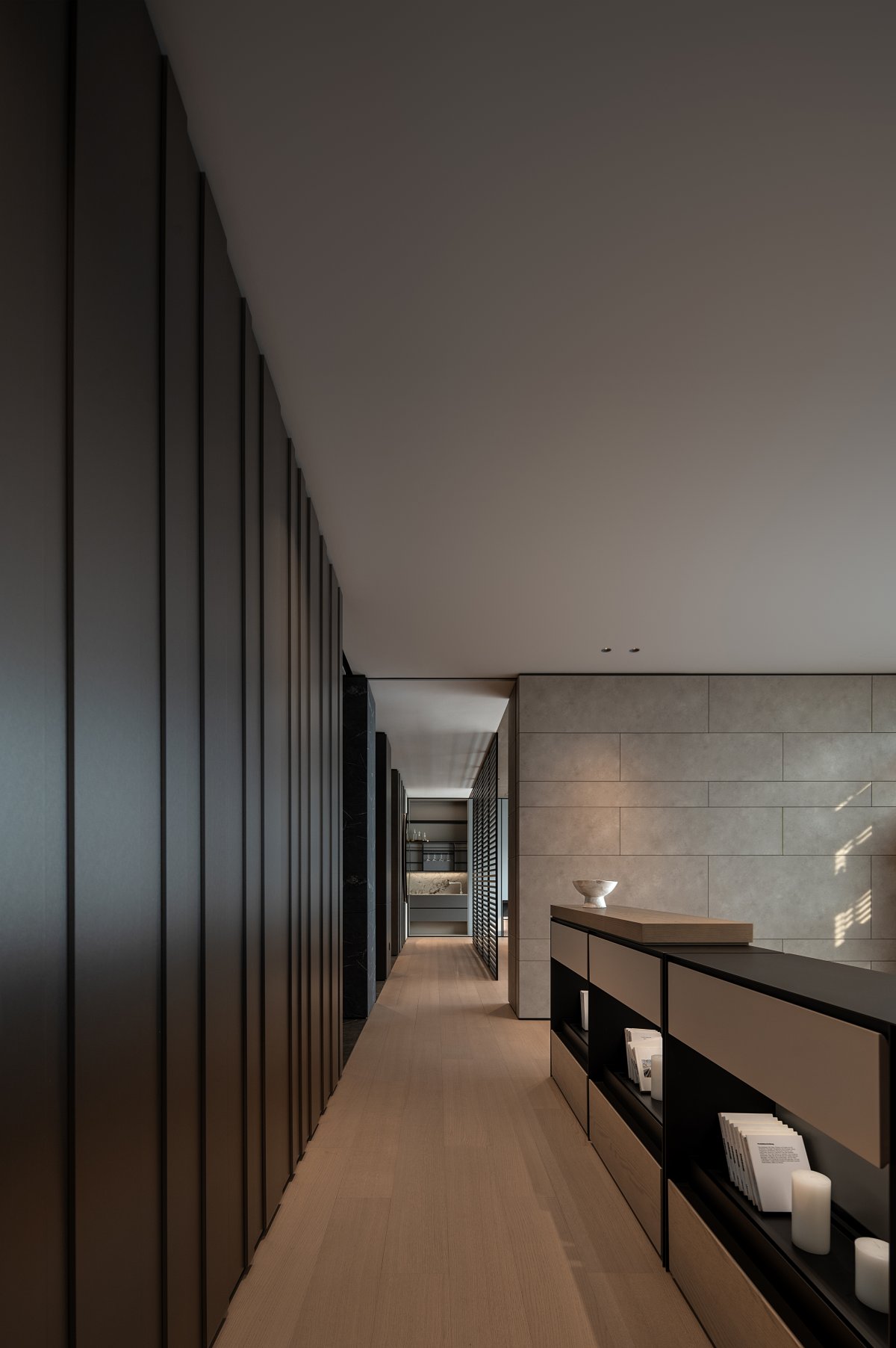
The rational use of space enhances its practical functionality. The refinement of natural materials and the marks of time endow the space with a unique sense of layering and exploration. Passing through a long corridor, the rhythm of movement subtly changes, achieving a more ideal balance of movement and stillness within the dwelling, and creating a sense of spatial extension on different dimensions.
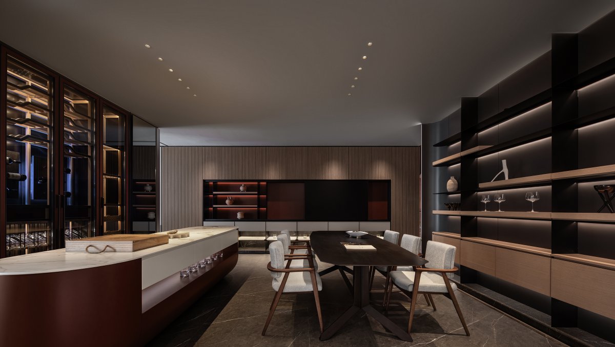
Space is a container, and what the exhibition hall contains are products and people. The essence of space always converges to one point, connected by countless hidden sub-lines. Creating opportunities for random pauses allows visitors to spend more time and attention, enabling a deeper understanding of the brand.
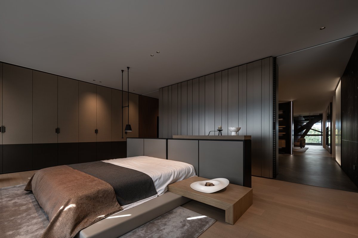
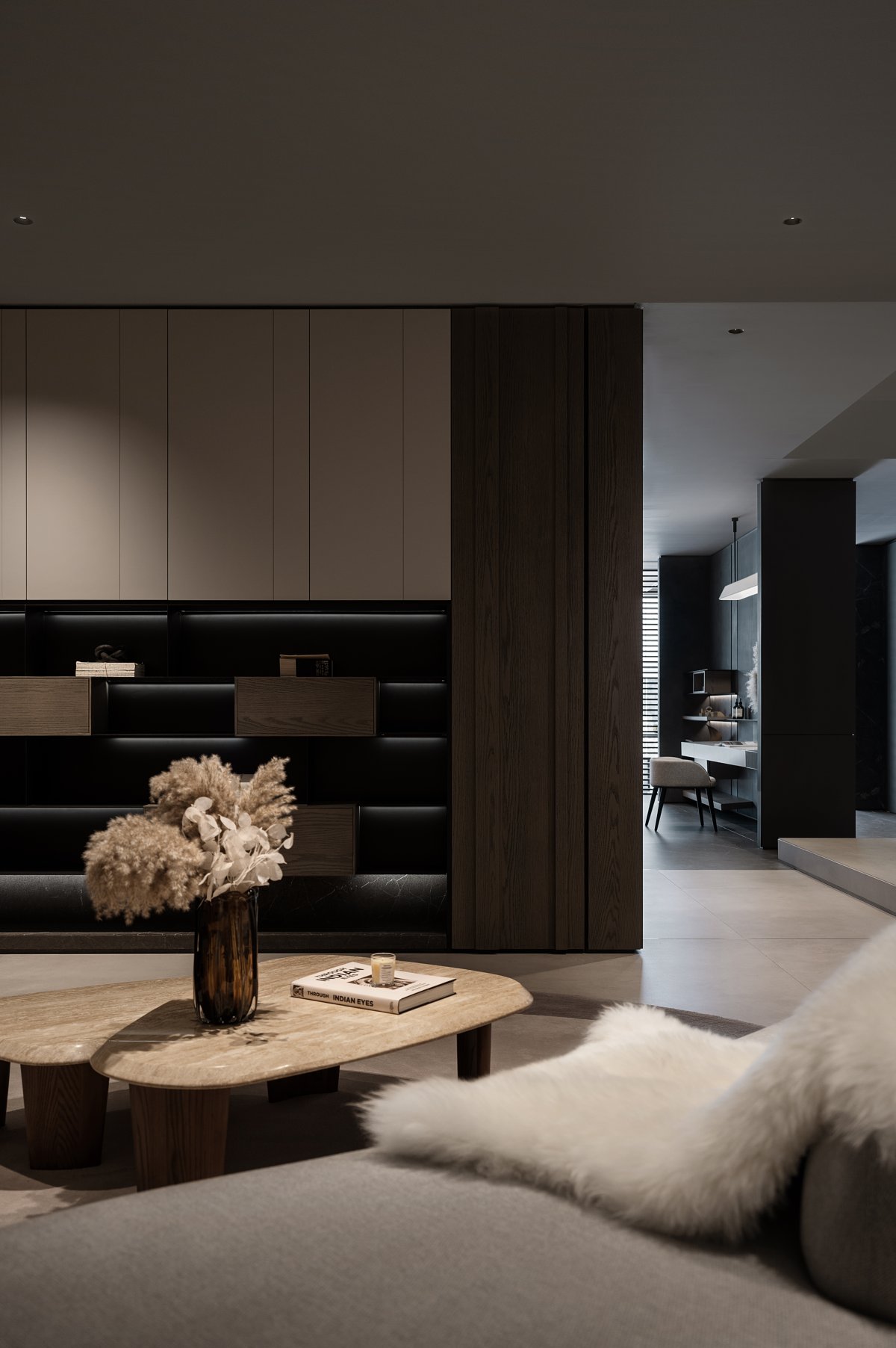
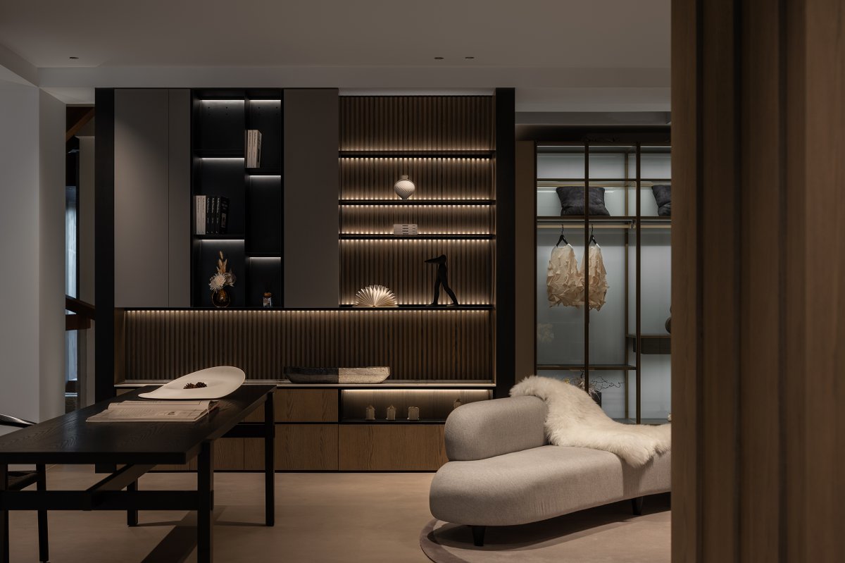
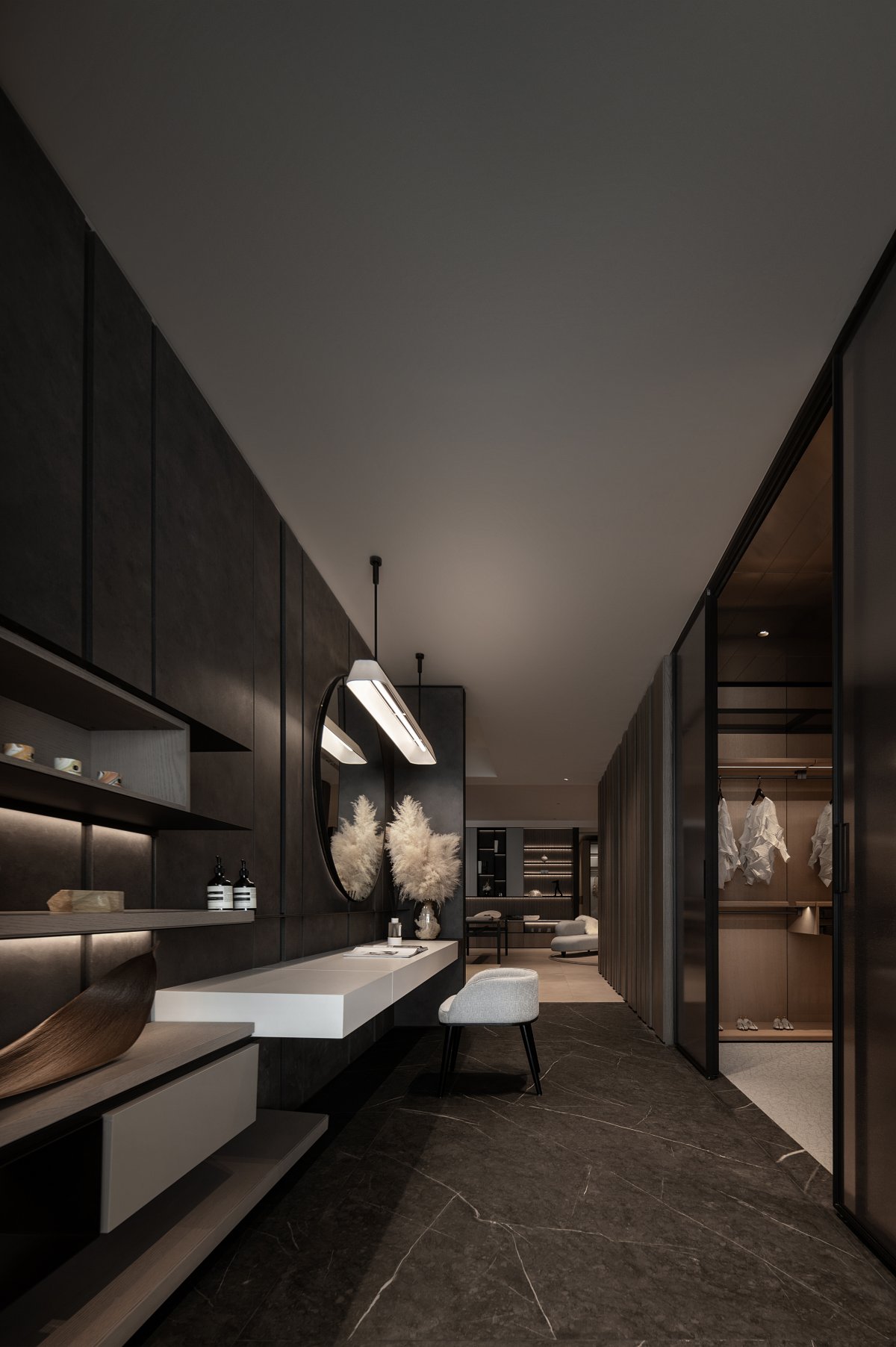
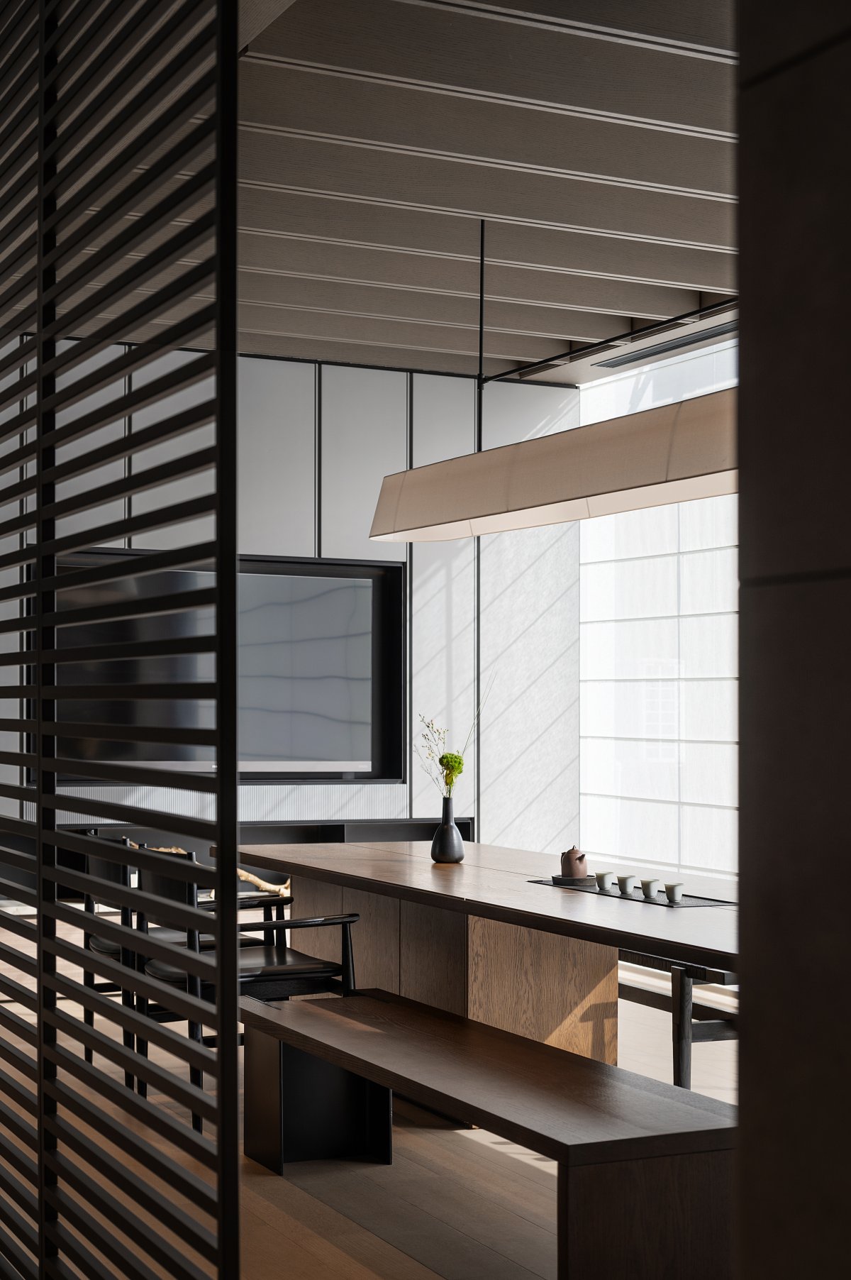
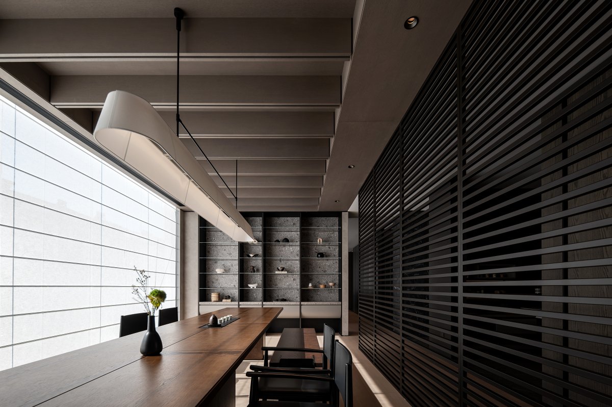
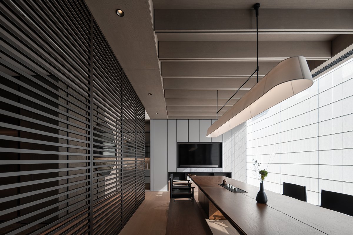
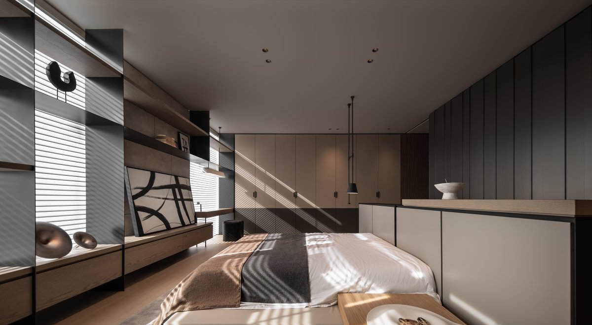
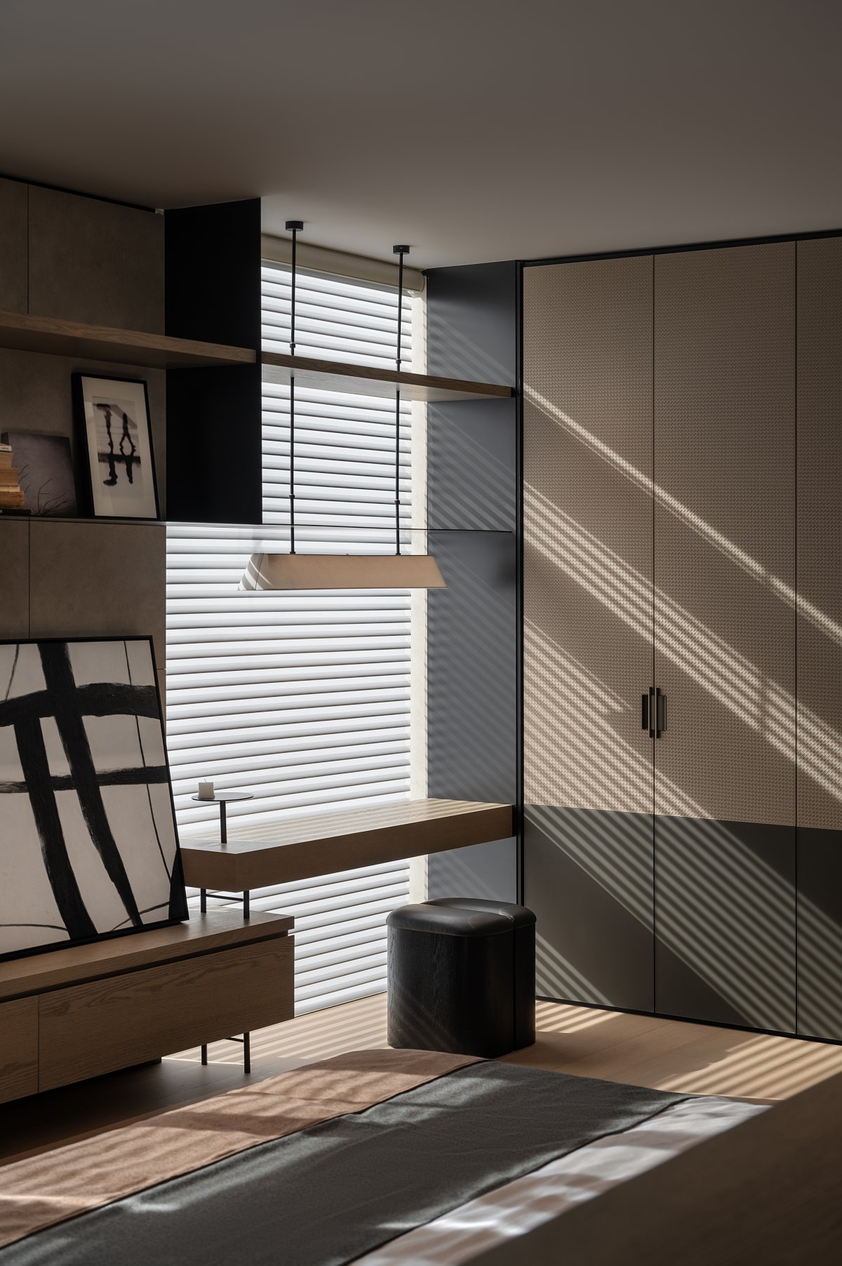
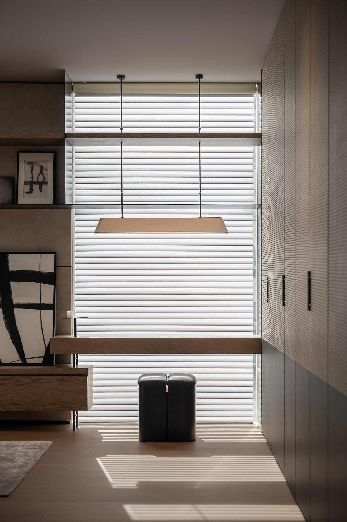
Light and shadow are the souls of space, gently brushing over wooden floors, weaving through the gaps in furniture. The interplay of these lights and shadows brings layers and depth to the home space, making every inch alive and vibrant.
The vertical stripes on the walls not only stretch the sense of space but also add a modern touch. With simple lines and colors, a minimalist yet sophisticated living space is created.
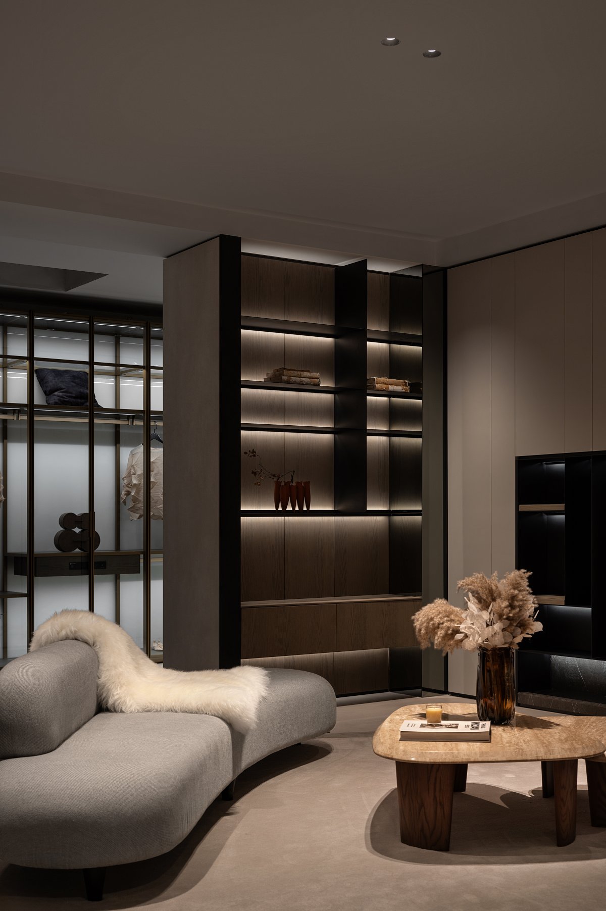
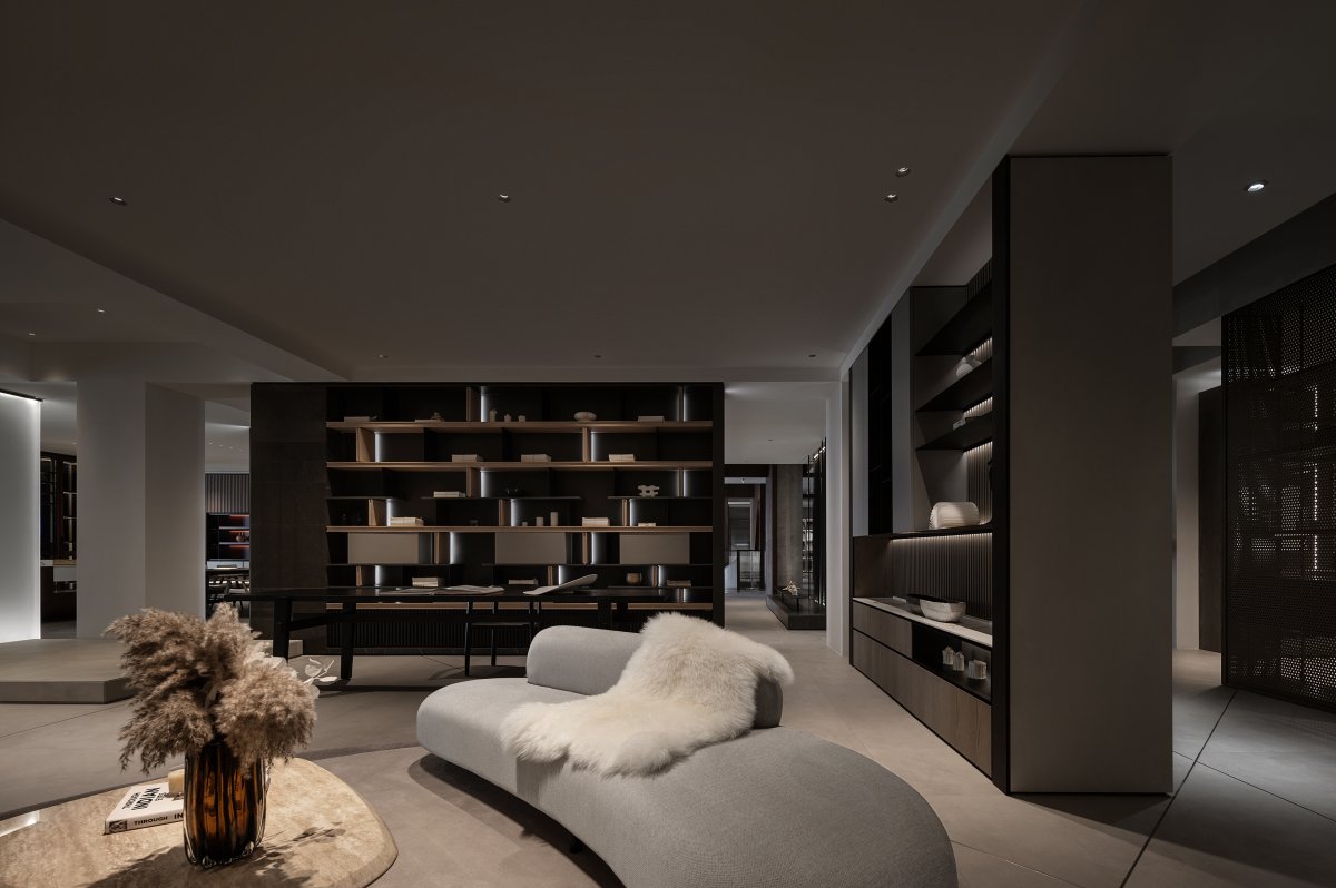
The living room is an open main social space, bearing the functions of relaxation and gathering. It is a place to share beautiful moments with friends, where the freedom of scale and flexible layout facilitate a more relaxed atmosphere.
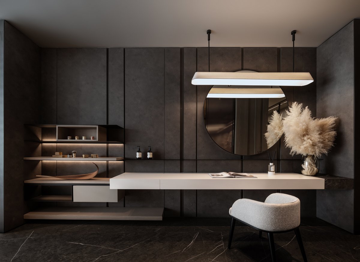
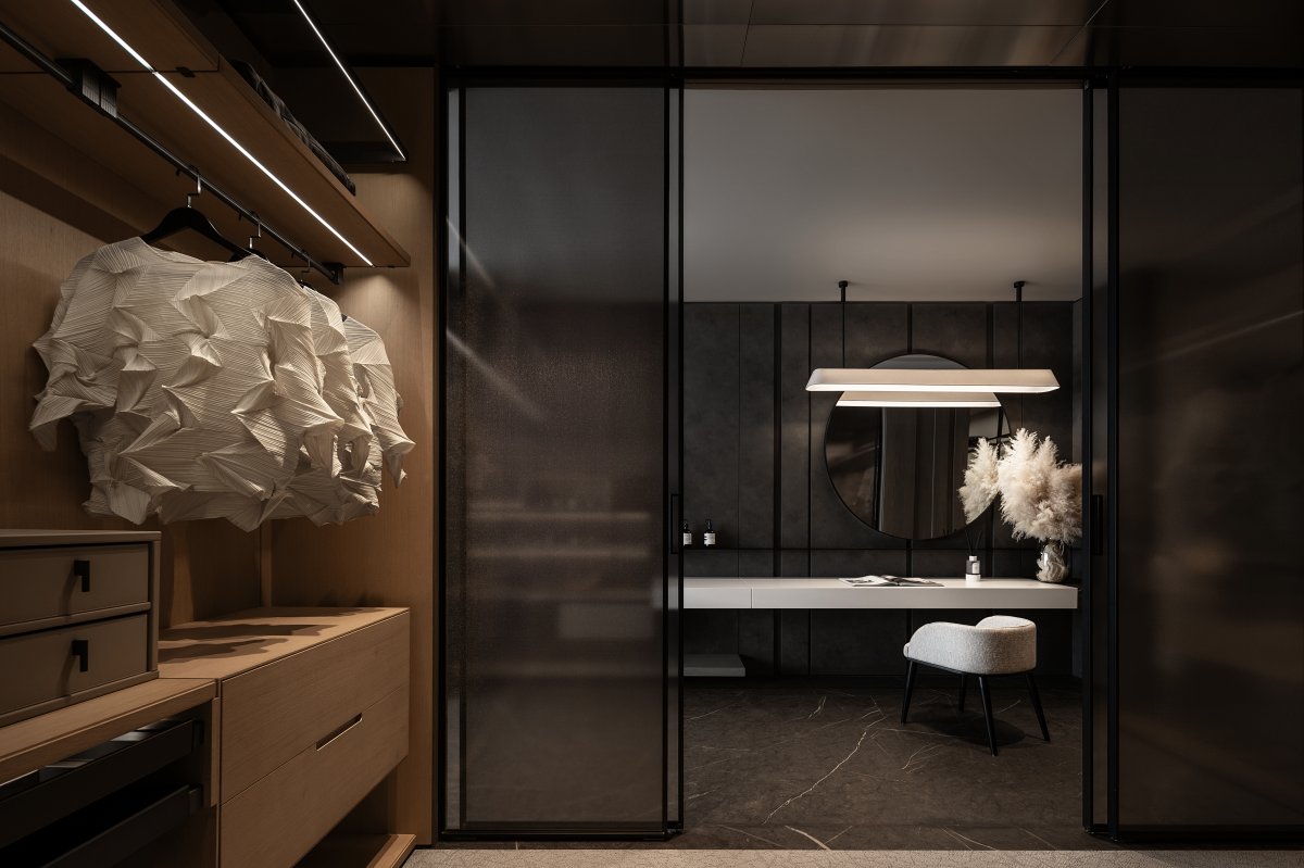
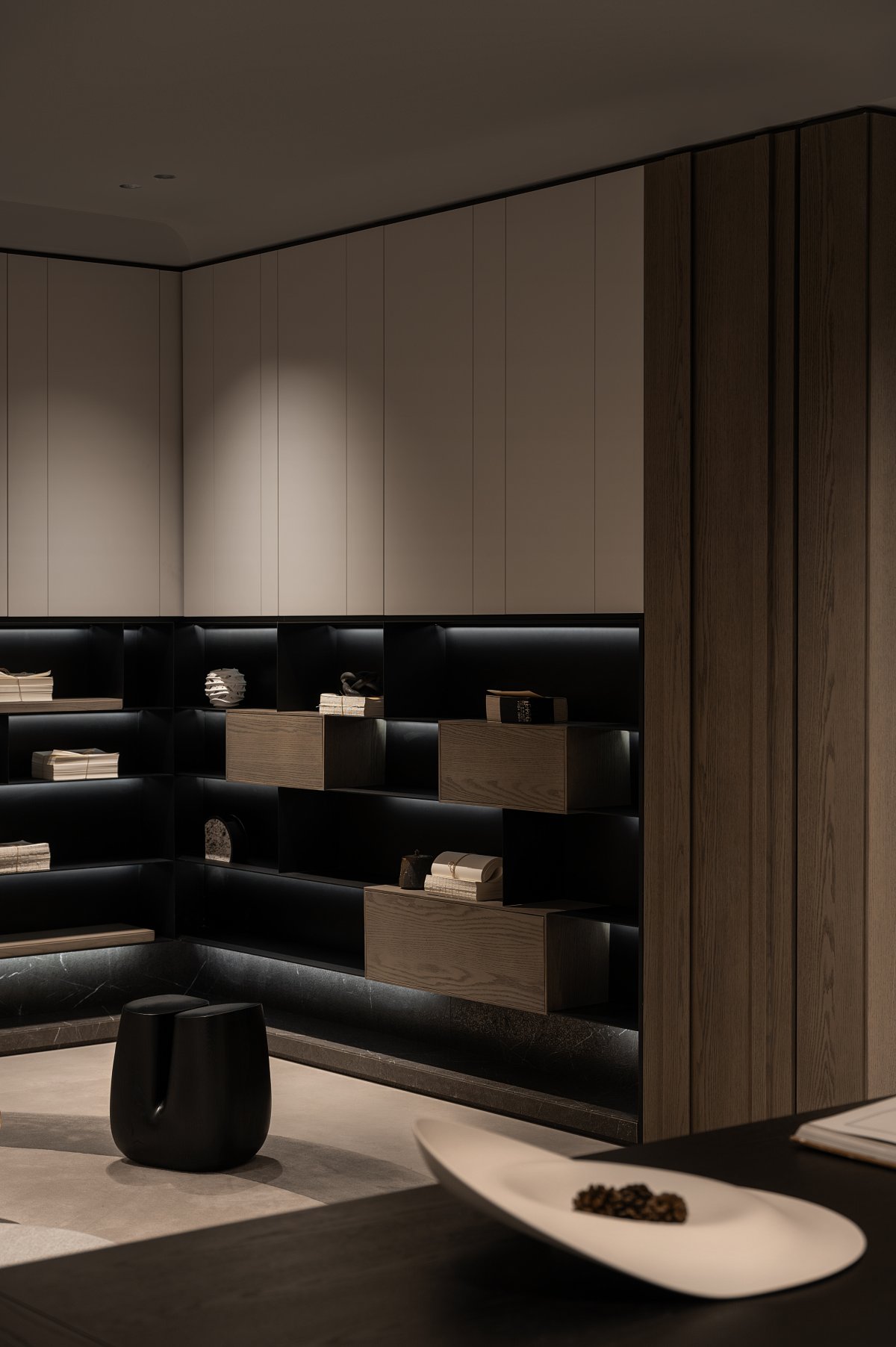
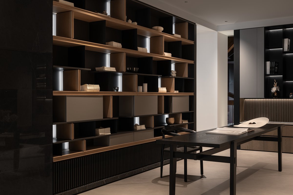
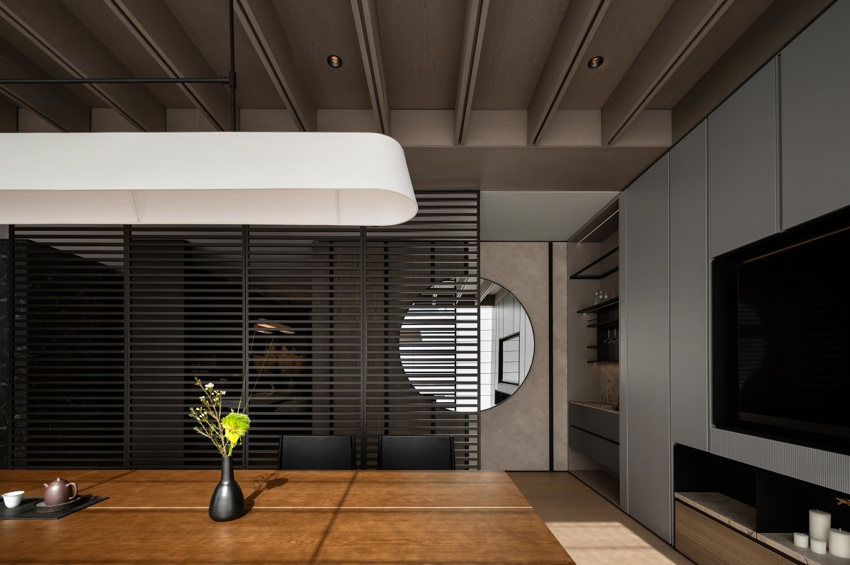
Material is the skin of the space, directly affecting people's tactile and visual experiences. The use of black metal materials adds a cold and hard temperament to the entire space, contrasting with the warmth of wood, enhancing the sense of spatial layers.
The use of metal lines, block surface linearity, and large areas of off-white leather imparts a gentle mood and sense of mystery to the reception space, atmospheric yet full of tension. The aesthetic memory of modernist architecture and the elegant temperament of hotel-style are narrated in the design, emphasizing the sense of geometric lines, integrating furniture and spatial elements into the design's points, lines, and surfaces.
The wall-mounted coatroom ensures functional independence while enhancing the overall continuity. The wall cloth hard pack and the delicate fabric texture of the bedding add elegance and depth.
Space is not just a simple dwelling place; it is an art hall where one can relax, enjoy life, and embrace the simplicity and purity in the hustle and bustle of the city. Learn to discard the cumbersome in the noisy city, pursue simplicity and purity, find inner peace and balance, and enjoy every moment of life.
- Interiors: DA-Interior
- Photos: SHAN YE Space Photography

.jpg)
