Build a temple where emotions and memories can wander···
ABOUT THE THEME
Everyday thoughts always bring the designer into the "landscape" of creation about universal values constructed by the wise, from which we can see the expression of place, atmosphere and memory. Feel the emotional tension about mystery and ritual.
All kinds of creation cases and phenomena seem to point to people's perception and instinctive reaction to the world and time in which they are located.
Inspired by the creation landscape, the designers tried to carve this fleeting exhibition venue into a spatial installation with a sense of eternity, to gather energy and create the possibility of the site.
DESIGN STRATEGY
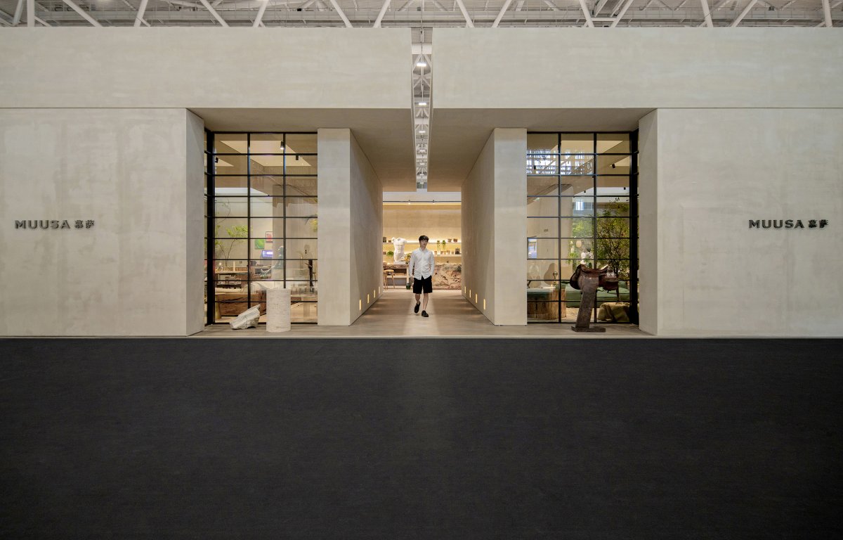
The exhibition organizer provided a square rectangular space, 21 meters long and 14 meters wide, adjacent to the public corridor on three sides. It is supposed to be stretched to a certain height to form a cube. Sculptors are good at giving new life and meaning to the shapes by carving and honing the raw materials that are square or irregular. This provides designers with a perspective to dispose of the site in the way of "sculpture" and implant functions to complete the display and promotion of MUUSA brand.
SPACE FRAME
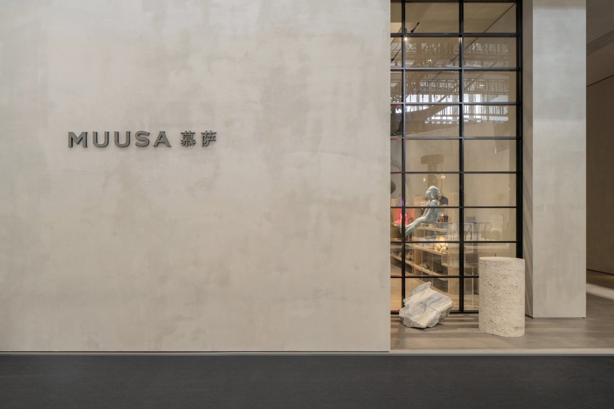
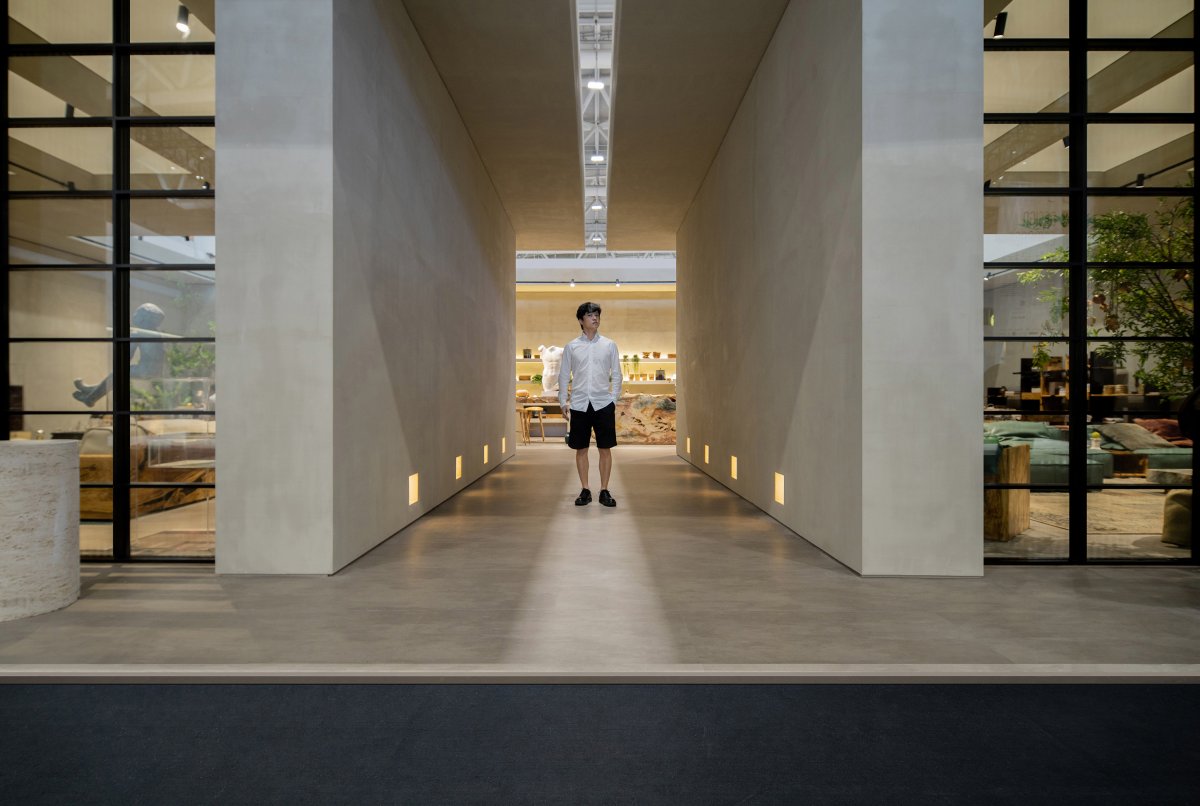
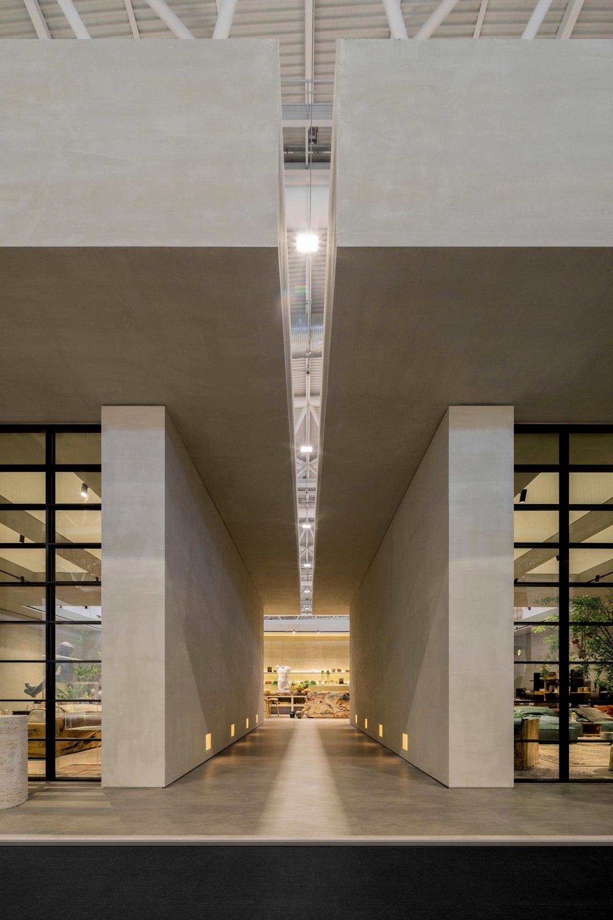
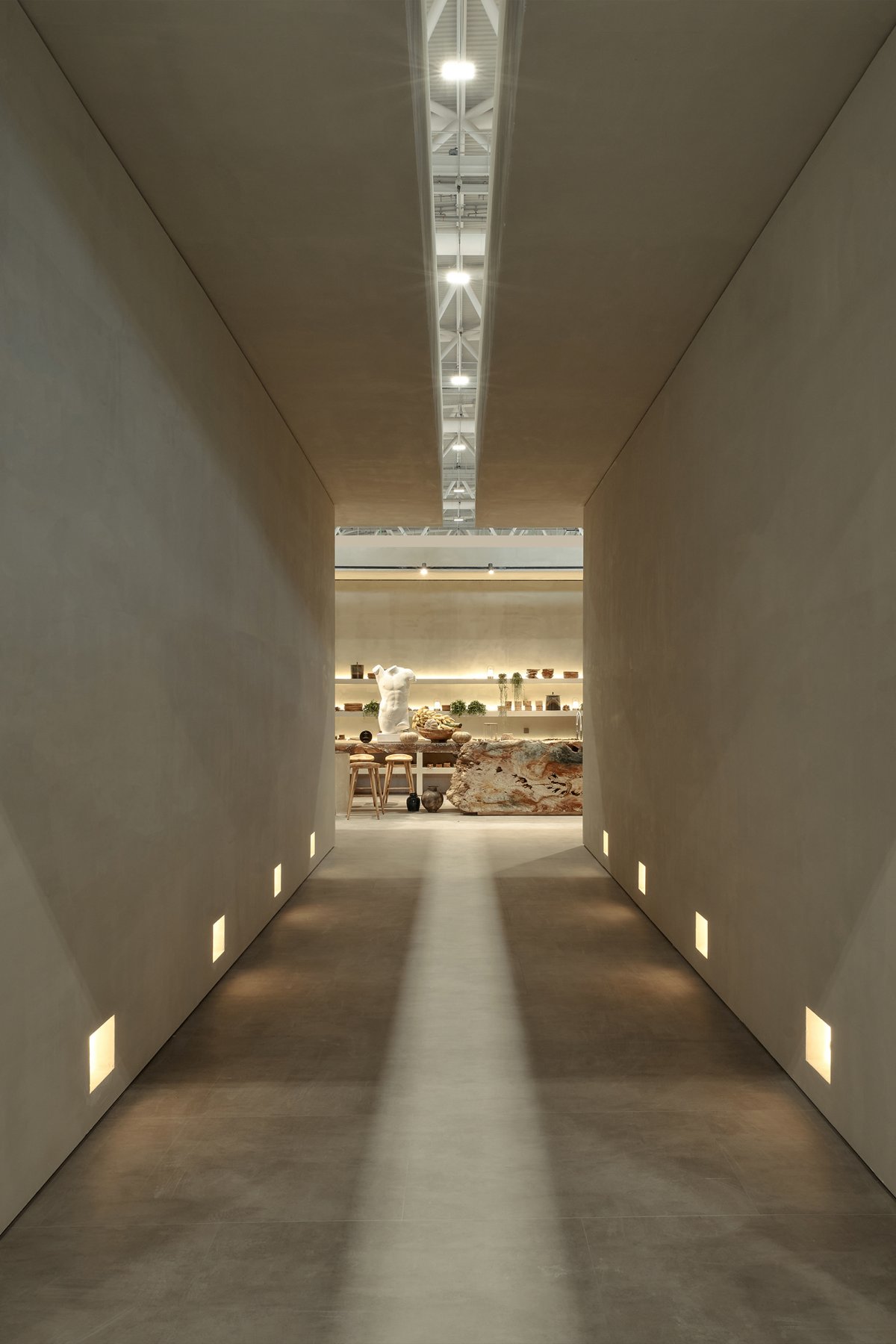
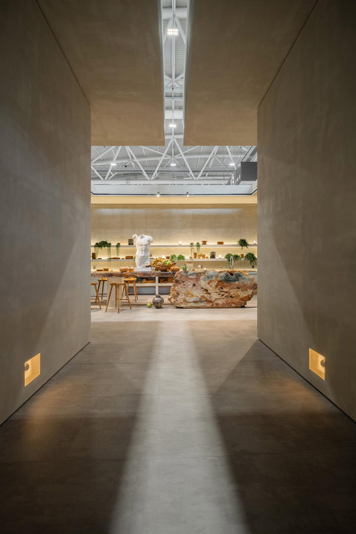
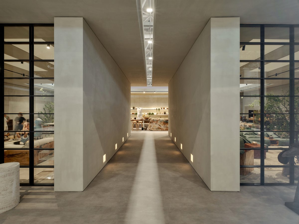
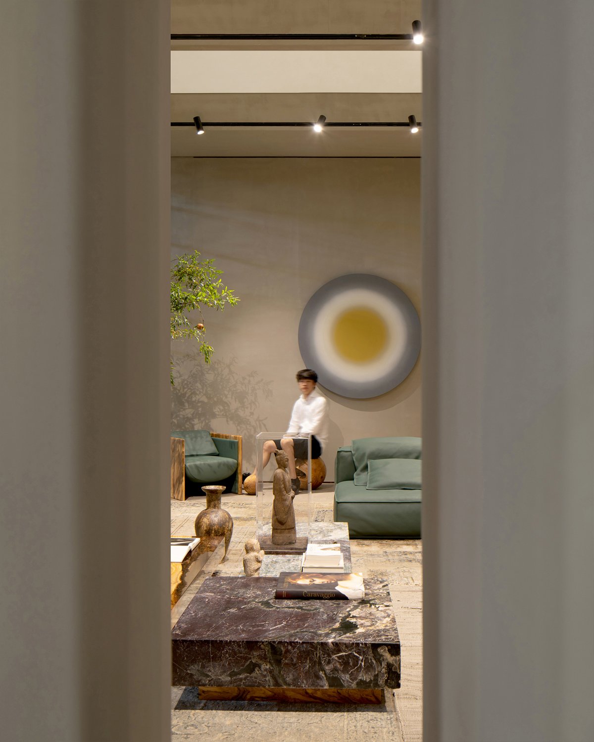
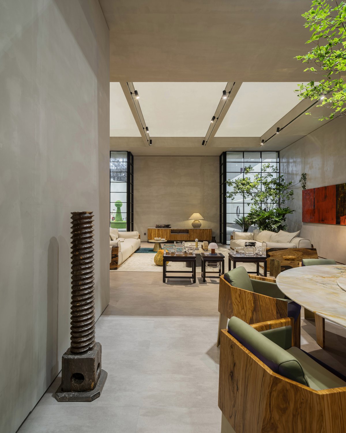
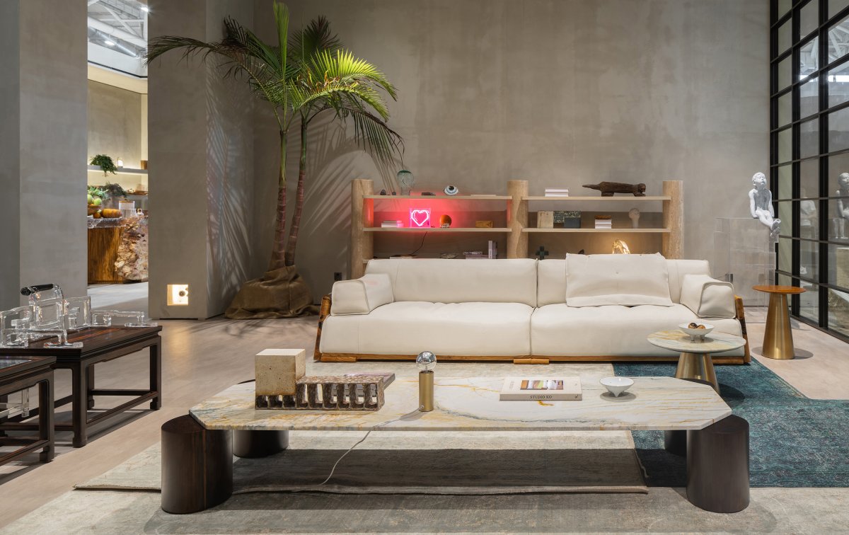
First of all, a space of 8 meters long and 3 meters wide facing the west is cut out on the axis of the cube as the entrance of the exhibition hall. It is the transition space between the public space of the exhibition hall and the exhibition hall, which seems to be wasteful but crucial. Four corner Spaces are cut out on both sides of the channel, which are retreated inside to set up the window display interface. The public corridors on the north and south sides have limited flow of people and are adjacent to the facade of the opposite exhibition hall. Only two vertical gaps are opened in the facade to attract the attention of pedestrians. After the frame is formed, the designer uses several details to enhance people's sensory experience of scale, light and color.
THE MEANING OF DARKNESS
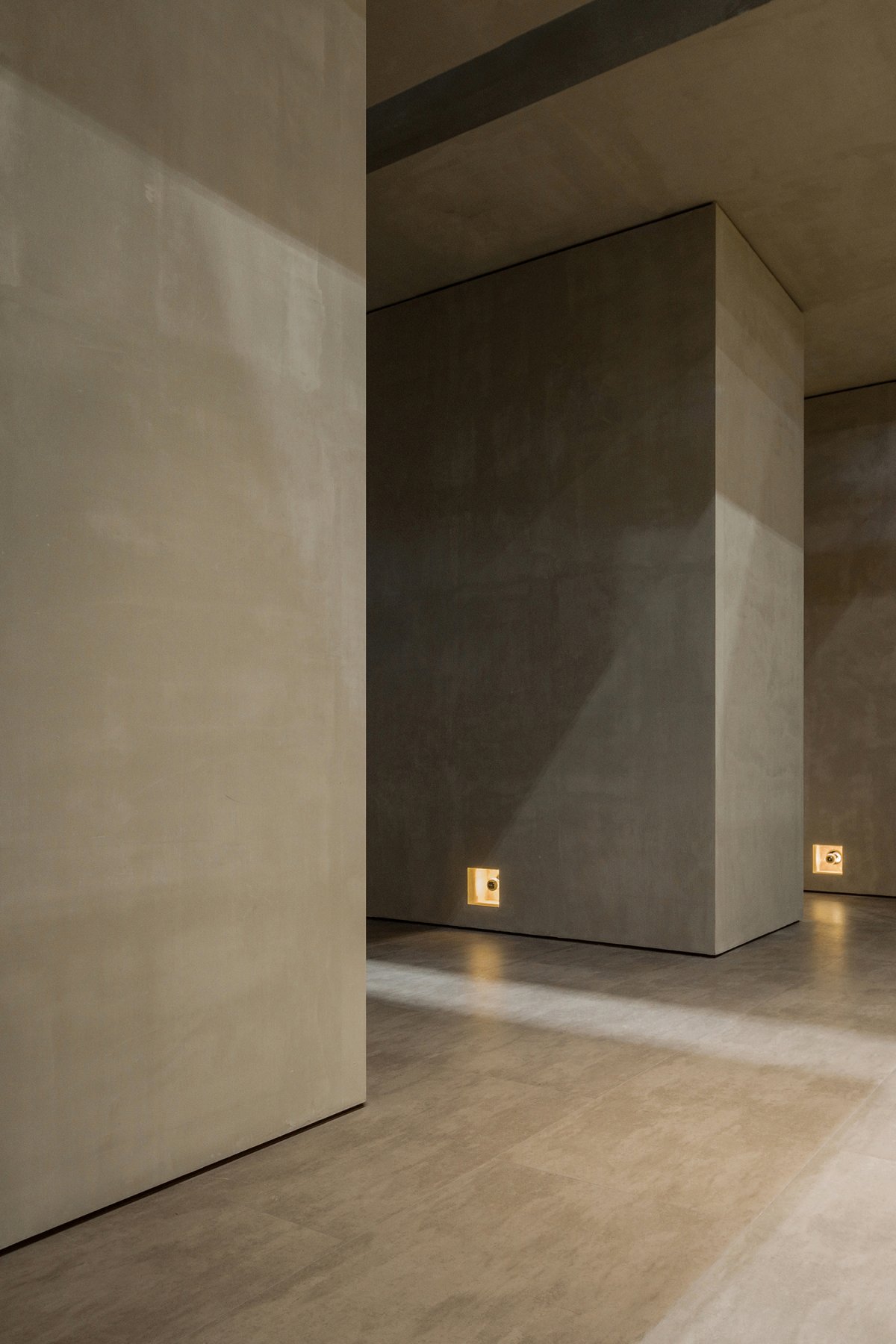
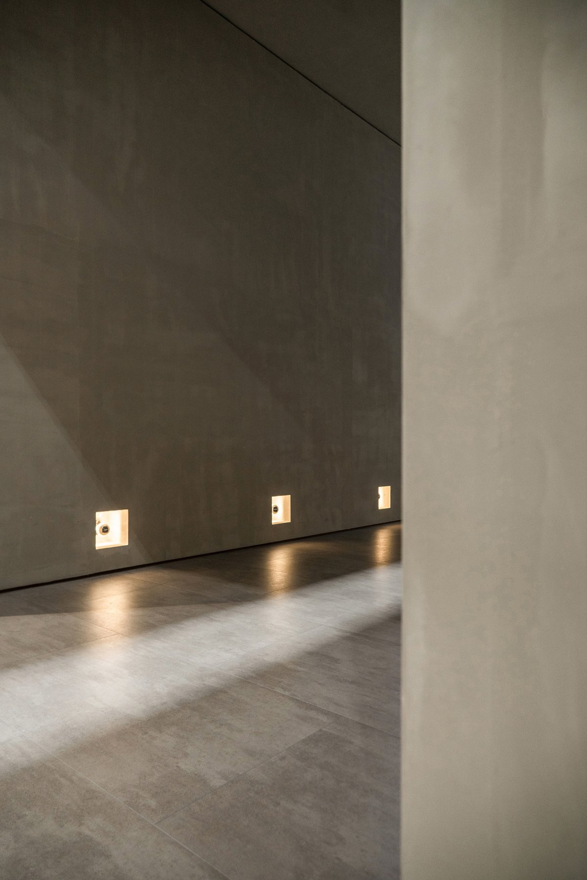
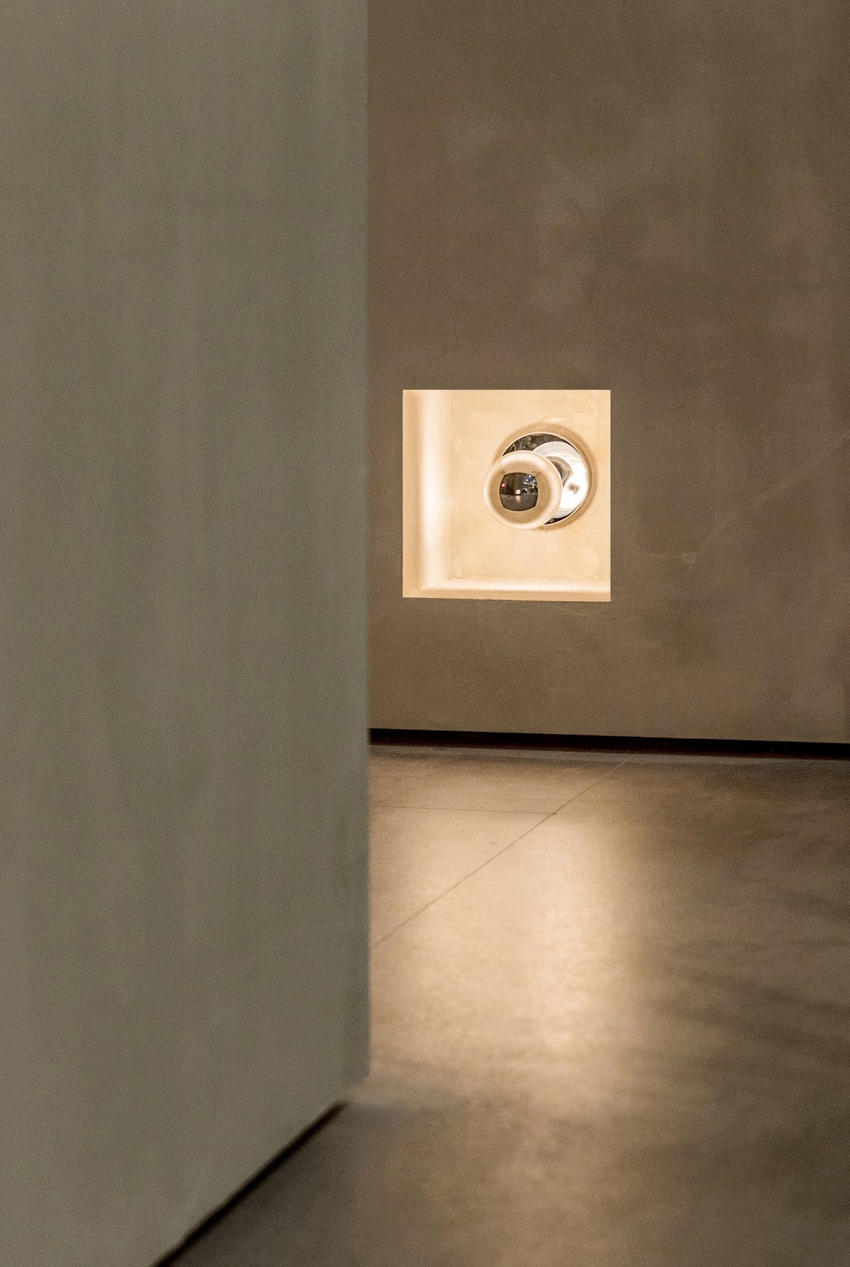
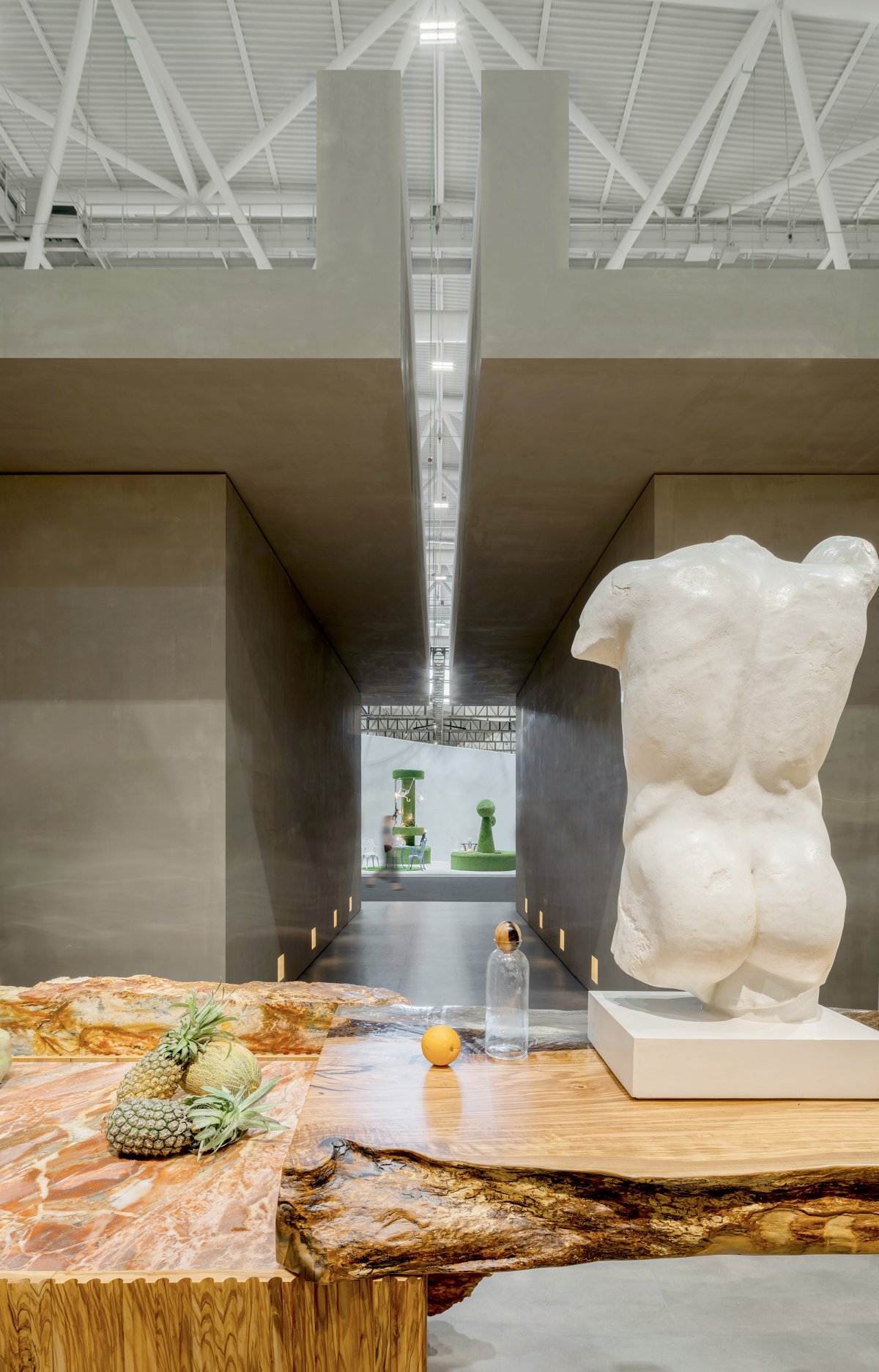
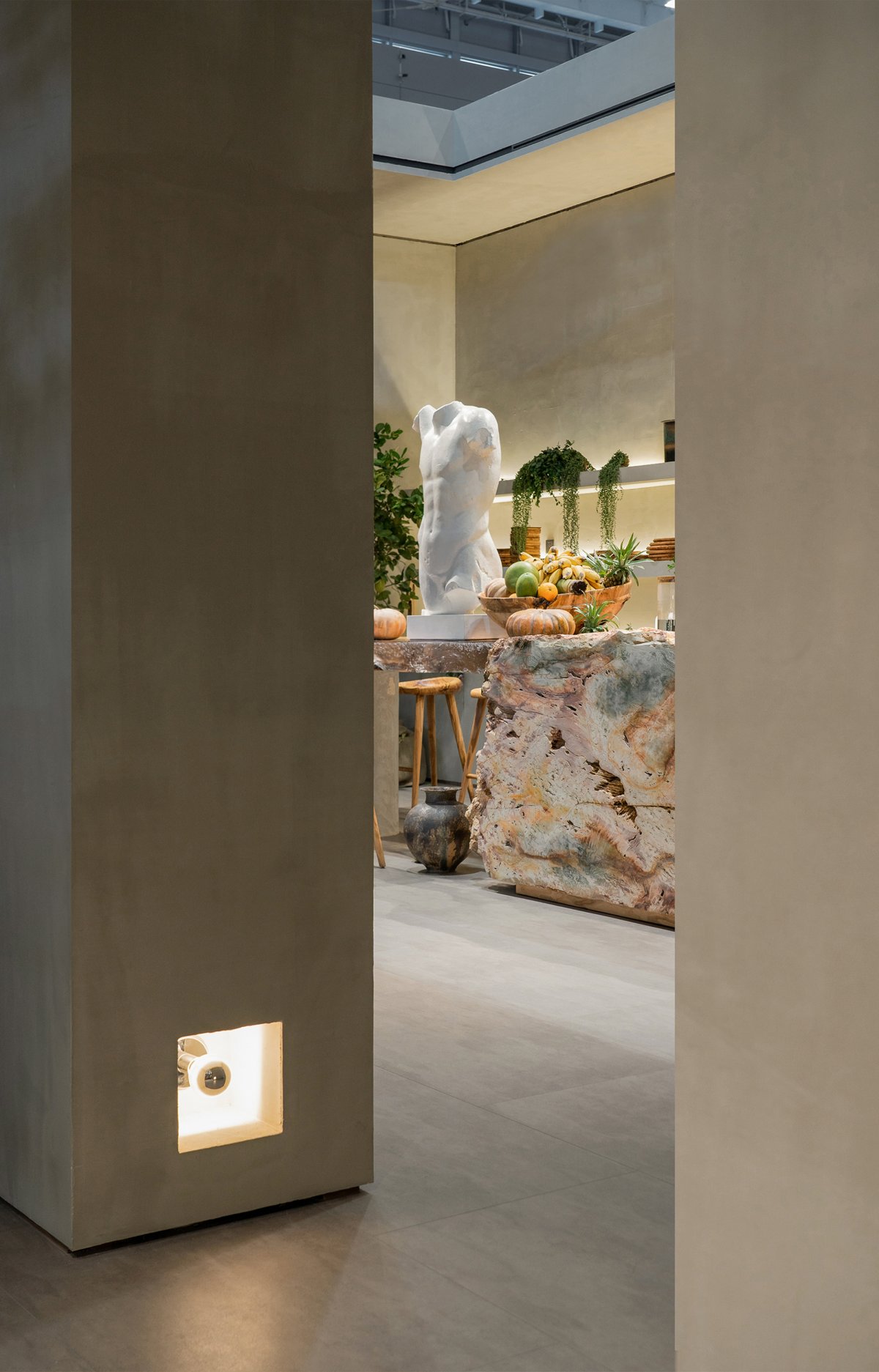
The light environment of the exhibition hall is composed of natural light and engineering lighting, which mix together to form a kind of out of control hybrid light environment. In order to reverse this unfavorable situation, the designer opened a gap in the ceiling above the channel, making the ambient light cast a weak light in this narrow channel. The symmetrical footlights on both sides not only emphasize the depth of the aisle, but also slow down the pace of arrival. The dark and quiet aisle forms a strong contrast with the bright cabinet area, which enhances the experience of entering.
NATURAL MATERIAL
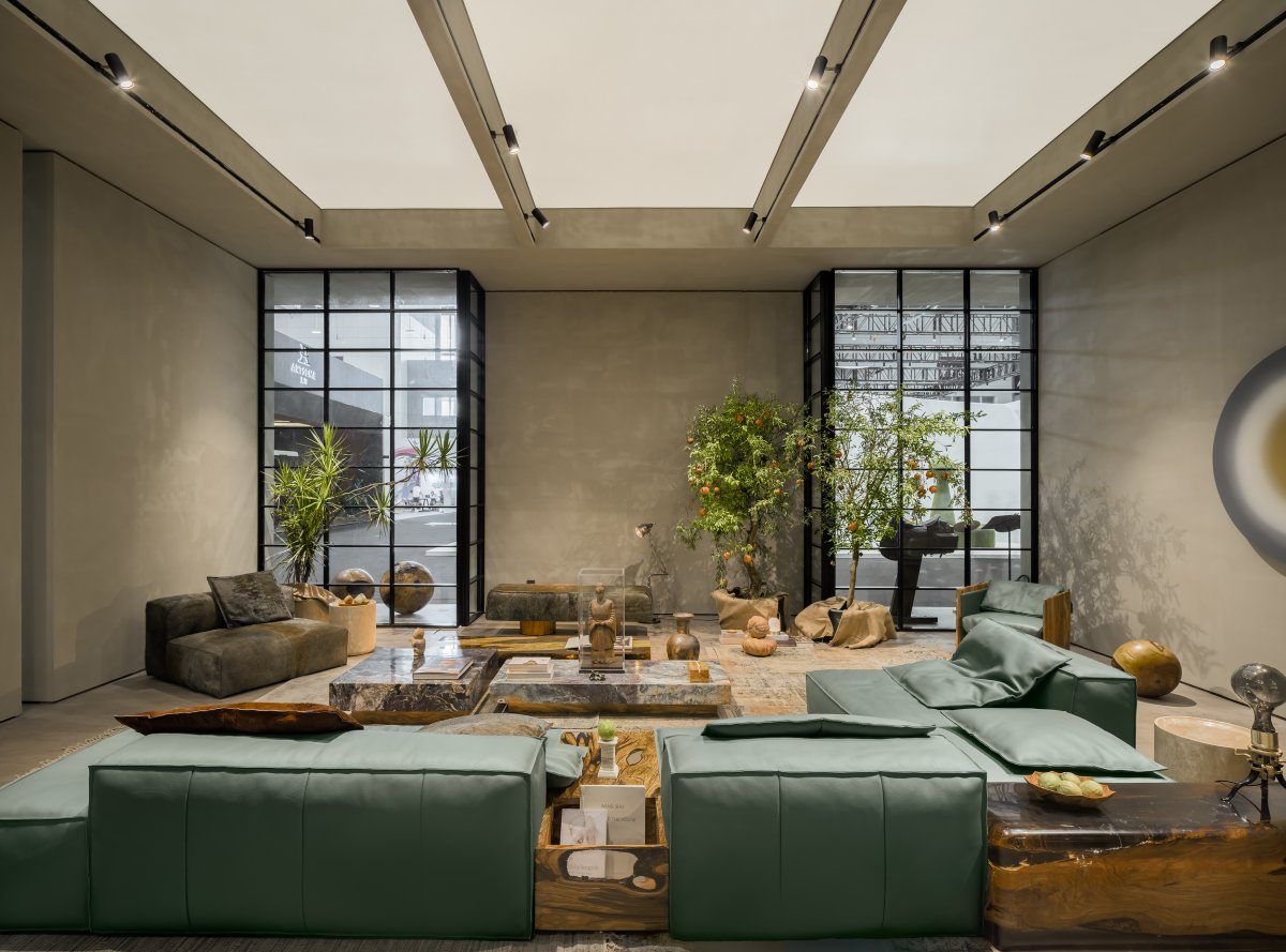
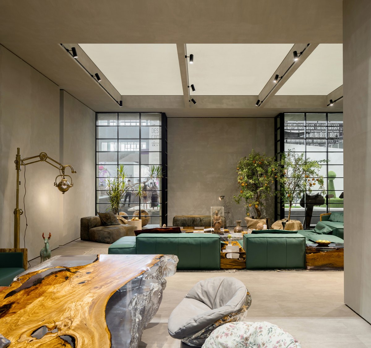
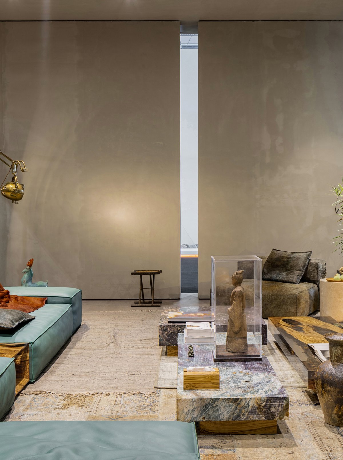
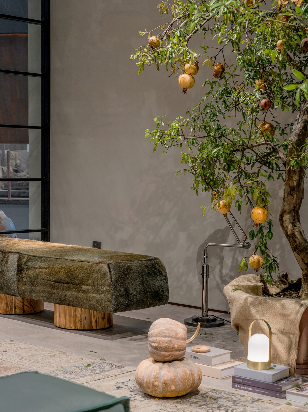
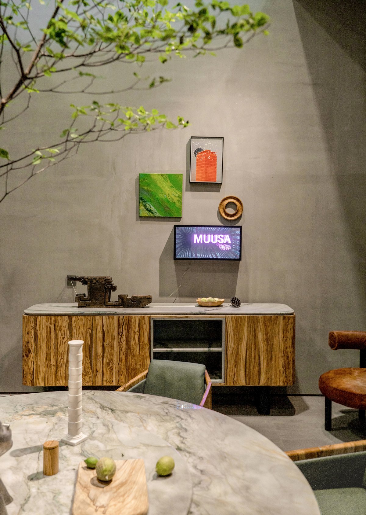
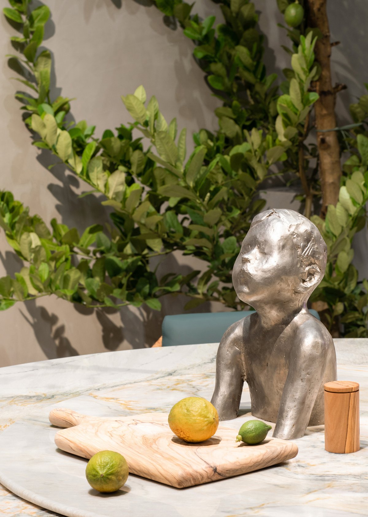
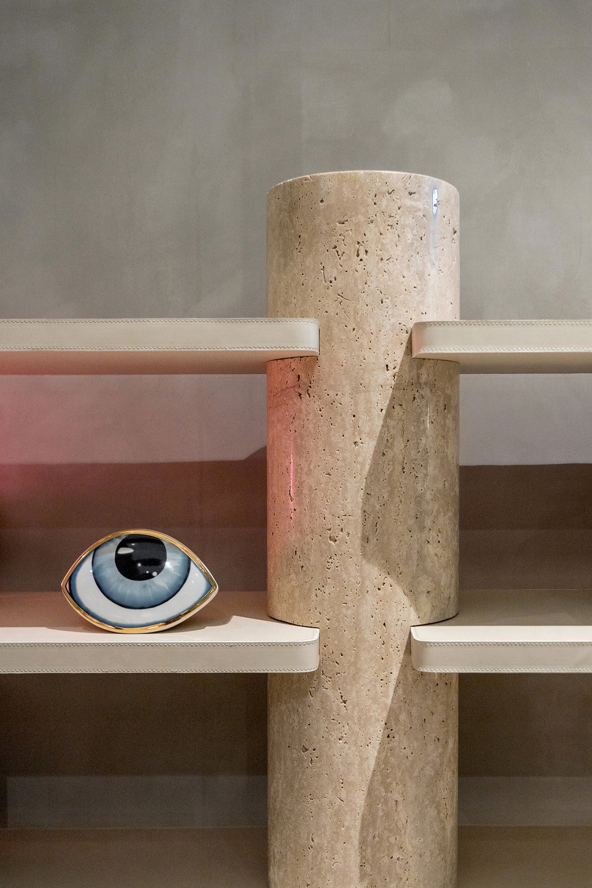
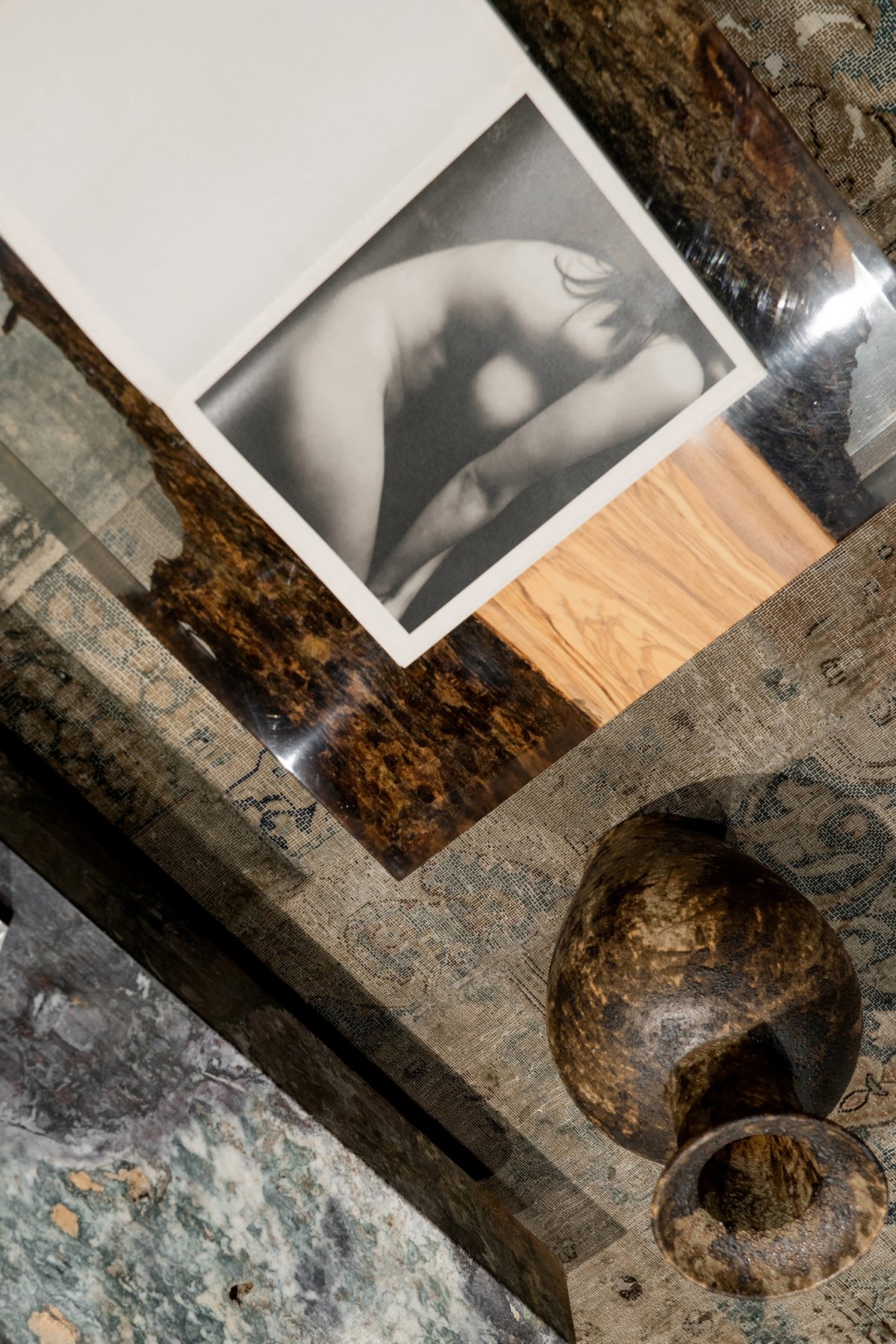
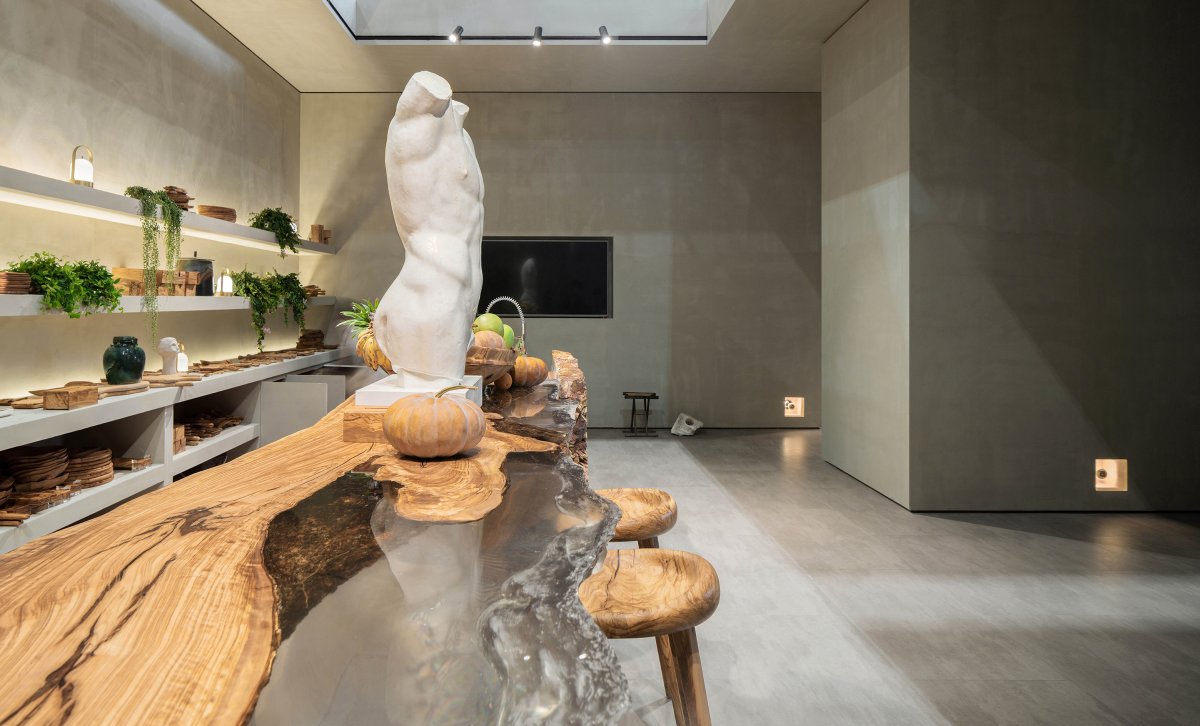
As the tide changes, natural materials become more and more unique and attractive through the hands of craftsmen. Since its inception, MUUSA has focused on the preference for natural materials. The main materials of furniture include high-quality wood such as Italian olive wood, top-grade coatskin imported from Europe, rare mining stone from the world, and a small amount of ceramic and corroded pure copper.
From the designer's point of view, minimalism does not mean the technical unity of form, material and color. Minimalism is an empirical perspective, which can break the boundary between simplicity and complexity and point to some potential richness and inclusiveness. Under the intervention of concepts, all visual elements can be balanced and coexist.
MUUSA has always kept a proper distance from the current domestic market mainstream home furnishes trend, trying to deduce the aesthetic connotation of "permanence" by virtue of abundant natural materials, high-level design, research, development and manufacturing system, and continue to output home furnishes with humanistic temperature and stand the test of time.
From the designer's perspective, it seems that there is another "temporality" without physical scale. Some words (such as classical, future, traditional, contemporary) that have been discussed countless are essentially no different. "Retro futurism", a reconstructed word, can include the meanings of the above phrases.
For the expression of the booth, from the space atmosphere to the display design, we focus on the expression of this "temporality" in the details. Designers are good at recombining familiar objects and installations to form an overall impression with strangeness, where people stay, explore, gain inspiration and joy.
CONCLUSION
The designer attempted to blur the boundary of design and break the limitation of cognition in this place. Rather than a temporary exhibition hall design, it is more like a visual presentation of a long-planned conceptual "game" by the designer. With the help of specific places, objects and people's participation, the infinite is constructed from the finite...
- Interiors: Fillstudio
- Photos: FEAST VISION fafa

