Site Description
This design commissioned the transformation of the house in Beijing Xicheng district, walk ten minutes can walk to the old hutong, old courtyard gathering place, set of building area of 200 square meters. When we made a field measurement, we found that there was no advantage in orientation or lighting, and the original compartment made the function and moving line chaotic, which could not meet the future life of space users.
The challenge of this case lies not only in the design technology and function setting, but also in the improvement of style and the inheritance of context, which needs to be taken into consideration. When a sunny afternoon, full of green color, ceiling, fish tank, pomegranate those belong to the old courtyard image and modern design concept as if spark collision, the concept of "square pavilion" in a city arises spontaneously.
Plane Layout
Lifestyle, customs and aesthetic ideals are what we discuss most with our clients. Therefore, the design scheme that is approved at the first time is actually a full understanding of the client's life. It is a kind of rhythm, there must be light and shadow, left and right, sunny and rainy, the taste is in the lines and composition of this change but not fierce.
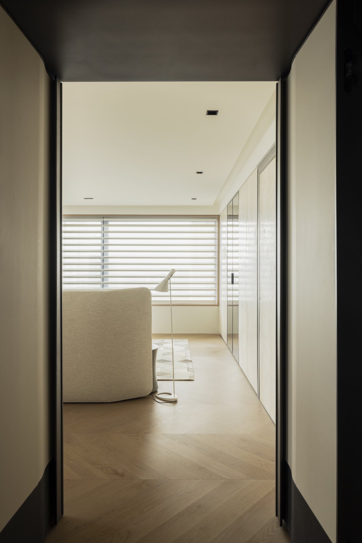
After removing the wall of Thinking, the layout of the plane is back to the origin, and large glazing Windows on the east, west and north sides are used to introduce sunlight to maximize the use of natural light and improve living comfort. Through the design, natural light is flowing and flexible. This is a kind of ability to organize light and shadow as well as space, which needs to communicate and sort out the scale relations of each part with users. Visual openness, light dyed every corner, let a person follow the heart immersed in the space of self.
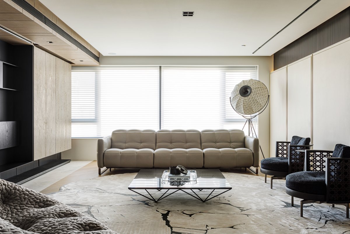
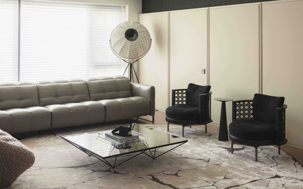
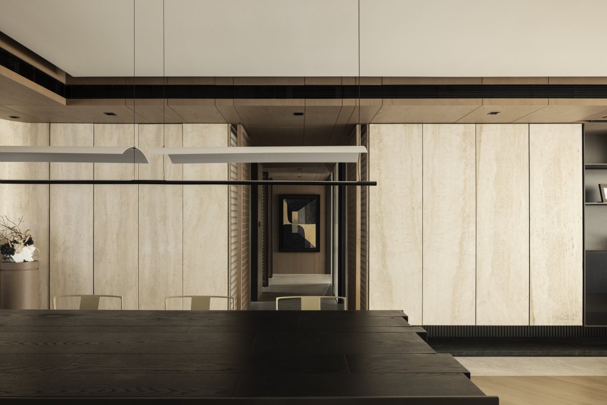
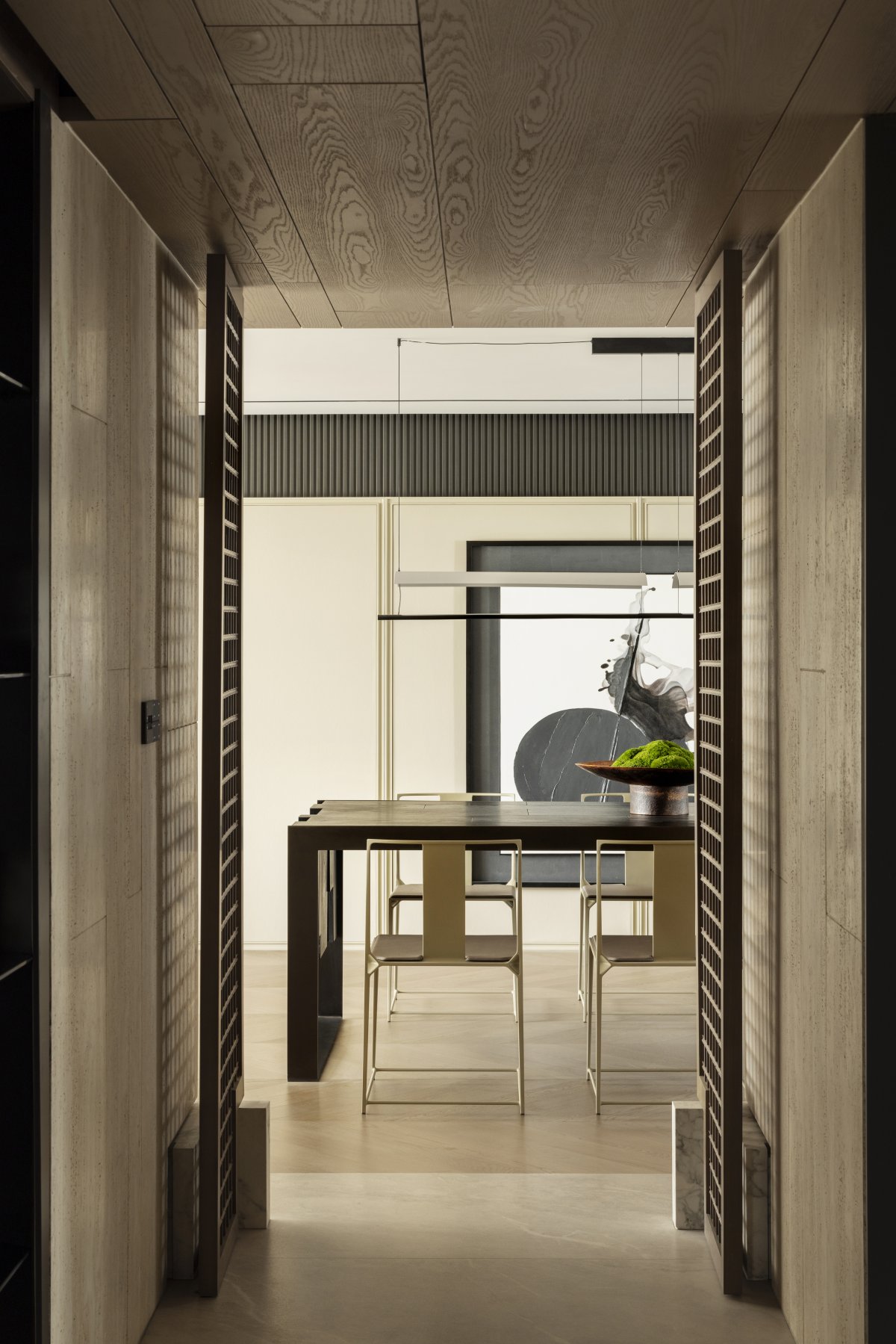
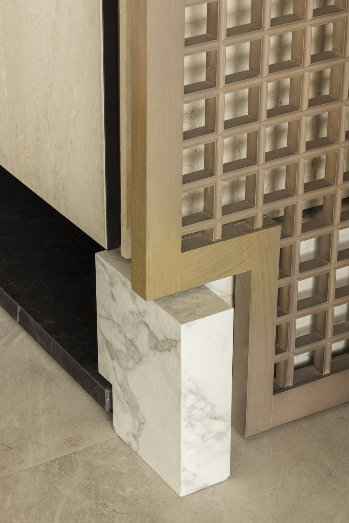
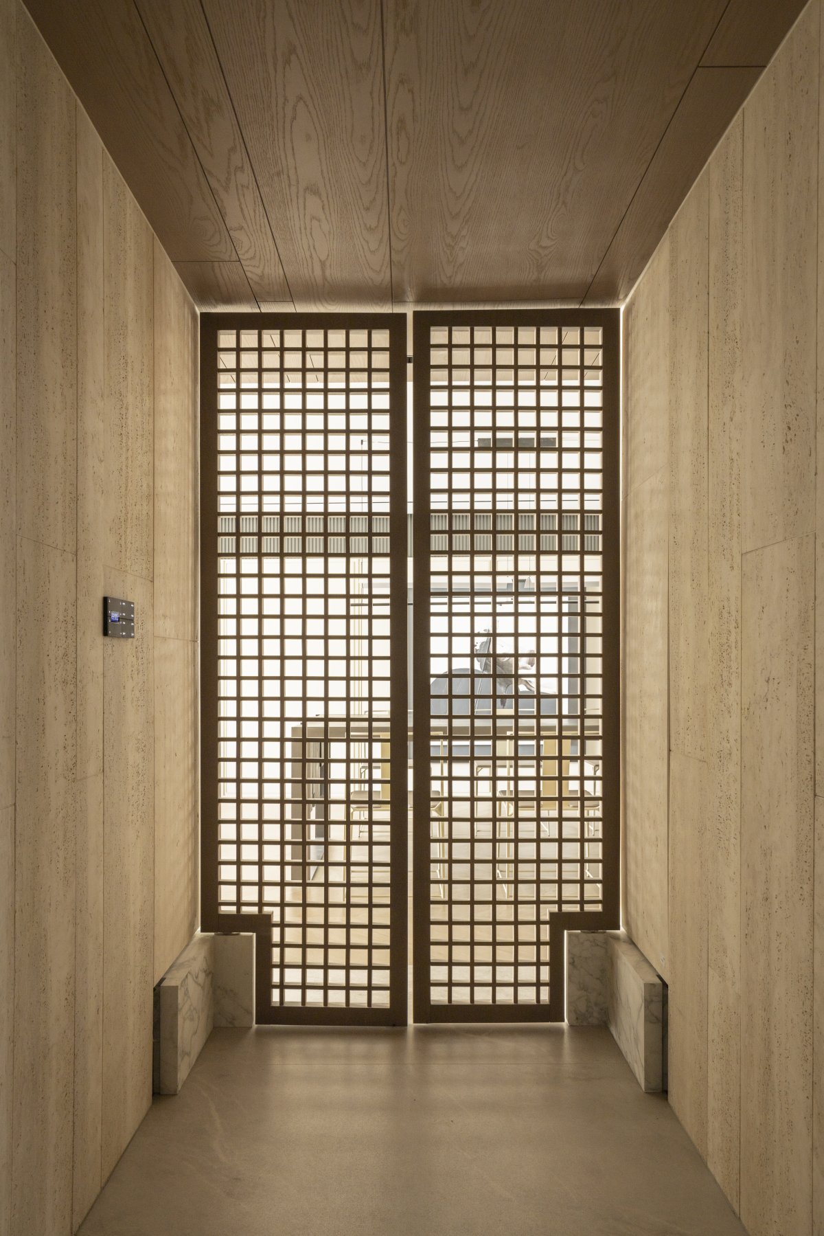
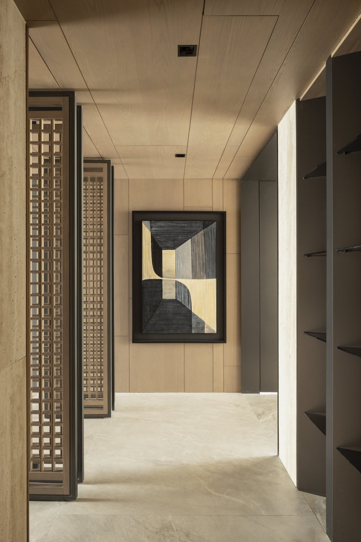
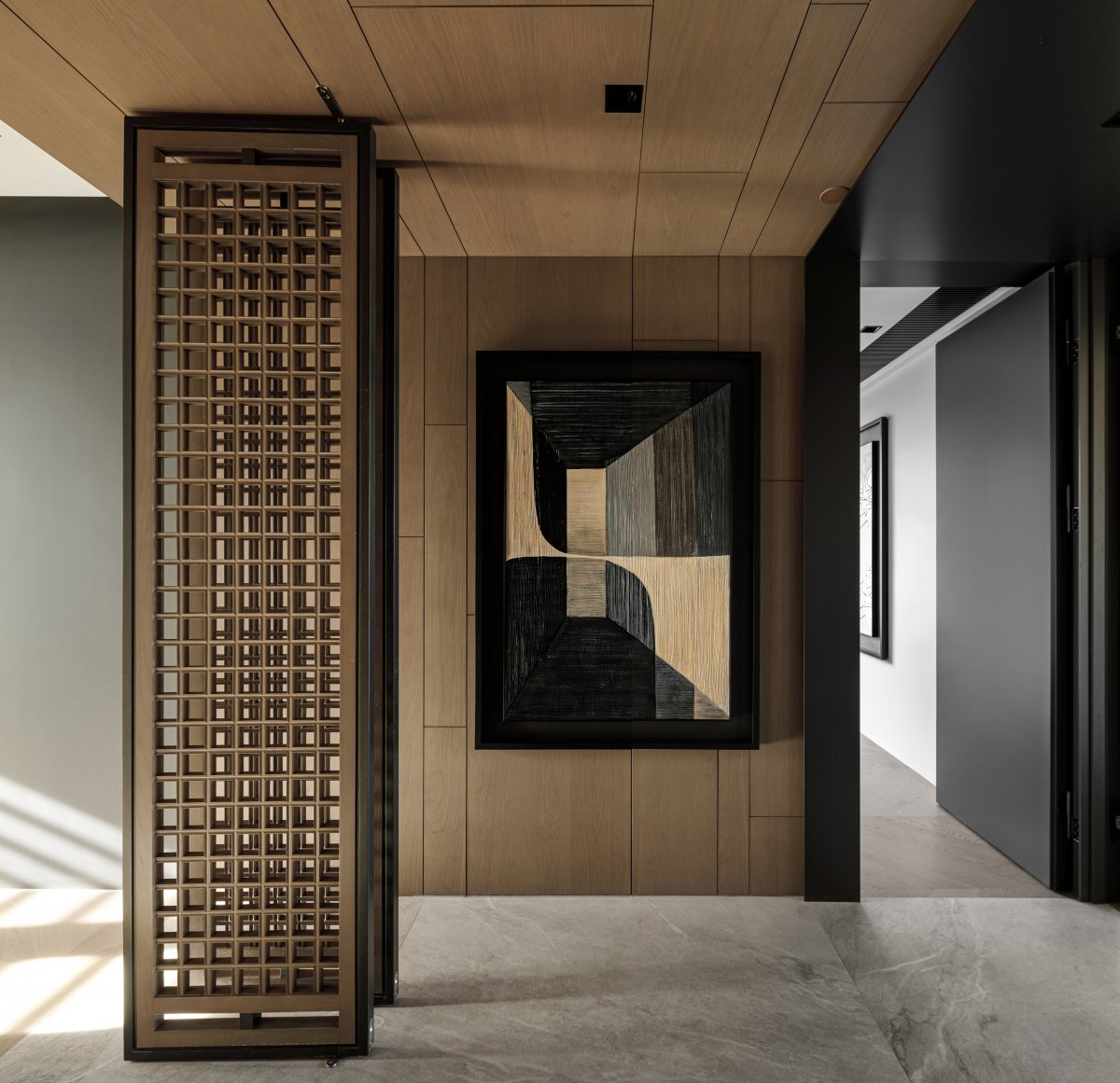
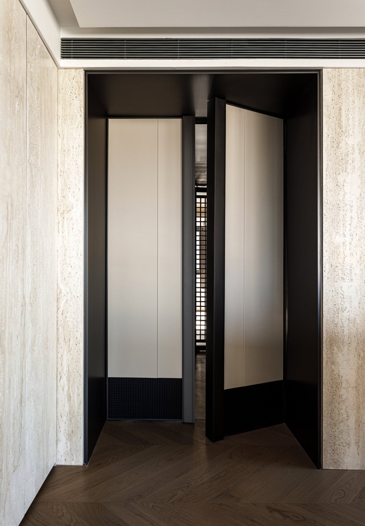
The open pattern of the guest restaurant, flowing geometric lines in the space, blurred the regional boundary and cognition, to build a more diversified public space experience scene. There is no obstacle stacks, with sofa table as the center of gravity of the life form gradually outward free extension, between light and shadow flow, full of life philosophy. The custom wooden door between the guest restaurant and the corridor, each door has more than 200 transparent square squares, not only echoing the square pattern of the whole house, but also in the function of the combination of virtual and real, making the guest restaurant as a public domain and the residential area as a private domain both contact and separated, in the moving line and spatial organization is very reasonable. The bottom two sides of the wooden door draw on the door pillow stone of a quadrangle courtyard to create two stone components, which not only has the design sense of a modern mansion, but also hides the dark lines of Beijing traditional Chinese architecture.
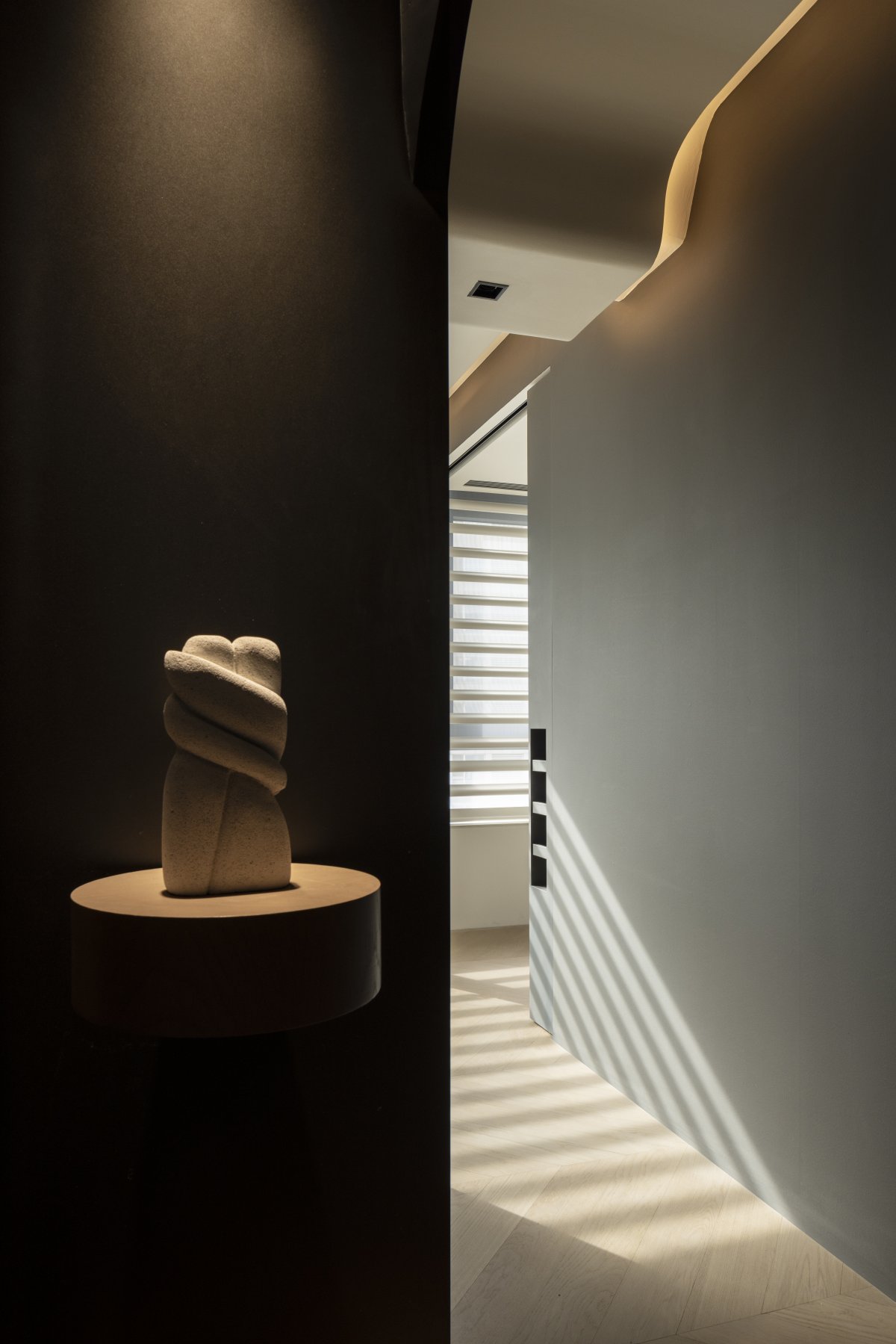
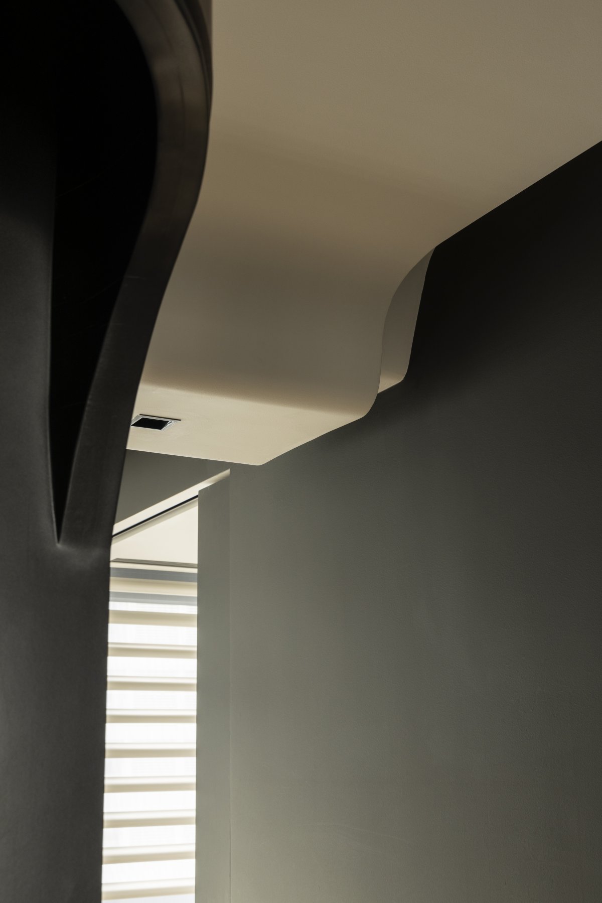
The sculpture table on the north side of the restaurant relies on an arc structure, which shows a rich and diverse sense of space. The interior here is actually a variety of pipes including flue, etc. -- the function must be guaranteed, and the vision needs to be modified.
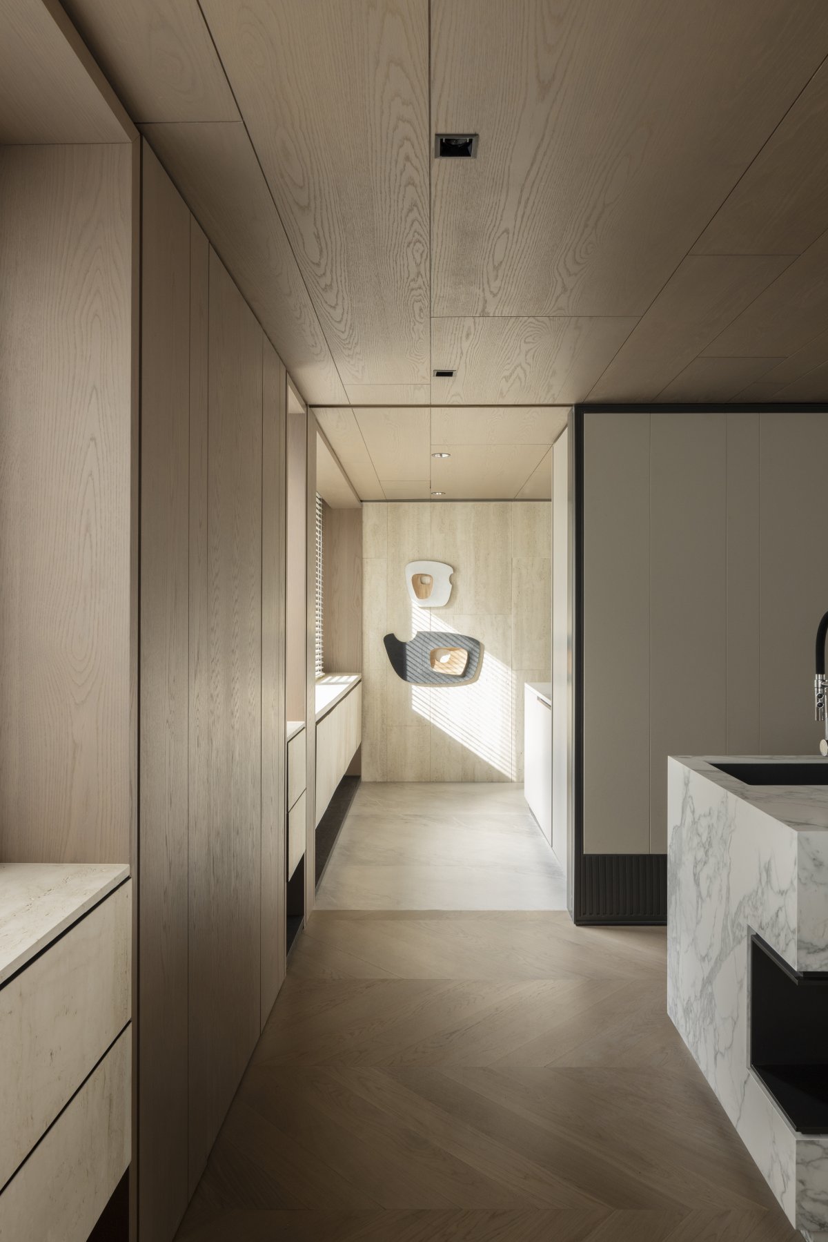
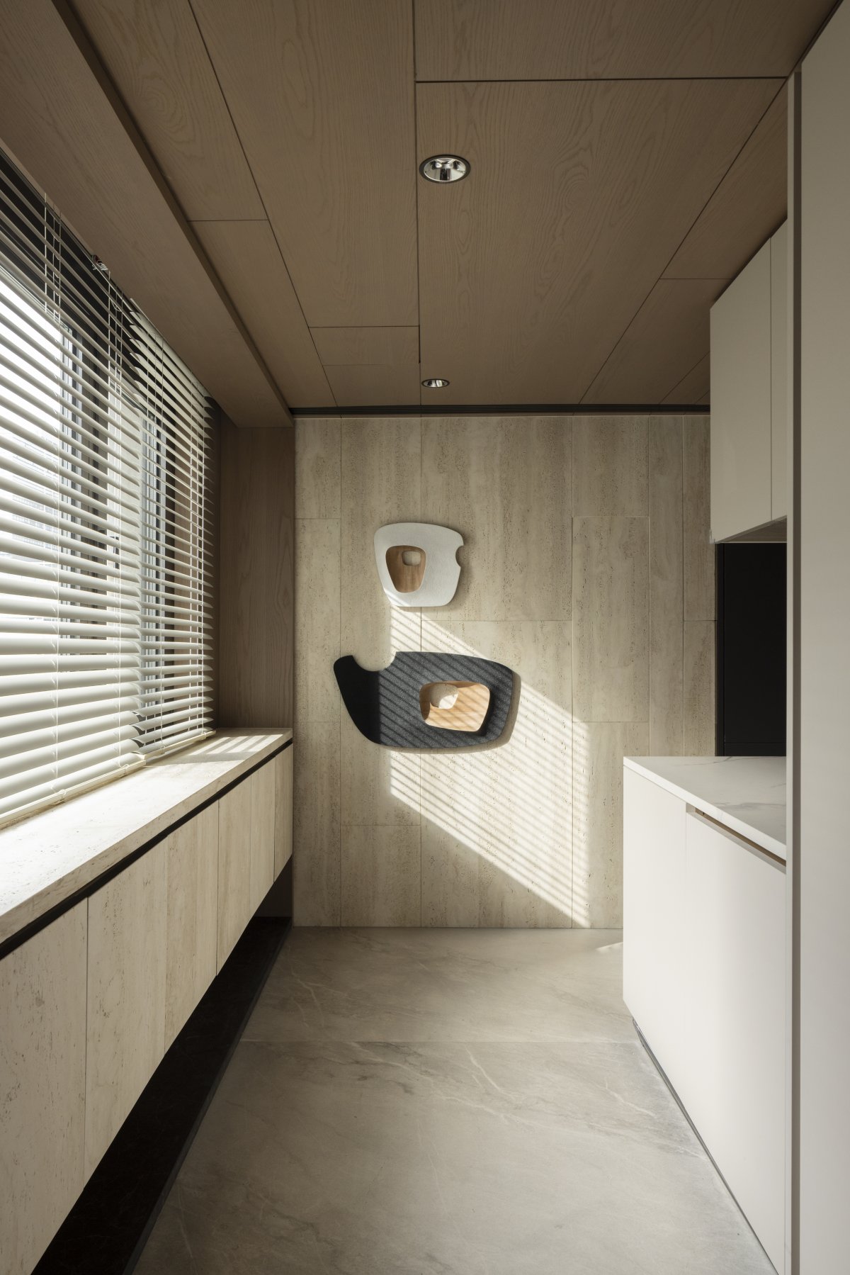
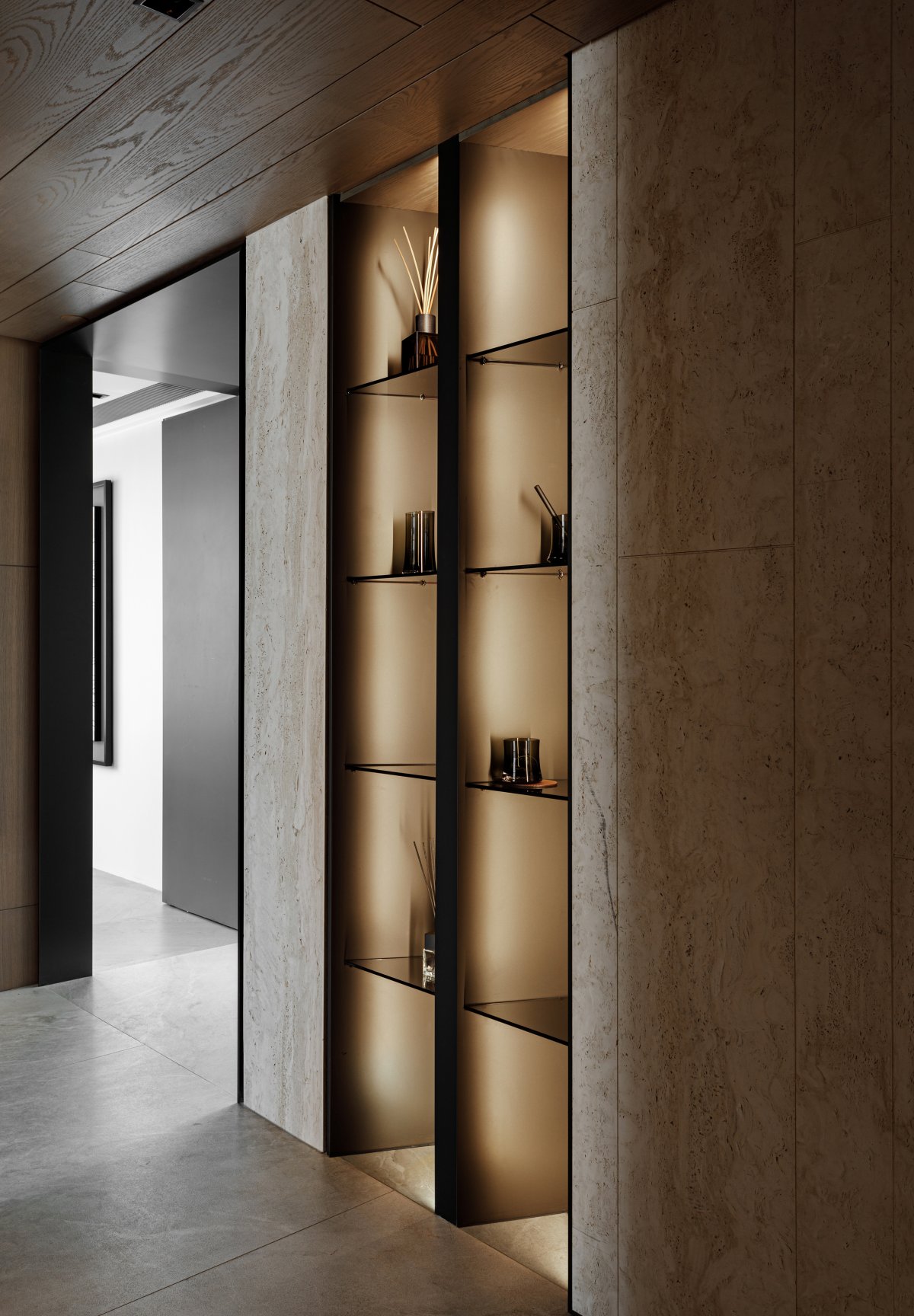
Three generations under one roof and double-toilet is the standard fittings to solve the living function. The customized design of storage, adhering to the aesthetic interest to life experience, bedroom and corridor have storage space, with large storage space, enough private as the first priority. The storage space on the east wall of the corridor is mainly aimed at displaying objects, enhancing aesthetic feeling and high style. The west side that enters door left namely guest dining-room is large receive a space, with the receive a space of the kitchen be versed in, match outside with wooden door. Daily sporadic size of objects in their proper place, convenient and practical.
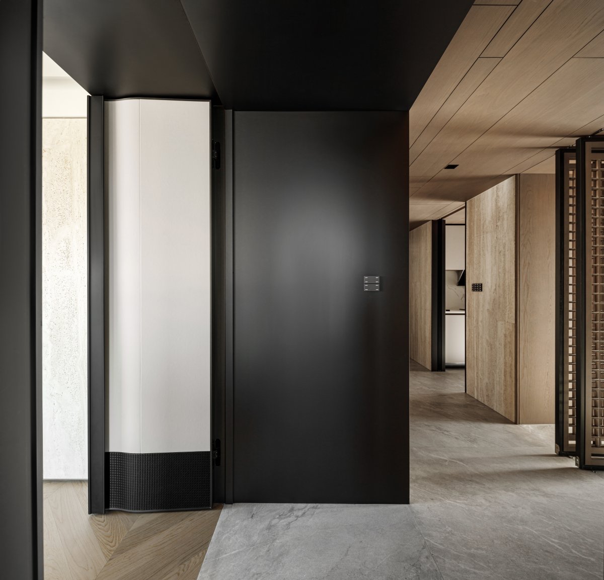
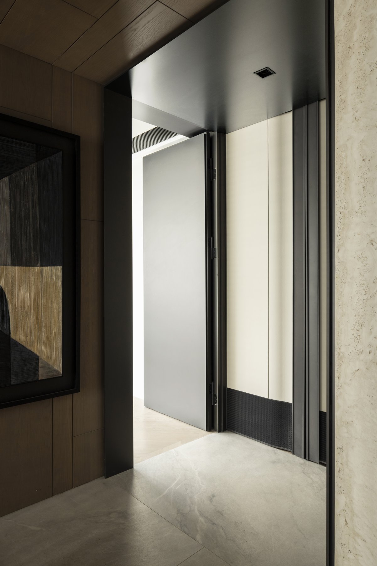
There is a secret door to the north of the sitting room can lead to storage, to the host can facilitate the entry of private domain space processing chores, and to the guest, here is a wood face wall, do not know the real face at all, having good privacy.
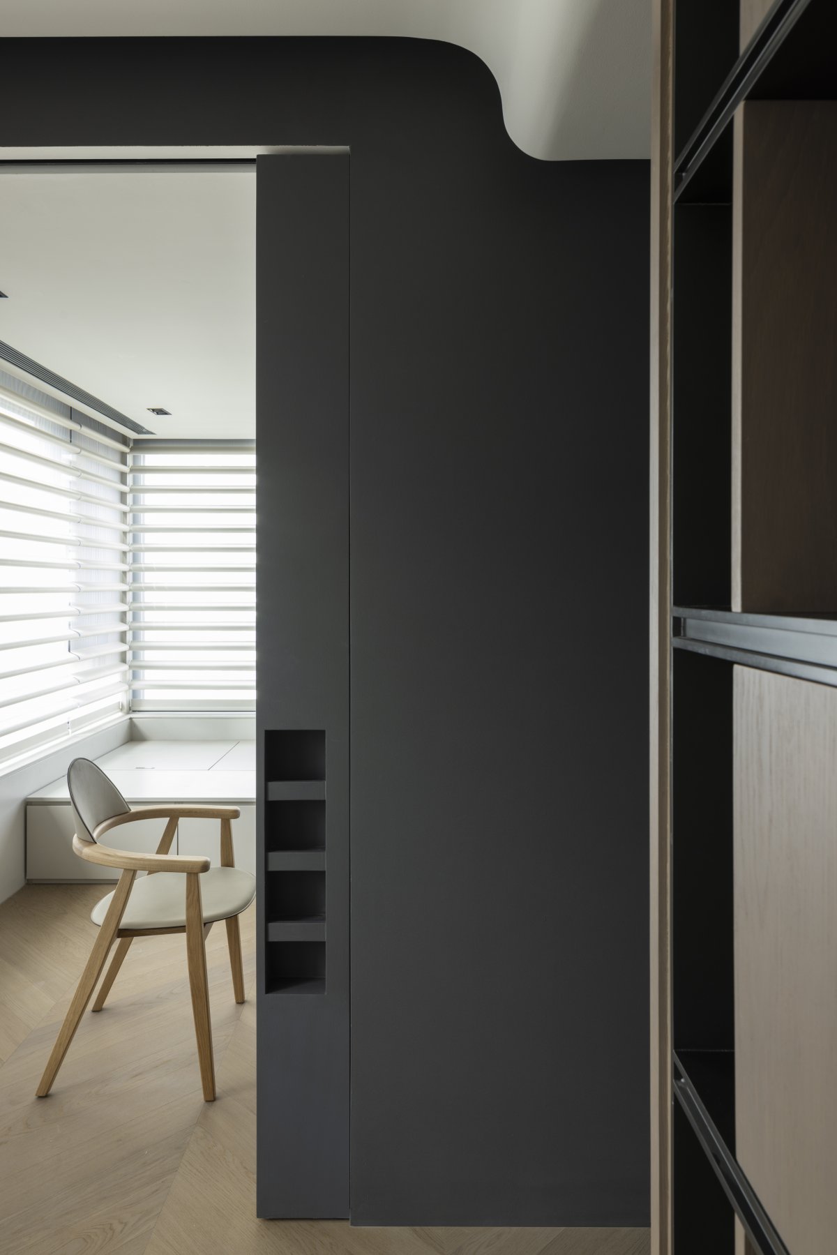
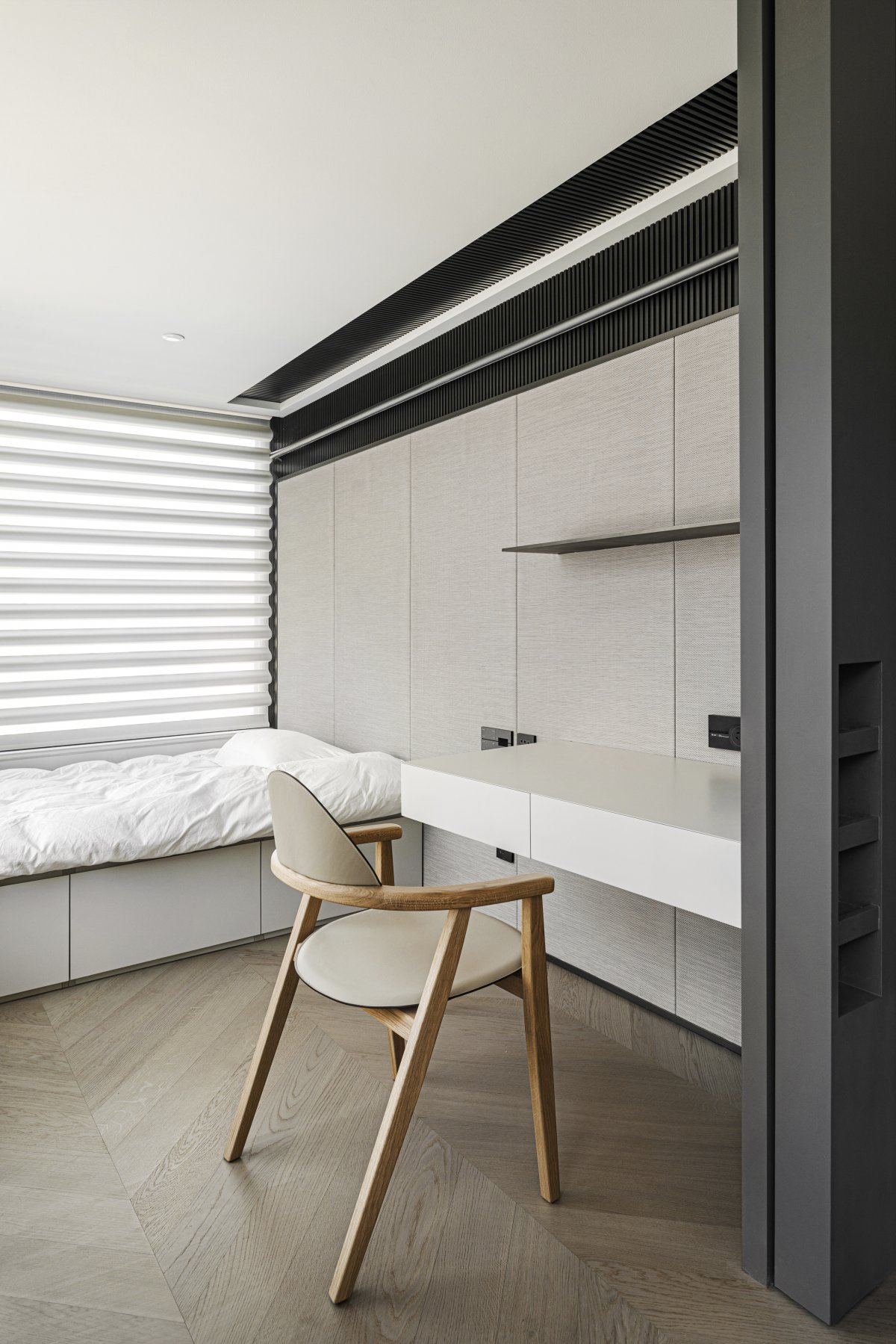
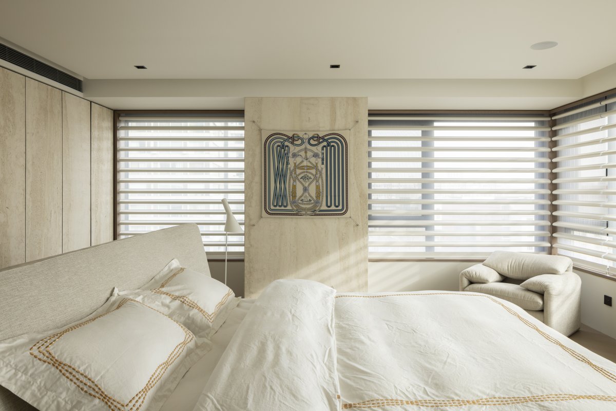
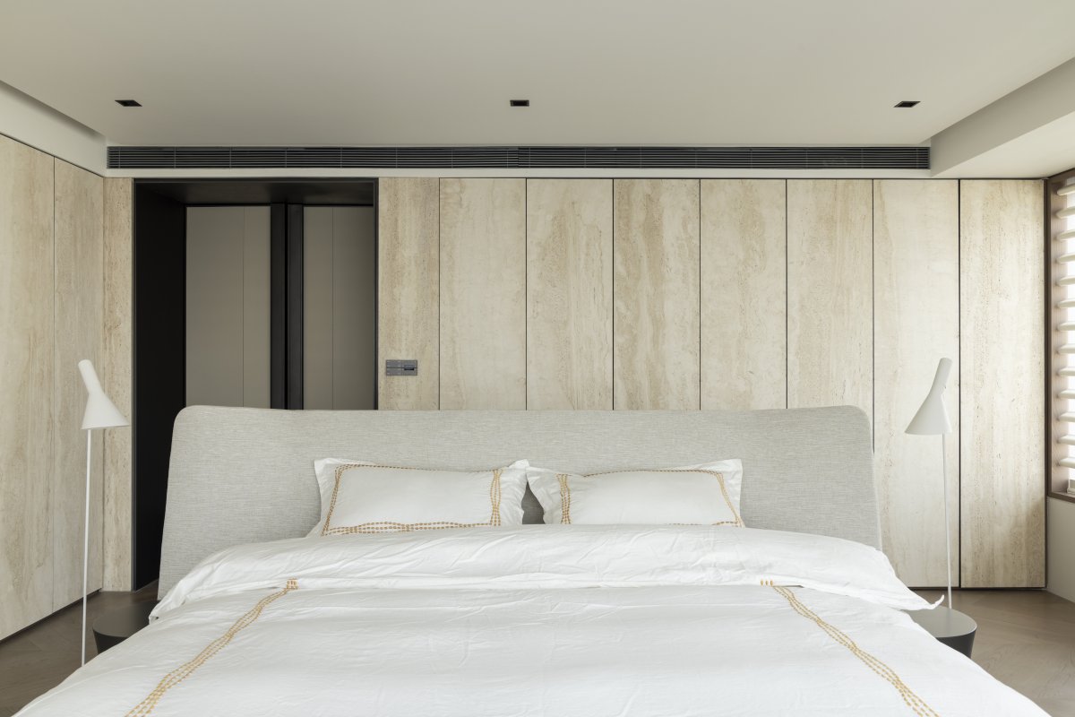
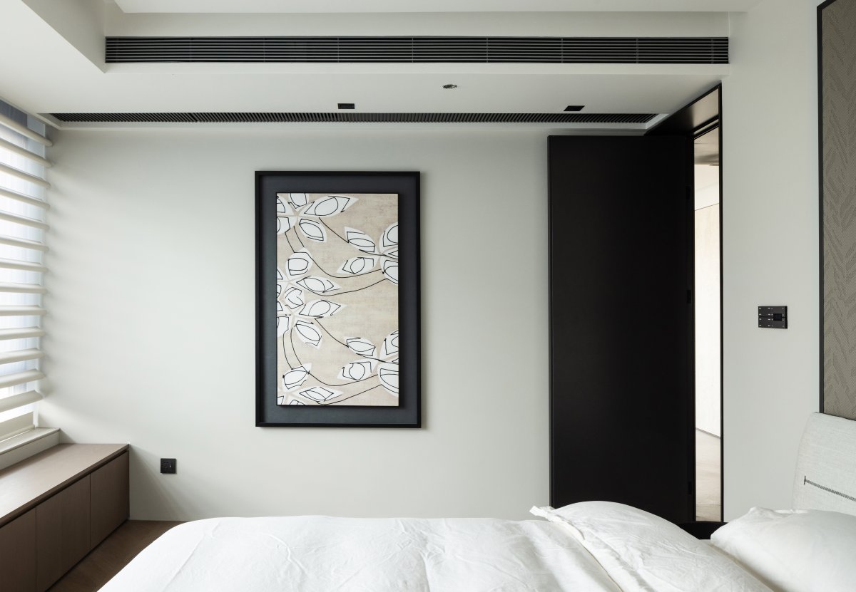
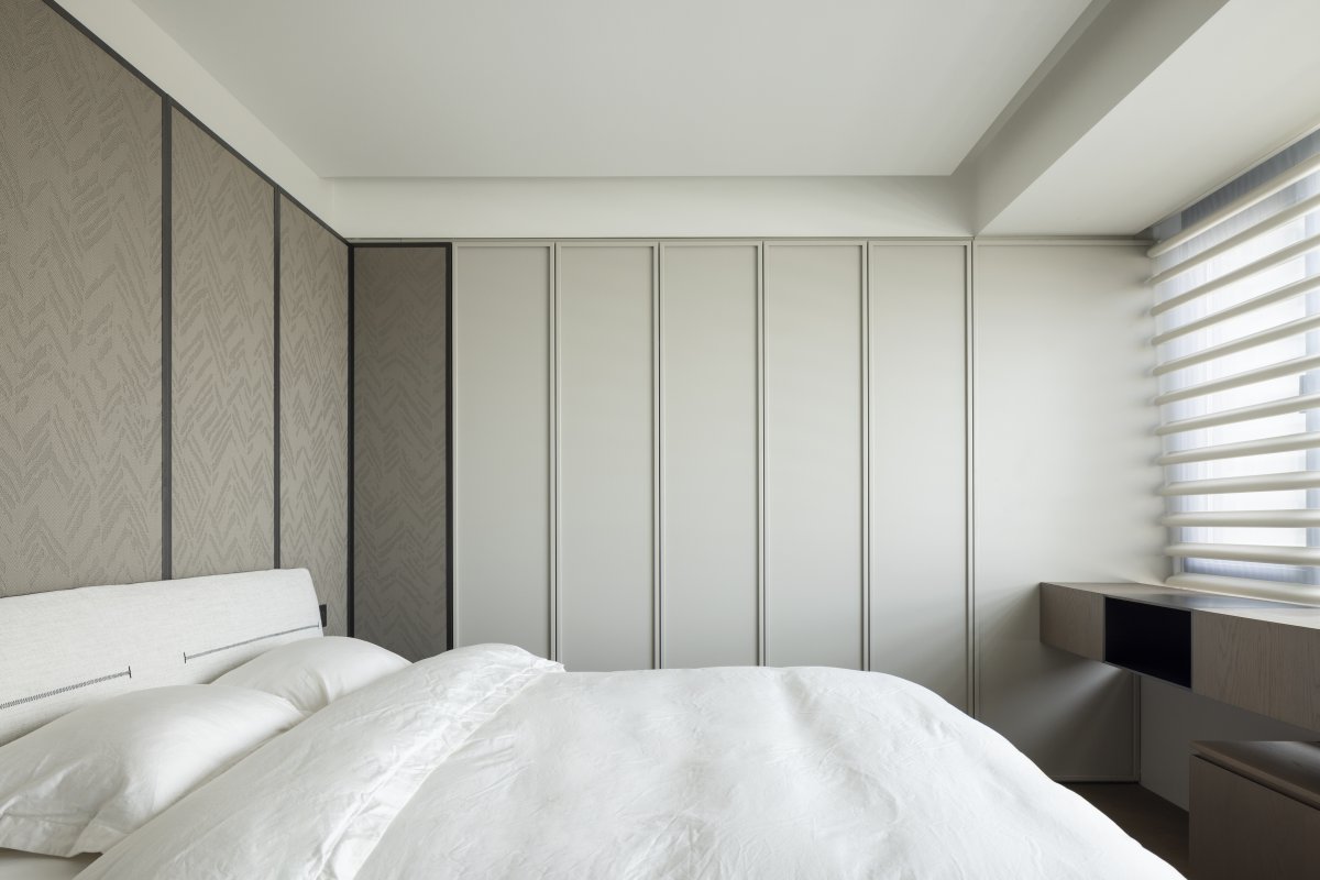
The change of the four seasons in Beijing is brief but generally clear. The comfort of 3 bedrooms is the point that primary consideration, reduce the bedroom part the most basic function, morpheus becomes a very pure thing, form detail and the natural aesthetic feeling of uneven protruding space itself on the plane.
Material Language and Elevational Treatment
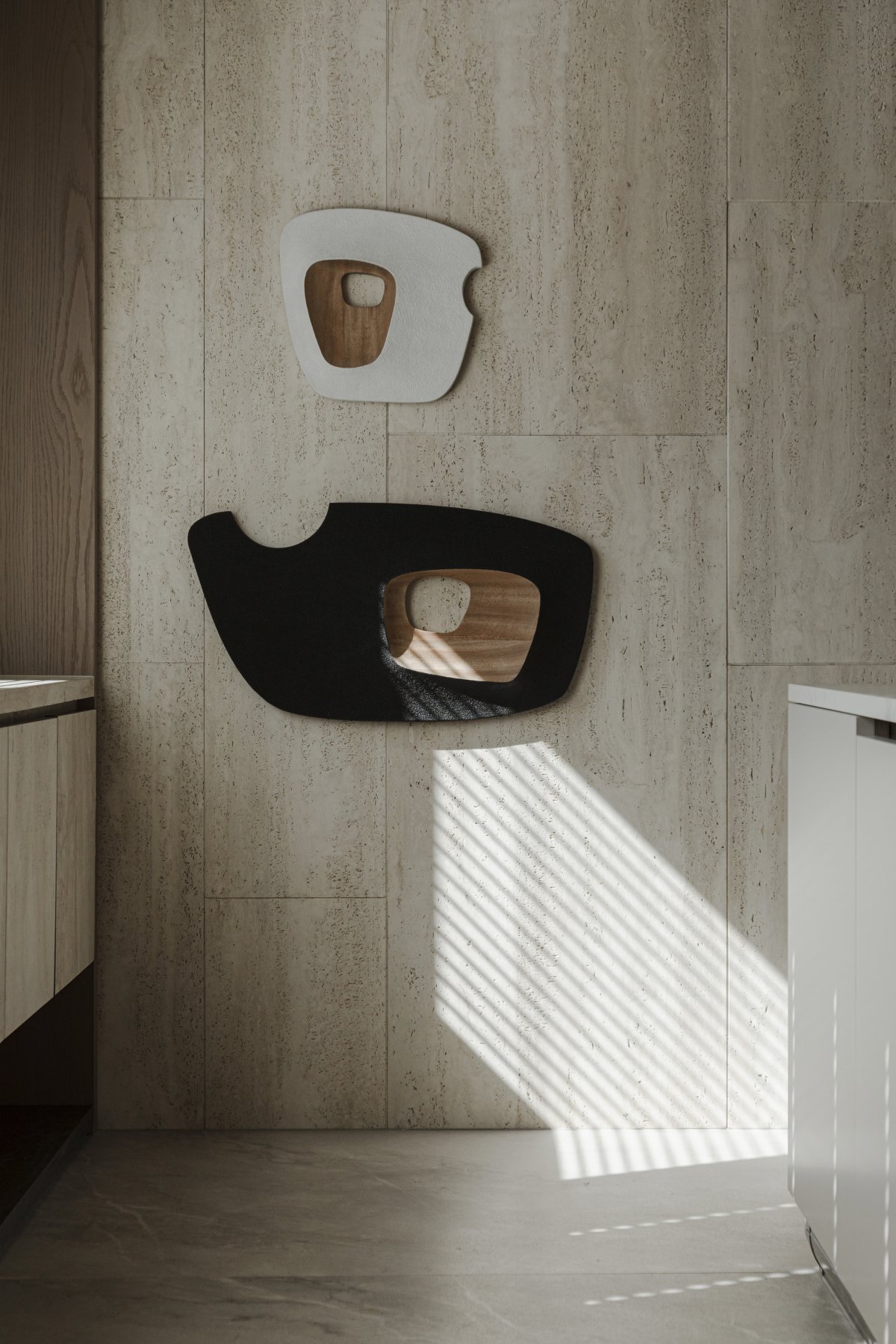
From the visual enjoyment to the practical function of the construction charm, with Italian super white cave stone, hand-dyed veneer, lychee grain leather, matte stainless steel, rock plate and other materials endowed with temperature, but also the pursuit of art and functional flexible implication, for life.
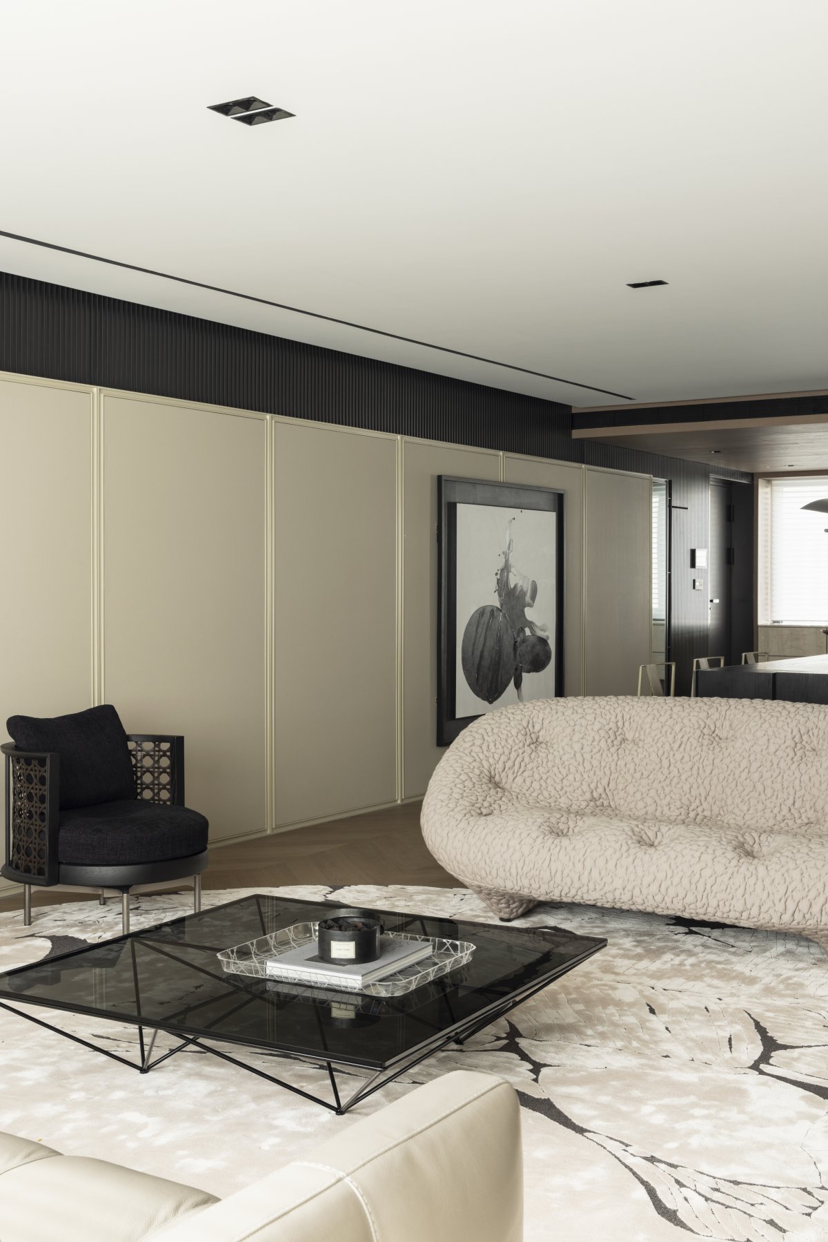
Color relations to deal with harmony and unity, so we grasp the traditional color context, but also the introduction of modern mansion fashion color, with moderate gray series of the whole space. First the parts are subservient to the whole, and then the parts are further refined. In the traditional quadrangle courtyard, the gray system is very rich, soot, brown gray, green gray, eaves, courtyard wall, screen wall, woven into a gray wave, in which we can discover a gradual change of shades of multiple gray, elegant and harmonious.
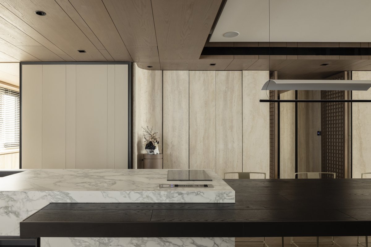
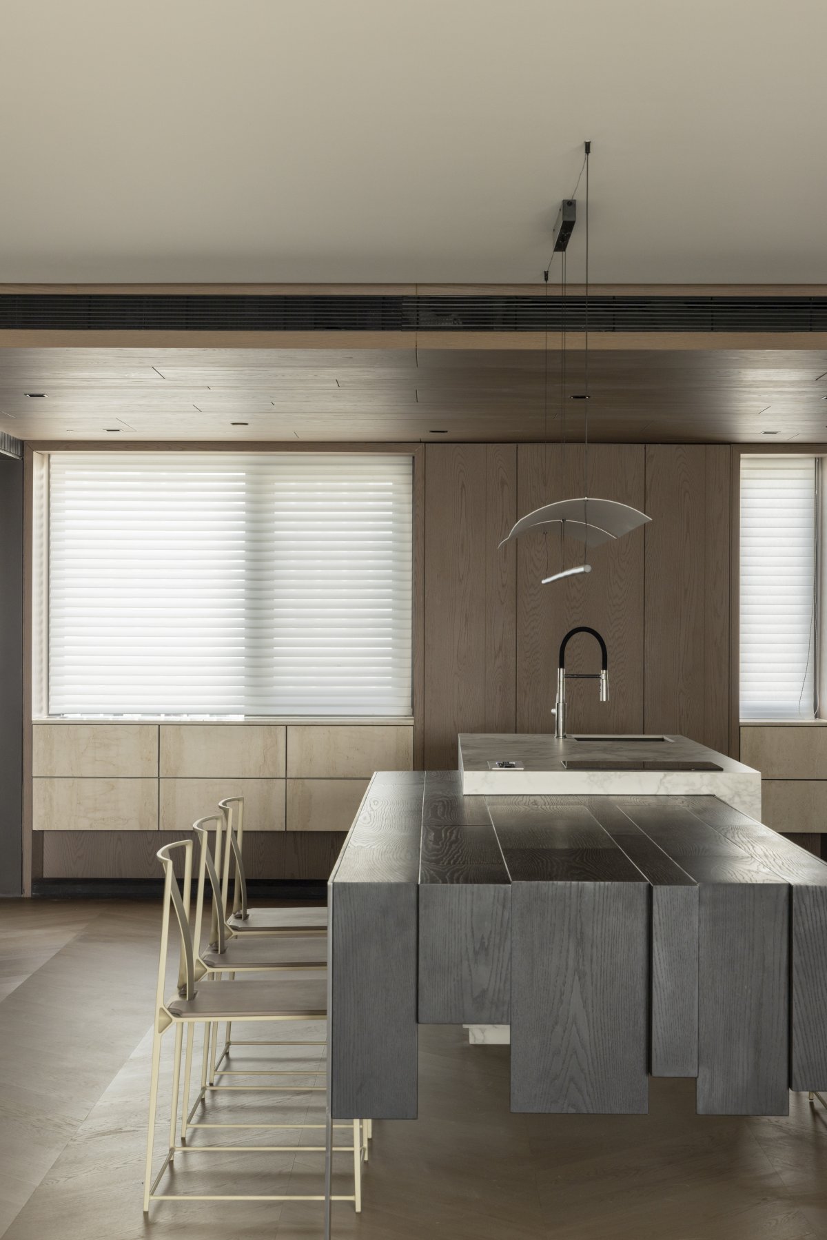
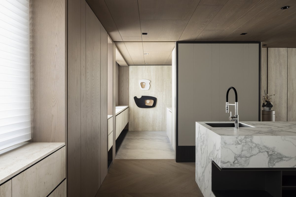
餐厅岛台采用了石纹岩板和不锈钢,和餐桌有一定的高度差,既有错落有致的美感也便于插头、接口等功能组件的安装。白色岩板岛台和黑色橡木餐桌在色彩上形成鲜明的反差,却又有一种会通的色块一致性,加强黑白对比使得客餐厅的左边空间既轻快又凝重,视感上不自觉的雄厚起来。
Dining-room island used stone grain rock board and stainless steel, have certain height difference with table, already strewn at random have the aesthetic feeling that send also facilitate the installation of the functional component such as plug, interface. White rock slab island and black oak dining table form a sharp contrast in color, but there is a kind of uniform color block, strengthen the black and white contrast makes the left space of the guest restaurant both light and dignified, visual sense unconsciously strong up.
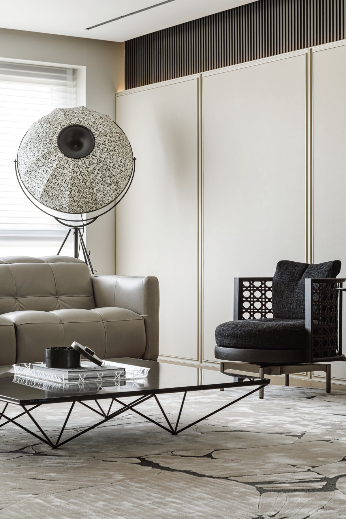
In soft decoration, whether it is Natuzzi, Ligne Roest, Minotti or B&B, such Oriental and Chinese aesthetic product design forms are concentrated in the Middle.
Lights
Architecture is a learned game, correct and macro, a form assembled under the light.
-- (France) Le Corbusier
The lighting system design of this case is also unique. Lighting serves moving lines and human settlements. According to different life scenes, we create different lighting atmospheres, which can be freely selected according to space users' work and rest time. Suitable lighting atmosphere for aging, lighting atmosphere under learning mode, lighting atmosphere at family gatherings...Then there are the echoes of different materials in the interior under natural light, which are our usual design techniques.
As The British architect Norman Foster said, "It takes a lot of effort to make a building look effortless." As designers, we will devote ourselves to the richer and more exquisite perception of space, the multi-level texture interweaving, the mysterious experience endowed by five senses and six senses, and the ingenious living space with details...
- Interiors: TEN DESIGN
- Photos: Li Ming

