TOMO
PHILOSOPHY
Beauty is absolute freedom and sensibility, but to create beauty requires extraordinary ingenuity. When TOMO that insists on doing valuable design in an interesting way meets ICON HOTEL, what will happen?
TOMO has insight into consumers’ demand for pursuing trendy and personalized hotel experience, explores and expresses ICON HOTEL’s gene, which is humanistic, interesting, and exploratory, and discovers the possibilities of the lifestyle of new travelers and architecture space. The brand’s core value is built through the ‘X+C²’model, X standing for the unknown while C² standing for the thought towards city and culture, so as to put forward a beautiful life formula of ICON, which is ‘ICON+X+C²’.
TOMO
CONCEPT
TOMO believes, the sense of beauty, high class, and experience feeling in a hotel can’t come from decorations. Hotel design should be liberated from the old approaches that mainly rely on decorations. Instead, it should explore the interesting aspects of life and the meaning of living, and use contemporary, cultural, and architecture language to create a sense of art and eternity in the space through material and consciousness.
DNA
The unknown X of city originates from life.
Based on the beautiful life formula of ICON HOTEL, ‘ICON+X+C²’, TOMO defines X as SELF in the project. The hotel space is constructed from dimensions of gene, architecture, art, and boundary, empowering business with the visual arts, adopting the architectural expression, and utilizing the fashion arts that matches the city of Shenzhen, to build a distinctive ICON. This is the ICON HOTEL X that TOMO reshaped, and the concept of next X is also highly anticipated.
INSPIRATION
Arts originates from consciousness.
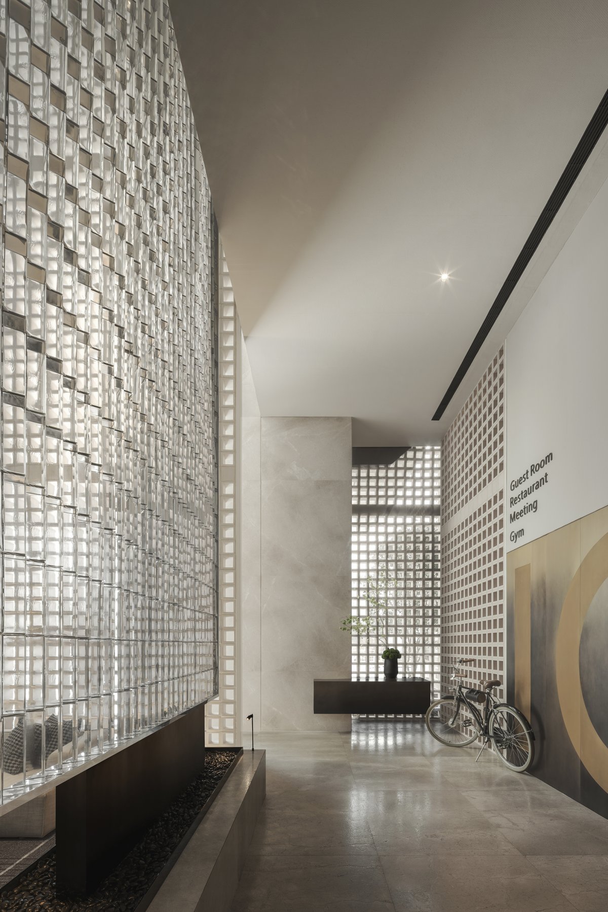
The design of lobby is inspired by the Kunsthaus Bregenz. Adopting Peter Zumthor’s architectural language, four thick walls are used to support the interior outline, which can allow the natural sunlight in to the greatest extent. Besides, the space structure provides more freedom and flexibility to the layout and functional partition.
The new layout, which partially raised the ground and three ceramic-brick panels separated by high walls, adopts the contemporary language to reinterpret the classic gardening, so as to make the lobby more interesting and enhance the texture of the space. Large glass window that natural sunlight can shining through, vintage but modern furniture, bronzed metal wall, glass panel, rough bases, semi-transparent ceramic brick walls and other designs, rough and light contrast materials, increase the interest of the space and sense of circulation.
BOUNDARY
-
The nature of space originates from the unknown.
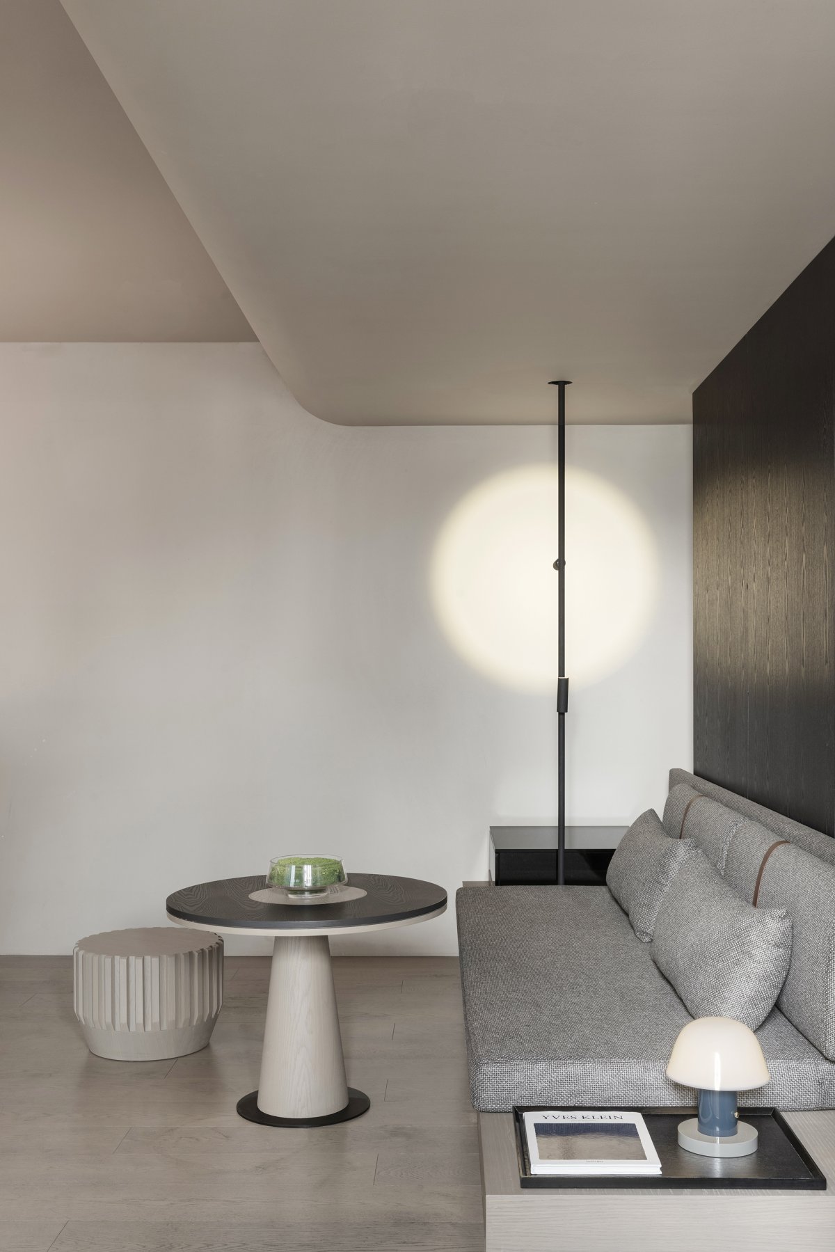
Unlike the traditional hallway with single function, the designer redelimits the space. The friendly display and leisure area, Chinese roof elements on the ceiling, create a buffer time along the elevator to the guest room. The designer boldly proposes the form of retreat in the guest room, sacrificing the space of room. Through the combination of landscapes and panels at the entrance, a small independent courtyard is enclosed, which is isolated from the outside world and forms a corridor block, creating an impressive experience and sense of privacy.
From boundary to space, the designer hopes to blur the boundary of space. Relying on the interaction generated by the space, space is where the unknown happens. When the space has ‘emotions’, people will have a higher level of experience. Learning from the garden landscaping, the designer builds landscape indoors, to eliminate the visual and psychological boundary of public area and allow the coexistence of interior and exterior beauty. When perceiving art, losing in thought, and sparking inspiration, it stimulates the unlimited interaction between users and space.
Restaurant
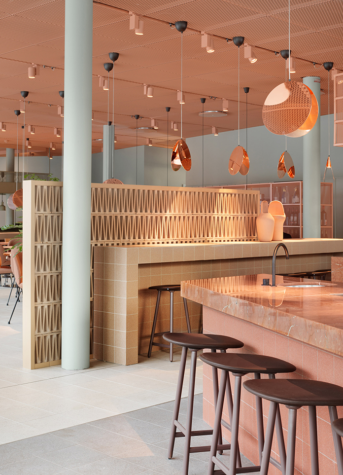
The corridor connecting the halls on both sides is planned as a extension of the public area. The designer creates a restaurant for people to have meals or read books, thus it helps upgrade customers’ experiences. The glass panels at the entrances on both sides of the corridor enhance privacy and sense of ceremony; the ceiling is constructed based on the technique of classical architecture, using the arc elements and high-class texture, setting the tone of architectural art for the entire space.
- Interiors: TO ACC
- Photos: Qin Zhaoliang


