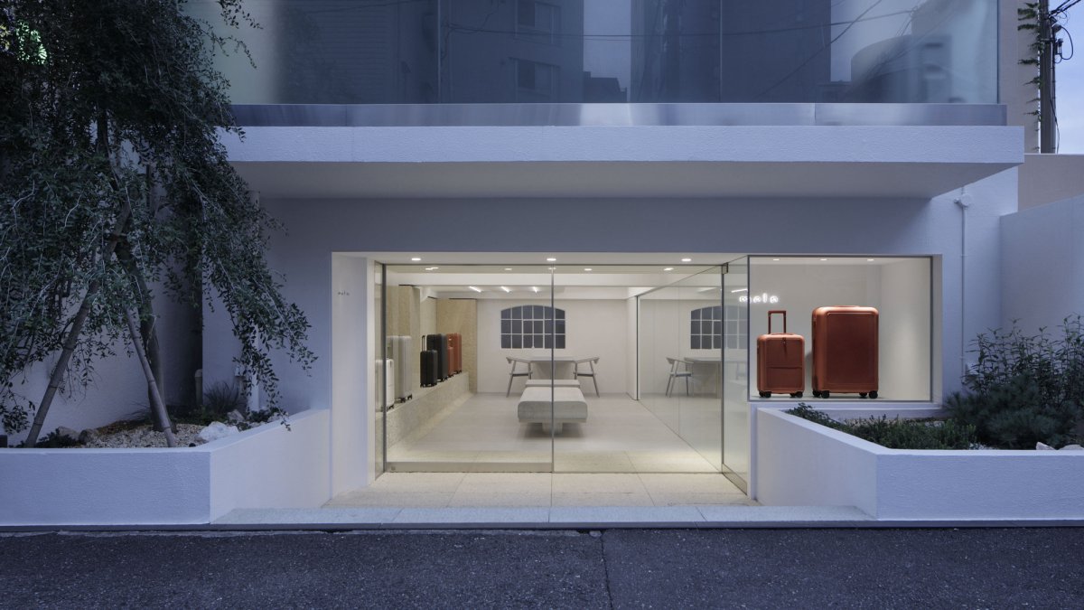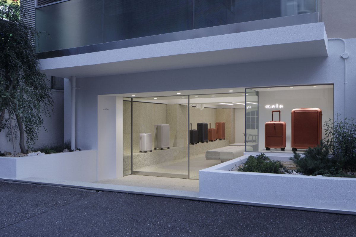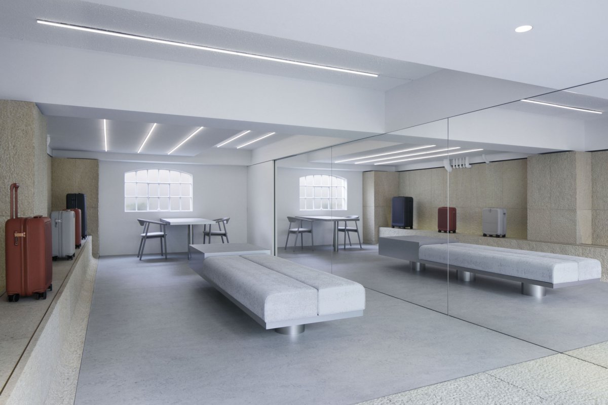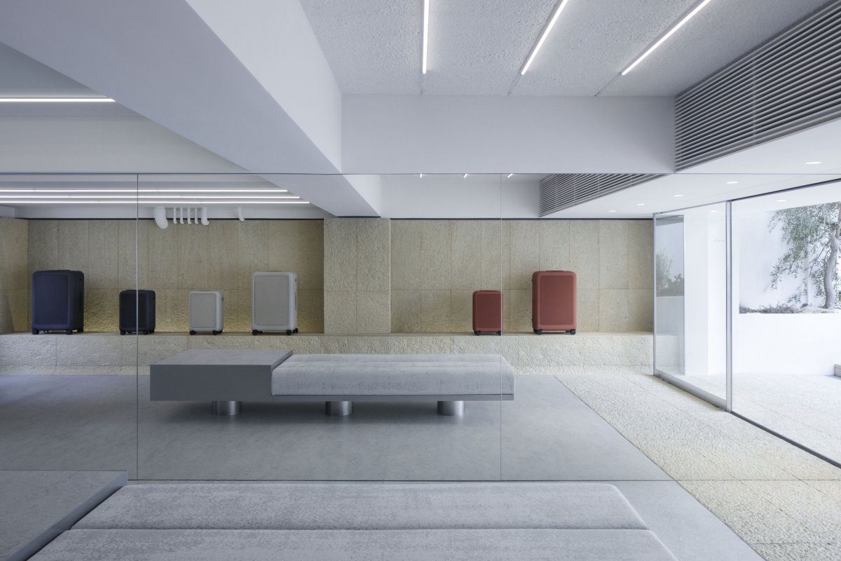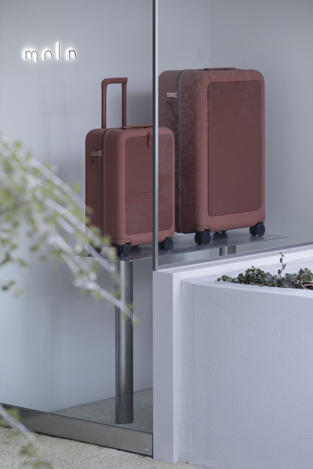
The interior design project for the travel brand "moln". The word "moln" derives from the Swedish word meaning "cloud," and reflects the desire to be a presence that is softly felt anywhere on earth, changing with place, time and air, just like those clouds that hover in the sky when one suddenly looks upwards on a journey. In response to this brand concept, Case Real believed that a contrasting space that is both light yet strong like the ground would be a good place to receive the light products of "moln".
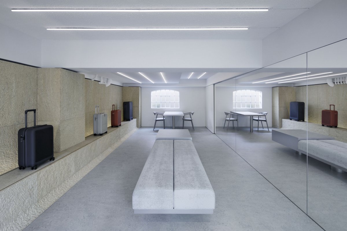
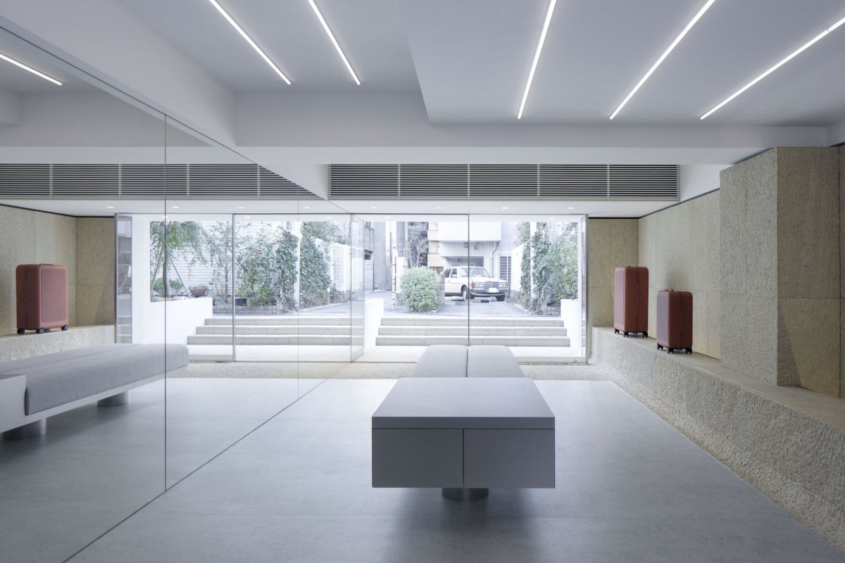
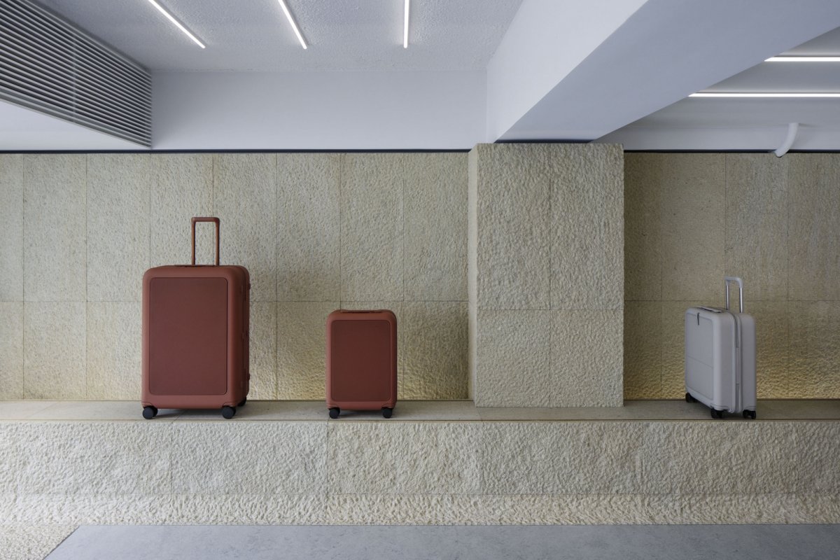
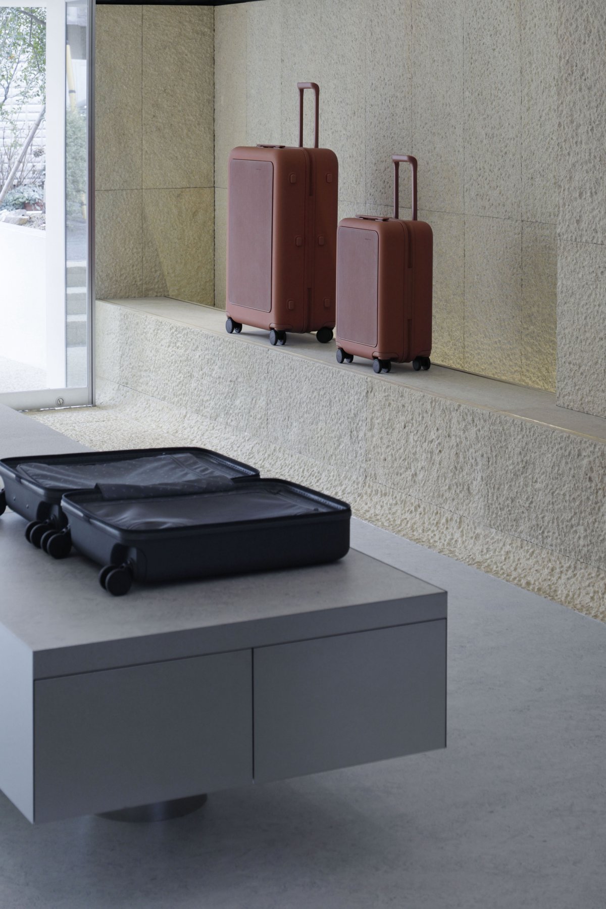
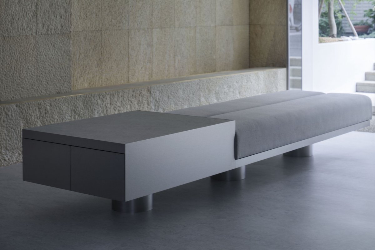
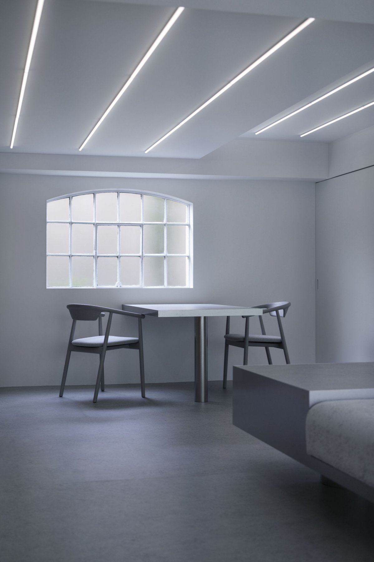
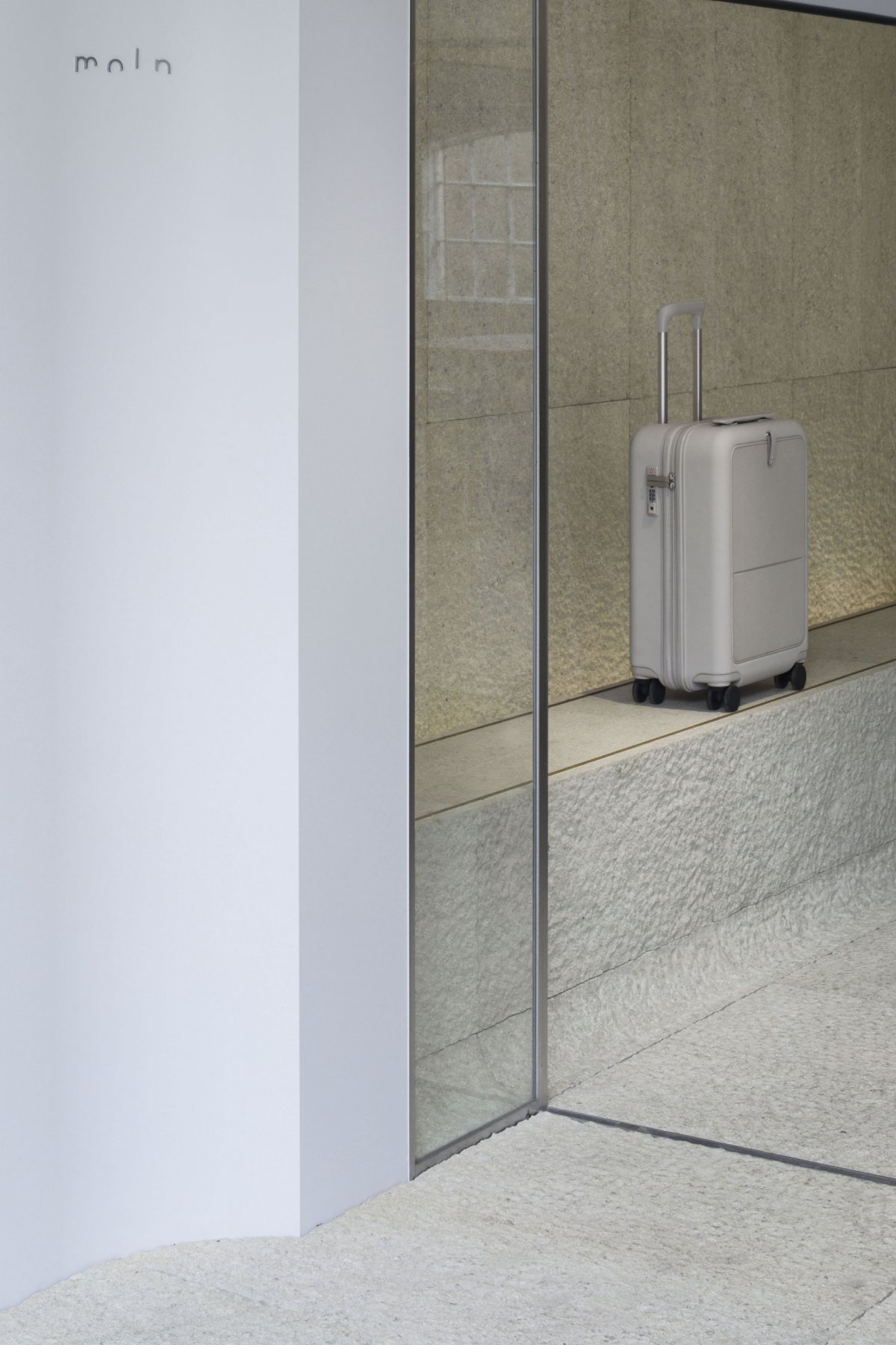
The materials used for the space were natural materials with subdued colors, such as stone with a roughened surface in light tones, gray linoleum, and fabrics. moln's products are developed based on earth colors, inspired by nature, thus the designer considered colors and materials that would fit well as a background for the products. In addition, the stone was applied not only to a part of the floor, but also to most of the walls and display stands, and by taking advantage of the low ceiling and semi-basement nature of the store, a cave-like space with adequate brightness was created.
The store functions consist only of display stands along the walls, a central bench and presentation counter, and a desk at the back of the store. Despite the limited space, the design aimed to create a relaxing lounge-like space by arranging the functions in a spacious manner. A large mirror on one side of the store allows customers to try the suitcases while actually walking through the store. The global COVID crisis has made it difficult for people to travel freely, hence "moln" was launched with a wish for the day when people will be able to travel around the world again.Case Real L expect that the products and space together will transmit the brand's vision and a new sense of values for travel.
- Interiors: Case-Real
- Photos: Qianqian
- Words: Daisuke Shima

