Through the tension between secular views and self-persistence, "I" becom who "I" am.
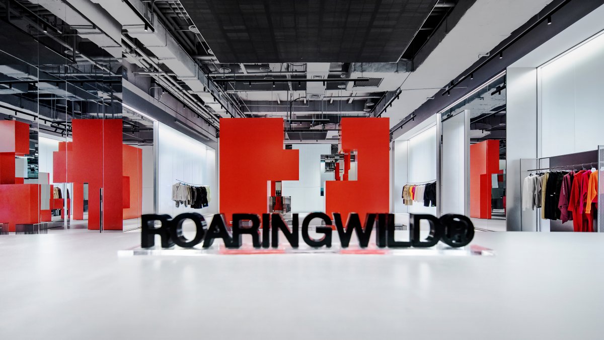
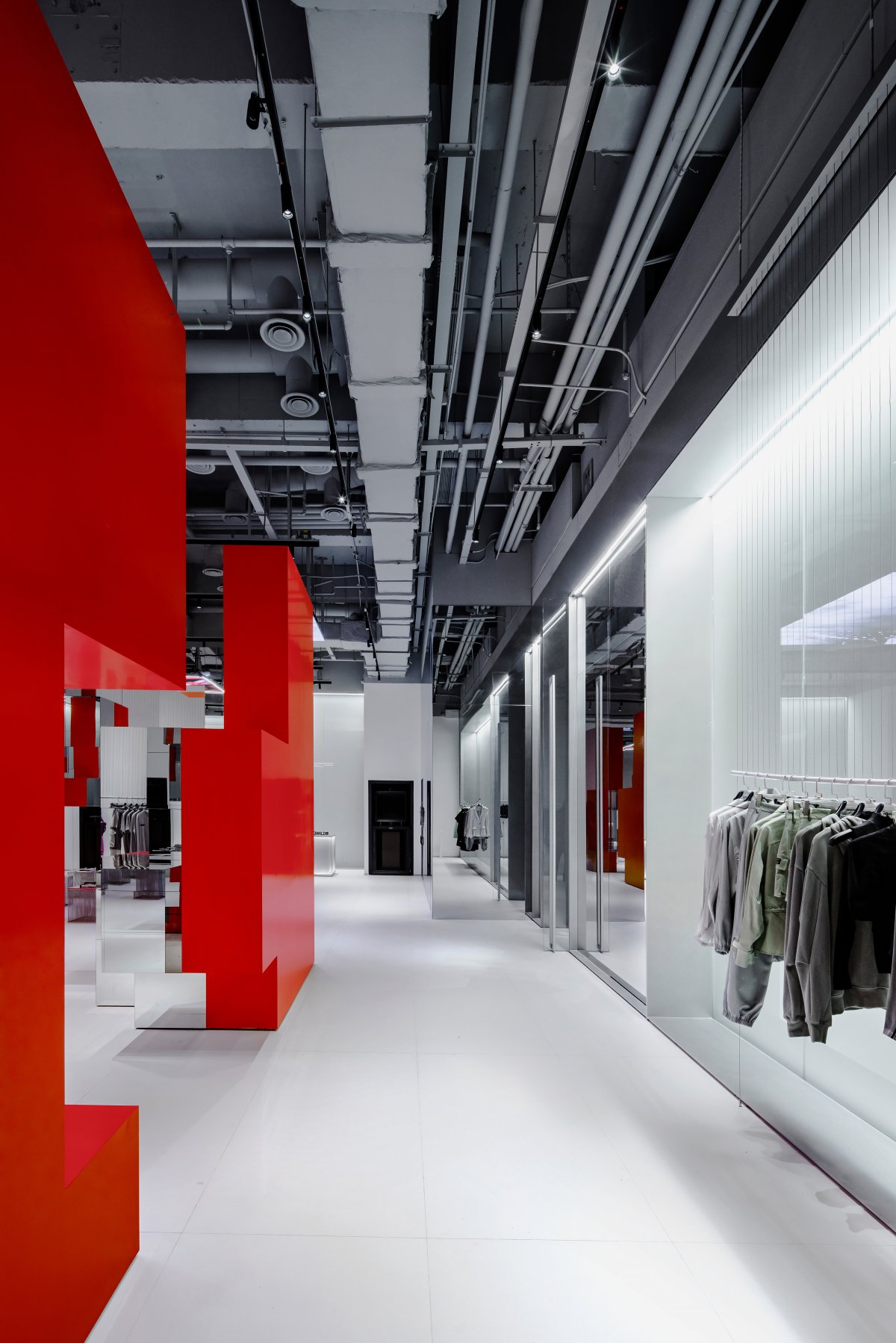
As a Chinese fashionable brand, ROARINGWILD has gained numerous followers with streetwear culture. Its inspiration to life is: awaken silent young people with clothes, dare to chase dreams and value the inner world of oneself. Adhering to this spiritual attitude, DOMANI once again designed an interesting retail space for this brand, creating an experience center for youth culture and life, hopes to build a unique compound and forward-looking brand.
Following the Shenzhen store, first flagship store of ROARINGWILD in Shanghai takes into account the aesthetic orientation and lifestyle of consumers in the place where the project is located. Magic Box fits the incredibility of Shanghai also called the "Magic City" and echoes the blurred, contradictory and ever-changing urban aesthetics with the word “magic”.
Instead of simply inheriting the brand's consistent urban style, the design is more about "how to provide customers with a sense of design and fashion attributes, while integrating into the space with a sense of functional experience".
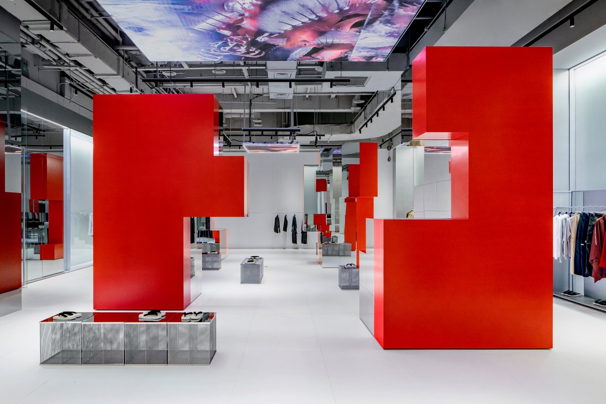
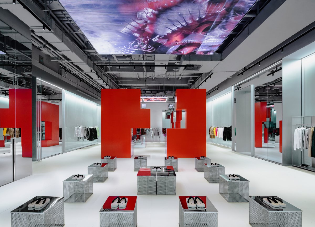
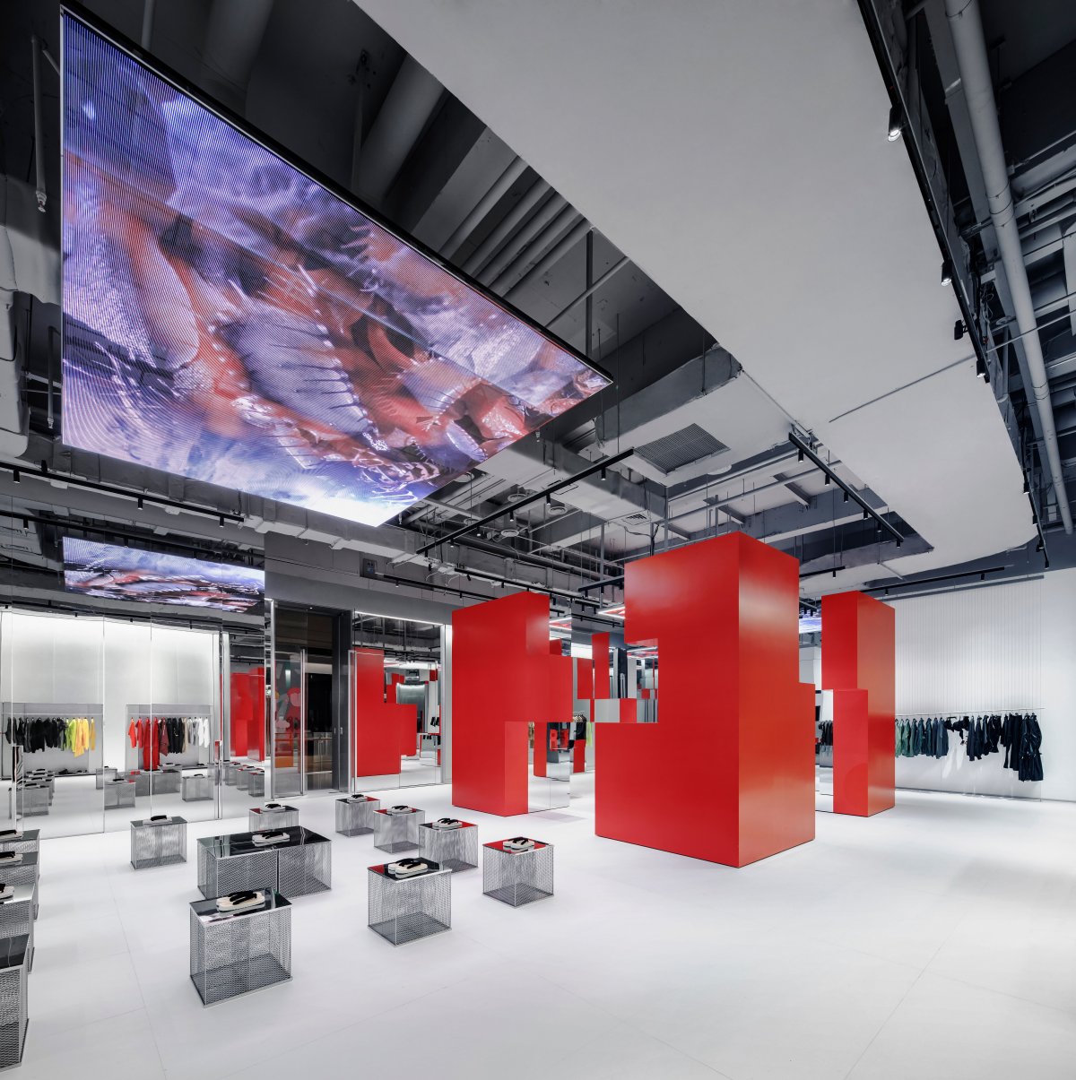
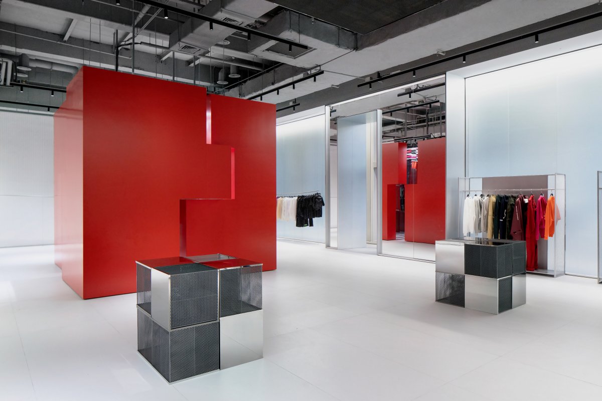
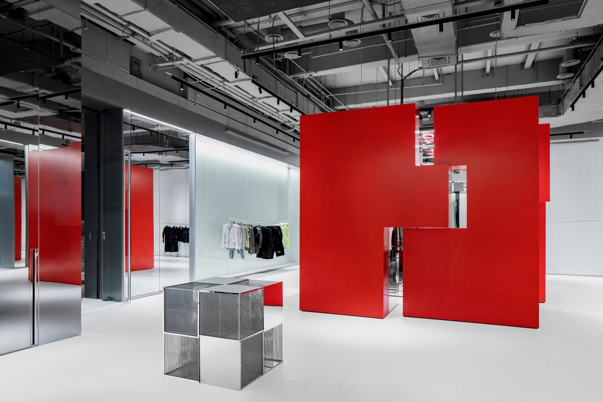
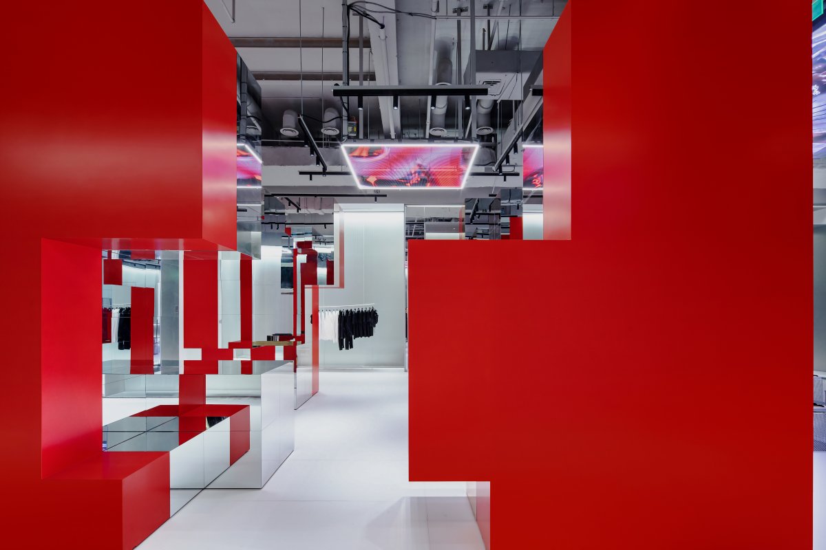
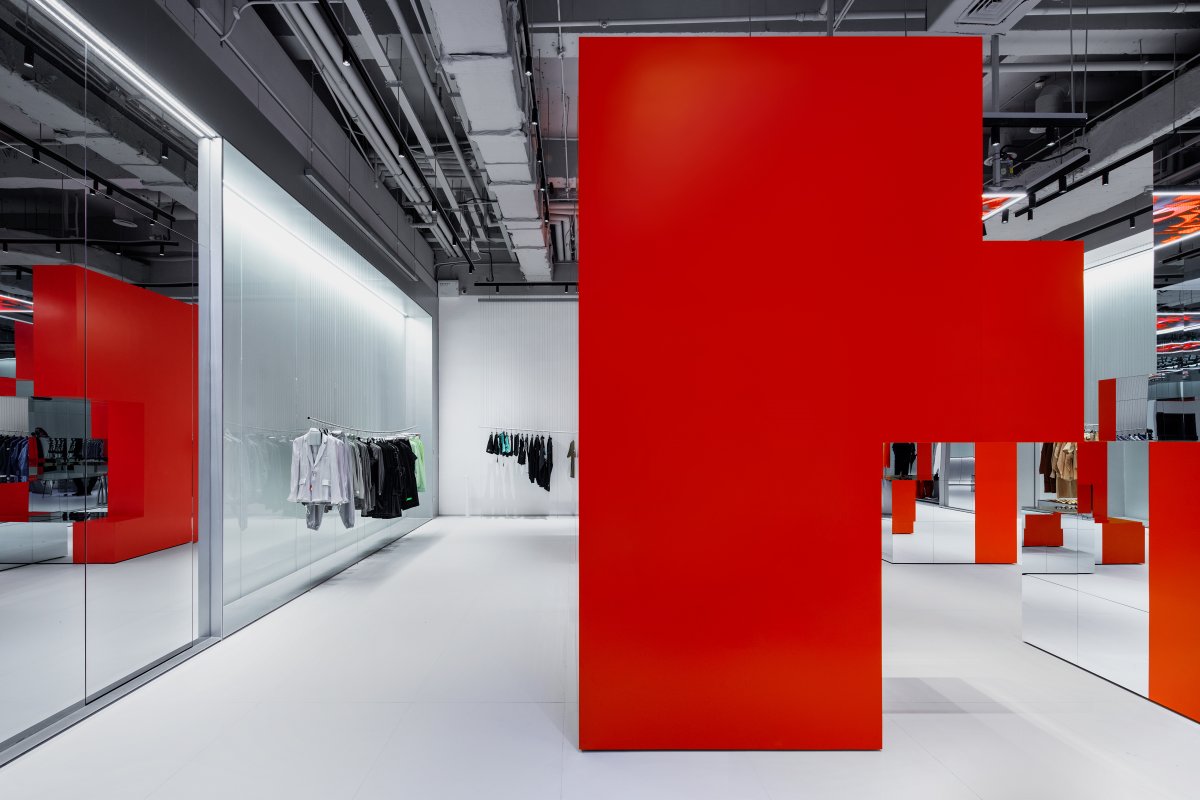
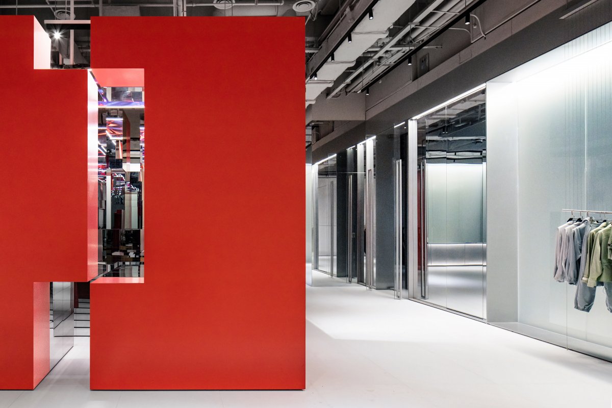
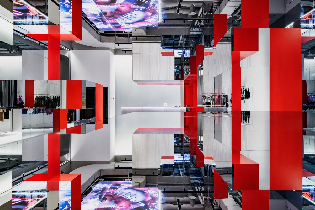
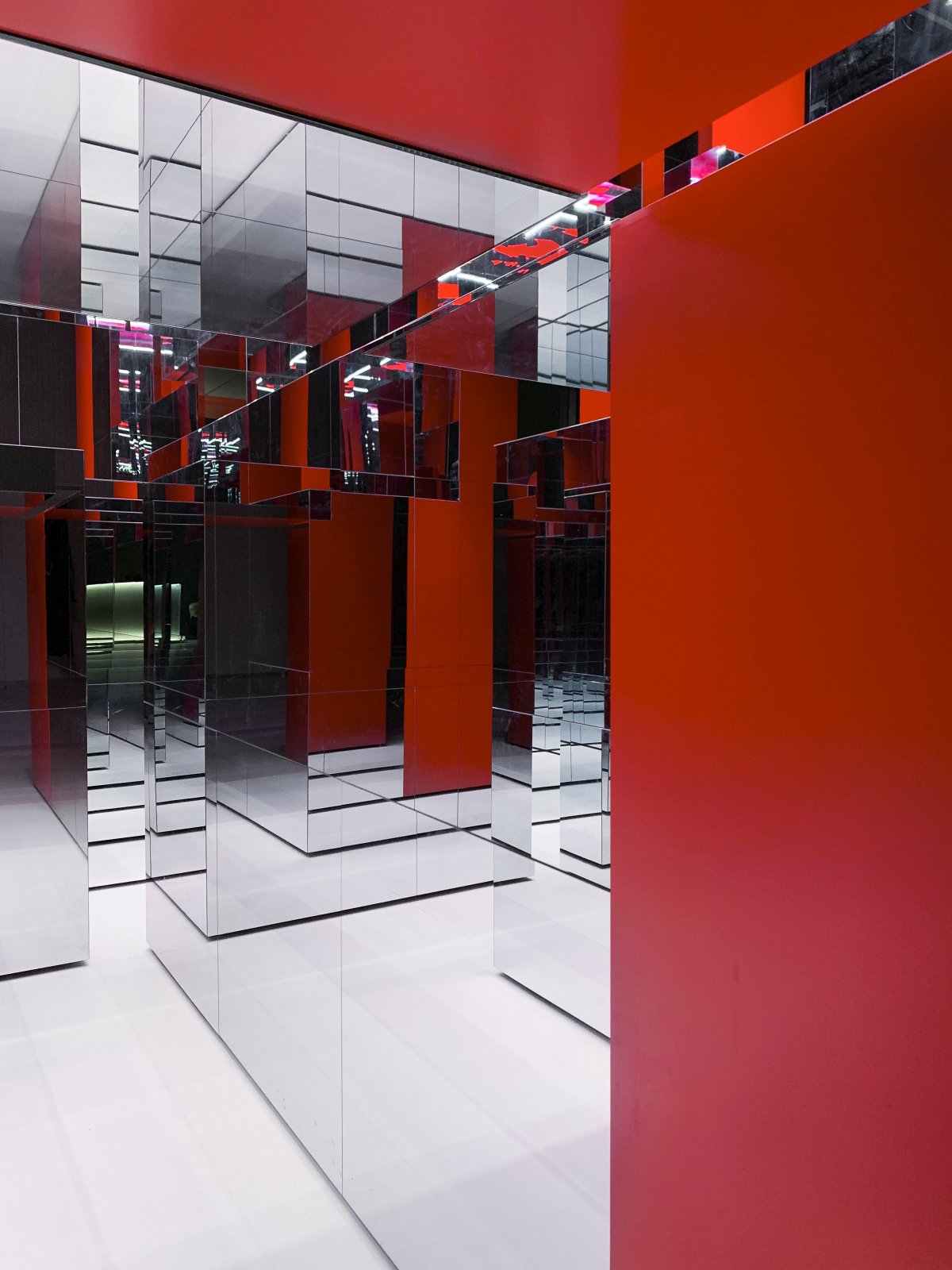
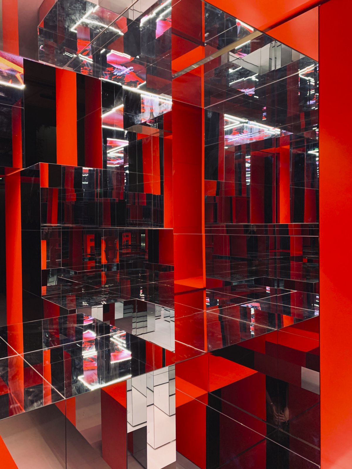
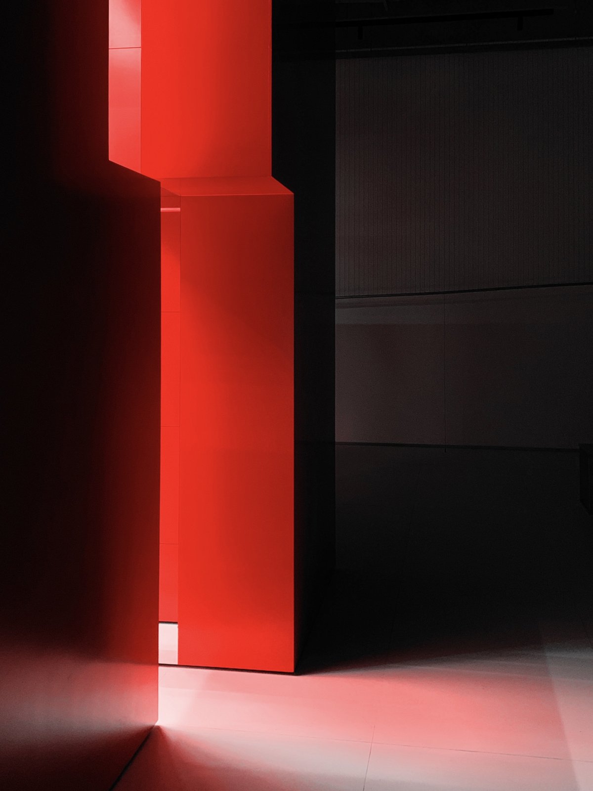
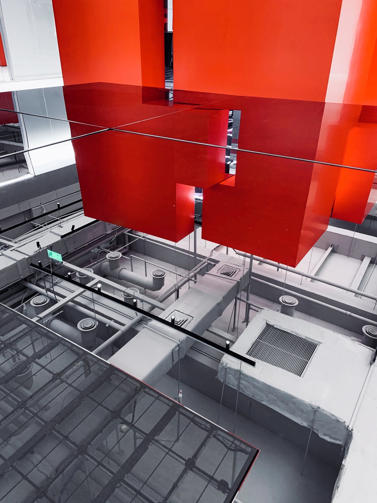
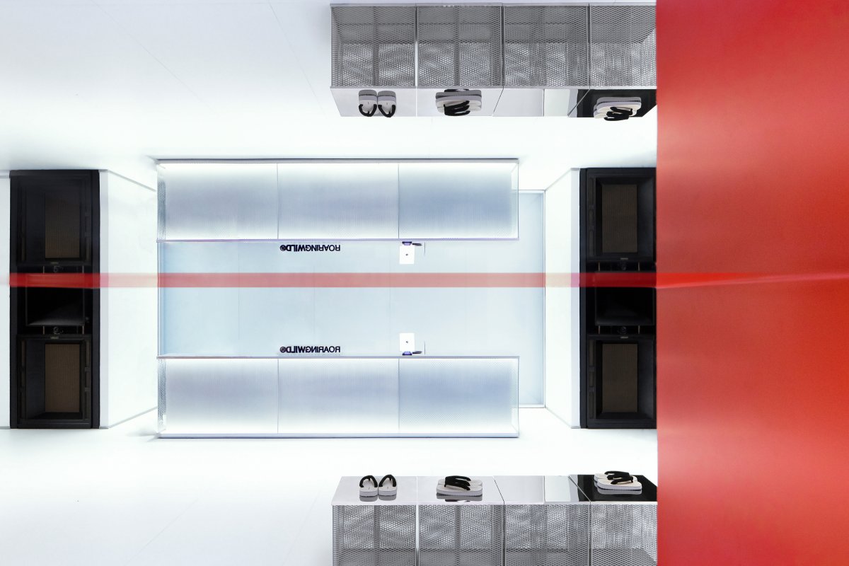
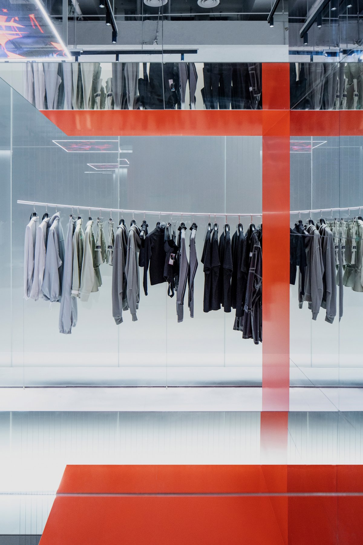
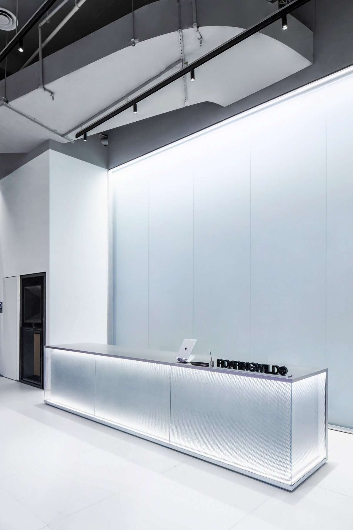
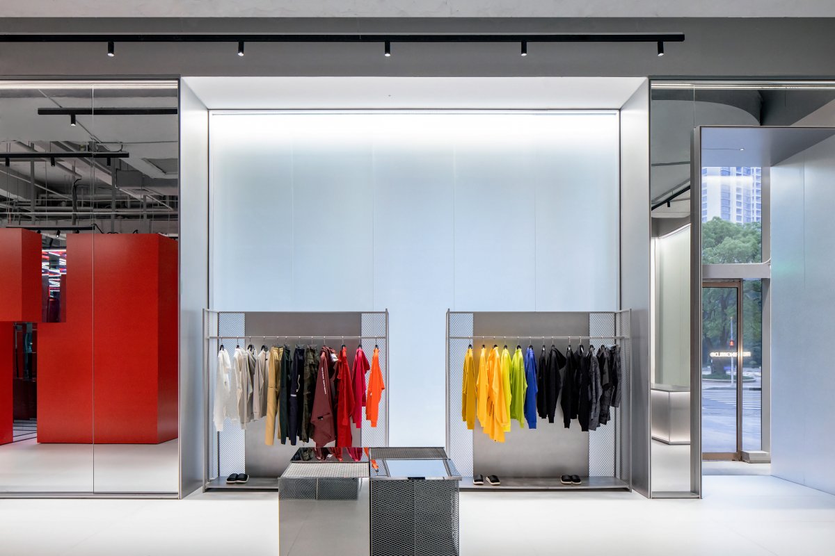
The red paint baking board of the magic box is chosen to be combined with the metal-textured glasswork so as to give the space a brand-new visual sensory experience with the complex geometric figure transformation technique.
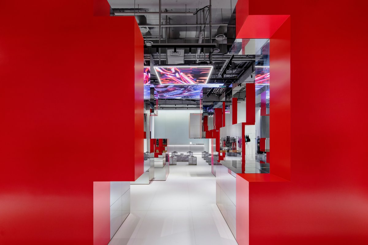
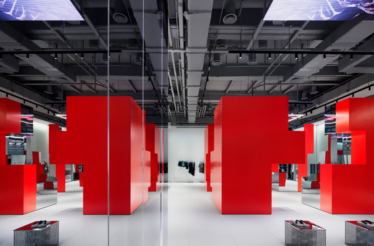
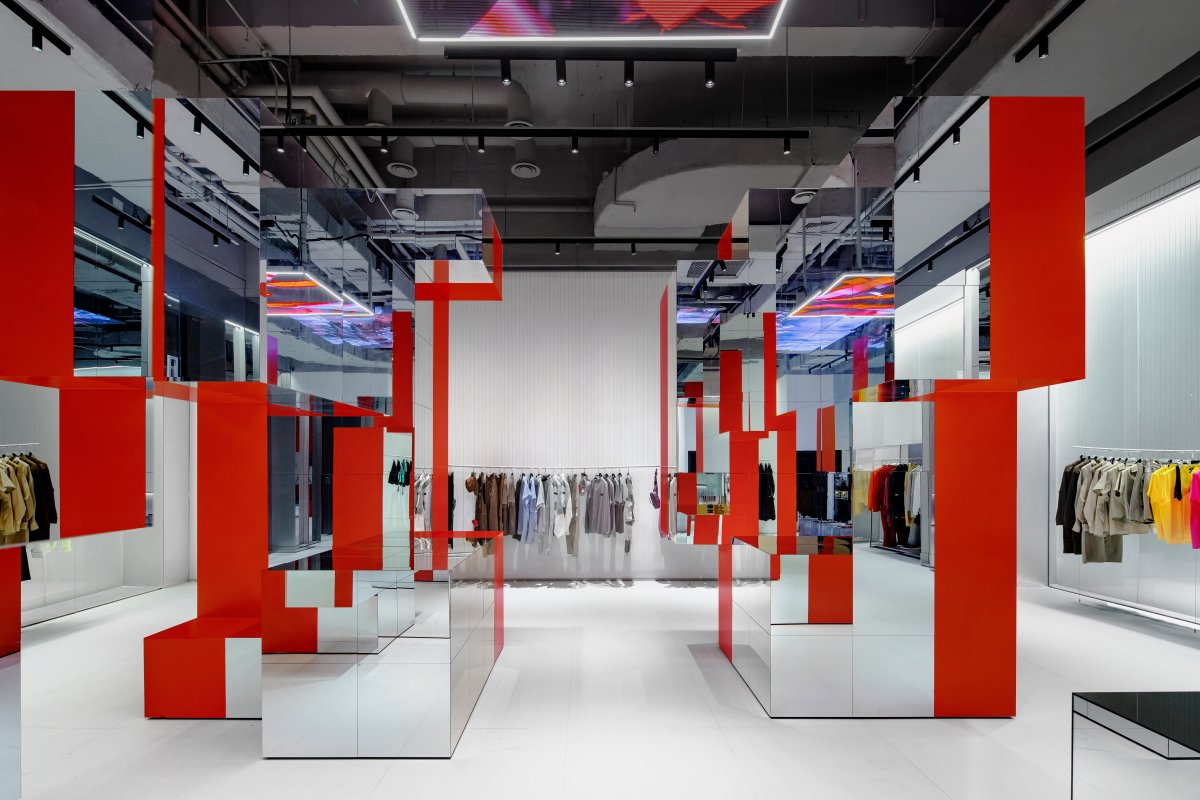
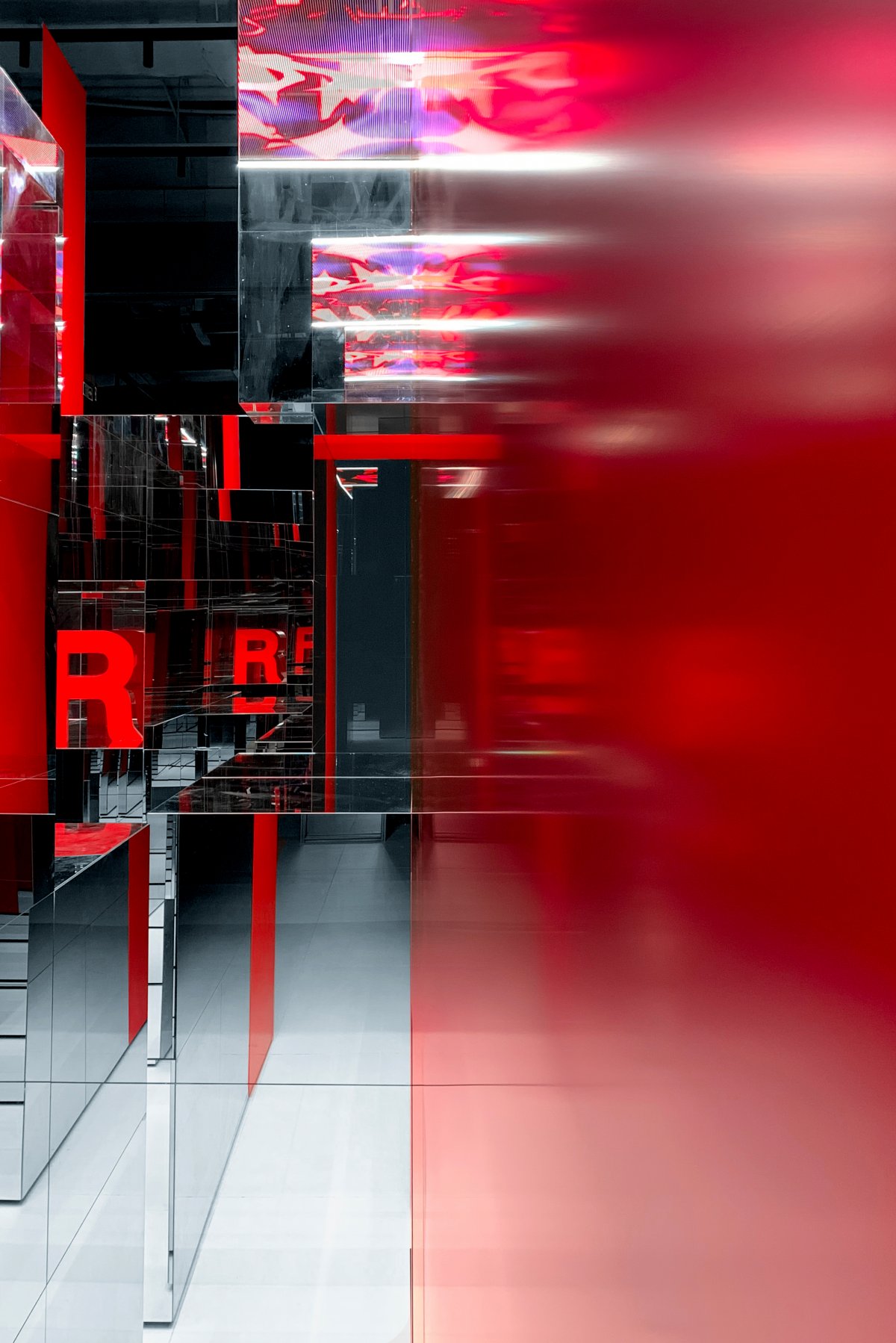
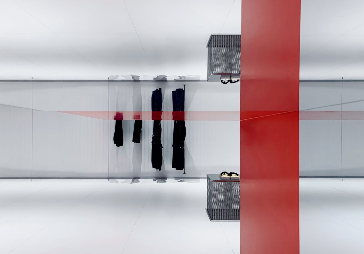
Developing the concept of Magic Box, the project employs the mirror reflection effect of the external space to re-present different aspects. The designer hopes to extend it as a metaphor, implying the variability of fashion trends rather than a single perspective.
The design deploys avant-garde red modelling as the carrier, trying to present a blood surging heart by creative thinking on the color. On one hand, it uses the bright red device like a red hard core wrapped around the outside with firm enthusiasm in order to interpret the never-fading trendy style.
On the other hand, it focuses on the core significance of vitality as a carrier for its creation, and further discusses the way that commercial space is perceived by people-more spiritual core and avant-garde concepts.
From the perspective of consumers, the most interesting point of the space is that the cubic Magic Box is not an unchangeable furnishing structure. It can be a complete overall display or divided into separate parts, which breaks the business model of standardized design. Due to the diversity of products, traditional store spaces cannot meet the display needs of pioneer brands. Therefore, in this unique city of Shanghai, we need a more dynamic space.
In the context of the diversified information trend, space is defined as “endless fun with changes”. Magic Box takes “integration-disintegration” as the design language with the aim of anti-traditional and stacking display, creating a better carrier for products and more Dynamic and changing ways of moving lines.
To open and close Magic Box device increases the flexibility and sense of participation in the space. And it creates more event themes and personalized product display methods to maximize the performance of the device.
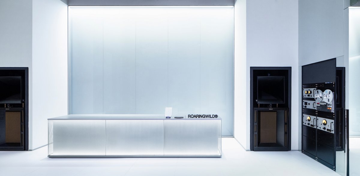
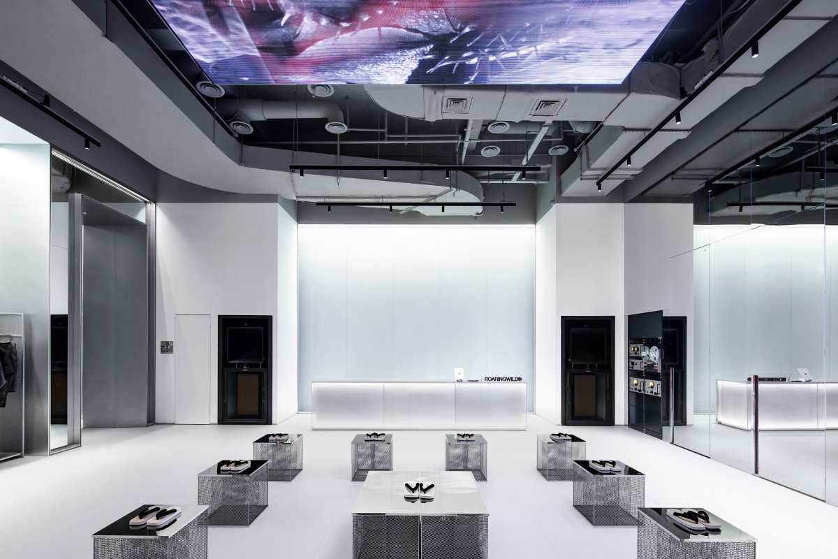
Music, which is inseparable from street culture, is an important art form. In terms of music, the design imbedded a huge sound device into the wall, combining with DJ's music operation panel to respond to the changes of the space so that the music can complement the blank space, bringing people a unique and trendy way to interact. The LED screen form of the ceiling is compatible with the music, and a sufficiently wide activity area is set up to meet the needs of joint activities and trend parties. From the perspective of creative freedom, the space is not limited to shopping space, but also a multi-social space.
Regarding to the internal design concept of Magic Box, it is just like a nuclear change, intense and dreamy. The neat cutting modules of the mirror surface allow customers in the space to jump out of the flat space and enter a multi-dimensional one. By capturing their forms, it attempts to establish a field where they can think and talk with themselves.
Due to the location environment of the project, the external facade of the space cannot be changed and redesigned. The designer's ingenuity in the work is reflected in the establishment of a background wall inside the space. Starting from the theme of art, emotional creation, and activity, the external window is truly shaped into a "miniature" of the urban landscape.
Change is a very moving thing, it is about the way of thinking, behavior pattern and sensory experience. We all hope to use this space to convey the idea of richness, diversity and infinite possibilities.
- Interiors: Kingson Leung × DOMANI
- Photos: Lenz Wang

