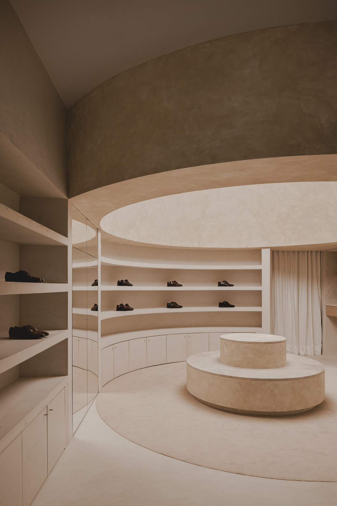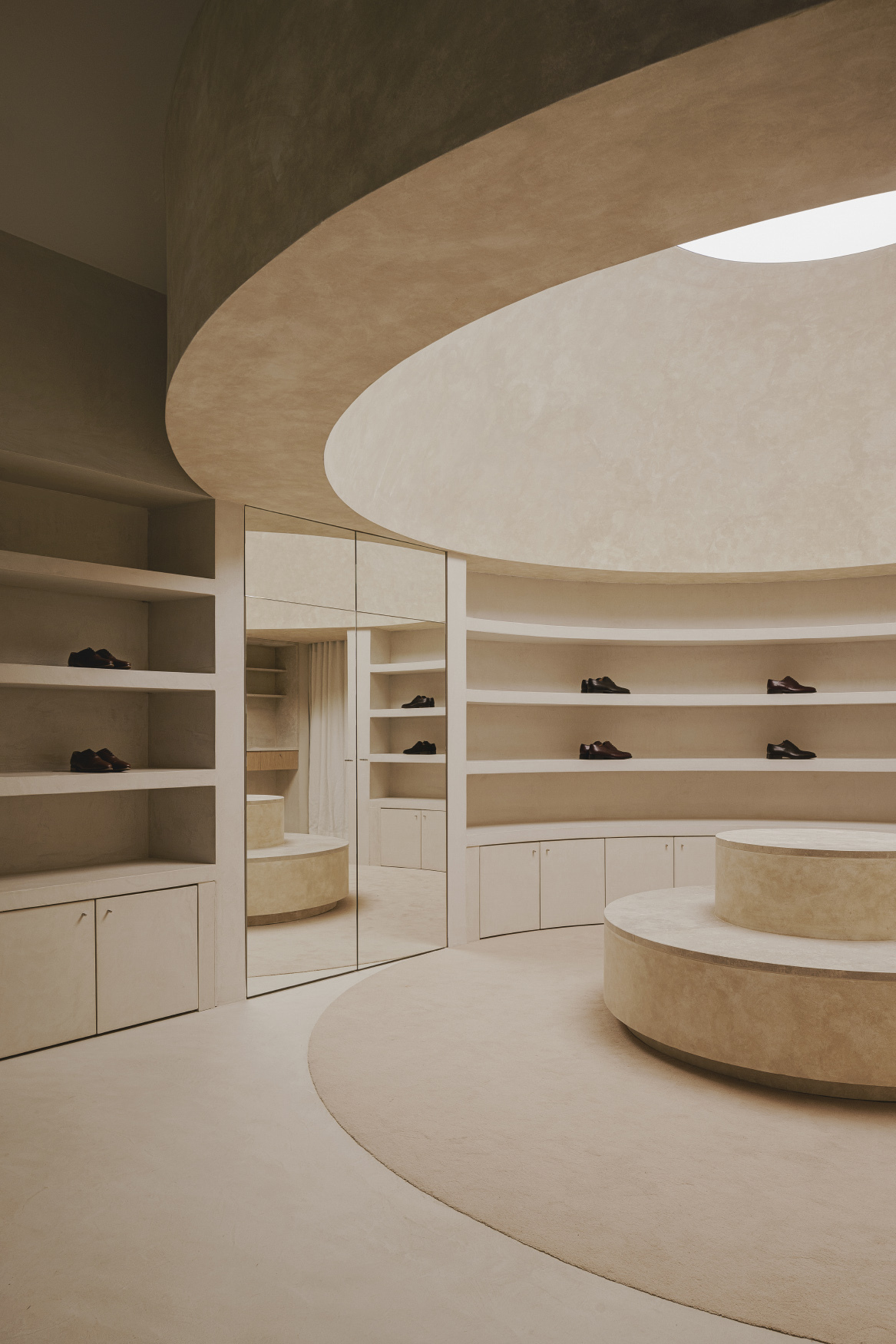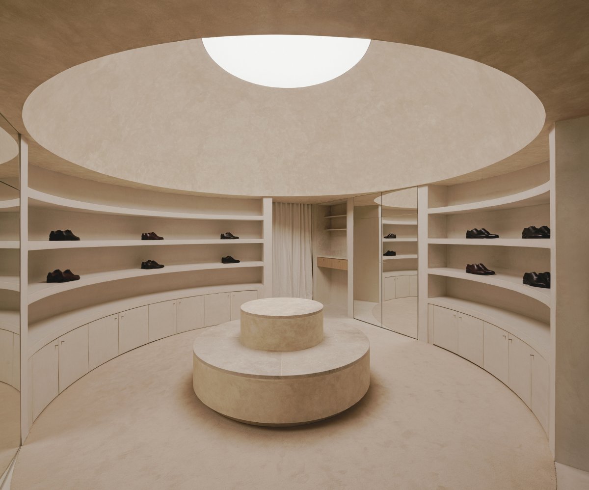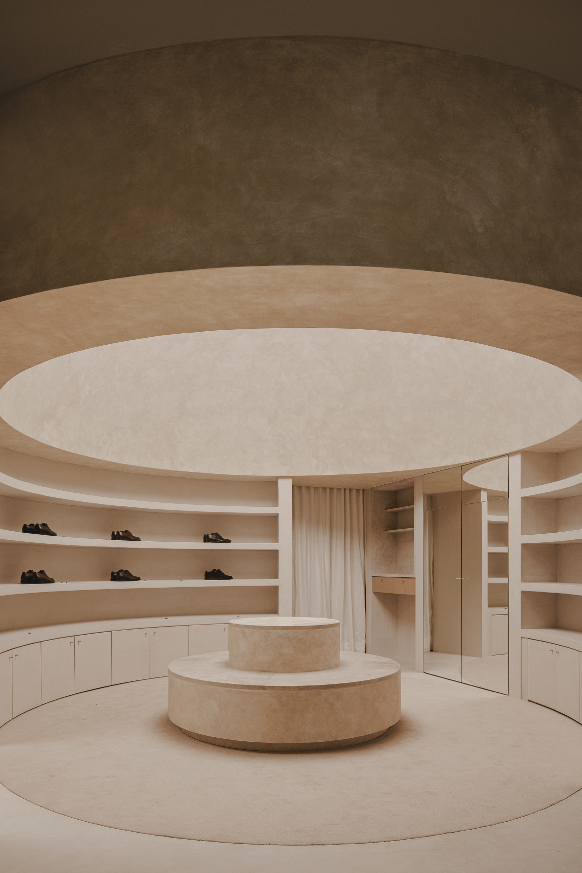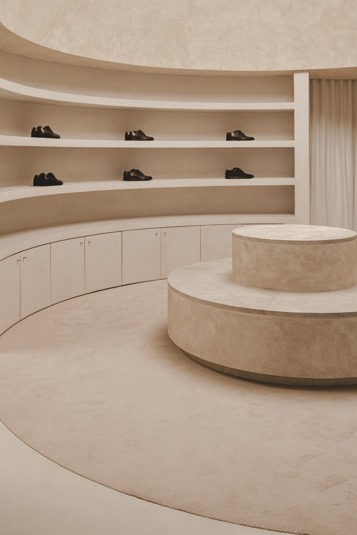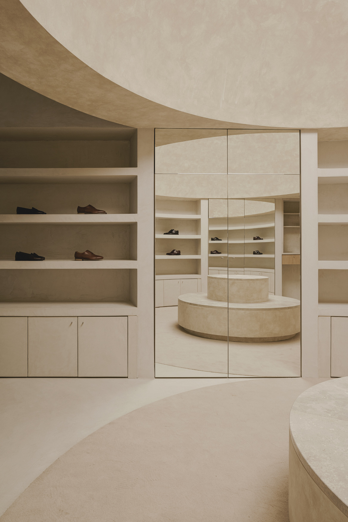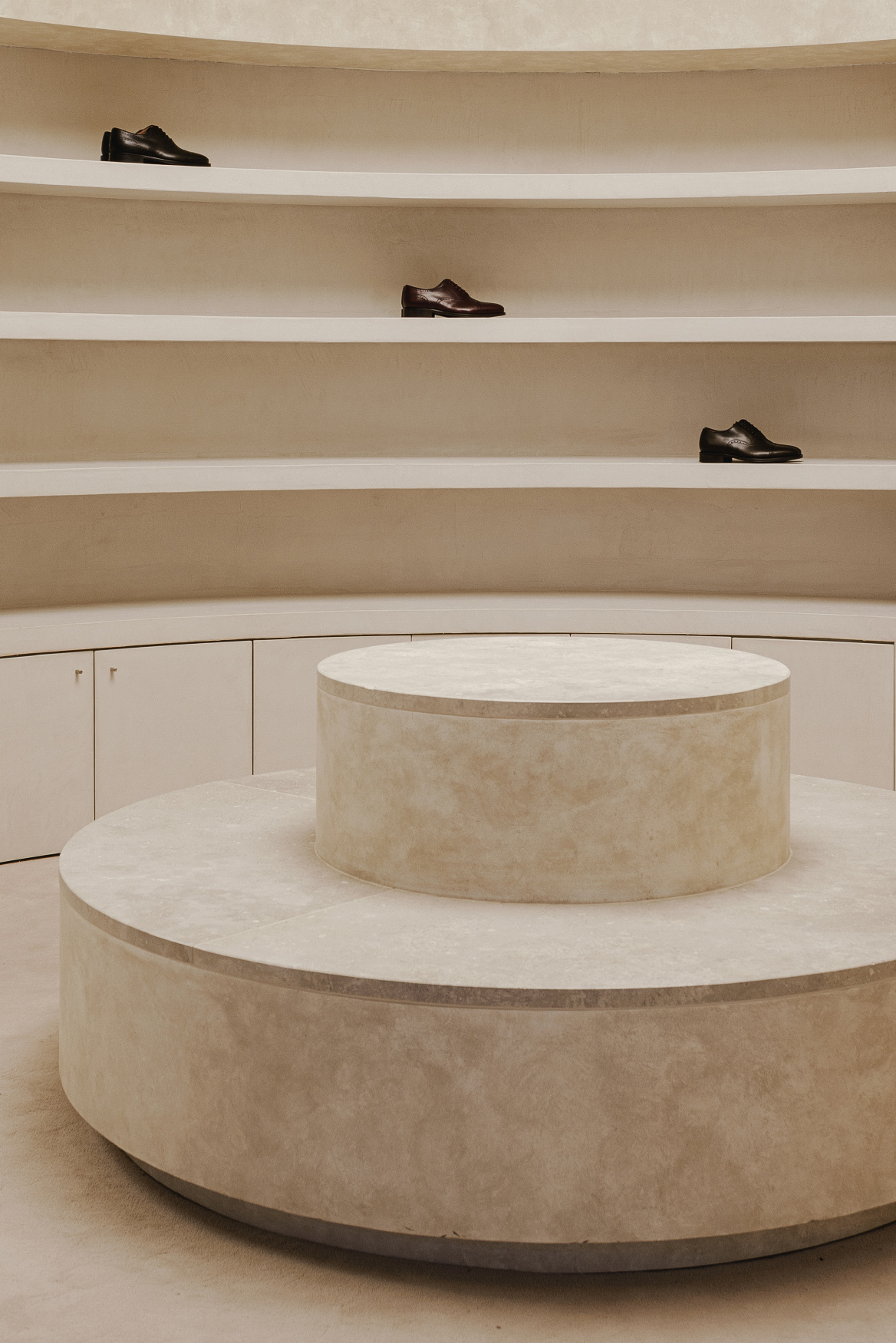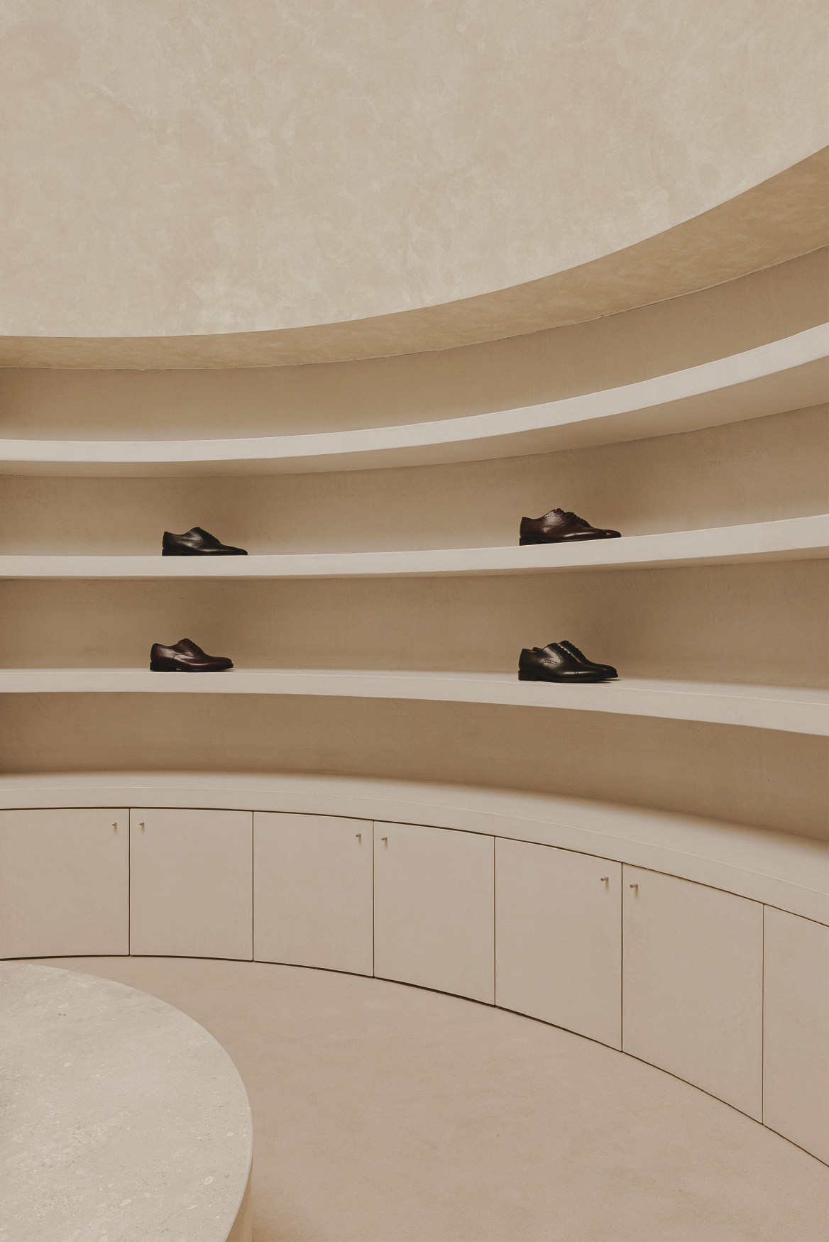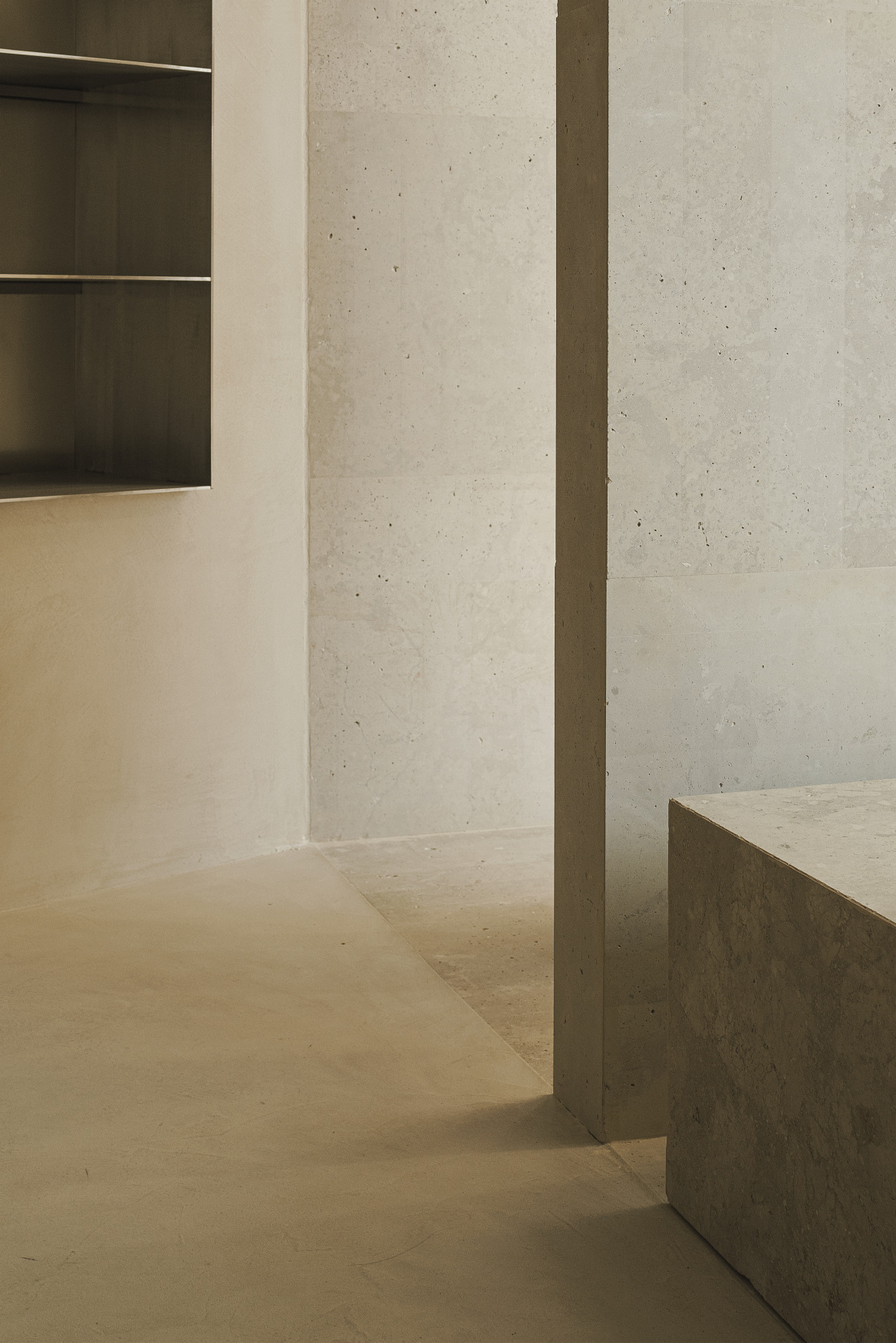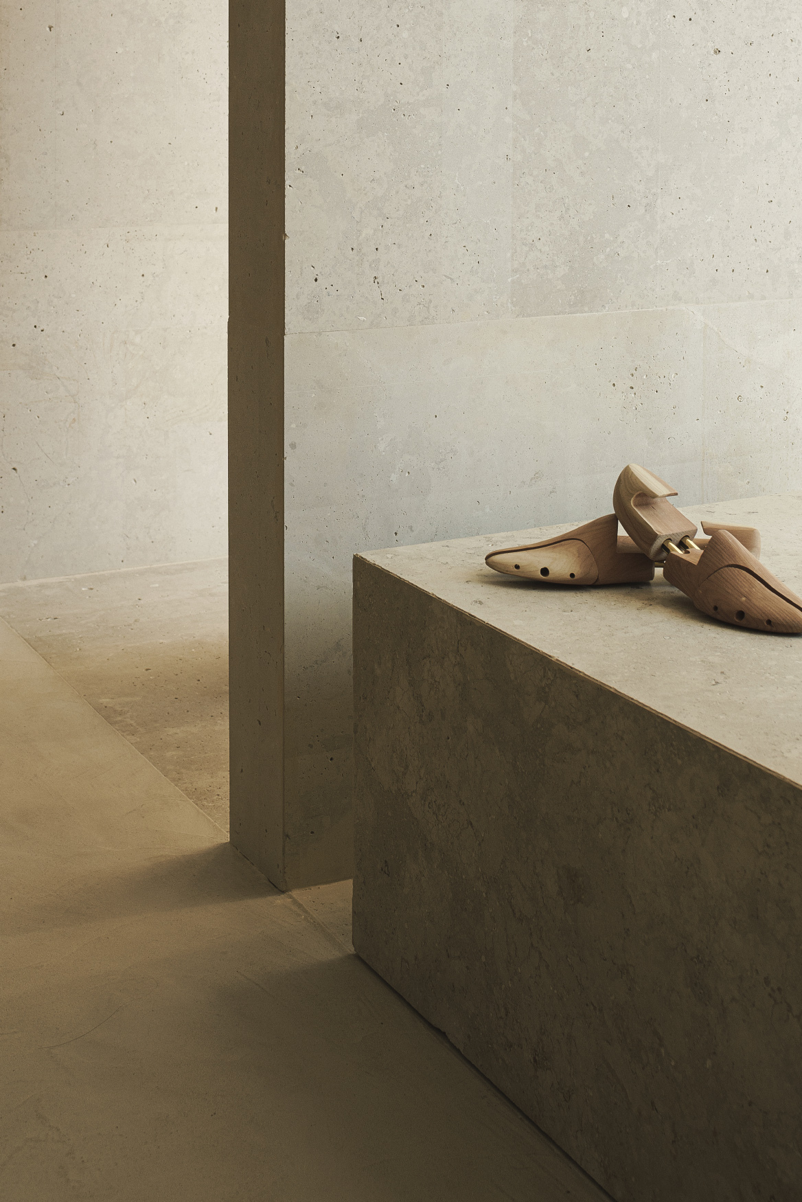
The sales experience becomes the object of study of this new store. To do this, Estudio DIIR work on the preparation of a route through which the visitor discovers different forms of exhibition. The rectangular and monotonous enclosure that is taken as a starting point is shaped in order to pursue a singular space where geometries acquire substantial importance.
In this way, two spaces are distinguished that follow each other linearly. The first is used as a letter of introduction and is in charge of exposing the featured product in its various devices.The showcase, the interactive screen and the exhibition shelves act as attractions. The access plane is broken and invites the user to enter inside.
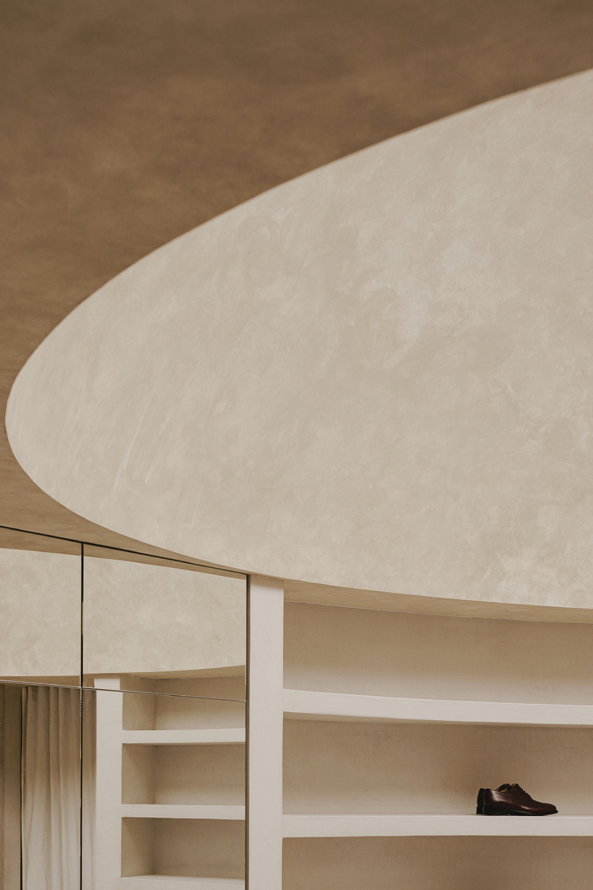
Next, the circular space stands at the center of the project. After crossing a large crown lintel, the ceiling is decompressed and a space is entered where surprise is emphasized.Through the creation of an enormous dome,an atmosphere is drawn in which the aforementioned geometric roundness enters the scene.The space is illuminated from above and bathes in light.
Neutral tones define the material palette.The Campaspero limestone is combined with various mortar coatings. In this way,a sincere dialogue between content and container is established. Geometric expressiveness is counterbalanced by calm tones,thus emphasizing the importance of the product.
- Interiors: Estudio DIIR
- Photos: David Zarzoso
- Words: Qianqian

