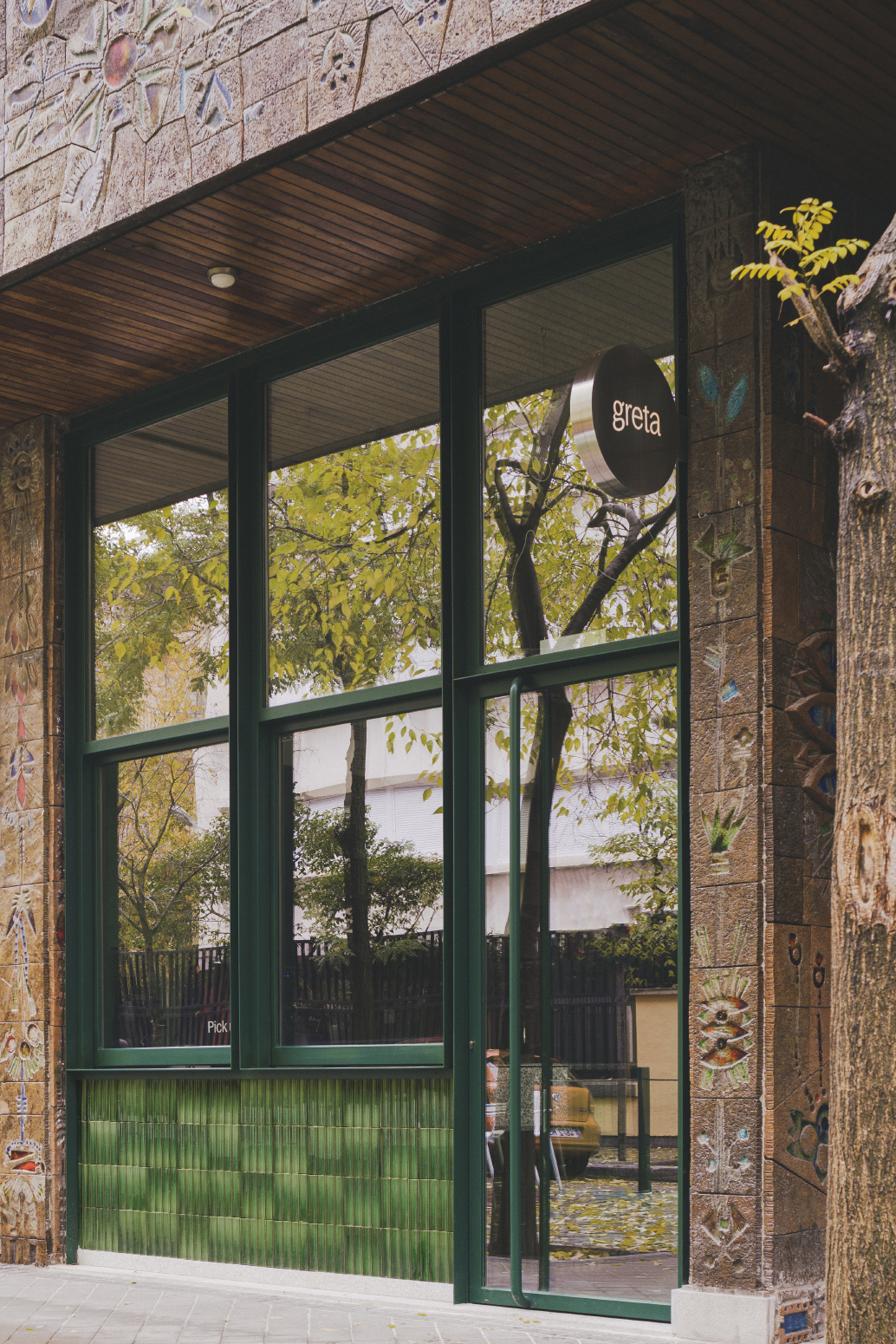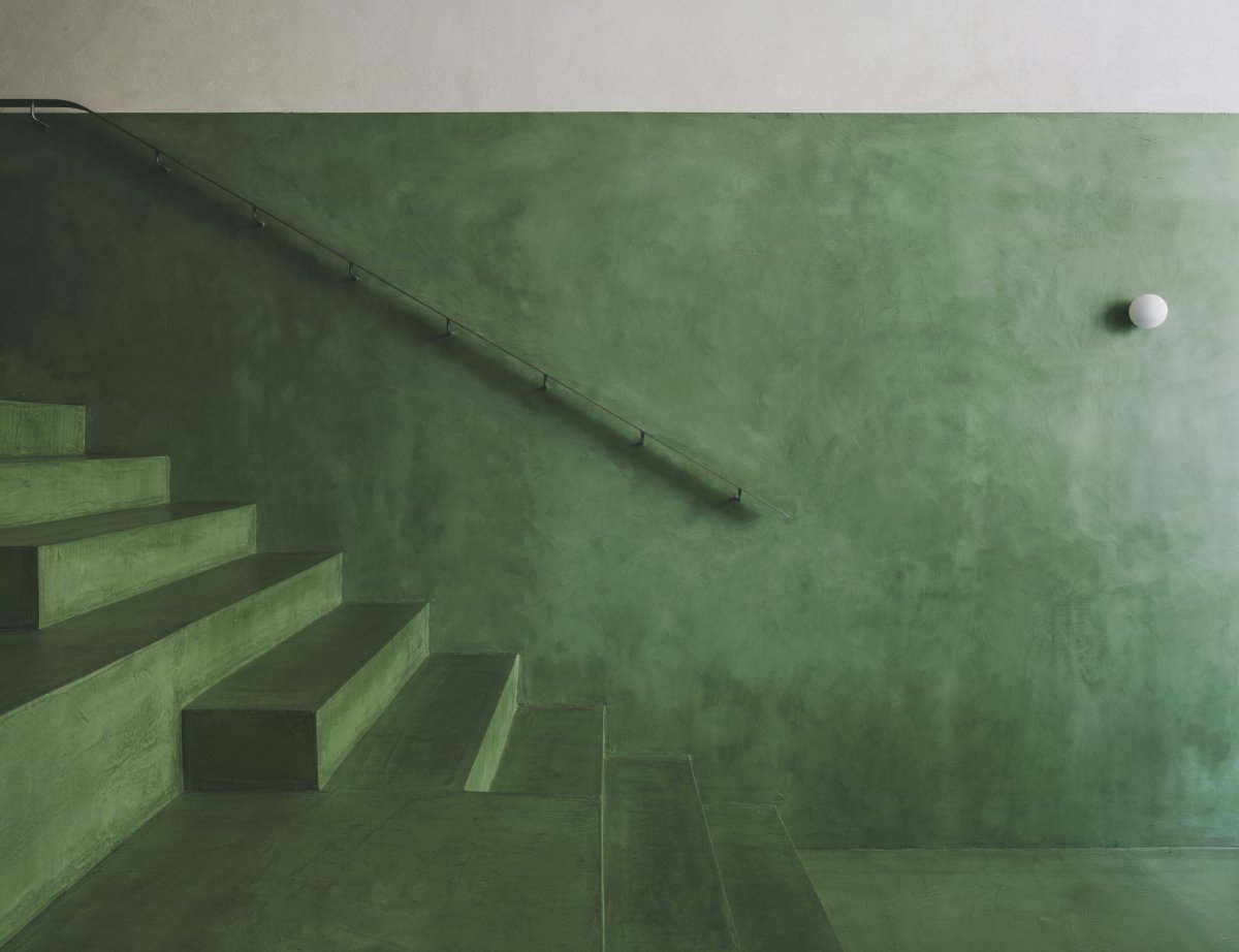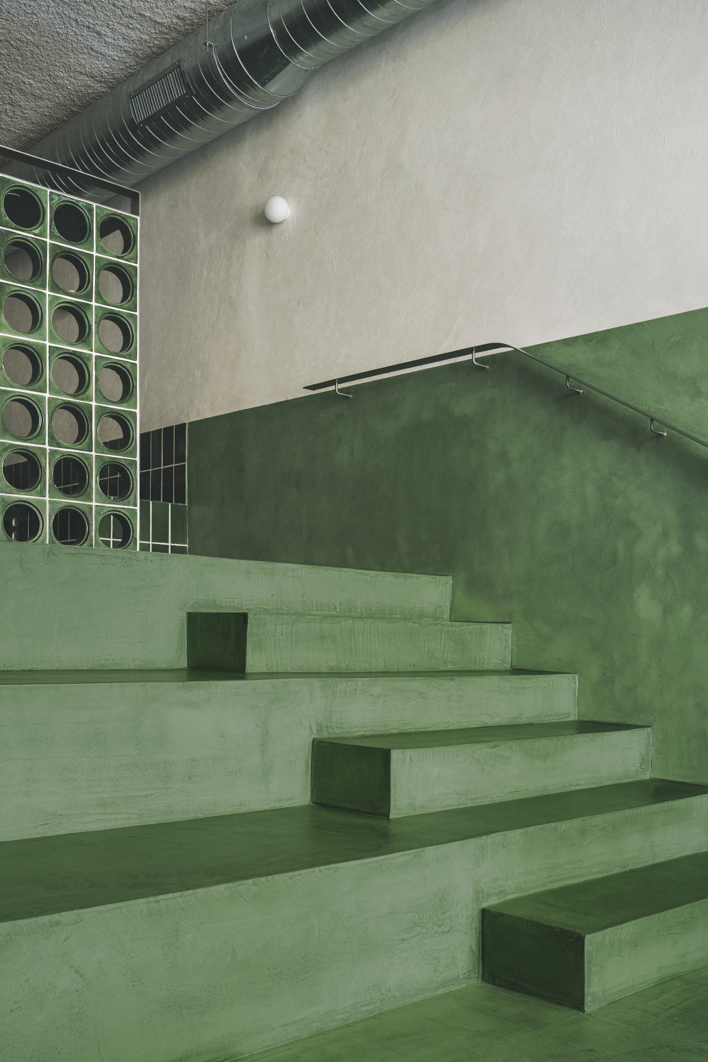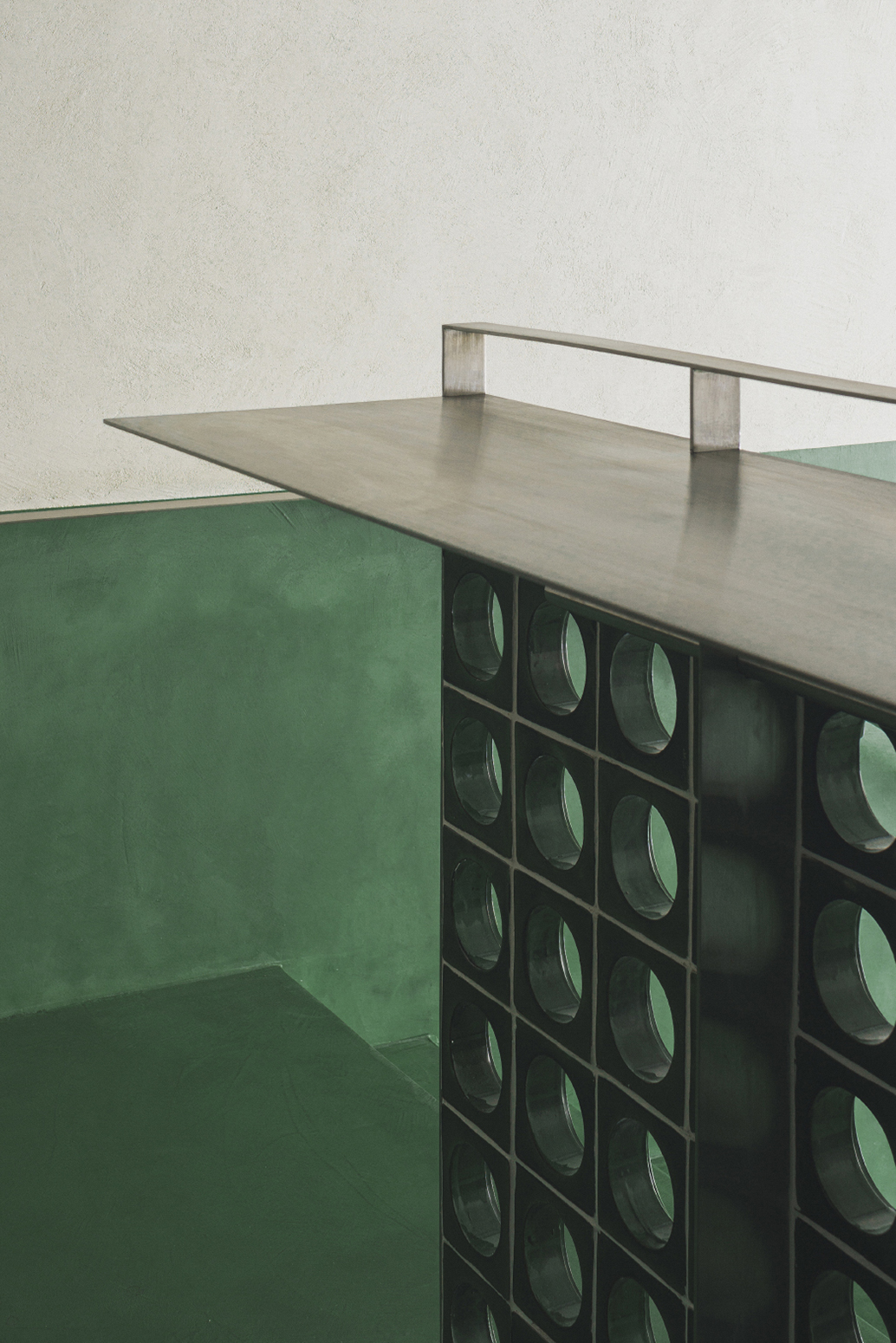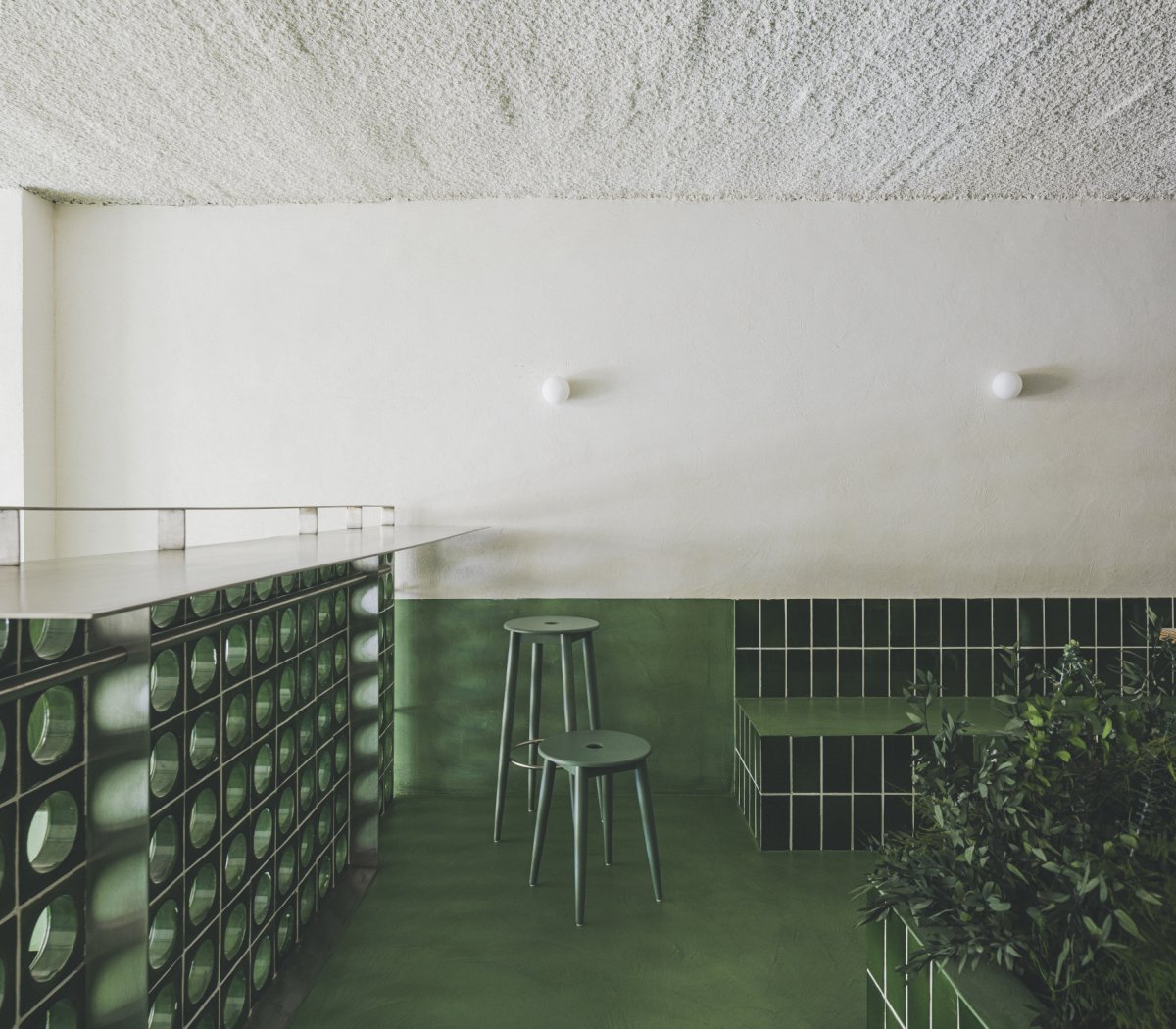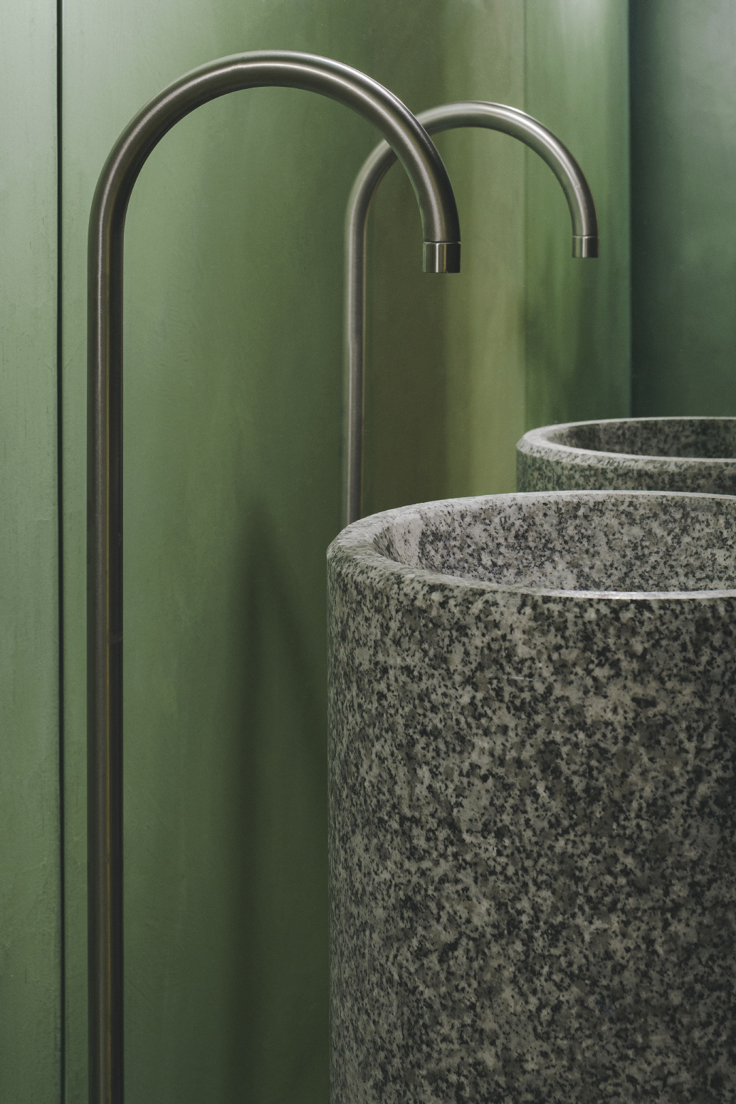
Brand identity and sales experience become fundamental values in the conception of this project. The need to transmit healthy values explains the use of colour. The project makes green its main protagonist and floods the space in a radical way.This design strategy requires exclusive attention to every detail.
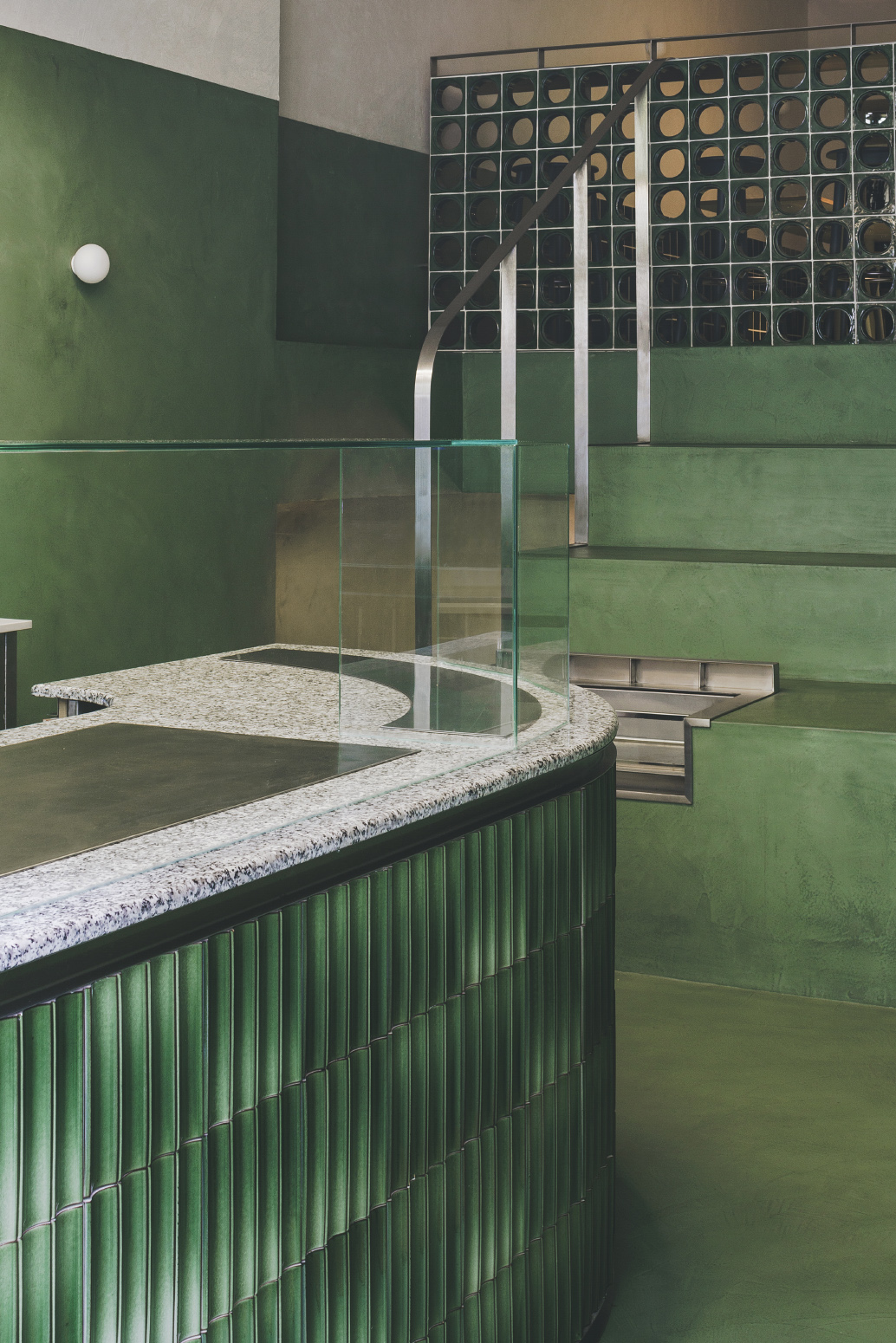
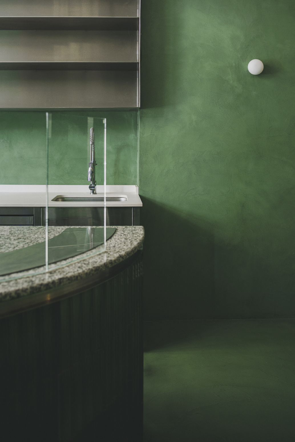
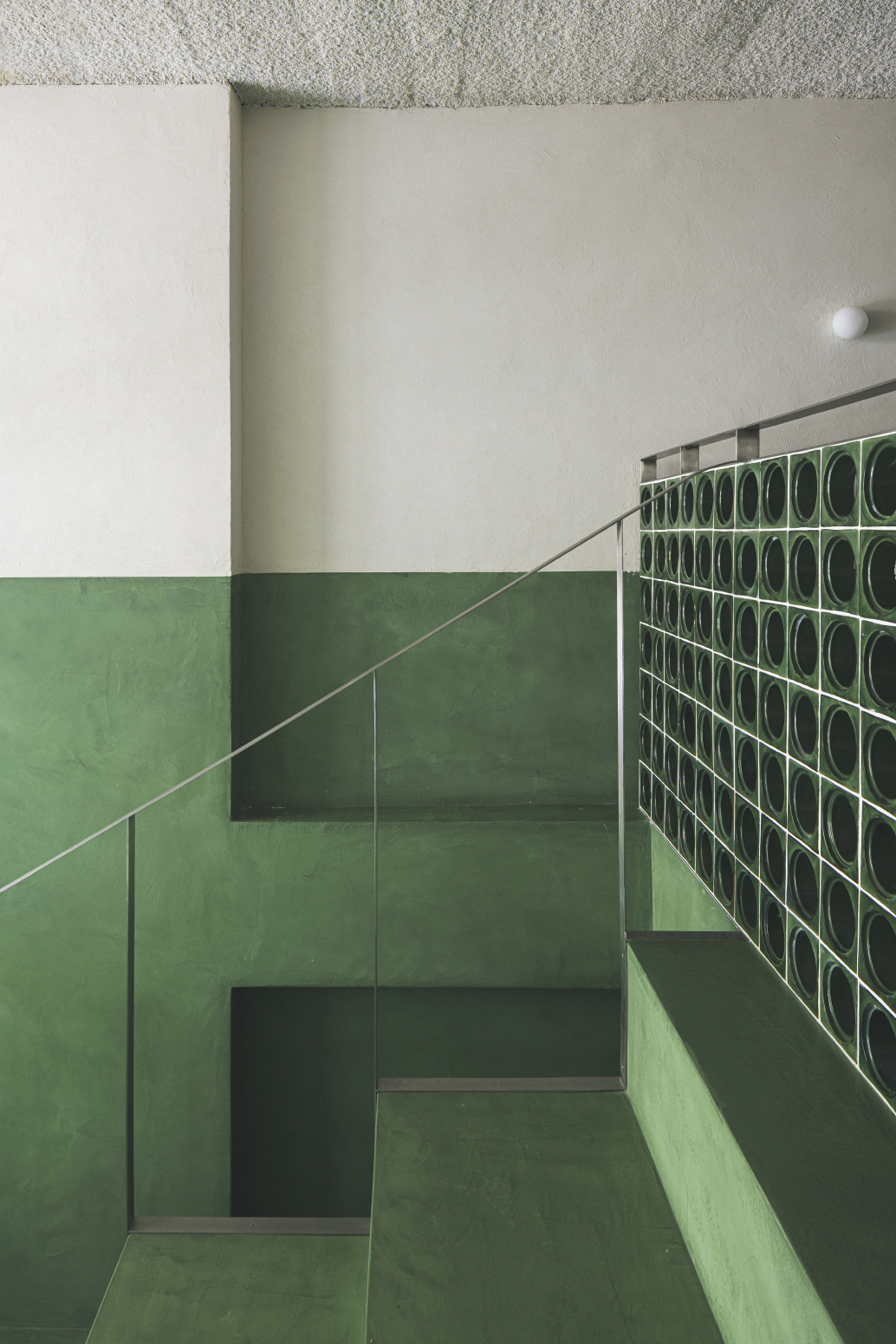
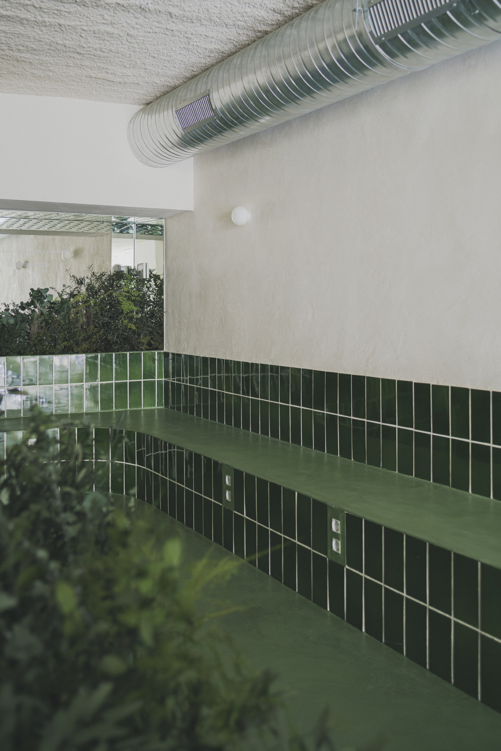
Turning a single colour into the main actor of the project requires the creation of a repertoire of constructive solutions where everything is related. In this way, Estudio DIIR are committed to the variety in the use of materials, but do not forget to make a selection in which each tone matches the one next to it. An ambitious exercise whose result offers a peculiar and, above all, unique atmosphere.
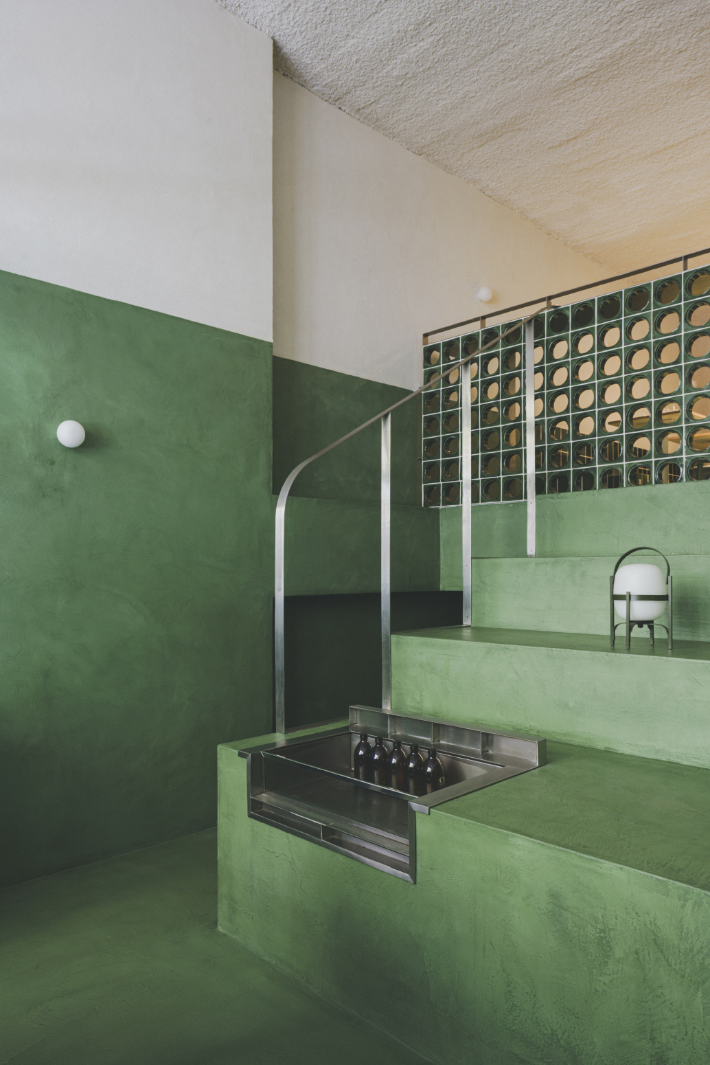
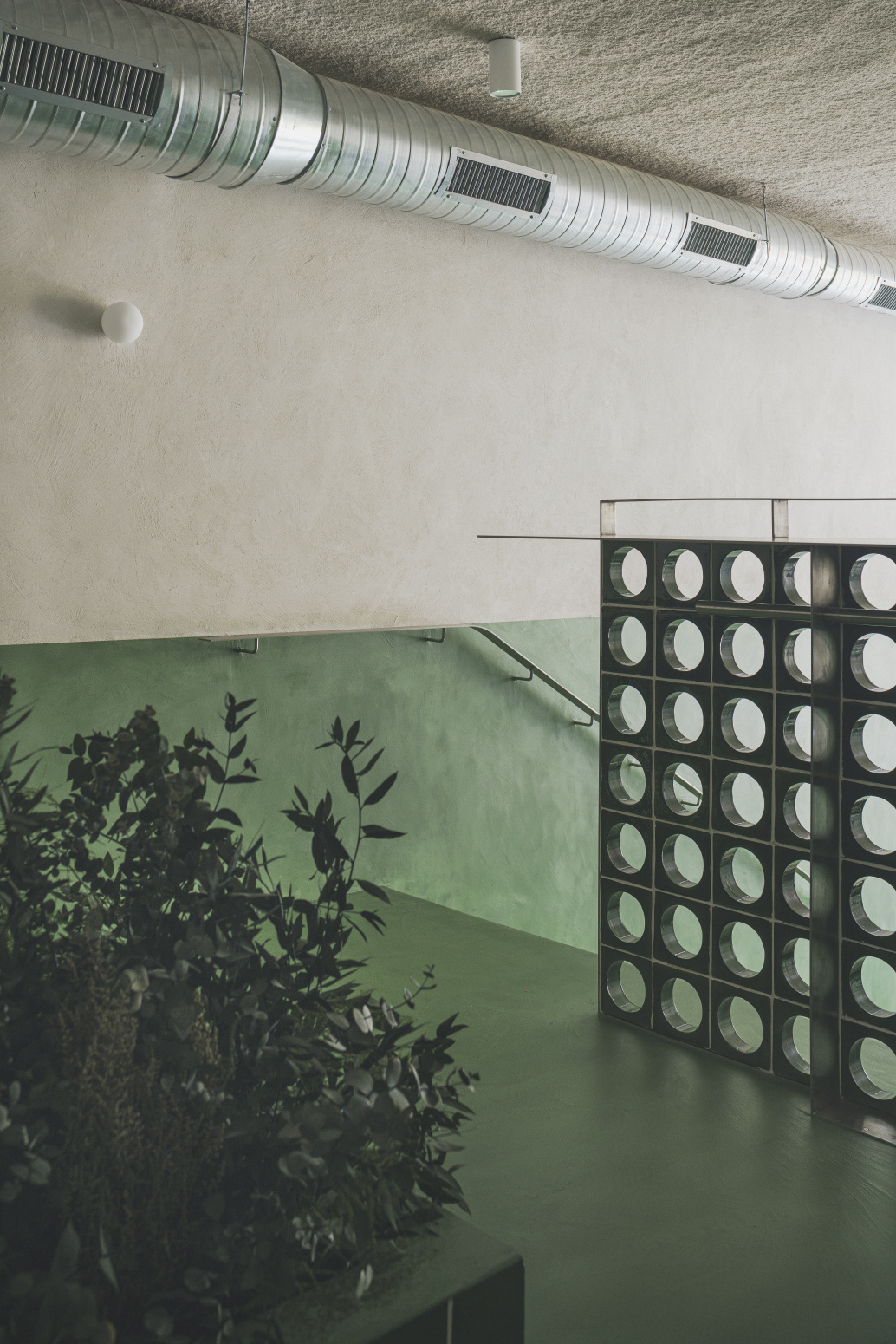
For its part, the sales experience can only be understood through a very conceptual strategy. The succession of spaces characterises a project whose longitudinality is perceived as a handicap. Estudio DIIR To overcome this, and without resorting to compartmentalisation, the height of the premises is played with and three rooms are designed.
Firstly, a large ceramic-clad bar acts as a welcoming element and combines the display of the product with its preparation. Next, there is an amphitheatre that has a double function: it serves as a grandstand for the diners and resolves the unevenness by means of an integrated staircase. Finally, in the highest area is the dining room, a room surrounded by benches and flanked by vegetation. The colour of these plants blends in with the rest of the green tones, in a clear desire to build an identity that characterises the philosophy of this new brand.
- Interiors: Estudio DIIR
- Photos: David Zarzoso

