In nature, simple, definite geometric shapes are the most powerful in creating a clear and powerful sense of beauty. The aesthetic sense behind this is harmonised by an inner mathematical logic, and is embodied in a state of order, restraint and rhythmic harmony. Thus the concept of the "primitive form" was born, which Le Corbusier once called "the form of beauty" because "it enables us to recognise it precisely."
Imagery / The Aesthetics of Geometry
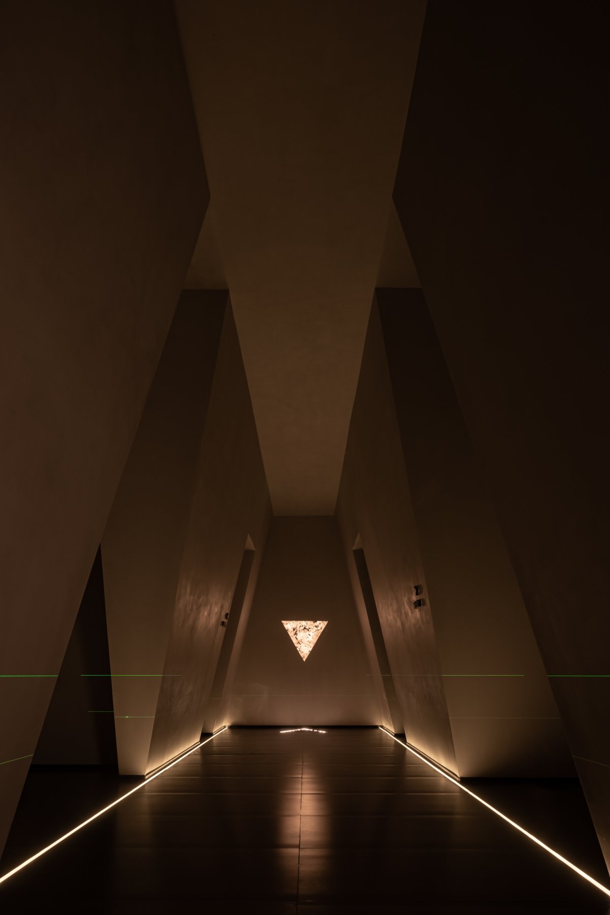
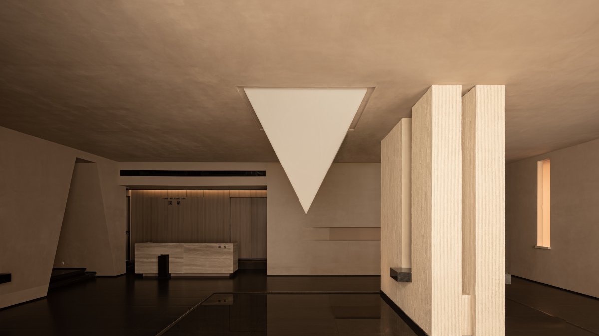
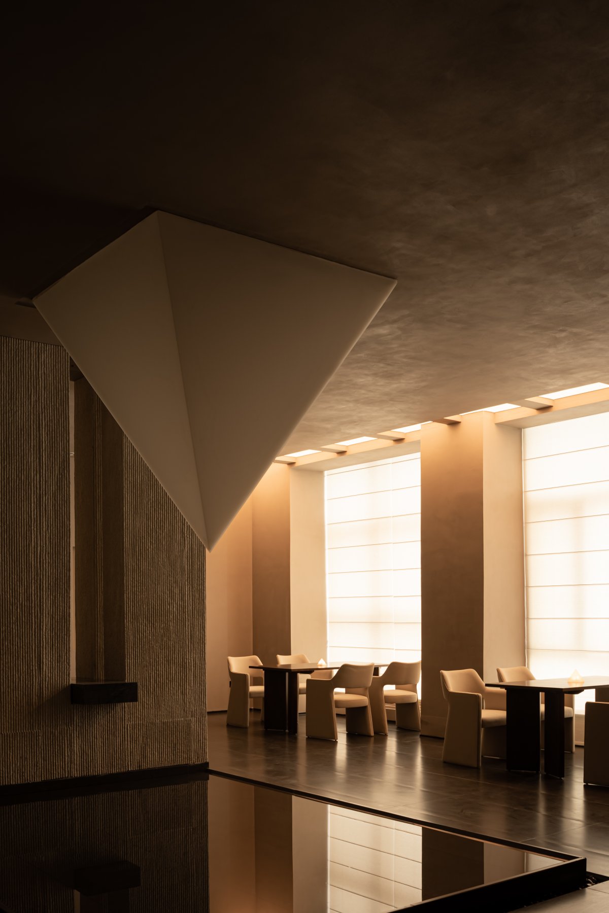
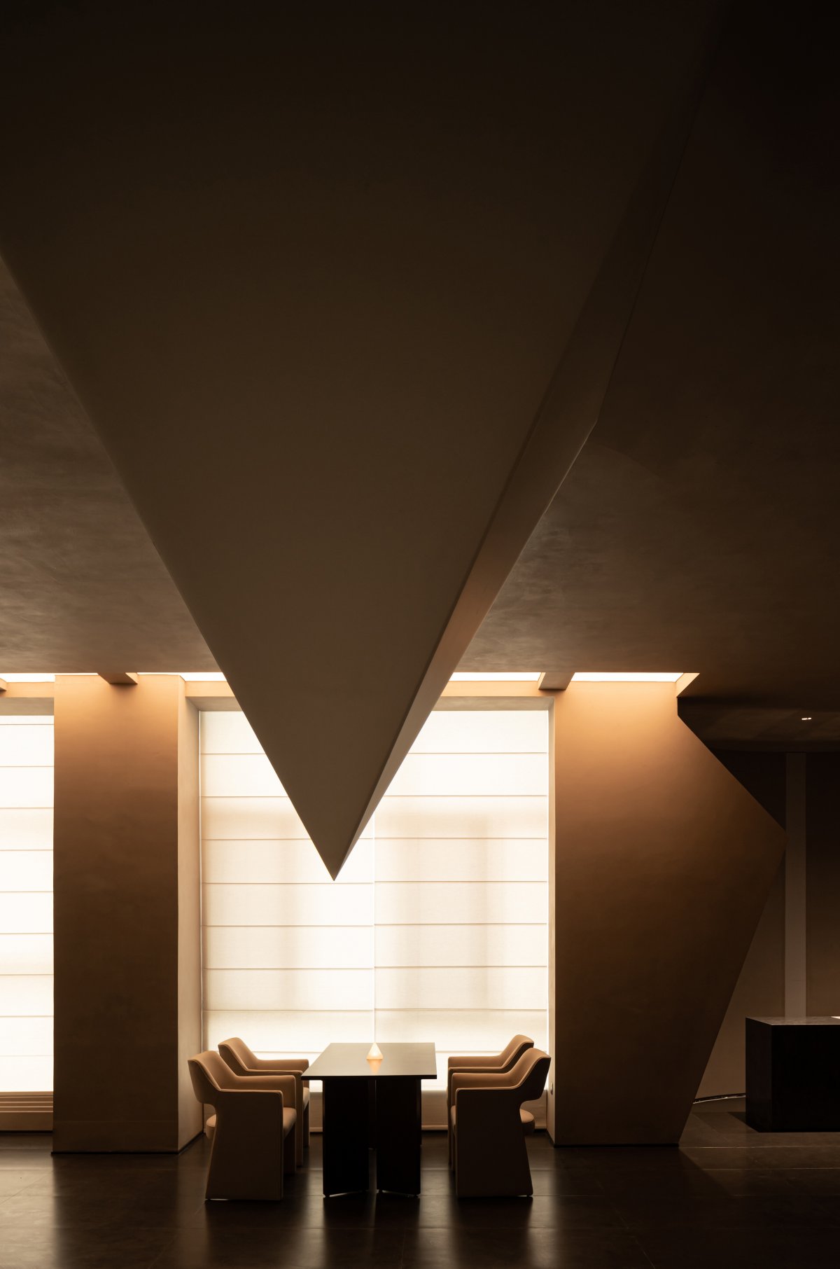
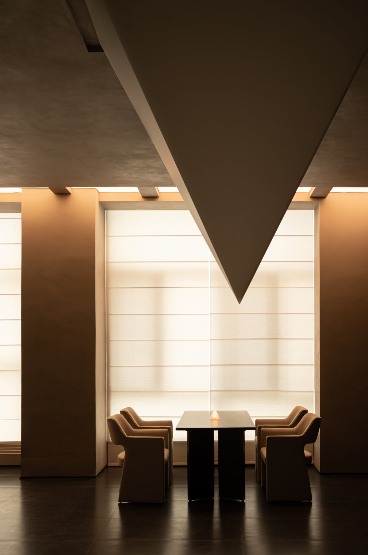
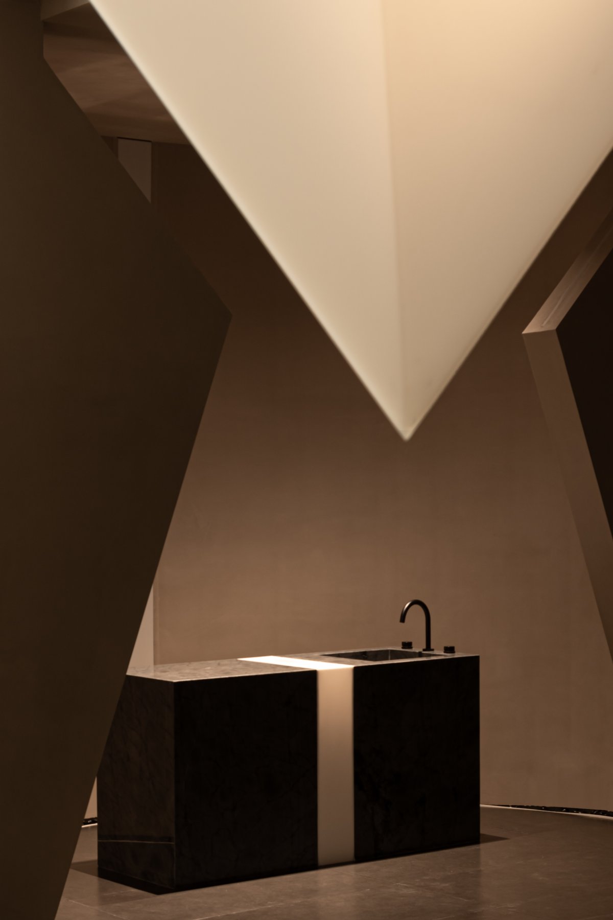
The superposition, repetition, and unification of geometric shapes produce organic cycles that can be magnified from the local to the infinite. And the triangle with stable structure, its equilateral property has the foundation of building the space framework. Starting from Puristar's brand vision, the diamond-shaped logo is disassembled to become the main formal language of the space composition, and the original square layout is enclosed by the wall with a certain inclination angle.
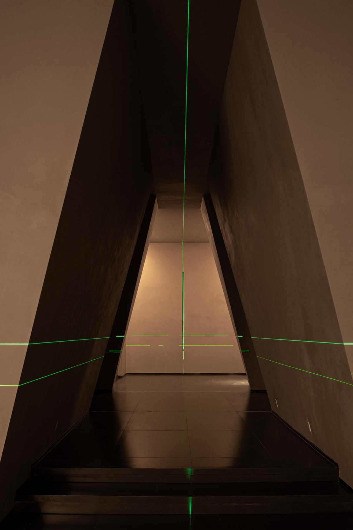
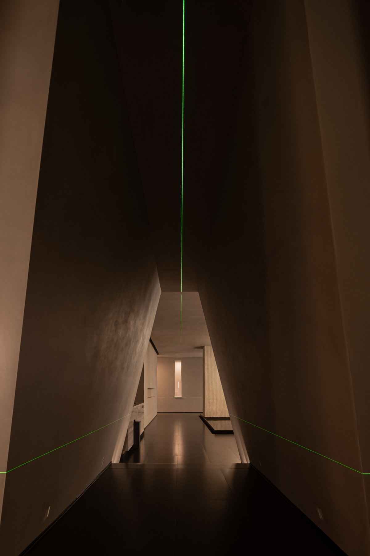
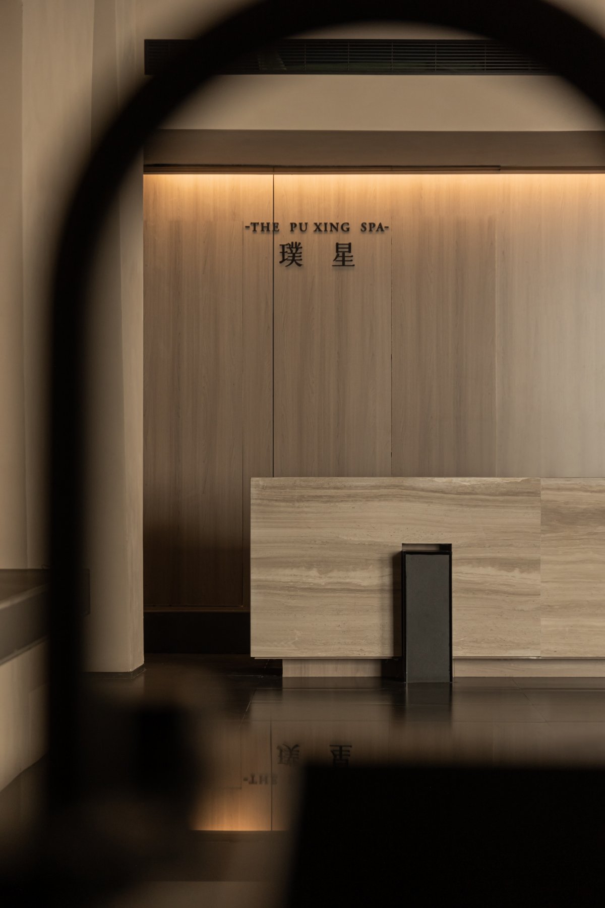
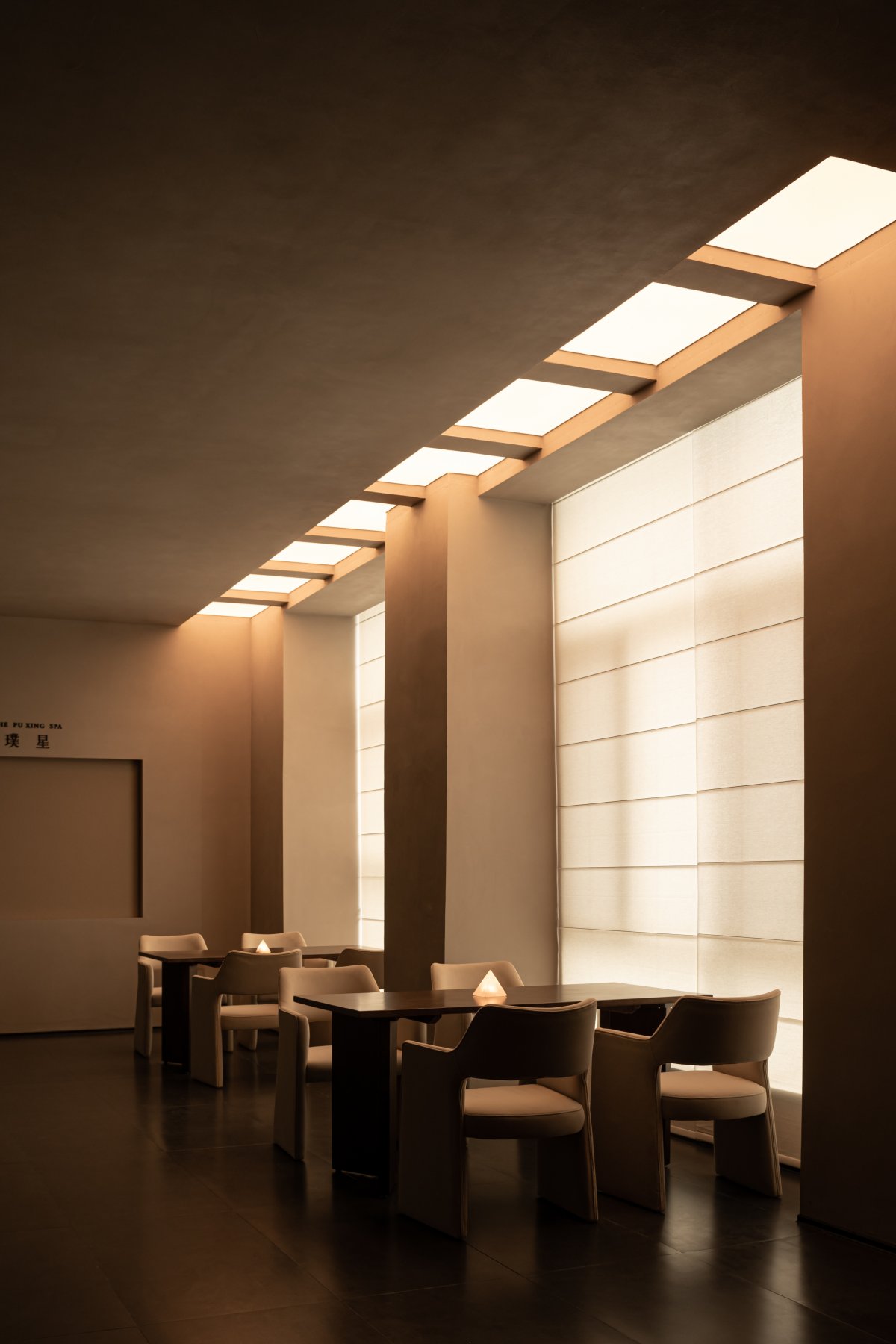
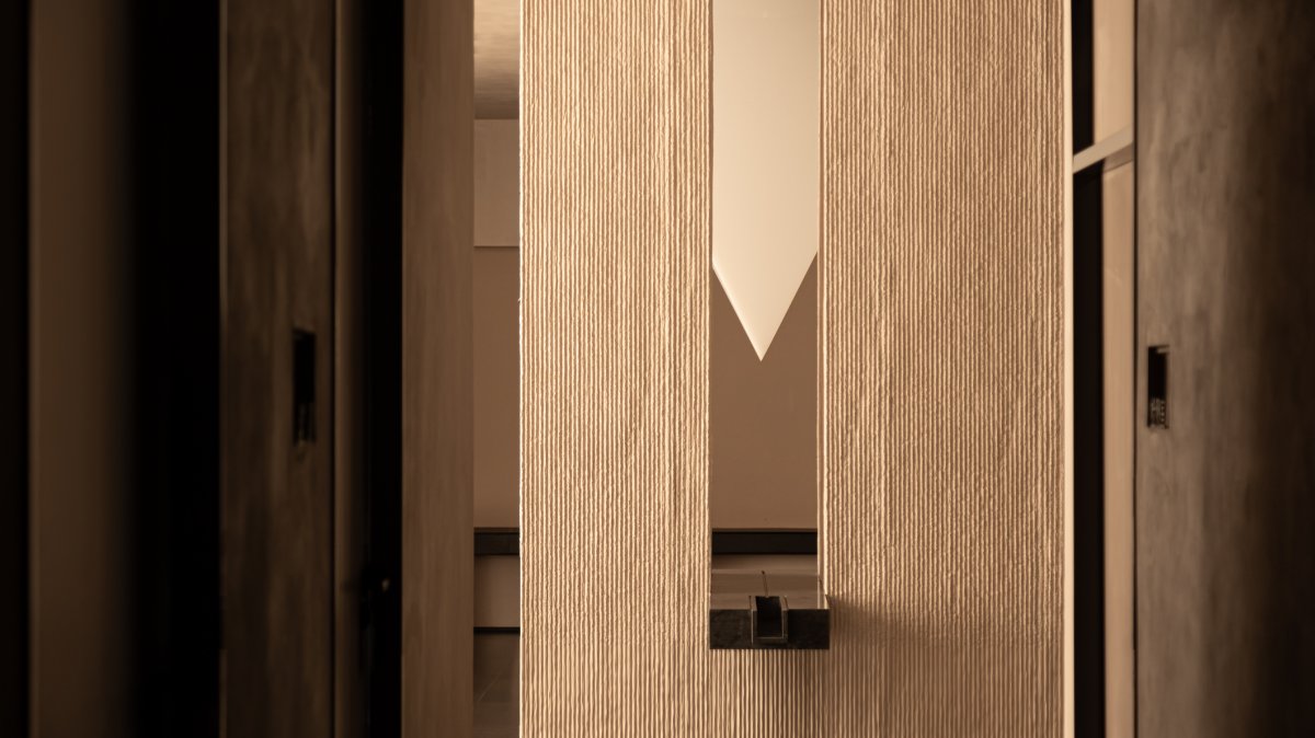
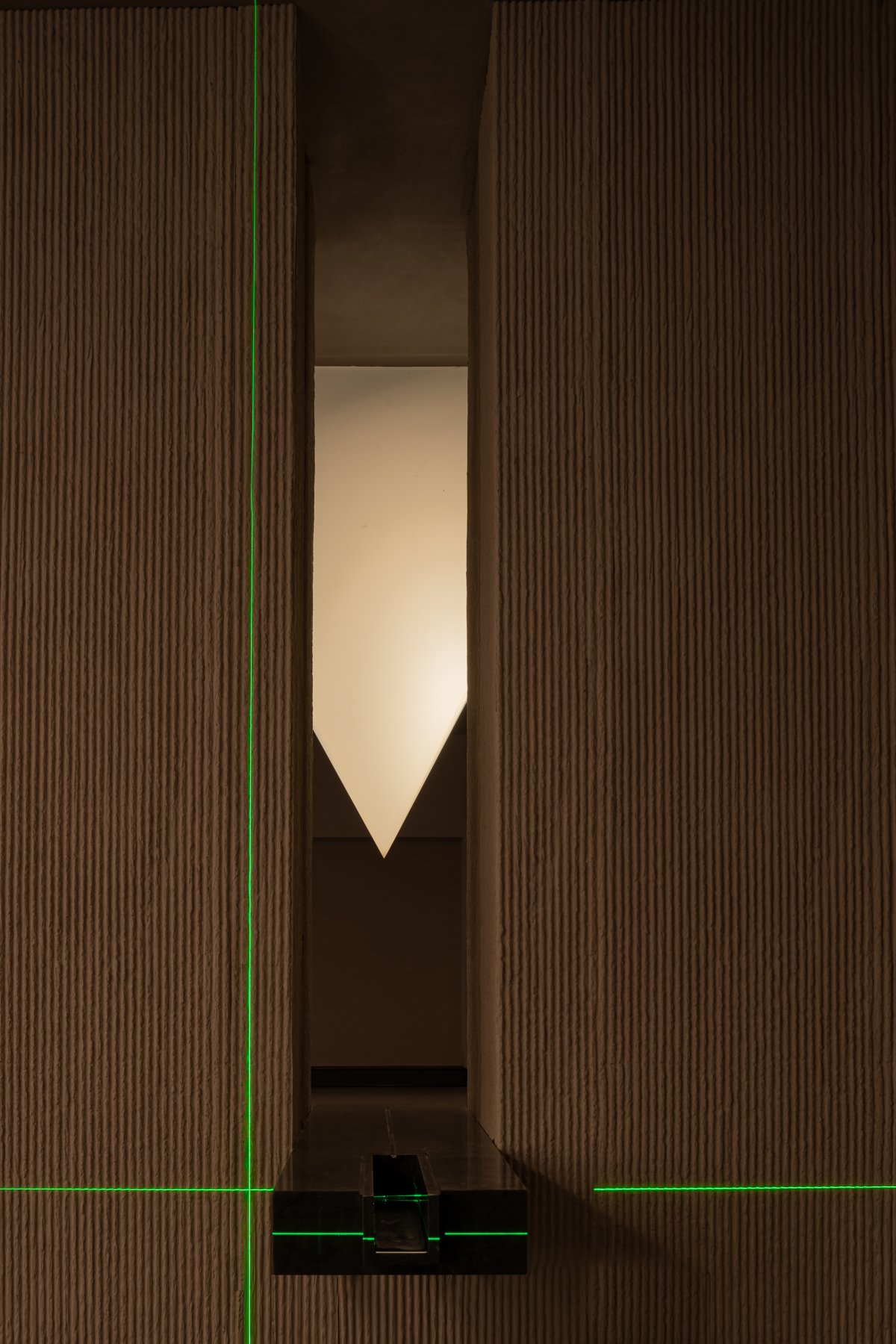
Based on the consideration of spatial rhythm, the lift entrance to the lobby reception is arranged in an orderly manner in terms of length and height, which creates a rich and overwhelming travelling experience. In addition to the functional significance of connection, the passage also has the role of emotional transformation. The bright, noisy and dynamic exterior is transformed into the remote, tranquil and static interior, with strips of light on both sides guiding the visual focus, and the triangular translucent stone on the façade establishing a mirror relationship with the concave shape of the floor.
Mirror Image / Nature of Matter
Mirroring, is the beginning of self-knowledge. Through the reflection of materiality through the properties of mirrors, the essence of things takes on the same or different appearance, depending also on the differences between the bearers.
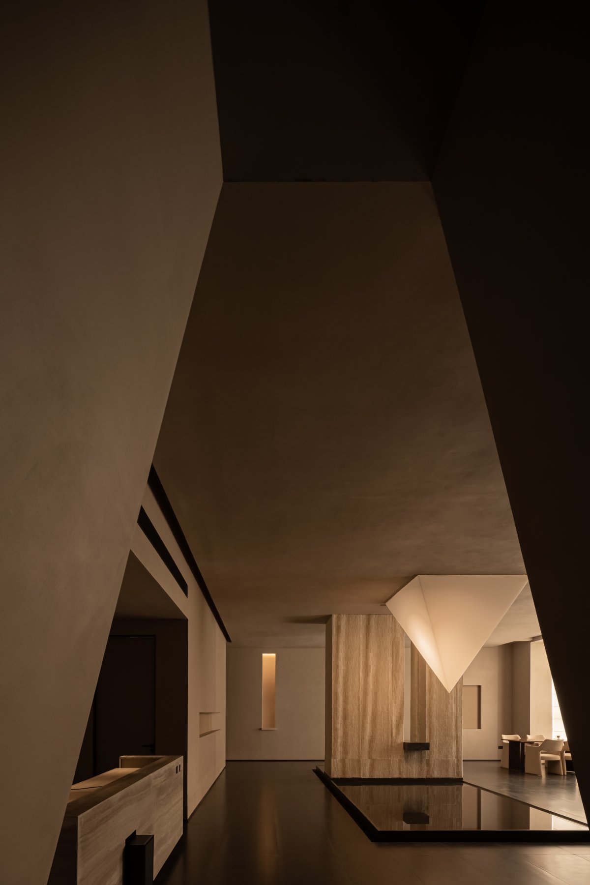
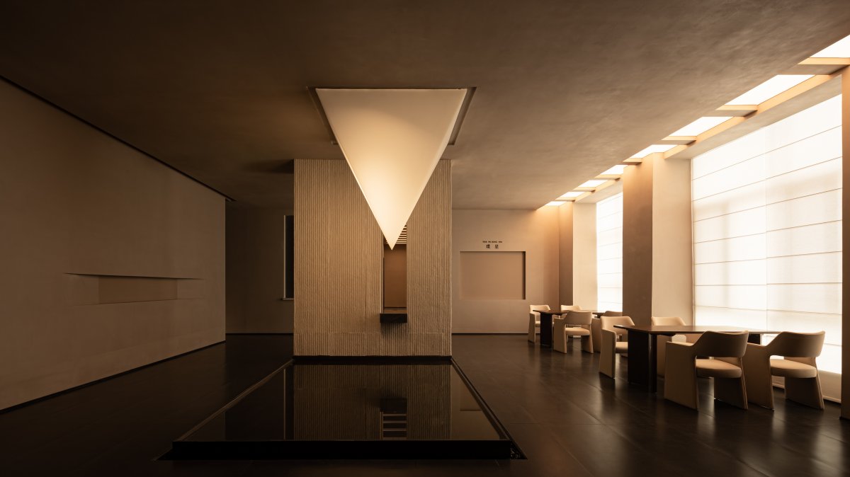
In the centre of the hall, combined with the original columns, a pool is placed, with water drawn from the interior and flowing down from the half-height, forming a dynamic water system with internal circulation. The vertical joints in the centre piece of the wall solve the need for horizontal form joints, and also provide a possibility for air and visual flow.
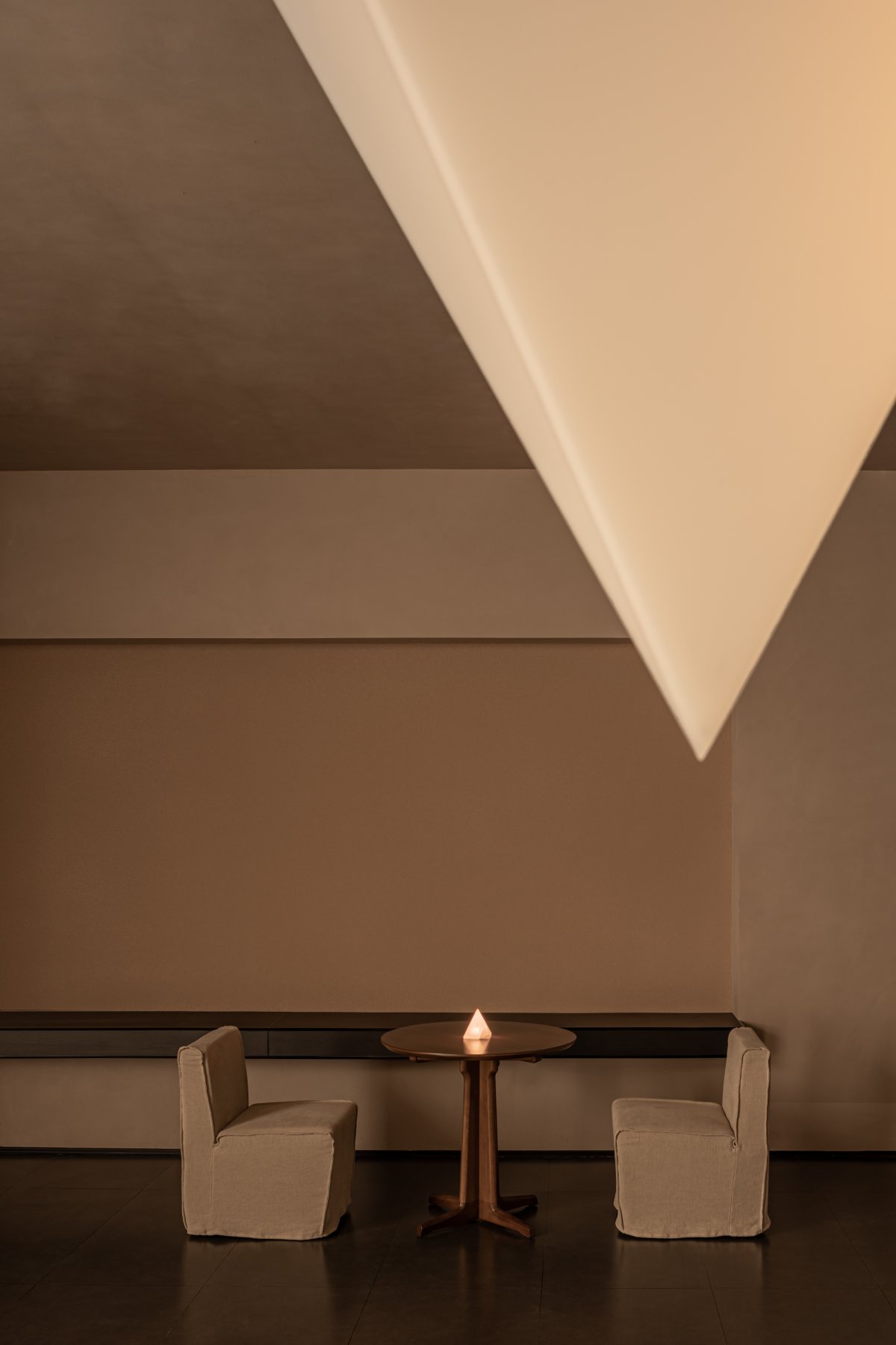
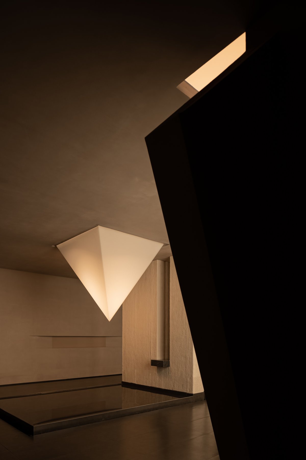
And the two-dimensional brand logo is interpreted into a three-dimensional form of language, which is installed with an externally controlled spotlight, and the light flaps irradiated at random angles make the acrylic splicing have a bright and dark, gradual change in the presentation.
When the water is still, the image of the brand is divided into two, one suspended in the air and the other hidden in the water, the reflection of the water makes the two form a clever interaction, and at the same time constitutes a link and echo with the visual language of the aisle. And all the surrounding materials, with the path of travel and changes in the observation angle, also gives a layer of "flowers in the water, the moon in the mirror" like a hazy, poetic, can be interpreted arbitrarily visual language.
Halo / Atmosphere Creation
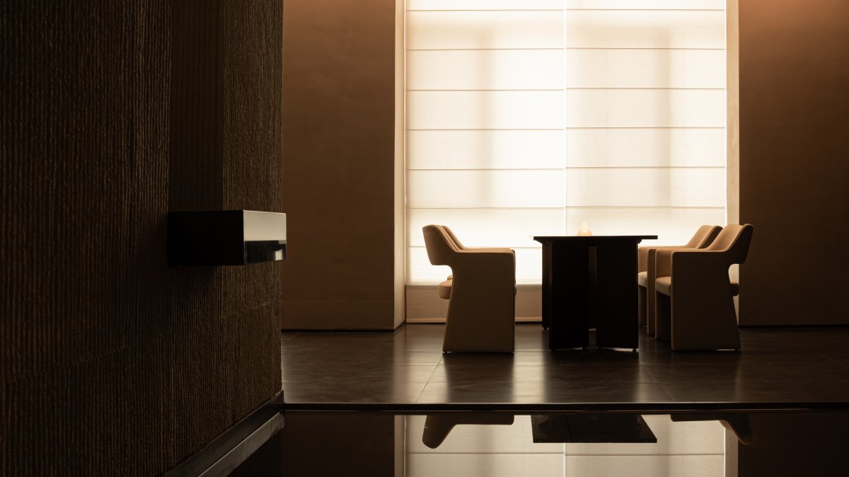
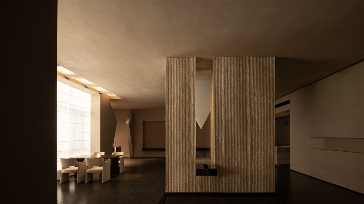
The one-sided lighted area is arranged as a waiting and resting area, with the curtains rising to enjoy the outdoor cityscape; and the curtains falling to form a delicate soft "light wall" under the effect of natural light. In order to beautify the exposed pipes in the ceiling, a sequence of false beams is constructed at the window, between which a light film is embedded, combining with the windows to form an L-shaped large-volume "light belt", creating a warm texture for the interior.
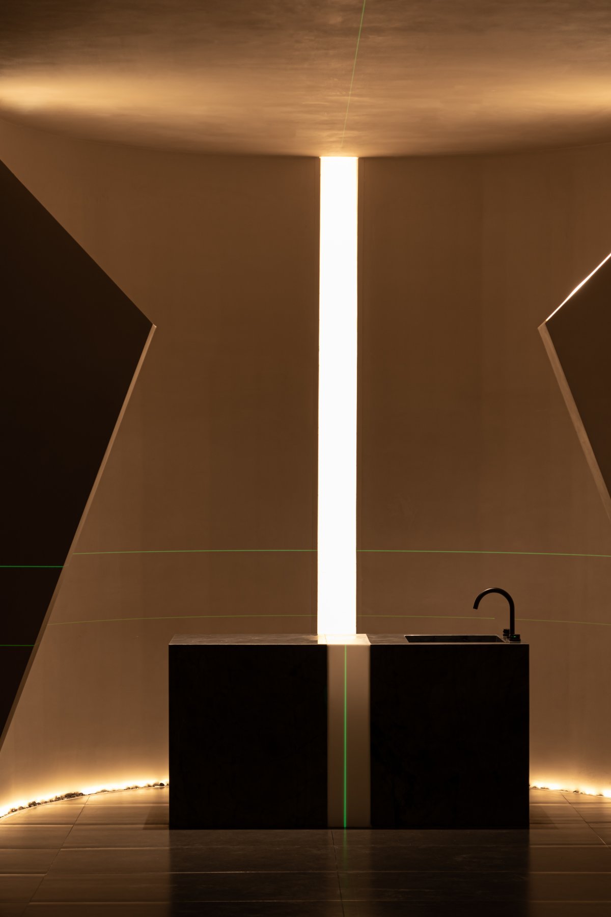
On the south side, the square space structure is constrained into a semi-circular shape, while the unity of texture and material makes the façade and the ceiling blend into one. The bar, with its experiential attributes, is embedded in the space, facilitating service in close proximity, while the white structural part of the bar is illuminated by light like a slit in the light. Light has a distinctly different nature in different contexts. Light is a medium, an atmosphere and a behavioural construct.
Baseline / The Art of Behaviour
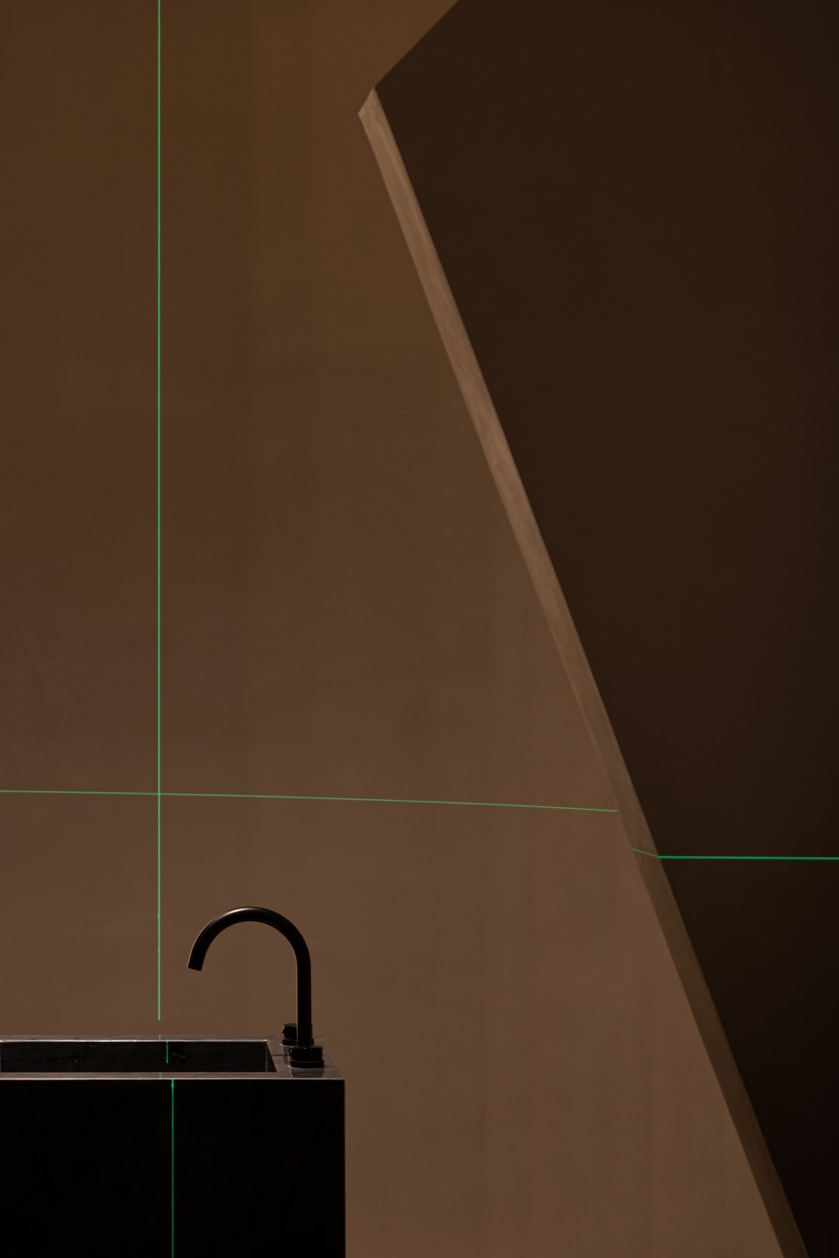
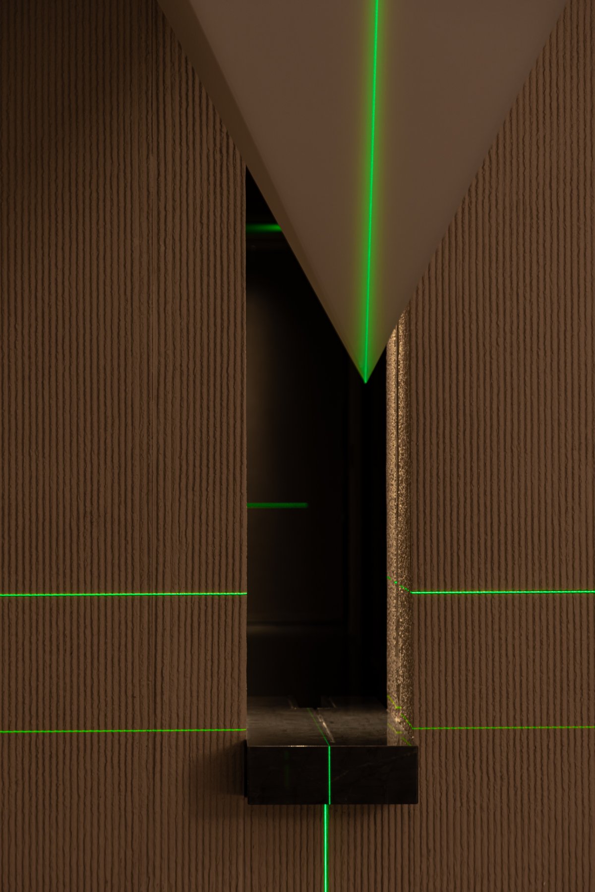
In concrete construction, the 1m line is usually a datum that actually needs to be highlighted. During the shooting, the horizontal and vertical visible lines from the two horizontal lasers become the protagonists of the space, jumping between different functional fields. The first horizontal direction coincides with the datum line, indicating the beginning of the line; the second datum line coincides with the façade niche moulding, emphasising the appropriateness of the proportions; while the vertical datum line can be interpreted as the presence of an axis.
As a healing place for the soul, the conception and approach of the design reflects the brand's cultural connotations and image symbols to a certain extent, and the inspiration and inspirations gained from the cycle of all things in nature are interpreted in the construction of the space, and at the same time, in a holistic, coherent, and harmonious tone, it tries to adjust and restore the body's equilibrium and calmness of mind, so that the subtle and mysterious inner world can be nourished, relaxed, and taken care of.
- Interiors: GODOT DESIGN
- Photos: Shenghui
- Words: Off-Words / Moon

