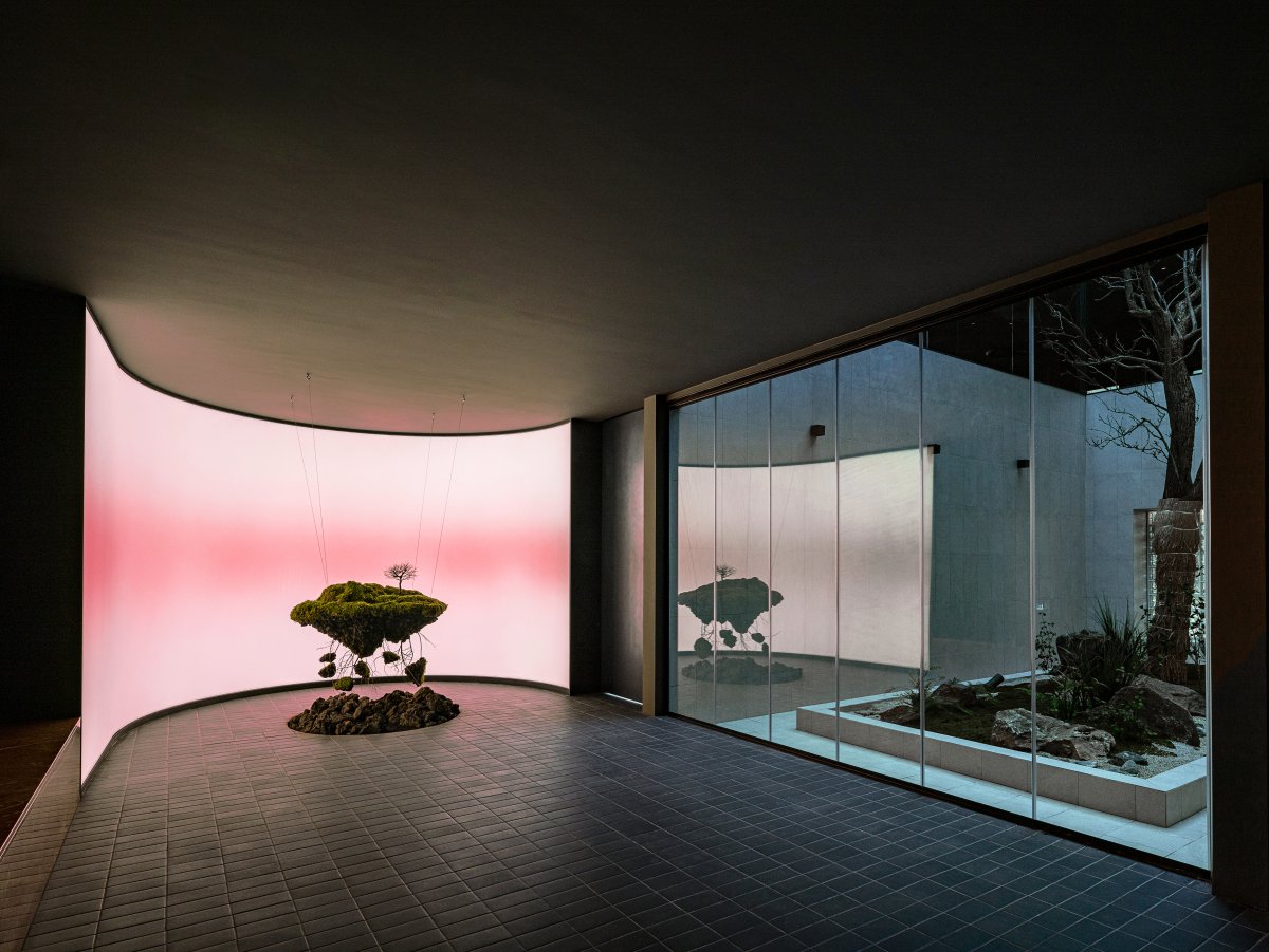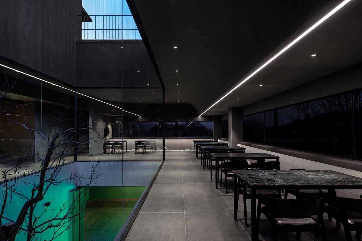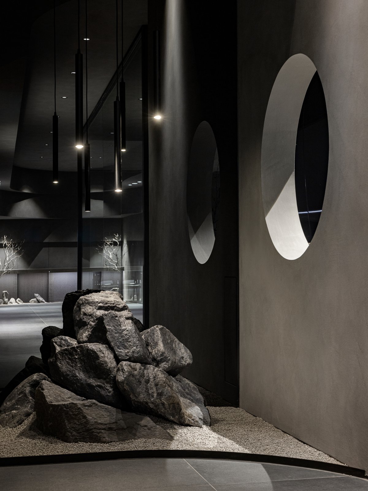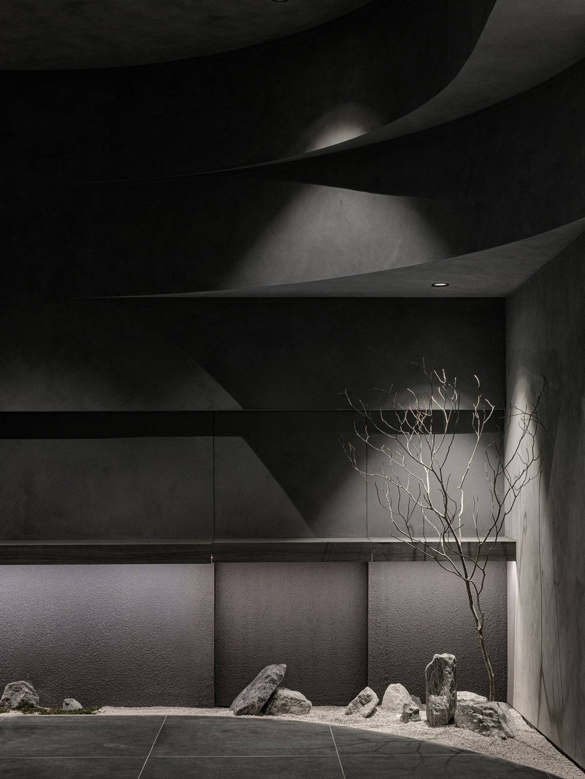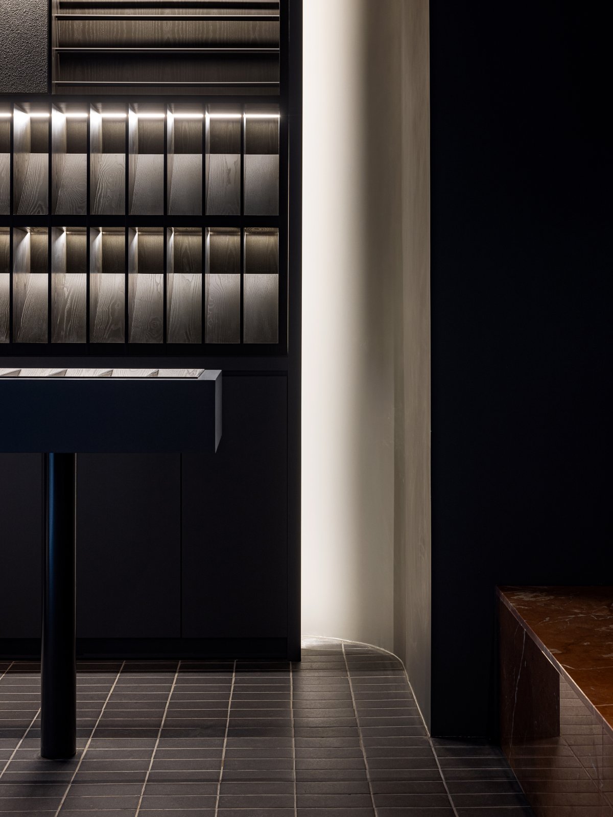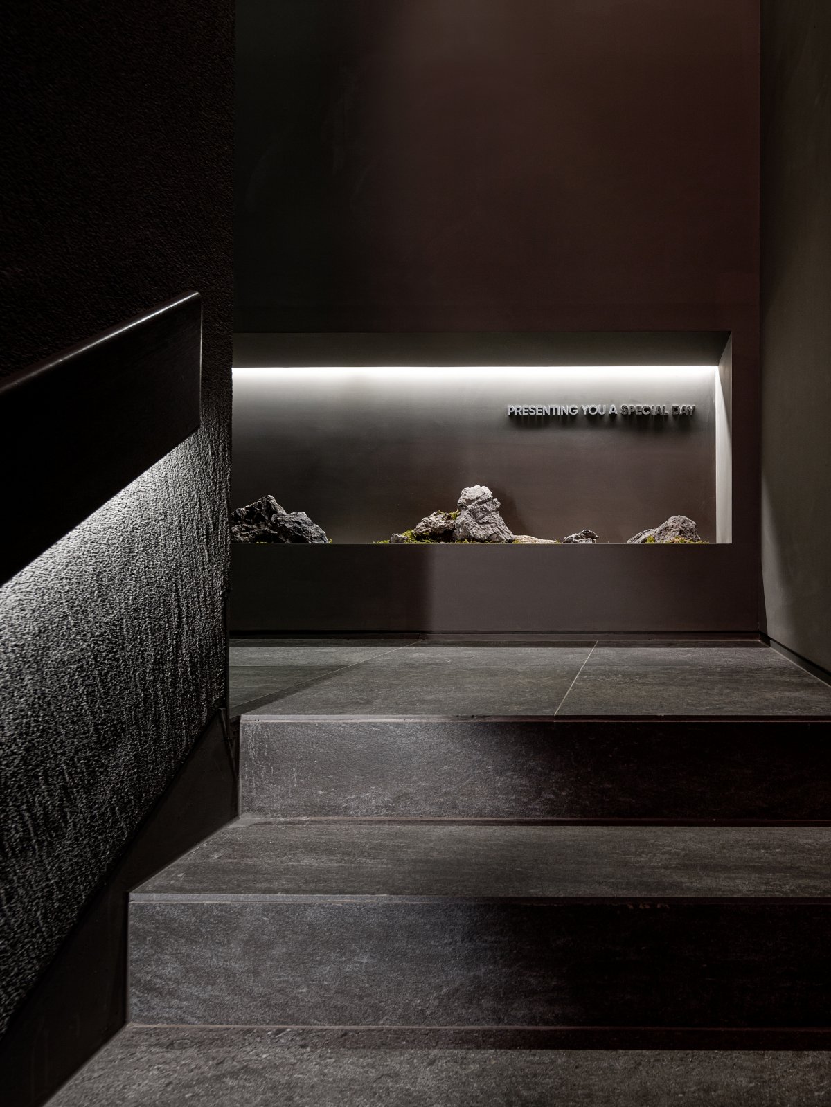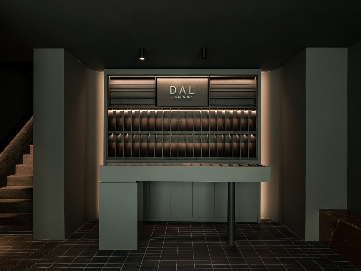
An Italian restaurant that brings something special to an ordinary day. As for food,heavy foods like pasta and steak are on the‘dark line’. Light foods such as salads and desserts are organized in the‘light line’. In the name of light and darkness,‘LIGHT SPACE’tried to express light and brightness, lightness, and open nature.‘DARK SPACE’is expressed as darkness, heaviness, and closed space. It was designed as a space where light and darkness circulate.
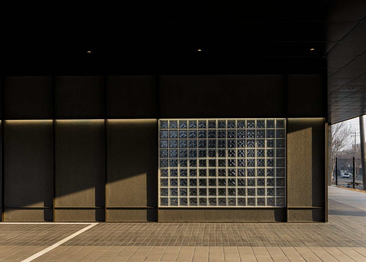
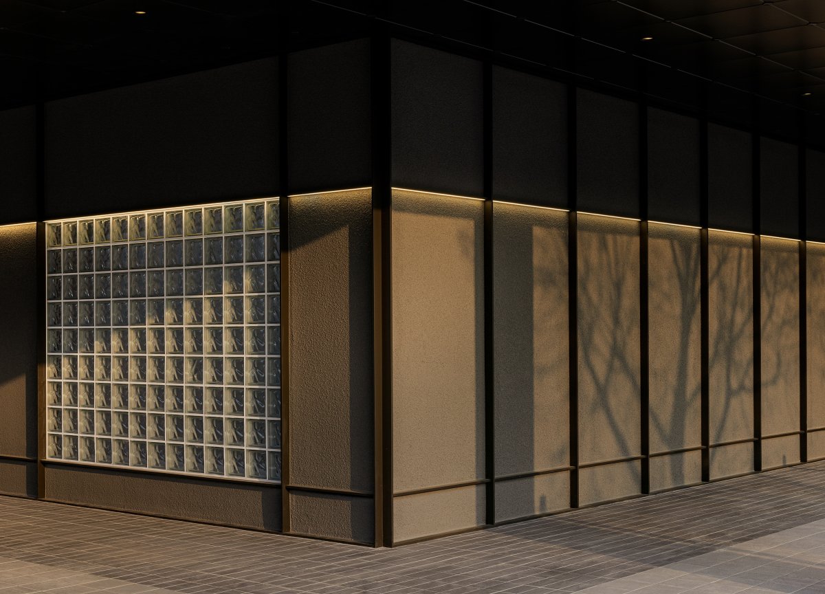
The exterior of the building has a piloti structure, and horizontally long windows are placed in the form of pillars supporting a long rectangular mass. After parking, enter the back of the building. The entrance was placed far away from the parking lot so that a different sequence came out whenever the gaze changed.
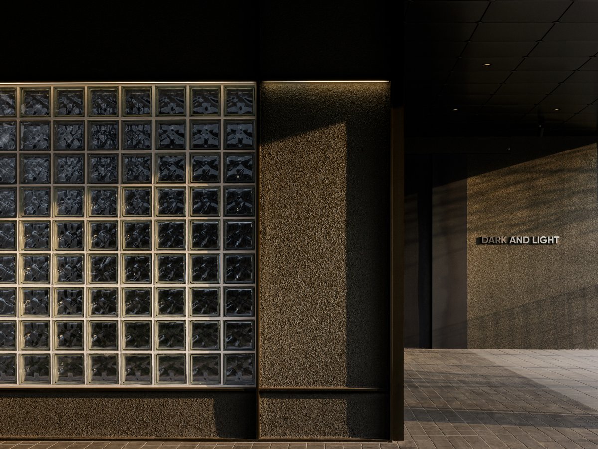
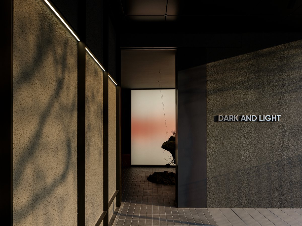
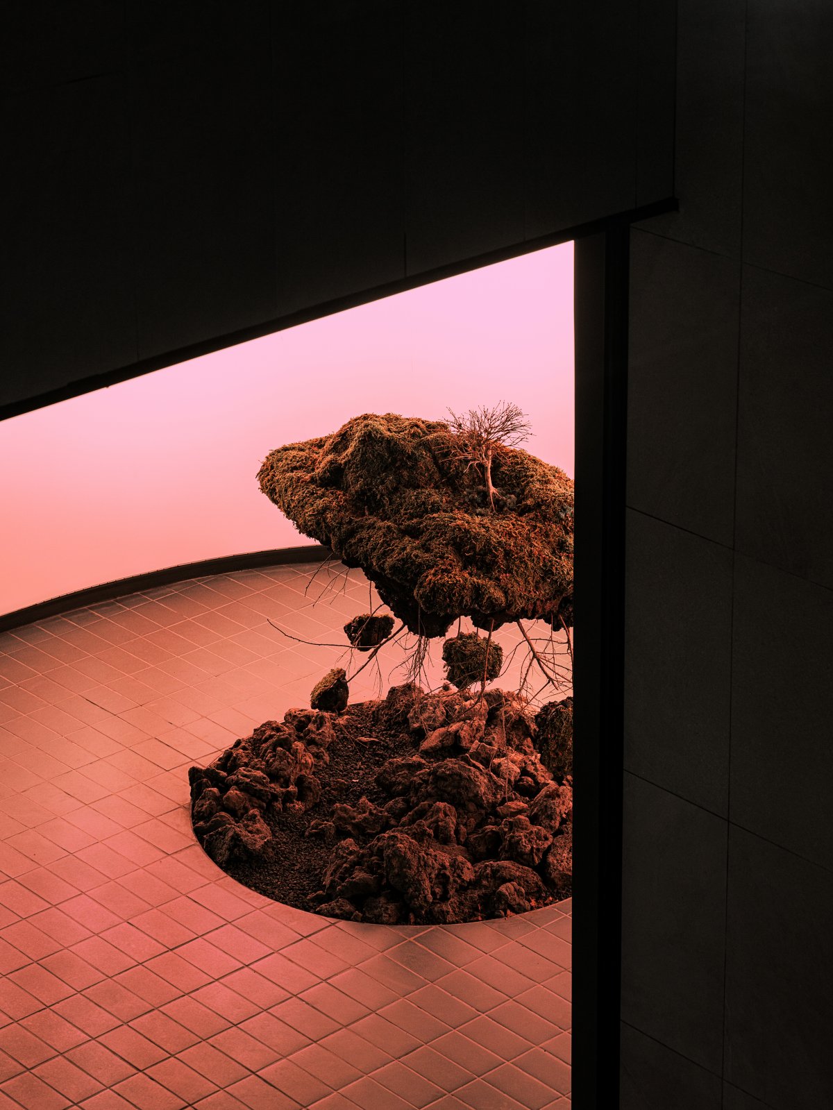
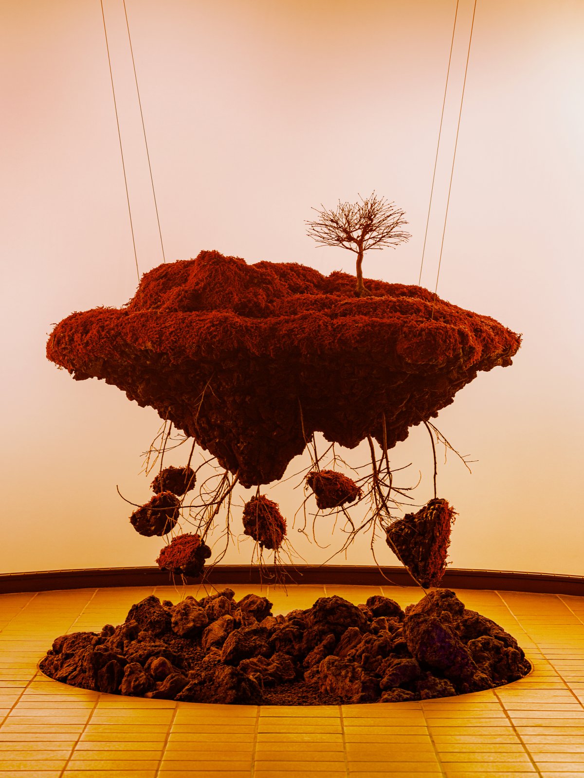
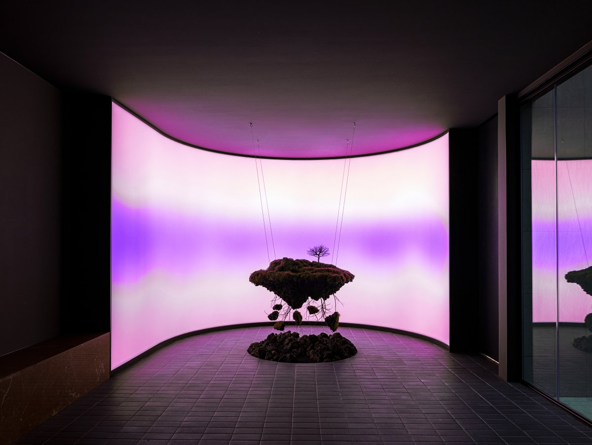
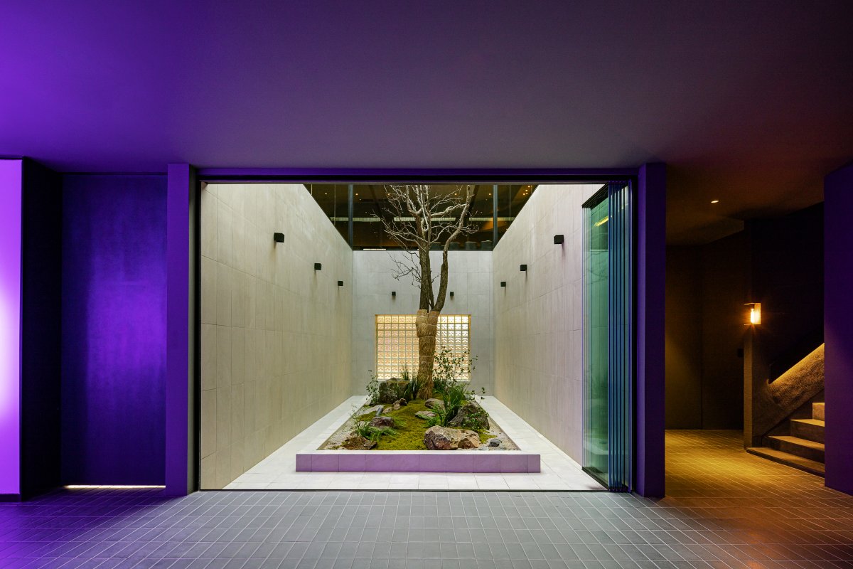
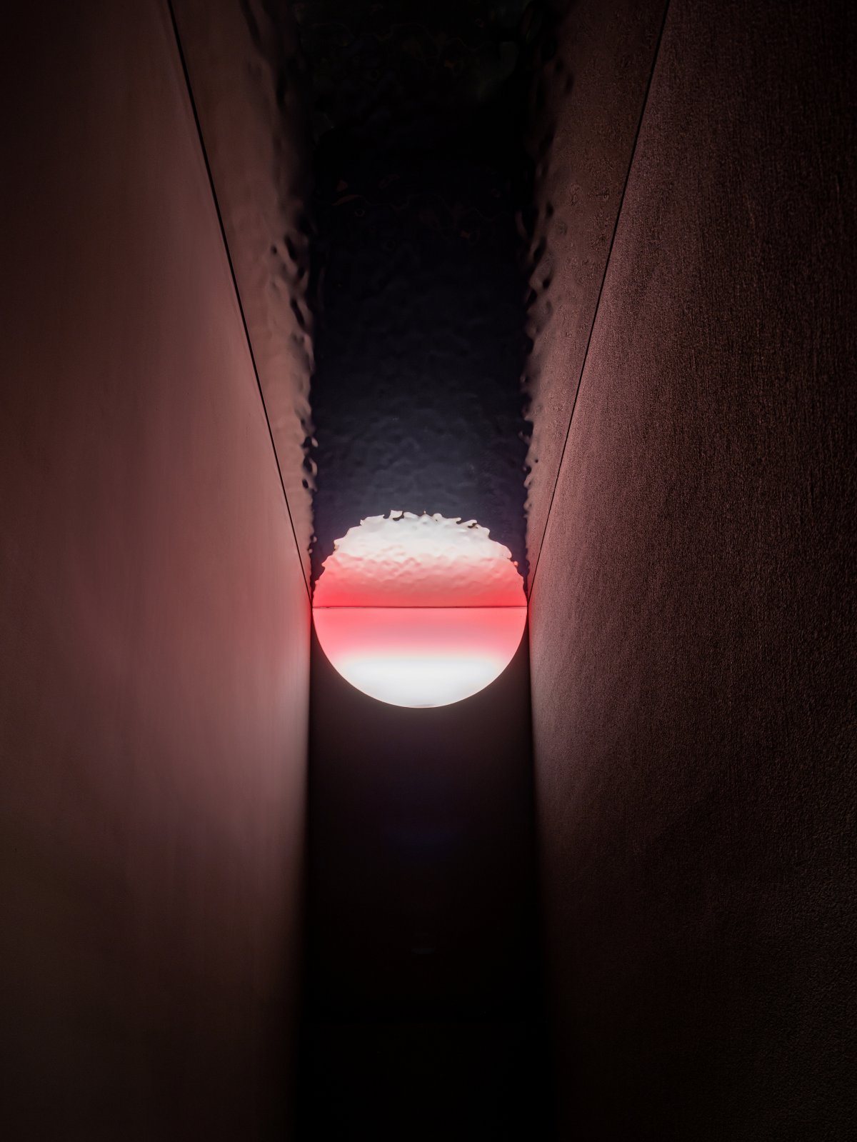
The wall of the hallway is composed of a regular grid repetition, and lights are installed to lead to the main entrance. The glass block located on the middle surface shows the silhouette of the interior space, arousing curiosity. At the end of the hallway, open the door and enter the floating island. The color-changing Barisol surrounding the floating island gives a fantastic feeling as if it came to a new world. After passing through the floating island, receive a response from the reception and go up to the second floor.
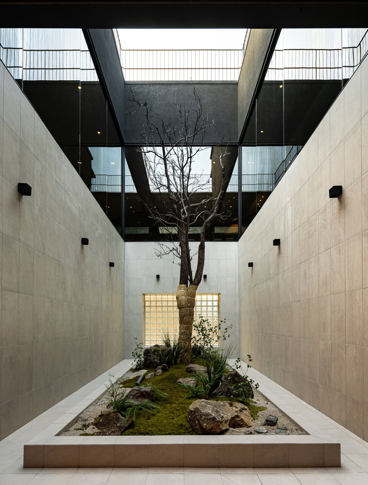
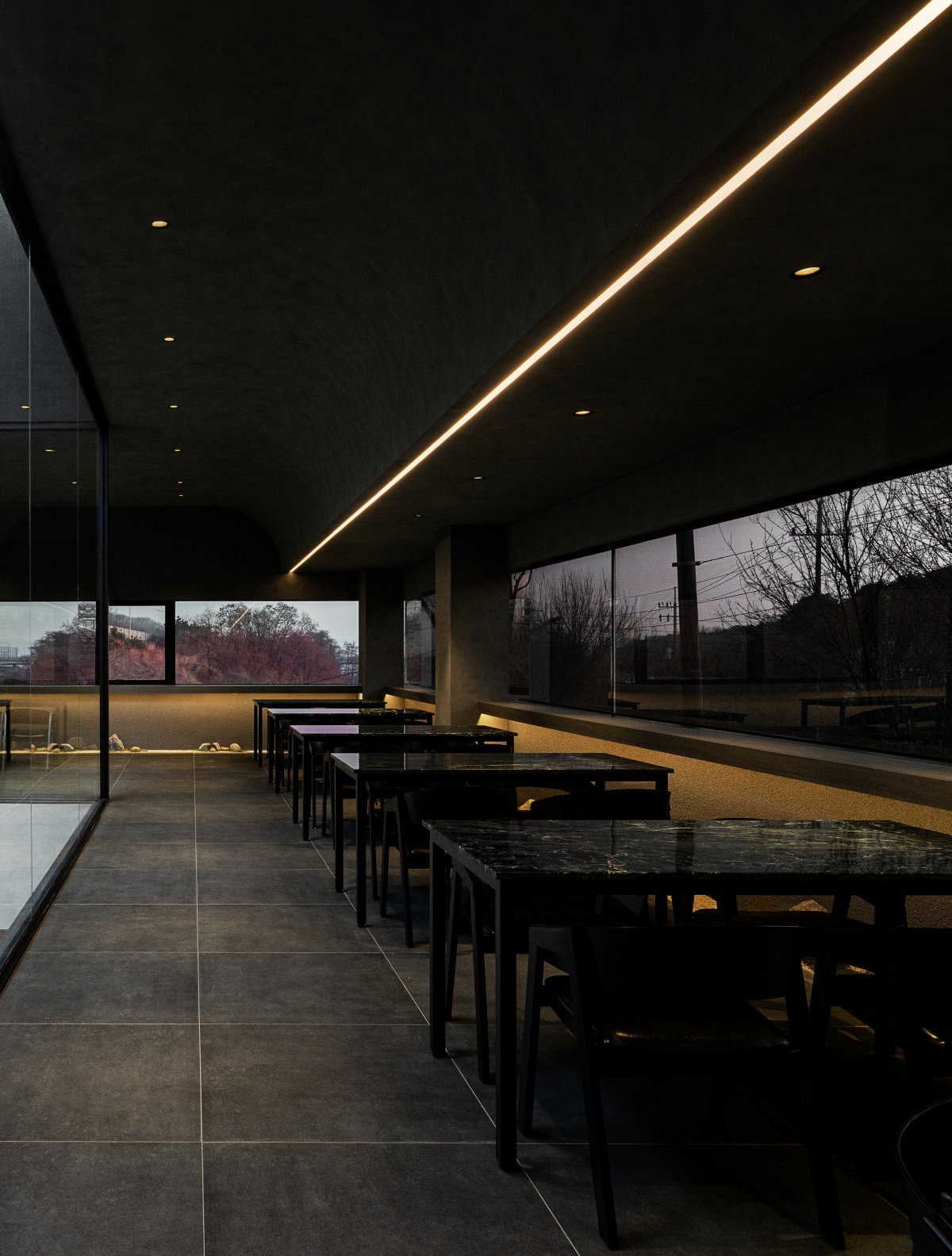
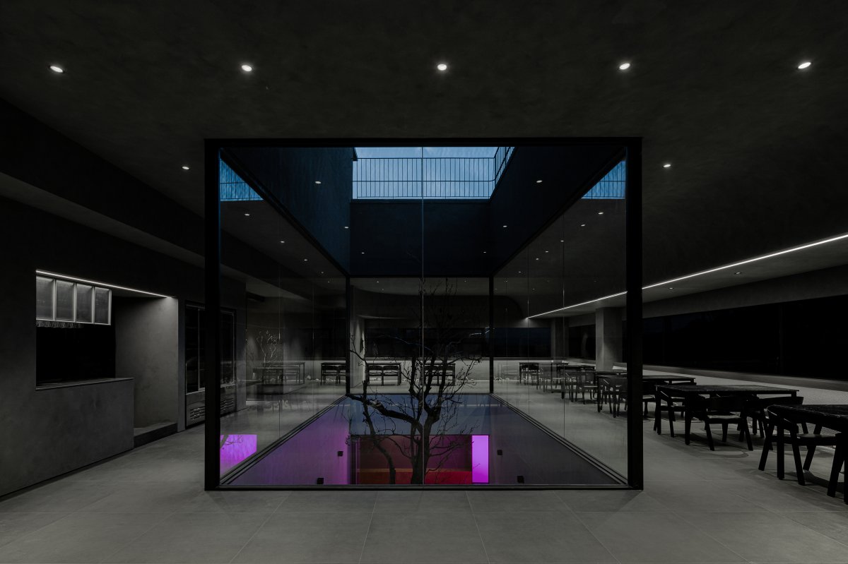
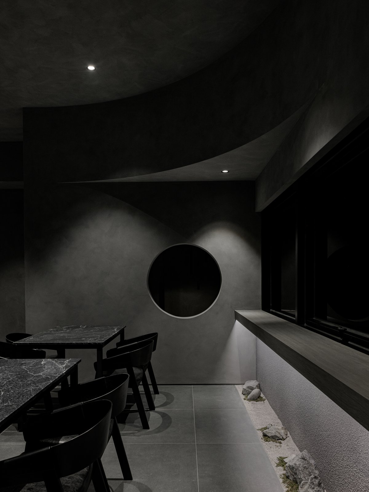
Climbing the stairs from the transition space on the first floor leads to the restaurant on the second floor facing the courtyard. The first and second floors are in rather dark and heavy tones, and a bright and warm courtyard space is placed at the center so that it can be viewed from anywhere. On the second floor, the curved ceiling was used as a plane and elevation to give the image of a soft and cozy space to the monotone space.
A small landscaping line was made under the shelf around the edge, except for the kitchen side. Achromatic, yet rough and soft textures, large and small tiles, and various finishing materials and variations in form ensured that the space was not boring. Landscaping and sculptures of the sun that does not set are made on the long stairs from the first floor to the rooftop.
- Interiors: Plainoddity
- Photos: Choi Yongjoon

