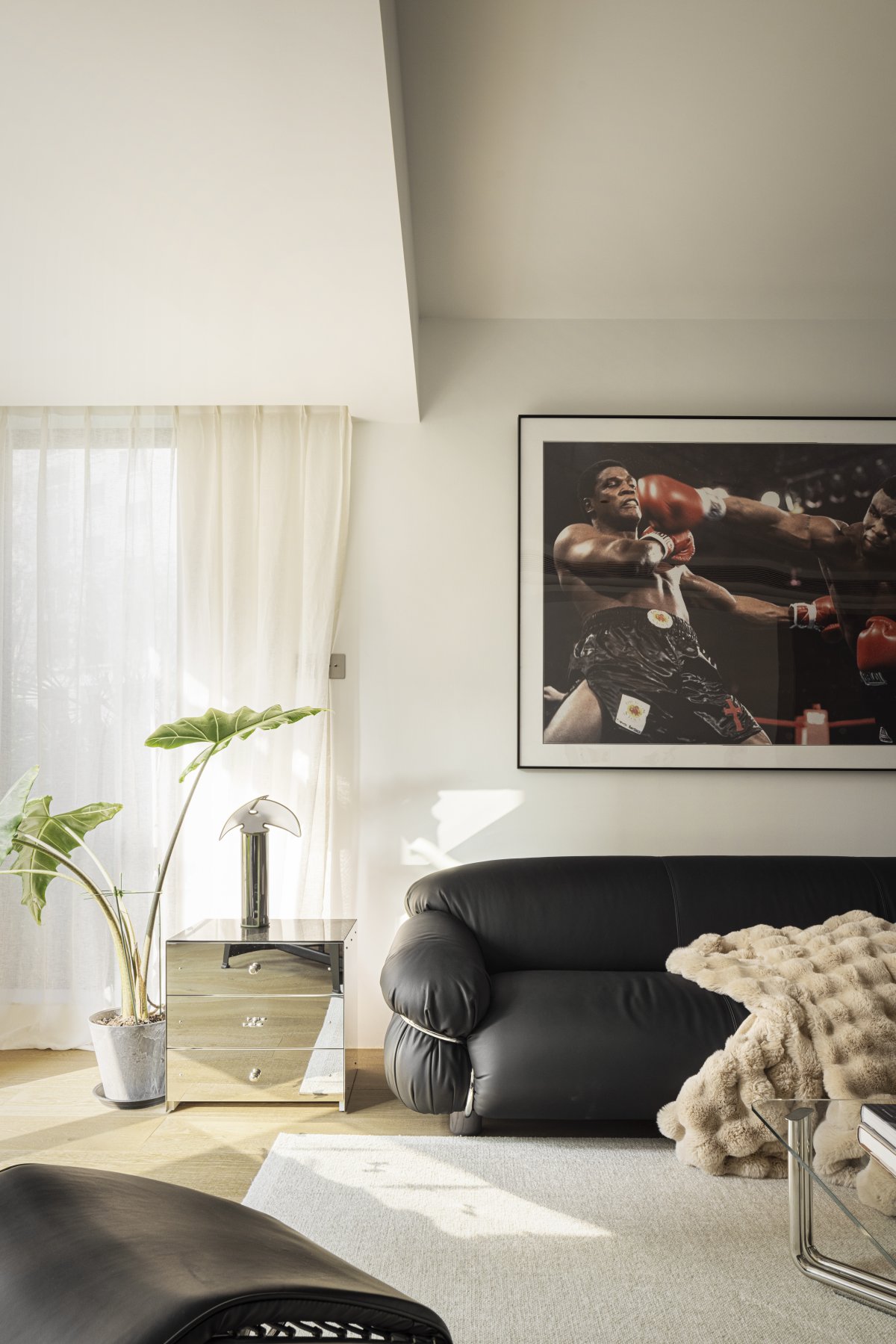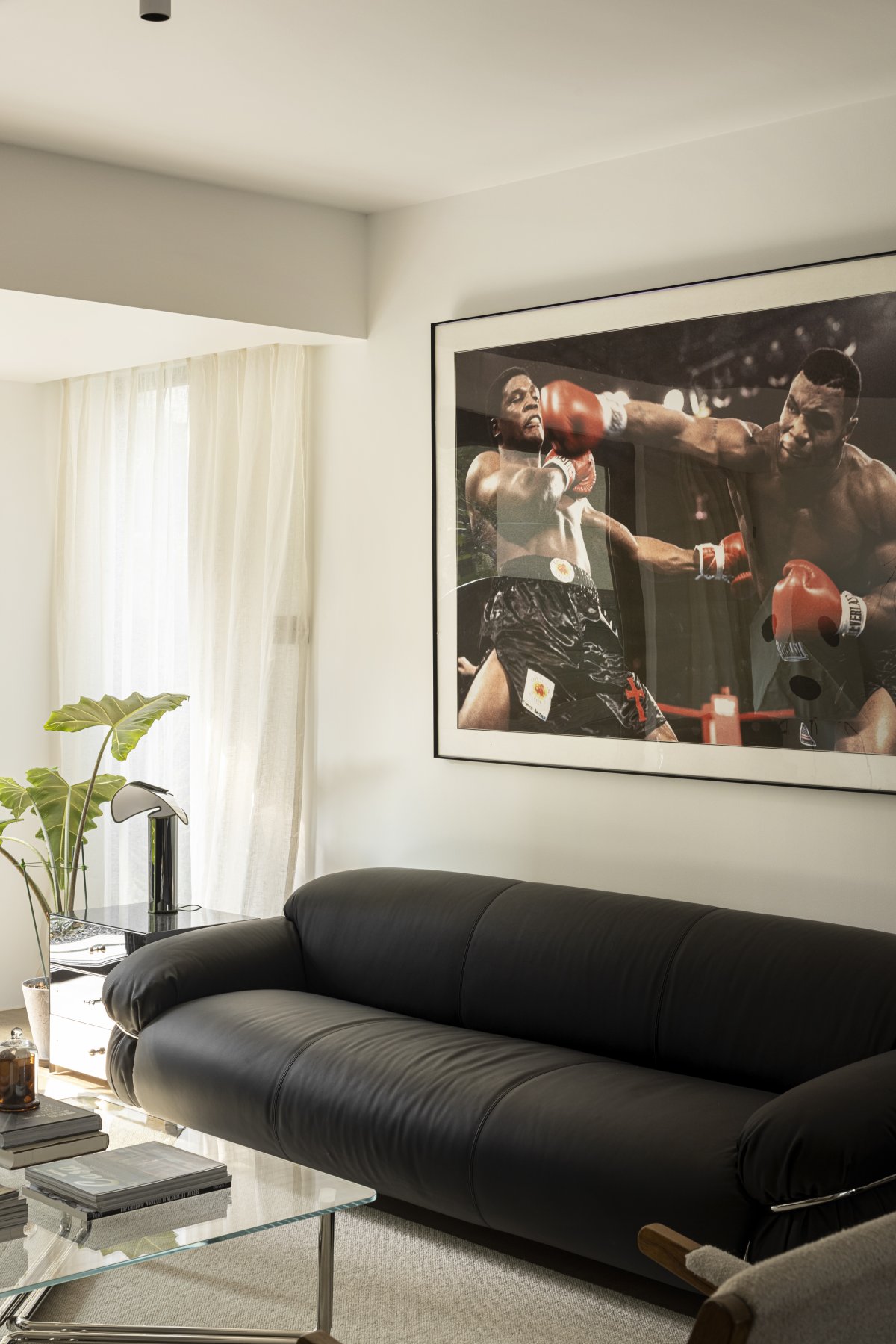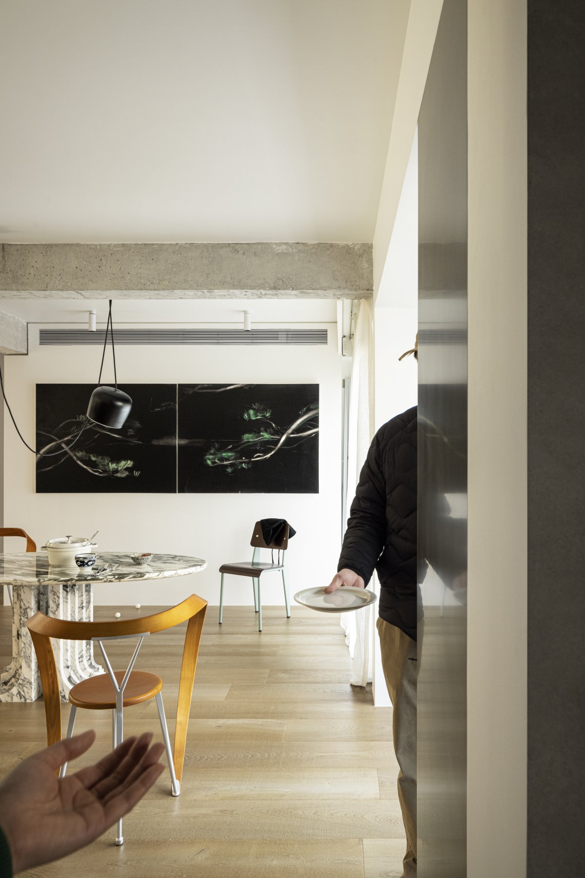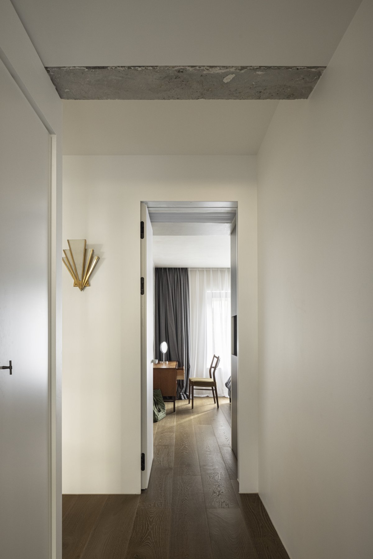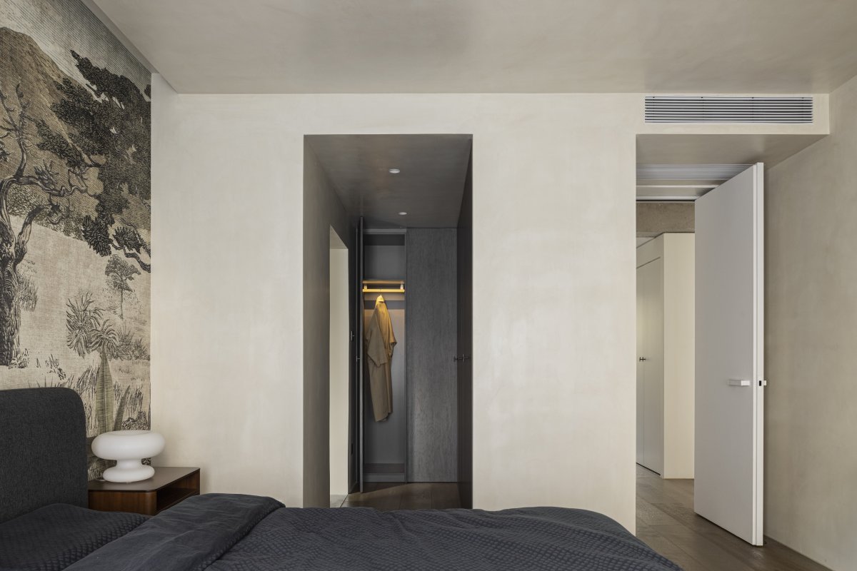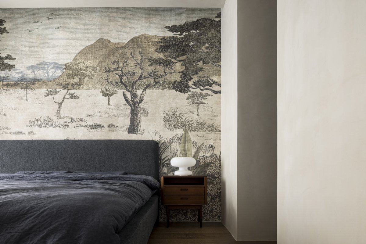
We have been thinking about what kind of living conditions can keep the occupants relaxed and pleasant at all times, as green as pine trees in all seasons. The Green Pines of Relaxation is a home that we tried to design intuitively, without detailed drawings and comprehensive plans, but only with the expectation of a three-dimensional and diversified living experience.
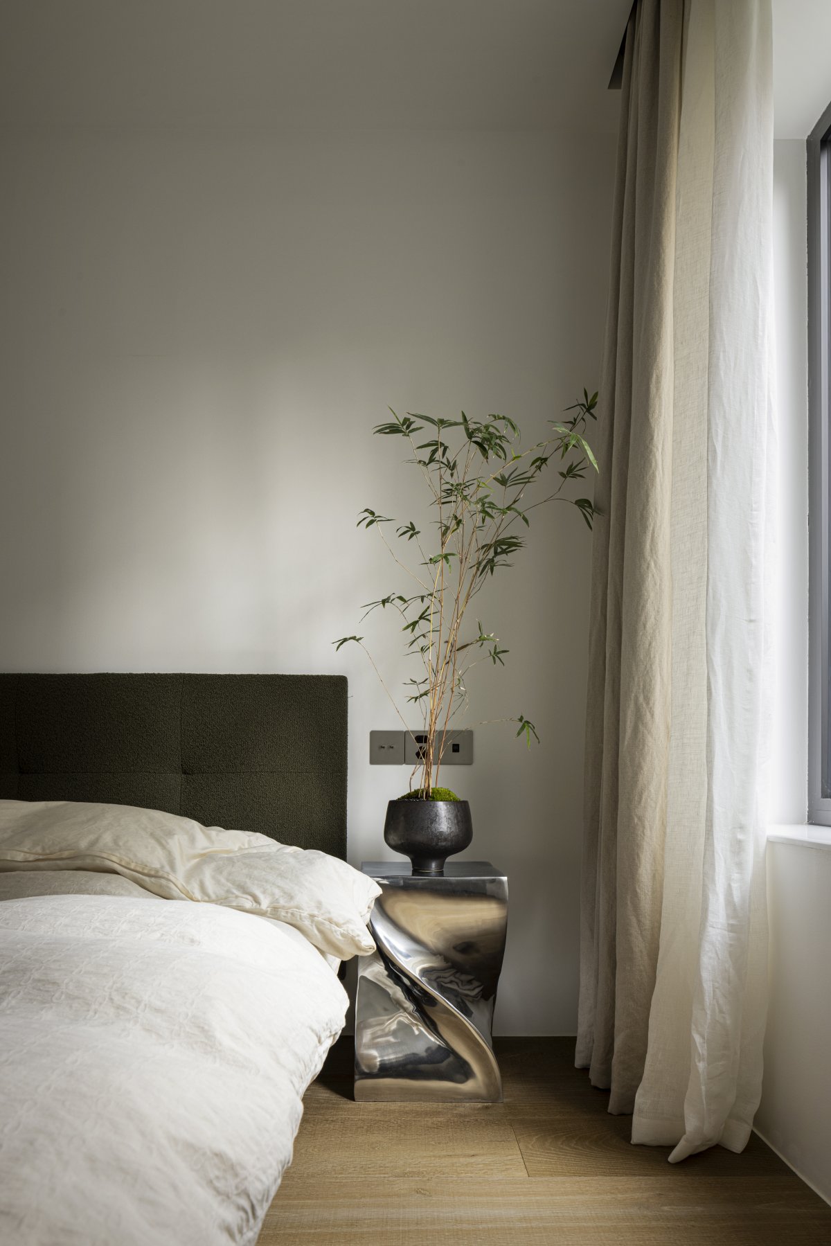
Green pine is the visual theme that runs throughout the house, and in Chinese it has the same pronunciation as "relaxed", meaning that home is an ideal place to let go of stress and be free of burdens. The combination of different elements brings a controlled tension to the home. This is our understanding of design and what we hope to provide to each and every user in the future. From the visual to every accessible corner, we want to give the house a more diversified and advanced quality.
This project is located in Guangxi Guilin Chuan Mountain Park, entering along the river and leaning against the mountains and water. The type of house is a first floor house with a small wrap-around courtyard. We are a couple and the owners of the house, which gives the project a great creative potential. We combined everything we love in life into the design of the house, and fully integrated living into the place.
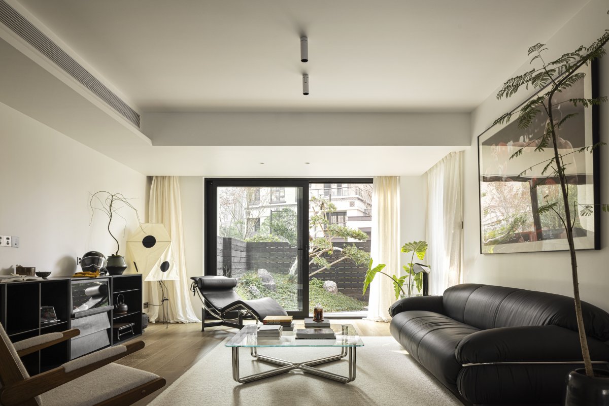
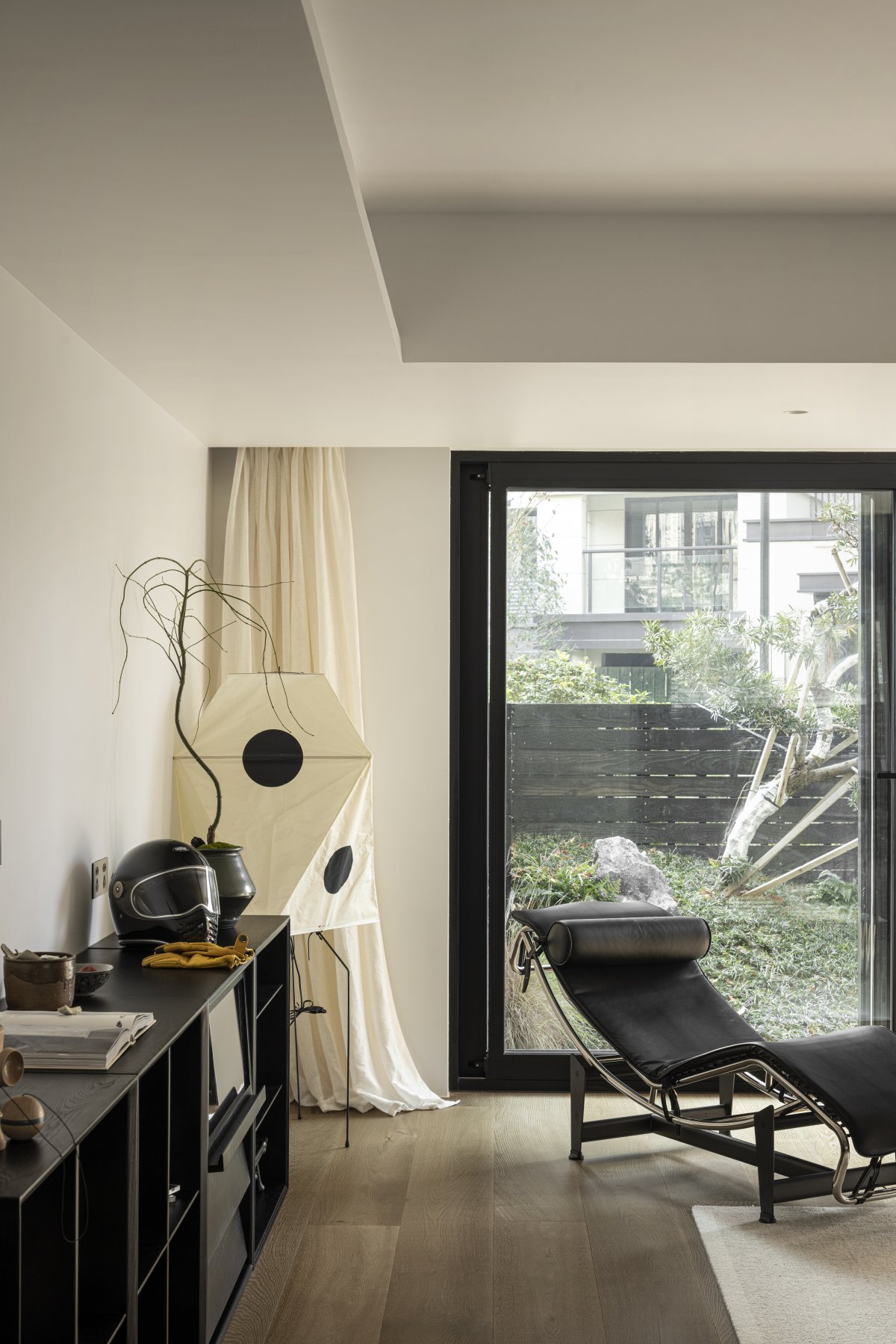
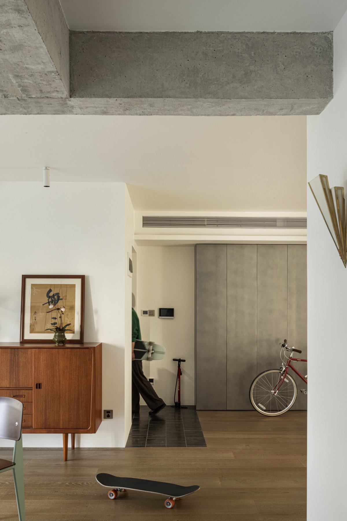
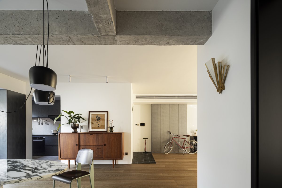
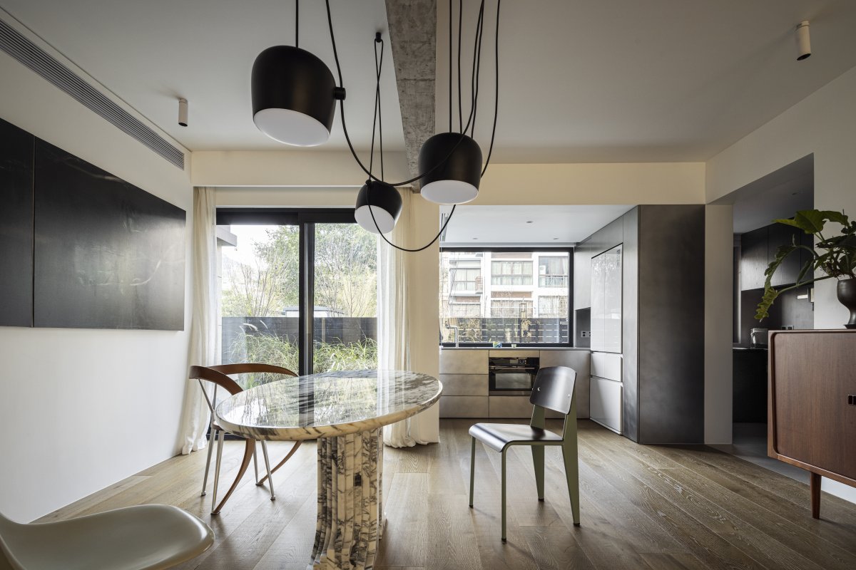
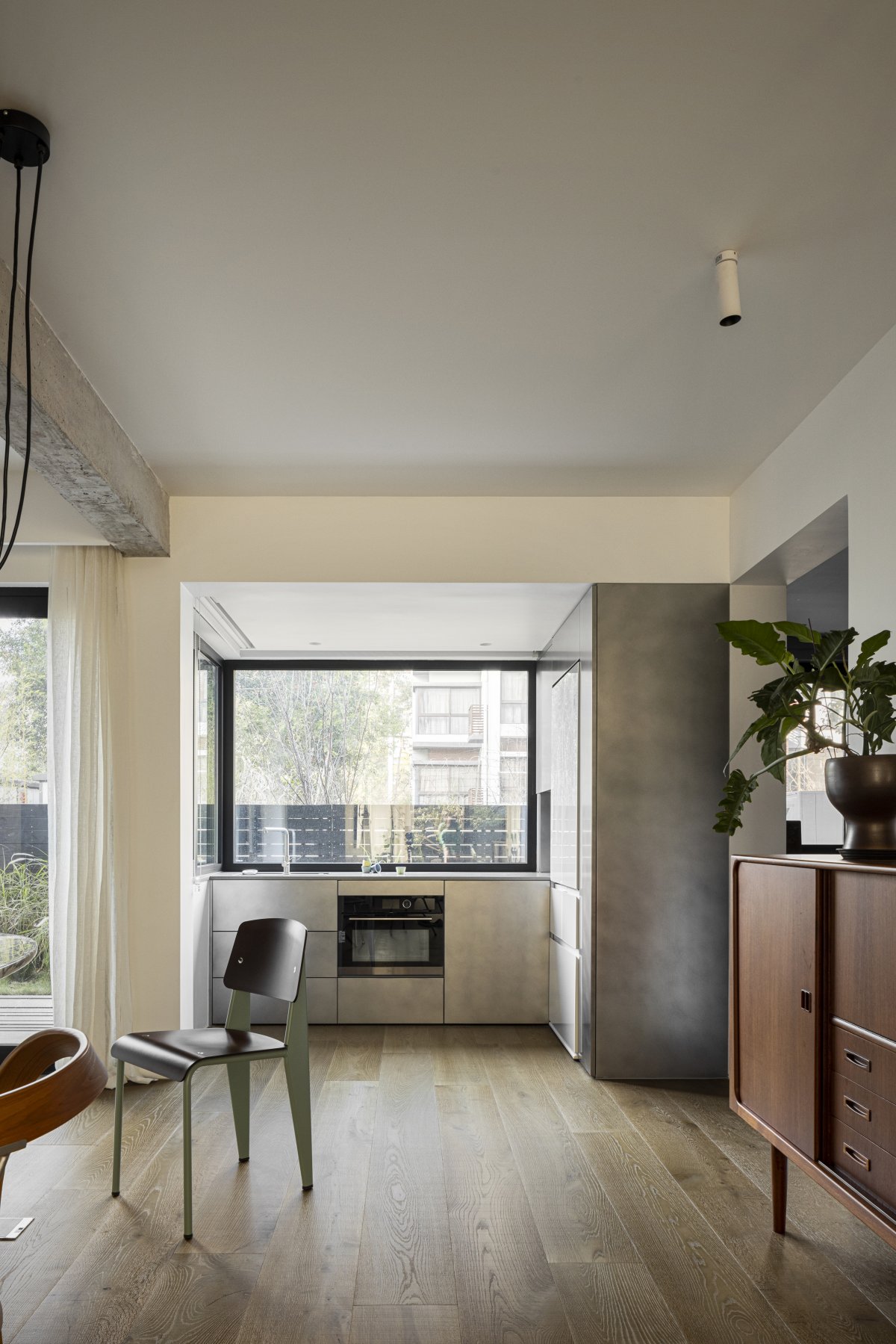
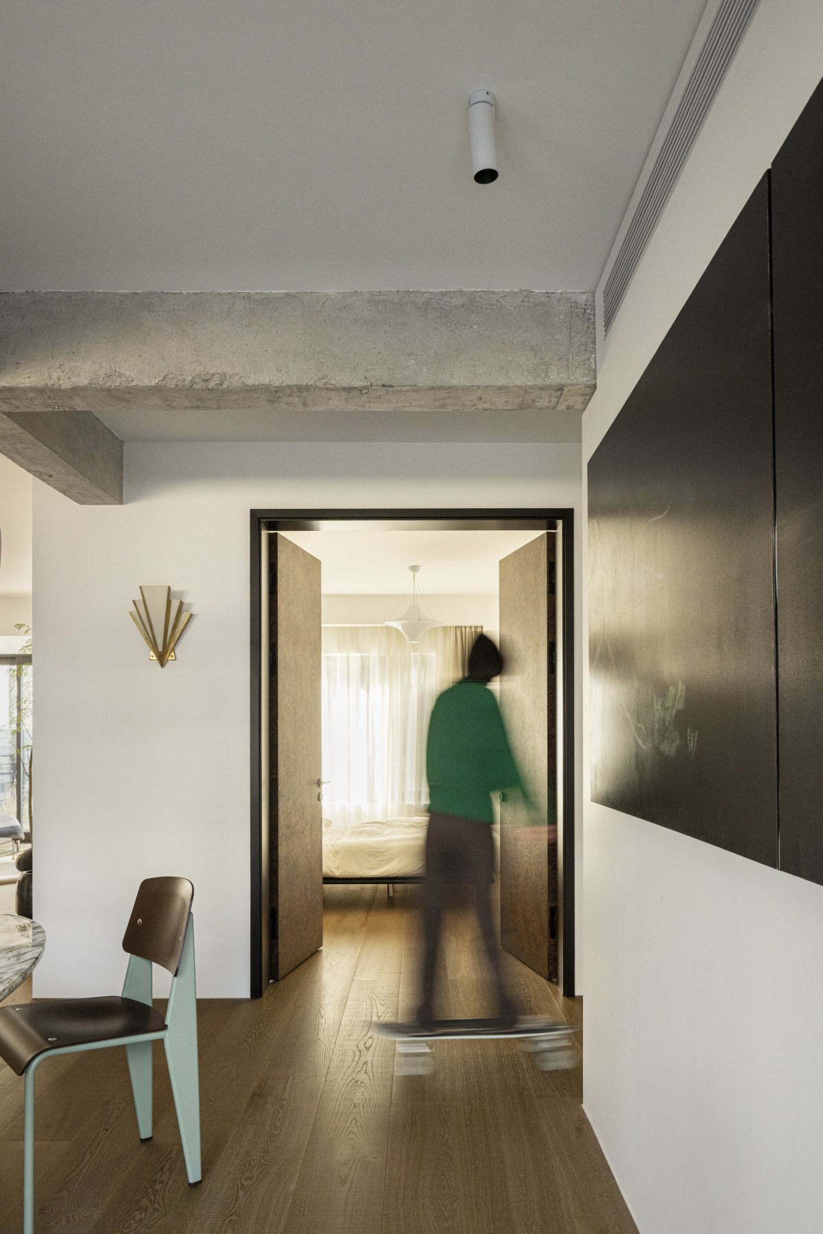
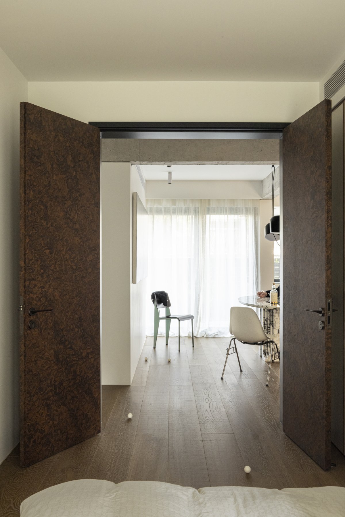
The house space was originally a traditional layout of four rooms and two halls, we divided one of the guest rooms according to our own habits. One third of which was used as a centralized miscellaneous storage area, and the other two thirds was contributed to the originally small dining room. Because of the outdoor courtyard, the balcony was incorporated into the interior space, expanding the living room space on the one hand and compensating for the lack of kitchen function on the other. The two guest rooms were not used most of the time, so they were treated as open spaces and can be used as screen partitions on a daily basis.
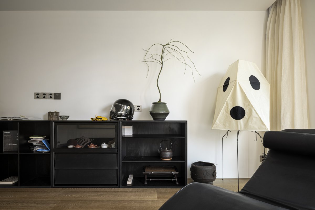
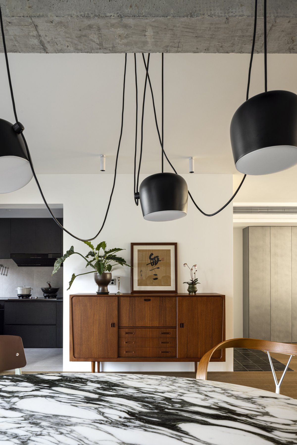
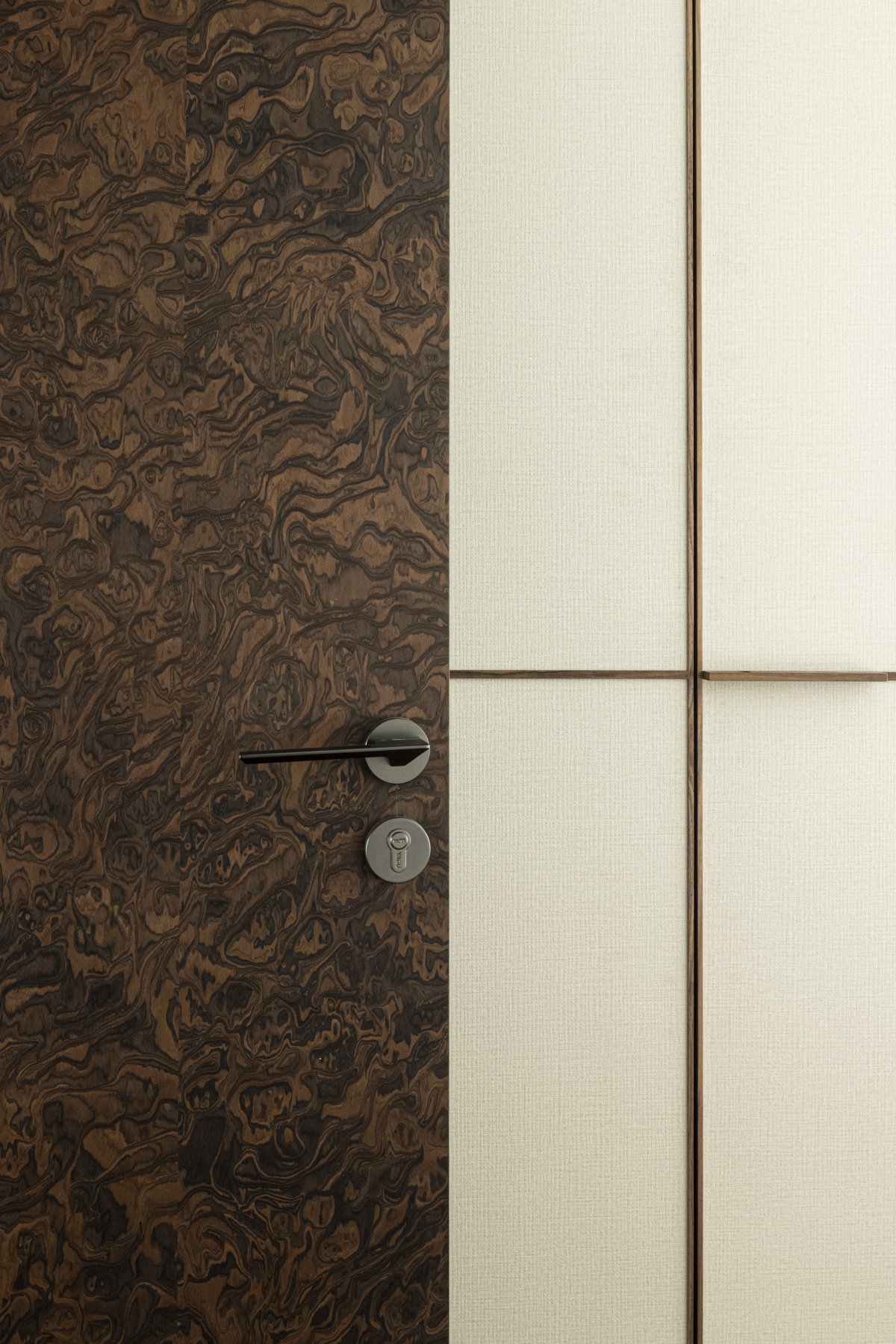
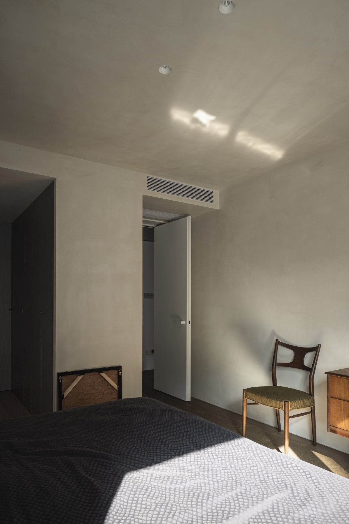
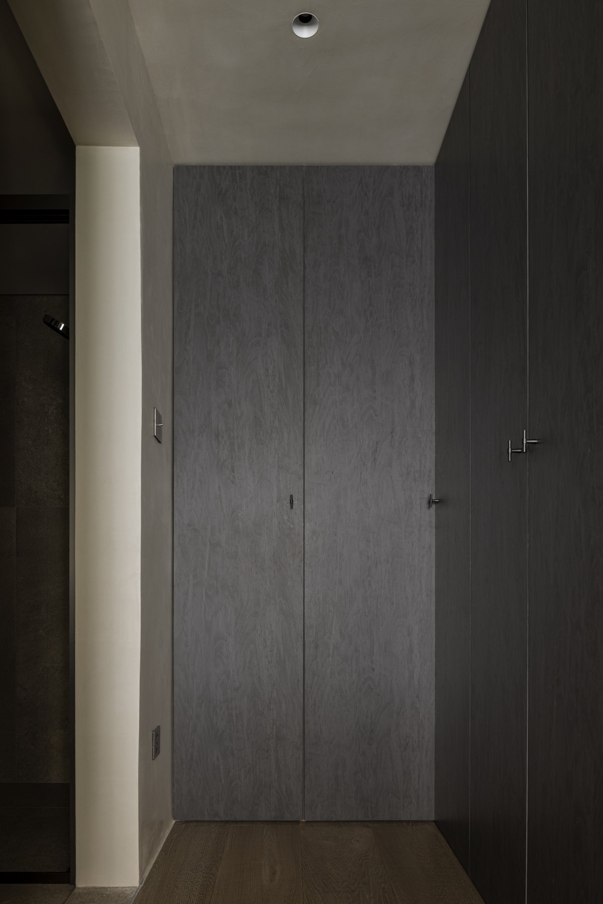
In terms of material selection, we used richly textured veneer, roughly textured flooring, irregularly patterned metal, antique furniture, and exposed original concrete structures. In terms of design, we decided not to let the structure and beams be the limiting factor for the ceiling, and boldly exposed the concrete beams of the original structure. The light cords were randomly twisted to provide a sense of art and uncertainty to the dining room. Hand-painted with metallic paint to create unique polished marks, the irregular texture was comforting. The dining room occasionally became the "main field" for after-dinner sports, and the living atmosphere was the most beautiful decoration. In terms of space utilization, we set up core storage space in a relatively hidden location, concealing necessary electrical equipment as much as possible and discarding superfluous access openings, and treating the common areas as completely open spaces to increase accommodation as much as possible.
We intended the house not to be the result of a so-called elaborate plan, but to be a unique perspective on the daily life and uncertainty of the design. It is an unrefined balance.
- Interiors: THE ONE STUDIO
- Photos: ACT Studio

