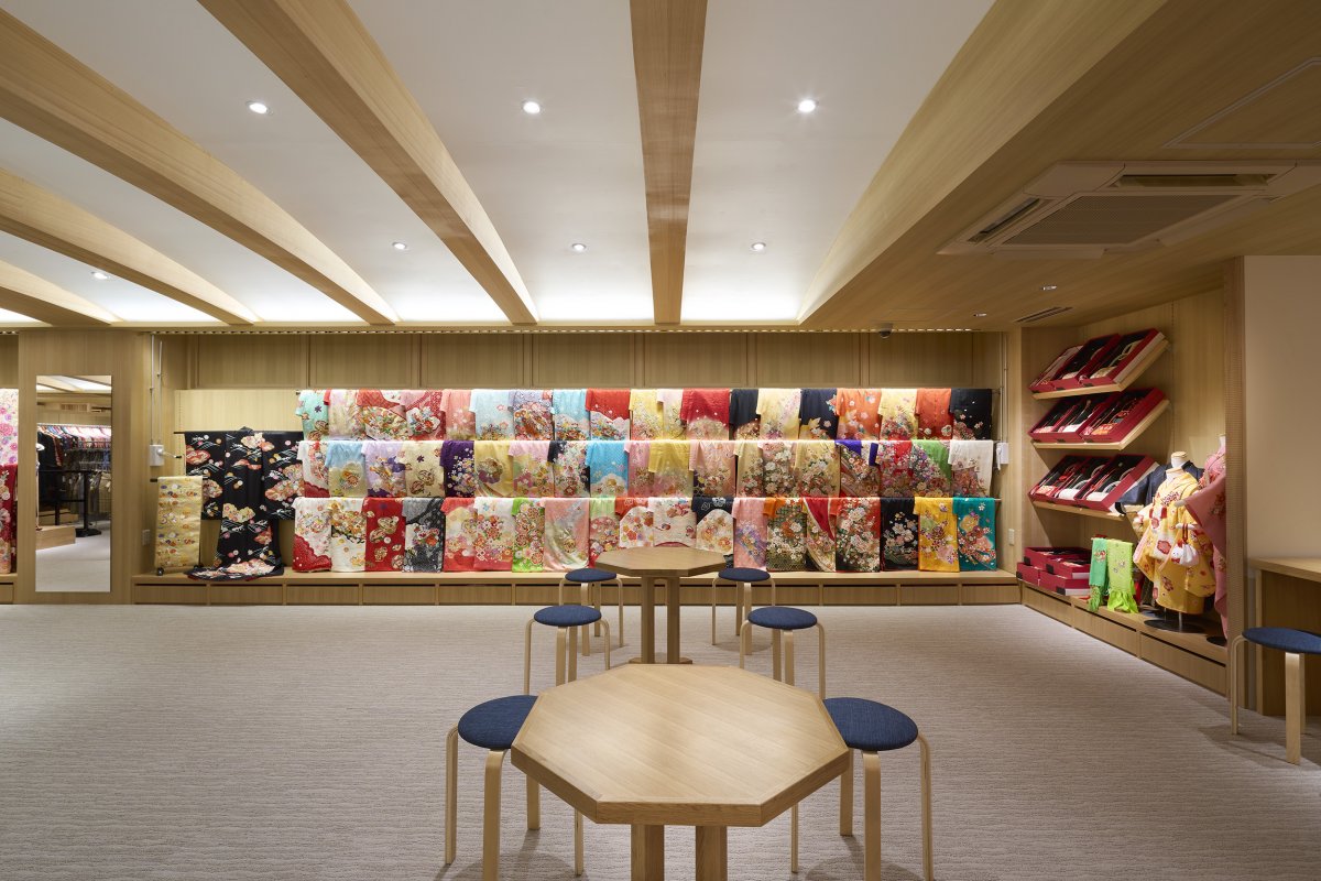
Marusho was founded in Yokohama 55 years ago. Tsutsumi & Associates were in charge of the renovation design of the 1st floor sales floor, staircase, and façade, in continuation of last year's second-floor clothing area. In contrast to the 2nd floor, which was mainly a formal Kimono for weddings, the 1st floor displays 3 types of Kimono which are Furisode for coming-of-age ceremonies, Hakama for graduation ceremonies, and Shichi-Go-San for kids.
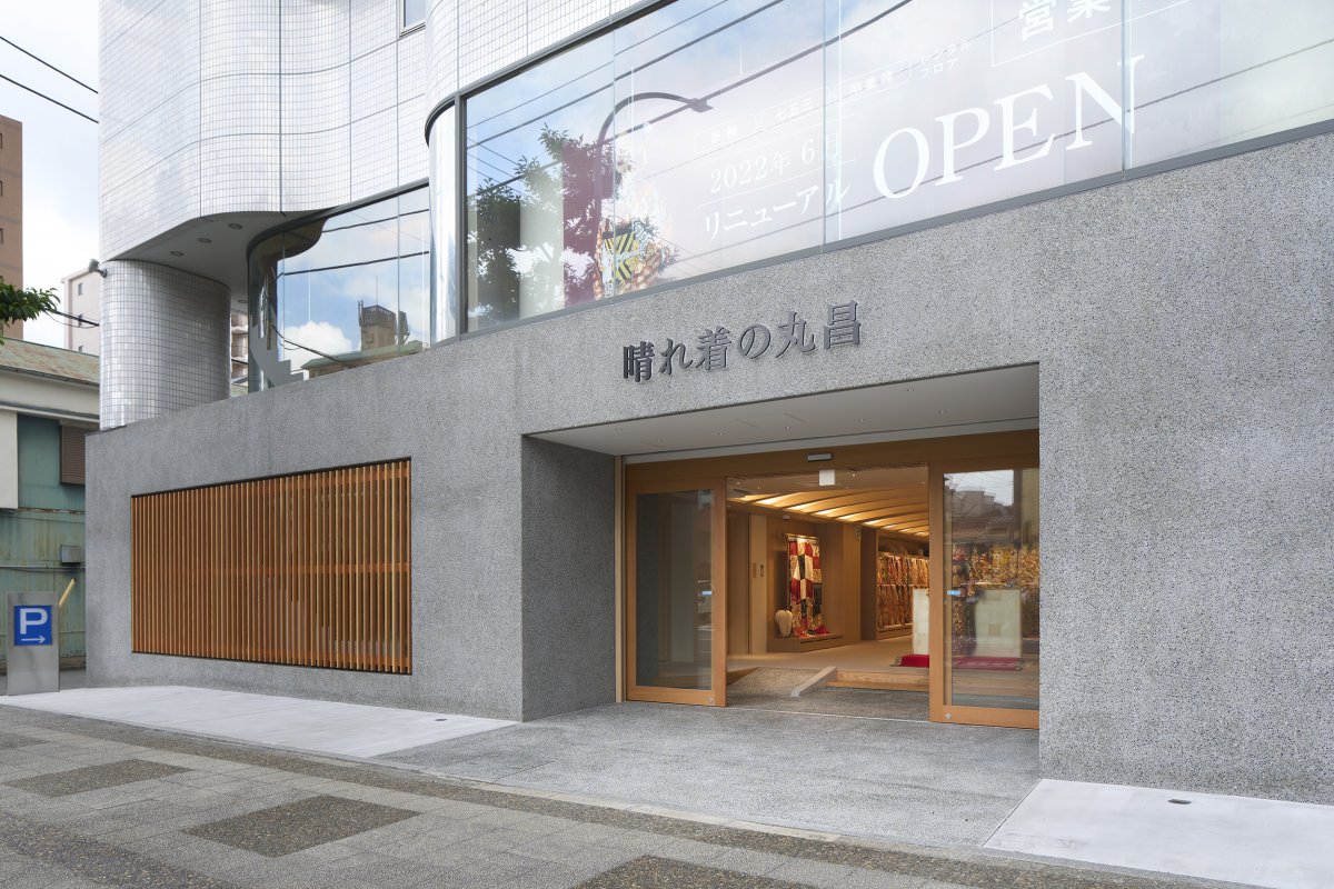
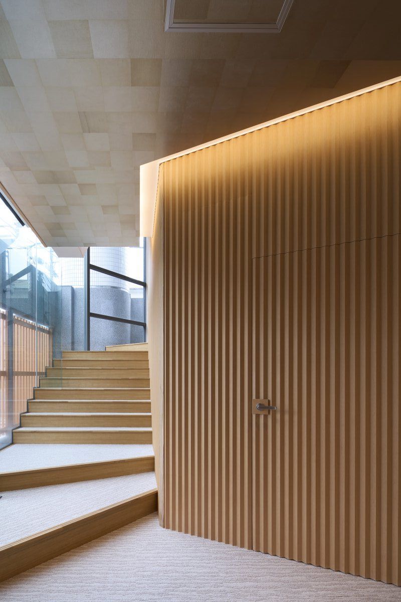
The façade before the renovation had curved wall with white tiles, which did not match the image of the Kimono. For this reason, they added a gate-shaped structure to hide the curved wall, and a straight wall covered with exposed-aggregate finish parallel to the road was created. Peeler louvers are installed on the part facing the staircase to gently block the line of sight. The interior walls of the staircase are fitted with noncombustible ribbed panels of Douglas fir, emphasizing the sharp verticality, and the gold leaf cloth on the ceiling creates an extraordinary sense of luxury.
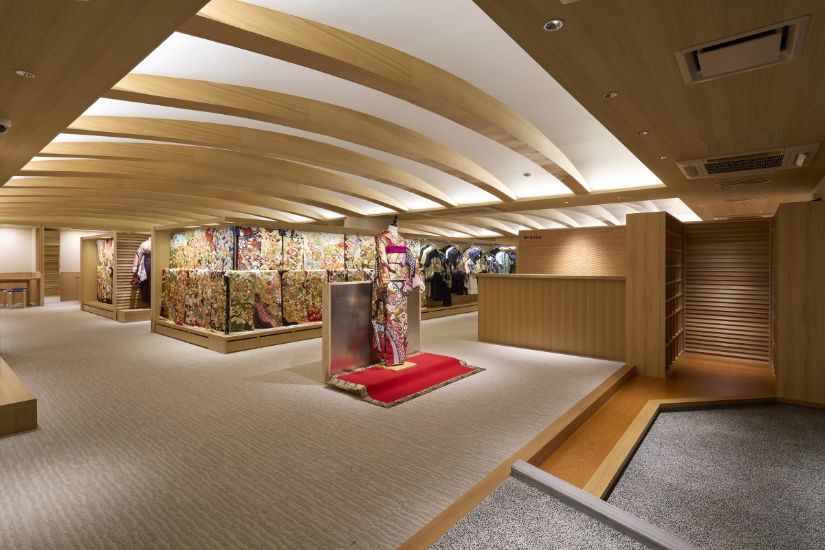
In order to prevent different customer groups from mixing in the room, Studio planned to surround the central sales area in a square nested state. The surrounded area in center is for Hakama sales area, the two sides of the outer periphery are for Furisode, and one side is for the Shichi-Go-San. The height of fixtures is kept to 1.8m to reduce the pressure. The meeting area faces a shelf for Obi sashes and accessories so that customers can easily arrange with the selected Kimono. The accessory shelf is a combination of Kumiko lattice and linden peg board to achieve both free display and design.
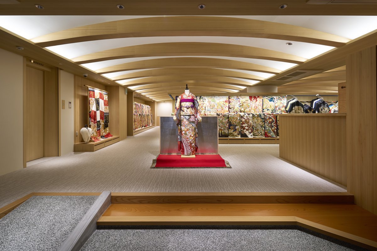
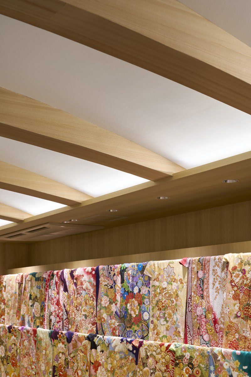
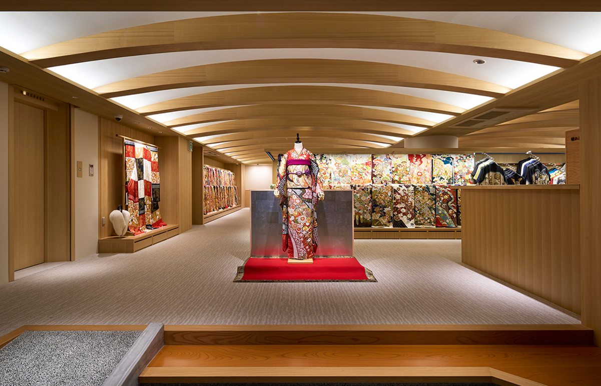
Tsutsumi & Associates studied to make a light structure like a crescent with tapering the edge of the arches which were bridged between the existing beams on the ceiling. The arches are covered with wooden veneer, and the vaults are painted white and illuminated with indirect lighting to highlight the structure. The crescent arch continues from the entrance to the back in the shop, strongly attracting the line of sight.
While the design of the 2nd floor was conscious of formality, we wanted to create a light and generous space on the 1st floor. Looking at the repetitive two rows of slight arches, it seems like an eyebrow. Therefore, we borrowed another Japanese name for crescent and decided to call this project as "Mayuzuki".
- Interiors: Tsutsumi & Associates
- Photos: Toshiyuki Yano

