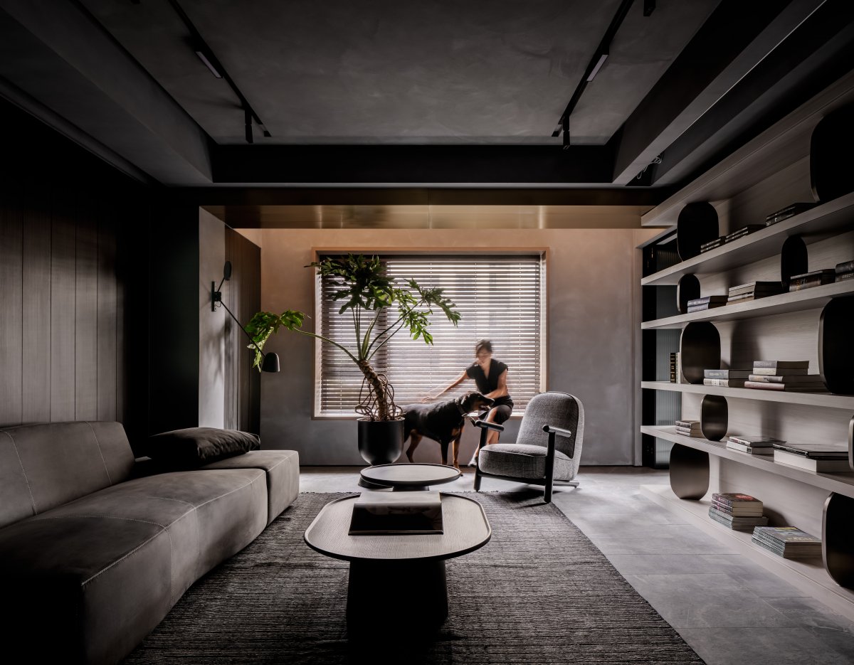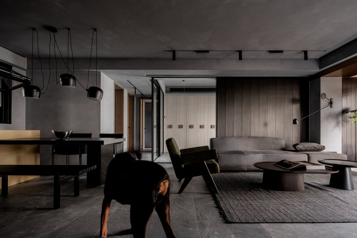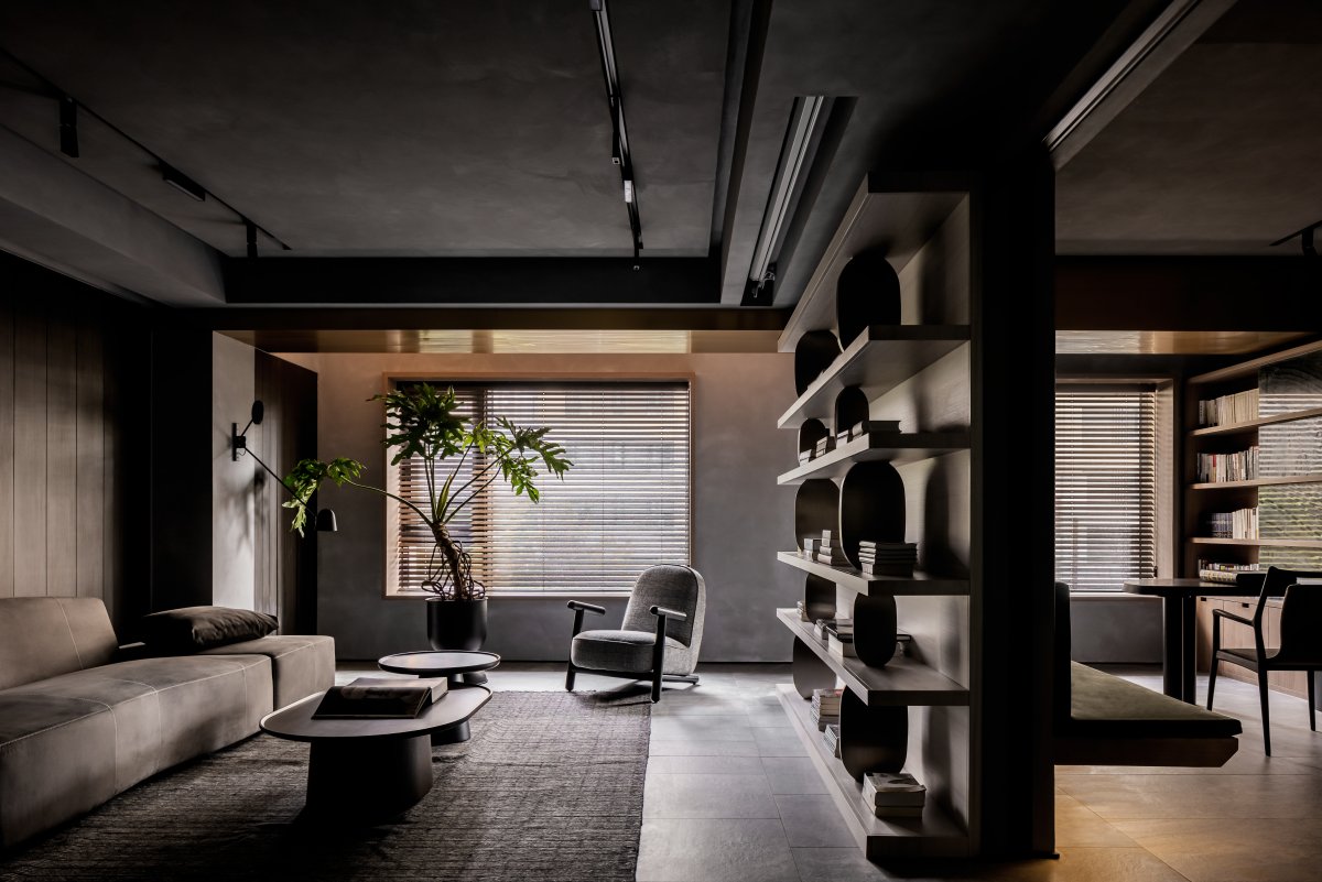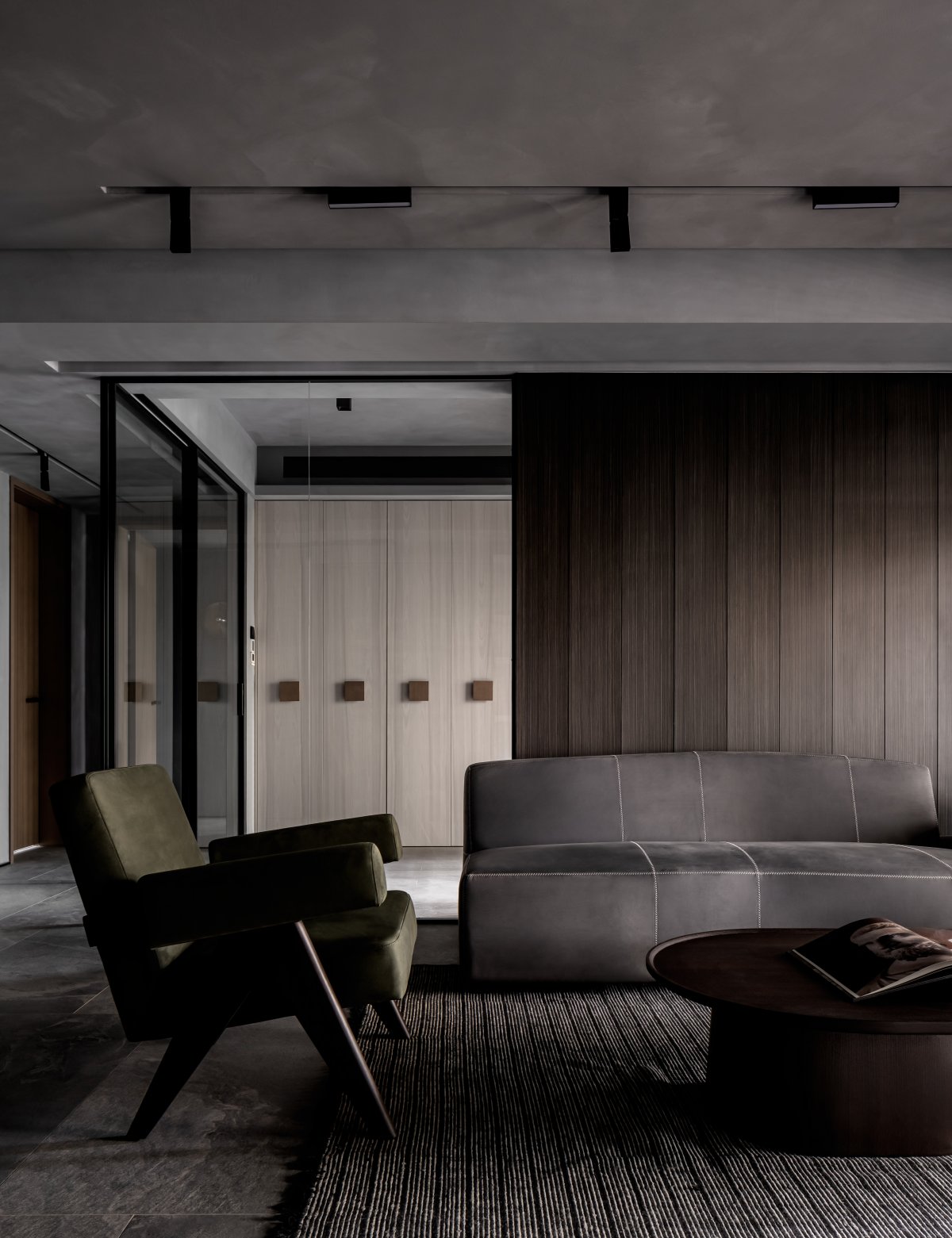
After stripping away the wall structure, the home is like a space displaying the owner's memory pieces. Visiting a home is like walking into the owner's experience and emotion.
Simplified space in order to make goods and material organization own language, but also because believe that "the people" is the best style, modern household space besides can serve as a social place, it should be a able to look at ourselves, the return of the dialogue with their place, they will work here open dialogue, staged scene after scene of life is ordinary and beautiful scenes.
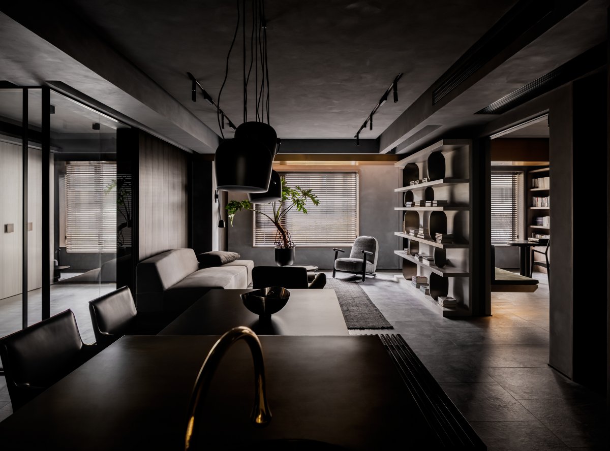
The project is located in the hinterland of Wuhan Optical Valley, is a set of 4 bedrooms, the current state is two people live, so I hope the house to show the state is open, multiple transparent without obstacles.
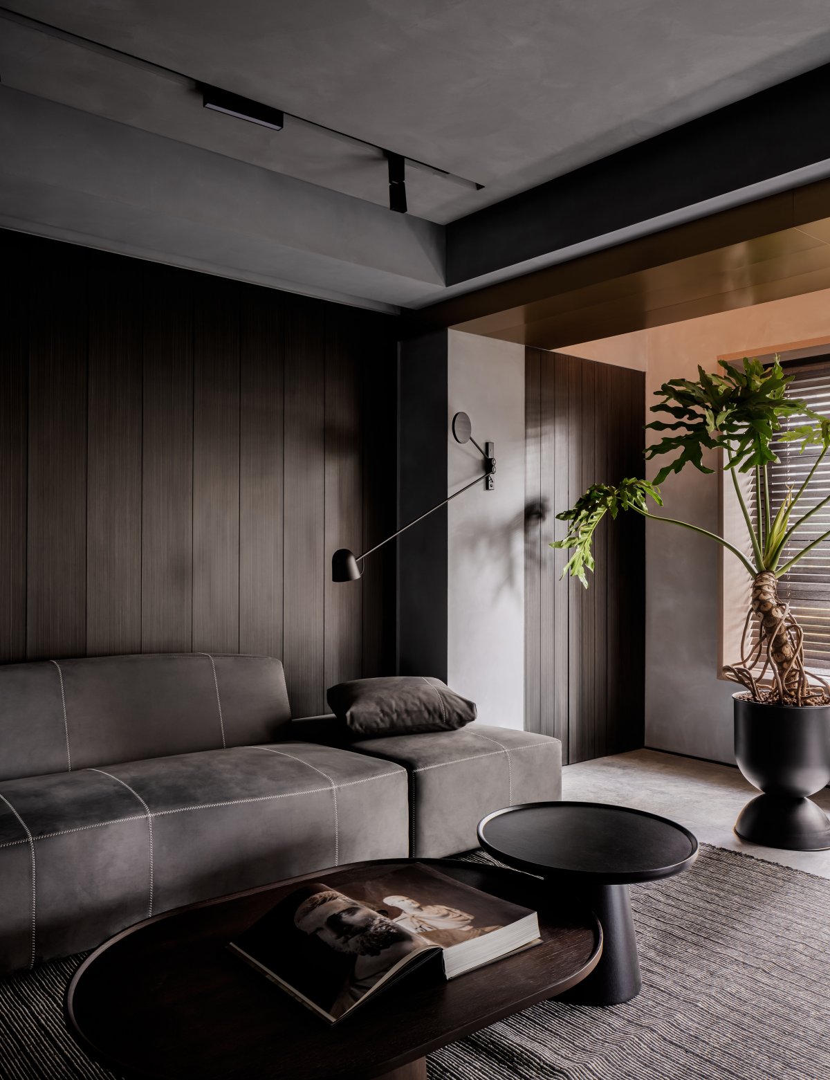
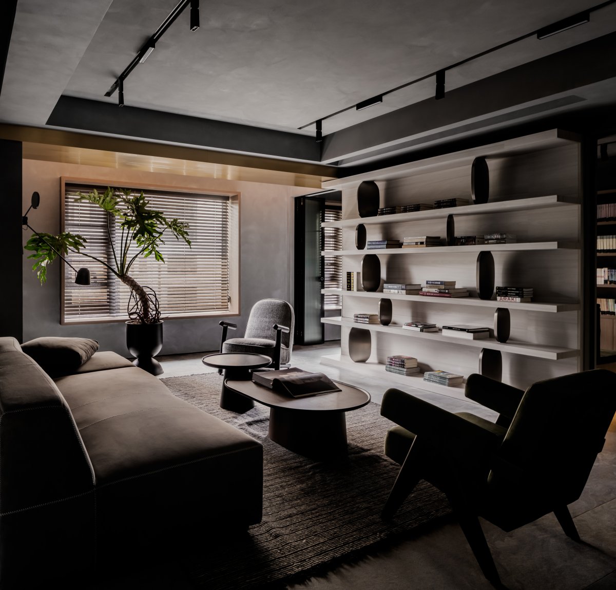
For designers, how to use our design techniques and aesthetic tendencies to present the needs of the owners is our focus. We like to use the sense of layering and contrast between different materials in the design to achieve sensory enjoyment. In this space, we made extensive use of materials and soft furnishings in different textures of dark and neutral colors, in order to achieve the look that both the owner and we wanted for this new home.
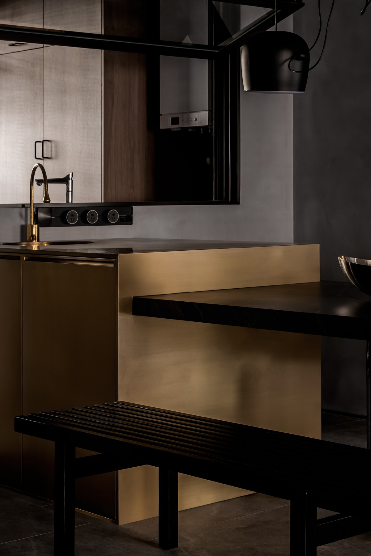
Metal brass and soft decoration, such as sofa carpet and green plants, are integrated into the space. At the same time, a large number of natural wood veneer elements are filled everywhere in the space, which also harmonizes the rational atmosphere of the space to a certain extent. At the same time, the texture is also infinitely profound details, to achieve a delicate balance between rationality and sensibility.
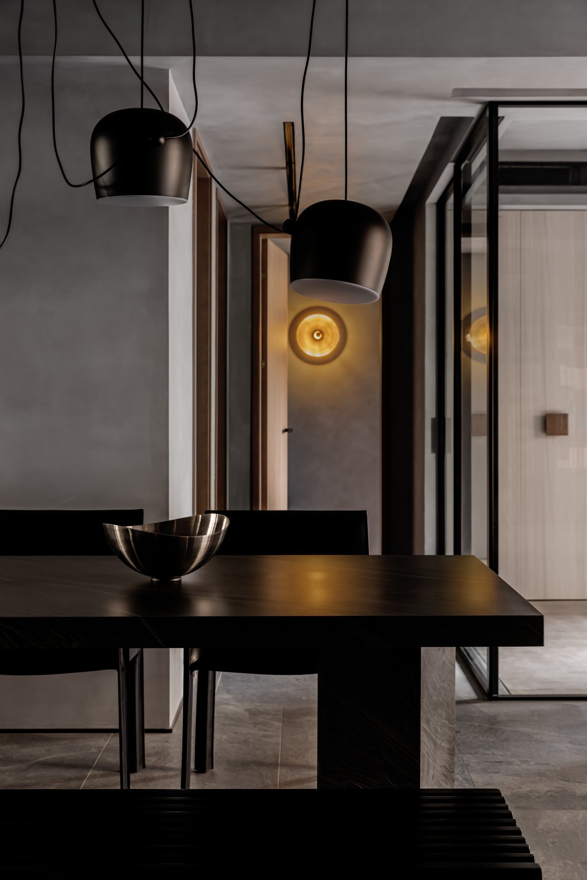
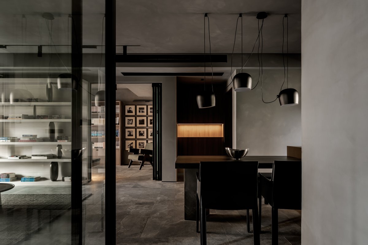
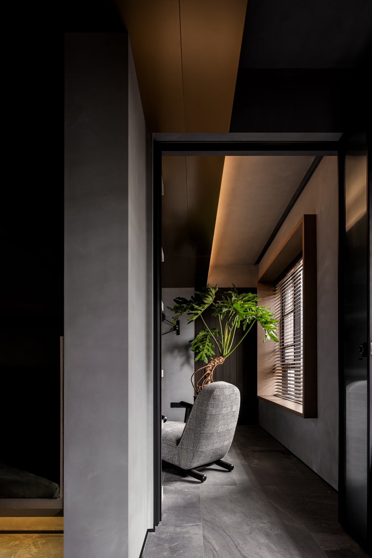
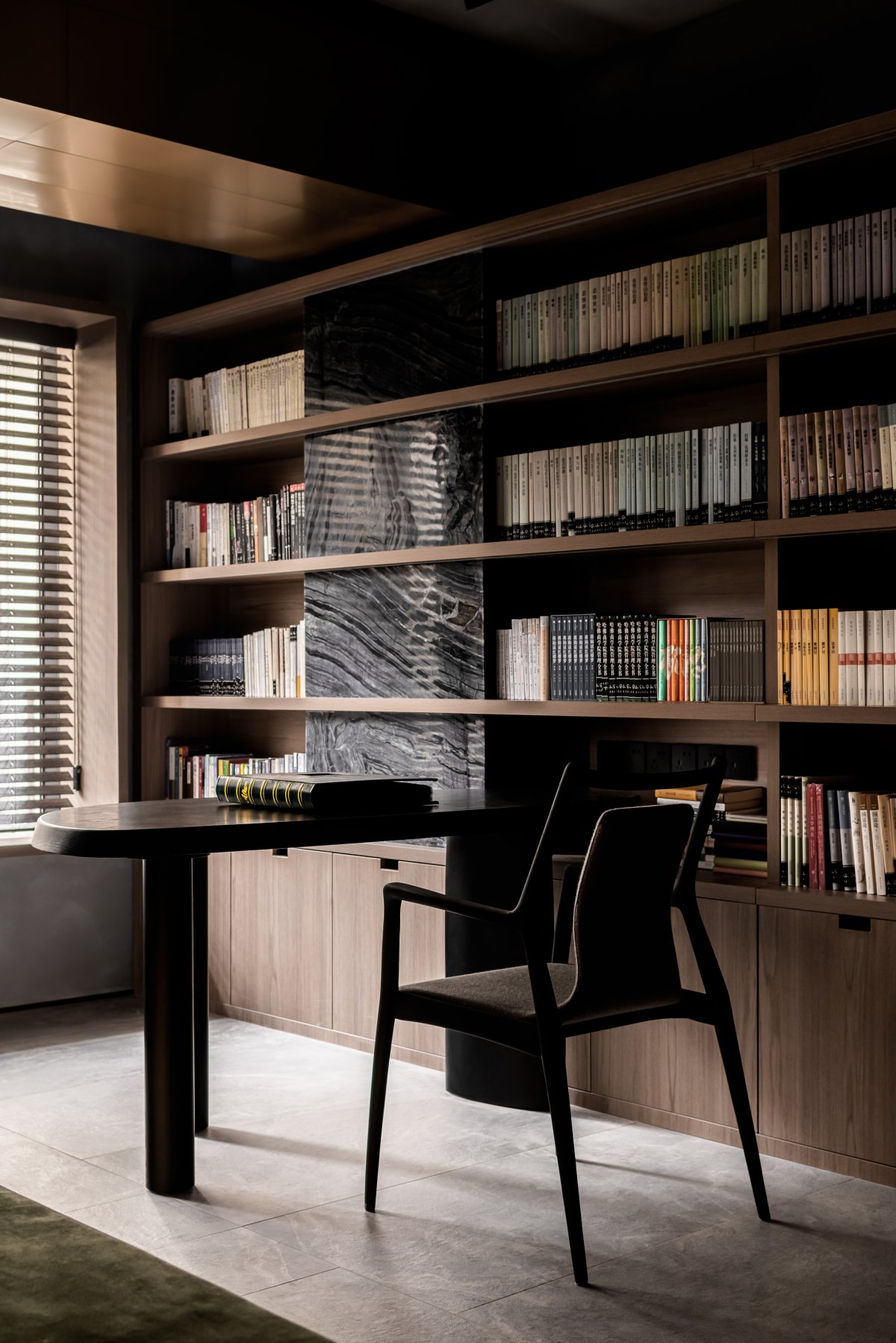
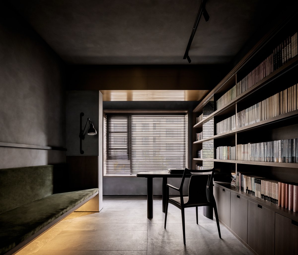
Looking out through the corridor, the guest dining room and study have a sense of orderly order and exhibition. Each space silently exudes charming temperament in its own field, waiting for the dialogue with the owner. The photo wall that the female owner expects is quietly displayed in the corner of the study, and the scattered lighting system is gentle every moment at home.
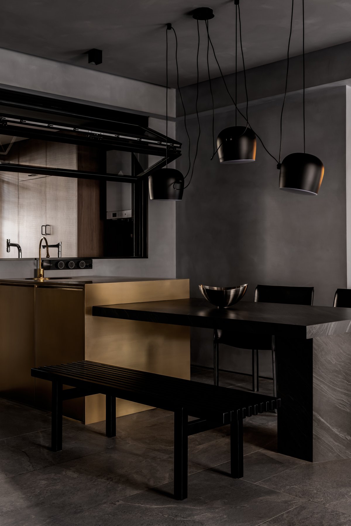
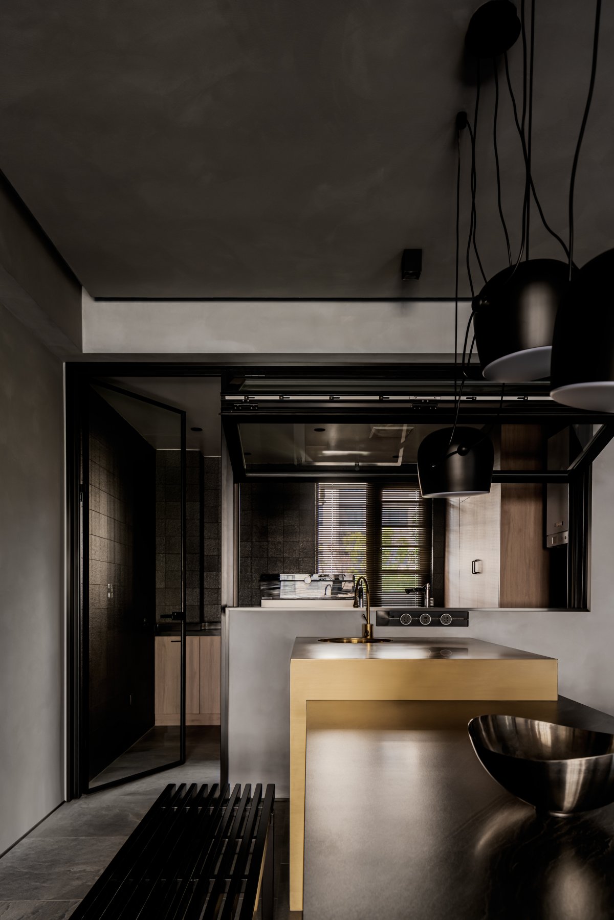
We expanded the scale of the original kitchen, making it possible for the kitchen with the original back to the guest dining room to face the guest dining room. From then on, we have a good interactive experience between Spaces. In the visual scale, we can also see the guest dining room, study and preparatory children's room to the greatest extent. In the dining room, the entire structure of the island is made of metallic brass, while the dining table is made of rock slabs with metal support structures embedded inside. The metal brass island and the rock plate dining table are closely intertwined, which is a beautiful presence in the space like a sculpture of "David".
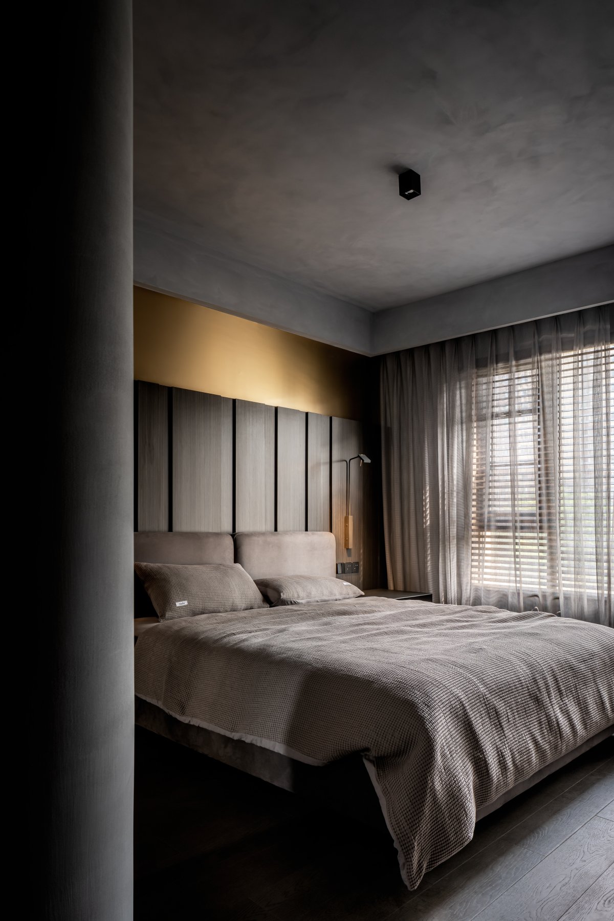
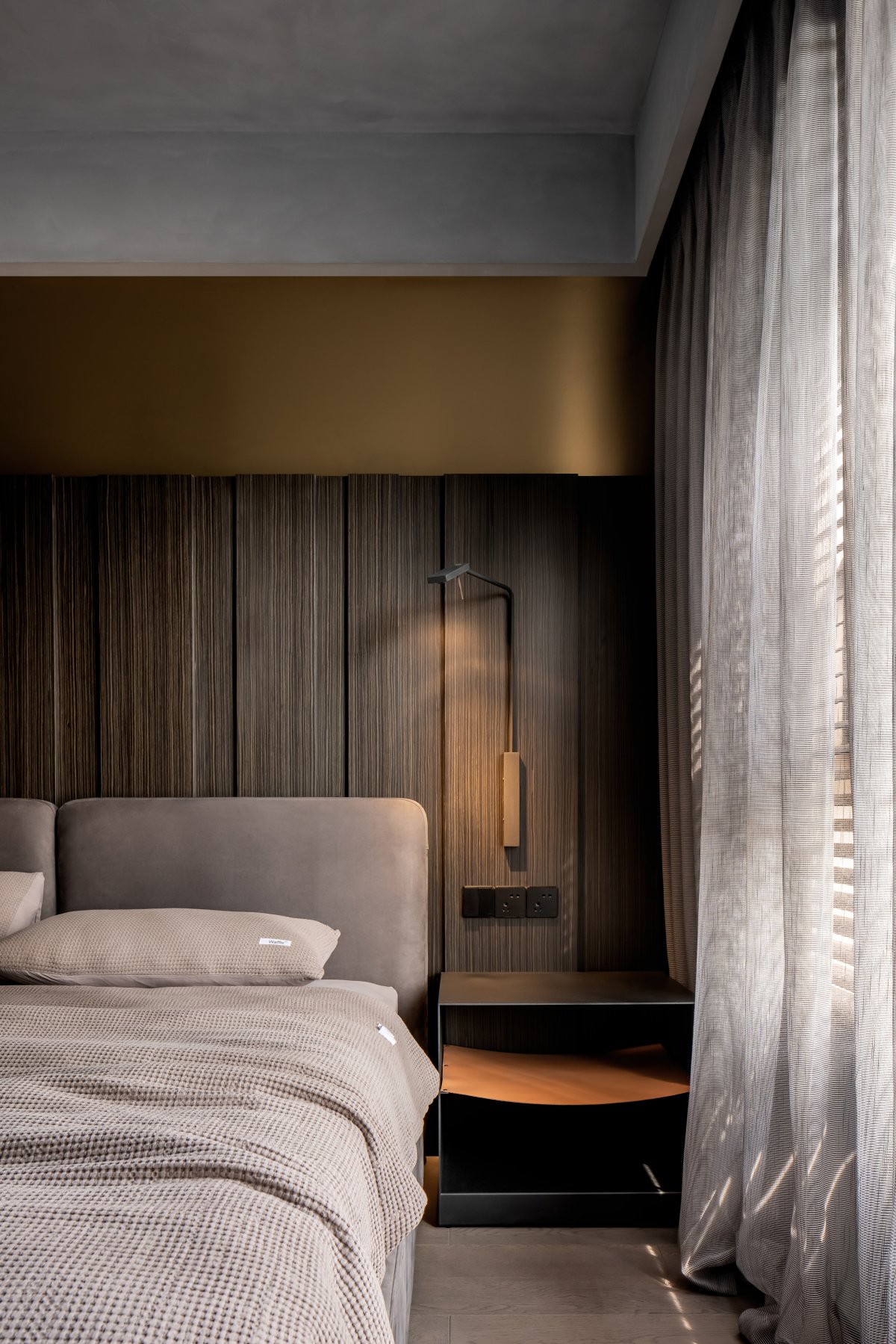
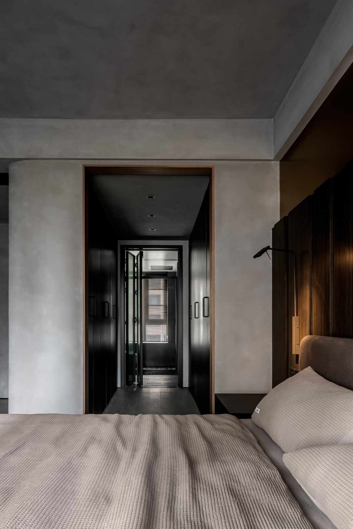
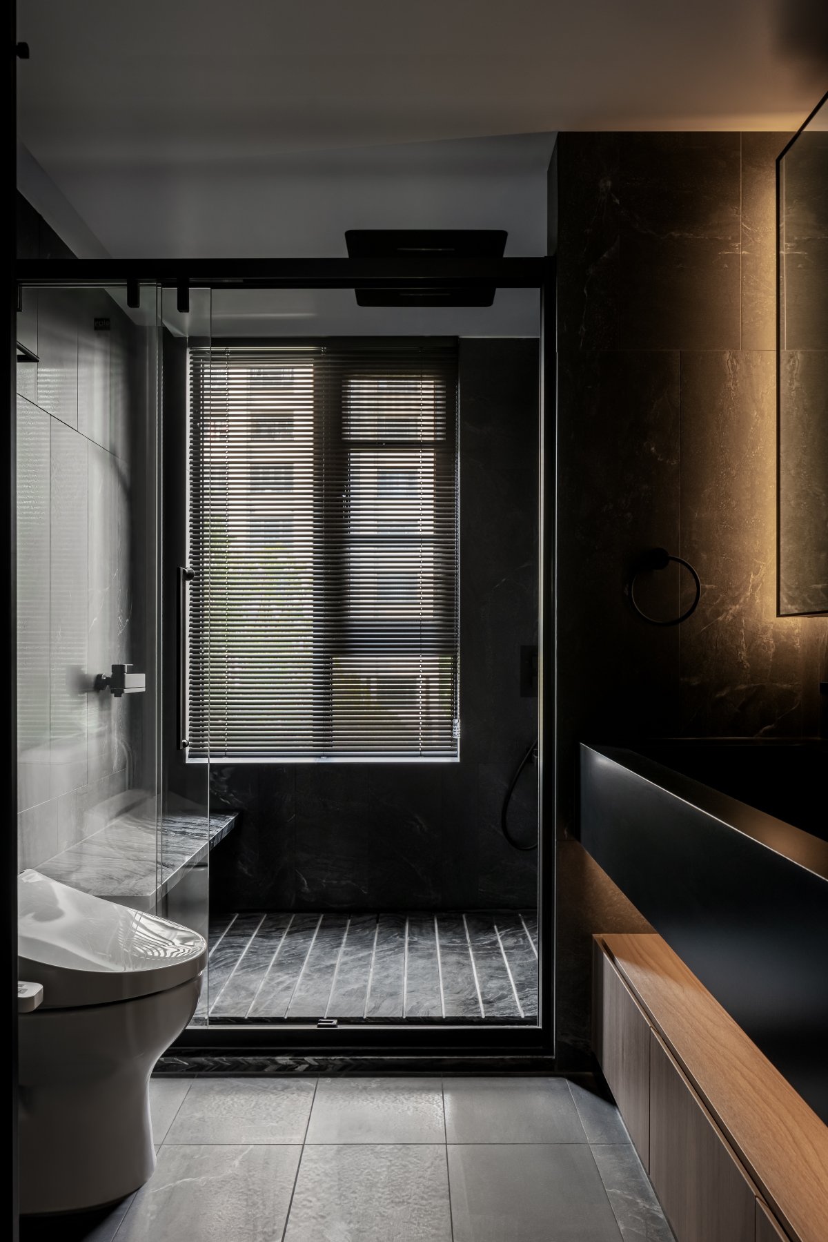
The bedroom continues the material language of the guest restaurant. Under the action of the light belt, like a masterstroke, breaks the quiet of the space, becoming delicate and fashionable. The interior of the toilet also continues the material language of the public area. Eternal high-quality materials are integrated into the rich space form, and diversified classic design elements complement each other, forming a modern graphic composition.
- Interiors: WWUD STUDIO
- Photos: Chen Ming

