Light and Silence
All matter in nature is the light, the hills, the streams, the air, even ourselves, are the light. -- Louis Kahn
Down | Natural Growth
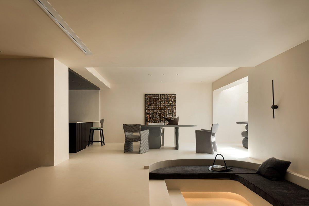
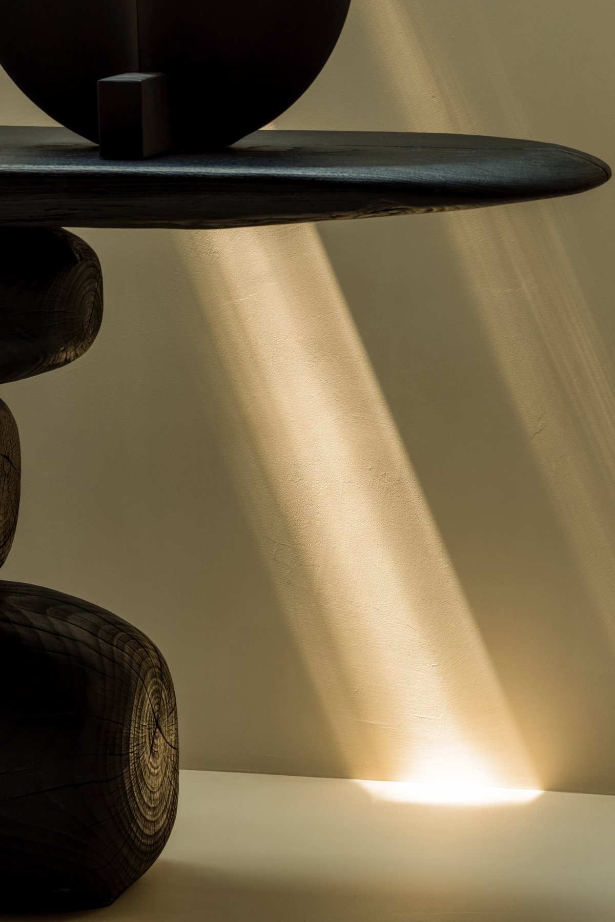
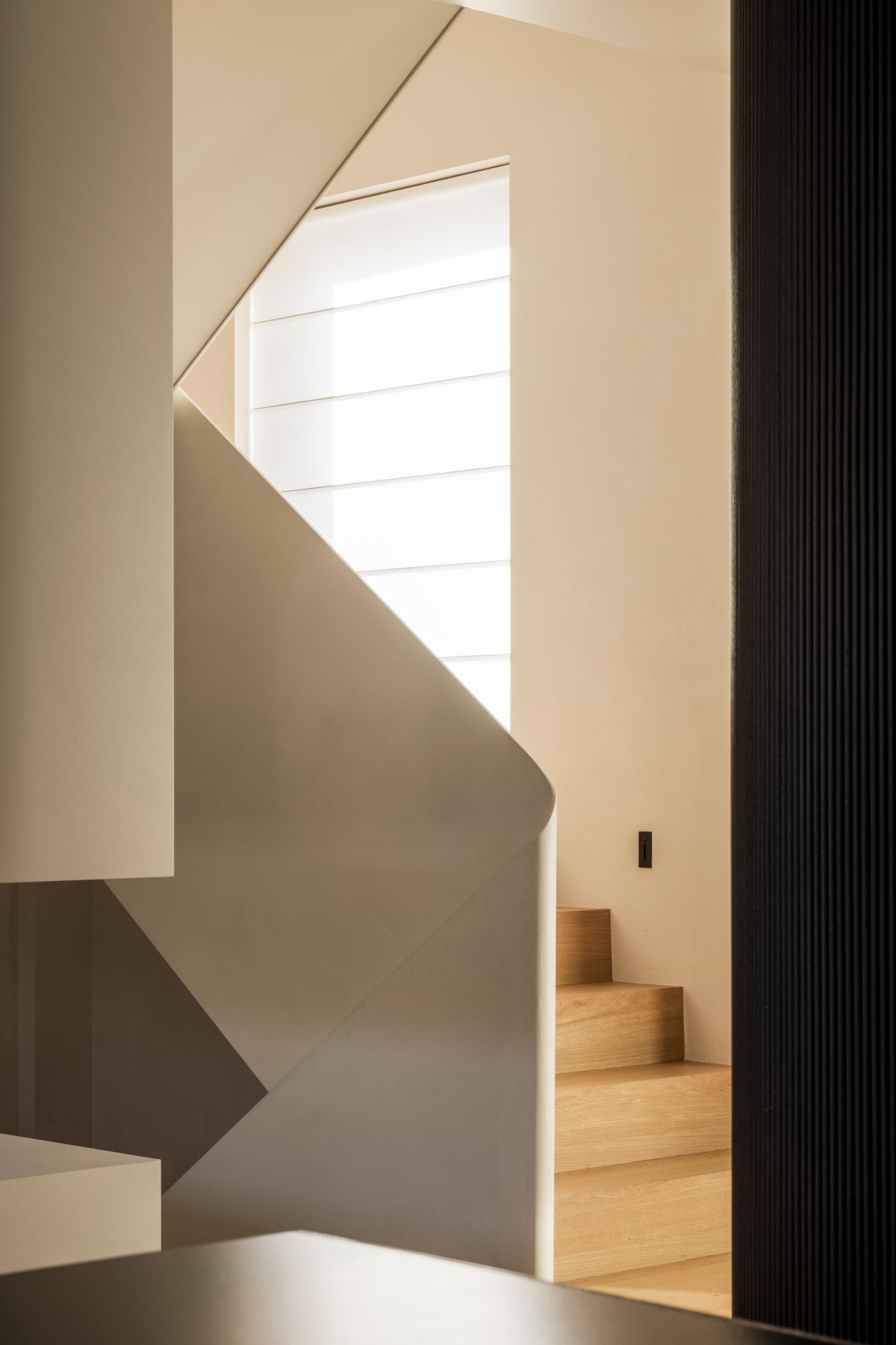
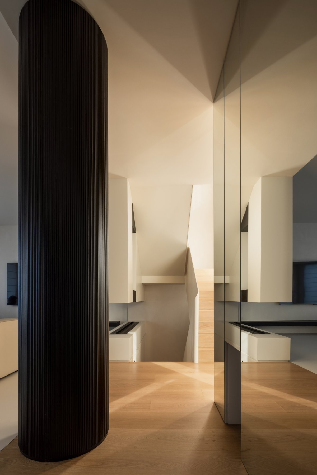
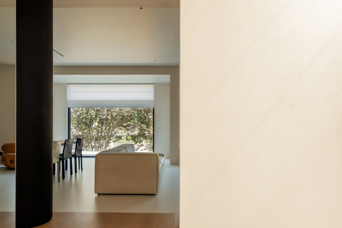
The blurring of the physical boundary of space realizes its interaction with light. Inside and outside, through the guidance of light, form a penetrating relationship, the block surface of the structure is refracted light outline a clear level of shadow.
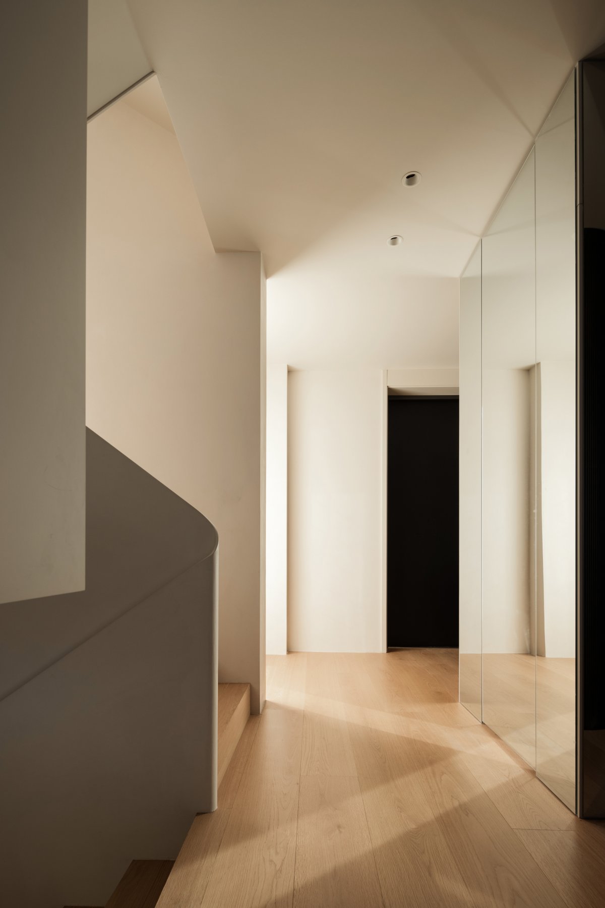
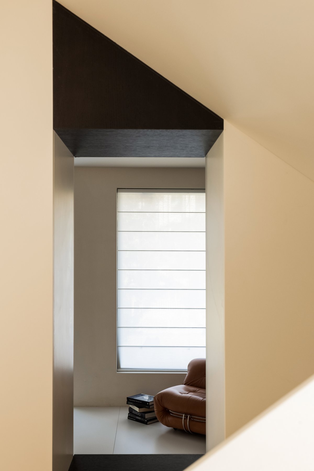
This case space, the designer with light for the pen, directivity to outline the concrete space. Part of the light, tiled straight overflowing ground, lay a bright bottom; There were bits of light, fine as wild flowers, shining from the window and swaying in the wind.
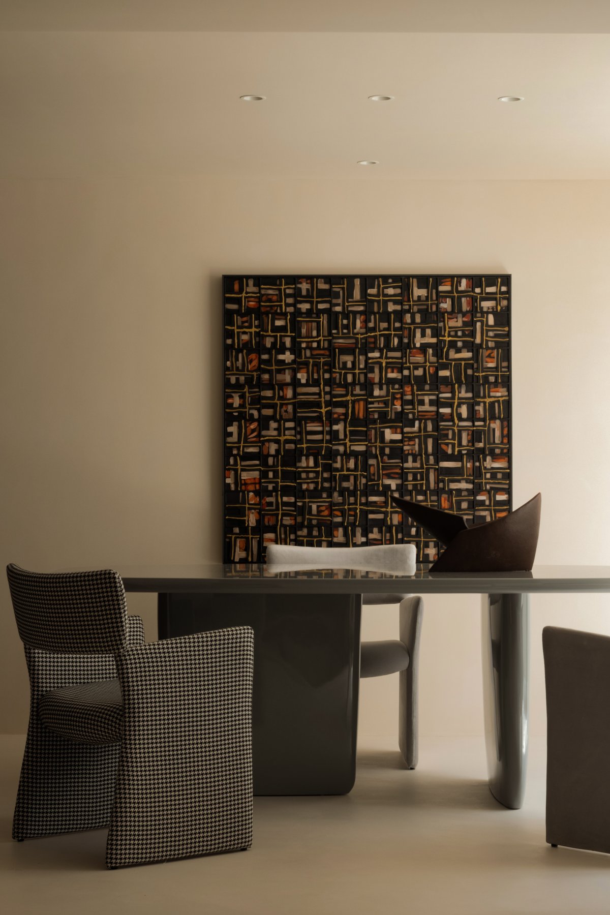
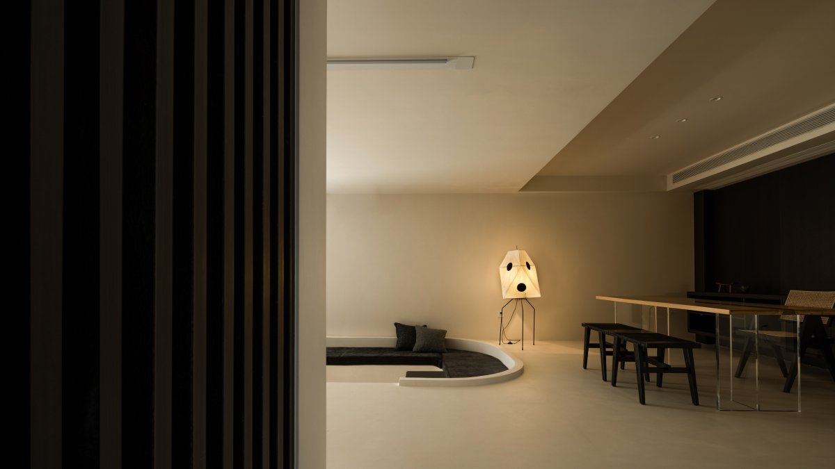
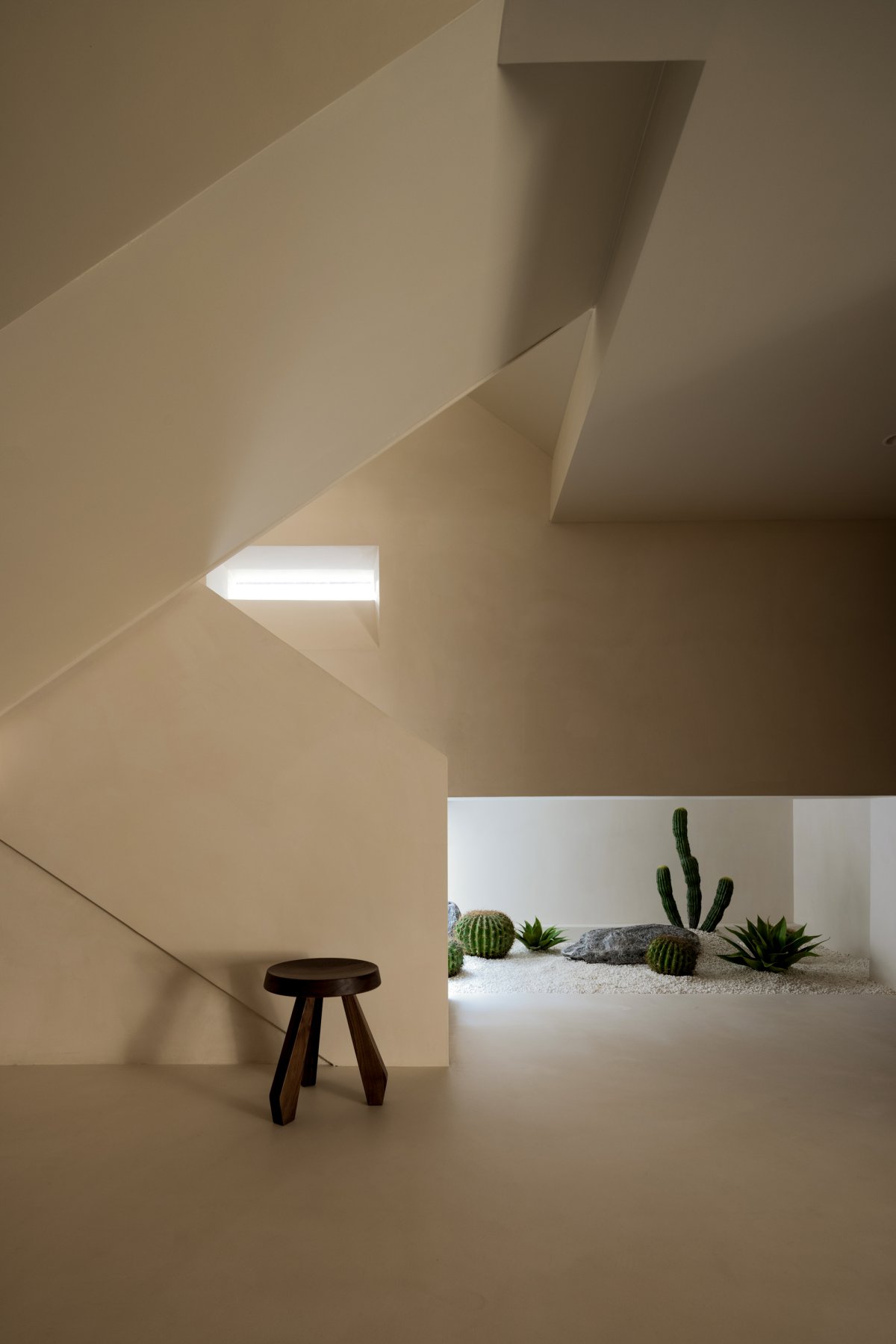
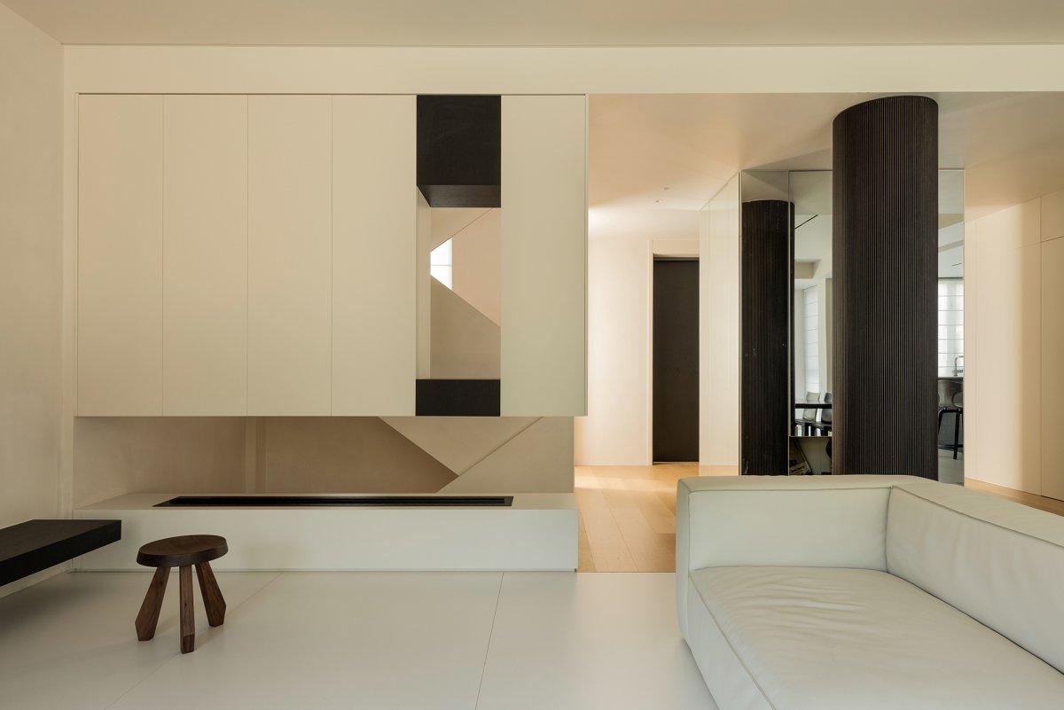
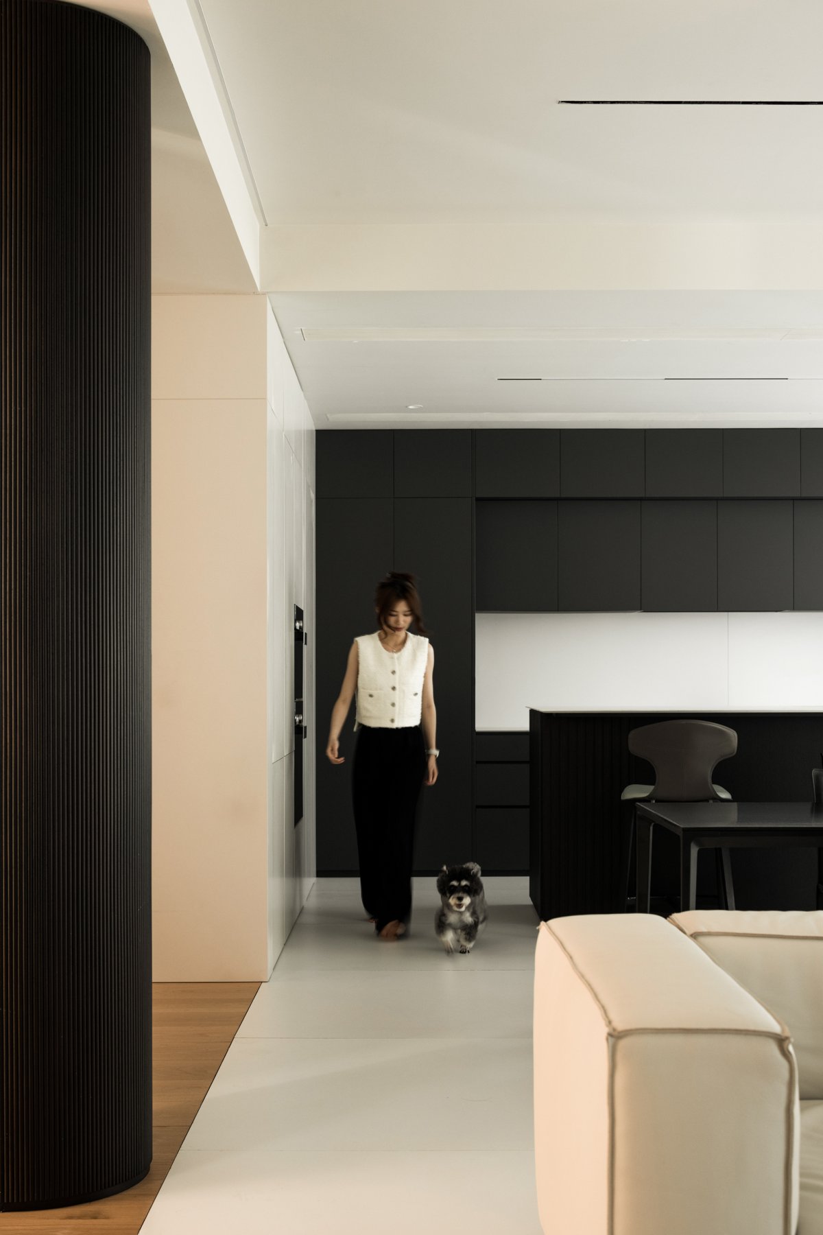
In the presentation of basement, more emphasis is placed on structure and light. Design the position of light entry and the starting position of the structure, so that it can reflect the beauty of space. As for decoration, discard as much as possible, reduce the display of formal elements, and build a balanced relationship with color. Using architectural techniques to construct the space, the geometric block forms a vigorous tension, which still gives people an upward and extended space atmosphere and rational power in the basement. Beige micro cement and black wood are used for color spreading, which is suitable for cold and warm. Under the light, it neutralizes the cold and hard texture brought by the general block structure, forming a warm perception of "home" space.
Outside | Quoted dialogue
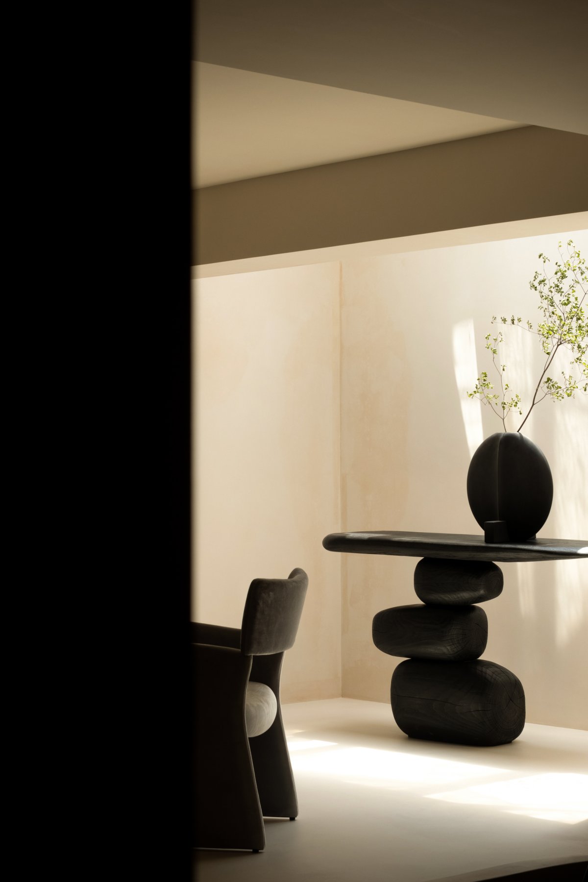
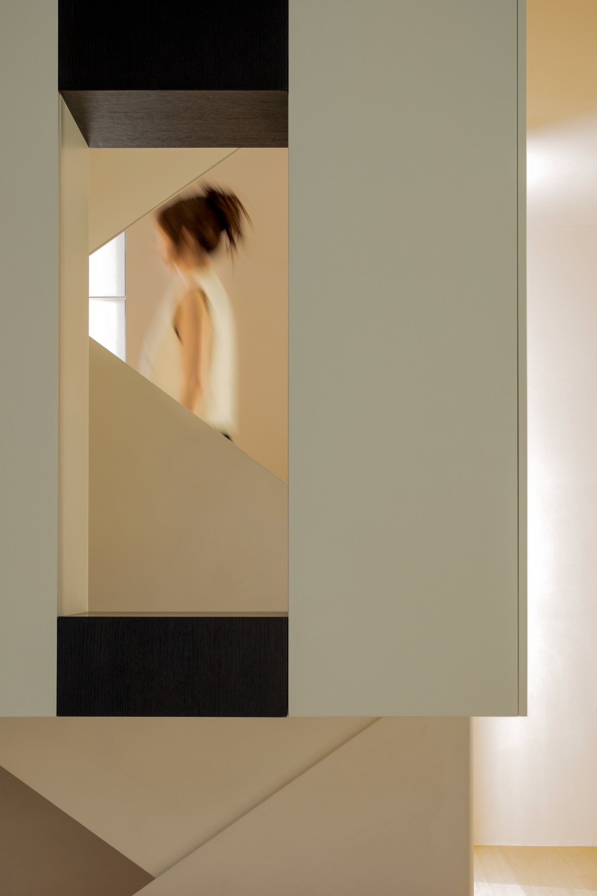
As the cycle of a day, daylight casts bright halo through the structure that falls at random, changing direction and shape ceaseless, now and staggered, now and secret, it is the display that is again simple however, because of the change of light and produced fresh vitality, the space looks simple, hide the idea stealthily however in the details. The charm of space structure itself is conveyed through simple brushstrokes, and the space is played between cold and warm, soft and rigid, static and dynamic, stagnation and growth by the way of balance and balance. The environment is withdrawn and the feeling is returned to the dweller himself.
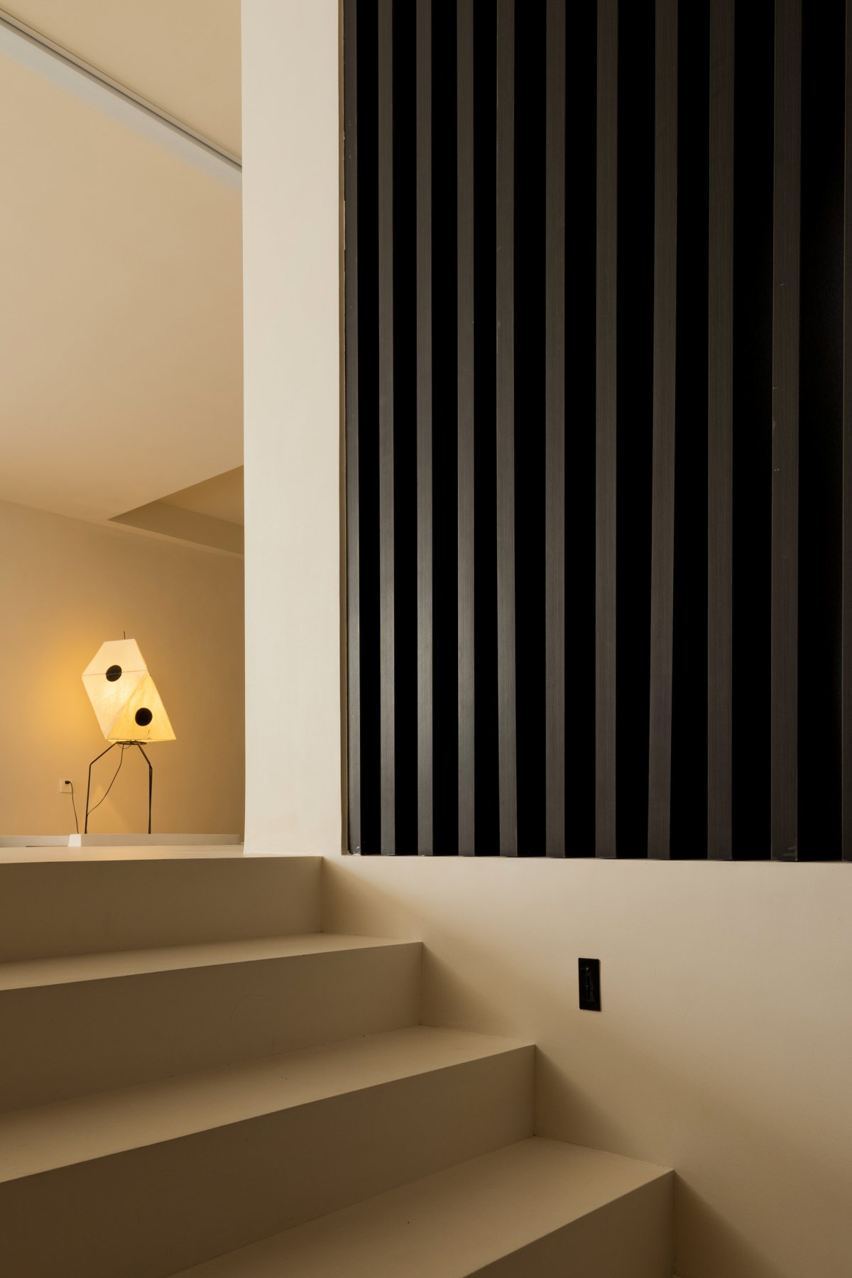
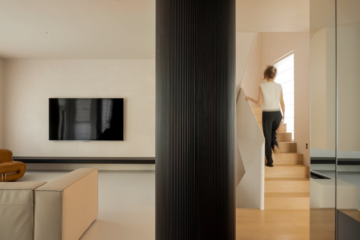
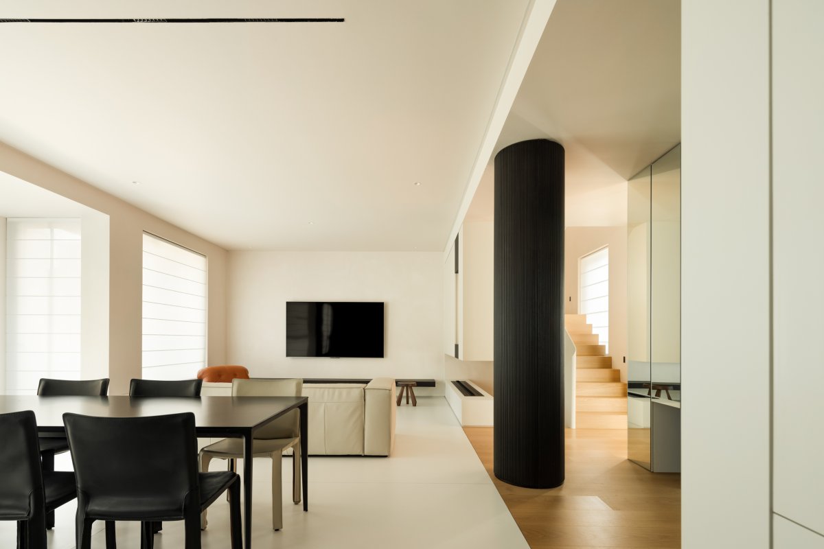
Partition and penetrate, the line of vision is able to spread to the plane of whole floor, spatial narration does not interrupt because of the difference of functional zone, cannot be dismantled column, reverse its way of, with the black like thick ink emphasizes its existence feeling, at the same time "imaging", make empty space is full of powerful force.
Outdoor green vegetation frame into the space, in the extreme plain background color, a bright green, while emphasizing the spirit of inward and outward interpretation, space is no longer a reinforced concrete "box", but with the four seasons, with the atmosphere of living "home".
Inner | Living in the sunshine
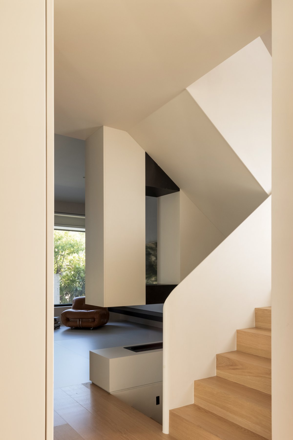
Following the color scheme of the first floor, the only difference is the wood floor, creating a more warm and private living experience, modern furniture with the temperament of contemporary design, while meeting the daily life, emphasize the simple and comfortable living experience, residents can feel the powerful power from the space atmosphere in the quiet and slow.
In the rapid development of Internet at present, the way people access to information becomes more simple and direct, tens of thousands of information from one end of the network flooding into the brain, life has been fill enough trival, aesthetic is single, and so on the space design, we hope that absolutely clean, with pure plane stress for inner exploration, thinking about the nature of human living space requirements.
Soft beds, plain gauze curtains, the warmth of wood floors... They are the basic elements of a home. Natural materials and flowing lines achieve a gentle aura, light is the only ornament. Light and shadow, light and dark, freedom and regulation, calm and movement...The process of designing a space is not a simple accumulation, but a definite target. It connects the preceding and the following, and the dynamic and static are appropriate.
Light is free, but can also be captured, guided by the structure is designed to best fit the appearance. Light space, rather than space light.
- Interiors: Pusu Design
- Photos: Wu Changle
- Words: ChengShe Media

