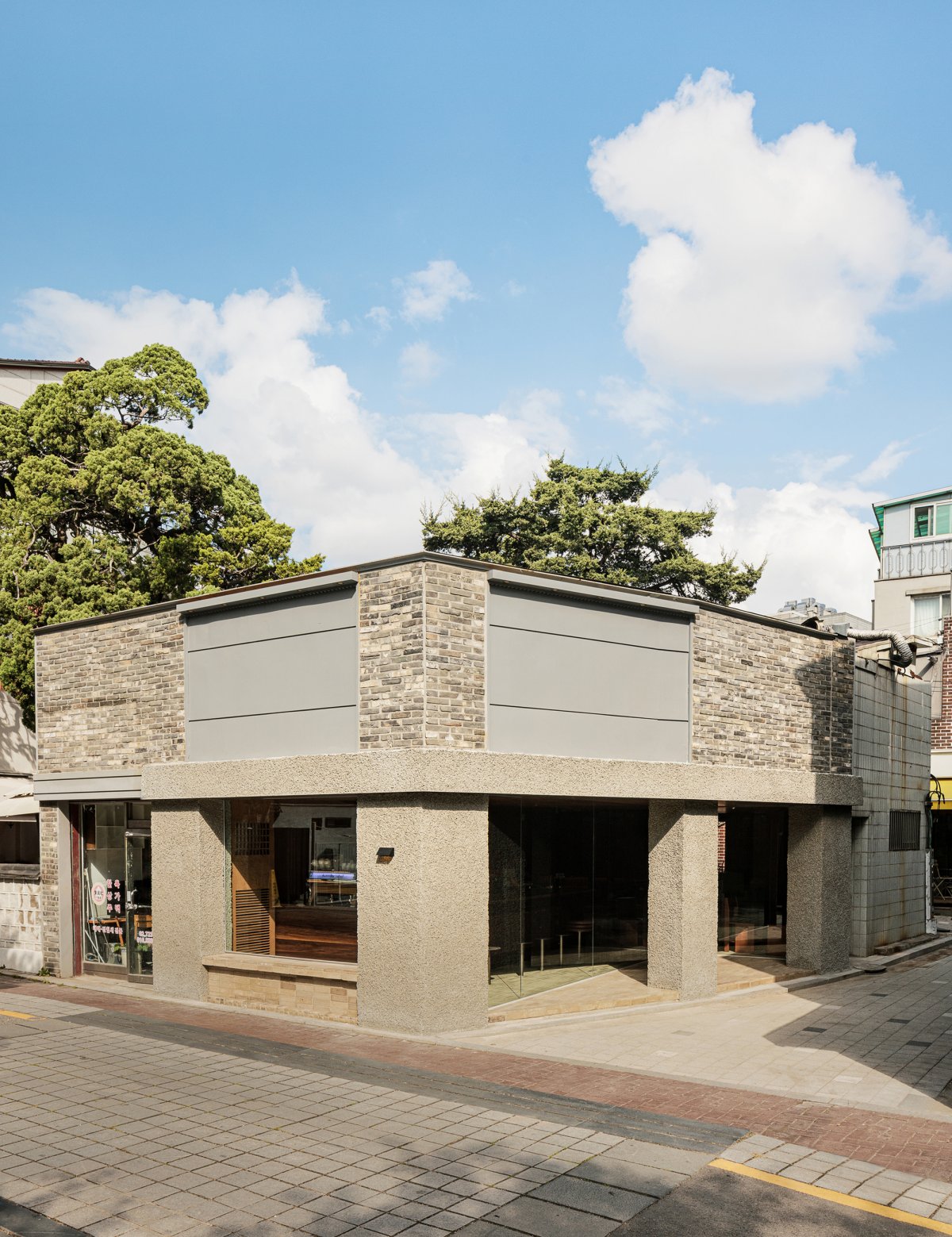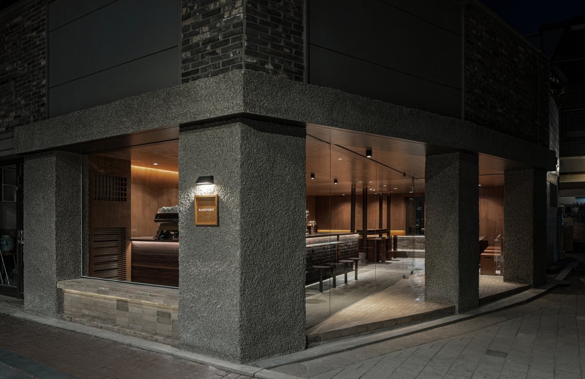
GRANHAND, which pursues fragrance being spread into everyday life, launched KOMFORTABEL, which is a specialty coffee shop that closely focuses on the scent of coffee.The existing construction site was in the condition as the newly built building with a full of Gross Floor Area. The interior and the exterior were clearly divided by the walls which were extremely adjacent to the architectural boundary line with no spare space.
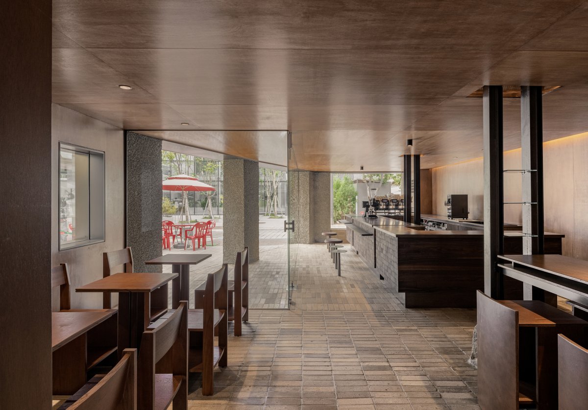
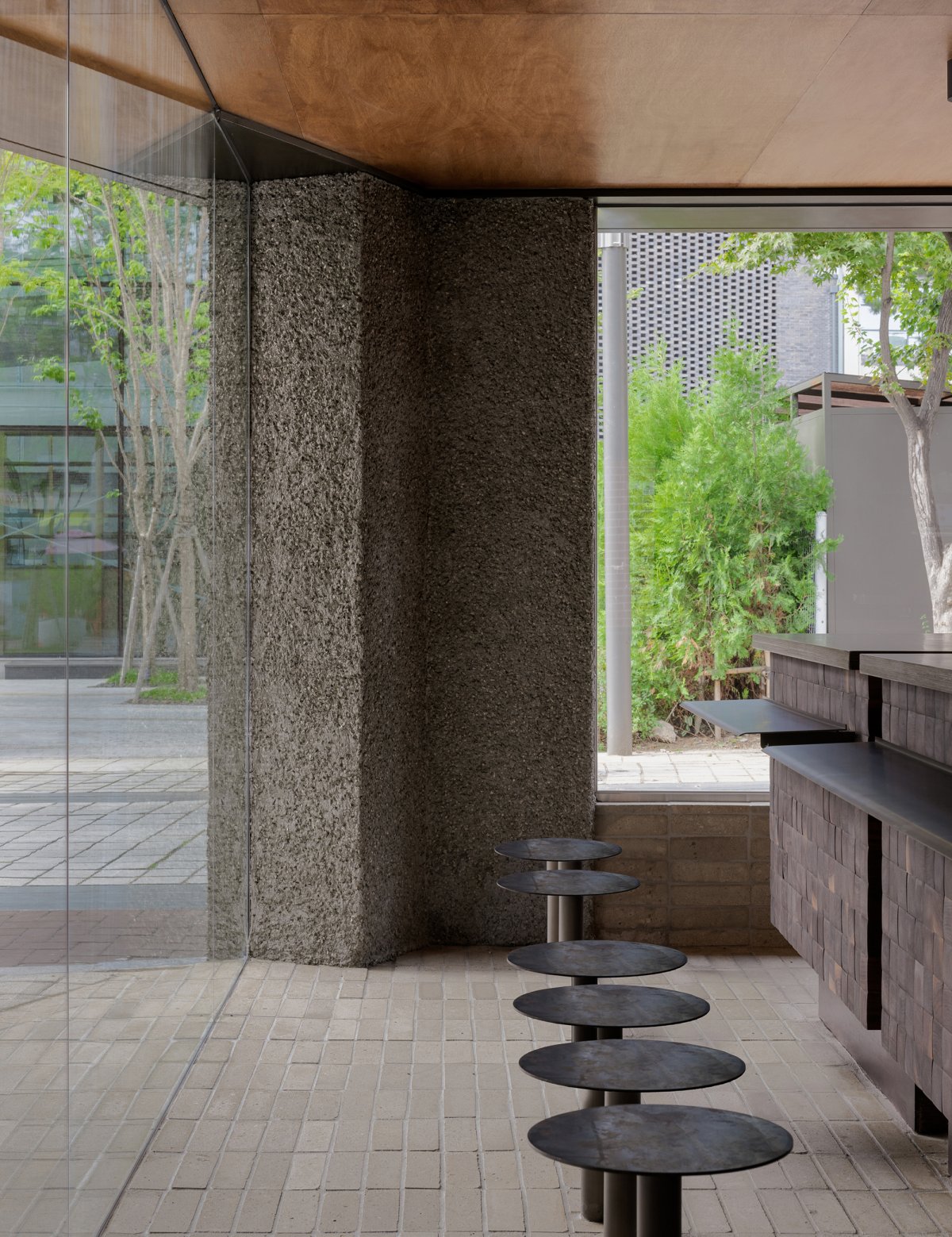
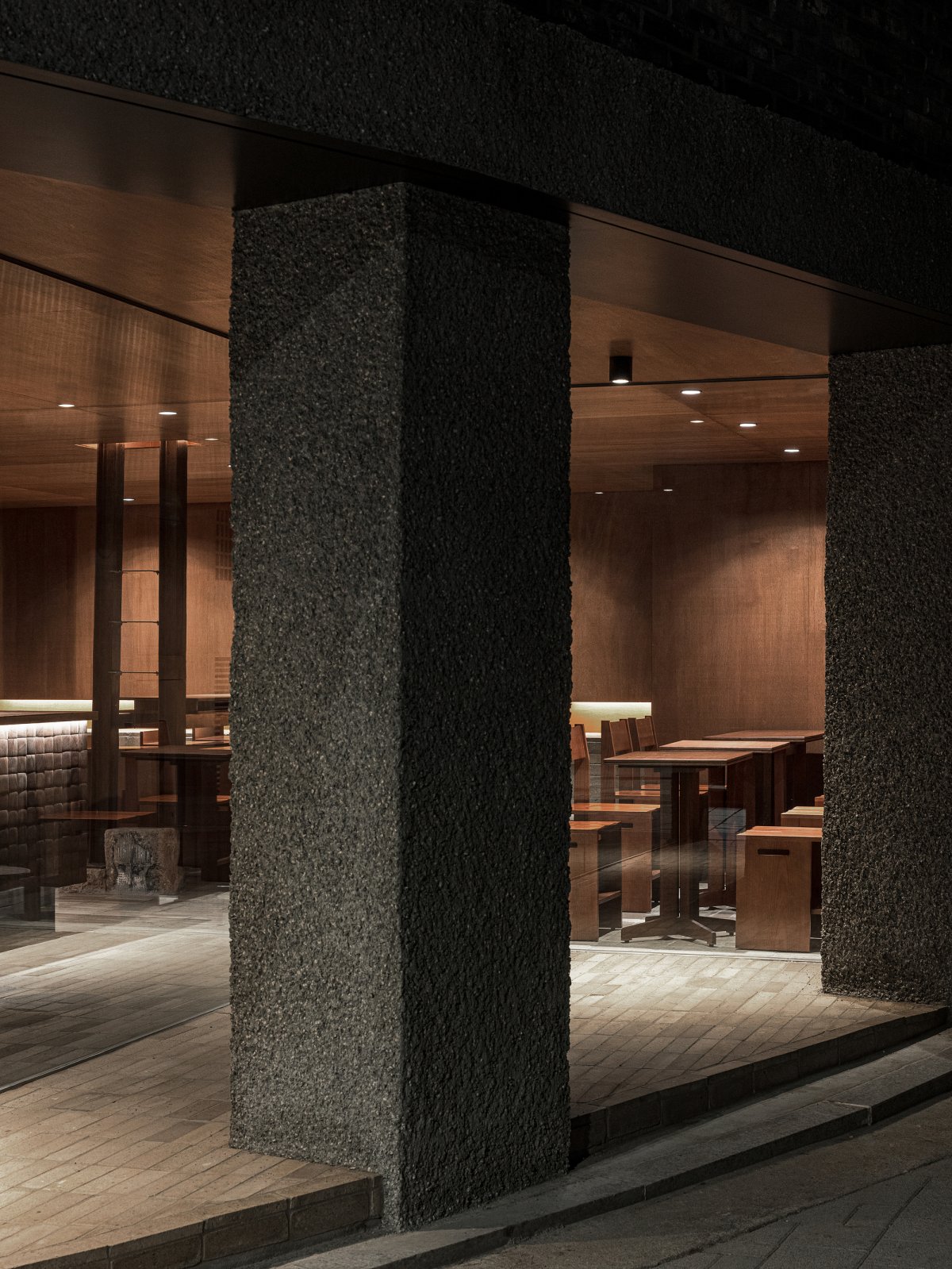
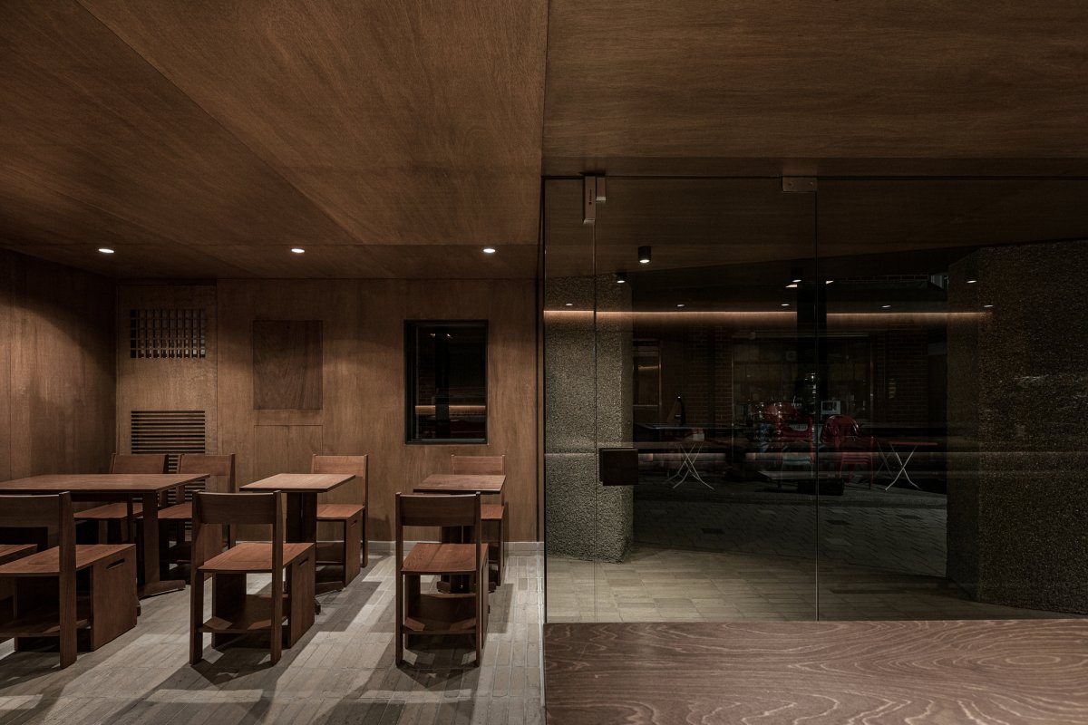
So, Studio Motif demolished some parts of the outer wall to add a three-dimensional effect to the space. Planned external spaces like cantilever eaves by giving up using about 3㎡ of the interior space. Also, Studio Motif broke down the strict boundaries between the interior and exterior by lightly dividing them with glass. Consequently, with the low height, the not stuffy but cozy atmosphere was added to the existing construction site.
Materials used in the space were selected under strict standards, and that is‘Nature-Friendly building materials which have been used classically for a long time. The artificial materials used in ordinary modern building are easy to maintain in the early stages, but it leaves a trace of use as time goes by, which could be perceived as‘Deterioration’.
On the other side, the materials used in KOMFORTABLE are not suitable for maintenance work due to the properties of the materials. However, these nature-friendly building materials become calmer and more fascinating as time goes on, by displaying the trace of time. Hence, someone expresses this material as‘time-containing materials’. For this reason, what these materials need is not‘Maintenance’but‘Managing’.
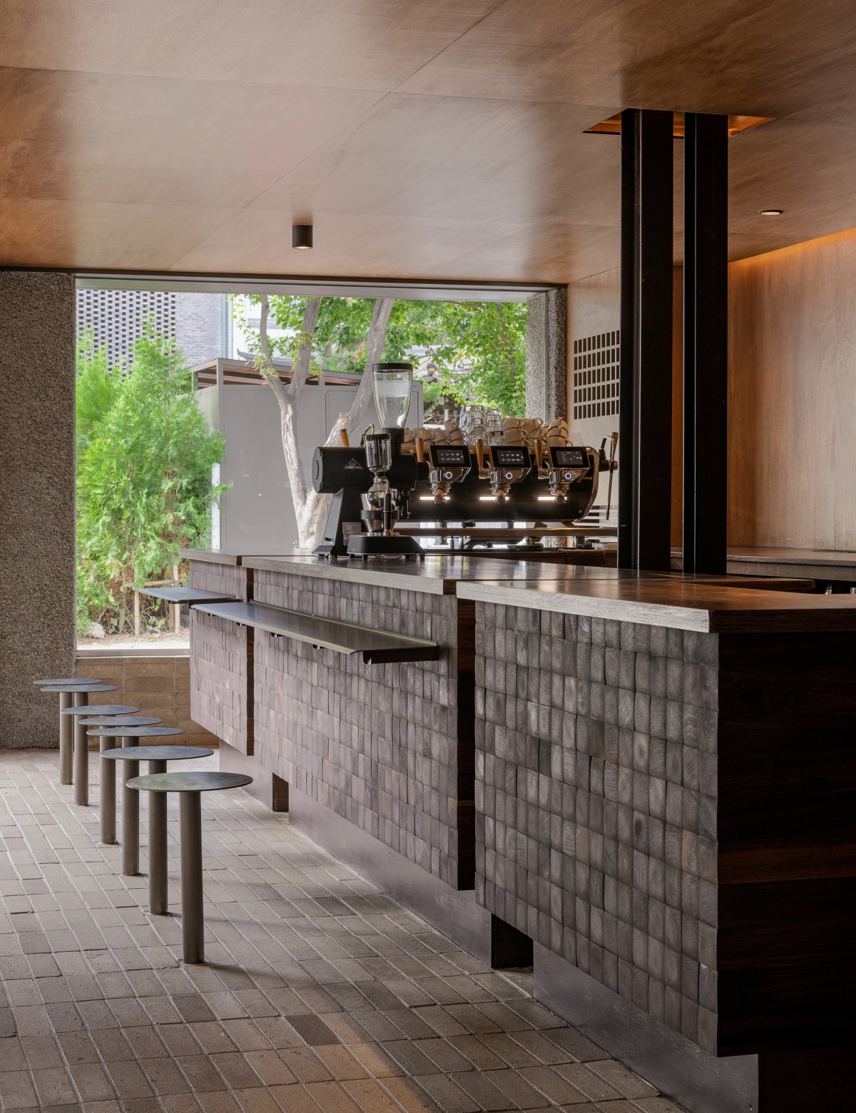
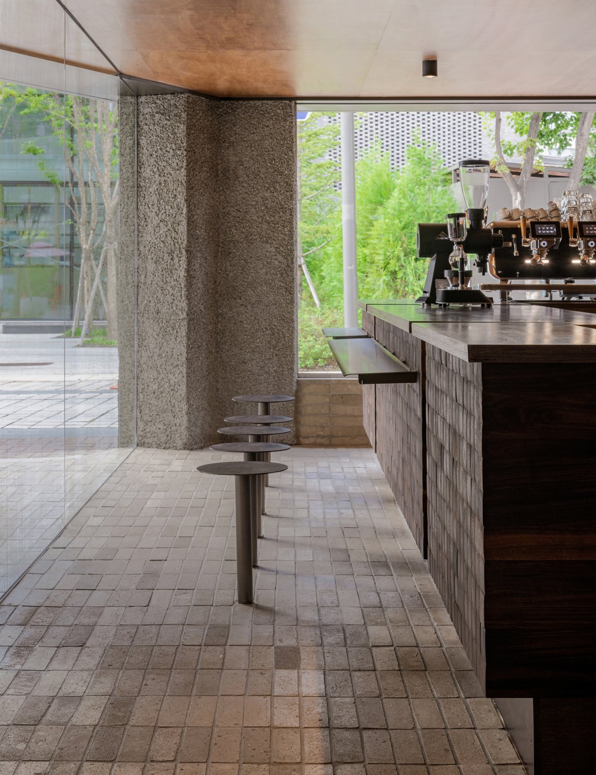
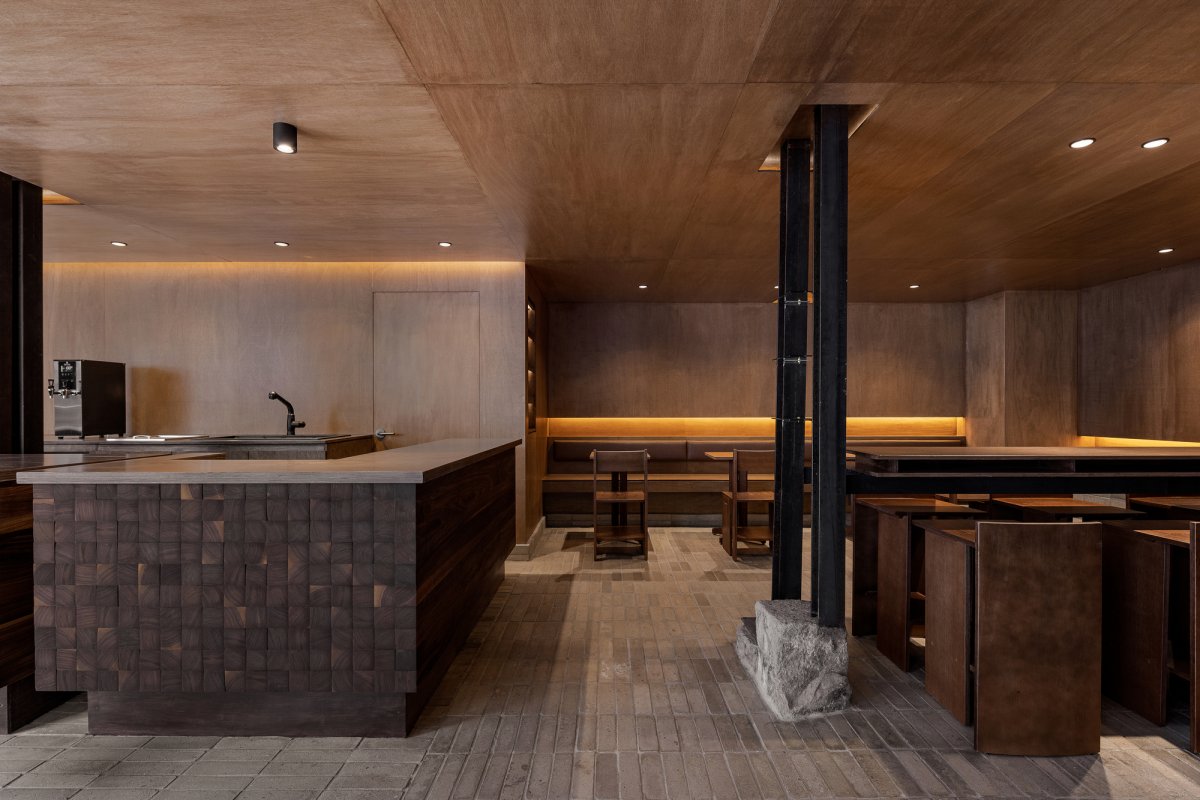
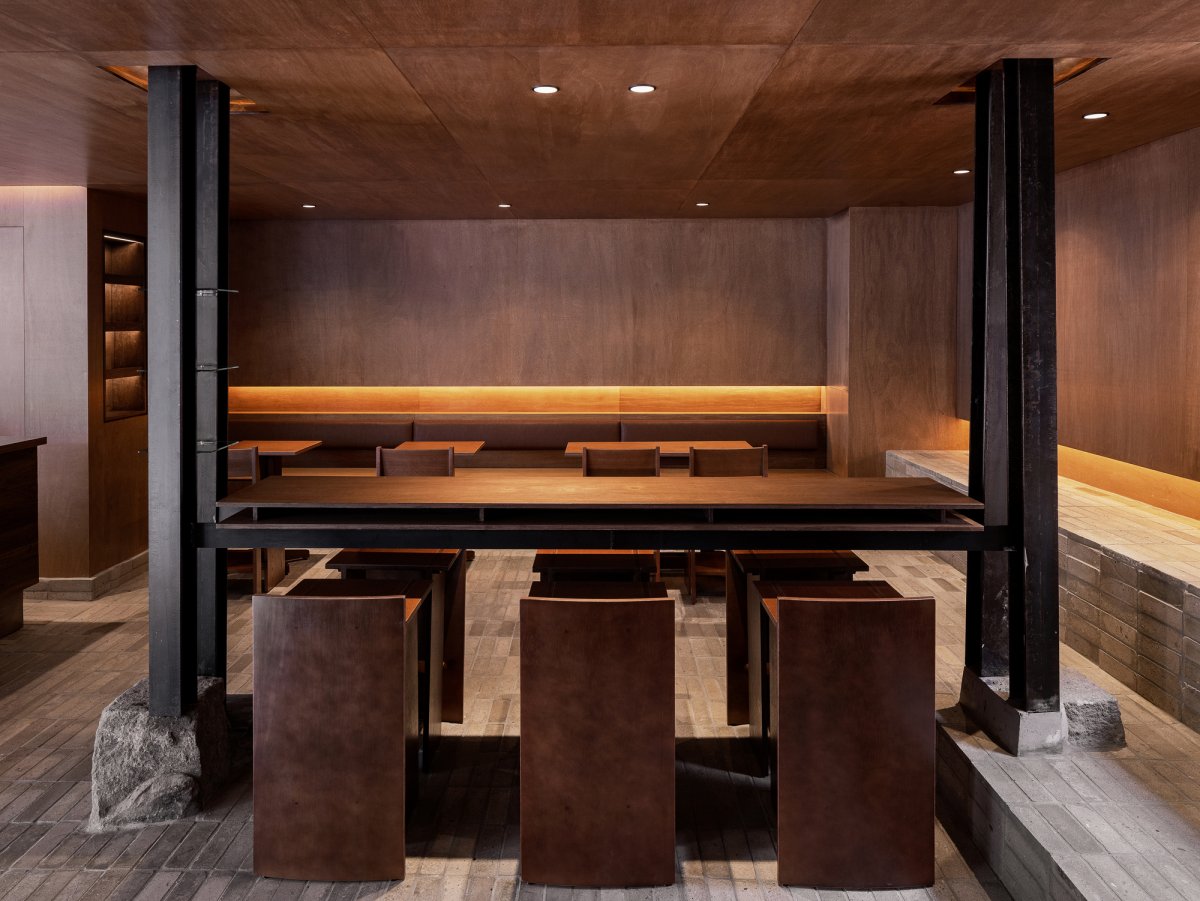
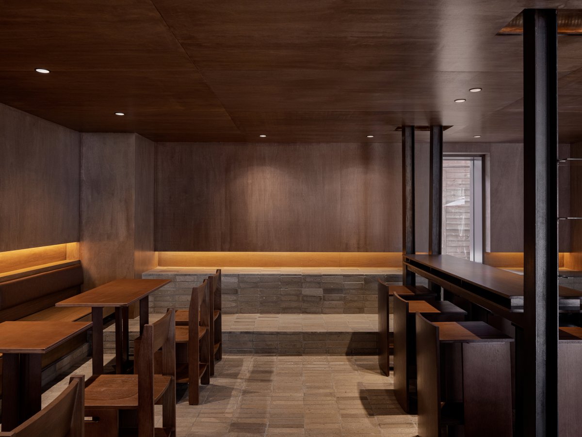
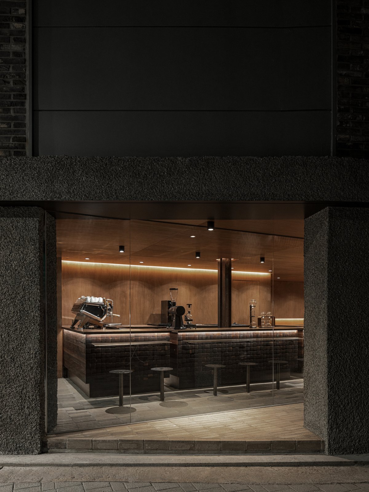
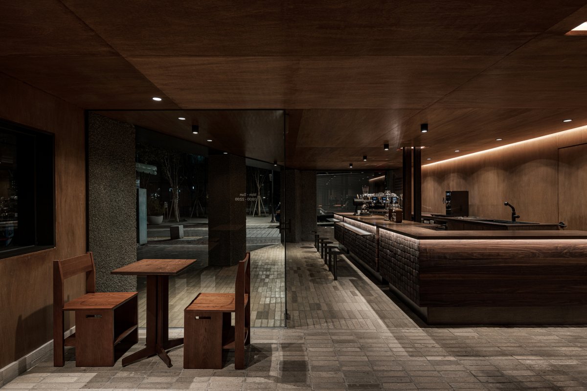
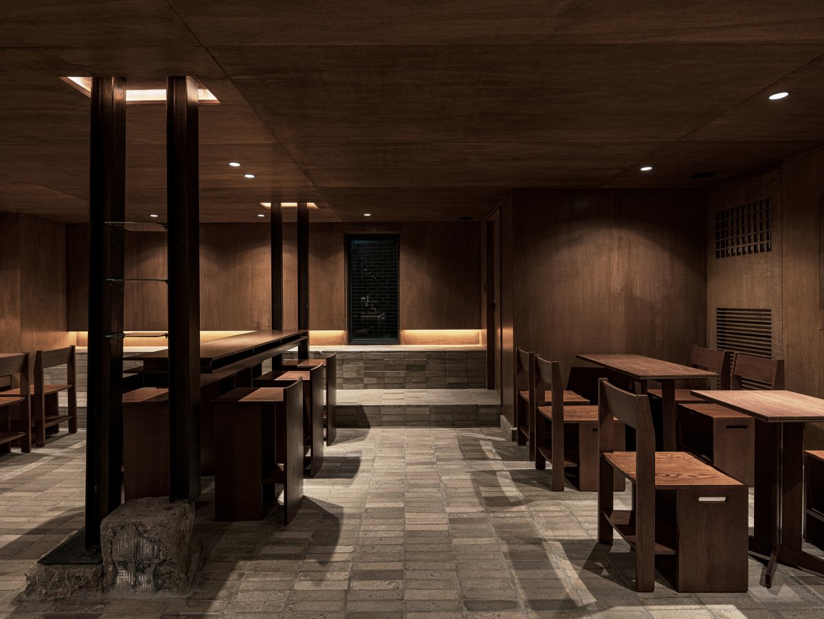
Studio Motif finished the wall and the ceiling with lawang plywood and finished the floor with cement brick. For designing the counter, which is the core of this space, their had been inspired by the image of a heap of roasted coffee beans. Hence, their decided that walnut wood is a suitable material to express the image of coffee beans since an end grain of walnut wood has deep brown color and soft texture.
Studio Motif arranged the end grain of the walnut wood to be seen in front, by stacking hardwood blocks. Then, sanded each edge with the hand grinder to make each block could be slightly misaligned. The furniture and the countertop were planned as being made of birch plywood whose grain is clear and soft rather than the lawang plywood which is the background of this space. The cold sense of the facade which was finished with rough concrete is contrasted with the warm sense of materials which was used in the internal space.
- Interiors: Studio Motif
- Photos: Choi Yong Joon

