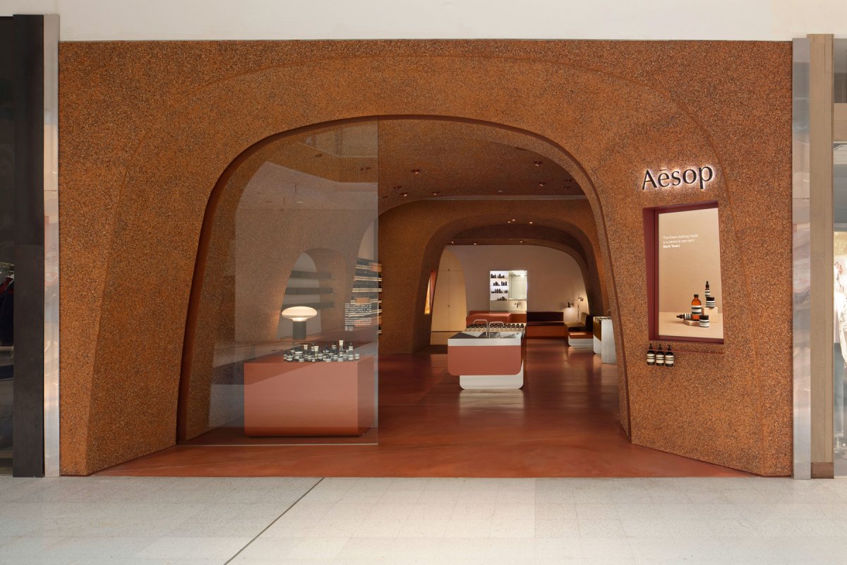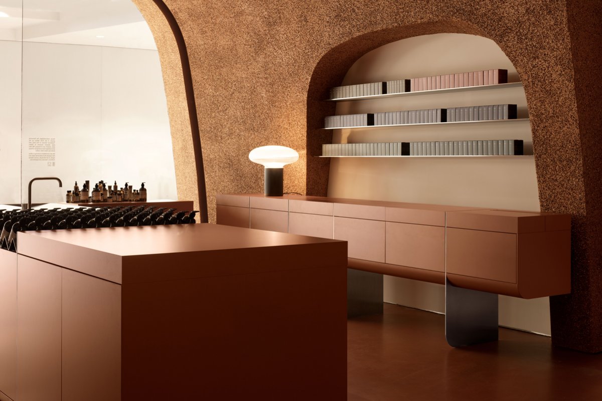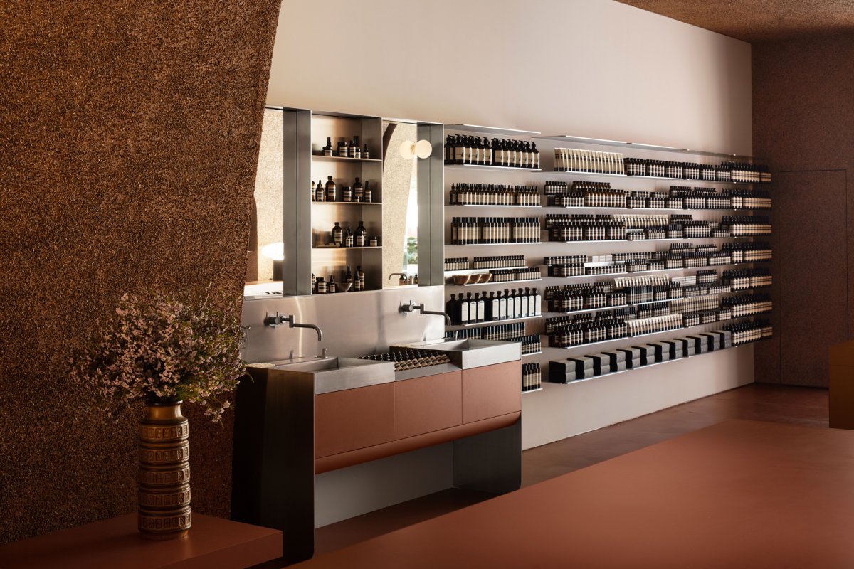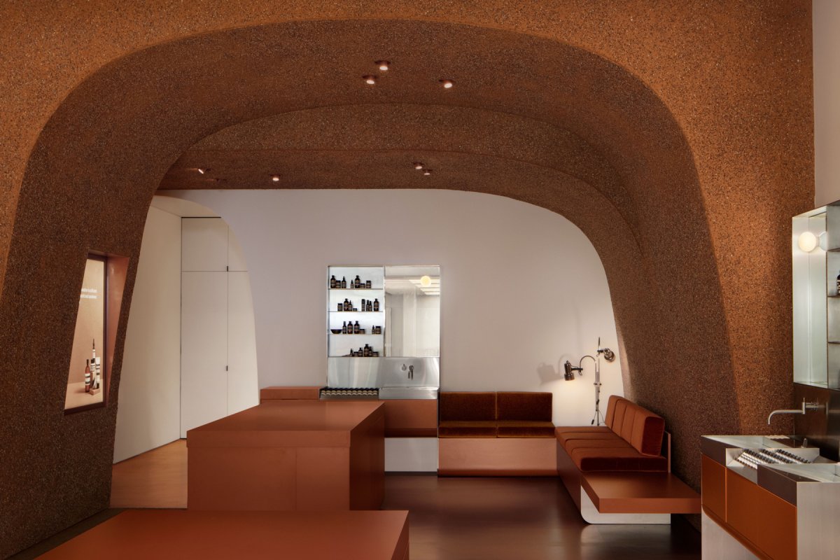
Luxury skincare brand Aesop's Southland store interprets the arch in a contemporary way, as a naturally reshaped space that respects the architectural landscape of the late 1960s and pays homage to the architectural era while generating a new and memorable retail experience.
The original Southland shopping centre was designed in 1968 by Melbourne architects Tompkins, Shaw and Evans. Quite contentiously, the project was given 1969’s top honours in the Royal Australian Institute of Architects Awards, besting the now architectural icon of the National Gallery of Victoria (NGV). In hope of honouring this legacy, Aesop conceived a store informed by a modernist history.
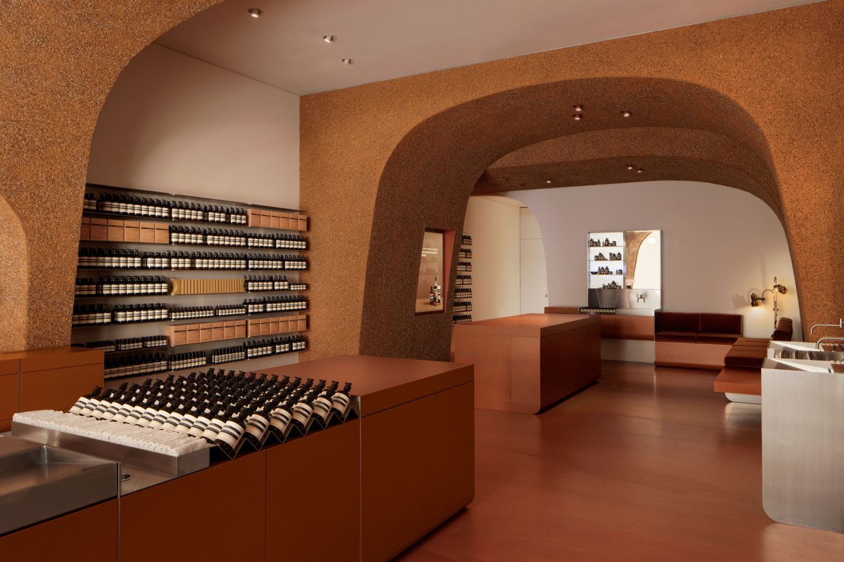
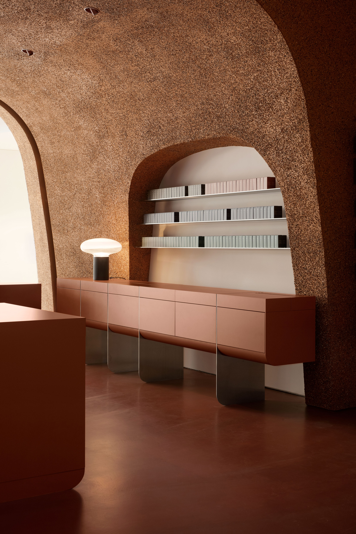
Upon entry to the store, the dramatic cavernous archways are enveloping, generating volume and the spatial characteristics representative of ancient design. And yet despite their structural purpose, the archways imply a weightlessness that guides the visitor experience through a series of unfolding rooms. In contrast to the expansiveness felt at the centre of the space, the various rooms offer moments of quiet contemplation to peruse Aesop’s complete range of hair, body and skin care products.
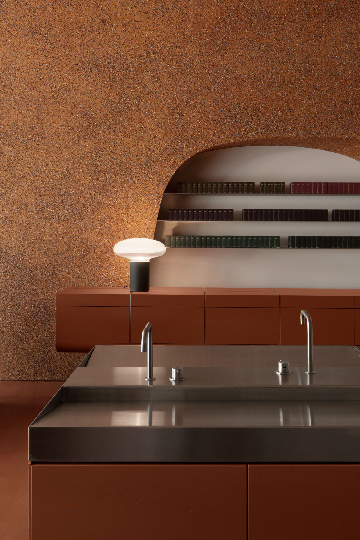
Aesop Southland’s floor plan promotes a pleasantly steady pace, and this is reciprocated by a restrained selection of furnishings – an upholstered lounge invites unhurried interactions with the products and encourages in visitors a sense of repose. The store’s materiality is informed by history – in the local housing vernacular of post-war brick veneer – and also by site – with reclaimed bricks from nearby demolition sites crushed and repurposed as aggregate render to form a vibrant materiality.
