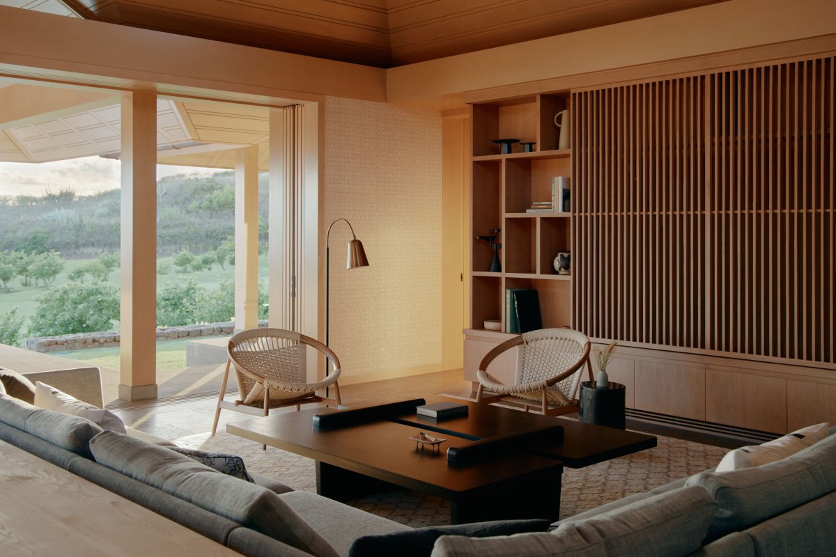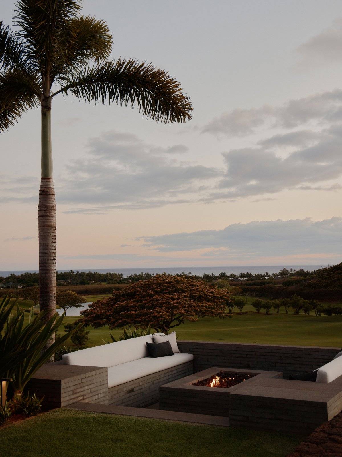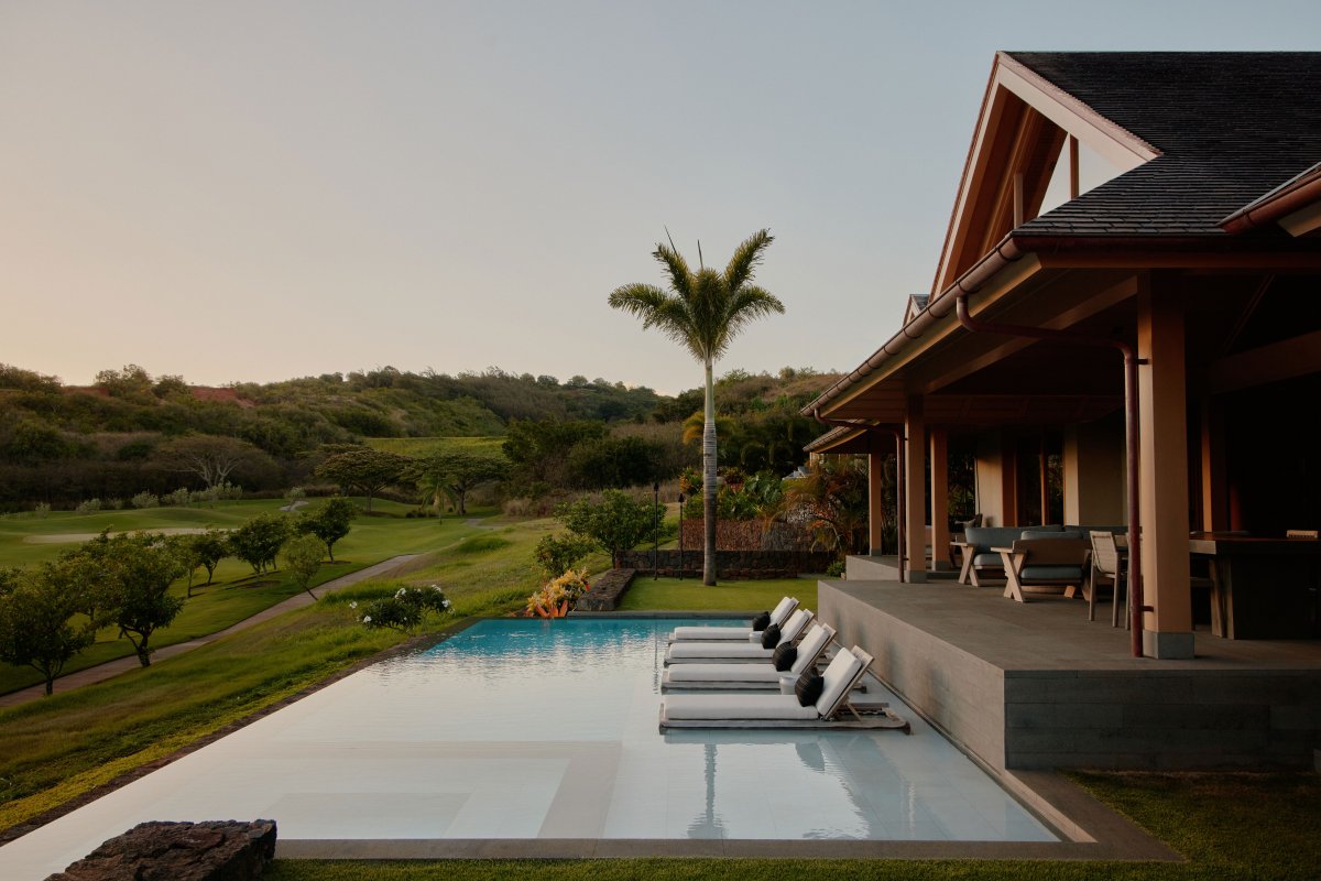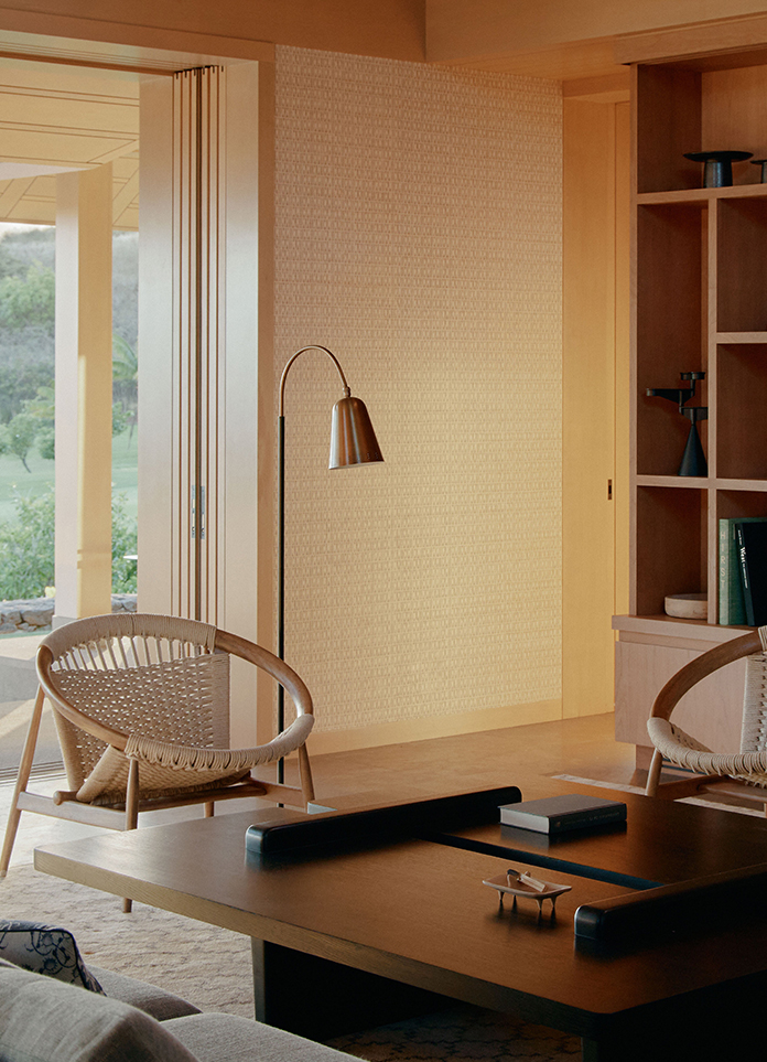
Shay Zak, of the eponymous San Francisco–based firm Zak Architecture, follows just one unbreakable rule when it comes to designing a Hawaiian residence: The interior’s great room and the outdoor pool must be constructed next to one another. “In Hawaii, the skies are so beautiful that a pool [can] reflect the atmosphere into the [interior],” he explains. “That adjacency is absolutely key.”
Therefore, before his first meeting with a pair of new clients on a hilly Kauai site, Zak decided to solve the potential conundrum of the great room and pool area layout.The result is a 4,070-square-foot, four-bedroom house that appears as a group of high-ceilinged pavilions organized around a stepped courtyard.
At this point in the process, Zak suggested that the husband and wife consider reaching out to interior designer Catherine Kwong of Catherine Kwong Design, with whom he had partnered on two Hawaiian houses previously.
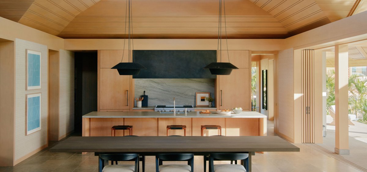
Kwong soon learned that the client’s vision also involved plenty of home cooking and social visits. The kitchen, which anchors the southern end of the great room, would therefore need to be durable. Ultimately, she decided to finish the cabinetry in bleached walnut, which features a particularly pretty wood grain, and to use quartzite countertops.
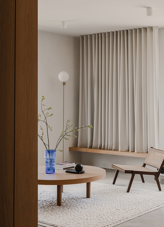
Another notable feature is the kitchen’s large, darkened bronze hood, which Kwong describes as a counterpoint to the great room’s scale. Fittingly, Kwong’s design direction “has everything to do with the architecture” . Zak’s concept represents “a move away from a heavy, traditionally tropical interpretation Clients today want more serenity in their spaces, [and for interiors to function] almost like a backdrop,” she notes.
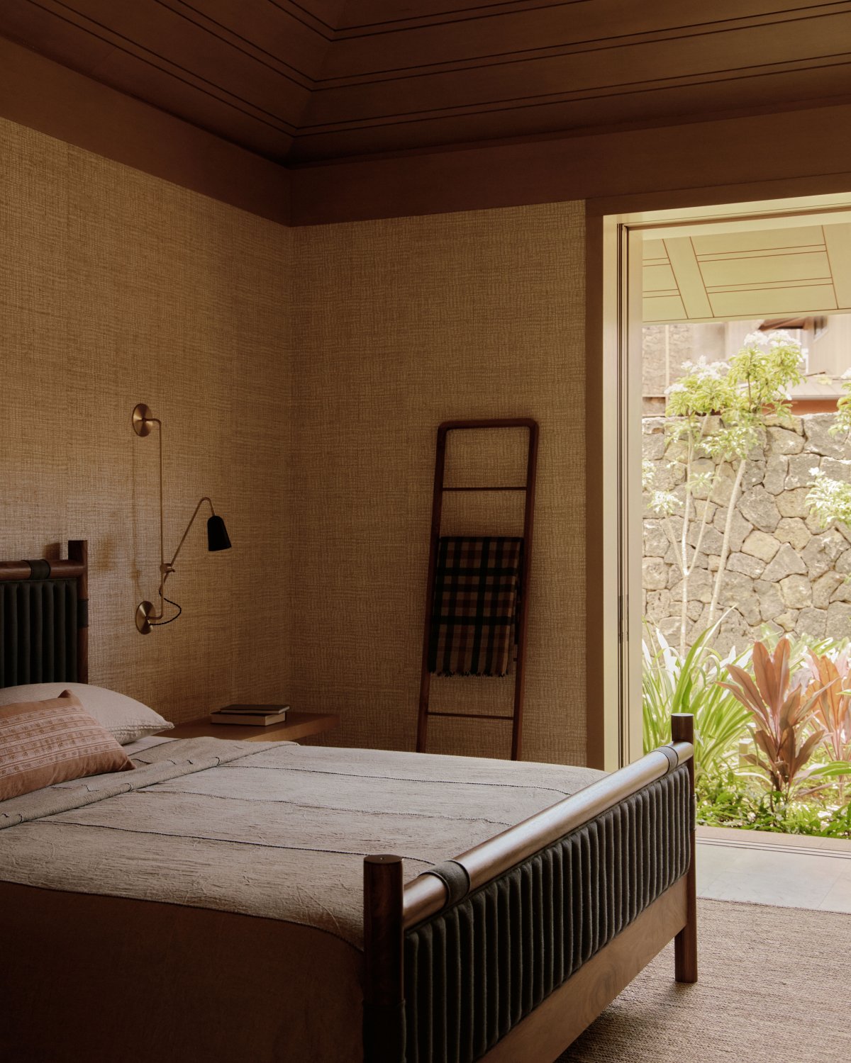
In turn, Kwong conceived a color palette of neutrals, which in part involved staining the yellow cedar walls to make them pale parchment in tone. She also furnished the space sparingly, prioritizing open circulation over vignettes.
- Architect: Zak Architecture
- Interiors: Catherine Kwong Design
- Photos: William Jess Laird
- Words: Qianqian

