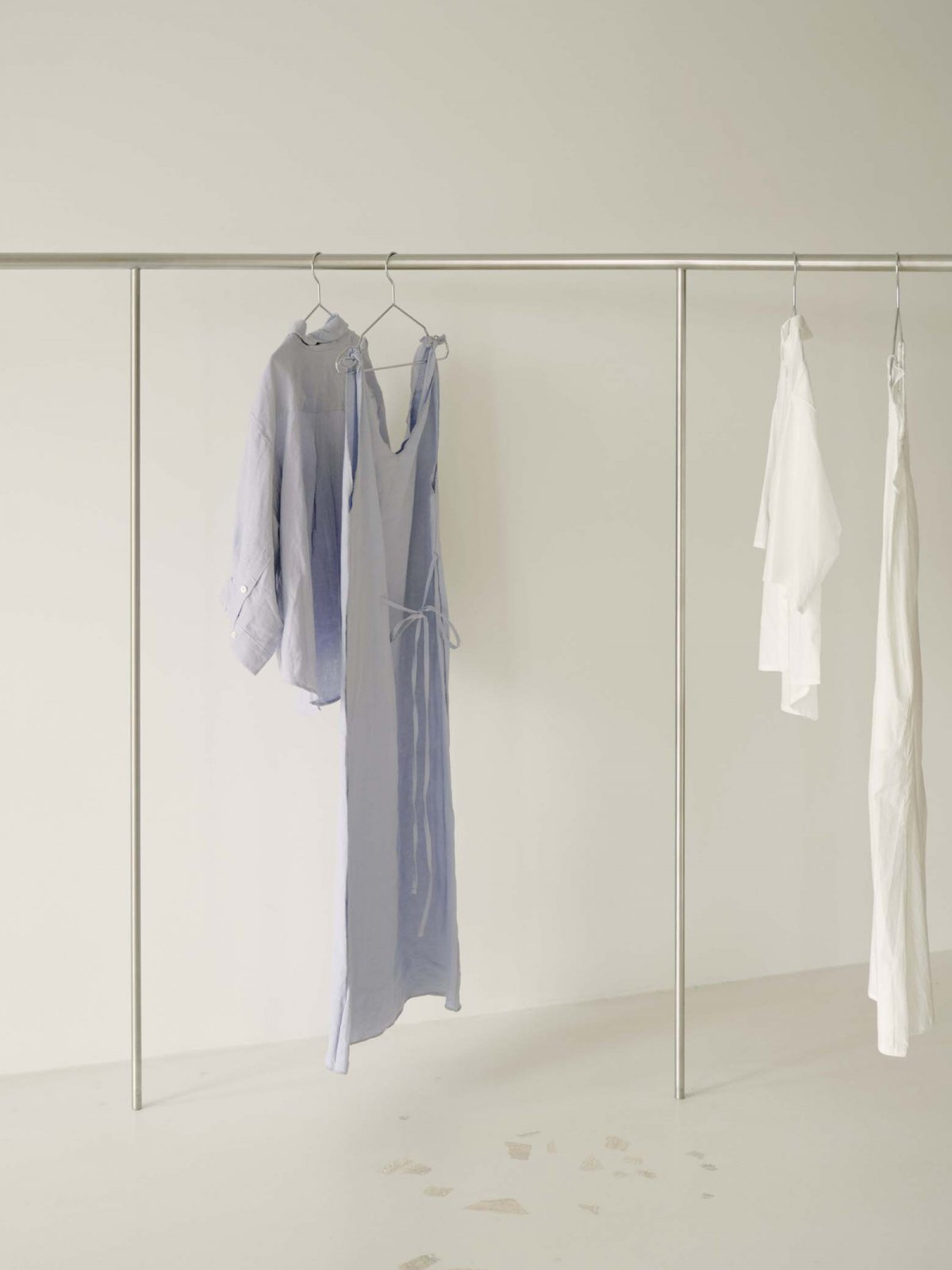
Pattern Studio has conceived the first flagship store for Australian apparel and lifestyle brand Deiji Studios,located in Byron Bay’s newest fashion precinct,Johnson Lane.The scheme champions the brand’s serene and effortless style,celebrating a natural yet slightly off-kilter beauty.
Deiji directors, Emma Nelson and Juliette Harkness, did not approach Pattern armed with a fixed design brief. Instead, the clients and the designers ruminated over which of the brand’s qualities might translate spatially in an interesting way. A quote from the 17th-century Japanese poet Matsuo Bashō established a harmonious tone for the project early on in the piece.
Bashō’s abstract, poetic worldview offered design cues regarding the spatial arrangement of the store, whose layout does not follow typical retail conventions. Also influential on the interior’s planning were the works of Isamu Noguchi, most notably his sculpture gardens and Richard Serra’s immense, inhabitable artworks. Materially, the store’s palette uses a carefully edited selection of neutral and natural finishes. The result overall, is an interior that feels utterly calm and serene — but never boring.
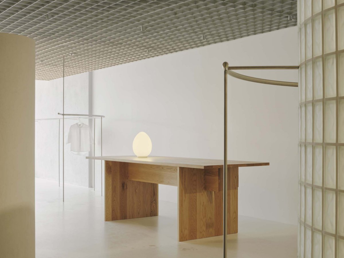
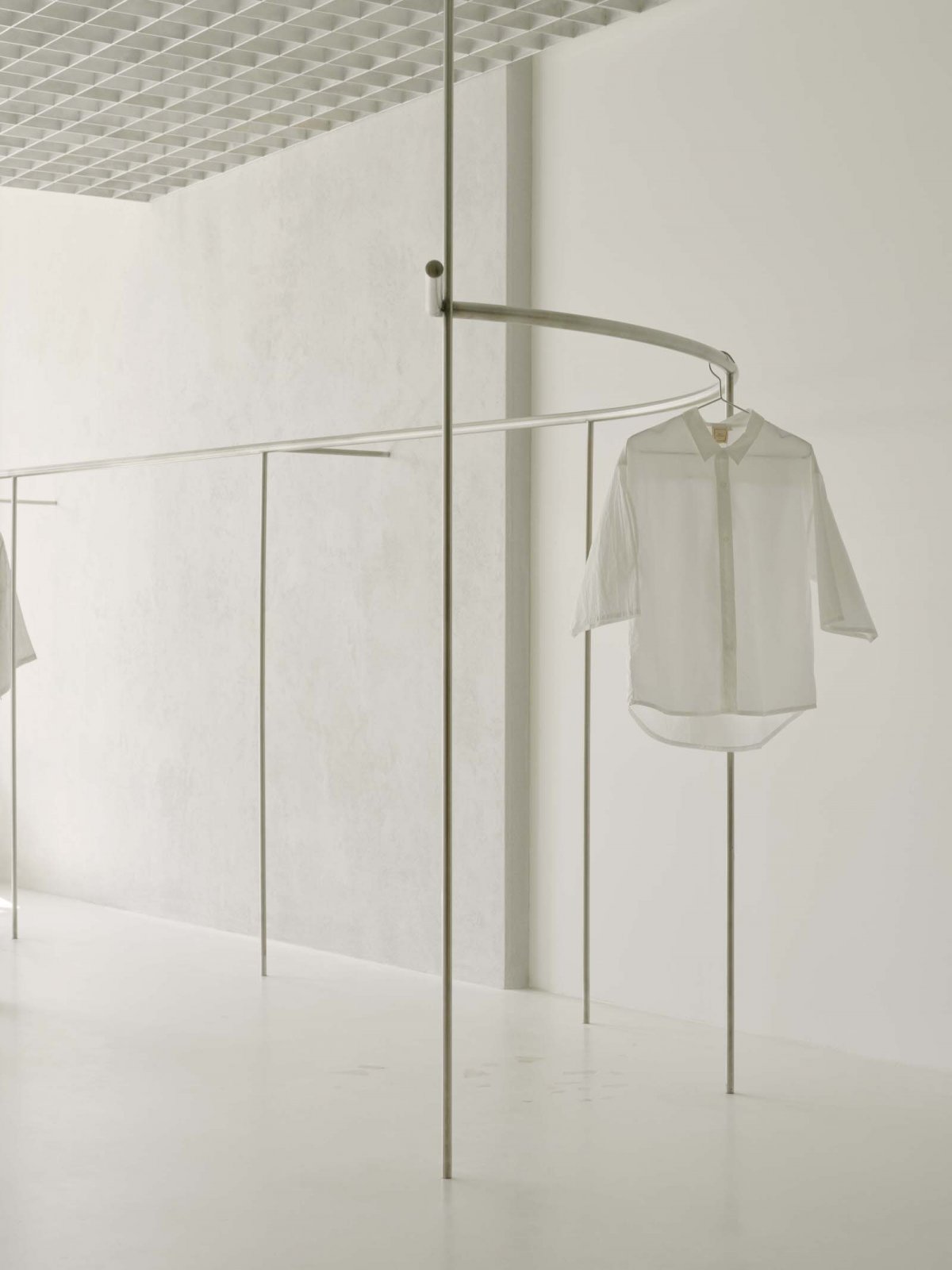
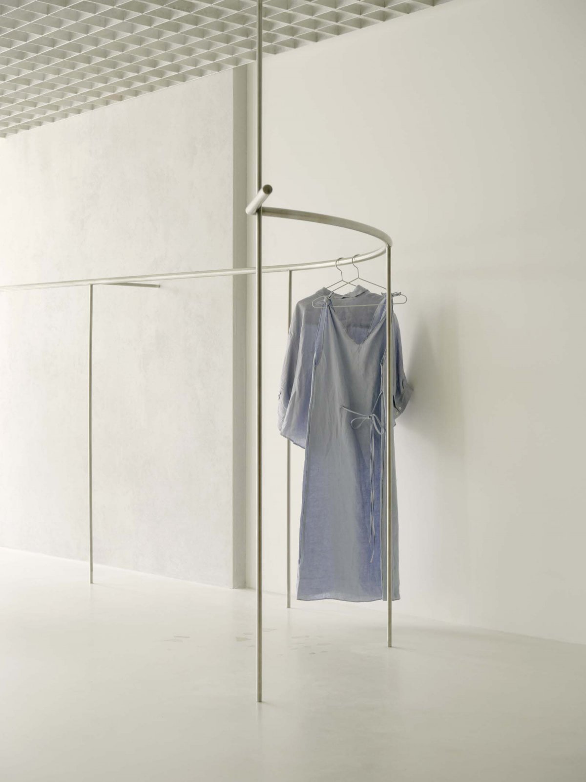
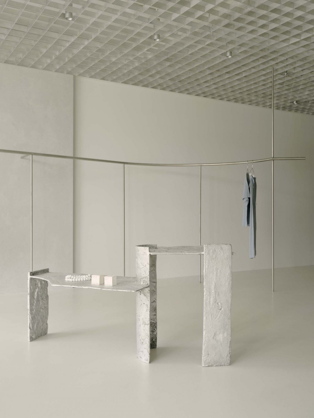
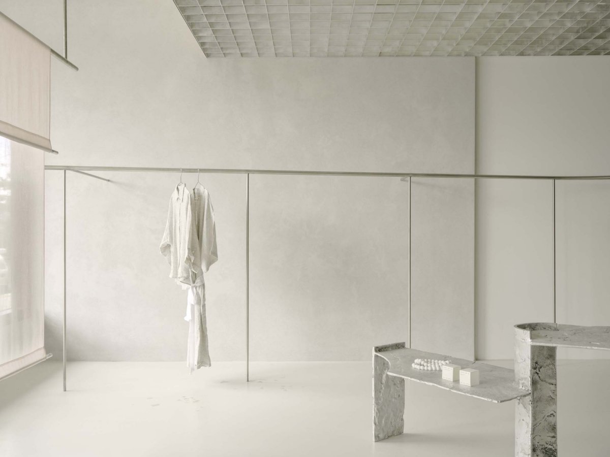
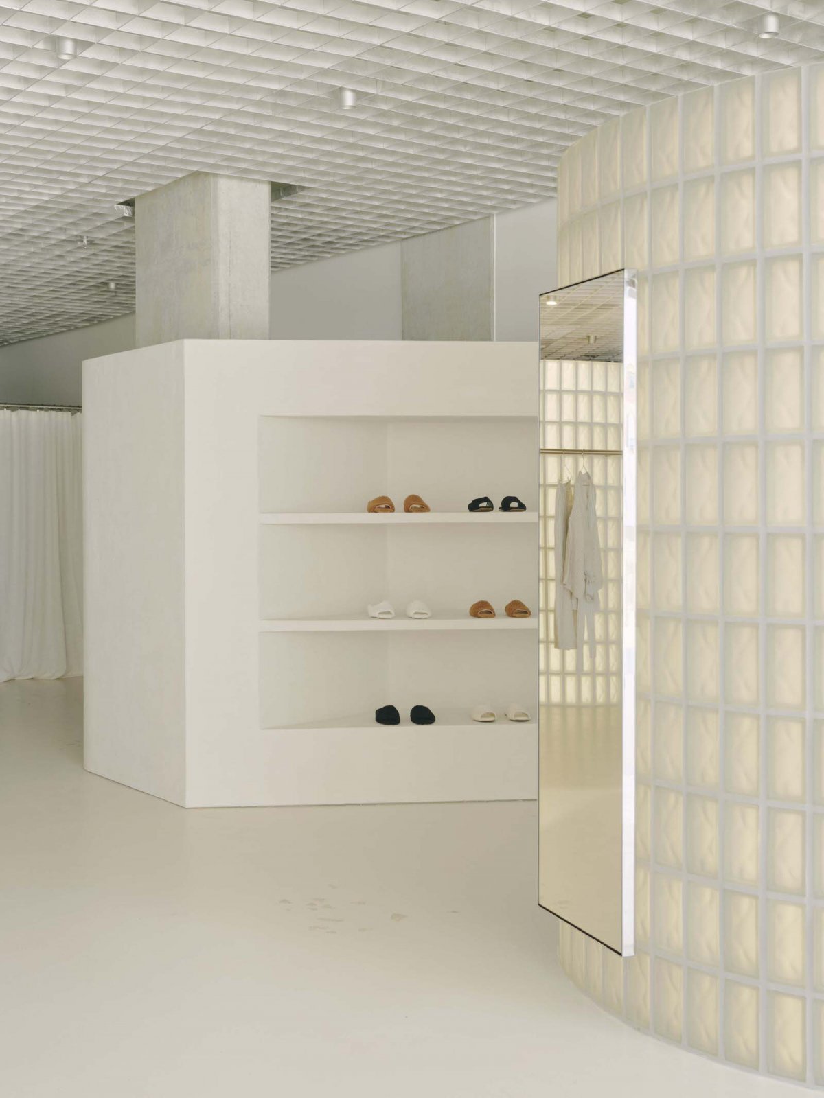
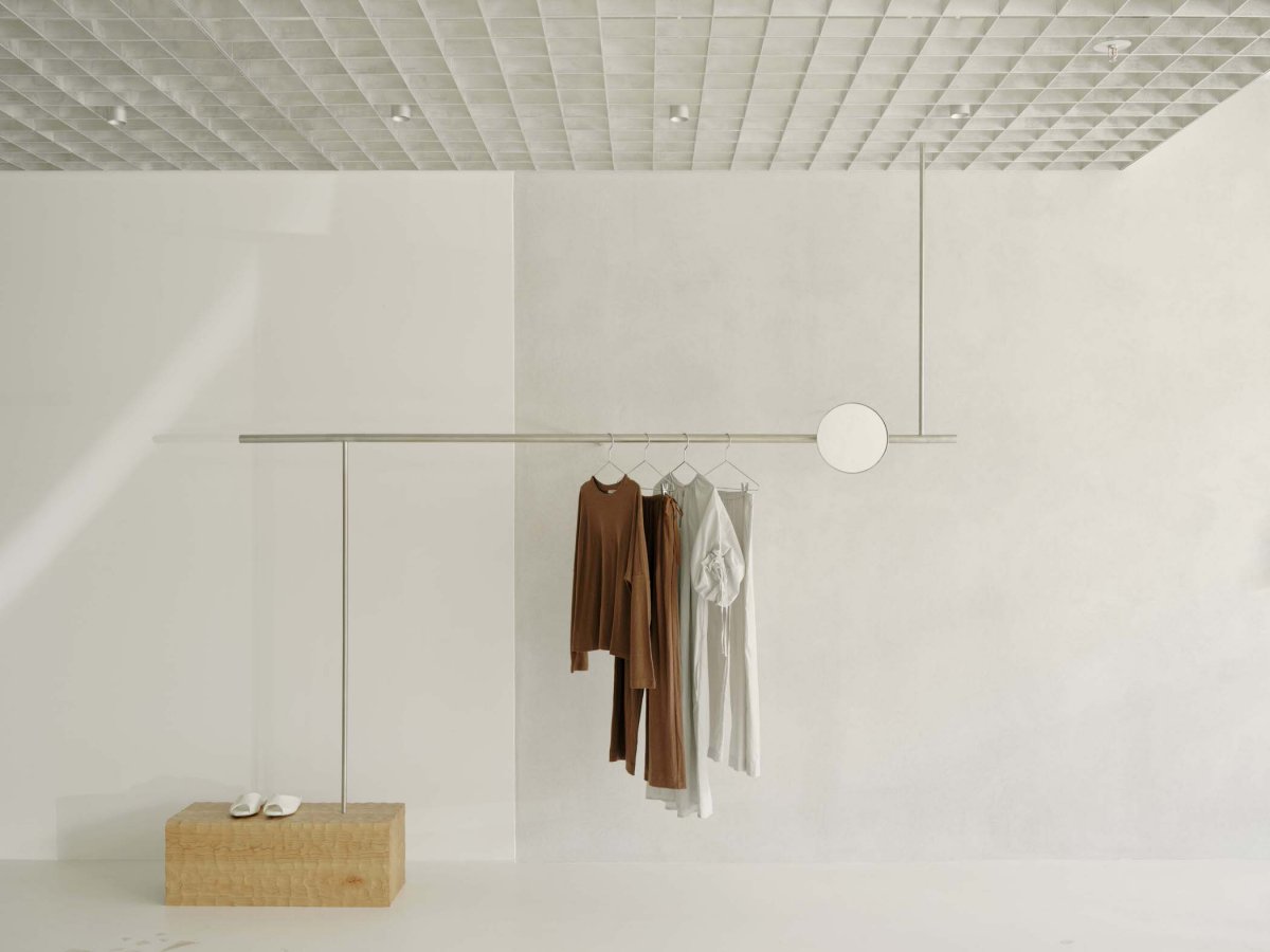
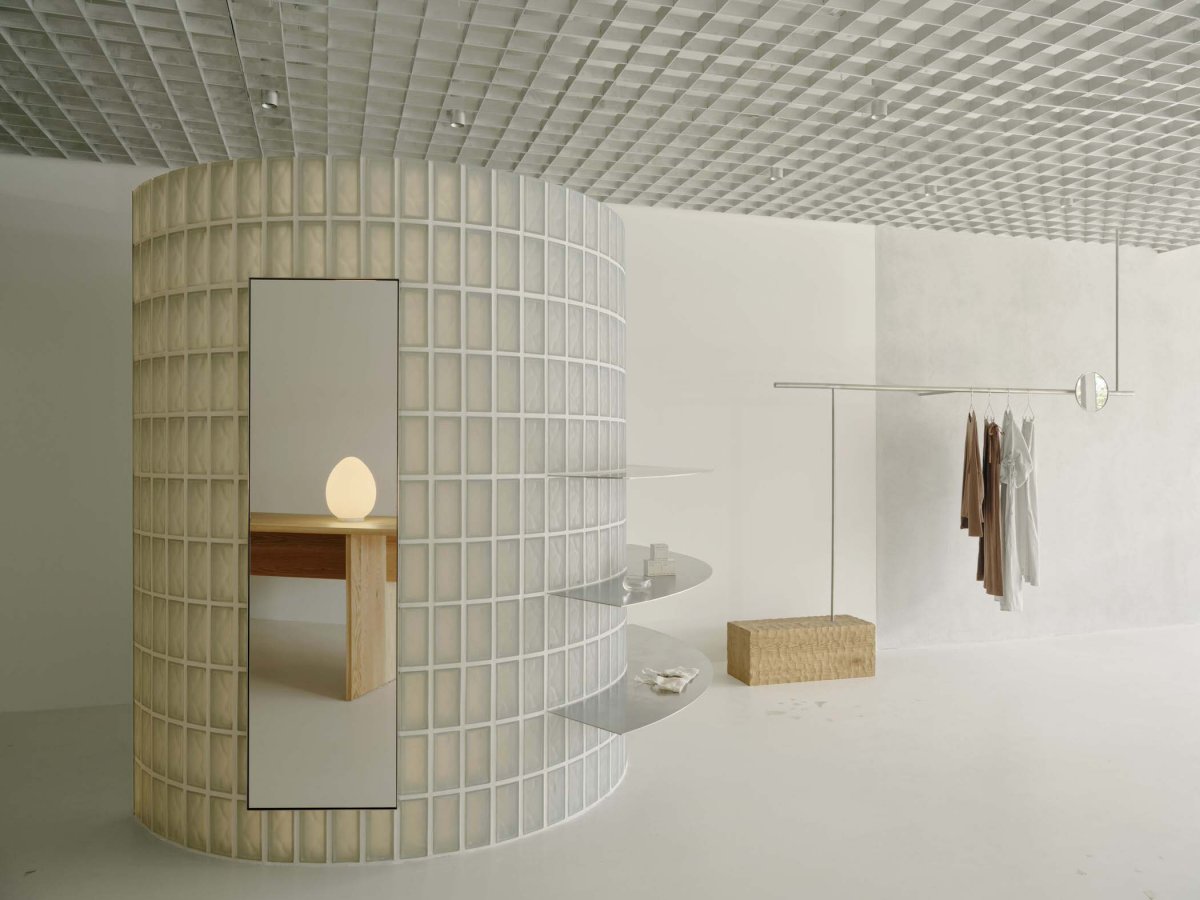
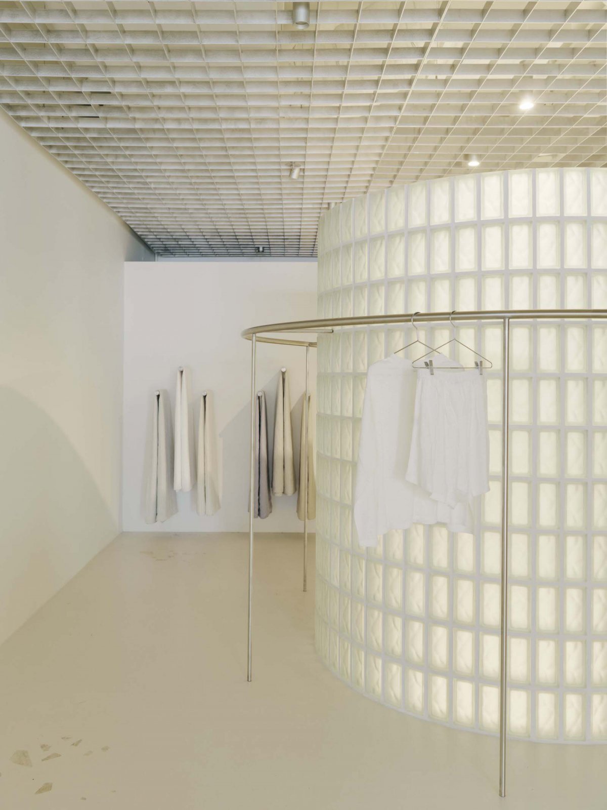
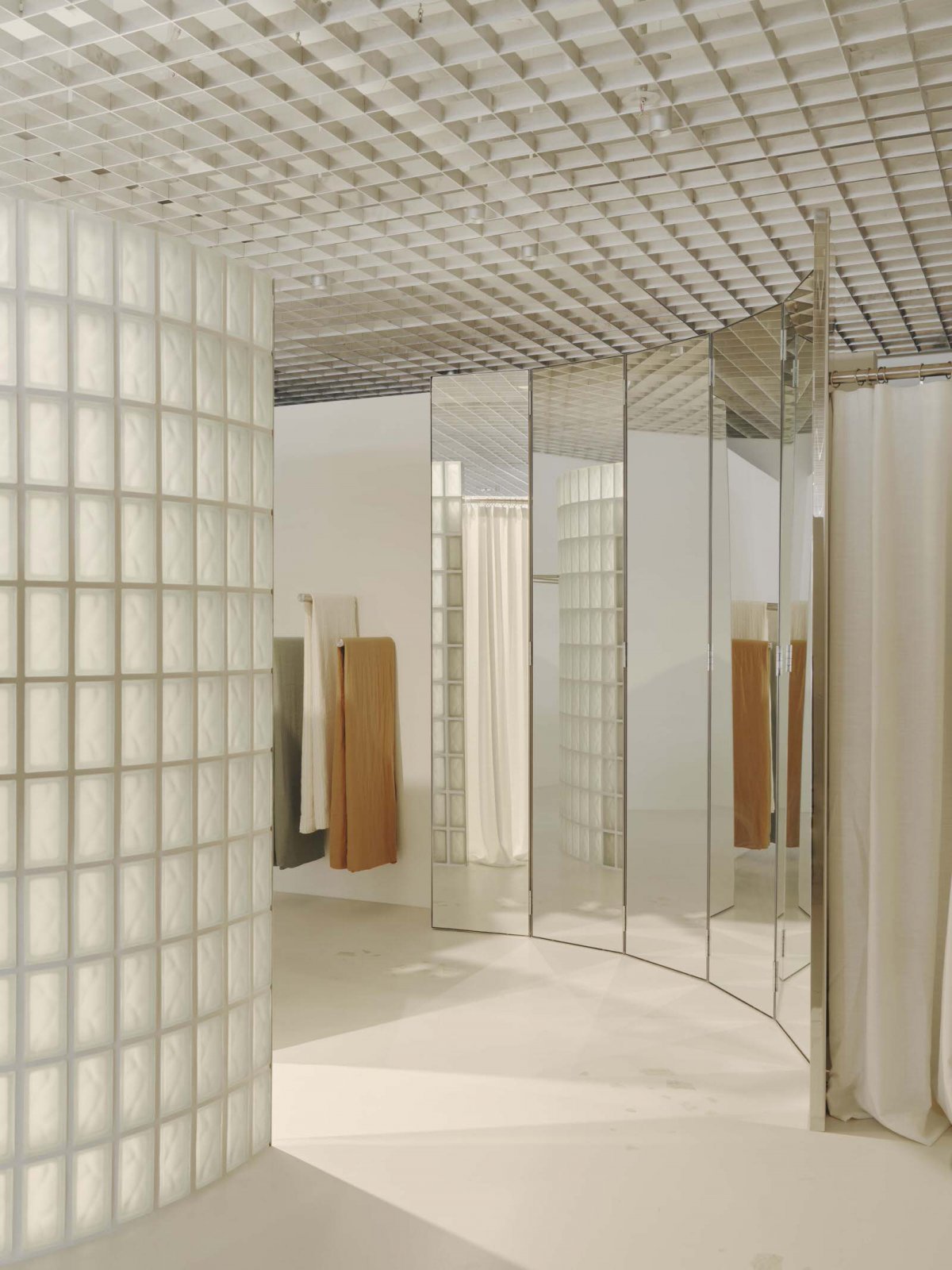
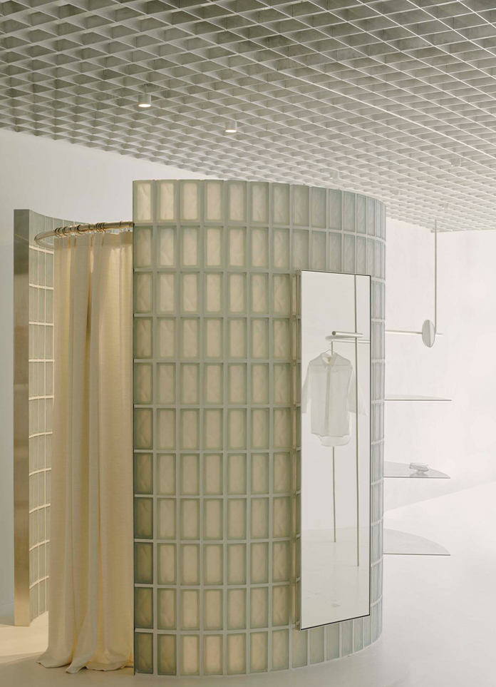
An off-white concrete floor contains smatterings of natural stone, with pieces gently strewn and dispersed as if by the tide. The walls are deliberately minimal, painted out in a soft white. Also in white are in-ceiling services, obscured partially by a suspended open-cell ceiling. The rhythmic geometry of the raw aluminium grid ceiling offers a contrast to the more lyrical curved elements found on the shop floor.
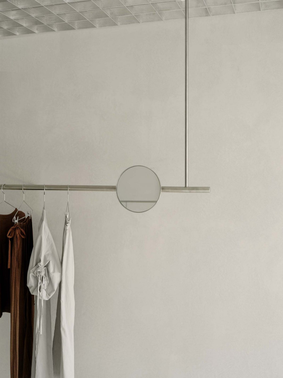
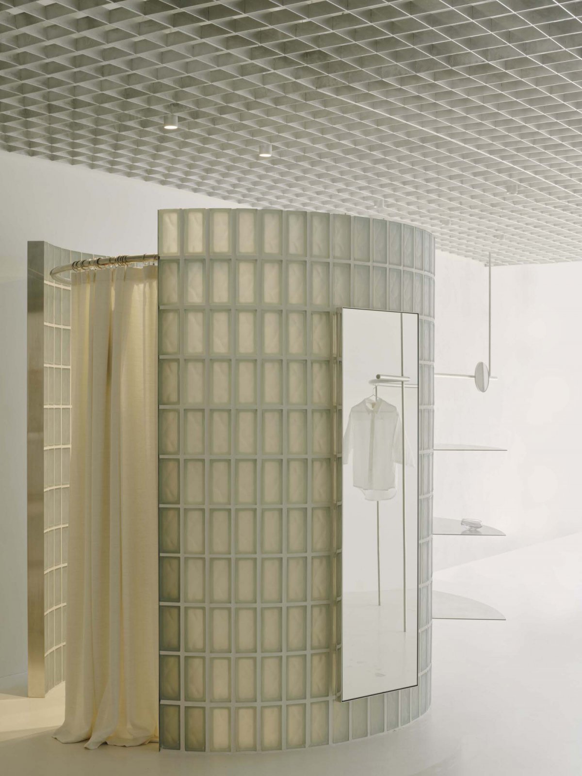
Fine steel hanging rails bend delicately, with the rounded design language continuing into the glass block fitting rooms. The curved glass chambers glow ethereally, offering a luxuriously tranquil experience for those changing. Scale and mass are carefully balanced by the sense of lightness their translucency creates.
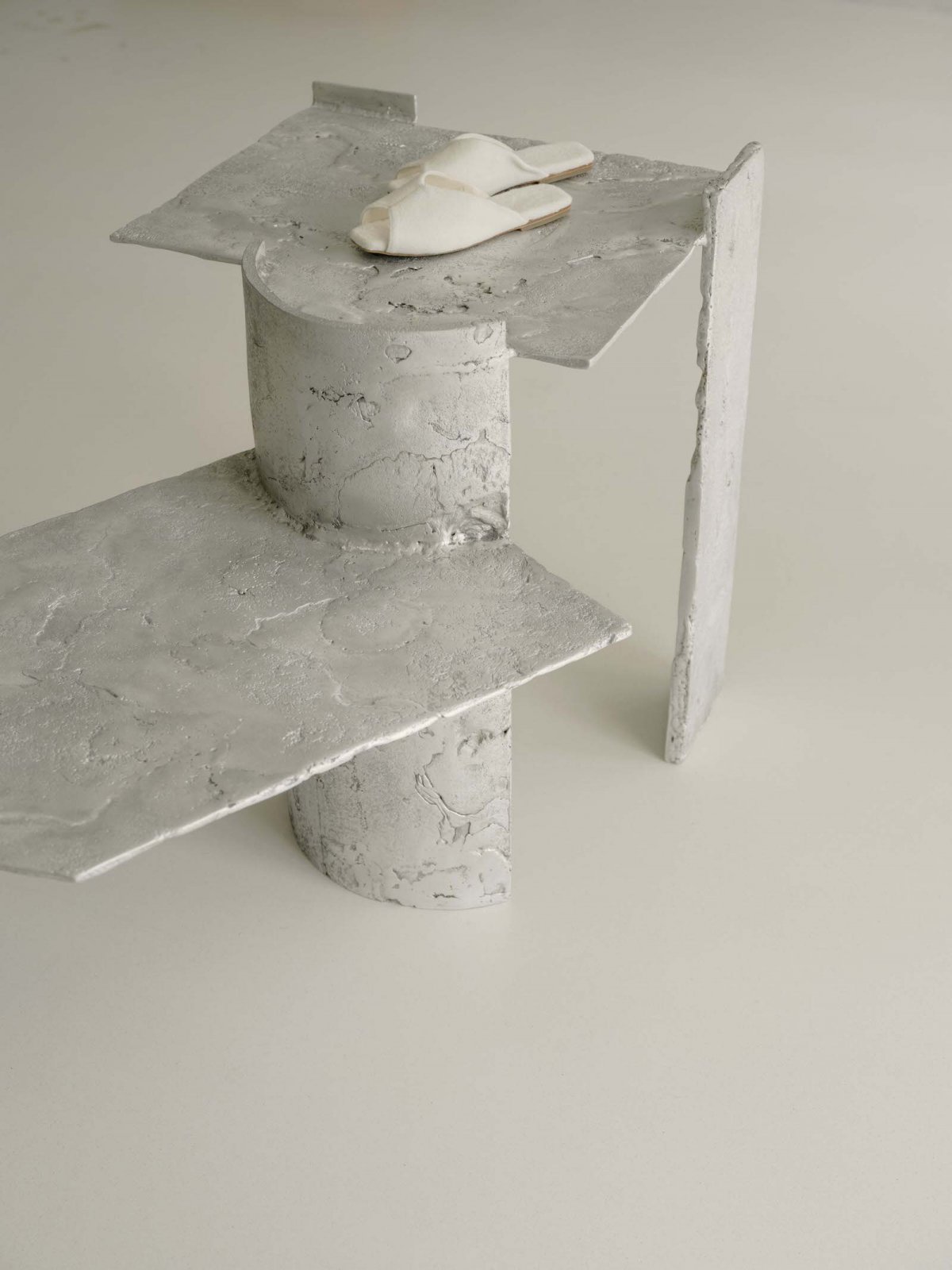
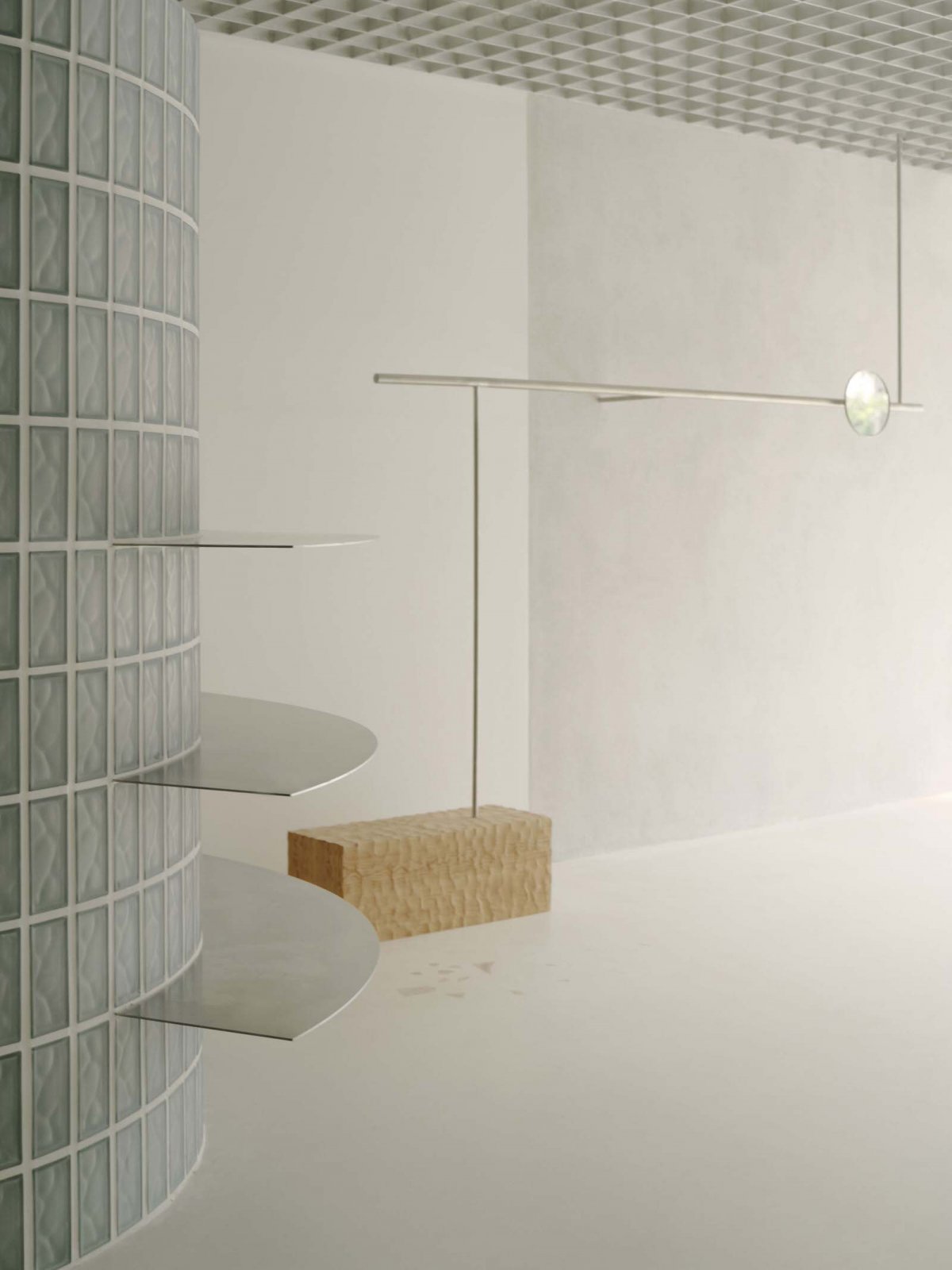
Outside the fitting room, an oversized, faceted mirror wall follows the gentle curve. Melbourne-based furniture maker Annie Paxton’s magnificent metallic display table brings another sculptural language to the space. Paxton’s perfectly imperfect bespoke Vestige Table, customised to suit the scale of this store, is texturally irregular and kooky in form; its asymmetry counters the cleaner, more regular forms seen elsewhere in the fitout.
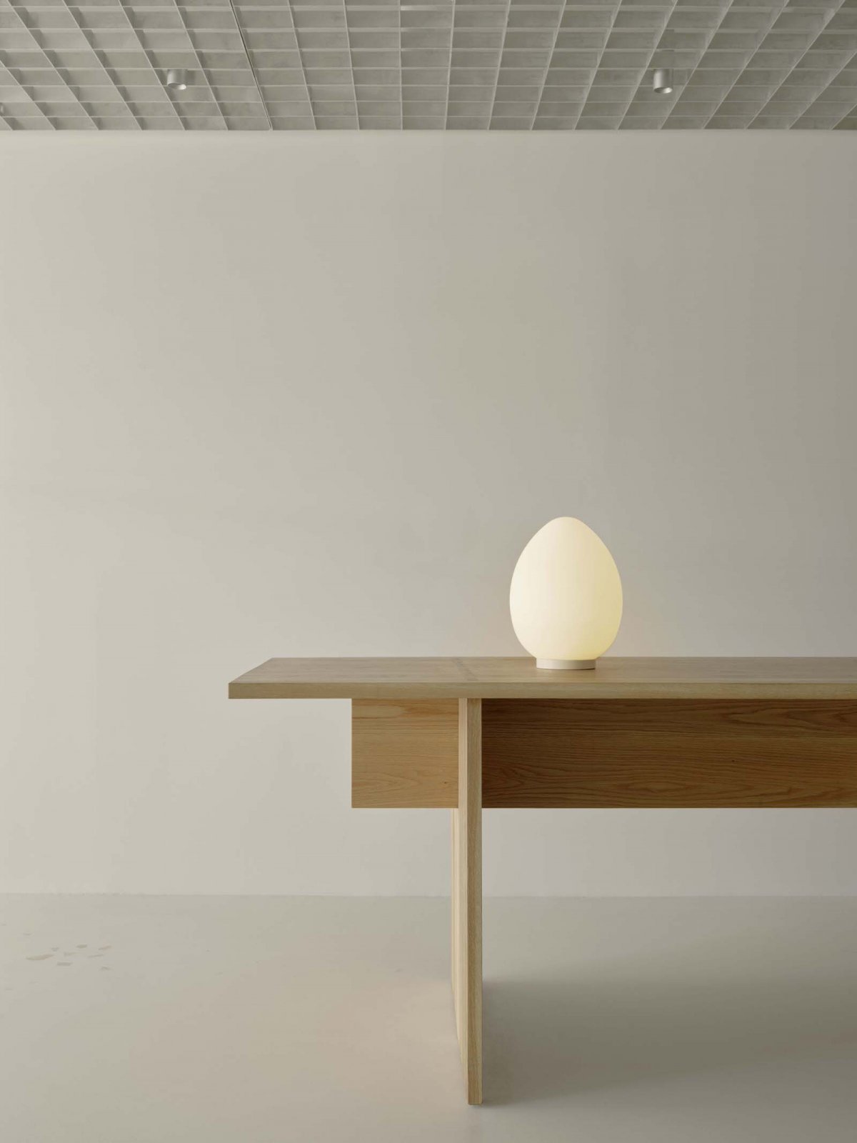
Less kooky but no less elegant is the store’s Point of Sale counter; a handsome timber unit crafted from oak by local maker Kye Darcy. The refined simplicity of the table’s detailing resonates with contemporary Japanese architecture, adorned by a charming, luminous egg lamp. The curved form of the vintage 20th century frosted glass table lamp perfectly offsets the rectilinear nature of the counter. Also offering illumination in the space is the orb-like‘Moon Washi’ pendant designed by Nendo for Aoya Washi, and the characterful, intricate steel and ceramic floor to ceiling suspension lamp by Spanish artist Carina Feldman.
Each fitout component was designed or selected for its unique charm, a quality that spoke to the essence of the Deiji brand. The interior seeks to create an overall harmony and cohesion through the careful balancing of these slightly peculiar individual elements. Like an orchestra of obscure instruments, this store aims to create a considered and beautiful — if slightly offbeat — retail experience.
- Interiors: Pattern Studio
- Photos: Tom Ross
- Words: Qianqian
