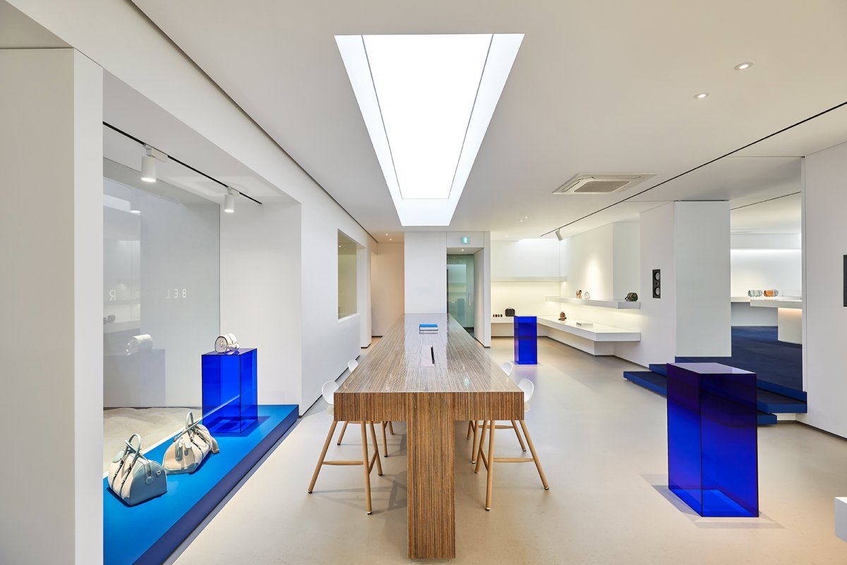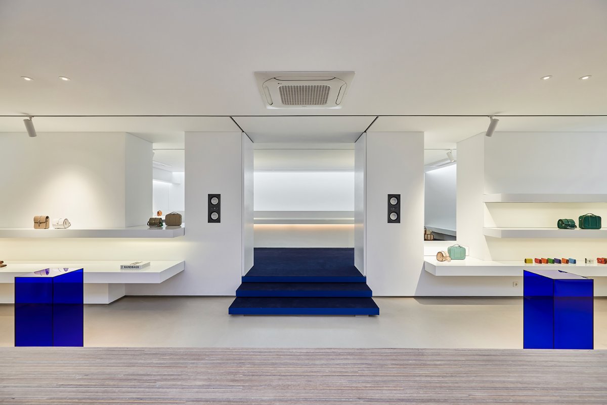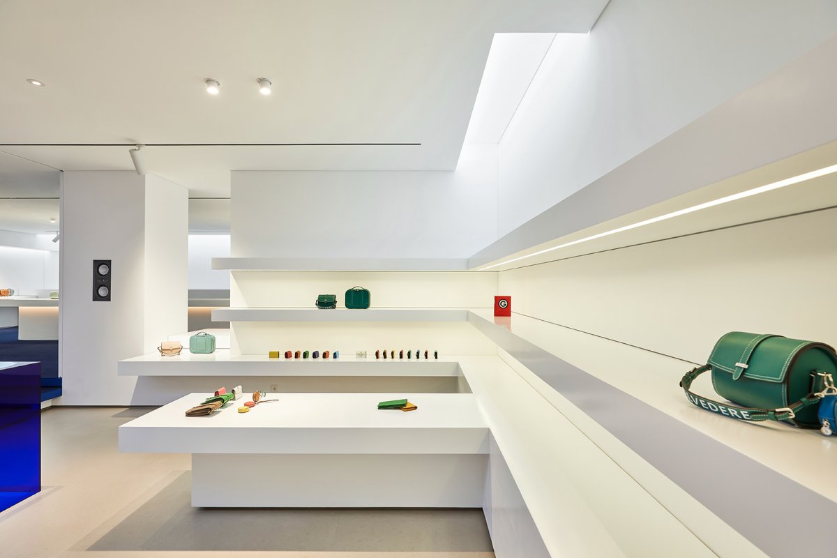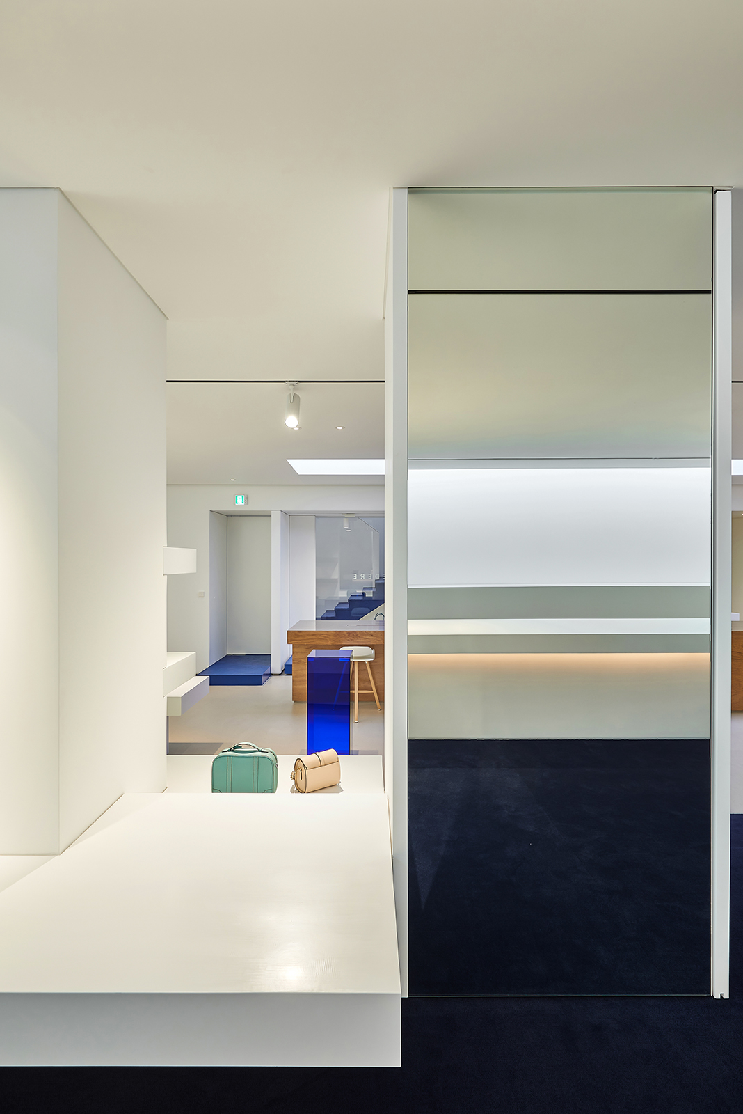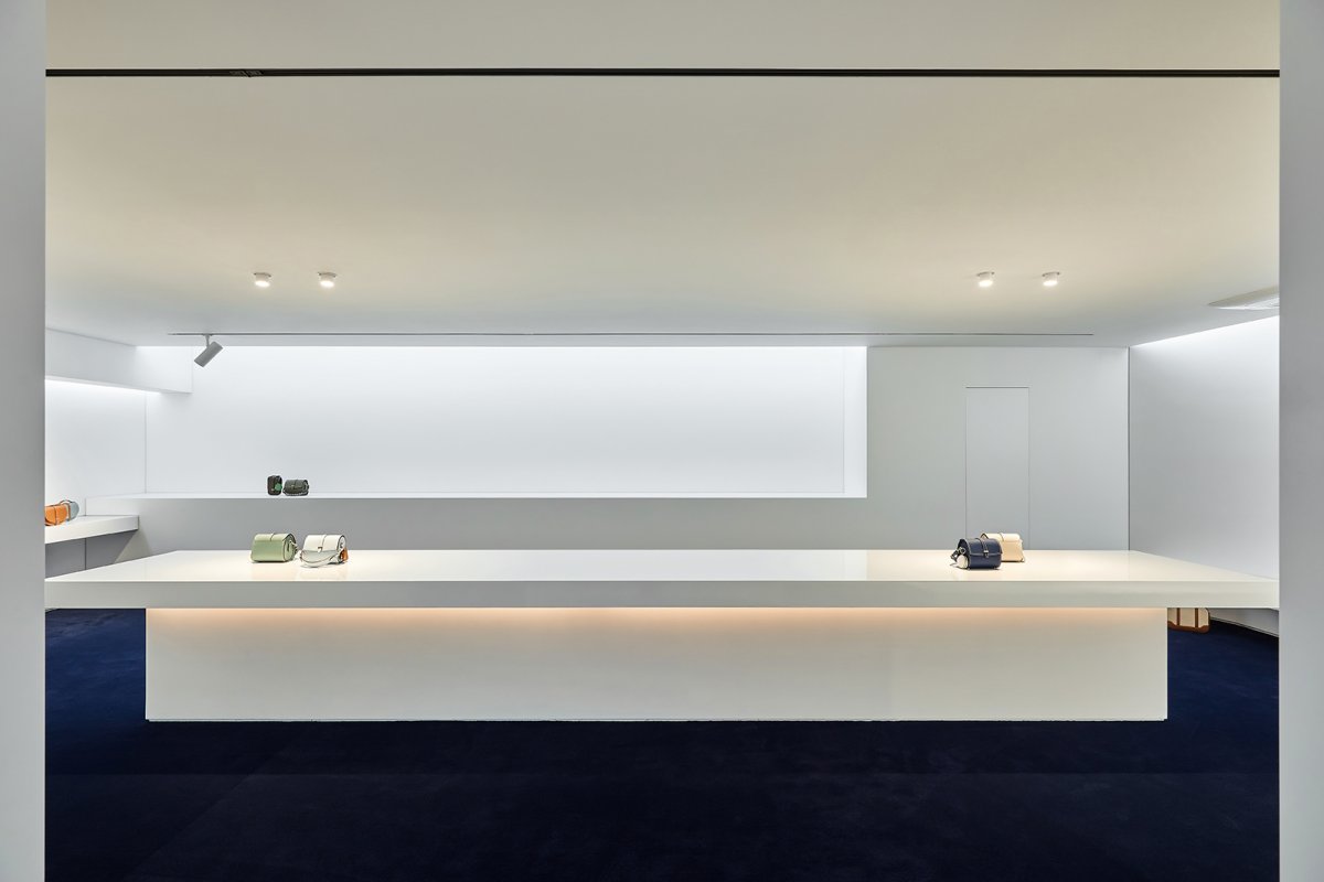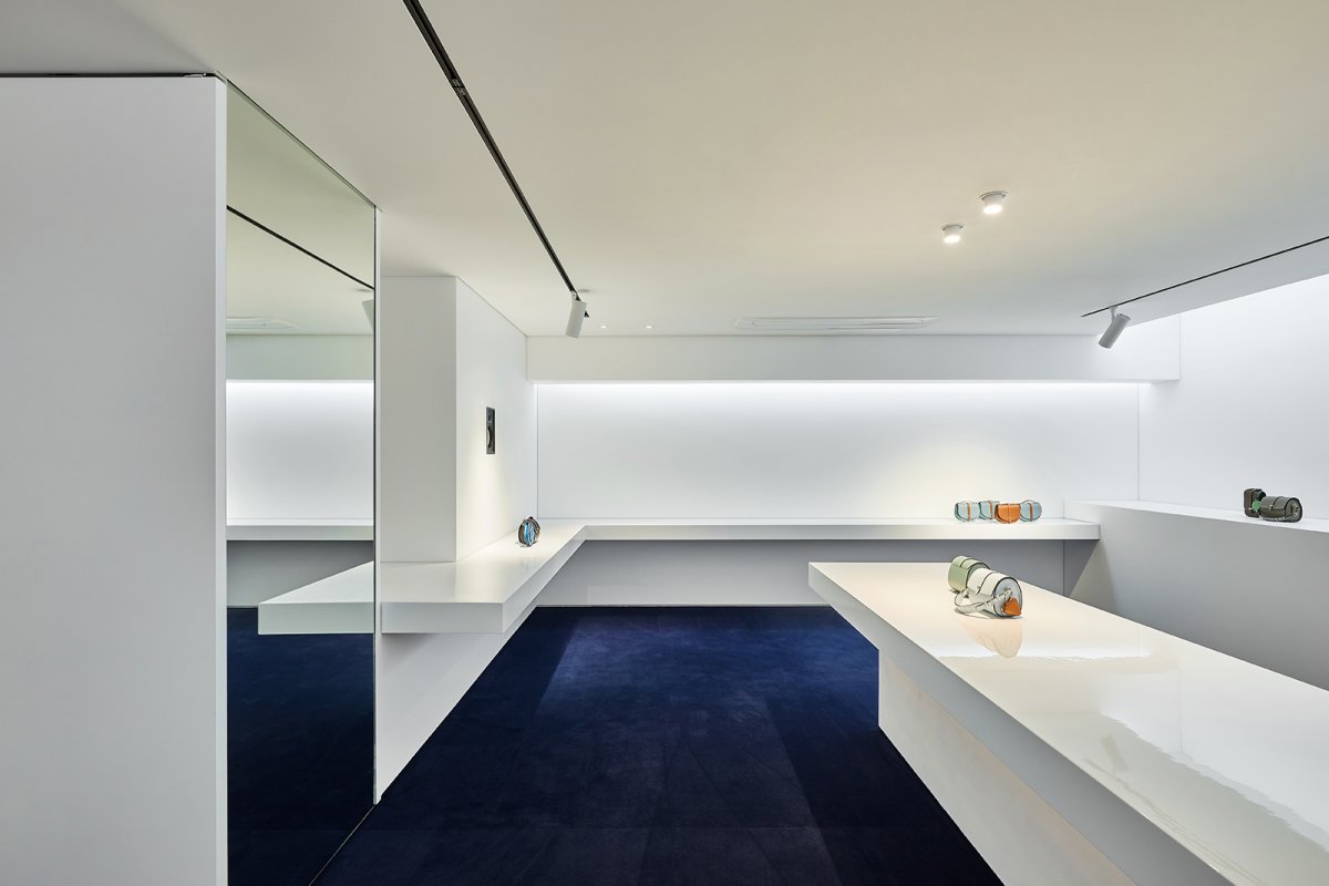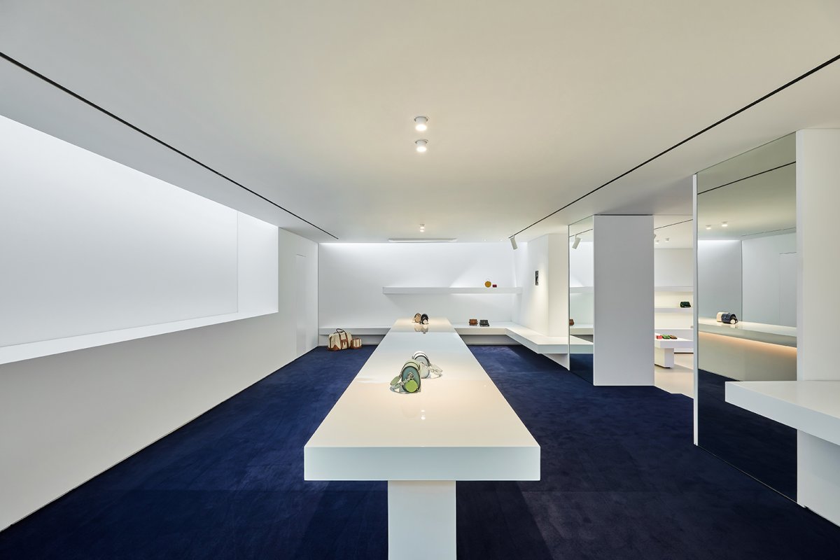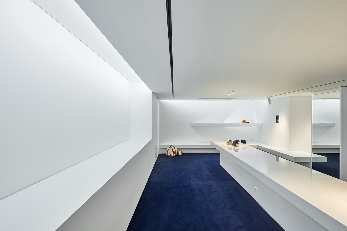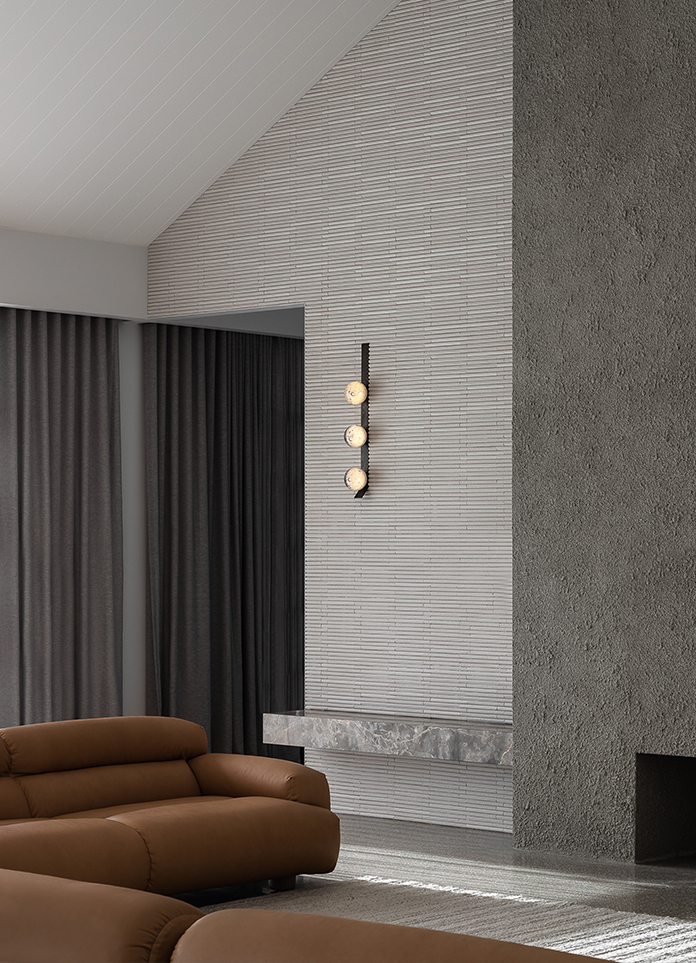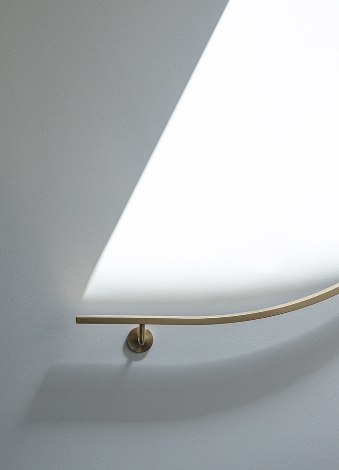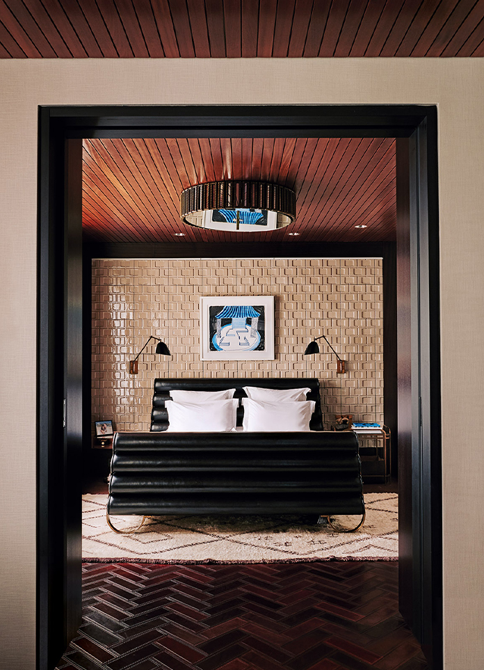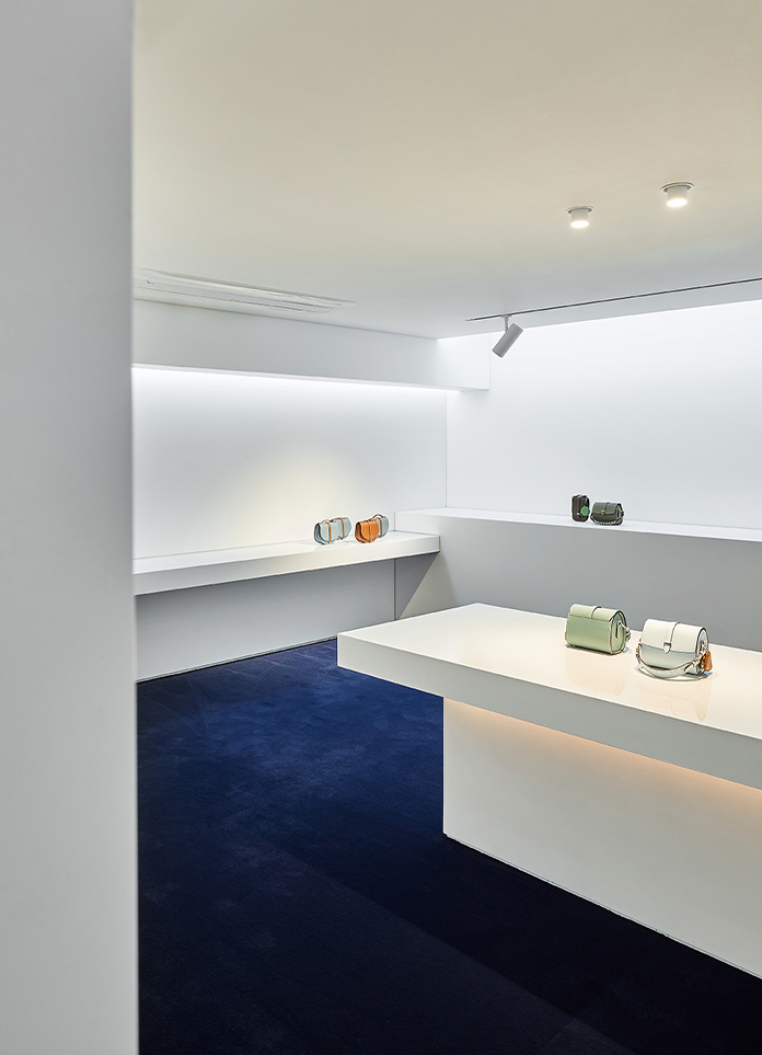
Minimalism literally means ‘to make things simple’. In this project, the designer tried to emphasize linearity by using straight lines instead of dynamic curves so that the simplicity of minimalism can be fully manifested. The designer was confident that it is possible to achieve minimalism with one simple line in a space.
The space is located on the basement level. And a box type structure on the 1st floor makes the space to be mistaken as the ground floor and brings a underground showroom up to the ground. In this project, a ‘minimalist’ arrangement plan brings about a ‘maximal’ effect. Intricate patterns or decorations are kept to a minimum, and lines are put to the fore. Objects with different sizes are positioned to look stylish with the goal of achieving ‘maximum’ through ‘minimum’ intervention.
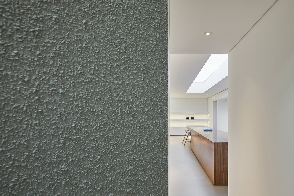
Walls are partially cut out to ensure continuity throughout two spaces at different levels and to express a sense of depth in the space by adding layers so that the scenery of the space can change with the viewer’s position. This project aims to create a ‘showroom’ that doubles as a ‘multi-function space’. The space is designed to provide not one but many different functions that can create synergy. The design is developed with a little wisdom that ‘you have to empty first to fill’ in mind.
- Interiors: Super Pie Design Studio
- Words: Gina


