MYLANDS & panDOMO Showroom
"Great beauty is silent, fusion between its own principle of square."
Zhibai ZHIBAI DESIGN was invited to participate in the design of the paint exhibition hall under the Adier Home Furnishing Group, creating an exhibition hall integrating two top paint brands in a space of 75 square kilometers.
MYLAND Paint, founded in 1884, originated from London, England. With more than 130 years of history, MYLAND is the oldest paint manufacturer and an artistic paint producer with royal certification in the UK. panDOMO is a brand new interior decoration wall and floor system mainly based on special cement base material under German ARDEX (ARDEX). Modern architectural design concept.
How to integrate the two brands in a small space and keep the characteristics of the brand itself is one of the biggest challenges we face. Modern tonality and tribute to the classics are our thinking directions for the design of the entire space. Redefinition is a test of our manifestation.
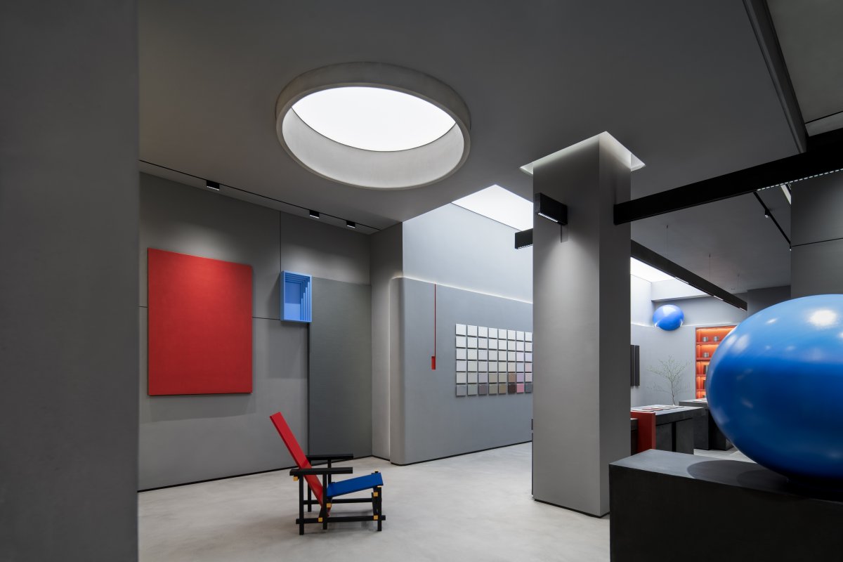
Mondrian means modernism. His name and work together interpret the highest ideals of the modernists. He is the totem of the origins of modernism.
From an artist to an architect, Mondrian, with his ultimate artistic pursuit and pure and simple design style, not only inspired all subsequent modern art schools, but also profoundly influenced everything from fashion modeling to space appliances in addition to painting. design field. Architect Rietveld extended Mondrian's style from a two-dimensional plane to a three-dimensional space.
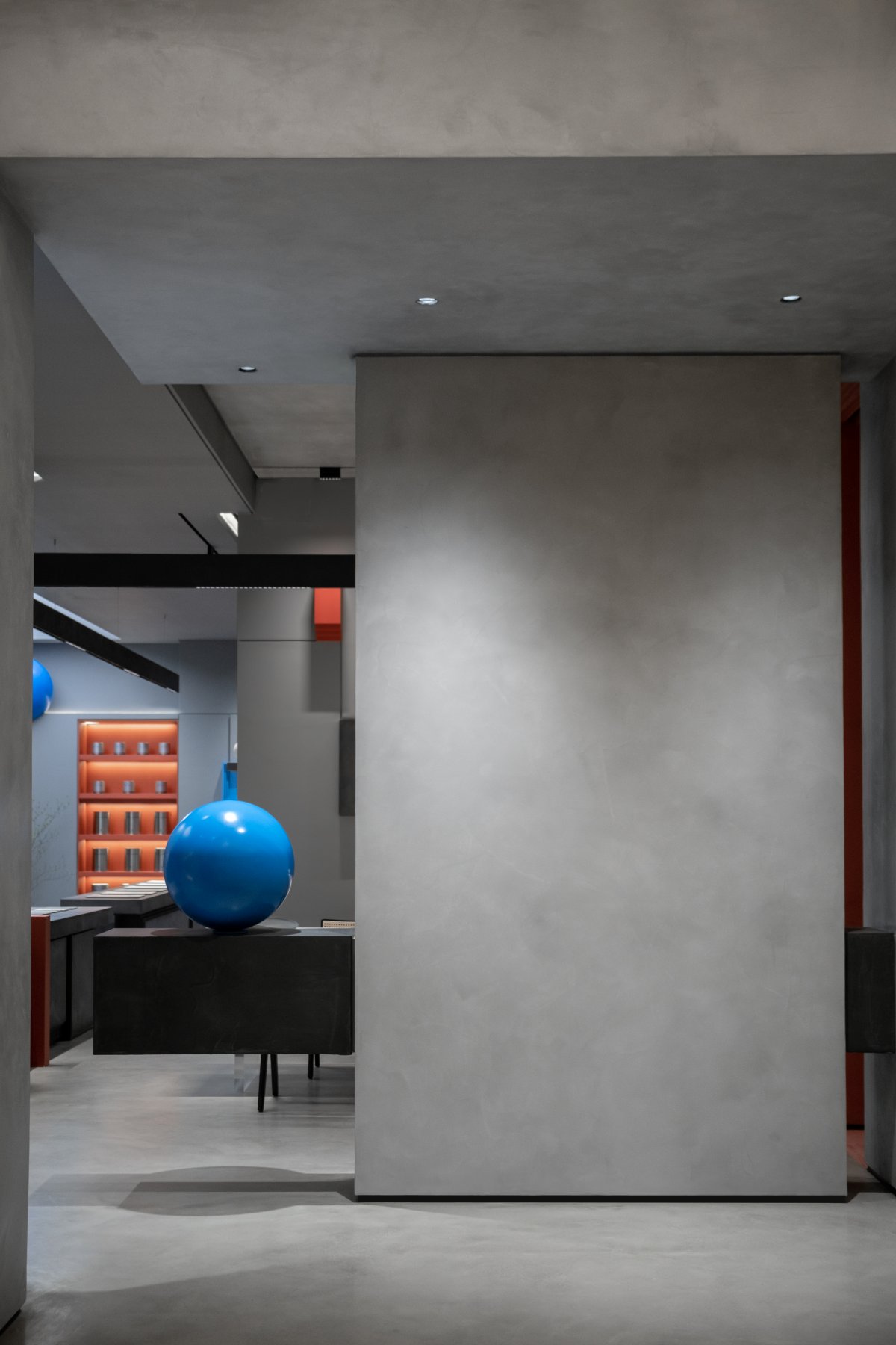
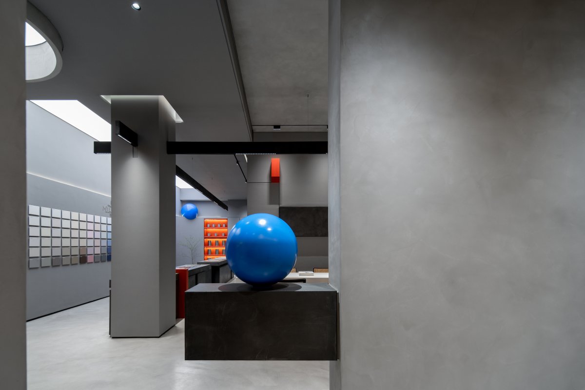
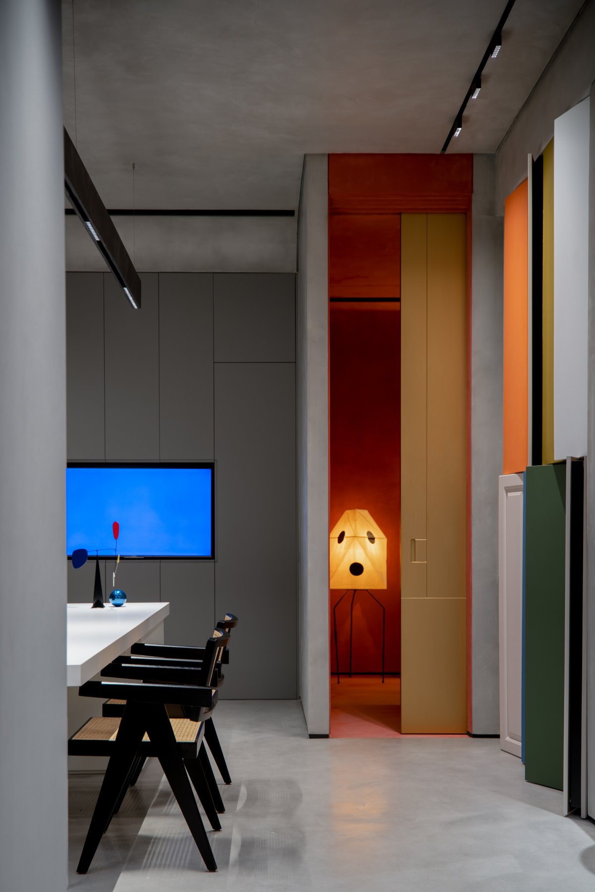
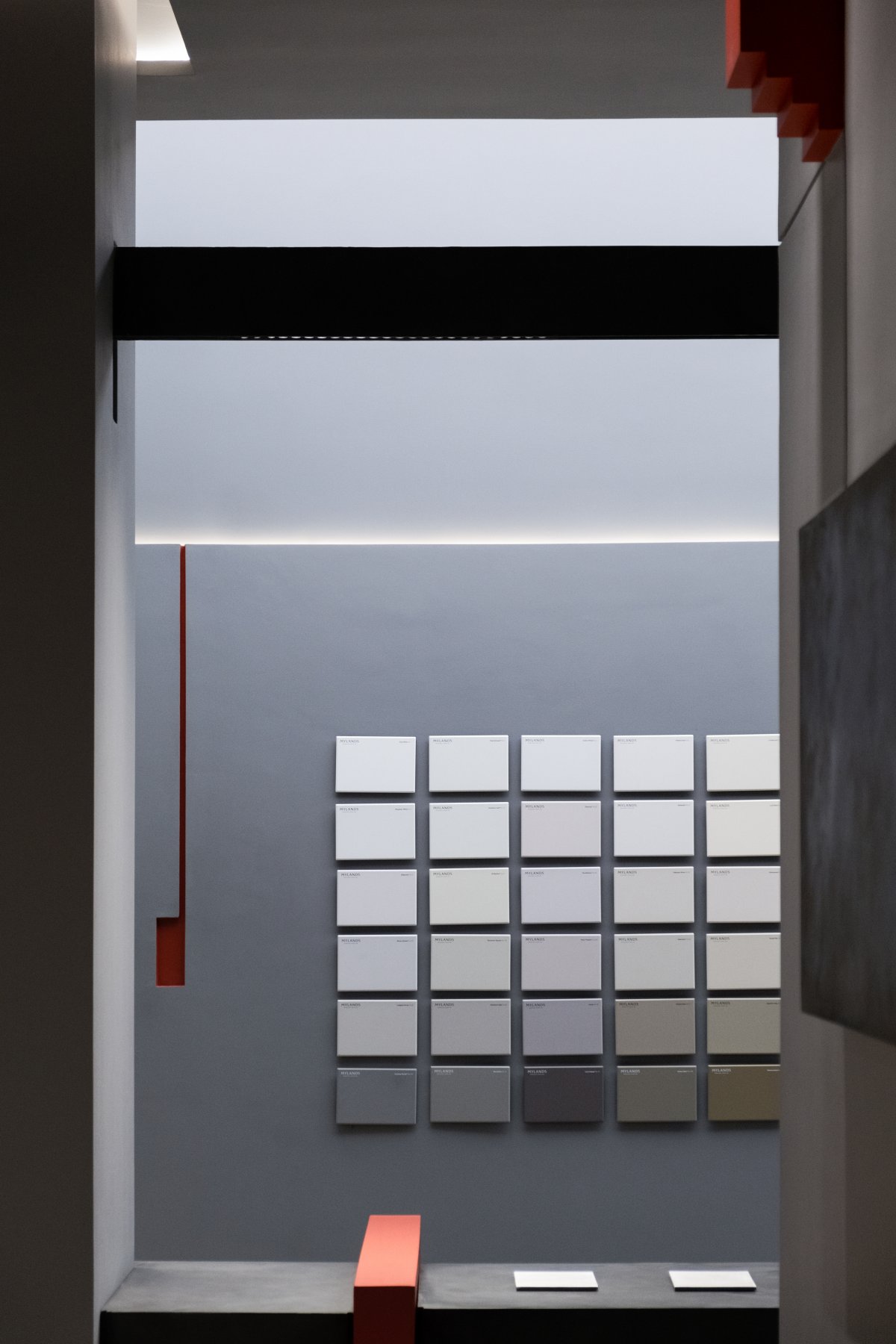
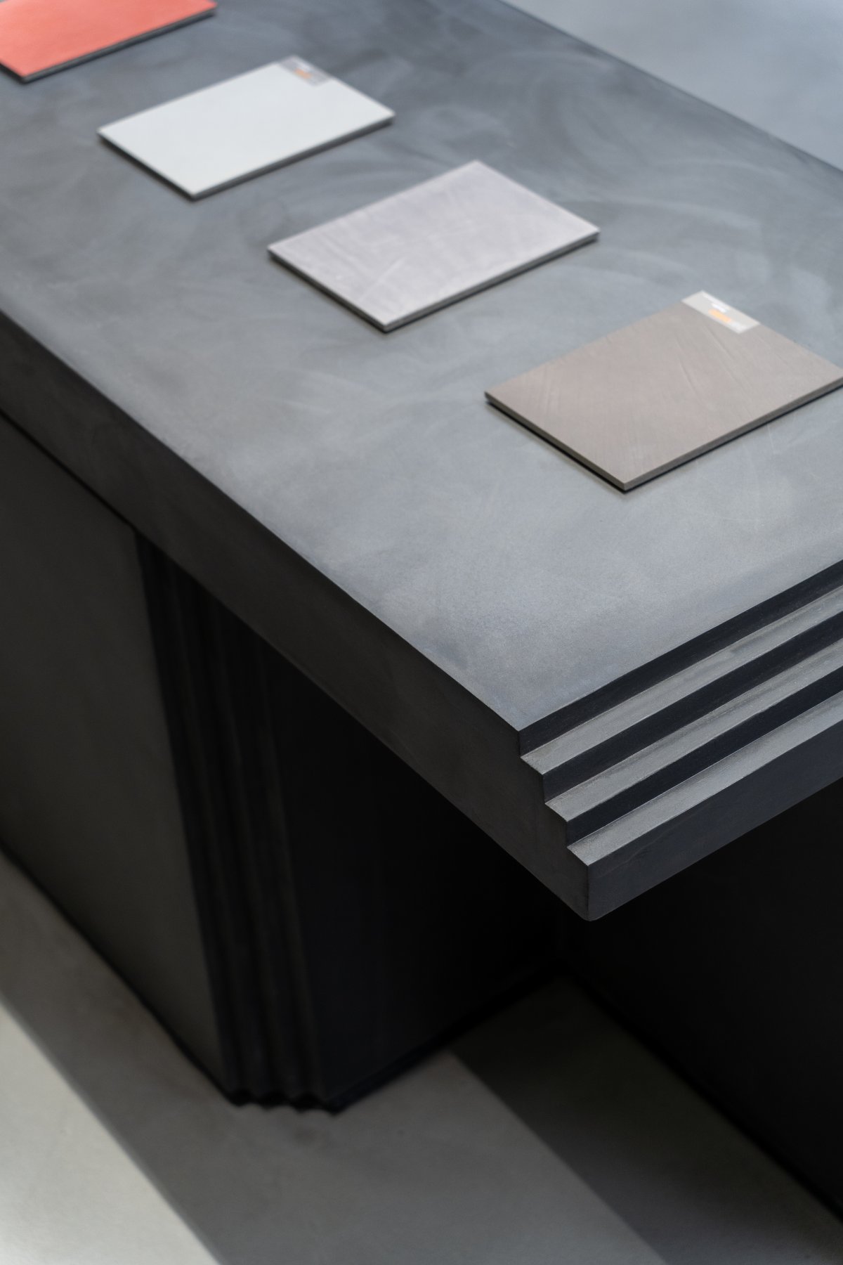
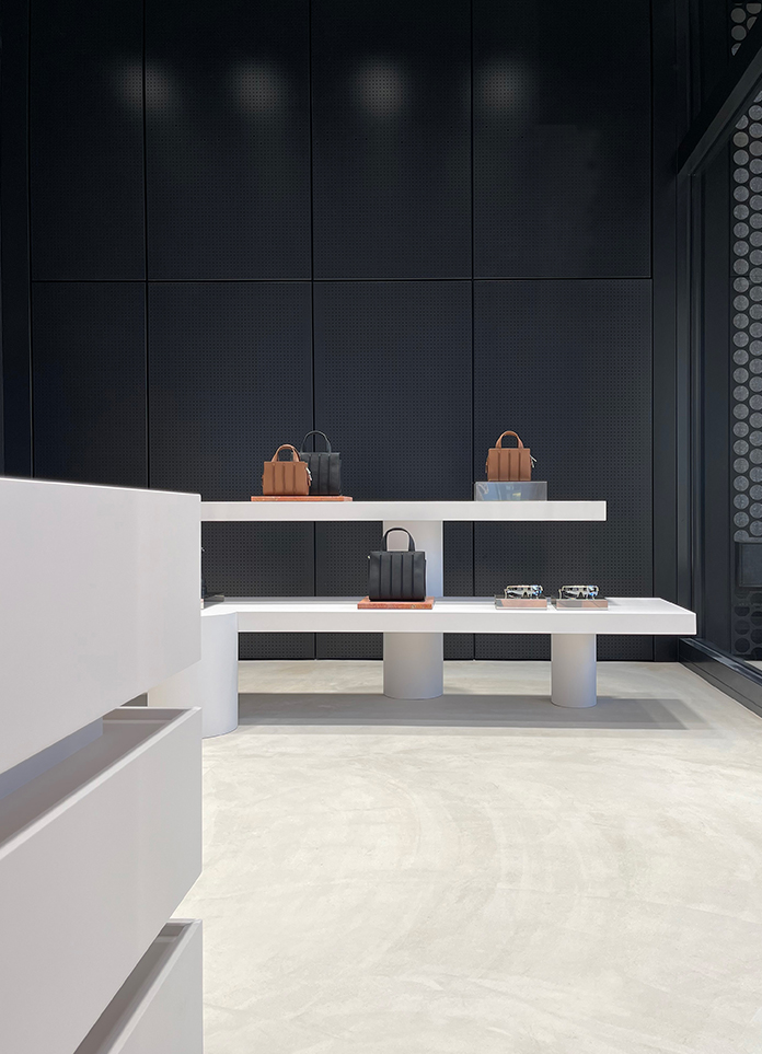
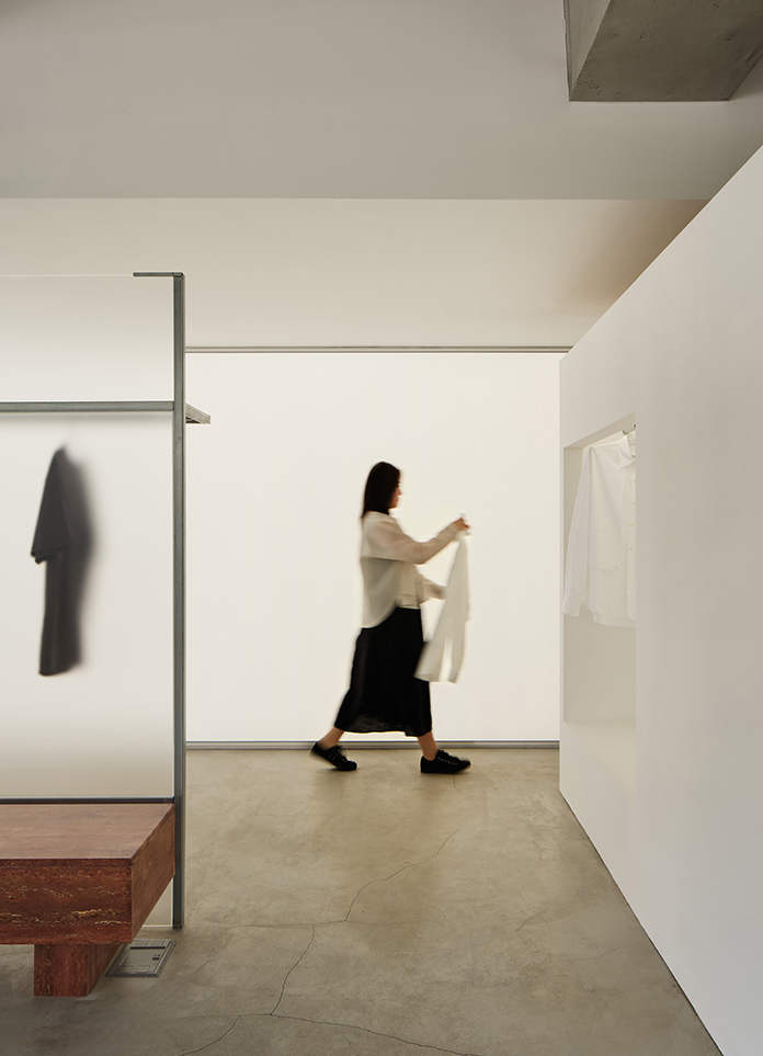
The choice of cement gray as the main color is restrained and unassuming, with an irresistible sense of luxury and mystery. Abandoning the cumbersome design skills, the space is clean and neat, making people quiet, easy to think and create, and maintain the true color of the material, so as to express the pragmatism of the space.
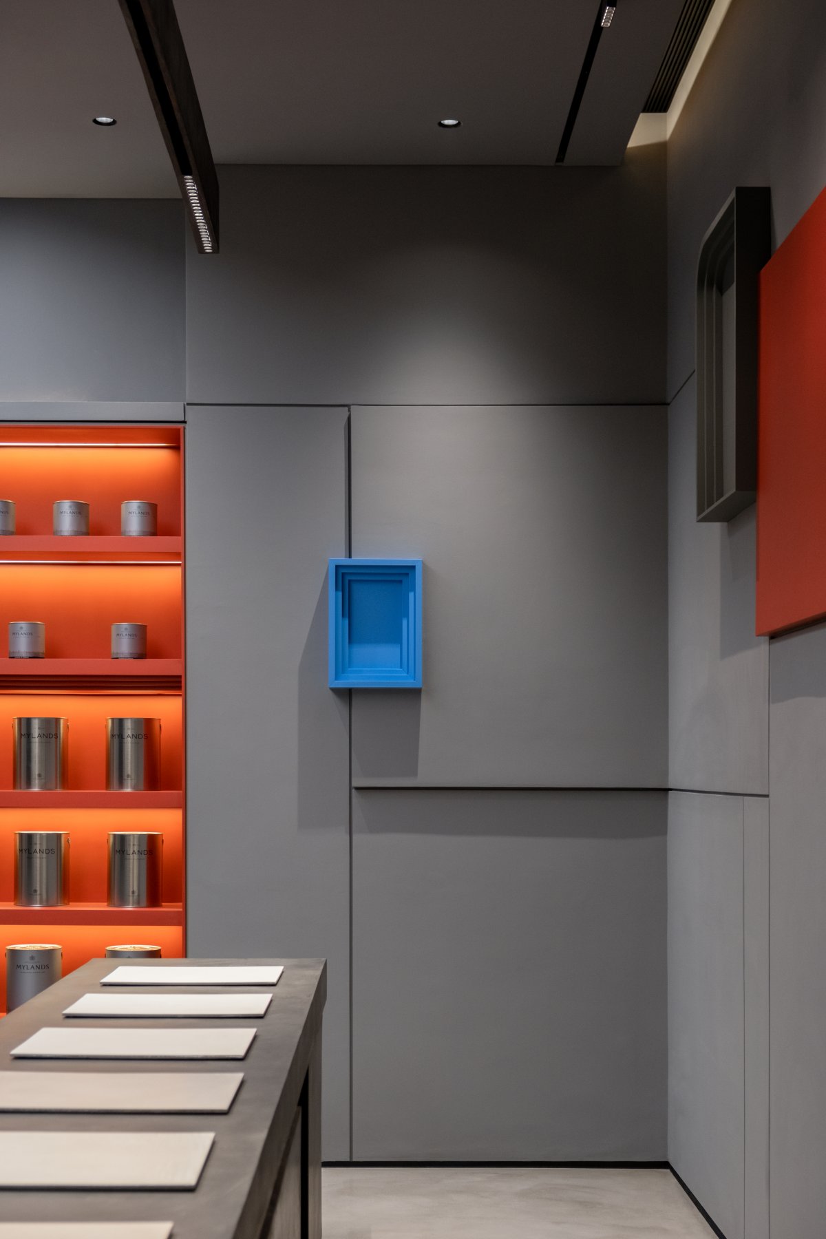
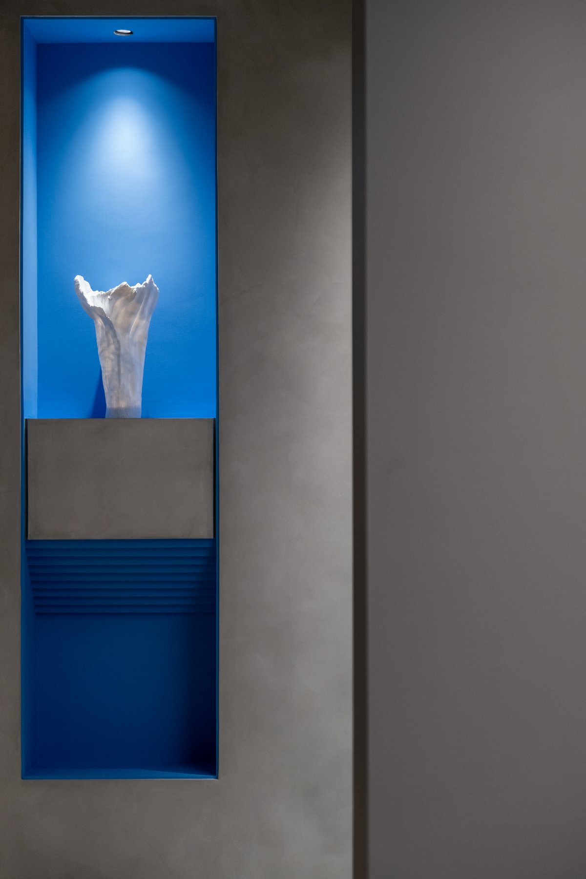
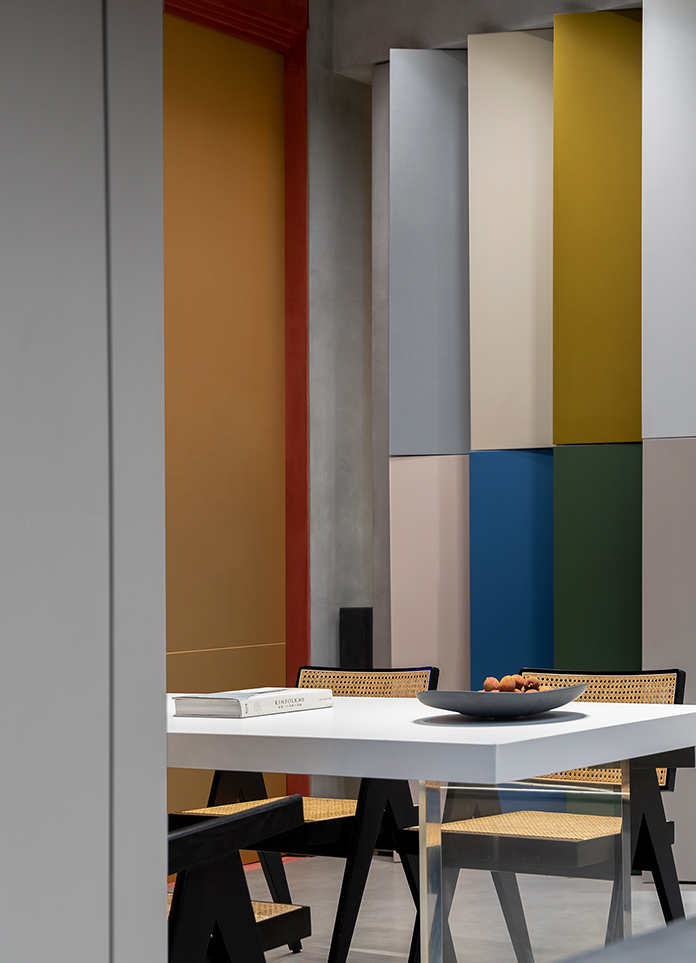
The space is impacted by the technique of changing tones, and the simple and bright colors are used to strengthen the structure, highlight the format of the space, and shape the artistry of the exhibition hall space. In order to transform the space, the furniture and the space structure are skillfully combined, so that the furniture becomes the continuation of the space rather than a single movable animal or obstacle. The prominent key colors enhance the architectural sense and personality of the space and create visual fluctuations.
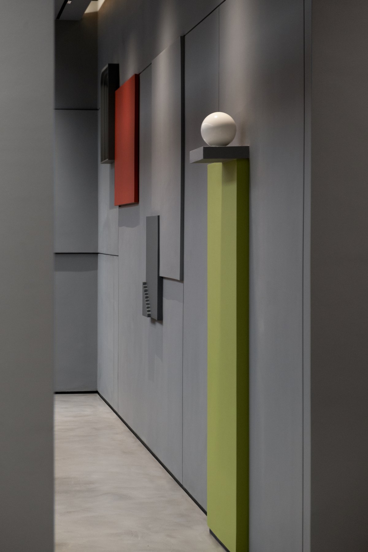
Simple and clear geometric shapes are pieced together, the basic colors are opposite and unified, the simple sense of form, and the integrity of the shape. The space is arranged horizontally and vertically, with transparent and opaque materials, and the spaces are interconnected, making the exhibition hall simple and purified to express a timeless value.
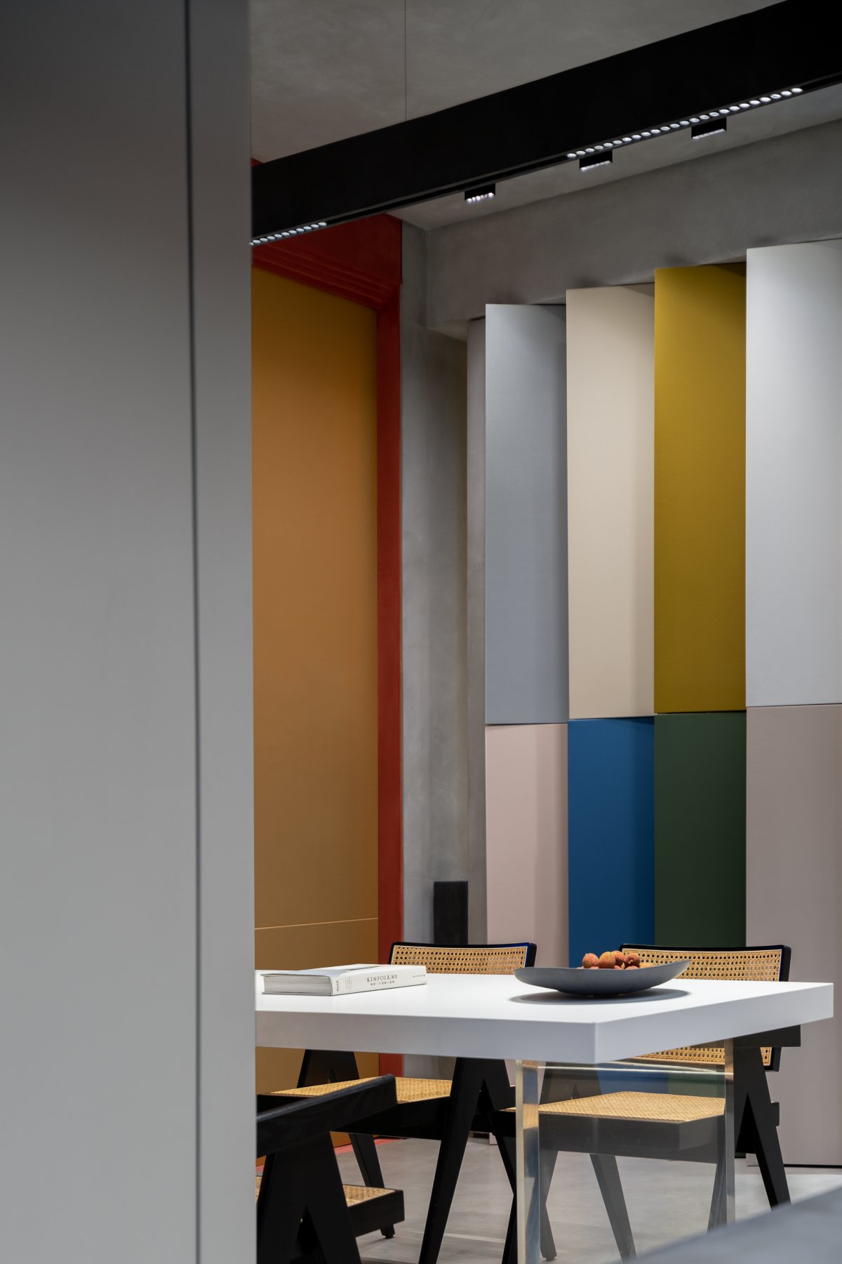
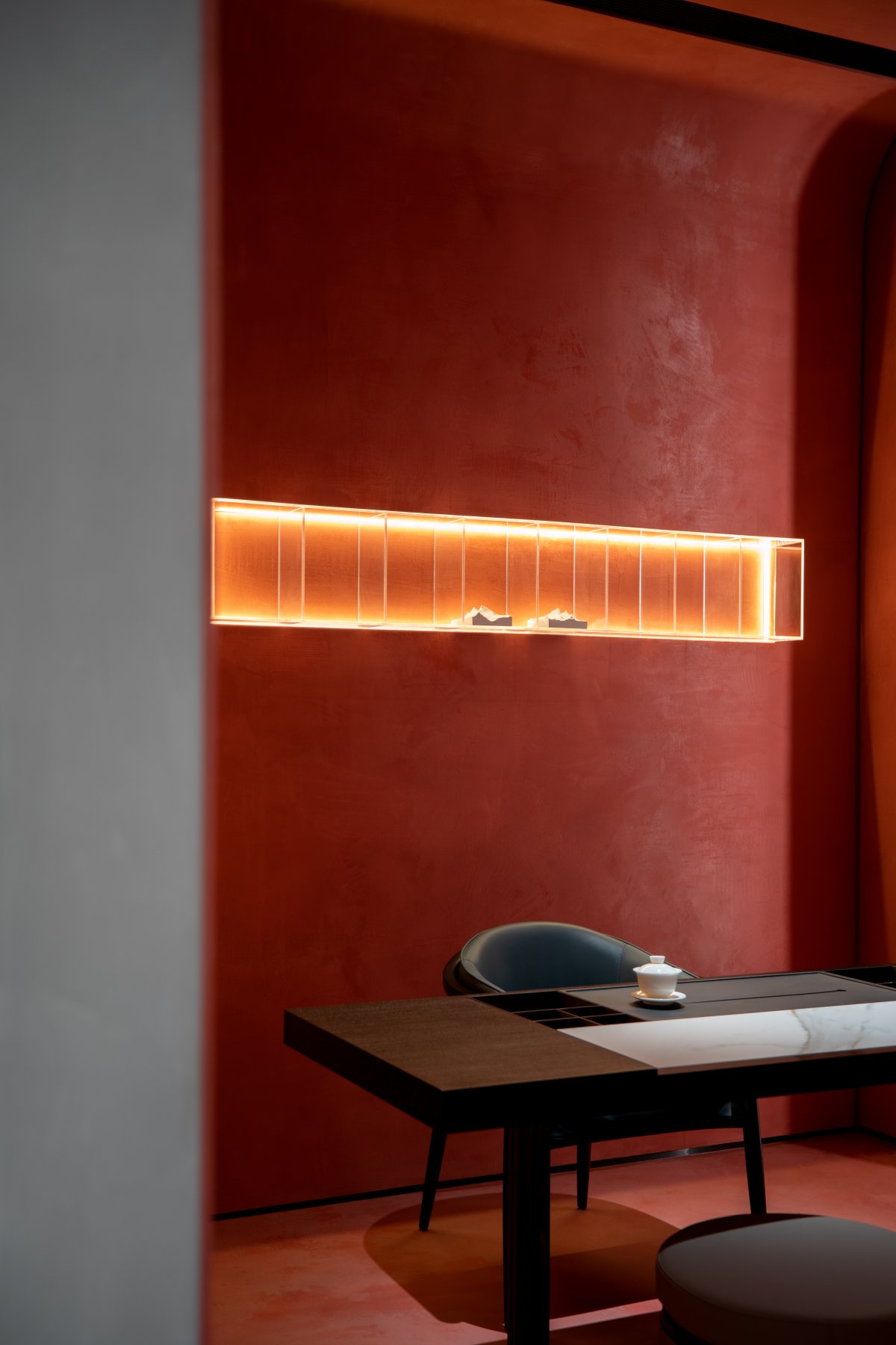
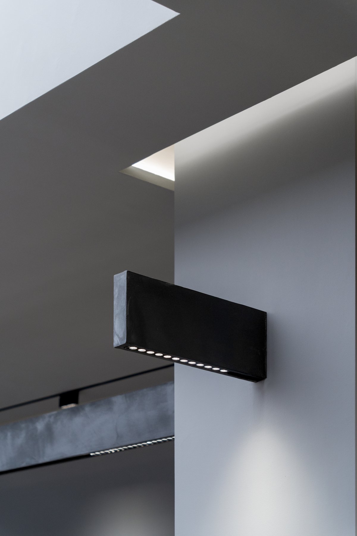
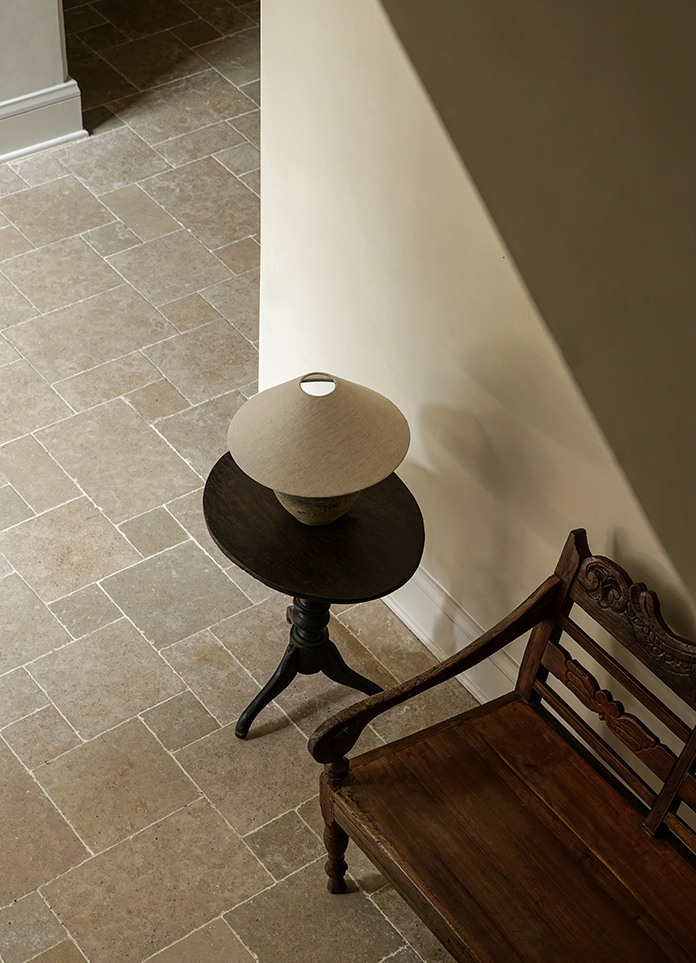
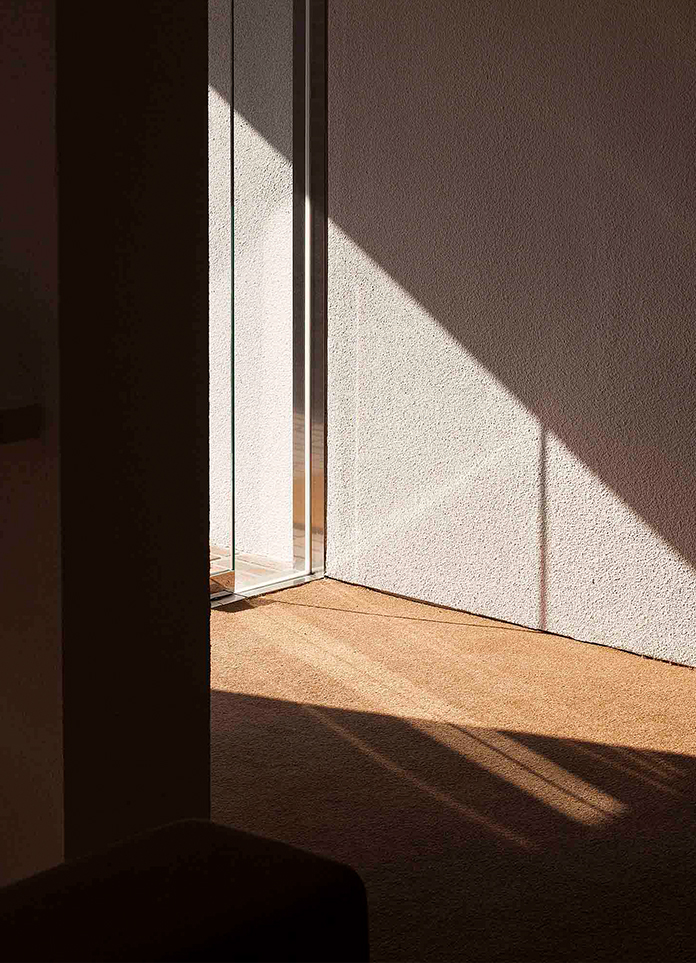
We use a more peaceful way to deal with the tea room. Light and shadow create a quiet space atmosphere here, so that people have a deep perception of the color and texture of the material. Maintain a balance between multiple visual focal points. The linear lighting adds a flexible and free field to the interior, bringing a flow of vitality.
Precise mathematical calculations, long and short lines, cut the picture into geometric shapes of different sizes, and the picture looks simple, clear and full of rhythm. The balance in the composition of geometric divisions, the processing of vertical and horizontal lines intersecting at right angles, and the asymmetric left-right relationship.
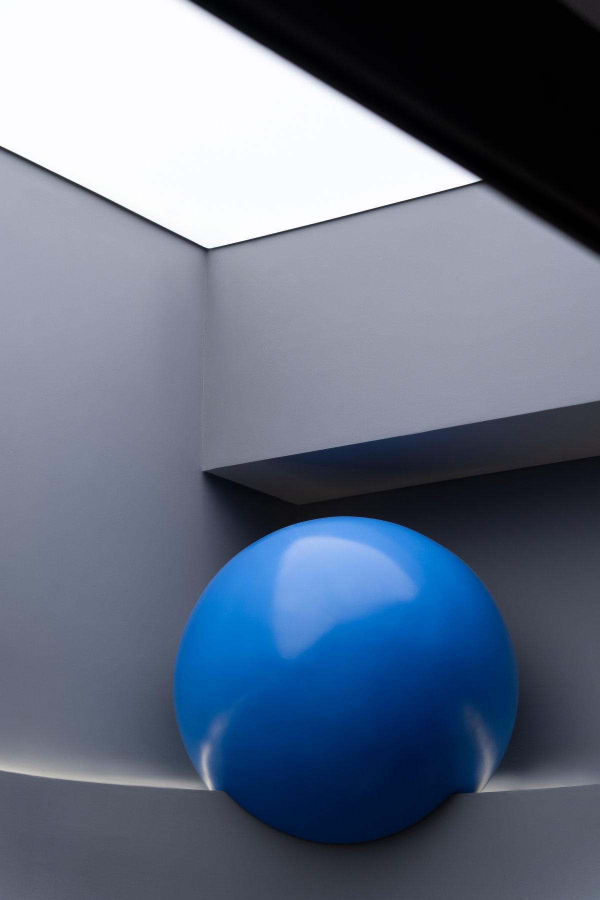
The curve of the wall superimposes the taut space with a soft focus of softness. The arc and the curved surface are humble and elegant, continuous, smooth and soft. The separated structure adds not only the spatial structural tension, but also the sculptural three-dimensional beauty. , relaxation and rich depth, unevenness is the source of happiness...
The curve of the wall superimposes the taut space with a soft focus of softness. The arc and the curved surface are humble and elegant, continuous, smooth and soft. The separated structure adds not only the spatial structural tension, but also the sculptural three-dimensional beauty. , relaxation and rich depth, unevenness is the source of happiness...
- Interiors: Zhibai Design and Research Office
- Photos: MIN STUDIO


