Cafe Mersey
"We tried to create a 'sense of time' that is unique to the site, integrating complex functional elements into the overall concept in a soft and precise way to create a highly textured public space." 一 Yang Yuewen
Place and mood
"We tried to create a 'sense of time' that is unique to the site, integrating complex functional elements into the overall concept in a soft and precise way to create a highly textured public space." 一 Yang Yuewen
It is said that inner awareness is one's true ashram. Through the construction of the place, the designer tries to describe another kind of "dojo" about time: less mysterious and grand, with a relaxed and lazy tone, so that people can inadvertently get involved in the "game" of environmental and emotional resonance after a short rest.
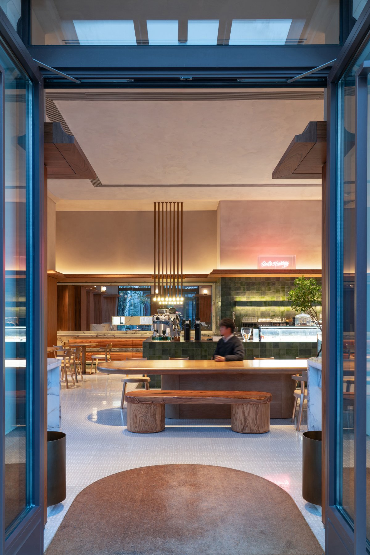
CafeMersey Bicester store is independent of the dining area of the shopping village and located at a corner of the shopping street, so it can effectively integrate into the shopping rhythm of people and provide them with services at their fingertips.
Space as background
Through the design strategy, the interior and exterior of the building form a whole, which helps to amplify the function of the Windows and doors along the street as "viewfinders". As a "background" role, the space does not need to deliberately show its own sense of existence, it is a "stage" waiting for the story to happen.The original design manuscript showed a certain intention: people moving through the streets and the interior, doing their own things, the scene is rich and relaxed.
CafeMersey, as one of the local growing enterprises in Suzhou, is committed to providing healthy baking, coffee juice and vitality meal as daily needs, integrating into the urban community and becoming an indispensable part of people's life.
As for Bicester Shopping Village, which is dominated by shopping, CafeMersey team hopes to go beyond a single functional supporting attribute here, and integrate its own brand propositions into the overall environment of the park. In addition to bringing high-quality food and beverage products to guests, it is also a comprehensive interpretation from vision, taste and touch.
Material and atmosphere
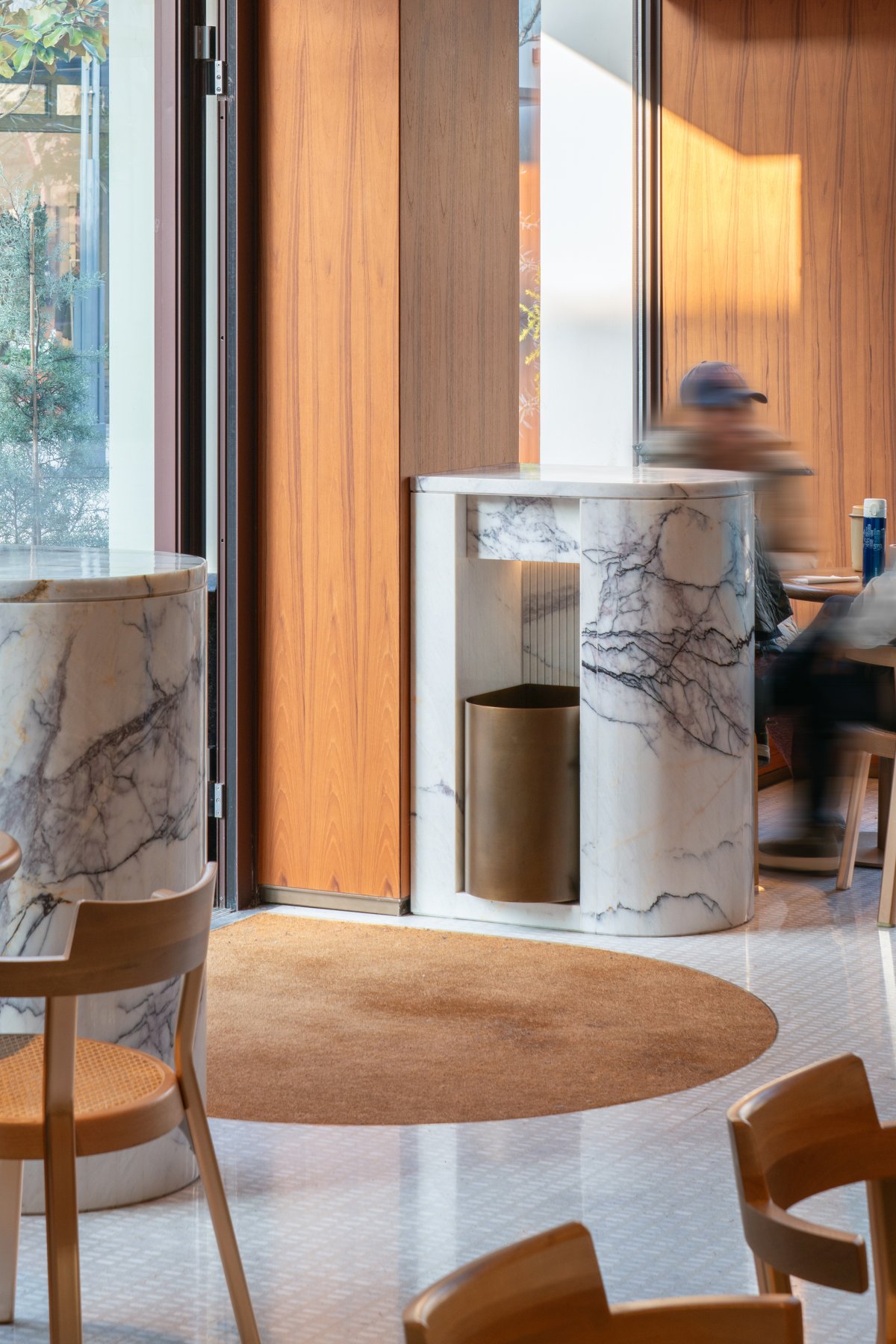
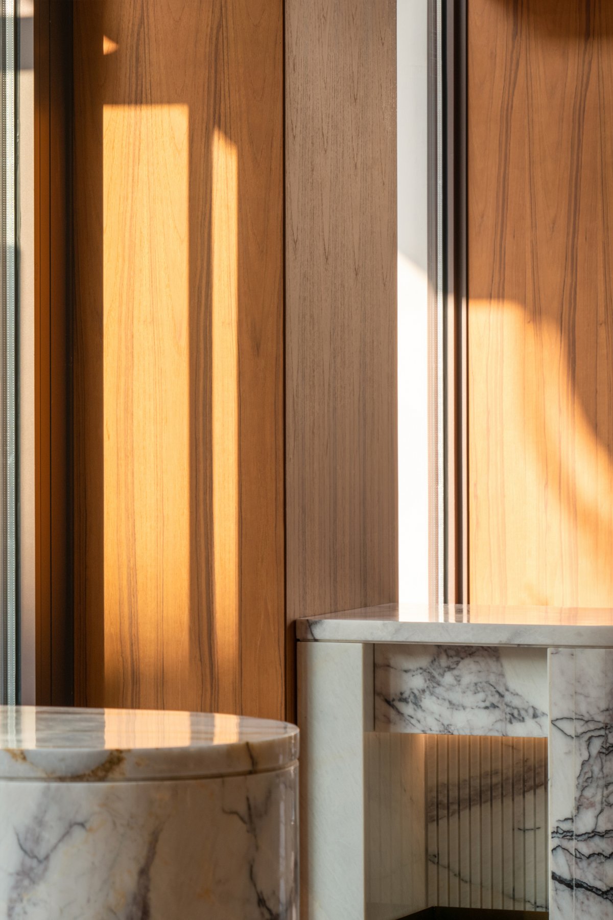
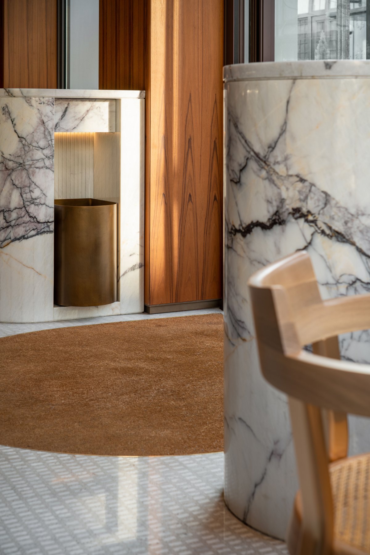
The function of the umbrella rack on both sides of the entrance of the store is a mandatory management regulation of the mall. Instead of purchasing finished products, the designer customized one for the space, combining copper and marble materials to form a lap relationship between high and low, extending the function of the seat by the window, and distributing symmetrically on both sides of the entrance. At some point, light pours onto these material surfaces, rendering rich visual layers.
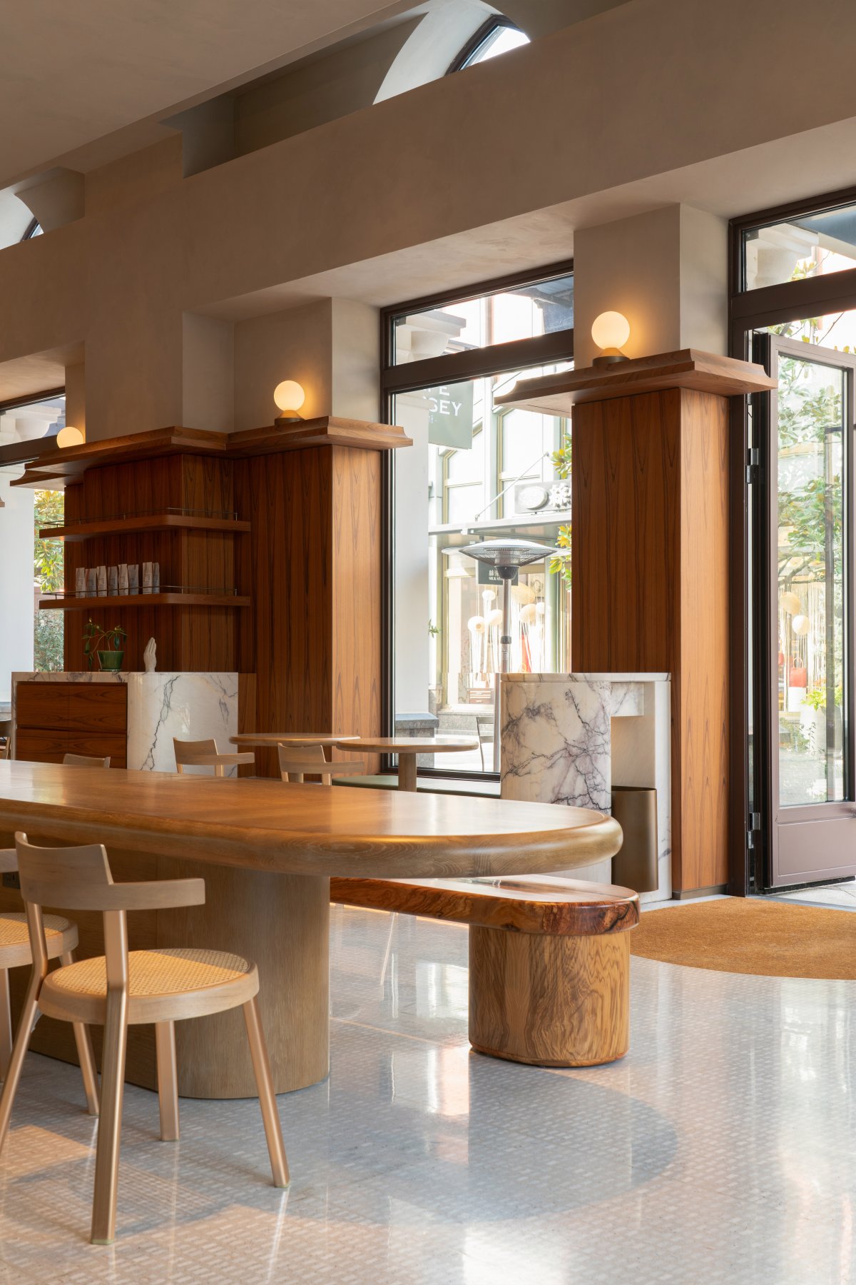
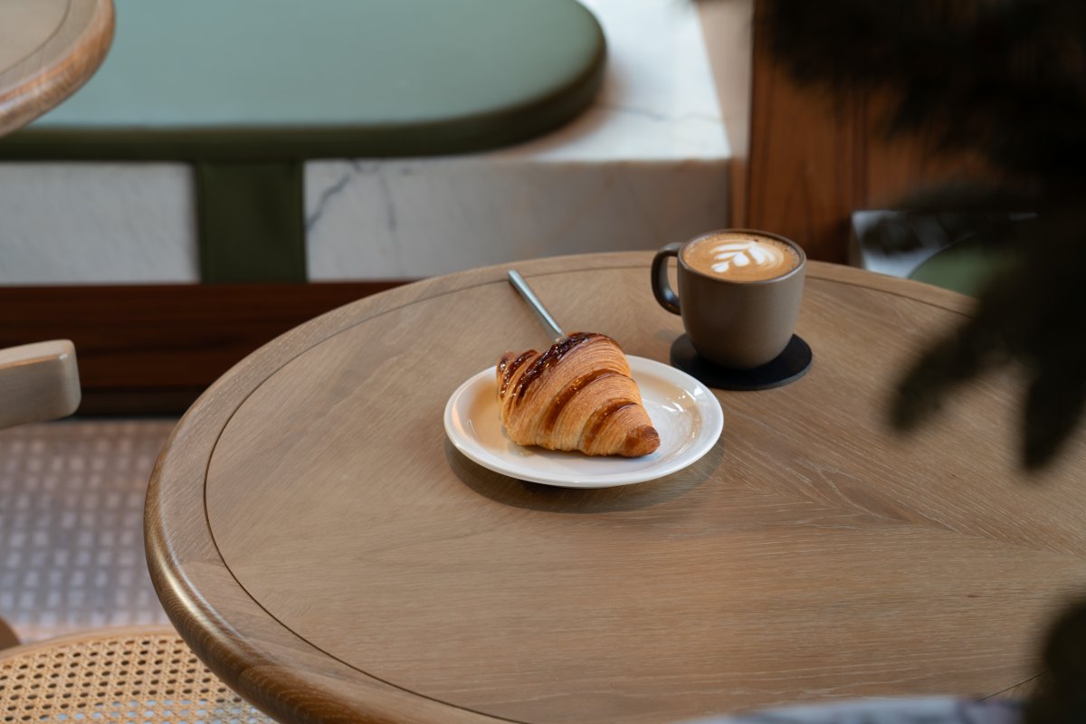
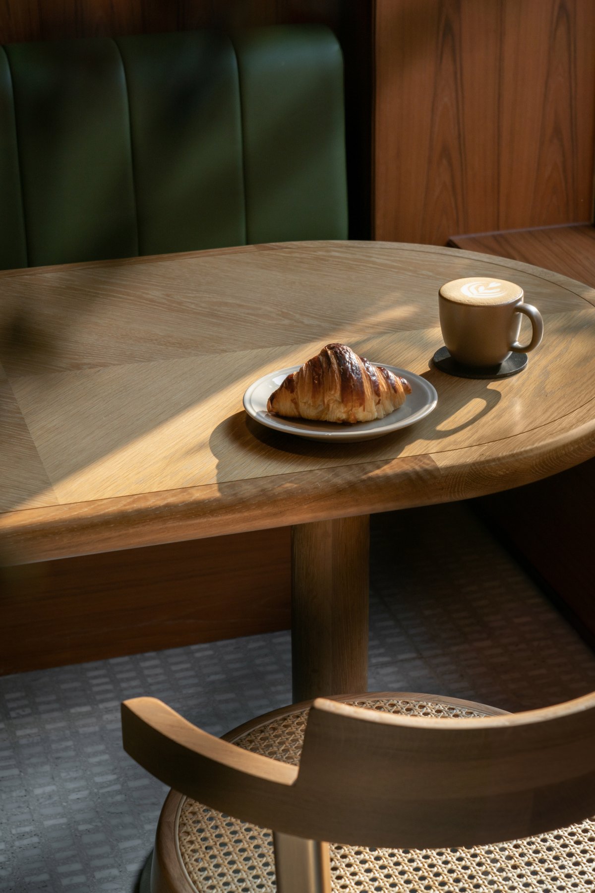
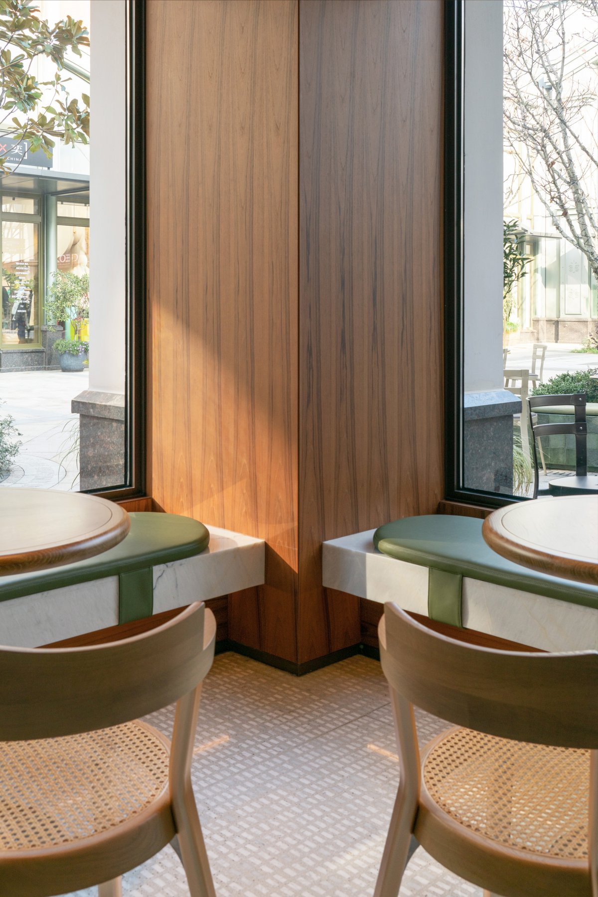
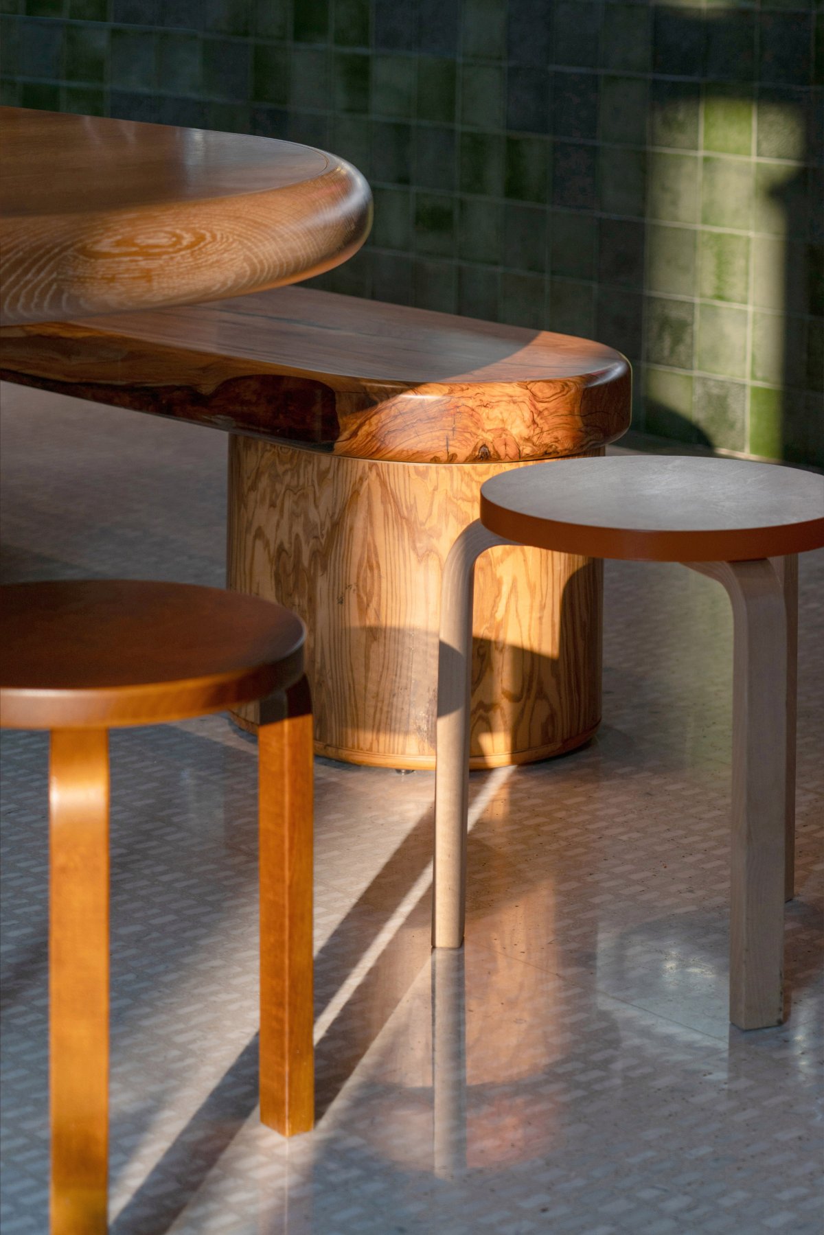
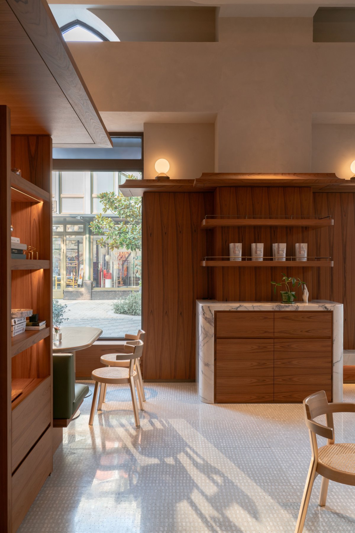
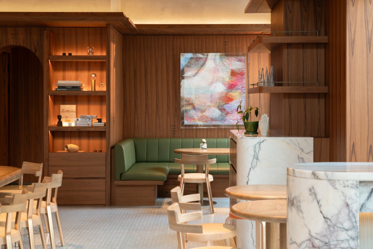
The green leather cushions in the scattered areas are paired with marble, oak furniture, and teak veneer with skin on the walls to create a sophisticated and approachable corner facing the street.
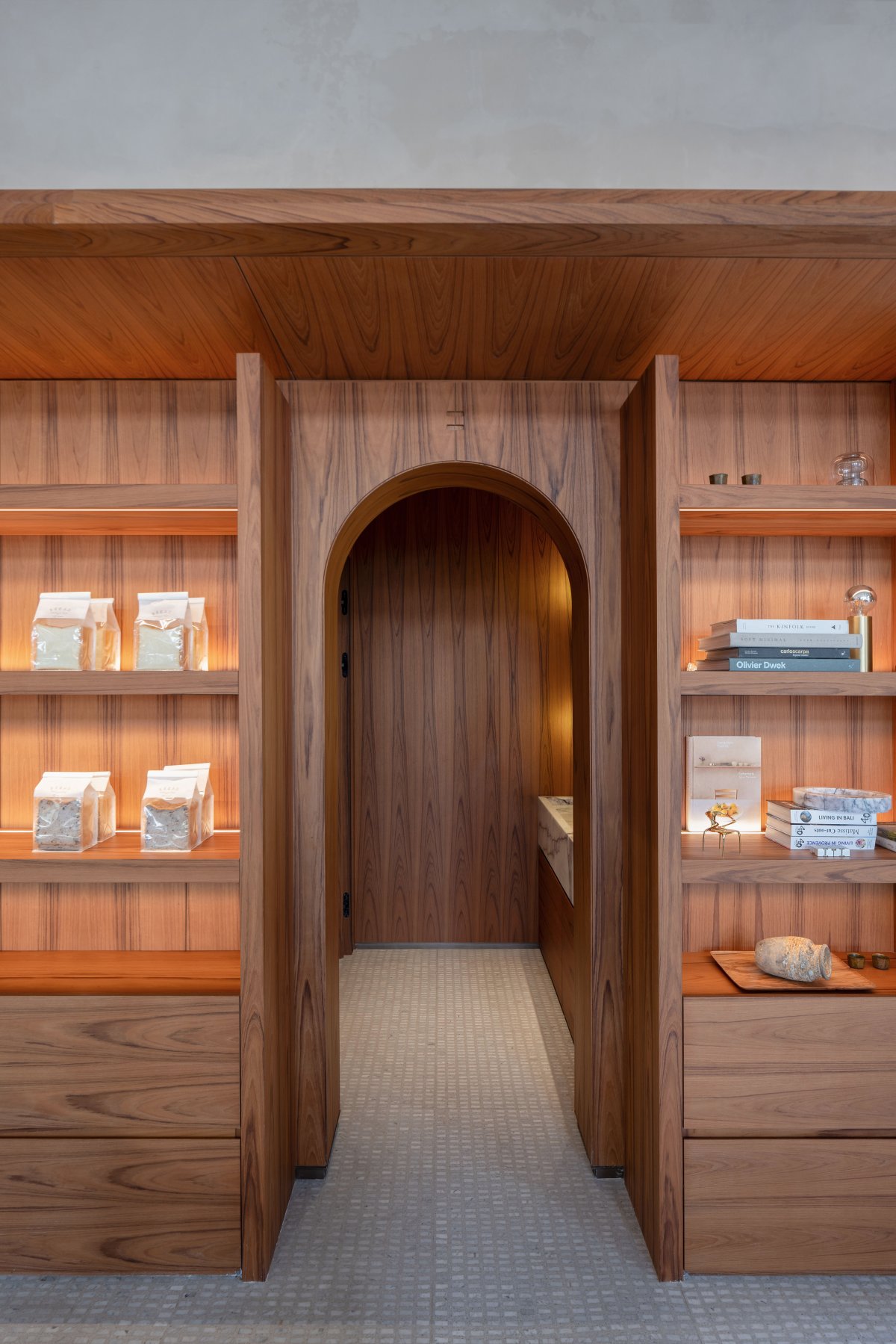
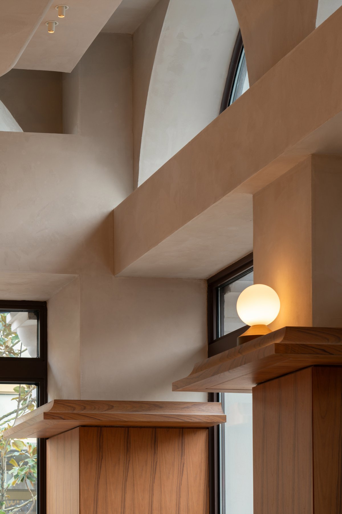
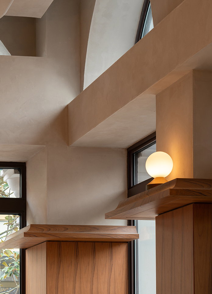
On the one hand, the decorative part of the eaves surrounding the facade is to achieve harmony with the architectural formal language, and on the other hand, it acts as the "architect" of the facade to organize all the functional elements of the space, including: display cabinets, copper lamps, neon logos, linear lights, etc.
Manufacturing relationship
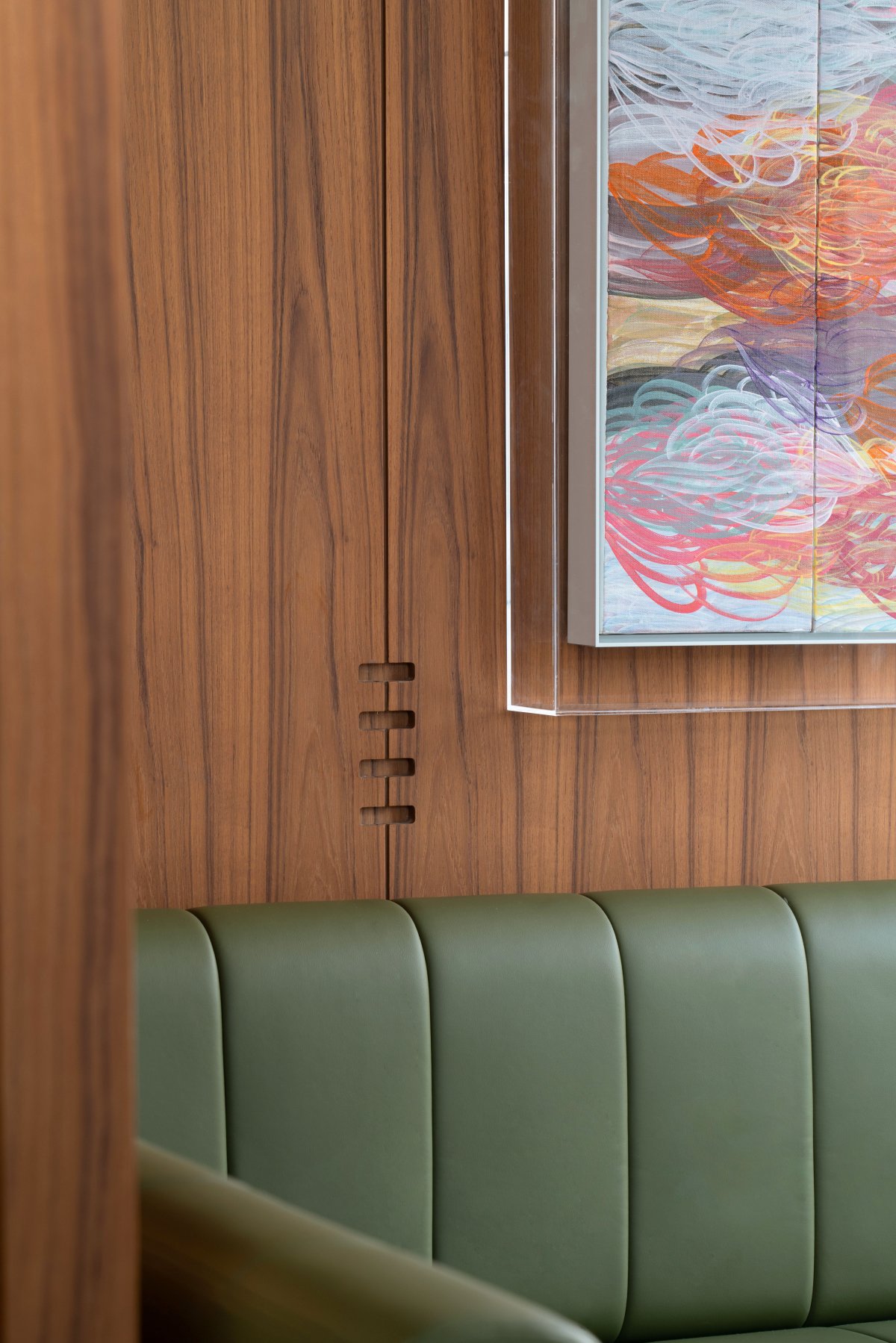
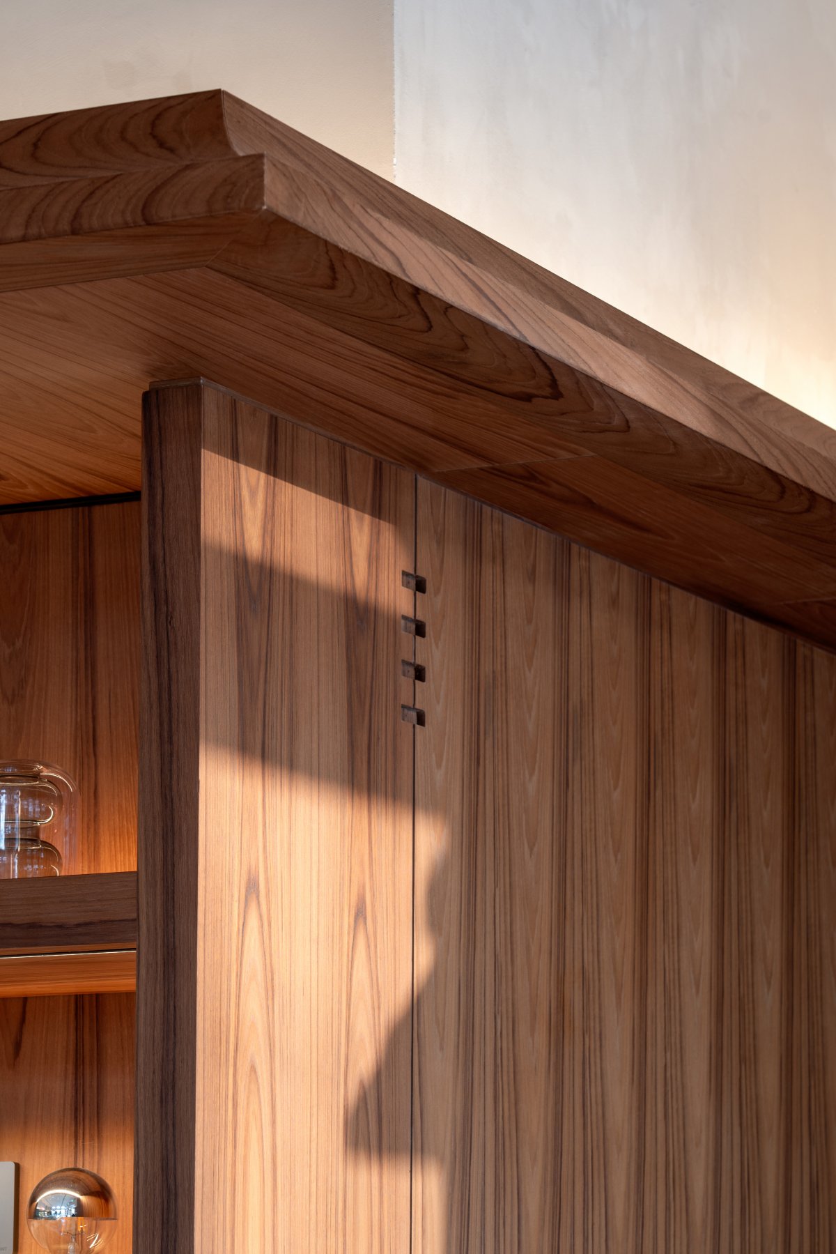
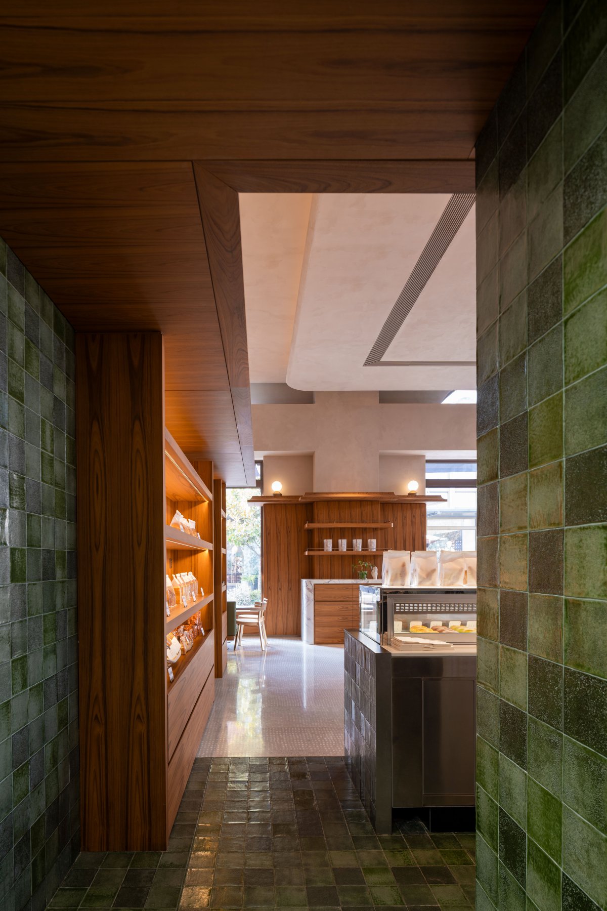
Mass and energy are equally important and complement each other. There are gaps between the side panels of the cabinets on both sides of the arch and the eaves of the wood, so that the cabinets are not completely independent from each other and at the same time, this form enhances the sense of grandeur of the arch as an entrance and exit. The concave nodes in the wood veneer directly above the arch signify that all elements in the space are interlinked.
Let each local detail show its independent sense of quality, and at the same time integrate into the overall framework, highlighting the readability of the space from macro to micro. Designers are more interested in "eternity", not a firm and distant concept with a rational time scale, but with the help of the local conditions of the project, using space as the medium, a number of fragments full of daily scenes, replaced into an endless process of feeling and memory.
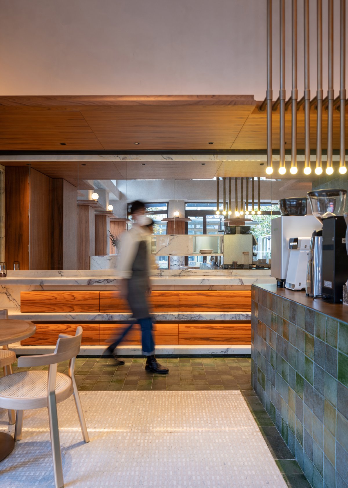
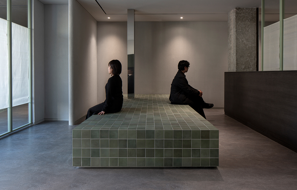
Green handmade brick, as one of the main materials of the space, also has the function of dividing the space area, and vividly shows its important role in the material characteristics and spatial organization. Its modulus has a rich spatial relationship with the spatial interface (ground, wall, ceiling, bar, etc.).
The meaning of details
Green brick wall chiseled out of the dining mouth, with marble edge to close the mouth, that deep like a camera to capture the kitchen chef's every move, between relaxation, cool.
The mirror on the wall of the counter, facing the direction of the street, is to expand the spatial scale through reflection, on the other hand, the indoor and outdoor moving and static images can be juxtated on this interface, so that people can perceive the spirit of the space in the middle of the walking process or.
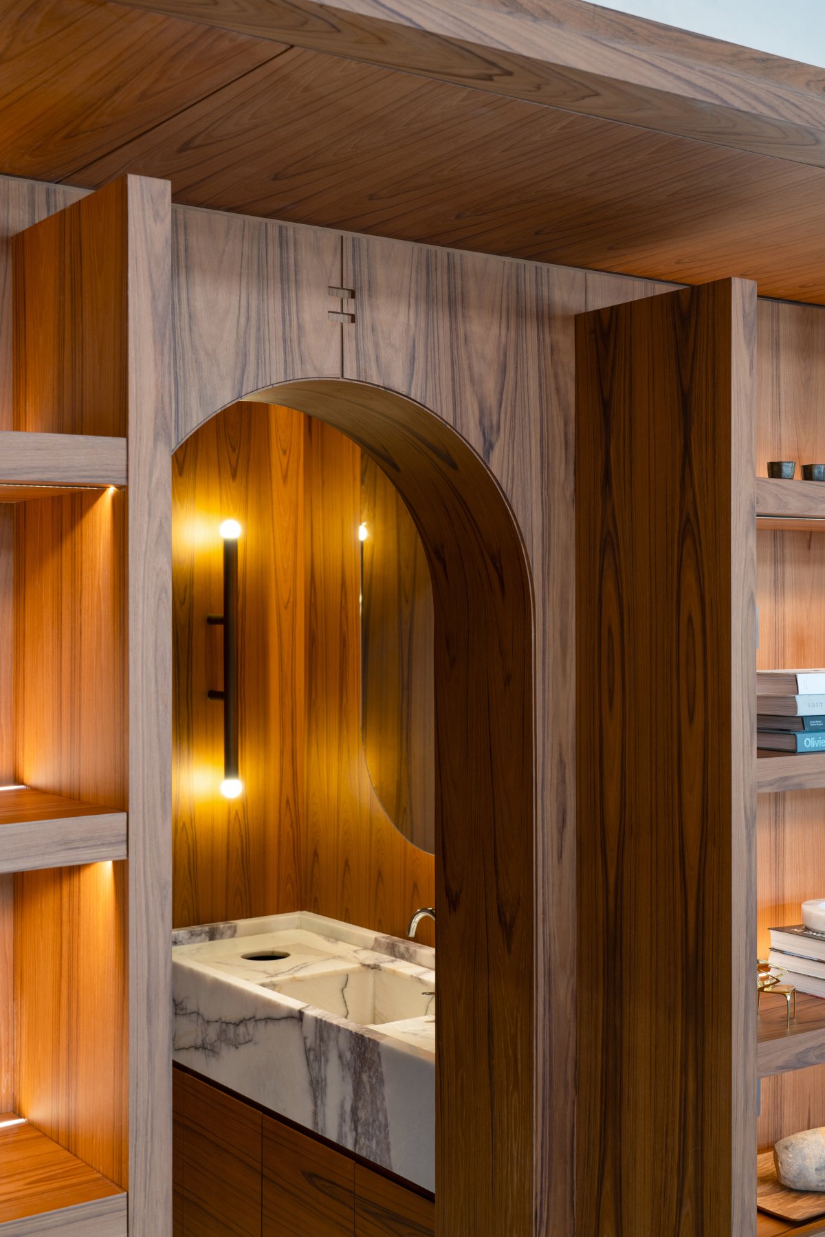
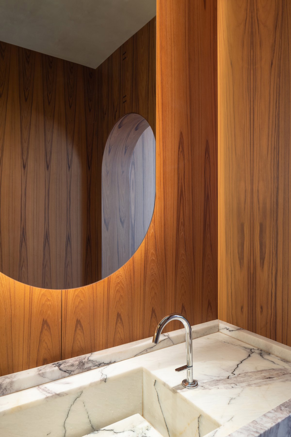
The bathroom is also a corner that cannot be ignored, and the details are the experience. There are marble washbasins, inverted arched mirrors to echo the arch, and copper wall lamps are both playful and with a touch of medieval demon temperament.
The marble material connects the device and the storage cabinet, and its physical motive force and detailed closure point to the compromise of functionality and aesthetics.
Sensory comfort
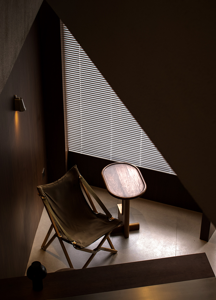
Retro and fashion coexist, and sensory comfort is the first element of material matching reference, we choose including: teak wallboard, hand-made green brick, natural and composite stone, copper and other main materials. The interior design needs to respond to the architectural style of the site, so that people will not feel uncomfortable in the process of switching between indoor and outdoor, which will affect the quality of time even when buying a cup of coffee.
Between inside and outside
Design work is the process of implementing abstract design concepts into visualizations. In the eyes of designers, design is only a medium to solve problems, and it is easier to approach an ideal state of space by exploiting the design along the trend than by forcibly expressing it.The street doors on both sides of the store are kept open during business, which allows the movement lines inside and outside the store to connect naturally. The atmosphere of the interior is expressed through the doors and Windows in an attractive manner.
Quality and experience
CafeMersey team believes that the brand should always bring guests a sense of quality from the inside out and a multi-dimensional value experience. In the context of continuous iteration of domestic consumption, the brand continues to output high standards of service and establish a more intimate symbiotic relationship with local consumers is the goal of the management team.
Break through the limited physical space, inject imagination, to create an "infinite" container to accept everything, so that people can have the opportunity to hide outside the time to obtain poetic, harmonious and consistent presence experience.
Space, like time, can never be fully described. We await your exclusive time at Cafe Mersey......
- Interiors: Fillstudio
- Photos: Bridge House
- Words: Yang Yuewen
