Most people's lives are wrapped up in the active or passive pursuit of trends, which are essentially an excessive internal drain and premature ageing. This is also the case with living spaces, where we want to dull time through every possibility, not as an appeal to a certain style or doctrine, but as a way of retaining the beauty that may one day pass away.
This is a school house purchased by a young couple for their upcoming child. The male owner is an architect and the female owner is a general employee who loves coffee baking, considering the hard living requirements, the layout of the three bedrooms needs to be retained, while the client proposed the idea of de-styling, so we considered going back to the essence of life and designing an ideal home that only fits them.
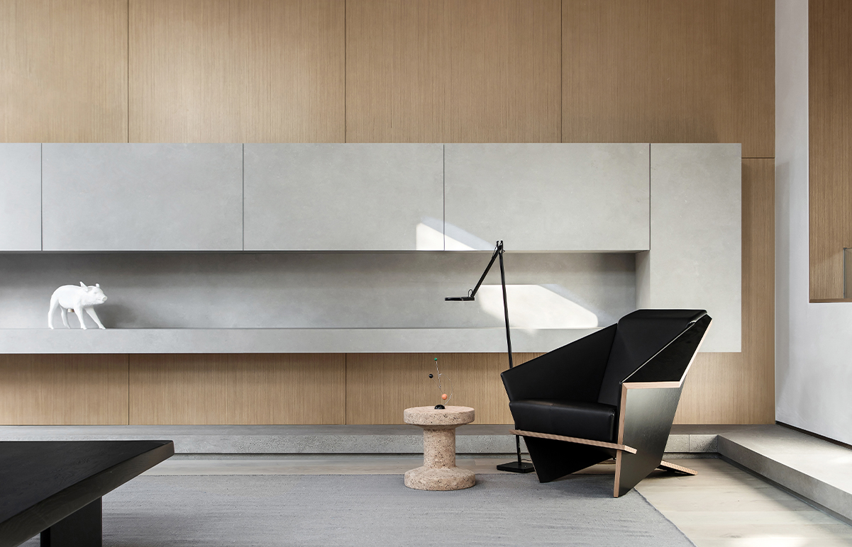
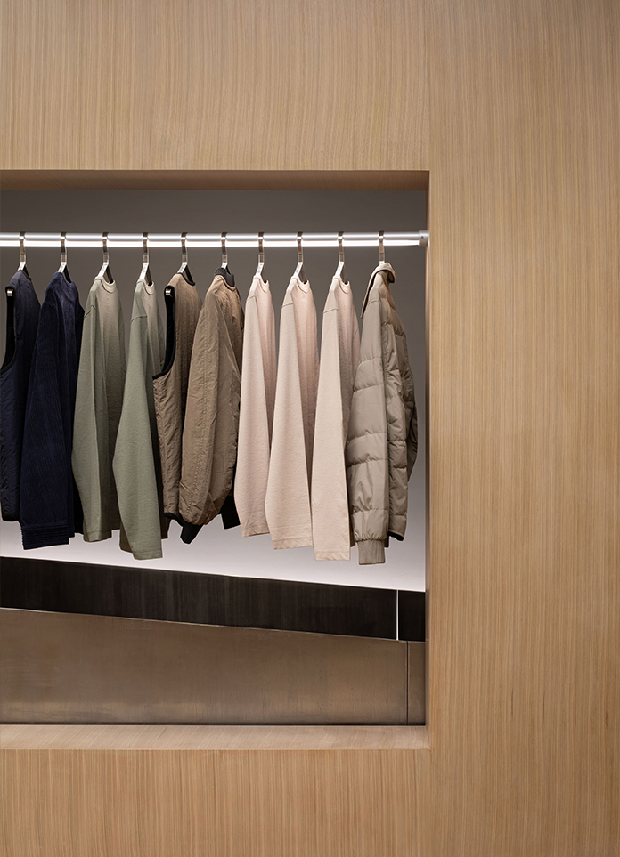
The original living room architecture is fully preserved and the warm, restrained wall material allows light to lazily adhere. On the partial top surface, a low-saturation matte metal was deliberately used to create layers with small clashes of natural travertine materials. Taking into account the owner's sensitivity to sound, pocket doors and transitional spaces connecting inside and outside were used to muffle outside distractions and noises as much as possible. The aisle leading from the outside to the sleeping area is set up with a dressing table for the lady of the house and a system of storage with different functions.
The original dining and kitchen functions have been reorganised and expanded to meet the individual needs of different users and to facilitate dialogue and communication. The dining, reading and storage functions are planned around the migratory flow of the dining room. To weaken the heaviness of the large storage system, the balance is neutralised with light steel panels and metallic suspension cabinets. The small spaces set back inside create a modest sense of enclosure, using wall gaps to fill in with soft luminous materials.
The main bathroom has been relocated to a central position so that the air and light from the south can flow in, not only visually but also perceptually, so that it can breathe and breathe. Concrete or deliberate design language becomes impotent in the process, and everything seen in the space happens appropriately and astringently.
The study serves as a temporary resting place, and this is where the whole atmosphere of the residence is condensed. The bookshelves, often found on the walls, float on the top, and the dark desk floats on the floor through the wall support, amplifying and controlling the light coming in through the windows.
The inside of the children's room is finished with an inward-folding detail at the bite of the cabinet to replace the function of a bedside table.
The wall of the living room is extended and interrupted, naturally forming a barrier between the washbasin and the common area, with restrained curves and cut-outs forming.
- Interiors: NON DESIGN
- Photos: Howie
- Words: NON DESIGN


